Problem, opportunity, impact
Core Problem
The brand has strong story, products, testimonials, and media credibility, but the website structure is cluttered and does not build trust or guide users through a clear conversion funnel.
Main Oppurtunity
Reorganize the homepage, navigation, collection pages, and product pages around trades-focused messaging, trust signals, clearer merchandising, bundles, and stronger product page hierarchy.
Estimated Impact
Improved trust, clearer user journey, higher product page conversion, and increased average order value through bundles, multipacks, and cross-sells.
Core Problem
This audit found that BlueCollaz has strong assets, including a compelling trades-focused story, authentic products, testimonials, and media coverage. However, those strengths are not being used effectively in the current website structure.
The biggest issue is that the homepage and navigation feel cluttered and unorganized. Visitors are shown discounts, products, bundles, blog content, and story sections before the brand has clearly established who it is, who it serves, and why tradespeople should trust it.
The product and collection pages also need stronger conversion structure. Product pages lack clear hierarchy, trust signals, reviews near the top, shipping and return reassurance, and stronger average order value mechanics such as multipacks, bundles, and frequently bought together offers.
The recommendation is to rebuild the site around a clearer funnel: establish trust first, show bestsellers, organize products by trade or collection, promote bundles strategically, and use the story as a trust-builder rather than hiding it near the bottom of the homepage.
Problems Identified
Cluttered Navigation
The navigation contains too much visual clutter and does not follow the standard navigation pattern users expect, creating friction before visitors even begin shopping.
Weak Logo Presentation
The logo appears inside a busy image and is difficult to read, which weakens brand recognition and credibility.
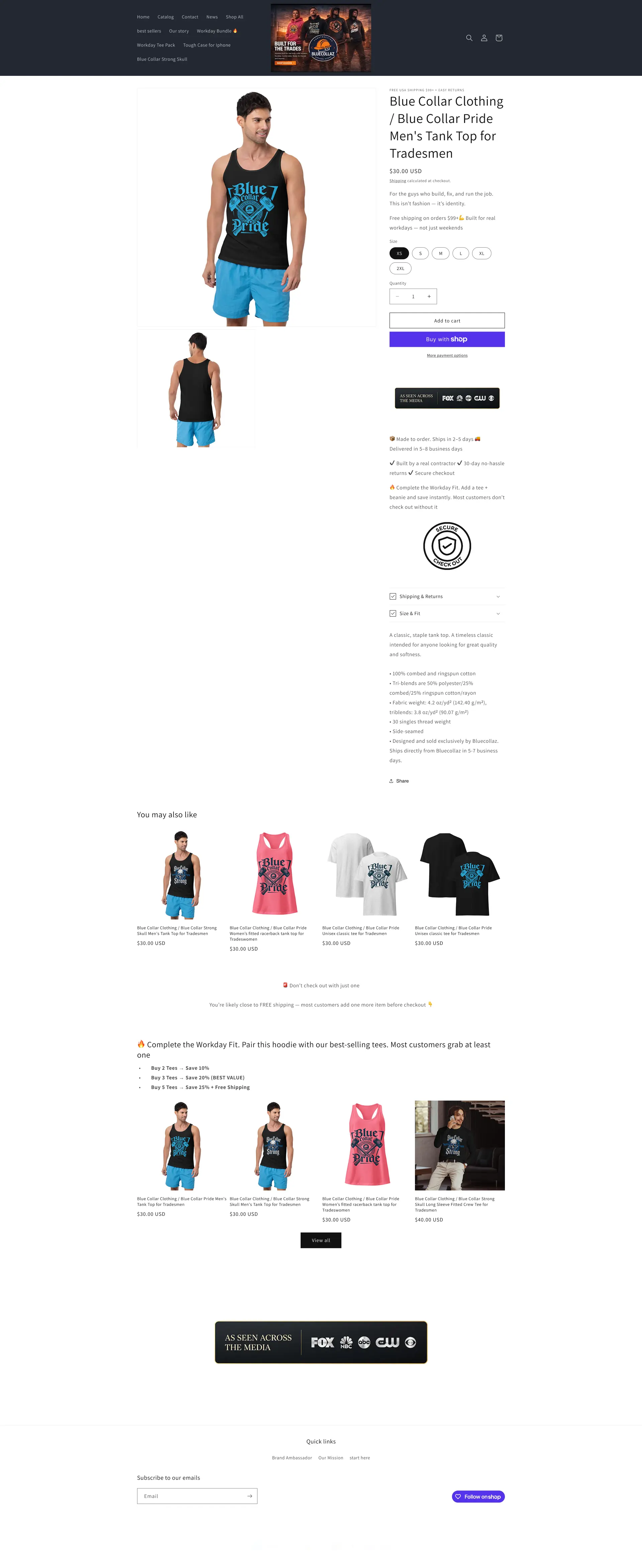
Discount-Led Hero Section
The homepage opens with discount messaging before explaining who the brand is, who it serves, or why customers should trust it.
Brand Story Is Introduced Too Late
The powerful “built by tradesmen for the trades” story appears too far down the page, after many visitors may have already lost interest.
Trust Signals Are Underused
Media mentions, testimonials, and proof points exist, but they are not surfaced early enough to build confidence.
Homepage Sections Are Poorly Organized
The homepage jumps between featured products, bundles, blog posts, collections, testimonials, and story content without a clear conversion flow.
Featured Product Placement Creates Confusion
A single featured product appears too high on the homepage and disrupts the path toward bestsellers and broader product discovery.
Bundle Deal Appears Too Early
The bundle deal is shown before visitors have enough trust or context to understand the value of the offer.
New Release Section Lacks Key Information
New release products do not show enough detail, pricing, sizing, or clear purchase context before asking users to add to cart.
Blog Content Interrupts Shopping Flow
A blog post appears in the homepage shopping journey without enough context, creating distraction instead of supporting conversion.
Inconsistent Product Grid Imagery
Some product images have different dimensions or styles, making the grid feel less polished and harder to scan.
Collection Page Lacks Filtering
Users are shown many products without filters, categories, badges, or guidance to help them find what they need quickly.
Collection Page Does Not Guide Purchase Decisions
Products are listed without visual cues such as best seller, crew favorite, new, or trade-specific labels.
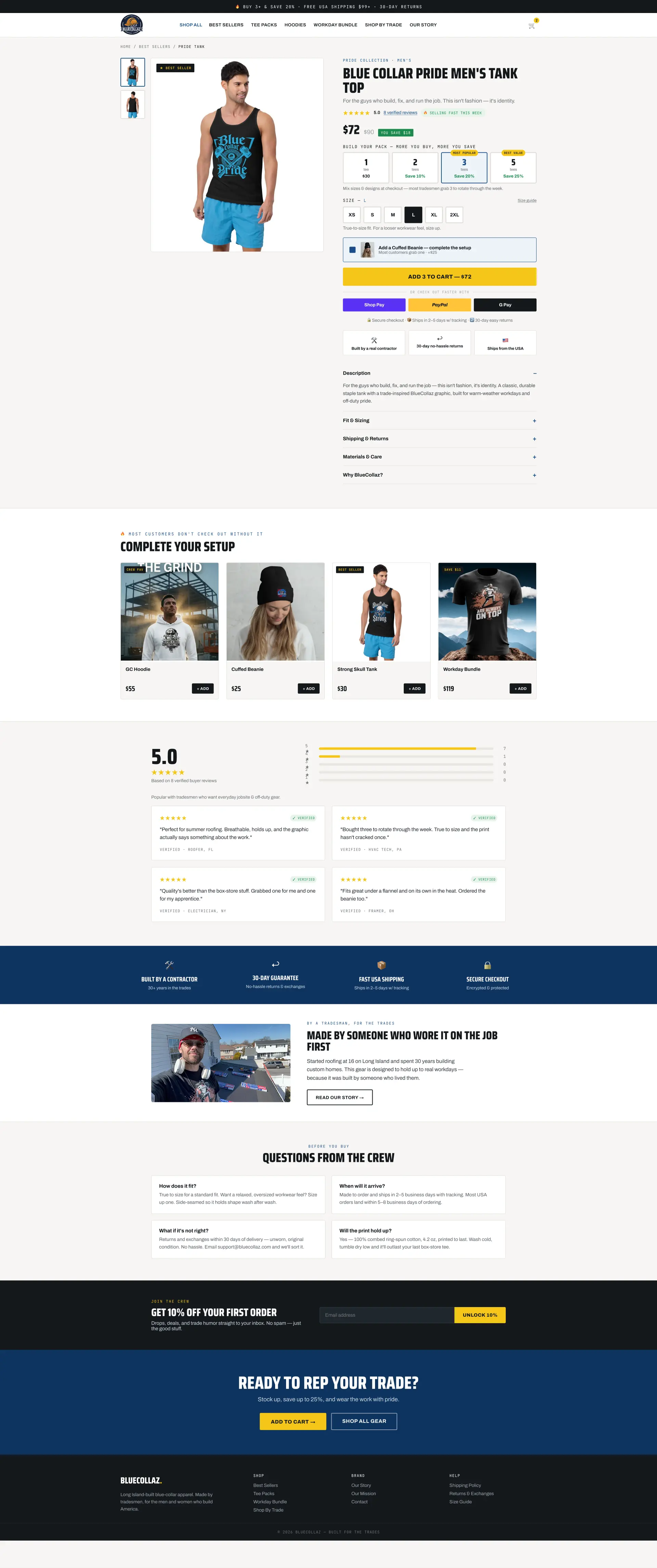
Product Page Lacks Clear Hierarchy
The product title is large and readable, but it overshadows the price and makes the purchase area harder to scan.
Product Page Lacks Trust Signals Near The Top
Ratings, reviews, free shipping, returns, delivery expectations, garment quality, and trust-building details are not clearly visible in the main purchase area.
Shipping Information Is Poorly Placed
Shipping calculated at checkout appears too high and should be moved closer to the purchase reassurance area.
Average Order Value Opportunities Are Missing
The product page does not use strong multipack offers, quantity discounts, bundles, cross-sells, or frequently bought together sections.
About Page Is Stronger Than Main Conversion Pages
The About/Story page builds more trust than the homepage or product page, but most visitors may never reach it.
Recommendations
Simplify The Navigation
Use a standard, easy-to-understand navigation structure with clear links for shop, bestsellers, bundles, story, and contact.
Improve Logo And Header Presentation
Use a clean logo in the header without background clutter so the brand feels more professional and recognizable.
Lead With Trades-Focused Messaging
Open the homepage with a strong message such as built tough for the ones who build everything else.
Move Trust Signals Above The Fold
Show verified tradesmen ratings, media mentions, free shipping, returns, tracking, secure checkout, and built-for-the-trades messaging near the top.
Use Media Coverage As Authority
Feature press logos and “as seen in” proof early on the homepage to quickly build credibility.
Promote Bestsellers Earlier
Move bestsellers directly below the hero and trust-building section so visitors quickly see the most proven products.
Reposition Bundle Offers
Move bundle deals lower on the homepage after trust and product context have been established.
Organize Products By Trade
Create collection paths for farmers, painters, iron workers, roofers, landscapers, general contractors, and other trades.
Use A Story Teaser On Homepage
Show a short version of the founder/tradesman story on the homepage and link to the full story page.
Move Long Story Content To The About Page
Keep the detailed BlueCollaz story on a dedicated page where it can be structured more clearly.
Add Collection Filters
Allow users to filter by product type, trade, collection, fit, or use case so browsing becomes easier.
Add Product Badges
Use labels such as bestseller, crew favorite, new, and route number to guide purchase decisions.
Improve Product Page Hierarchy
Make the product title and price clearly visible, with the price given stronger emphasis.
Add Reviews Near Product Title
Show verified reviews or star ratings near the product name to build confidence immediately.
Add Urgency Carefully
Use light urgency, such as low stock or recently ordered messaging, to encourage faster decisions without feeling manipulative.
Add Trust Elements Near Add To Cart
Show free shipping, 30-day returns, secure checkout, tracked shipping, delivery expectations, and garment quality details near the purchase button.
Use Multipack Pricing
Offer options such as buy 3 and save 20% or buy 5 and save 25%, with the most popular package preselected.
Add Preselected Upsells
Recommend relevant add-on products and consider preselecting useful extras to increase order value while keeping the choice clear.
Add Frequently Bought Together
Show complementary items that complete the workday fit and encourage customers to buy more than one product.
Redesign The Story Page
Keep the strong story content but improve hierarchy, section grouping, readability, and trust-building flow.
The short version
- The brand has strong assets, but the website does not organize them effectively.
- The homepage navigation and structure are too cluttered.
- The hero should explain the brand before pushing discounts.
- Media coverage and verified tradesmen reviews should appear much higher.
- The About page is strong but should support the homepage and product pages.
- Collection pages need filters, badges, and clearer product guidance.
- Product pages need stronger hierarchy, trust signals, and reviews near the top.
- Multipacks, bundles, and cross-sells can increase average order value.
- Products should be organized by trade to make browsing easier.
- The site should feel built for tradespeople from the first screen.
Before
After
Before

After
(Free CRO audit)
See what's quietly
costing you sales.
Tell us about your store and we'll send a personalized 5-minute video
showing exactly where you're losing buyers — and how to win them back.
Tell Us About Your Store
Takes about 40 seconds. No call required.
What's Included

5-minute video teardown
4:52
Where attention leaks and buyers hesitate.
70% of your traffic — judged on its own terms.
The signals that make first-time buyers convert.
Ranked by impact vs. effort, ready to ship.