










Cosmetics Product Page CRO audit
The product page contains most of the elements required for conversion, but lacks strong brand identity, emotional positioning, and differentiation from a standard Shopify store.
Watch the 26:47 teardown.
Pressing play loads the video from YouTube — you can allow it for every teardown under cookie preferences.
The short version.
This audit found that the product page is already well optimized from a conversion structure perspective. Unlike many ecommerce stores, the page contains important conversion elements such as reviews, product imagery, bundles, FAQs, social proof, and supporting content. Overall, the page was rated approximately 7 out of 10 for conversion readiness.
The biggest issue identified is not the page structure itself but the lack of a distinctive brand identity. The website currently feels like a standard Shopify store that could belong to almost any company. There is very little visual or emotional differentiation that helps visitors build trust or form a connection with the brand.
The audit also highlights information overload around the decision-making area. Too much text, lengthy product titles, repetitive information, and competing offers create unnecessary friction during the purchase process. Visitors should be guided toward outcomes and benefits rather than being overwhelmed by product details.
The recommendation is to build a stronger branded experience, simplify the product page, create more emotional engagement, introduce beauty-focused storytelling, and use trust-building content such as customer stories, UGC, before-and-after transformations, and branded visual elements.
The product page contains most of the elements required for conversion, but lacks strong brand identity, emotional positioning, and differentiation from a standard Shopify store.
Introduce stronger branding, reduce information overload, improve emotional connection, and reposition the experience around outcomes rather than product features.
Improved trust, stronger emotional engagement, higher conversion rates, and increased average order value through better product positioning and branding.
repositioned around outcomes so the page feels like a brand, not a template.
Scored across five dimensions.
Average of the five scores below, as judged at the time of recording. Adequate overall — the detail is in which dimension is dragging.
12 findings, each with the fix beside it.
Every finding below was called out on the recording. Open one to read what was found and what we would change. Nothing is hidden from the page source.
01 Weak Brand Identity Fix included
The website lacks distinctive branding and could easily be mistaken for a generic Shopify store. There is little differentiation from competitors.
Develop Stronger Brand Identity
Create a more recognizable visual brand system using consistent colors, typography, imagery, messaging, and navigation.
02 Trust Gap Caused By Generic Design Fix included
The overall experience feels like a standard ecommerce template rather than a trusted beauty brand.
Add Stronger Trust Signals
Continue reinforcing shipping, returns, guarantees, and customer satisfaction near key decision points.
03 Navigation Is Too Generic Fix included
The navigation contains only basic links and does not showcase collections, best sellers, featured products, or category breakdowns.
Introduce Rich Navigation
Add collections, best sellers, featured products, and category navigation to create a more professional shopping experience.
04 Information Overload Above The Fold Fix included
Too much text appears in critical decision-making areas, making it harder for users to focus on the most important information.
Reduce Information Density
Move technical details, ingredients, and supporting information further down the page while keeping purchase decisions focused on benefits and outcomes.
05 Product Benefits Are Buried Fix included
The outcomes customers want are not emphasized enough compared to descriptive product content.
Create How-To Sections
Add clear usage instructions to help customers understand how to get the best results from the product.
06 Long Product Titles Fix included
The product name creates unnecessary visual clutter and could be simplified for clarity.
Simplify The Product Header
Reduce visual noise by shortening the title, reducing excessive text, and emphasizing key benefits.
07 Frequently Bought Together Placement Creates Friction Fix included
Additional product recommendations appear at a stage where users are ready to purchase, potentially distracting them from completing the transaction.
Move Frequently Bought Together Lower
Relocate product recommendation sections further down the page to avoid distracting users who are ready to purchase.
08 Standard Shopify Visual Experience Observation
Several sections resemble common Shopify templates rather than a premium beauty brand experience.
This one is addressed by the wider recommendations below rather than a single change.
09 Overemphasis On Features Rather Than Outcomes Fix included
The product focuses too heavily on what it contains instead of the results customers will achieve.
Focus On Outcomes
Move benefit-driven messaging higher on the page and position outcomes as the primary selling point.
10 Unnecessary Decorative Icons Observation
Emoji-style icons reduce perceived credibility and make parts of the page feel less premium.
This one is addressed by the wider recommendations below rather than a single change.
11 Limited Emotional Positioning Fix included
The product is presented logically rather than emotionally, despite beauty purchases often being emotionally driven decisions.
Introduce A Beauty Ritual Framework
Position products as part of a daily ritual rather than a one-time purchase to increase emotional connection and repeat purchasing behavior.
12 Insufficient Human Validation Fix included
The page lacks enough customer faces, user-generated content, and real-world proof that reinforces trust.
Add User Generated Content
Feature videos, testimonials, and customer experiences from real users to build trust and credibility.
5 further recommendations that cut across the whole store.
Improve Pricing Visibility
Make pricing more prominent and easier to understand within the purchase area.
Create A More Branded Homepage
Use softer backgrounds, stronger category presentation, branded visuals, and clear product positioning.
Use Product Tags Strategically
Add visual indicators such as Best Seller, Trending, or New Arrival to help customers make decisions faster.
Show Before-And-After Transformations
Use authentic customer results to validate product claims and demonstrate effectiveness.
Build Emotional Storytelling
Create stronger emotional connections through customer success stories, brand values, and aspirational messaging.
What the fixed version looks like.
Drag each frame to move between what is live today and the version built on the recommendations above.
Home page
Drag to compare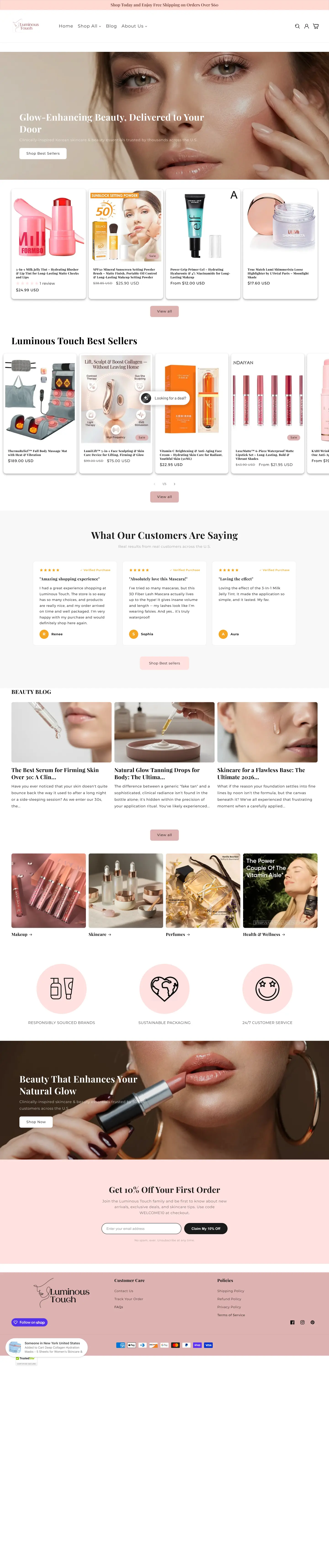
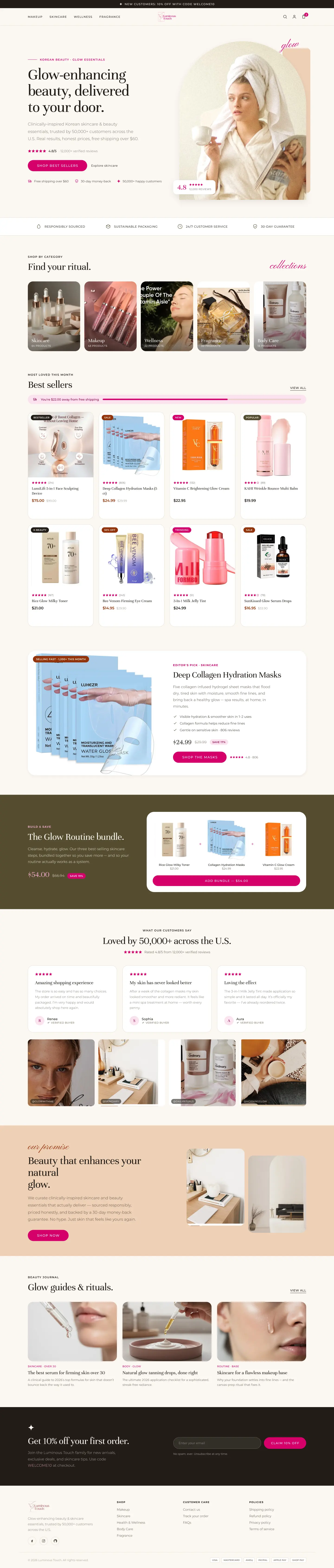 After
Before
After
Before
Product page
Drag to compare
 After
Before
After
Before
What to take from this teardown.
The product page already contains most major conversion elements.
The primary issue is weak branding rather than missing CRO components.
Beauty products require emotional positioning, not just feature explanations.
Information overload is creating unnecessary friction.
Frequently bought together offers should not interrupt buying decisions.
Benefits and outcomes should be emphasized over ingredients and technical details.
User-generated content can significantly increase trust.
A stronger branded experience can help differentiate the business from generic Shopify stores.
Customer transformation stories are a major opportunity.
Introducing a beauty ritual framework can increase loyalty and repeat purchases.
What people ask about this teardown.
10 answers drawn from the recording and the written report — the questions store owners in beauty & cosmetics ask after watching this one.
Ask about your own store →
Is this cosmetics product page actually badly built?
No — it is one of the stronger pages in the library. It already has reviews, bundles, FAQs, social proof, supporting content and good imagery, scoring 8/10 on both UX and product page and 7/10 on conversion. The gap is brand identity at 5/10: the page works, it just does not feel like a specific beauty brand.
What does 'weak brand identity' mean when the page converts reasonably well?
It means the page could belong to almost any Shopify store. There is little in the colour, typography, imagery or voice that a returning customer would recognise, and nothing that differentiates it from a competitor selling a similar formula. That caps trust and repeat purchase even when the conversion mechanics are sound.
What is 'information overload above the fold' and why does it hurt sales?
Too much text sits in the area where the buying decision is made: a long product title, repeated information and competing offers. Every extra line of copy next to the buy button is another thing to read before deciding. Shorten the title, cut the duplication and lead with the outcome the customer wants.
Should a Frequently Bought Together block sit next to the Add to Cart button?
Not on this page. It appears at the exact moment the visitor is ready to buy, which turns a decided customer back into a browsing one. The recommendation is to move it lower — after the purchase decision is made — where it raises average order value instead of interrupting it.
Why should a beauty product page sell outcomes rather than ingredients?
Because beauty purchases are emotional. Ingredient lists and technical detail justify the choice after it is made; they do not create desire. Move benefit and result messaging high on the page and push formulation detail further down, where interested buyers will still find it.
What kind of proof works best for cosmetics?
Human proof: customer faces, user-generated content and authentic before-and-after transformations. This page has reviews but not enough real-world validation, and transformation content was flagged as the single largest untapped opportunity on the site.
Do emoji-style icons hurt a beauty brand?
They were recorded as a credibility cost here. Decorative emoji-style icons make sections read as templated and reduce the premium feel a beauty brand depends on. Replace them with brand-consistent iconography or nothing at all.
What is a 'beauty ritual framework' and why recommend it?
It is the practice the products belong to — morning and evening routines, order of application, what pairs with what. Framing products as steps in a ritual rather than standalone SKUs helps customers buy more than one item and gives them a reason to come back, which is why it was recommended for both AOV and loyalty.
What should the navigation include?
More than basic links. Collections, best sellers, featured products and a real category breakdown, so the menu does merchandising work and shows the depth of the range. Product tags such as Best Seller, Trending or New Arrival help visitors decide faster on the pages themselves.
What was the overall conclusion of this audit?
The page does not need more CRO components — it needs a brand. Twelve issues and fifteen fixes were written across identity, navigation, information density, outcome messaging, pricing visibility and proof. The recording runs 26:47.
More teardowns from the library.
See what's quietly costing you sales.
Tell us about your store and we'll send a personalized 5-minute video showing exactly where you're losing buyers — and how to win them back.
Takes about 40 seconds. No call required.
-
5-minute video teardownA personalized walkthrough of your store, recorded by Eva.
-
Homepage & PDP reviewWhere attention leaks and buyers hesitate.
-
Mobile UX audit70% of your traffic — judged on its own terms.
-
Trust & credibility checkThe signals that make first-time buyers convert.
-
Prioritized CRO roadmapRanked by impact vs. effort, ready to ship.