Problem, opportunity, impact
Core Problem
The watches feel premium, but the website presents them like a mid-market ecommerce store rather than a premium watch brand.
Main Oppurtunity
Improve brand storytelling, premium presentation, trust-building elements, and product page structure to better justify the price point.
Estimated Impact
Stronger perceived value, increased trust, better product engagement, and improved conversion potential.
Core Problem
This audit identifies a major gap between the perceived quality of the watches and the overall website experience. While the products appear premium, the website currently feels more like a standard ecommerce store than a luxury watch brand.
The biggest opportunity is brand positioning. The site does not clearly communicate what J Markul stands for, what story sits behind the watches, or why customers should emotionally connect with the brand. Since luxury purchases are often driven by emotion, identity, gifting, and perceived value, this missing brand narrative weakens trust and conversion potential.
The audit also highlights several practical conversion issues, including a broken collection link, product names being cut off, a weak collection page experience, missing trust signals above the fold, and a product page that does not sufficiently support the buying decision.
Overall, the recommendation is to shift the website from a product-focused ecommerce layout to a brand-led premium experience supported by stronger storytelling, lifestyle photography, social proof, warranty messaging, and clearer product value communication.
Problems Identified
Broken Collection Link
A collection link in the navigation leads to a 404 page. This creates an immediate trust issue and can cause visitors to leave the website.
Weak Brand Positioning
The website feels like it sells premium watches, but it does not yet feel like a premium watch brand. The brand story, identity, and emotional positioning are not strong enough.
Brand Story Is Buried
The story exists lower on the homepage, but most visitors may not scroll far enough to see it. This means the emotional hook is missed early in the journey.
Premium Experience Gap
There is a mismatch between the product price and the website experience. At a $500 to $700 price point, customers expect a more premium, polished, and reassuring experience.
Collection Page Feels Transactional
The collection page mainly shows a grid of products without helping visitors choose. There are no strong recommendation badges, buying cues, proof points, or storytelling elements.
Product Names Are Truncated
Some product names are cut off with ellipses, which makes the page feel unfinished and can reduce trust in the brand.
Product Gallery Issues
The product image gallery appears broken or does not work as expected, which damages the premium experience and weakens product confidence.
Missing Trust Signals Near Add To Cart
Important reassurances such as free shipping, warranty, return policy, delivery expectations, and review ratings are not clearly visible near the purchase area.
Product Description Is Hard To Scan
The product description contains useful information, but it is presented in a way that requires too much reading. Most users scan product pages, so key benefits may be missed.
Limited Lifestyle Photography
The site needs more lifestyle imagery showing the watches being worn and experienced. This is important for creating emotional attachment and justifying premium pricing.
Reviews Are Underused
The reviews are valuable, but the review count and star rating should appear higher on the product page and connect directly to the review section.
Packaging Experience Is Not Highlighted Enough
The premium packaging and unboxing experience should be shown more clearly because it helps justify the price and supports gifting decisions.
Recommendations
Fix The Broken Collection Link
Repair the collection link that leads to a 404 page, or remove it from the navigation if the collection does not exist.
Reorganize Navigation
Move the Daydream collection closer to the Shop link or remove unnecessary collection links that interrupt the buying journey.
Strengthen Brand Positioning
Reposition the website around J Markul as a premium watch brand, not just a store selling premium watches. Communicate the brand story, values, heritage, and emotional meaning earlier on the homepage.
Create A More Premium Homepage
Use stronger visual hierarchy, more breathing room, richer photography, and story-led sections to create a more elevated first impression.
Improve The Collection Page
Add helpful buying cues such as Best Seller, Signature, Recommended, or Limited Stock badges. The collection page should guide users, not just list products.
Show Full Product Names
Remove truncated product titles and ensure visitors can see the complete product name on collection cards.
Repair And Upgrade Product Galleries
Fix broken gallery behavior and use stronger product photography, including close-ups, angle shots, wrist shots, and lifestyle images.
Add Trust Signals Above The Fold
Place free shipping, warranty, return policy, secure checkout, and review rating near the Add To Cart area to reduce purchase anxiety.
Make Product Descriptions More Scannable
Convert long descriptions into short benefit-led sections, bullet points, feature cards, and visual highlights.
Highlight Technical Features Visually
Create dedicated sections for key features such as Sapphire Crystal, NH35 Automatic Movement, InfinityWeave Dial, and Exhibition Caseback.
Show What Comes In The Box
Add a section that explains the packaging, included items, delivery expectations, and the overall unboxing experience.
Use Reviews More Strategically
Show star ratings and review count near the product title, and make the rating clickable so it scrolls down to the review section.
Add Lifestyle Photography
Use photos of people wearing the watches to create aspiration, emotional connection, and stronger perceived value.
Build Product Pages Around Story And Trust
Instead of relying mainly on product specs, structure product pages around emotional value, craftsmanship, proof, trust signals, and ownership experience.
The short version
- The website has a premium product but does not yet create a premium brand experience.
- The biggest conversion opportunity is stronger brand positioning and storytelling.
- A broken collection link is an urgent trust issue that should be fixed immediately.
- The collection page needs better buying guidance and product merchandising.
- The product page needs stronger trust signals near the Add To Cart area.
- Product descriptions should be easier to scan and more benefit-driven.
- Lifestyle photography and packaging presentation can help justify the premium price point.
- Reviews should be shown higher on the product page to build confidence earlier.
Before
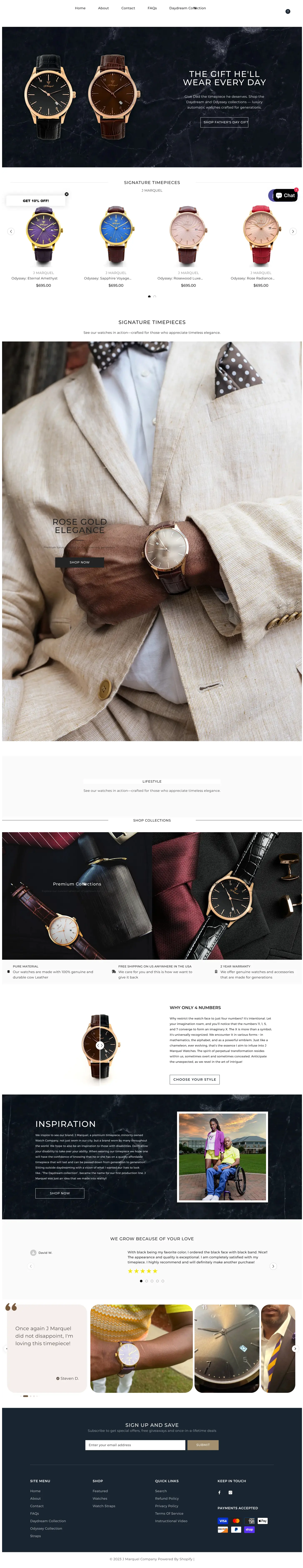
After
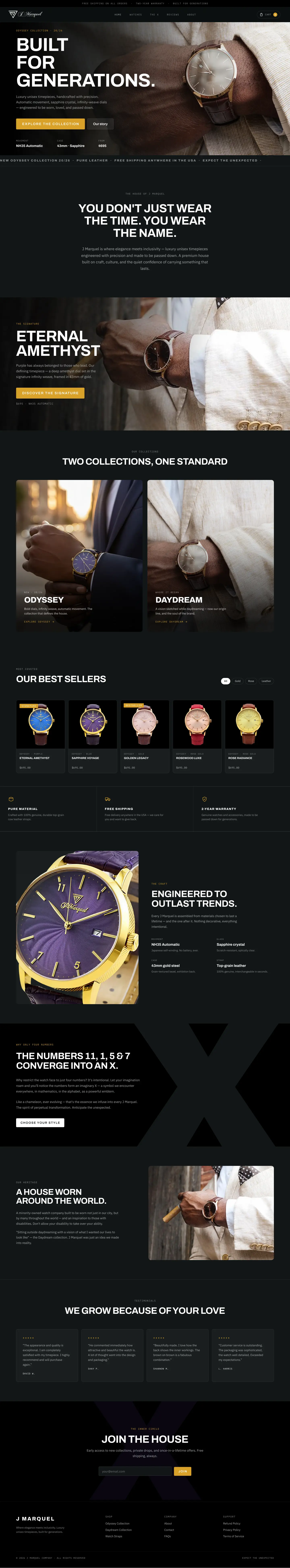
Before

After
(Free CRO audit)
See what's quietly
costing you sales.
Tell us about your store and we'll send a personalized 5-minute video
showing exactly where you're losing buyers — and how to win them back.
Tell Us About Your Store
Takes about 40 seconds. No call required.
What's Included

5-minute video teardown
4:52
Where attention leaks and buyers hesitate.
70% of your traffic — judged on its own terms.
The signals that make first-time buyers convert.
Ranked by impact vs. effort, ready to ship.