










KoolMedz CRO audit
The brand identity is strong, but the product page creates a major trust and conversion gap by selling only a single product instead of a larger philosophy, practice, or lifestyle system.
Watch the 38:25 teardown.
Pressing play loads the video from YouTube — you can allow it for every teardown under cookie preferences.
The short version.
This audit found that KoolMedz already feels like a real brand rather than a generic apparel website. The homepage has a calm, consistent, and polished identity, and the overall brand direction is stronger than many ecommerce stores.
The main issue is the product page. While the homepage begins to establish the brand, the product page does not carry that emotional positioning forward. It mostly presents the product, color options, sizes, and purchase button without building enough trust, value, or desire.
The reviewer emphasizes that KoolMedz should not simply sell apparel. The brand should sell calm, presence, philosophy, inner alignment, and a lifestyle customers want to join. This shift would make the products feel like part of a larger practice rather than individual hoodies or shirts.
The biggest revenue opportunity is average order value. Instead of selling one product per customer, the site should introduce partner purchases, ritual bundles, full collections, and product systems that encourage customers to buy multiple items at once.
The brand identity is strong, but the product page creates a major trust and conversion gap by selling only a single product instead of a larger philosophy, practice, or lifestyle system.
Position Calm as the core product, build a movement around inner alignment, improve product page storytelling, and increase average order value through bundles, partner purchases, rituals, and full collections.
Higher trust, improved conversion potential, increased average order value, stronger brand loyalty, and greater word-of-mouth growth through community-driven positioning.
turns a single product into a movement — and a higher order value.
Scored across five dimensions.
Average of the five scores below, as judged at the time of recording. Weak overall — the detail is in which dimension is dragging.
12 findings, each with the fix beside it.
Every finding below was called out on the recording. Open one to read what was found and what we would change. Nothing is hidden from the page source.
01 AI-Generated Imagery Feels Too Perfect Fix included
The website imagery is polished, but some visuals feel overly smooth and AI-generated. This may create hesitation around authenticity.
Use More Human And Authentic Imagery
Balance polished visuals with more natural, authentic, human imagery to reduce the feeling of AI perfection.
02 Homepage Jumps To Products Too Quickly Fix included
The homepage introduces the brand but moves into products before fully explaining the philosophy and emotional value behind the brand.
Strengthen Homepage Storytelling
Before showing products, explain what KoolMedz stands for, who it helps, and why the philosophy matters.
03 Product Page Is The Weakest Area Fix included
The product page was rated very low because it does not build enough trust, emotional value, or purchase motivation.
Improve Product Page Trust
Add reviews, ratings, product proof, customer validation, delivery reassurance, and clear quality expectations near the purchase area.
04 Gallery Issues Fix included
The product image gallery does not appear to work as expected and should better showcase product variations.
Fix Product Gallery Behavior
Ensure the product gallery properly displays product images, variants, colors, and visual details.
05 Missing Reviews And Social Proof Fix included
The product page lacks reviews, ratings, customer validation, and trust signals that help new visitors feel safe buying from a new brand.
Frame Reviews As Reflections
Use softer brand language such as reflections instead of standard reviews to better match the calm, introspective brand identity.
06 Single Product Selling Approach Fix included
The product page only tries to sell one item instead of showing users additional ways to buy more or join a larger brand experience.
Build A Practice, Not Just A Product
Encourage customers to see each purchase as part of a practice or lifestyle rather than a single apparel item.
07 Low Average Order Value Strategy Fix included
The site does not currently use bundles, partner purchases, collections, or rituals to increase the value of each order.
Promote Full Collections
Offer customers the option to purchase full product lines or intention-based sets to increase average order value.
08 Product Page Messaging Is Too Basic Fix included
The product page focuses mainly on product details instead of communicating the deeper emotional value customers receive.
Shorten Product Titles
Use cleaner product names and support them with short emotional descriptions instead of long titles.
09 Product Titles Are Too Long Fix included
Some product titles create unnecessary clutter and should be shortened for clarity.
Create Ritual Bundles
Bundle related products together as rituals or practices rather than simple product bundles.
10 Weak Trust Around Fulfillment Fix included
New visitors may wonder whether the brand is real, whether products will arrive, and what the actual product quality will be like.
Sell Calm As The Core Product
Reposition the brand around calm, presence, philosophy, and inner strength rather than only apparel.
11 Brand Philosophy Is Underutilized Fix included
The idea of calm, presence, and inner alignment is powerful but not fully used across the homepage, product page, and movement/community experience.
Create A Movement Page
Build a dedicated movement page around the idea of Live Within, including manifesto content, community identity, membership stages, and customer reflections.
12 No Movement-Based Funnel Fix included
The site does not yet have a dedicated movement or community page that turns customers into members, practitioners, or guides.
Introduce Intention-Based Collections
Organize products around intentions such as calm, presence, alignment, confidence, and personal growth.
3 further recommendations that cut across the whole store.
Add Partner Purchase Offers
Encourage customers to buy one item for themselves and one for a partner using messaging such as wearing the experience together.
Add Cross-Sells And Upsells Throughout The Product Page
Use multiple sections to recommend related products, matching items, and full collections after the initial product selection.
Use Founder Story For Authority
Add a founder message explaining why the brand exists, what it stands for, and why customers should trust the philosophy behind it.
What the fixed version looks like.
Drag each frame to move between what is live today and the version built on the recommendations above.
Home page
Drag to compare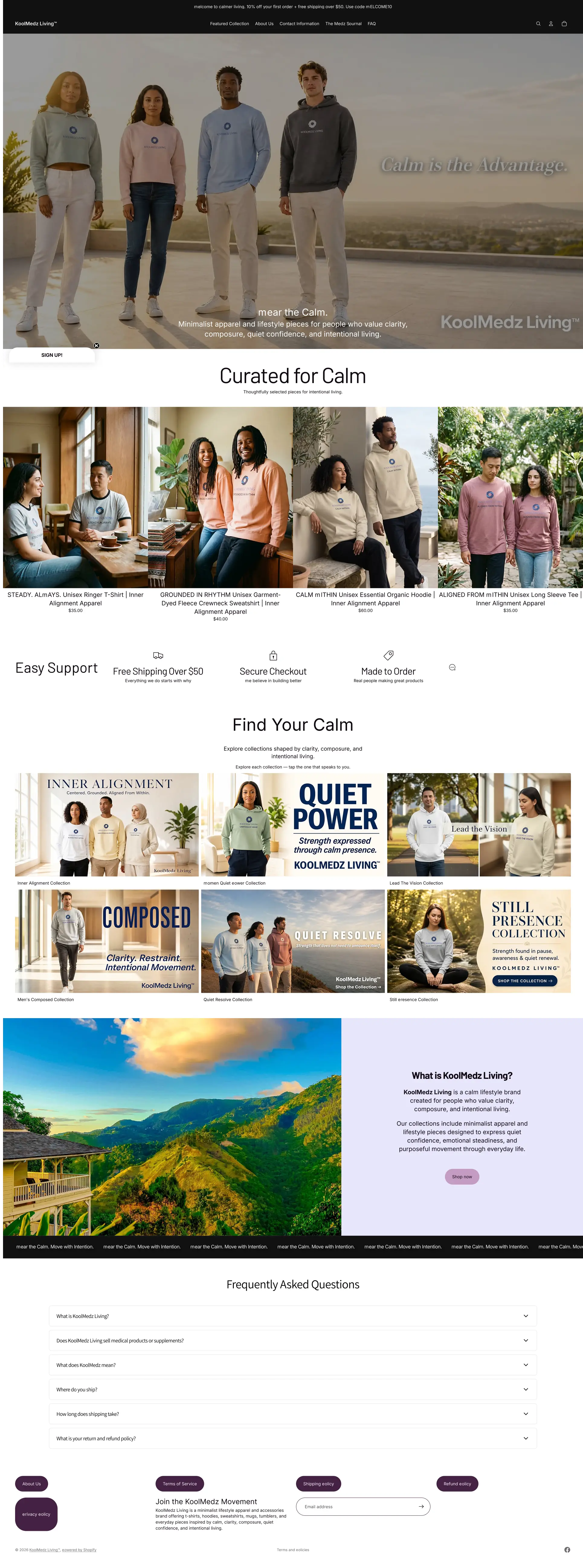
 After
Before
After
Before
Product page
Drag to compare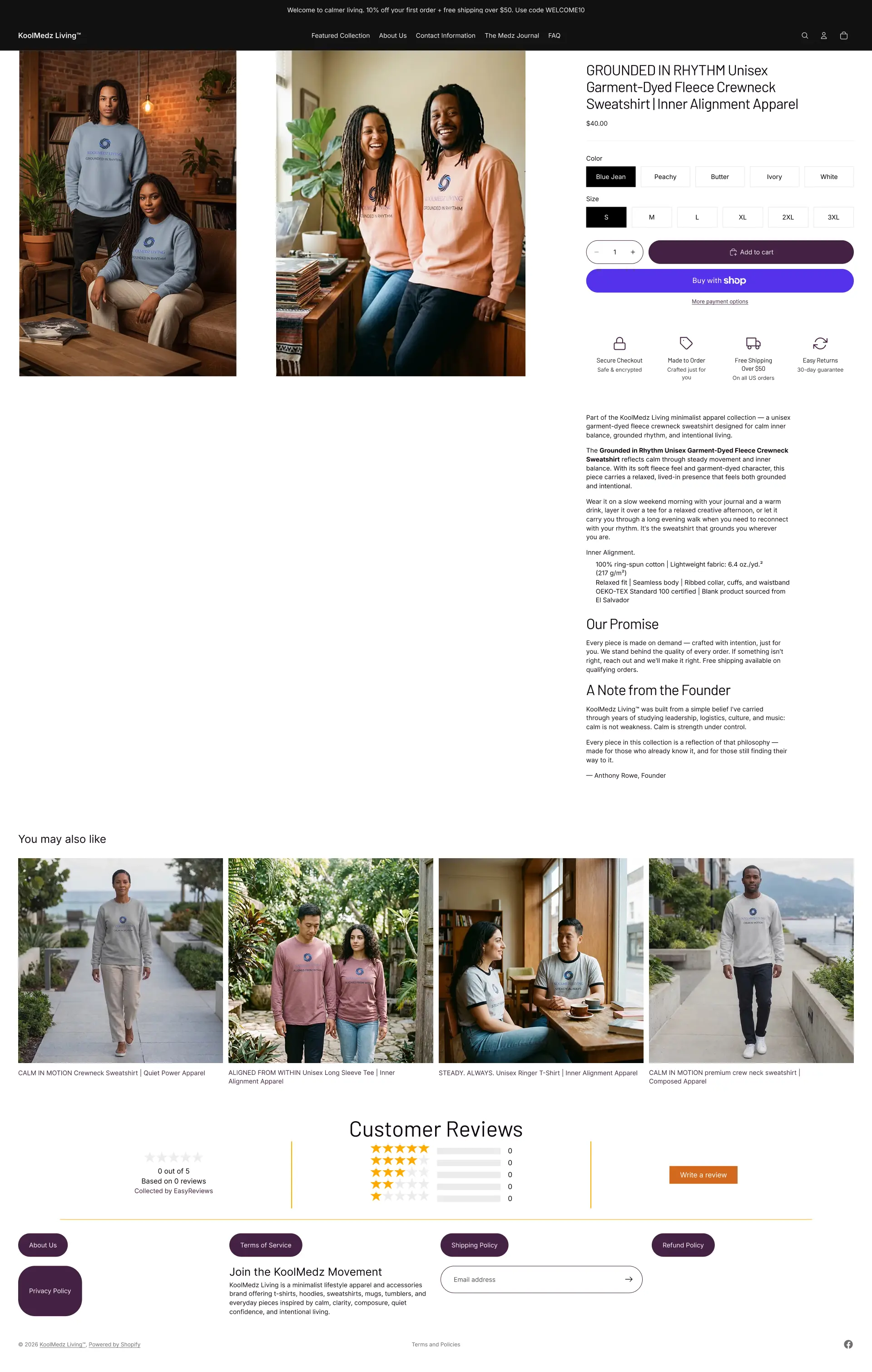
 After
Before
After
Before
What to take from this teardown.
KoolMedz already feels like a real brand, not just another apparel website.
The homepage is stronger than the product page.
The product page is the largest conversion weakness.
The brand should sell calm and philosophy, not just apparel.
Reviews and trust signals are needed for a newer brand.
Average order value can improve through partner purchases, rituals, and full collections.
The product page should continue the emotional story started on the homepage.
A dedicated movement page can help turn buyers into community members.
Product copy should focus on value, not materials alone.
KoolMedz has strong potential if it builds a system around presence, practice, and community.
What people ask about this teardown.
10 answers drawn from the recording and the written report — the questions store owners in apparel & lifestyle ask after watching this one.
Ask about your own store →
What is the strongest and weakest part of this store?
The homepage is the strongest — calm, consistent and genuinely brand-led, scoring 8/10 for brand. The product page is the weakest at 2/10: it presents colours, sizes and a buy button without carrying forward any of the philosophy the homepage establishes.
Why is 'selling calm' the recommendation rather than selling hoodies?
Because the brand's value is the philosophy, not the garment. Positioning calm, presence and inner alignment as the product makes each item part of a practice customers want to join, which supports both a higher price and multi-item orders. Sold as apparel alone, it competes on fabric and price.
Does AI-generated imagery hurt trust?
It was flagged as a hesitation point here. Some visuals are so smooth they read as generated, and for a new brand asking for trust that raises a question about whether the product and the people behind it are real. Mixing in authentic human imagery and a founder message resolves it.
Why does a new brand need reviews more than an established one?
Because there is nothing else to go on. The product page currently has no reviews, ratings or customer validation, so a first-time visitor has no evidence that the order arrives or that the quality matches the photography. The audit suggests framing them as reflections to match the brand's introspective voice.
How can this store increase average order value?
Four mechanisms were recommended: partner purchases — one for you, one for the person you practise with; ritual bundles; full collections rather than single items; and cross-sells placed after the initial product choice rather than beside it. The site currently sells one item per customer.
What is a 'movement page' and why would a clothing brand need one?
A dedicated page that turns buyers into participants — the philosophy, the practice, how to take part, and who else is in it. For a brand built on presence and alignment it converts a purchase into membership, which is what drives repeat orders and word of mouth.
What is wrong with the product gallery?
It does not behave as expected and does not show product variations properly. On an apparel page where colour and fit are the decision, a gallery that fails is a direct conversion loss — it was listed as an immediate fix.
Should product titles be shortened?
Yes. Several titles are long enough to create clutter in the grid and on the product page, which makes browsing harder and the store feel less considered. Short names, with the detail moved into the description.
What should the homepage do differently?
Slow down before it sells. It currently introduces the brand and moves into products before the philosophy and emotional value are established, so the strongest asset gets skipped. More storytelling first, products second.
How long is this audit and how many findings does it contain?
38:25 of recording, with twelve issues and fifteen fixes covering imagery authenticity, homepage storytelling, product page trust, gallery behaviour, bundles, collections and the movement funnel.
More teardowns from the library.
See what's quietly costing you sales.
Tell us about your store and we'll send a personalized 5-minute video showing exactly where you're losing buyers — and how to win them back.
Takes about 40 seconds. No call required.
-
5-minute video teardownA personalized walkthrough of your store, recorded by Eva.
-
Homepage & PDP reviewWhere attention leaks and buyers hesitate.
-
Mobile UX audit70% of your traffic — judged on its own terms.
-
Trust & credibility checkThe signals that make first-time buyers convert.
-
Prioritized CRO roadmapRanked by impact vs. effort, ready to ship.