










Homepage, two tall columns
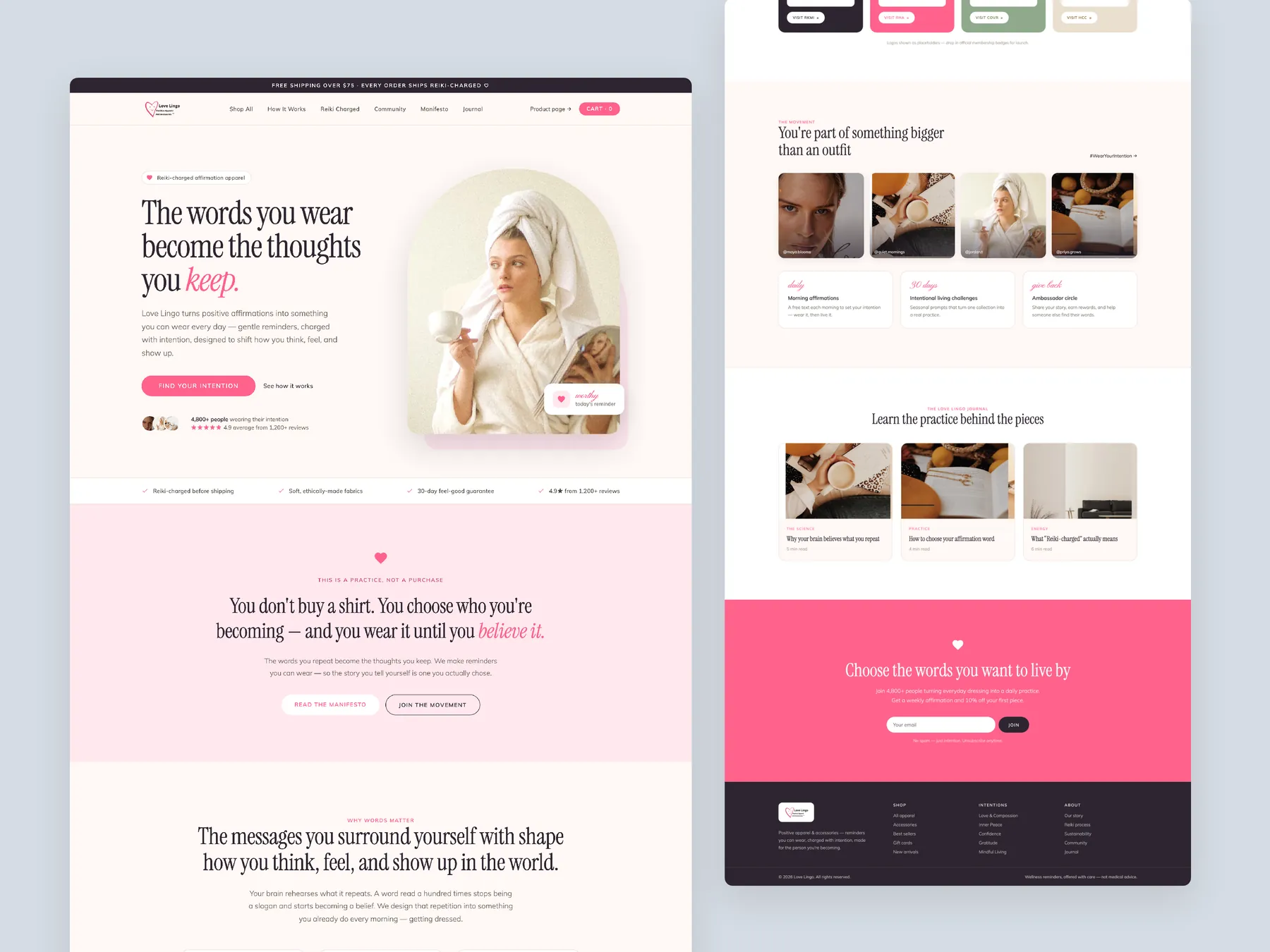
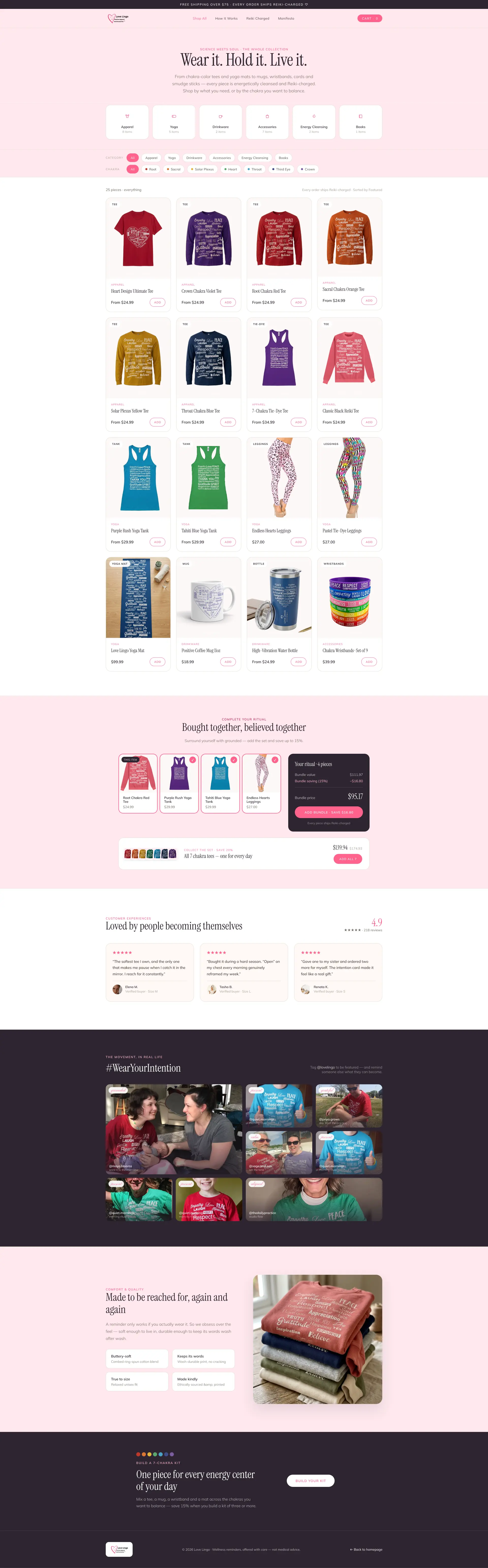
Homepage: the full page shown as two tall columns, from the opening statement down to the footer.
Storefronts we designed and built, across supplements, fragrance, health, wellness and skincare.
All 35 projectsFour engagements, measured before and after. What changed, why it changed, and by how much.
All case studiesDiagnosis, design and development from one studio — so the recommendation and the build never disagree.
All five services147 real Shopify stores torn down page by page, scored, and shown beside the version we would build. Free to watch.
Browse all teardownsSix conversion-first themes, each built for one industry’s buying journey. Zero required apps, $300, one licence.
Compare all sixThe brand idea is strong, but the product and collection pages are not fully converting that emotional brand potential into urgency, value, bundles, and higher average order value.
Pressing play loads the video from YouTube — you can allow it for every teardown under cookie preferences.
This audit found that Love Lingo already has a strong foundation as a brand. The website successfully creates the feeling that customers are buying into something more meaningful than a standard apparel product. Real people, positive messaging, community energy, and the idea of high-vibe apparel all help create trust and emotional connection.
The biggest opportunity is to turn this strong brand foundation into a stronger conversion system. The current site has good branding, but the product page is not creating enough urgency, value, or desire to buy. Visitors may like the brand and understand the message, but the product presentation does not yet fully convert that interest into purchases.
The audit recommends shifting the messaging from selling positive apparel to selling a movement, ritual, and lifestyle practice. The chakra concept, positive affirmations, and community identity should become central to how products are positioned and sold.
A major revenue opportunity is increasing average order value. Instead of selling one shirt at a time, the site should encourage customers to buy ritual kits, chakra collections, bundles, and full sets. This allows the brand to sell a larger emotional outcome rather than a single product.
The brand idea is strong, but the product and collection pages are not fully converting that emotional brand potential into urgency, value, bundles, and higher average order value.
Position the brand as a movement and daily ritual, then use bundles, chakra-based shopping, stronger product storytelling, and community proof to increase conversions and average order value.
Higher conversion potential, increased average order value, stronger customer loyalty, and more word-of-mouth growth through movement-based positioning.
turns the brand's emotional pull into bundles, ritual and a bigger basket.
Average of the five scores below, as judged at the time of recording. Adequate overall — the detail is in which dimension is dragging.
Every finding below was called out on the recording. Open one to read what was found and what we would change. Nothing is hidden from the page source.
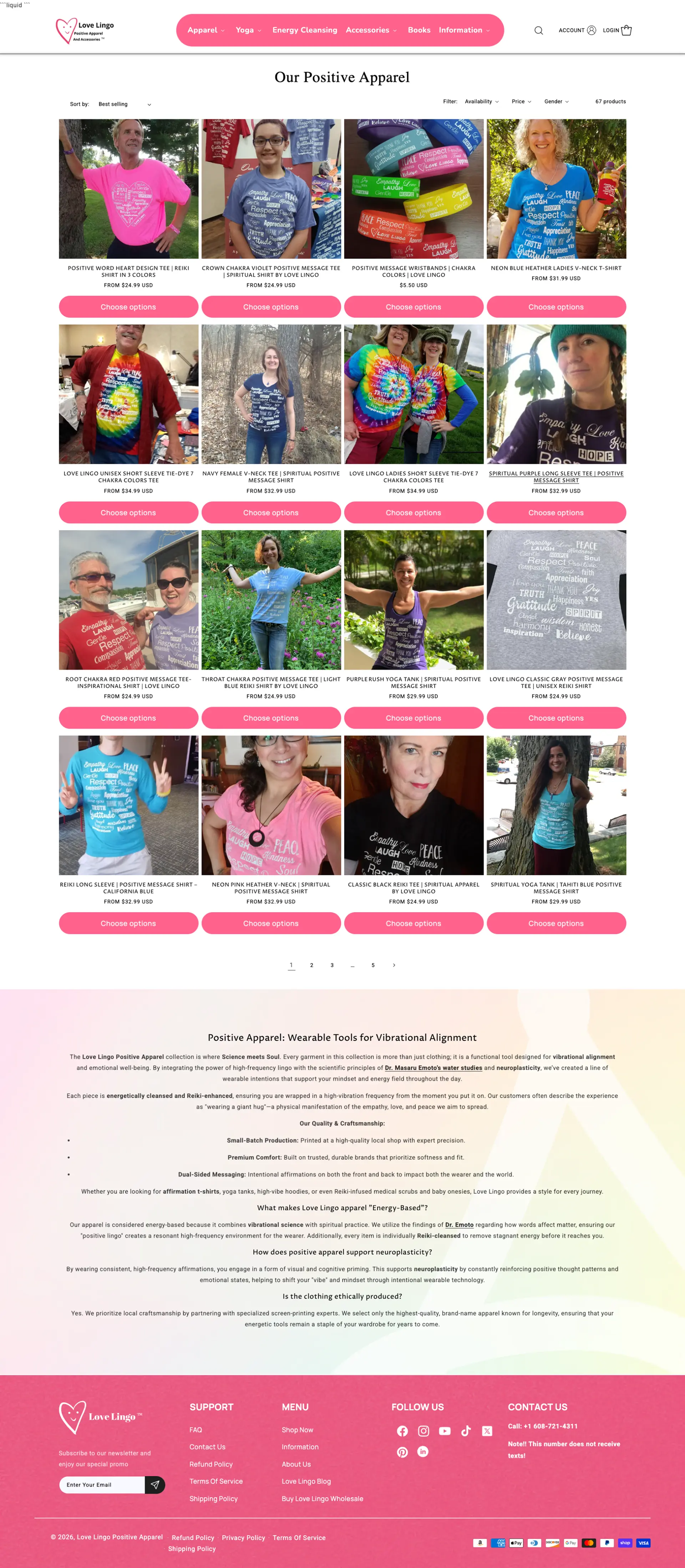
The homepage appears to show leftover Liquid code that should be removed immediately.
Remove the visible leftover Liquid code from the homepage to prevent the site from feeling unfinished.
The brand already has strong emotional positioning, but the site does not fully use that potential to drive conversions and repeat purchases.
This one is addressed by the wider recommendations below rather than a single change.
The current headline focuses on positive apparel with energized intention, but it could communicate a deeper benefit and emotional transformation.
Replace product-focused copy with deeper emotional messaging such as the idea that the words people wear become the thoughts they keep.
The chakra idea is powerful and already familiar to the target audience, but it is not used strongly enough as a shopping, storytelling, and bundling mechanism.
Allow customers to shop by chakra, intention, mood, or energy. This can make product discovery more meaningful and increase perceived value.
The collection page does not present products in a clean, conversion-focused way. It mixes proof imagery with product thumbnails, which can make shopping harder.
Use clean product thumbnails for shop pages and use customer/lifestyle photos as proof on product pages and testimonial sections.
The product page does not create enough desire, value, or urgency to buy, despite the strength of the brand.
Use the product page to explain the emotional value of the product, not just its features, materials, or design.
The site mostly sells one product at a time instead of encouraging customers to buy related items, bundles, sets, or ritual kits.
Encourage customers to buy three-piece, five-piece, seven-piece, or full chakra sets instead of single products.
The page focuses too much on the product itself and not enough on the emotional value, transformation, and identity attached to wearing it.
This one is addressed by the wider recommendations below rather than a single change.
The brand has the ingredients to feel like a movement, but this is not yet fully expressed across the homepage, product pages, and shop experience.
Own and promote a branded hashtag such as #WearYourIntention to create community participation and social proof.
Images of people wearing the products are valuable as proof, but they should support the product experience rather than replace clear product thumbnails.
Feature real customers wearing the products to reinforce that buyers are joining something bigger than an outfit.
There is no clear system for customers to buy multiple products together based on intention, chakra, lifestyle, or ritual.
Create dedicated bundle pages such as Pick Any 3, Pick Any 5, Complete Chakra Set, or Ritual Kit collections.
Common apparel concerns such as softness, print durability, fit, washability, and comfort need to be answered more clearly.
Clearly answer questions around softness, fit, wash durability, print cracking, and comfort.
Position Love Lingo as a movement, ritual, and positive lifestyle practice rather than only a positive apparel brand.
Bundle products together into kits that feel like a complete practice rather than separate products. Examples include shirts, mugs, wristbands, cards, yoga tanks, leggings, and chakra tees.
Present customer feedback as transformation stories rather than standard reviews.
After the core product selection, show complementary items that complete the ritual and make the purchase feel more valuable.
Open the shop page with stronger emotional messaging that reinforces the brand purpose instead of simply listing products.
Drag each frame to move between what is live today and the version built on the recommendations above.
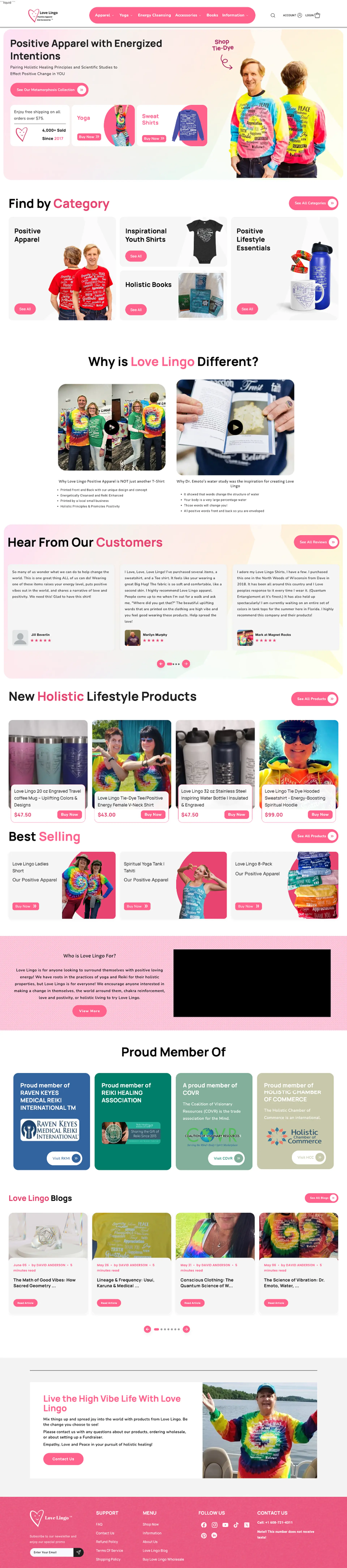
 After
Before
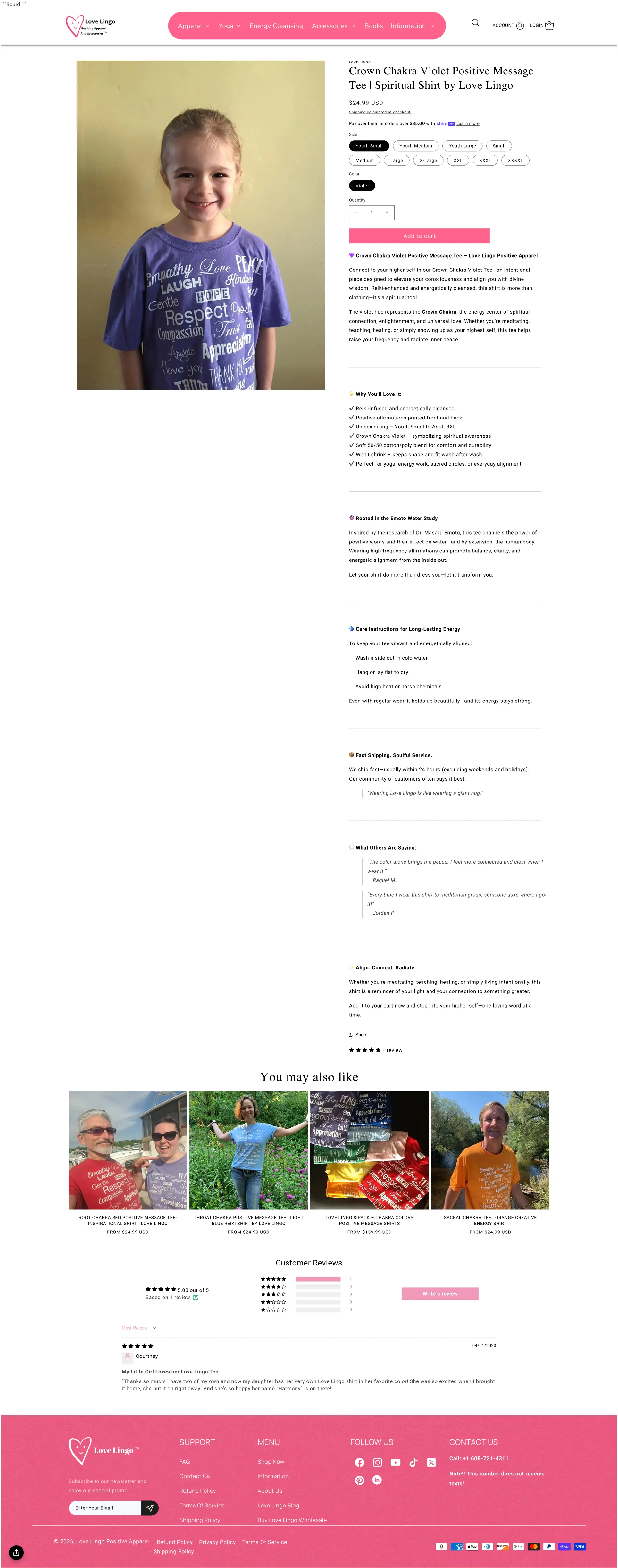
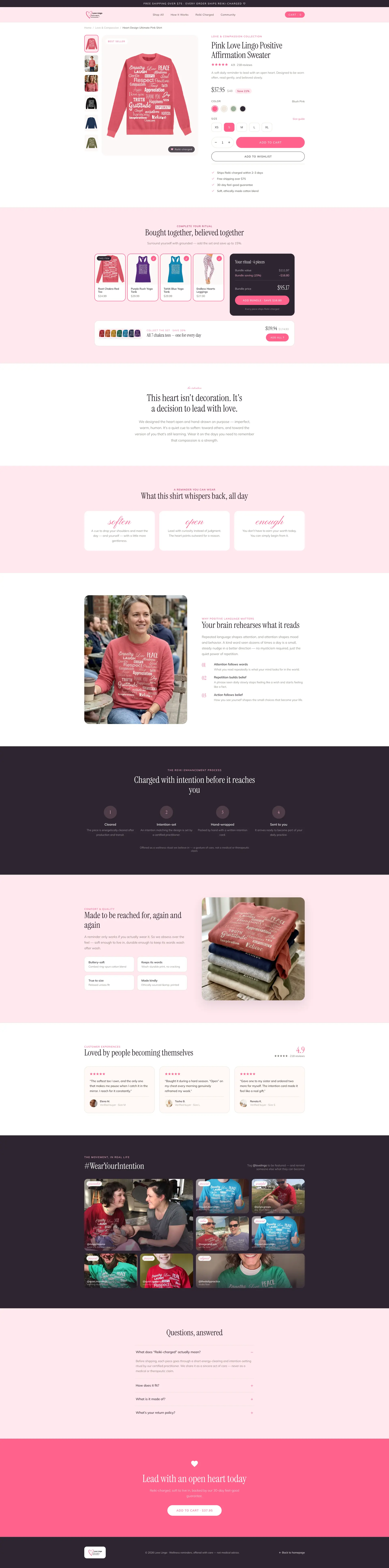 After
Before
 After
Before
Love Lingo already has strong brand positioning and emotional appeal.
The biggest weakness is the product page, not the overall brand idea.
The brand should be positioned as a movement and daily ritual.
The chakra concept should become a major shopping and bundling system.
Average order value can increase through ritual kits and full sets.
Product pages should sell value and transformation, not just product features.
Collection pages should use clean product thumbnails and separate proof imagery.
A branded hashtag like #WearYourIntention can strengthen community identity.
Testimonials should be framed as transformation stories.
The site has strong potential for loyal customers and word-of-mouth growth.
A concept redesign created by Convertica Studio from this audit. It shows how the store could work, it is not the live store.
Homepage: the full page shown as two tall columns, from the opening statement down to the footer.
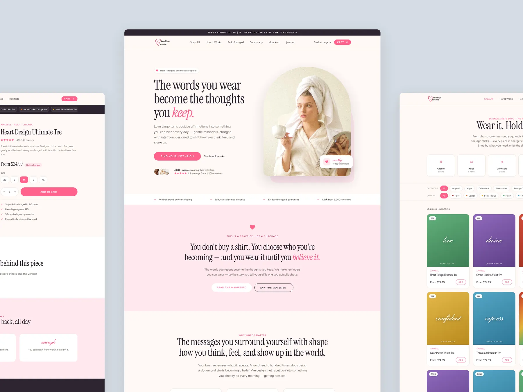
Three pages side by side: the product page, the homepage and the collection page, so the shared look reads at a glance.
Product page: the full page in two columns, from the buy box to the footer.
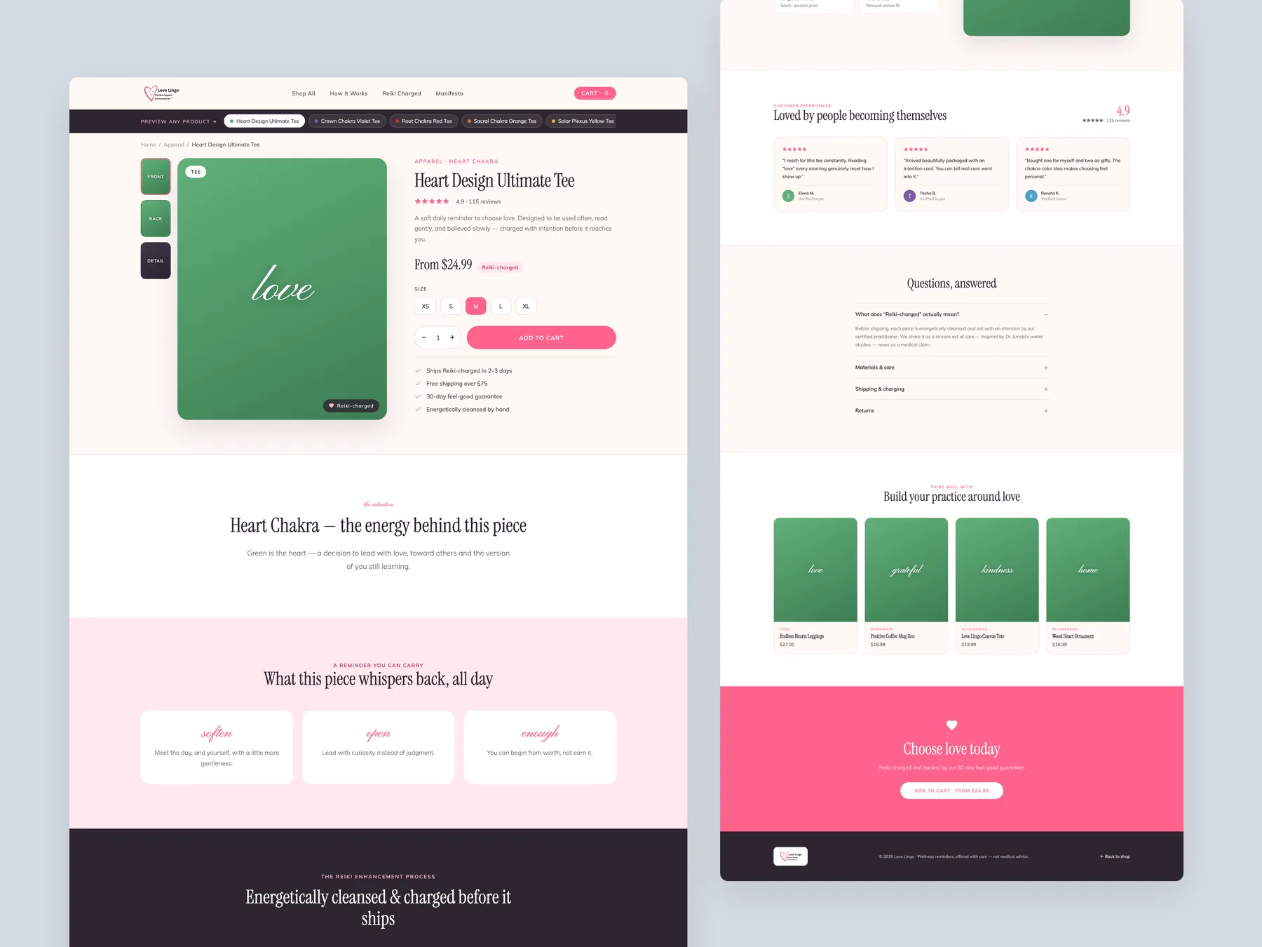
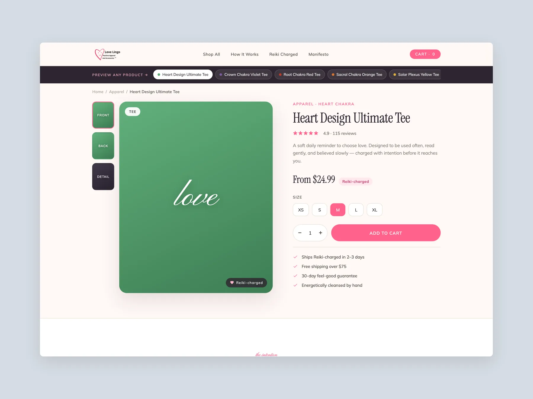
Product page first screen: the header and the buy box, with size, price and button on one screen.
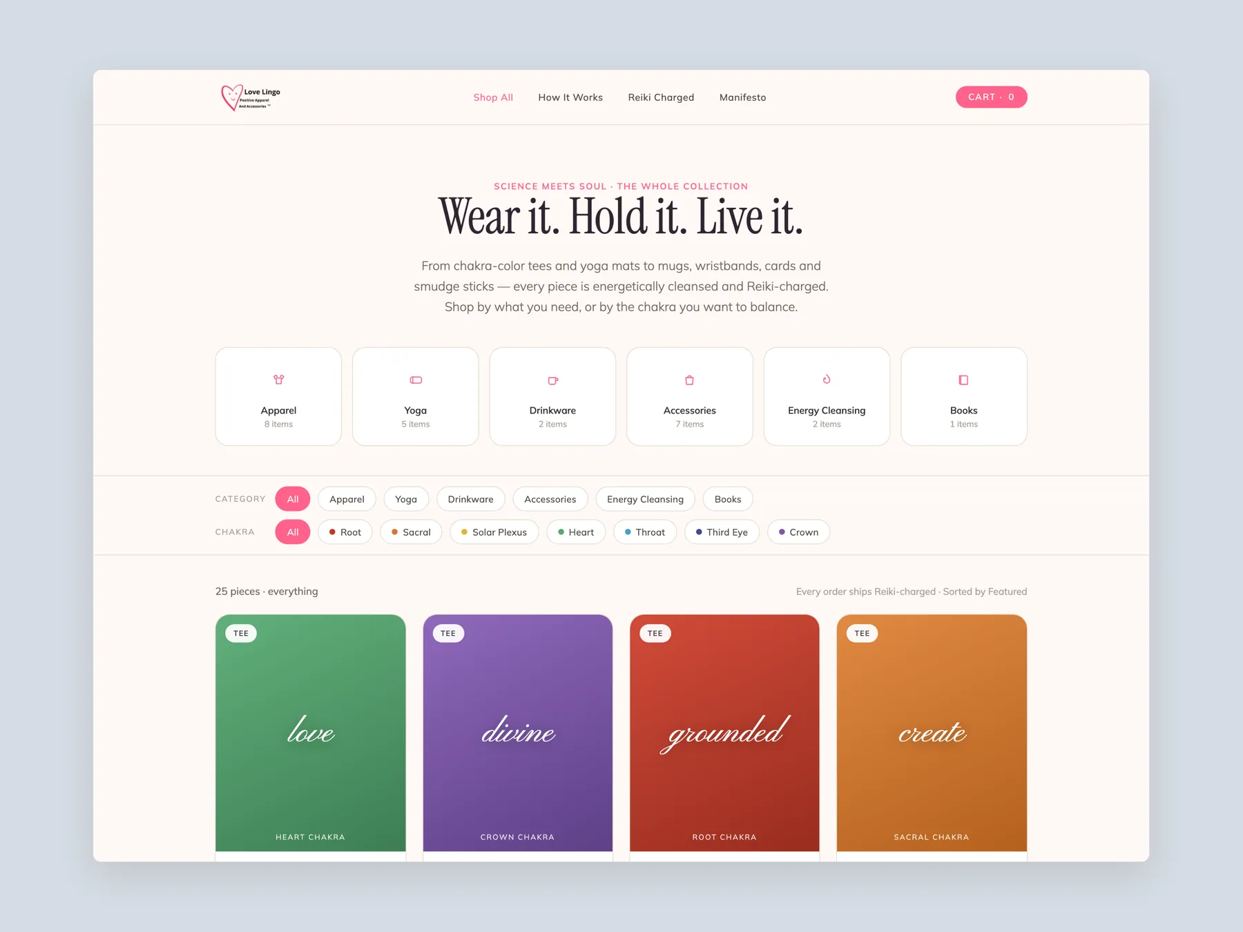
Collection page first screen: the header, the filters and the first row of designs.
10 answers drawn from the recording and the written report — the questions store owners in apparel & lifestyle ask after watching this one.
Ask about your own store →The brand. It scored 9/10 for brand and 8/10 for trust — real people, positive messaging, community energy and the high-vibe apparel idea all land, and visitors clearly feel they are buying into something more meaningful than a t-shirt. The problem is downstream of that.
Because the product page does not carry the brand's emotional charge. It scored 3/10 — the lowest score in the audit — and creates too little desire, value or urgency. Visitors like the message, then meet a standard apparel page that sells a garment rather than the transformation the homepage promised.
As a shopping system, not a motif. Let customers shop by chakra, intention, mood or energy; group products into chakra collections; and use it to bundle. The audience already understands the framework, which makes it the most natural merchandising and discovery mechanism the brand has.
Bundles that feel like a complete practice rather than several separate products — a shirt with a mug, wristband, cards or yoga tank, sold as one intention. Customers currently buy one item at a time; a kit lets the brand sell the whole emotional outcome and lifts the basket without discounting.
It mixes proof imagery with product thumbnails, so shopping and storytelling compete in the same grid. Photos of people wearing the pieces are valuable — they belong beside the product as proof, not in place of clean, comparable product images.
The ordinary apparel ones: how soft the fabric is, whether the print survives washing, how it fits, how to care for it and how comfortable it is to wear all day. Emotional positioning does not remove practical objections — the page needs both.
By giving people something to take part in. The recommendations here are movement-led messaging instead of product-led headlines, a branded hashtag such as #WearYourIntention, community proof used throughout the site, and testimonials reframed as transformation stories rather than star ratings.
Cosmetically serious, technically trivial. Visible template code on a homepage undercuts the polish of an otherwise well-branded site, and it takes minutes to remove — it is the first item on the list for that reason.
Something. It currently opens by listing products; it should open with the brand purpose, then merchandise by intention or chakra. A shop page is the second-most visited page on most stores and is usually the least written.
Turn emotional pull into a bigger basket. Twelve issues and fifteen fixes were written, concentrated on the product page, bundles, chakra-based buying and community proof. The recording runs 37:52.
Tell us about your store and we'll send a personalized 5-minute video showing exactly where you're losing buyers — and how to win them back.
Takes about 40 seconds. No call required.