










Premium Garment Cleaning CRO audit
The website presents the business as a cleaning service rather than a trusted premium garment care brand, creating uncertainty and reducing conversion confidence.
Watch the 35:59 teardown.
Pressing play loads the video from YouTube — you can allow it for every teardown under cookie preferences.
The short version.
This audit identifies a major gap between the premium nature of the garment cleaning service and the way the website currently communicates value. Visitors may understand that the business provides cleaning services, but the website does not yet create the feeling of a trusted premium garment care brand.
The biggest issue is clarity and trust within the first few seconds. Users need to immediately understand who the company is, what it does, why it is trustworthy, and how the process works. At the moment, the homepage does not clearly establish these points above the fold.
The audit also highlights missing proof, weak value framing, limited emotional positioning, unclear shipping and tracking information, and a lack of strong before-and-after evidence. These are especially important because customers are trusting the company with valuable and emotionally meaningful clothing.
The recommendation is to rebuild the website experience around care, protection, trust, proof, and convenience. The homepage should explain the service clearly, while the product/service page should include stronger pricing justification, proof, add-ons, subscriptions, sticky add-to-cart, and reassurance around insurance, tracking, shipping, and guarantees.
The website presents the business as a cleaning service rather than a trusted premium garment care brand, creating uncertainty and reducing conversion confidence.
Reposition the website around emotional garment care, trust, proof, clear service process, value framing, and stronger product page conversion elements.
Improved trust, clearer service understanding, higher conversion potential, and increased average order value through service bundles and add-ons.
repositioned around trust, proof and outcome — so the price feels earned.
Scored across five dimensions.
Average of the five scores below, as judged at the time of recording. Weak overall — the detail is in which dimension is dragging.
15 findings, each with the fix beside it.
Every finding below was called out on the recording. Open one to read what was found and what we would change. Nothing is hidden from the page source.
01 Unclear First Impression Observation
Within the first few seconds, visitors may not clearly understand what the website offers, who the business is, and why they should stay.
This one is addressed by the wider recommendations below rather than a single change.
02 No Strong Proof Above The Fold Fix included
Important proof points, recognition, media mentions, memberships, and authority signals are not clearly visible near the top of the page.
Add Proof Above The Fold
Show recognition, memberships, media mentions, number of garments preserved, guarantees, and trust signals near the top of the homepage.
03 Weak Brand Recognition Fix included
The website feels like a service provider rather than a recognizable premium garment care brand.
Lead With Emotional Value
Position the service around caring for valuable, sentimental, and premium garments rather than simply cleaning coats and jackets.
04 Hero Messaging Focuses On Mechanism Fix included
The homepage leads with what the company does instead of communicating the emotional benefit and outcome customers receive.
Clarify The Hero Section
Use a benefit-driven headline that tells visitors what the service does for their garments, not just what the company does.
05 Missing Emotional Positioning Observation
Customers often have emotional attachment to expensive coats, jackets, and garments, but the website does not strongly speak to that concern.
This one is addressed by the wider recommendations below rather than a single change.
06 Poor Information Hierarchy Fix included
The homepage content feels disconnected and does not build a clear story from problem to solution to proof to conversion.
Improve Homepage Story Flow
Structure the homepage around a clear journey: emotional value, how it works, proof, services, process, authority, testimonials, FAQs, and final CTA.
07 Proof Is Buried Too Low Observation
Important authority-building content is placed too far down the page where many visitors may never see it.
This one is addressed by the wider recommendations below rather than a single change.
08 Pricing Lacks Value Framing Fix included
The service price is shown without clearly explaining what is included, such as roundtrip shipping, expertise, insurance, and garment protection.
Frame Pricing Around Value
Explain what the customer receives for the price, including expert care, roundtrip shipping, insurance, tracking, and garment protection.
09 Weak Product Page Proof Fix included
The service page lacks strong before-and-after evidence and visual proof of the cleaning outcome.
Add Strong Before-And-After Proof
Use before-and-after visuals, ideally with an interactive slider, to demonstrate actual cleaning outcomes.
10 No Add To Cart Reinforcement Fix included
After users scroll down the service page, there are not enough repeated calls to action to capture buying intent at the right moment.
Add Sticky Add To Cart
Keep a sticky service purchase bar visible as users scroll so they can act immediately when ready.
11 Average Order Value Opportunities Are Missing Fix included
The page does not offer enough add-ons, bundled services, seasonal cleaning packages, or related garment services.
Increase Average Order Value
Add bundled services such as ship together and save, extra garment add-ons, seasonal cleaning bundles, and related care options.
12 Risk Reversal Is Not Strong Enough Fix included
Guarantees, insurance, tracking, satisfaction promises, and protection details are not clearly communicated near the conversion area.
Add Risk Reversal Near CTA
Place satisfaction guarantees, insurance details, tracking, return shipping, and service protection near the add-to-cart area.
13 Shipping Clarity Is Missing Fix included
The website does not clearly explain roundtrip shipping, labels, timelines, and how the full process works.
Explain How The Service Works
Clearly show the process: order online, receive shipping label, pack and ship, cleaning is completed, and garments are returned.
14 No Sticky Add To Cart Observation
Users who scroll past the purchase area do not have an always-available add-to-cart option.
This one is addressed by the wider recommendations below rather than a single change.
15 Subscription Opportunity Is Missing Fix included
The service is treated as a one-time order instead of creating a recurring seasonal care option.
Introduce Subscription Options
Create a seasonal care subscription so customers can automatically clean garments yearly or seasonally.
5 further recommendations that cut across the whole store.
Build A Stronger Brand System
Create a more consistent visual brand with stronger colors, typography, buttons, imagery, and page structure.
Clarify Shipping And Timeline
Explain when the customer receives the shipping label, how long turnaround takes, and when they can expect garments back.
Show Finished Delivery Experience
Explain how garments are returned, such as professionally finished, pressed, and packaged in a breathable garment bag.
Highlight Liquid CO2 Benefits
Explain why liquid CO2 cleaning is better than traditional dry cleaning using simple, scannable points.
Add More CTAs Throughout The Page
Repeat conversion opportunities after proof sections, reviews, process explanations, and FAQs.
What the fixed version looks like.
Drag each frame to move between what is live today and the version built on the recommendations above.
Homepage page
Drag to compare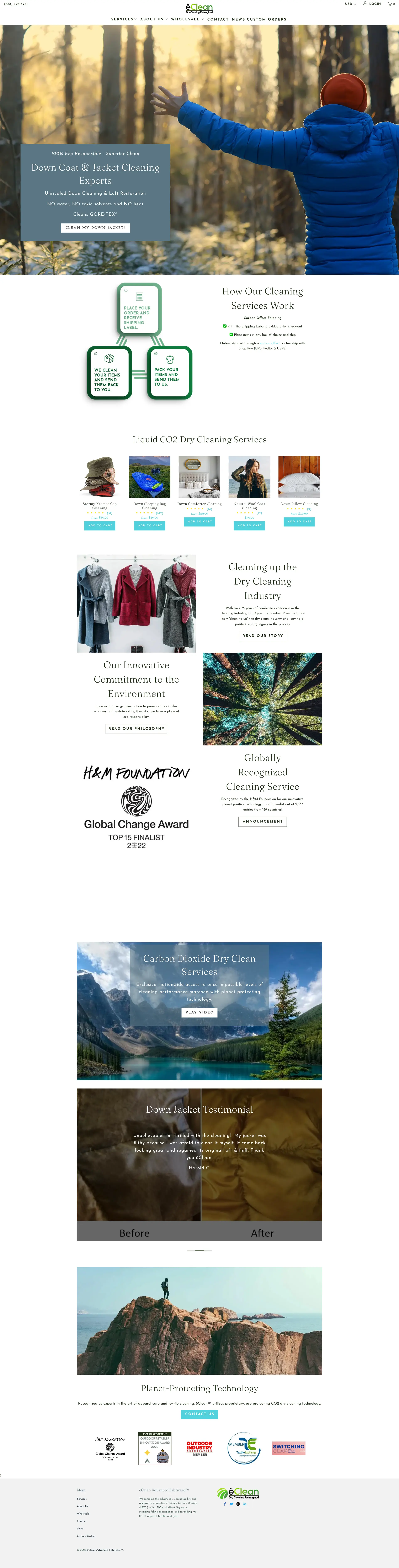
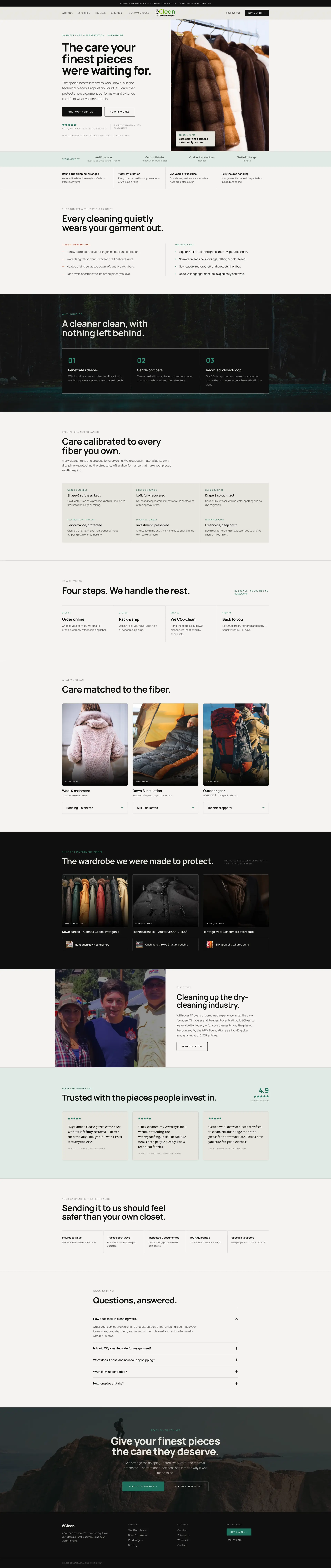 After
Before
After
Before
Product page
Drag to compare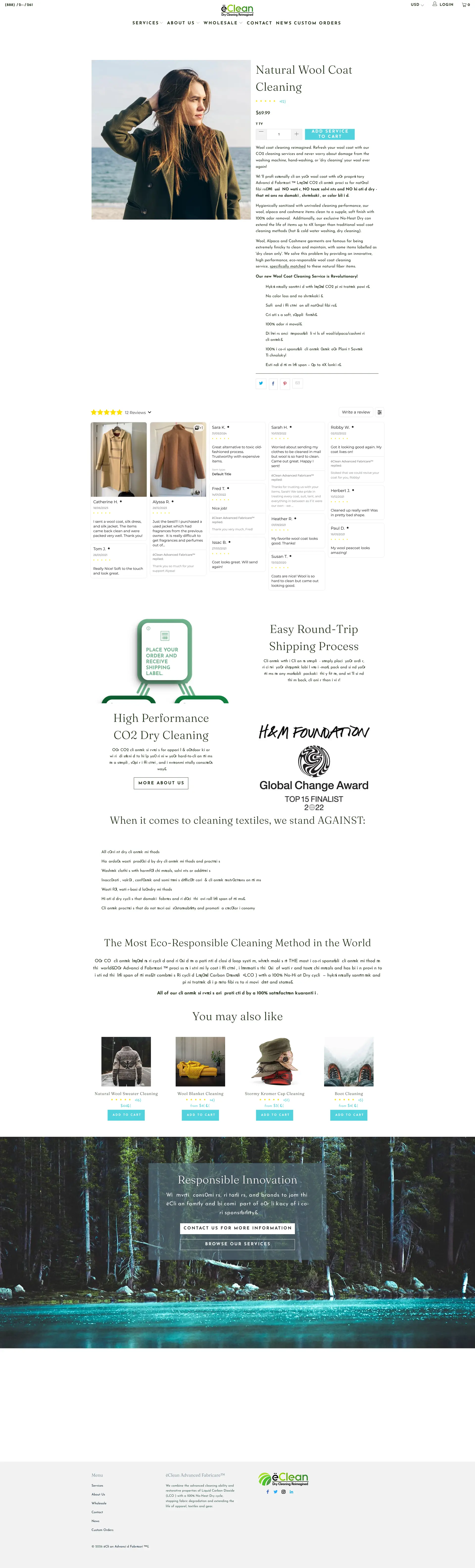
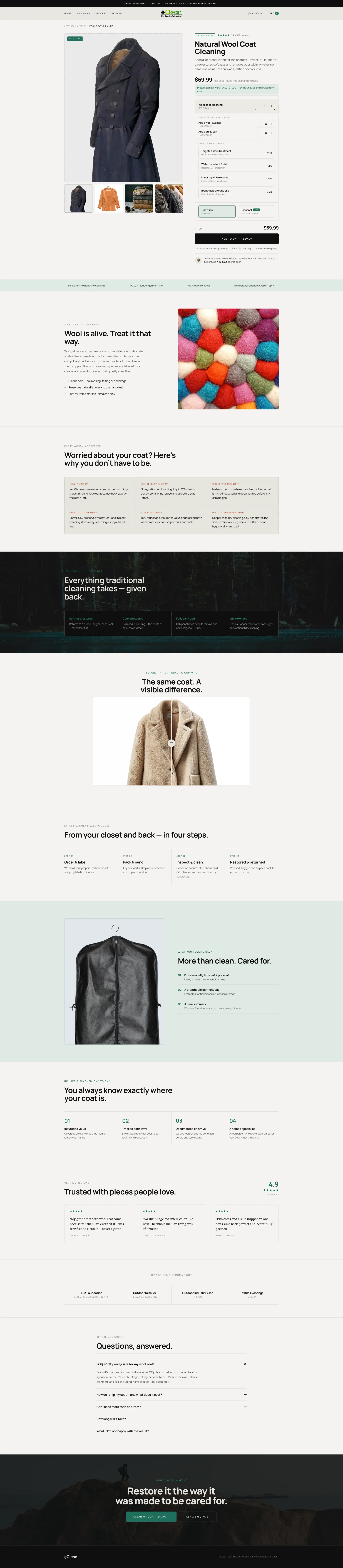 After
Before
After
Before
What to take from this teardown.
The website needs to communicate what it does within the first three seconds.
The business currently feels like a service, not a premium garment care brand.
Proof and authority signals are buried too low on the page.
The homepage needs a clearer story and stronger emotional positioning.
Pricing needs stronger value framing.
The product/service page needs before-and-after proof.
Shipping, insurance, tracking, and guarantees should be clearer.
Sticky add-to-cart can help capture purchase intent after users scroll.
Bundles, add-ons, and subscriptions can increase average order value.
The service should be positioned around protecting valuable garments, not just cleaning them.
What people ask about this teardown.
11 answers drawn from the recording and the written report — the questions store owners in garment care & dry cleaning ask after watching this one.
Ask about your own store →
What is the biggest problem with this garment cleaning website?
It presents itself as a cleaning service rather than a premium garment care brand. Customers are being asked to post expensive coats and jackets to a company whose site does not establish, in the first few seconds, who it is, how the process works and why it can be trusted. Brand and trust both scored 4/10.
What should a service website communicate in the first three seconds?
Who you are, what you do, why you are credible and how the process works. On this homepage none of that is clearly resolved above the fold, and the hero leads with the mechanism of the service rather than the outcome the customer cares about — garments they love, protected and returned in better condition than they left.
Why does proof need to be above the fold?
Because the decision to hand over a valuable garment is made early. Recognition, media mentions, memberships and authority signals currently sit far down the page where many visitors never reach them, so the trust they would create arrives too late to affect the decision.
How should the price be presented for a premium cleaning service?
With what it includes. The price currently appears without value framing — roundtrip shipping, specialist expertise, insurance while in transit and care, and garment protection are all part of what is being bought. Listing them beside the price turns a number into a package.
What shipping information is missing?
The full round trip: when the shipping label arrives, how long the turnaround takes, how the garments come back, and what the customer needs to do at each step. Adding how the garments are returned — professionally finished, pressed, in a breathable garment bag — also makes the outcome tangible.
What proof works best on a garment care service page?
Before-and-after evidence of actual cleaning results. The service page currently has no strong visual proof of outcome, which is the most persuasive content this kind of business can publish, particularly for stains, restoration and delicate fabrics.
Why recommend a sticky Add to Cart on a service page?
Because intent builds while reading. Once a visitor scrolls past the purchase area — through the process explanation, proof and reviews — there is no way to act without scrolling back. A persistent add-to-cart, plus repeated calls to action after each proof section, captures the moment conviction arrives.
How can a cleaning service increase average order value?
Add-ons and packages rather than discounts: bundled garment services, seasonal cleaning packages, related care services, and a subscription for recurring seasonal care. The service is currently sold as a single one-off order, which leaves both AOV and retention on the table.
How should risk be reversed near the buy button?
State the guarantees where the money is spent: insurance cover, tracking, satisfaction promise and what happens if something goes wrong. For a service holding a customer's expensive coat, risk reversal is not a nice-to-have — it is the purchase condition.
Should the cleaning technology be explained?
Yes, but in customer terms. Liquid CO2 cleaning is a genuine differentiator against traditional dry cleaning and deserves a short, scannable section explaining why it is gentler and better for the garment — not a technical paragraph.
How long is this audit and what does it cover?
35:59, the longest recording in the library, covering the homepage and the service/product page with fifteen issues and sixteen fixes across positioning, proof, pricing, shipping clarity, risk reversal, AOV and subscription.
More teardowns from the library.
See what's quietly costing you sales.
Tell us about your store and we'll send a personalized 5-minute video showing exactly where you're losing buyers — and how to win them back.
Takes about 40 seconds. No call required.
-
5-minute video teardownA personalized walkthrough of your store, recorded by Eva.
-
Homepage & PDP reviewWhere attention leaks and buyers hesitate.
-
Mobile UX audit70% of your traffic — judged on its own terms.
-
Trust & credibility checkThe signals that make first-time buyers convert.
-
Prioritized CRO roadmapRanked by impact vs. effort, ready to ship.