










Quinn Records CRO audit
The website has strong products and music history, but the experience feels outdated, cluttered, and difficult to navigate, with no clear primary conversion goal.
Watch the 31:56 teardown.
Pressing play loads the video from YouTube — you can allow it for every teardown under cookie preferences.
The short version.
This audit found that Quinn Records has strong underlying assets, including a long history, quality music, unique records, merchandise, artists, and cultural credibility. However, the current website does not present these strengths in a conversion-focused way.
The biggest issue is usability. The navigation is cluttered, difficult to use, and overwhelming. Visitors are not clearly guided toward a primary conversion goal such as shopping music, buying merchandise, listening live, or exploring artists.
The website also feels visually outdated, with too much text, low readability, competing calls to action, and weak product discovery. Users have to work too hard to find music, merchandise, artists, genres, or specific products.
The recommendation is to restructure the site around clear user paths: shop music, buy gear, browse artists, listen live, and explore genres. Artist pages, shop pages, and category pages should be redesigned with stronger hierarchy, filtering, product cards, storytelling, trust signals, and clearer purchase options.
The website has strong products and music history, but the experience feels outdated, cluttered, and difficult to navigate, with no clear primary conversion goal.
Rebuild the website around clearer navigation, stronger music and merch funnels, artist storytelling, category filtering, product discovery, and trust-building conversion paths.
Improved usability, stronger product discovery, higher music and merchandise sales, better artist engagement, and increased conversion potential.
Scored across five dimensions.
Average of the five scores below, as judged at the time of recording. Critical overall — the detail is in which dimension is dragging.
16 findings, each with the fix beside it.
Every finding below was called out on the recording. Open one to read what was found and what we would change. Nothing is hidden from the page source.
01 Cluttered Navigation Observation
The navigation is difficult to use, overly crowded, and makes it hard for users to click or reach the pages they want.
This one is addressed by the wider recommendations below rather than a single change.
02 Outdated Website Feel Observation
The website feels like an early 2000s site with too much information placed on the page without enough structure or hierarchy.
This one is addressed by the wider recommendations below rather than a single change.
03 No Clear Primary Conversion Goal Fix included
The site does not clearly prioritize whether users should buy music, purchase merchandise, listen to radio, browse artists, or subscribe.
Simplify The Navigation
Rebuild the navigation around clear paths such as Shop Music, Buy Gear, Browse Artists, Radio, Spotlights, News, and Contact.
04 Too Many Competing CTAs Fix included
Multiple calls to action compete for attention without one clear primary path for users to follow.
Feature New Releases
Show new releases with clear product cards, format options, tags, prices, and calls to action.
05 Weak Above-The-Fold Experience Observation
The top area of the homepage does not create enough interest, authority, or direction for visitors to continue exploring.
This one is addressed by the wider recommendations below rather than a single change.
06 Newsletter CTA Is Overprioritized Observation
The first major action asks users to subscribe to the newsletter instead of guiding them toward music, merchandise, or core conversion goals.
This one is addressed by the wider recommendations below rather than a single change.
07 Large Amounts Of Hard-To-Read Text Observation
Text-heavy sections and poor contrast make content difficult to scan and reduce user engagement.
This one is addressed by the wider recommendations below rather than a single change.
08 No Clear Conversion Funnel Fix included
Users are not guided from one step to the next based on their intent, such as music, gear, artists, genres, or radio.
Create Clear Music And Gear Funnels
Separate the main user paths for shopping music, buying merchandise, listening live, and exploring artists.
09 Missing Testimonials And Social Proof Fix included
The site does not show enough customer, listener, or artist testimonials to build trust and credibility.
Add Testimonials From Listeners And Artists
Use testimonials to build trust and show the cultural value of Quinn Records.
10 Weak Purchase Confidence Observation
The website does not provide enough reassurance that Quinn Records is legitimate, trustworthy, and easy to buy from.
This one is addressed by the wider recommendations below rather than a single change.
11 Difficult Product Discovery Observation
Finding music, gear, artists, genres, or specific products requires too much effort from the user.
This one is addressed by the wider recommendations below rather than a single change.
12 No Search Or Filtering Experience Fix included
Users cannot easily filter products by category, genre, product type, mood, style, or artist.
Add Product Filtering
Allow users to filter gear by apparel, footwear, accessories, and other product types.
13 No Dedicated Product Detail Experience Fix included
Products are listed in grids with add-to-cart actions, but there is not enough product detail, storytelling, or purchase support.
Improve Shop Product Cards
Use cleaner product cards with clear pricing, product tags, format details, and add-to-cart actions.
14 No Cross-Sell Or Upsell Strategy Fix included
The site does not encourage users to buy related merchandise, music formats, artist collections, bundles, or add-on products.
Add Cross-Sells And Upsells
Recommend related artists, records, merchandise, bundles, and format upgrades to increase average order value.
15 Artist Pages Lack Depth Fix included
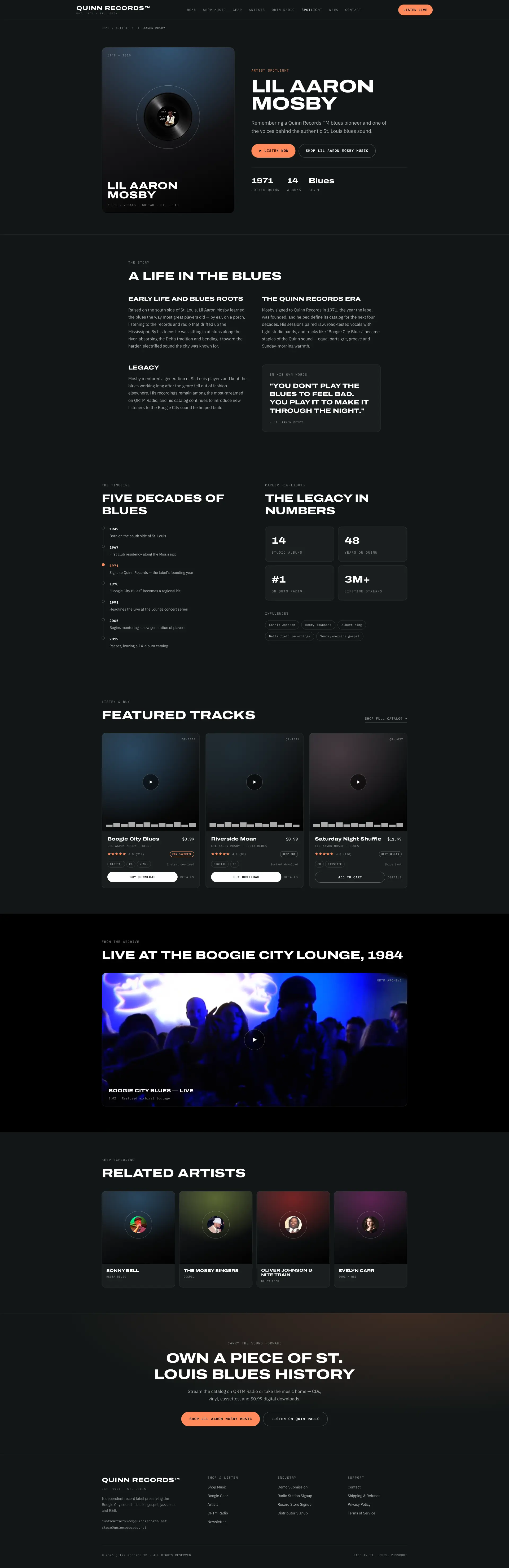
Artist pages do not provide enough story, timeline, legacy, highlights, music, and related content to fully engage users.
Build Strong Artist Pages
Redesign artist pages with artist story, lifespan, genre, timeline, highlights, featured tracks, video archives, related artists, and purchase links.
16 Category Pages Are Hard To Navigate Fix included
Music category pages do not provide clear filtering, sorting, featured releases, editor picks, or guided browsing.
Improve Music Category Pages
Create category pages with a strong heading, featured item, editor picks, full listings, recommended artists, and clear purchase formats.
9 further recommendations that cut across the whole store.
Create A Clear Primary CTA
Use Shop Music as the primary call to action while keeping secondary paths such as Listen Live and Buy Gear available.
Modernize The Visual Design
Reduce noise, improve contrast, remove clutter, and create a cleaner music-label experience that feels current and trustworthy.
Lead With Quinn Records' History
Show authority immediately by highlighting that the label has been active since 1971, with decades of history, artists, and releases.
State The Brand Mission Clearly
Position Quinn Records around preserving the sound of St. Louis instead of only selling records or merchandise.
Add Music Preview Options
Allow users to preview tracks or listen to samples before purchasing digital downloads, CDs, or vinyl.
Promote QRTM Radio
Use the radio station as a major brand asset and conversion path, not just a secondary page.
Add Genre-Based Browsing
Let users shop by genre such as blues, soul, jazz, gospel, rock, or other relevant categories.
Add Dedicated Record Detail Pages
Create pages where users can choose between digital download, CD, vinyl, or other formats with clear stock and shipping information.
Give Users A Reason To Subscribe
Frame newsletter signup around benefits such as new releases, exclusive artist stories, radio updates, limited promotions, and rare archival releases.
What the fixed version looks like.
Drag each frame to move between what is live today and the version built on the recommendations above.
Homepage (1) page
Drag to compare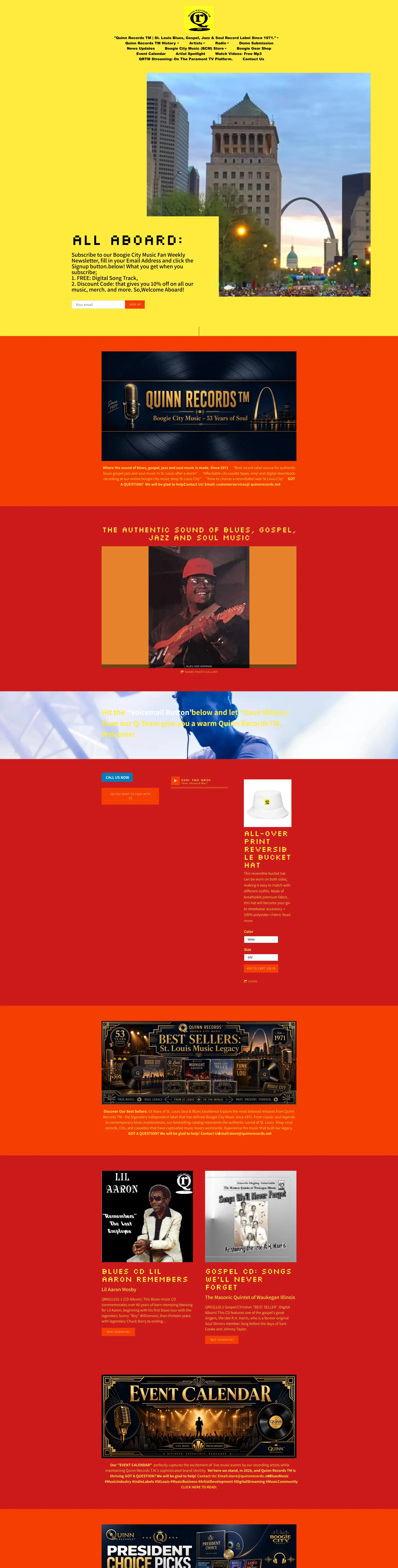
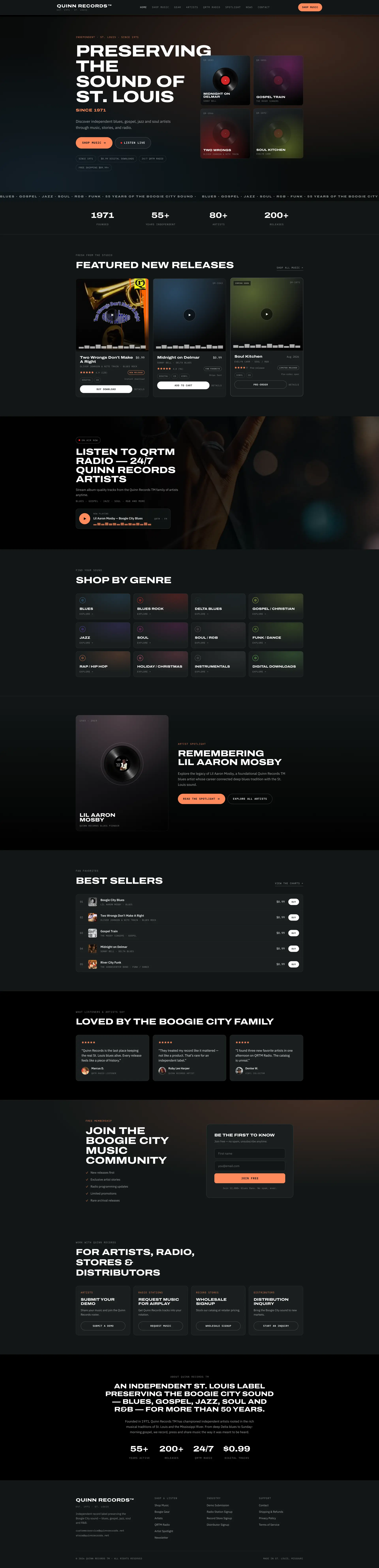 After
Before
After
Before
Category page
Drag to compare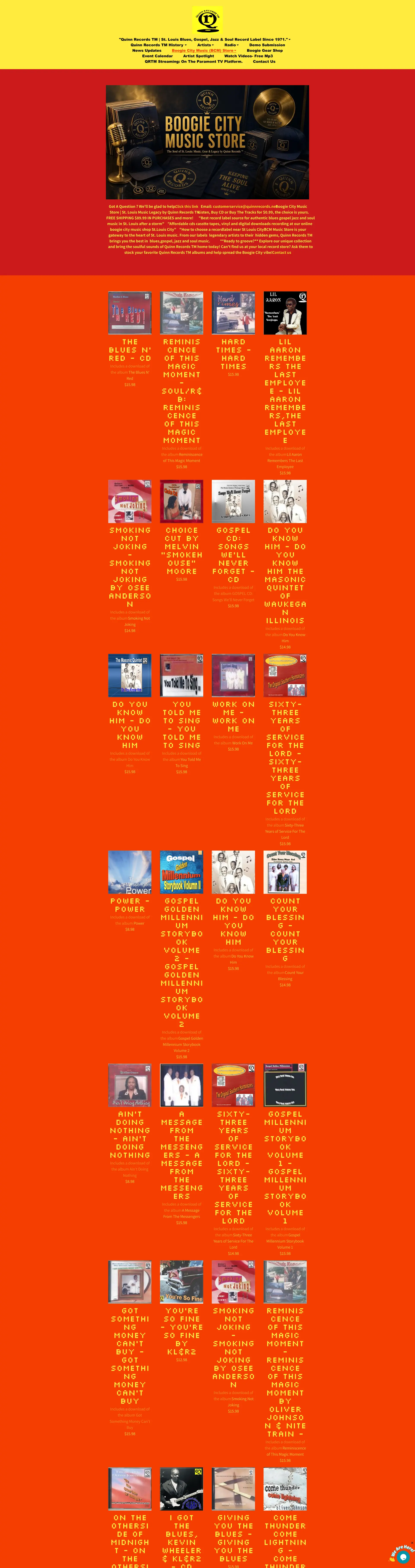
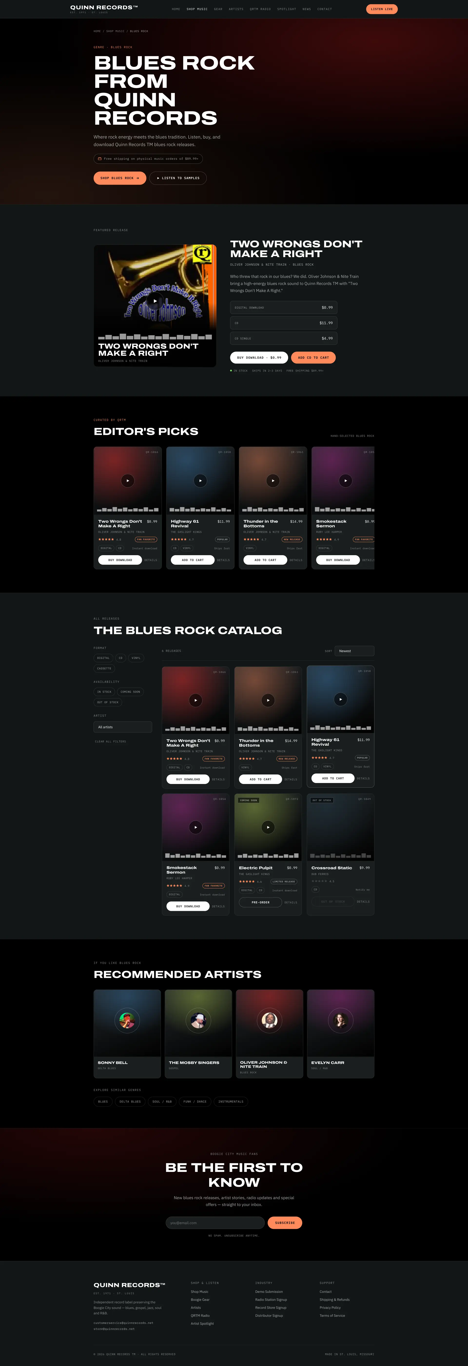 After
Before
After
Before
Artist page
Drag to compare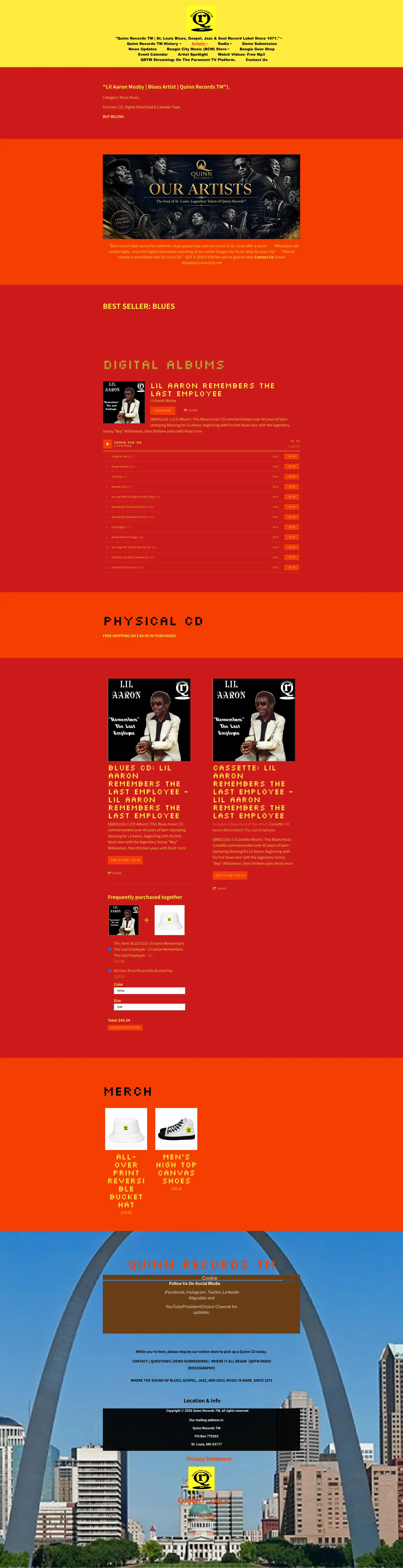
 After
Before
After
Before
What to take from this teardown.
Quinn Records has strong products, music history, and cultural value.
The current website is difficult to navigate and feels outdated.
There is no clear primary conversion goal.
The navigation should be simplified around music, gear, artists, and radio.
The homepage should lead with Quinn Records' history and mission.
Product discovery needs search, filters, genres, and clearer category pages.
Artist pages should tell deeper stories and showcase legacy.
Music pages should support digital downloads, CDs, vinyl, and previews.
Testimonials and listener proof can build trust.
Cross-sells and upsells can increase merchandise and music sales.
What people ask about this teardown.
12 answers drawn from the recording and the written report — the questions store owners in music, records & merchandise ask after watching this one.
Ask about your own store →
What is the biggest conversion problem on this store?
The website has strong products and music history, but the experience feels outdated, cluttered, and difficult to navigate, with no clear primary conversion goal. This audit found that this store has strong underlying assets, including a long history, quality music, unique records, merchandise, artists, and cultural credibility. However, the current website does not present these strengths in a conversion-focused way.
Why did this store score 1/10 on user experience?
User experience was the weakest of the five dimensions at 1/10, against 5/10 for brand and positioning. Cluttered Navigation: The navigation is difficult to use, overly crowded, and makes it hard for users to click or reach the pages they want.
Outdated Website Feel: what does that mean in practice?
The website feels like an early 2000s site with too much information placed on the page without enough structure or hierarchy.
Why is “No Clear Primary Conversion Goal” costing this store sales?
The site does not clearly prioritize whether users should buy music, purchase merchandise, listen to radio, browse artists, or subscribe. The fix: Simplify The Navigation — Rebuild the navigation around clear paths such as Shop Music, Buy Gear, Browse Artists, Radio, Spotlights, News, and Contact.
How do you fix “Too Many Competing CTAs”?
Multiple calls to action compete for attention without one clear primary path for users to follow. The fix: Feature New Releases — Show new releases with clear product cards, format options, tags, prices, and calls to action.
Is “Weak Above-The-Fold Experience” worth prioritising?
The top area of the homepage does not create enough interest, authority, or direction for visitors to continue exploring.
What would change if “Newsletter CTA Is Overprioritized” were fixed?
The first major action asks users to subscribe to the newsletter instead of guiding them toward music, merchandise, or core conversion goals.
What should be fixed first?
Start with Simplify The Navigation — Rebuild the navigation around clear paths such as Shop Music, Buy Gear, Browse Artists, Radio, Spotlights, News, and Contact.
How can a store like this increase average order value?
Add Cross-Sells And Upsells. Recommend related artists, records, merchandise, bundles, and format upgrades to increase average order value.
Does this store need a full redesign or targeted fixes?
Structural. The average is 2.8/10 and the weakest dimension, user experience, sits at 1/10 — the recommendations amount to rebuilding how the store presents itself, not tuning what is there.
What is the one-sentence takeaway?
Testimonials and listener proof can build trust. Cross-sells and upsells can increase merchandise and music sales.
What was reviewed in this audit, and how long is it?
A free 31:56 CRO teardown recorded by Convertica Studio for a music, records & merchandise store, walking the live site page by page. It produced 16 issues and 18 written fixes, plus scores across brand, UX, trust, product page and conversion. Any Shopify store can request the same review.
See what's quietly costing you sales.
Tell us about your store and we'll send a personalized 5-minute video showing exactly where you're losing buyers — and how to win them back.
Takes about 40 seconds. No call required.
-
5-minute video teardownA personalized walkthrough of your store, recorded by Eva.
-
Homepage & PDP reviewWhere attention leaks and buyers hesitate.
-
Mobile UX audit70% of your traffic — judged on its own terms.
-
Trust & credibility checkThe signals that make first-time buyers convert.
-
Prioritized CRO roadmapRanked by impact vs. effort, ready to ship.