










How we reduced bounce rate by 28%
By turning a product catalog into a customer journey
A catalogue where a welcome should have been.
Vexivo was attracting qualified traffic through paid ads and organic channels, but visitors were leaving before engaging with the brand or exploring products.
The homepage functioned more like a product catalog than a conversion-focused customer journey.
Six steps, and products come last.
The old homepage opened with product grids. The new one earns the scroll before it asks for a click.
Benefits
What changes for the customer, stated before anything is for sale.
Transformation stories
Real outcomes, early — the reason to keep scrolling past the first screen.
Social proof
Customer content and testimonials woven through rather than parked in one block.
Product education
How it works and why it is different, once there is a reason to care.
Customer outcomes
The result restated at the point of decision.
Purchase decisions
Products presented last, to a visitor who now knows what they are choosing between.
Four reasons visitors bounced.
Product overload above the fold
Visitors were immediately presented with numerous products and offers before understanding why they should care about the brand.
Limited emotional engagement
The homepage lacked storytelling and failed to connect the products to customer goals, frustrations, and desired outcomes.
Weak information hierarchy
Promotions, products, content, and educational messaging competed for attention, making it difficult for users to identify what mattered most.
Low content engagement
Visitors had little reason to continue scrolling after viewing the initial sections of the page.
Four moves, four weeks.
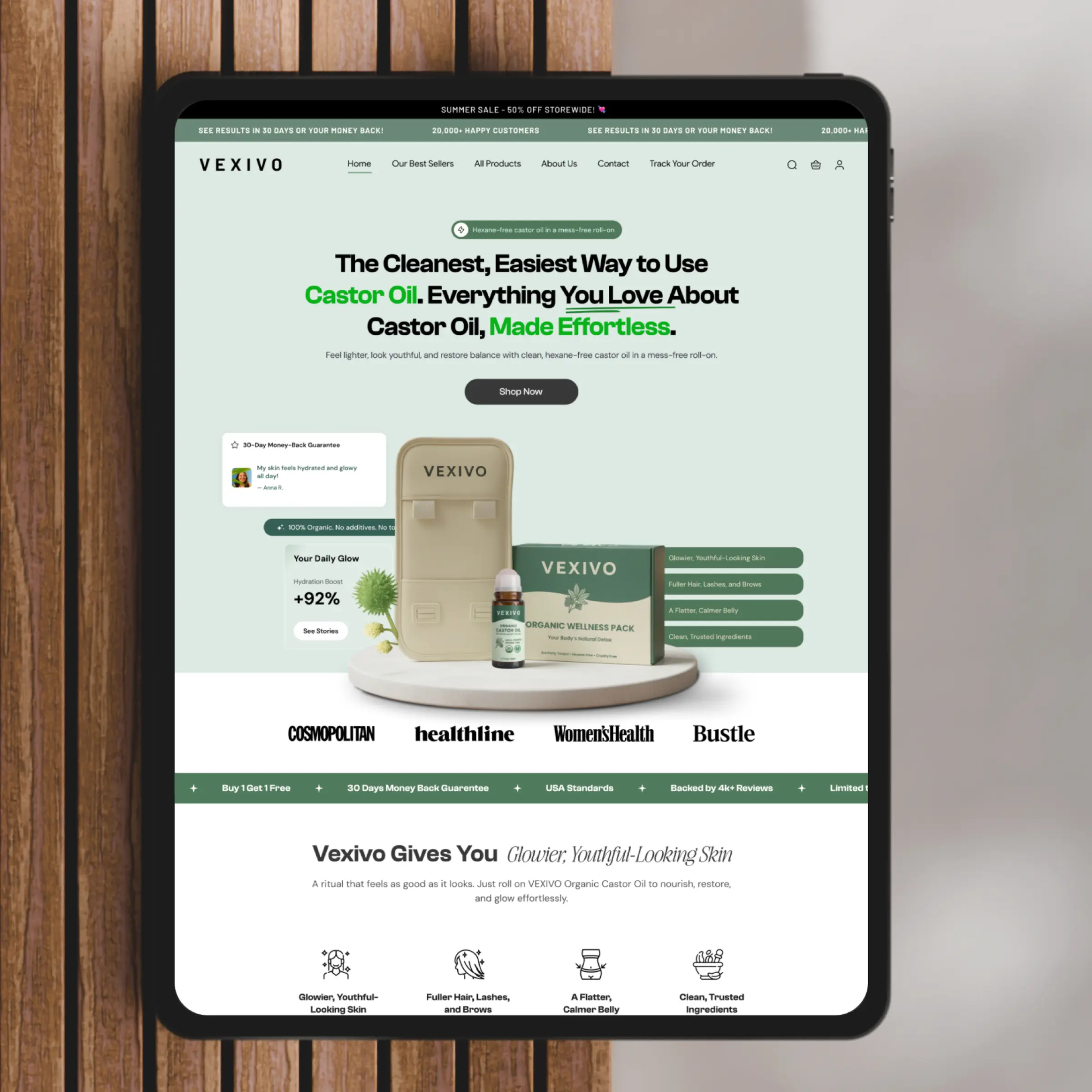

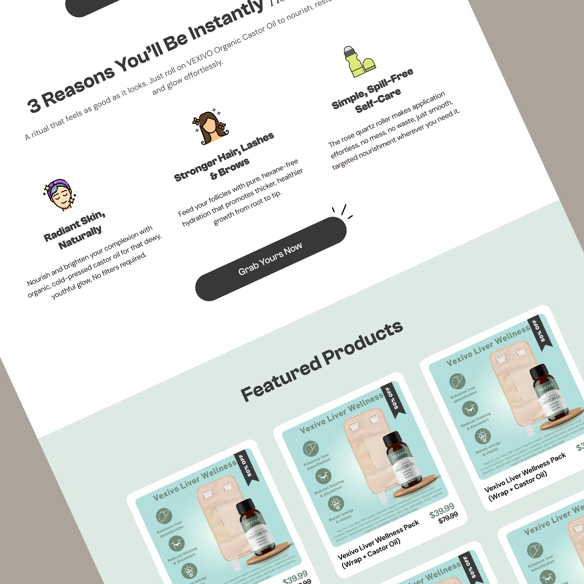
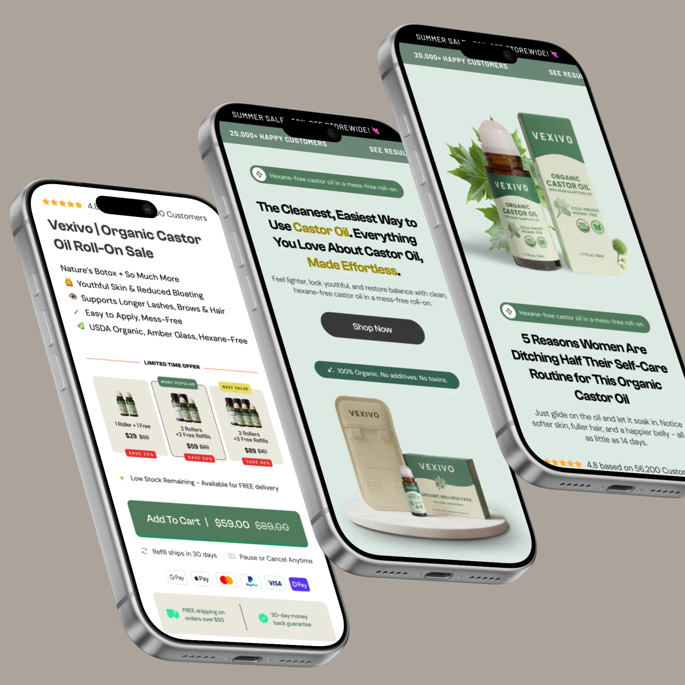
Rebuilt homepage around engagement
Shifted the homepage from a product-first experience to a customer-first journey focused on education, trust, and outcomes.
Stronger above-the-fold experience
A clearer value proposition, stronger visual hierarchy, and immediate credibility signals.
Structured storytelling flow
Benefits, transformation stories, social proof, product education and customer outcomes — presented before purchase decisions.
Enhanced social proof
Customer-generated content, testimonials and transformation examples integrated throughout the experience.
A catalogue became a journey.
The redesigned homepage transformed Vexivo from a product catalog into a conversion-focused customer journey.
By improving content hierarchy, strengthening storytelling, and introducing engagement-focused sections, the new experience encouraged visitors to spend more time exploring the brand and significantly reduced early drop-off.
- Reduced bounce rate
- Increased engagement
- Improved scroll depth
- Stronger product discovery
- Better customer education
- Enhanced trust and credibility
Questions about this engagement.
The homepage worked like a product catalog — visitors met product grids before any reason to care. The rebuild opened with a clearer value proposition and guided visitors through benefits, transformation stories, social proof and product education before presenting purchase decisions. Bounce rate fell from 58% to 42%.
Scroll depth rose 38% (42% to 58%) and average session duration went from 1m 42s to 2m 30s — visitors stayed longer and explored further before deciding.
Four weeks, on Shopify. The work concentrated on the homepage — the page that was turning visitors away before they engaged with the brand.
A CRO redesign and custom theme development. The engagement rebuilt the homepage of a wellness store from a product-first catalog into a customer-first journey focused on education, trust and outcomes.
It depends where a store starts. This homepage opened with product overload and little storytelling, so restructuring it moved the number quickly. Your store's result depends on your store's specific problems — that is what the audit is for.
This one started as an audit too.
Send us your store and we'll record yours free — no call, no obligation, two to three business days.