(Client)
BLIV
(Industry)
Healthcare / Telehealth
(Services)
CRO Audit, UX Redesign
(Timeline)
6 Weeks
Challenge
BLIV was attracting qualified traffic through paid advertising and organic channels, but too many visitors were leaving before booking a consultation.
The homepage contained large amounts of information, complex pricing comparisons, and multiple competing calls-to-action. New visitors struggled to understand the treatment process and what steps to take next.
As a result, users were abandoning the journey before reaching the consultation request stage.
Audit Findings
Overwhelming Information Architecture
Visitors were presented with large amounts of information before understanding the core offer, creating friction and increasing drop-off.
Weak Trust Building Above The Fold
The site did not immediately communicate credibility, expertise, or patient outcomes during the first few seconds of the visit.
Complex User Journey
Key steps in the treatment process were scattered throughout the experience, making it difficult for prospective patients to understand how the program worked.
Limited Emotional Connection
The site focused heavily on program details but lacked storytelling that connected with patient goals and motivations.
Mobile Experience Friction
Long sections and dense layouts created a demanding experience for mobile users.
Outdated Visual Presentation
The design did not reflect the level of professionalism, care, and trust expected from a modern health and wellness provider.
Key Improvements
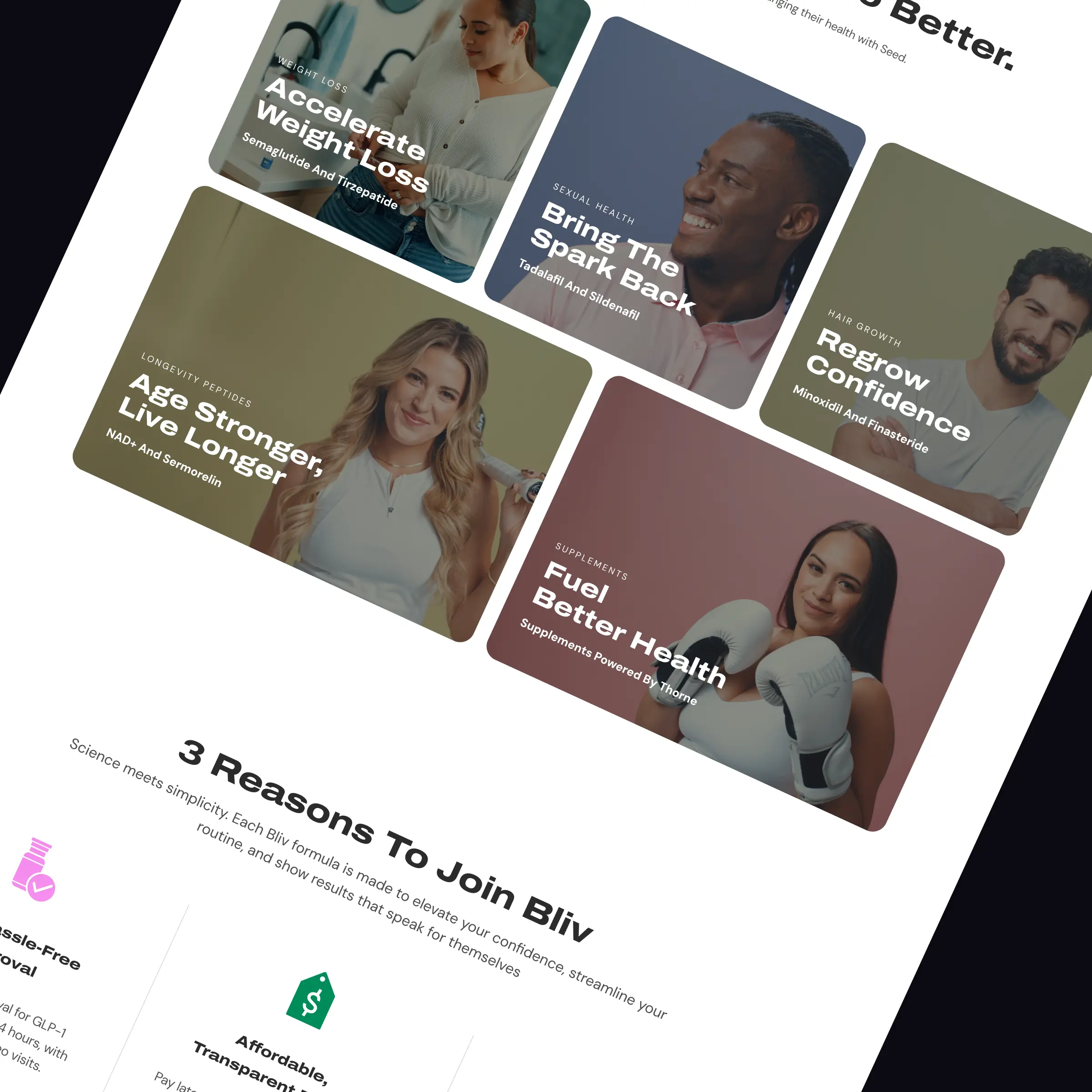
Complete Customer Journey Redesign
Rebuilt the experience around the patient’s decision-making process rather than the program itself.
Trust-First Homepage Structure
Introduced credibility, outcomes, social proof, and treatment benefits earlier in the customer journey.
Simplified Treatment Path
Created a clear step-by-step process that helps visitors understand how treatment works from consultation to medication delivery.
Modern Healthcare Branding
Redesigned the visual experience to feel more professional, trustworthy, and aligned with premium health brands.
Outcome-Focused Messaging
Shifted content away from feature-heavy explanations and toward patient goals, results, and transformation.
Stronger Social Proof Integration
Added testimonials, customer stories, community content, and success indicators throughout the site.
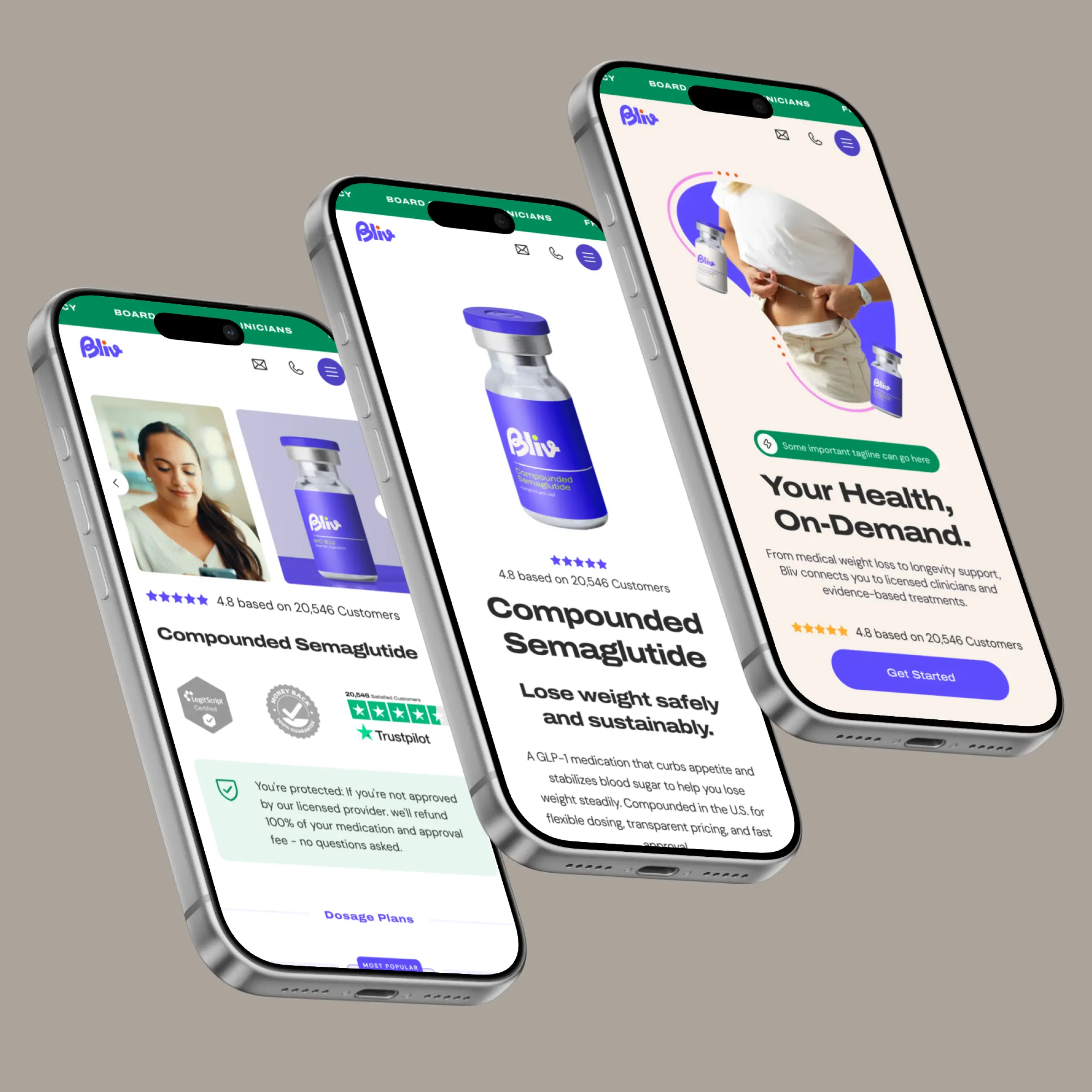
Mobile-Optimized Experience
Improved readability, navigation, and content hierarchy for mobile-first users.
(Final thoughts)
Results Summary
By restructuring the experience around patient education, trust, and simplicity, BLIV was able to significantly improve engagement and consultation intent.
The new journey reduced friction, clarified the treatment process, and guided visitors toward the next step with greater confidence.
This resulted in a 52% increase in consultation requests, a 41% improvement in appointment booking rate, and a substantial reduction in form abandonment.
Key Improvements
✓ Clearer treatment journey
✓ Stronger patient trust
✓ Improved user engagement
✓ Better mobile experience
✓ Enhanced brand credibility
✓ Increased conversion potential
CRO: 1.7% → 3.8%
The new experience completely transformed how we communicate our program online. Patients now understand the process faster, trust the brand more quickly, and can easily find the information they need to make a decision. The website finally reflects the quality of care we provide
Scott J.
Founder Bliv
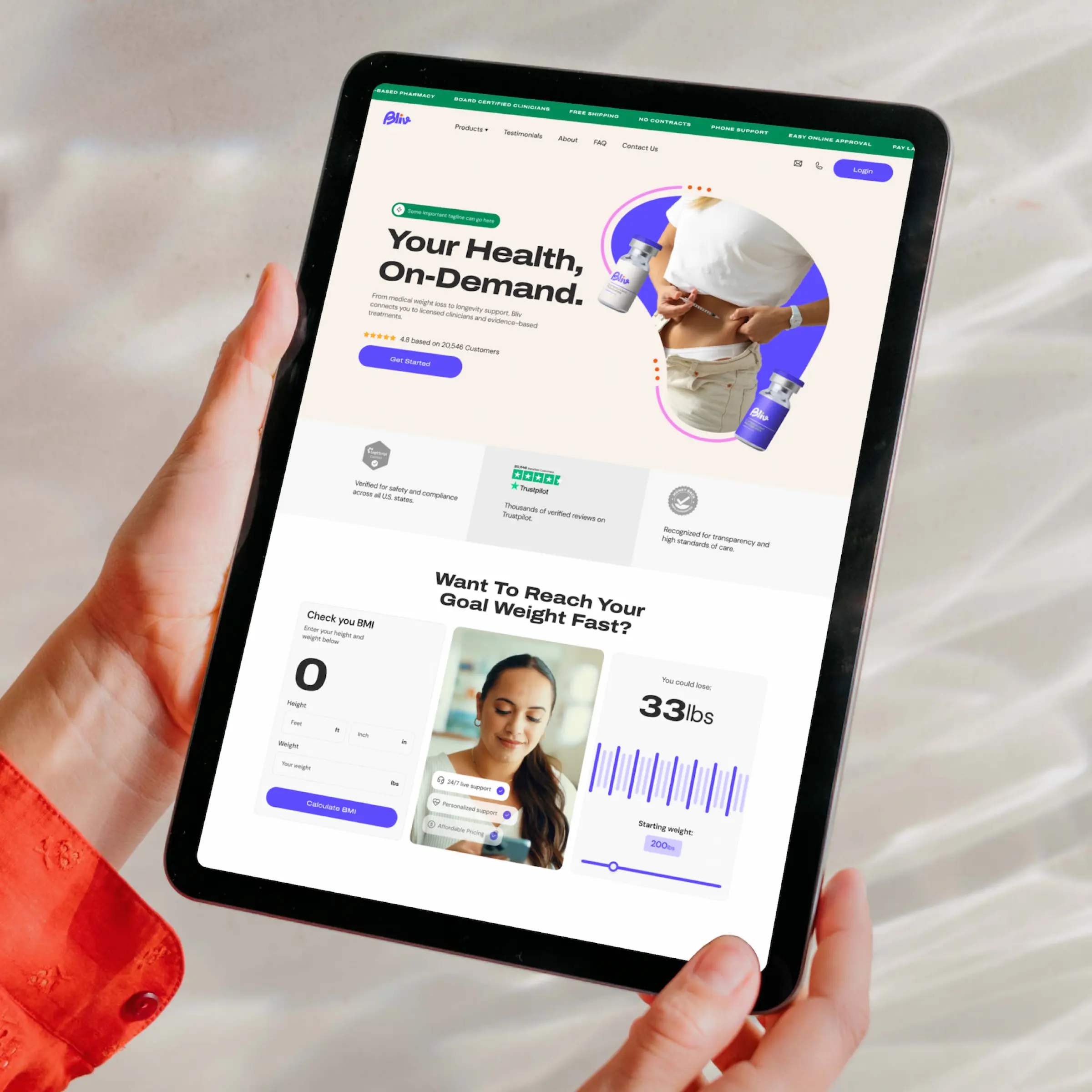
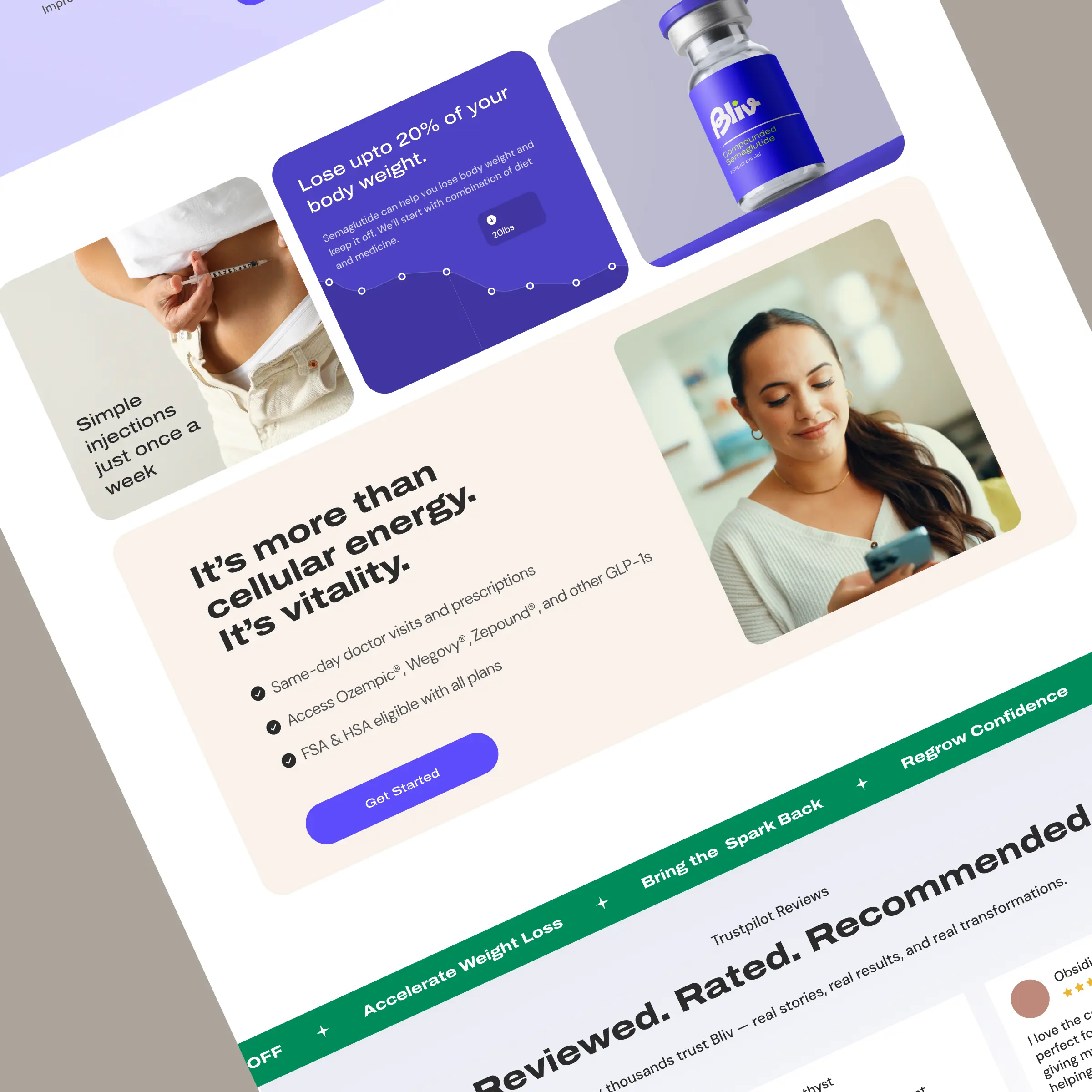
Before
The original experience prioritized information density over clarity.
Visitors were presented with extensive program details, pricing tables, comparisons, and educational content before understanding the core value proposition.
This created friction for first-time visitors and made the consultation process feel more complex than necessary.
❌ Information overload
❌ Multiple competing CTAs
❌ Complex treatment journey
❌ Weak visual hierarchy
❌ Consultation process unclear
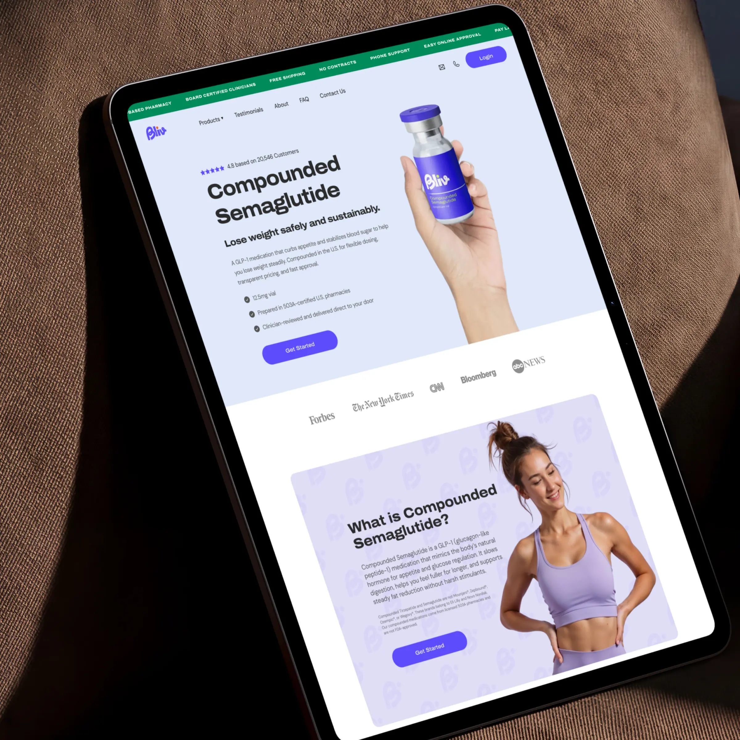
After
The redesigned experience focused on simplicity and progression.
Users are introduced to the program through a clear value proposition, supported by trust signals, patient transformations, and a structured explanation of the treatment process.
Each section naturally guides visitors toward booking a consultation, reducing friction and improving conversion intent.
✅ Clear patient journey
✅ Stronger consultation CTA
✅ Improved trust signals
✅ Simplified pricing structure
✅ Conversion-focused UX

Let's Uncover What's Costing You Sales.
Get a personalized Shopify CRO audit and discover the biggest opportunities to improve conversions, customer trust, and revenue.
Related Case Studies
From foundational design to advanced optimization — built for digital growth.