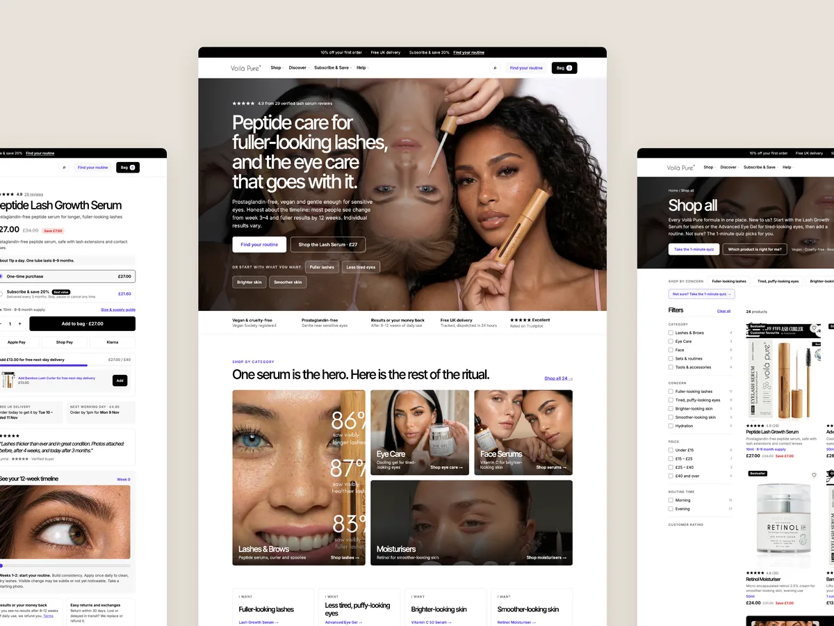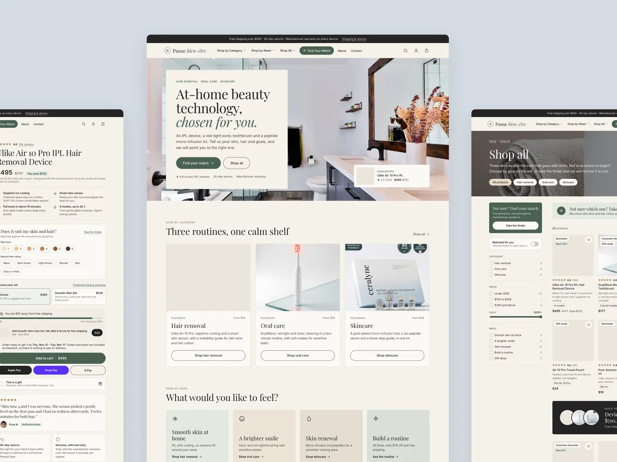
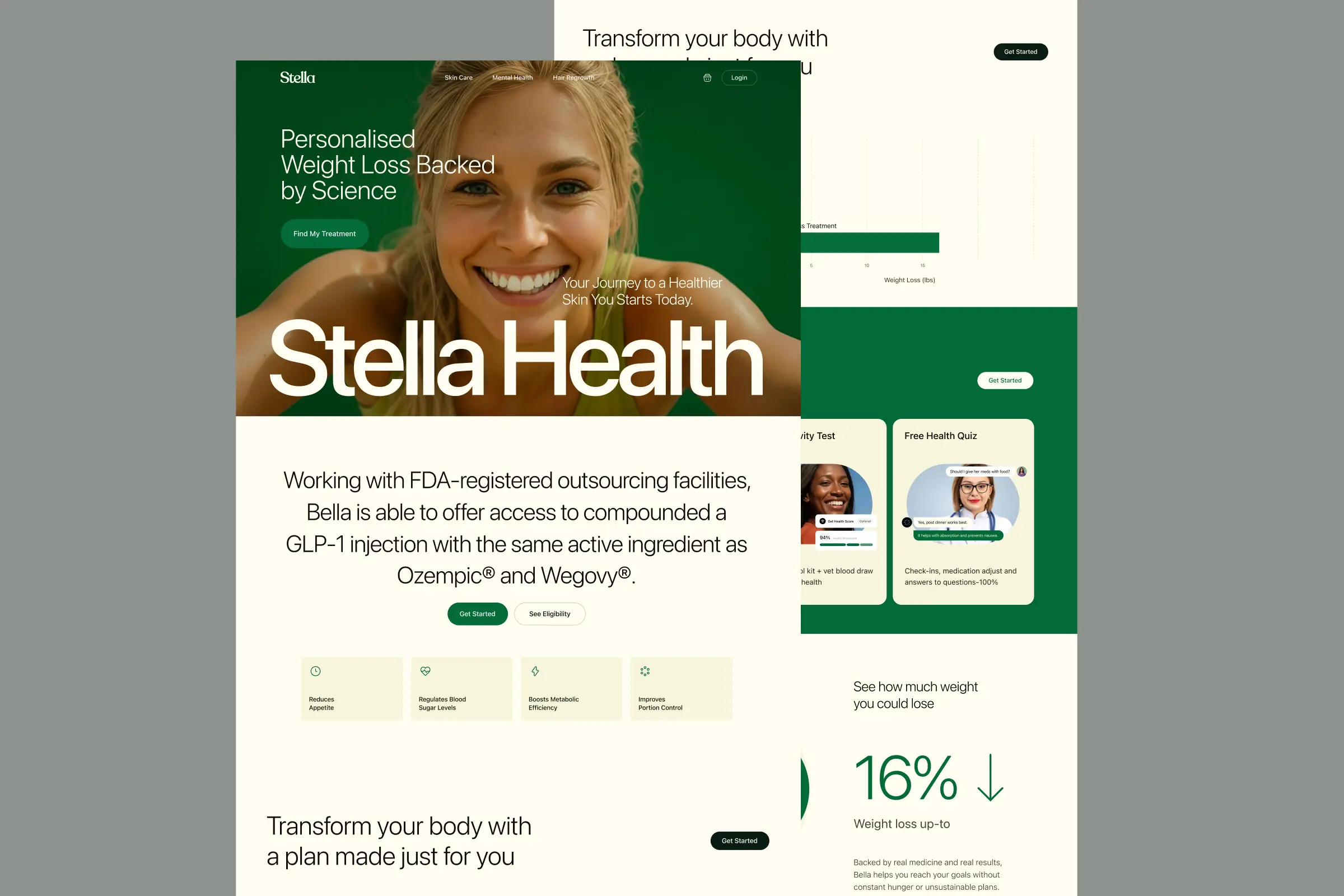
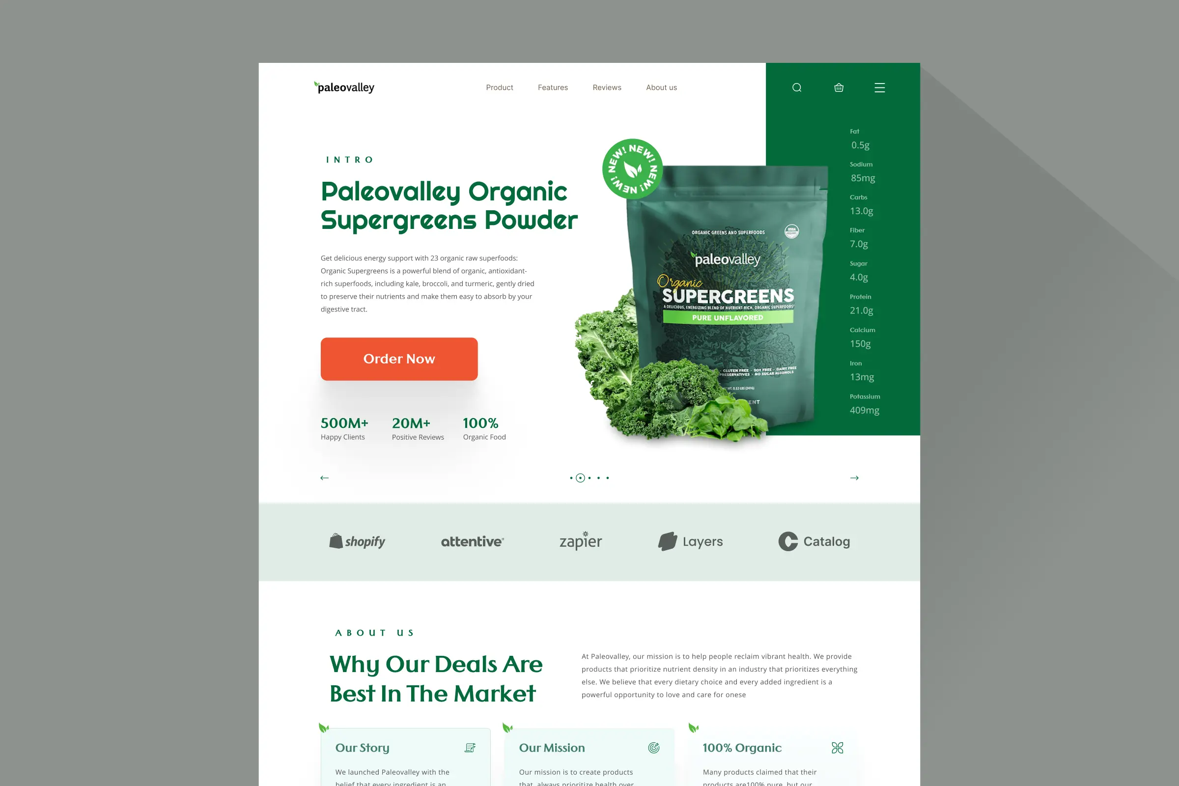
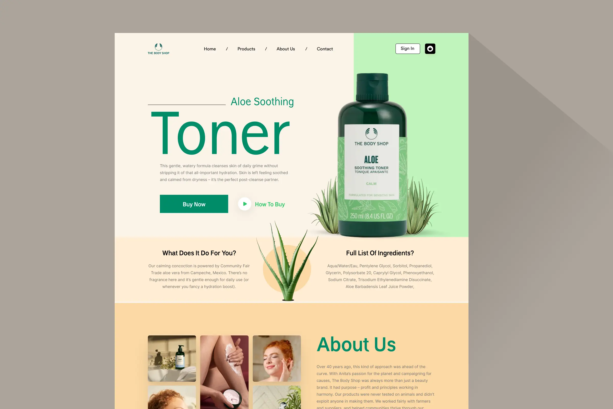
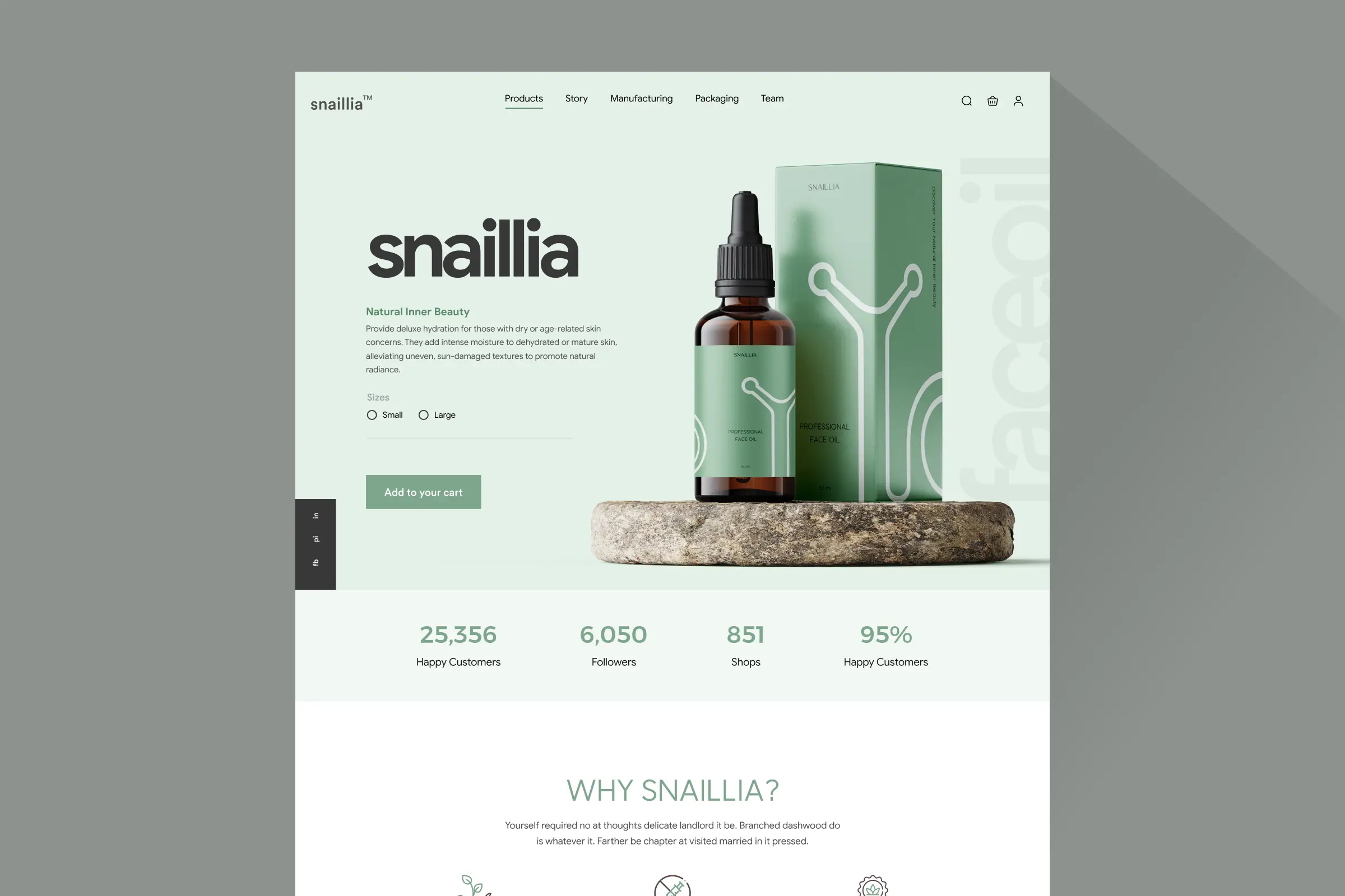
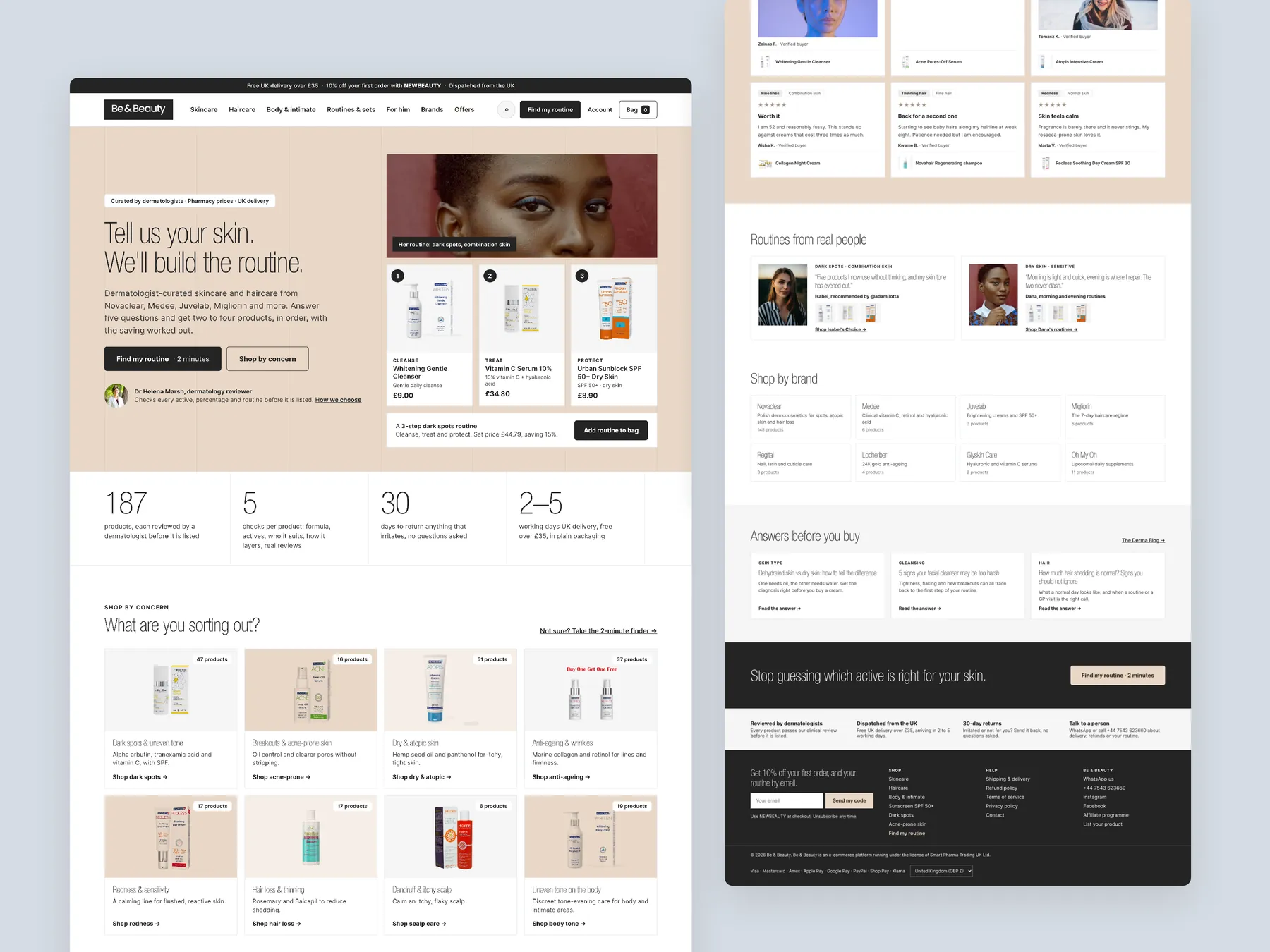
Homepage in two tall columns
The top of the page leads with the skin routine offer, and the lower half carries the page down to the footer.
Storefronts we designed and built, across supplements, fragrance, health, wellness and skincare.
All 35 projectsFour engagements, measured before and after. What changed, why it changed, and by how much.
All case studiesDiagnosis, design and development from one studio — so the recommendation and the build never disagree.
All five services192 real Shopify stores torn down page by page, scored, and shown beside the version we would build. Free to watch.
Browse all teardownsConversion-first Shopify themes, each built for one industry’s buying journey. No required apps, no monthly theme fee, one licence per store.
See all themes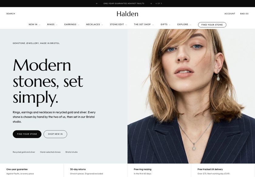 Halden
Jewelry & Accessories
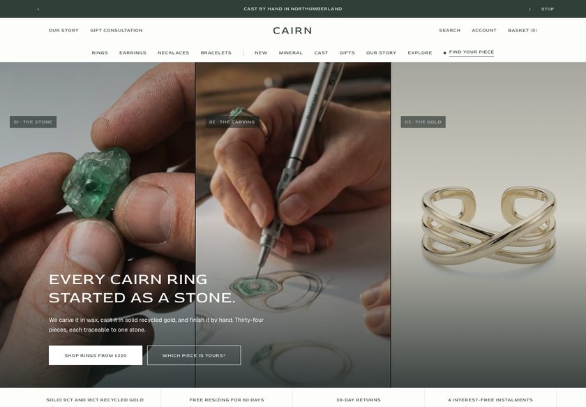 Cairn
Jewelry & Accessories
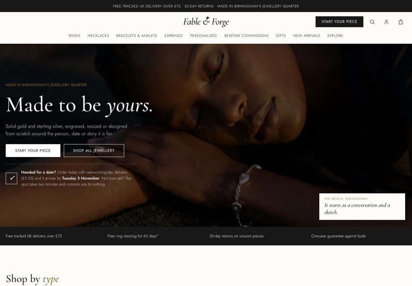 Fable & Forge
Jewelry & Accessories
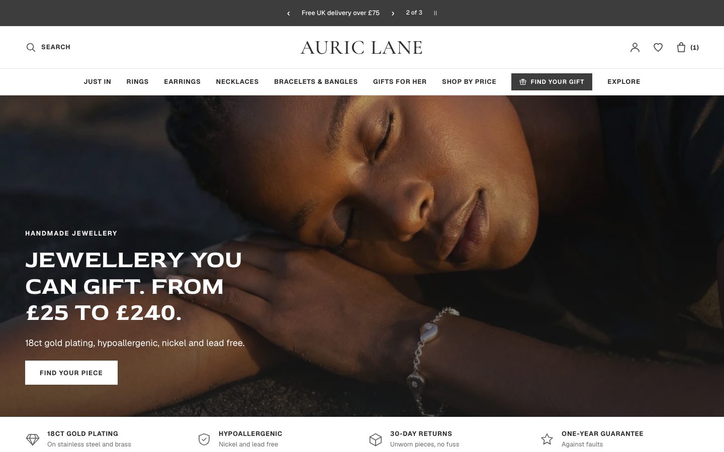 Auric Lane
Jewelry & Accessories
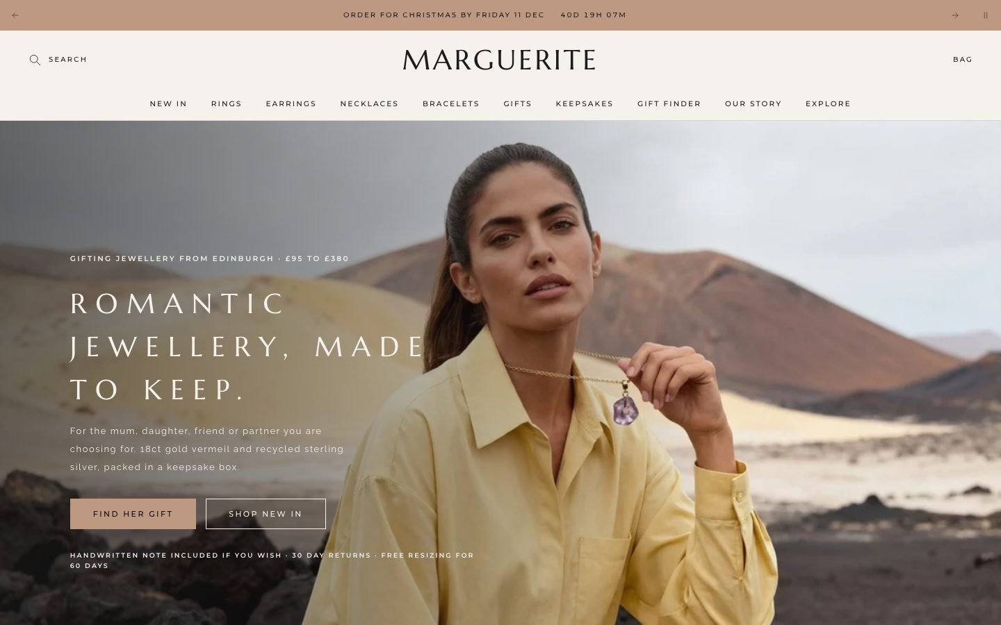 Marguerite
Jewelry & Accessories
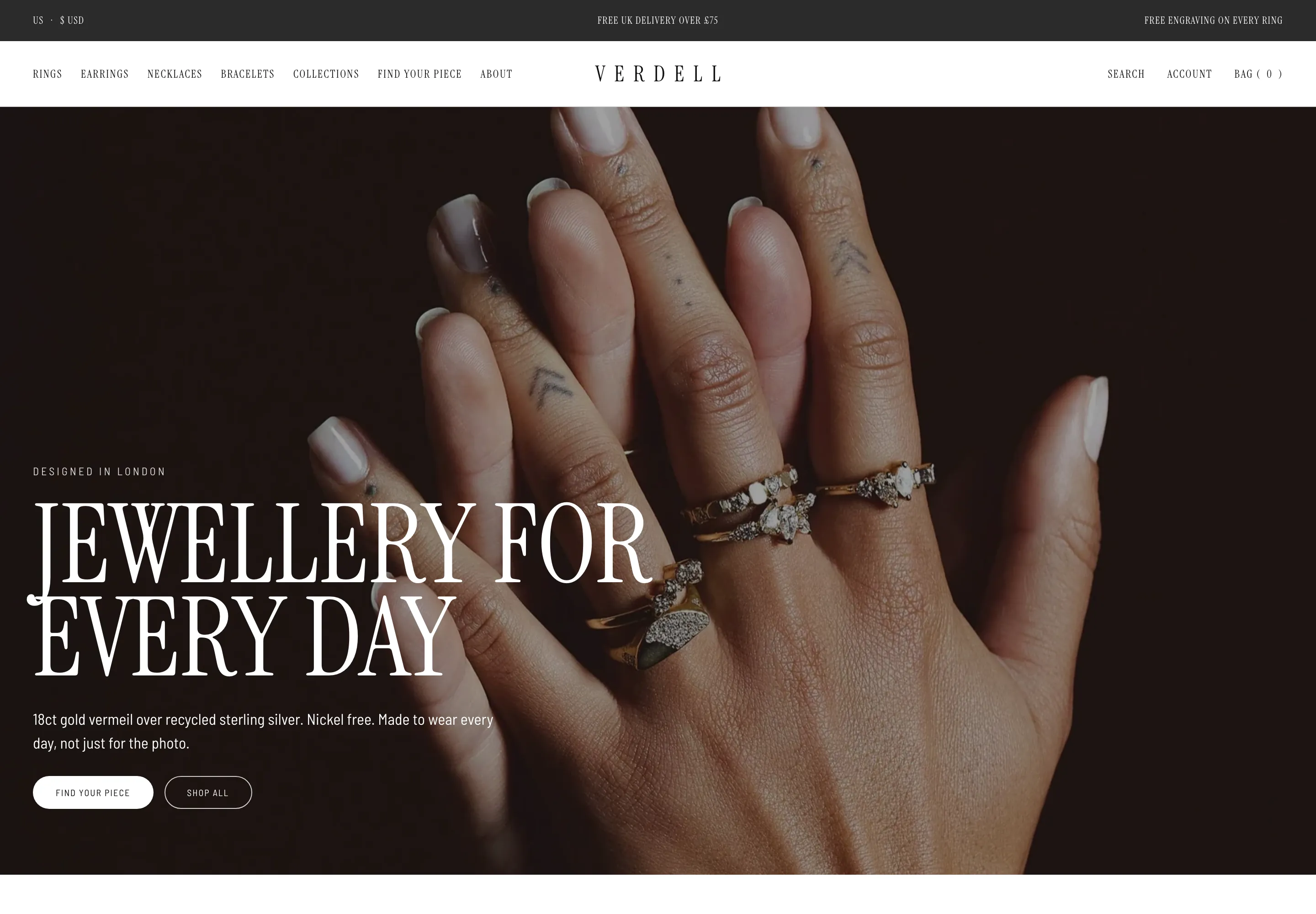 Verdell
Jewelry & Accessories
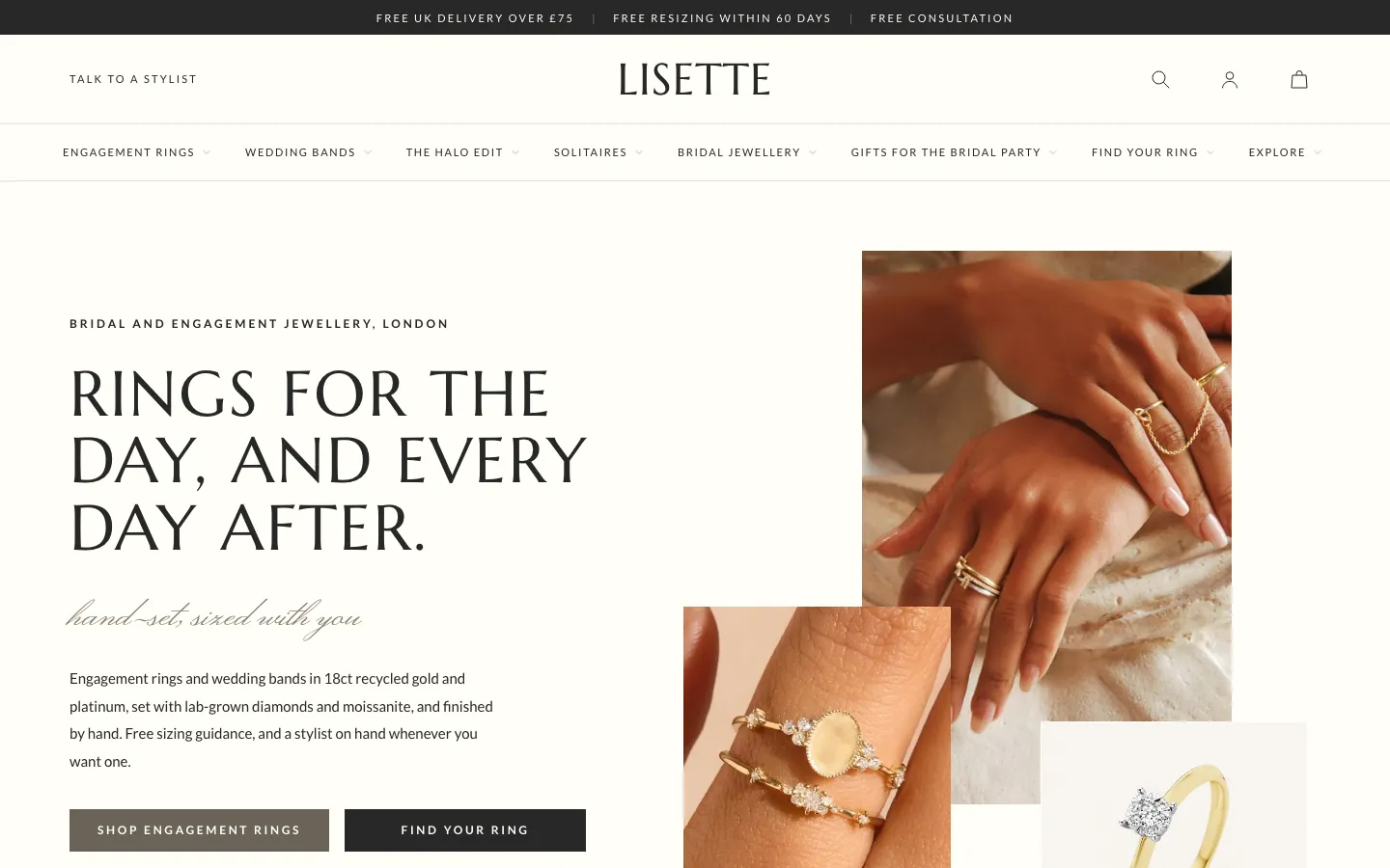 Lisette
Jewelry & Accessories
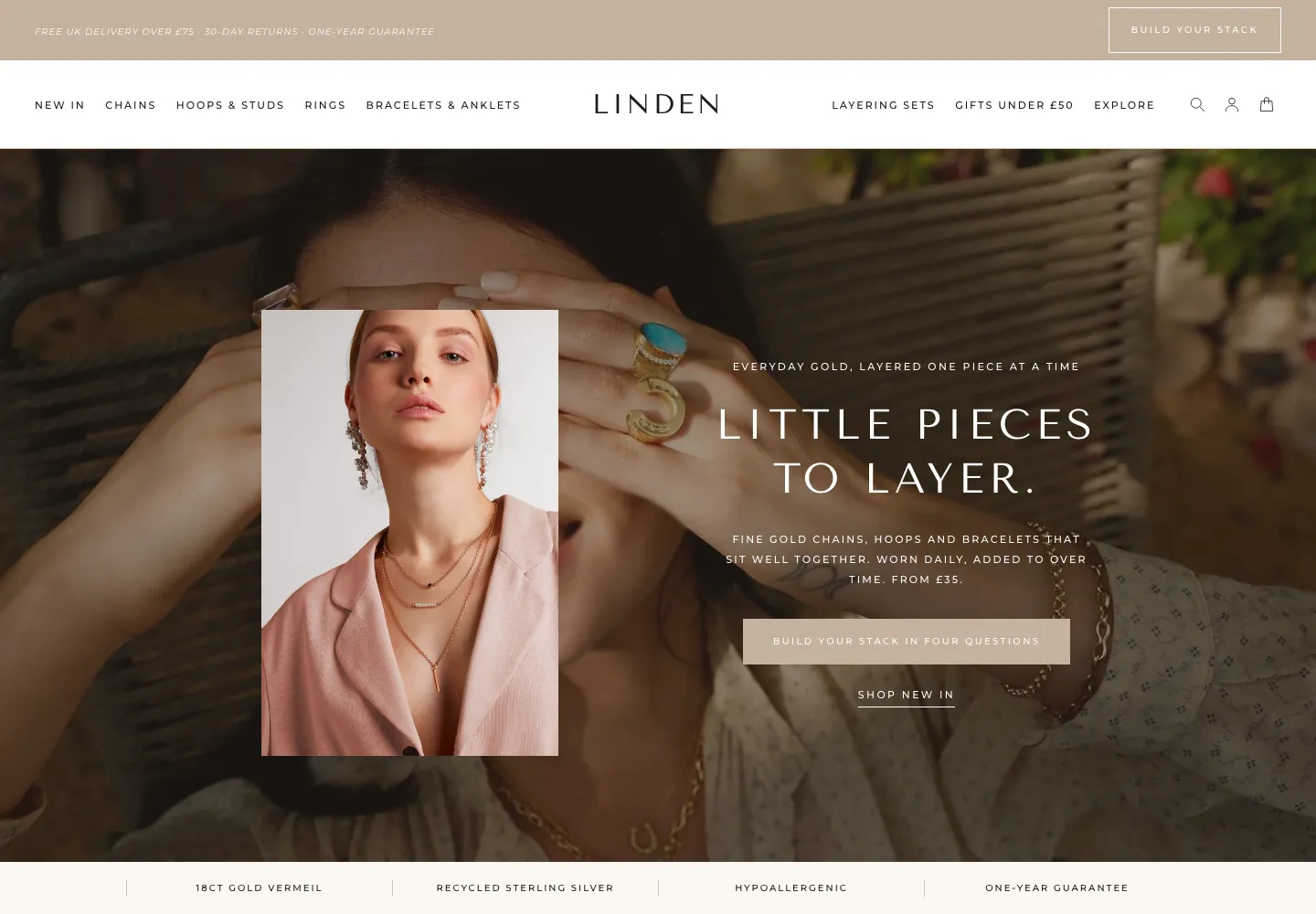 Linden
Jewelry & Accessories
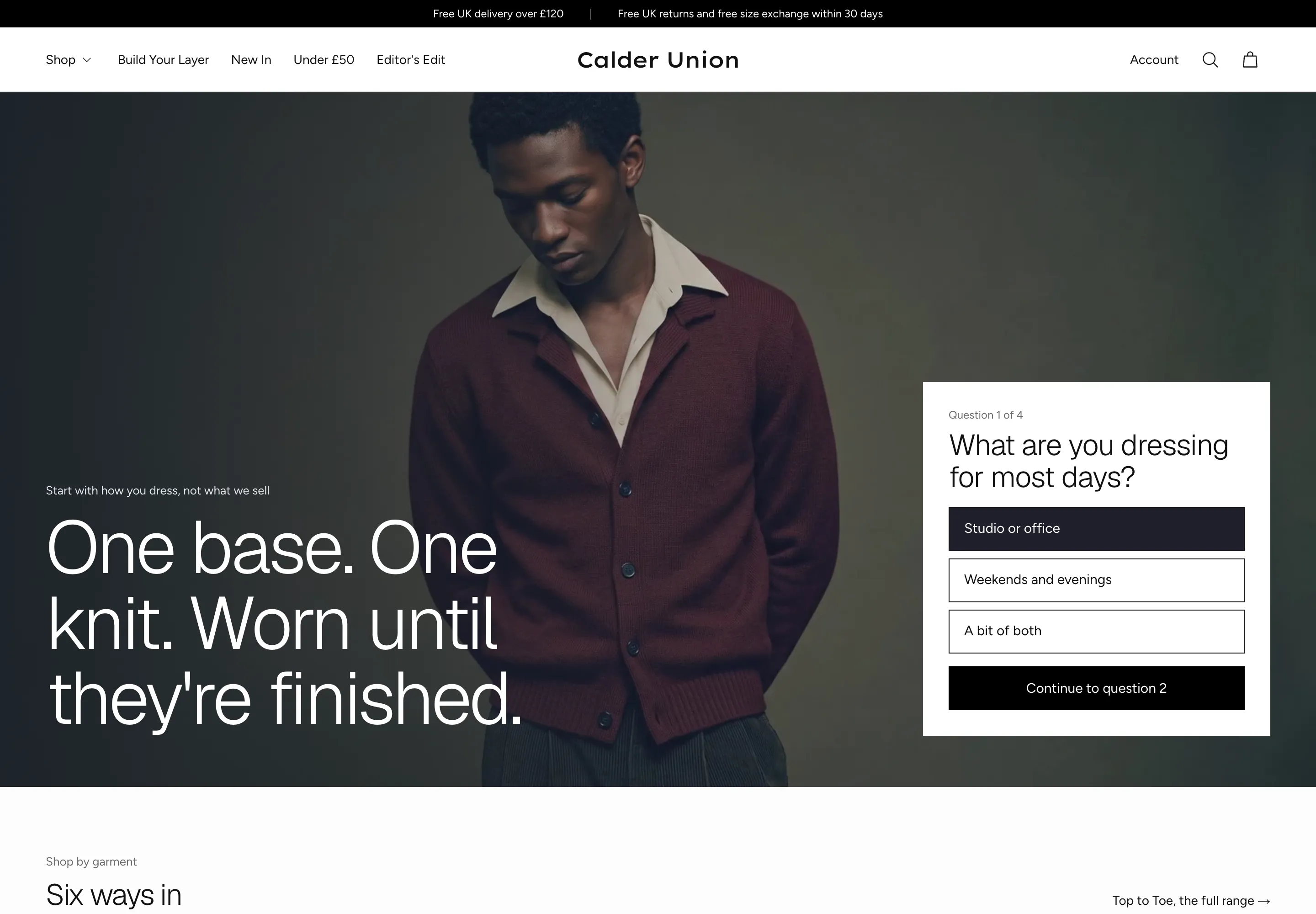 Calder Union
Clothing & Apparel
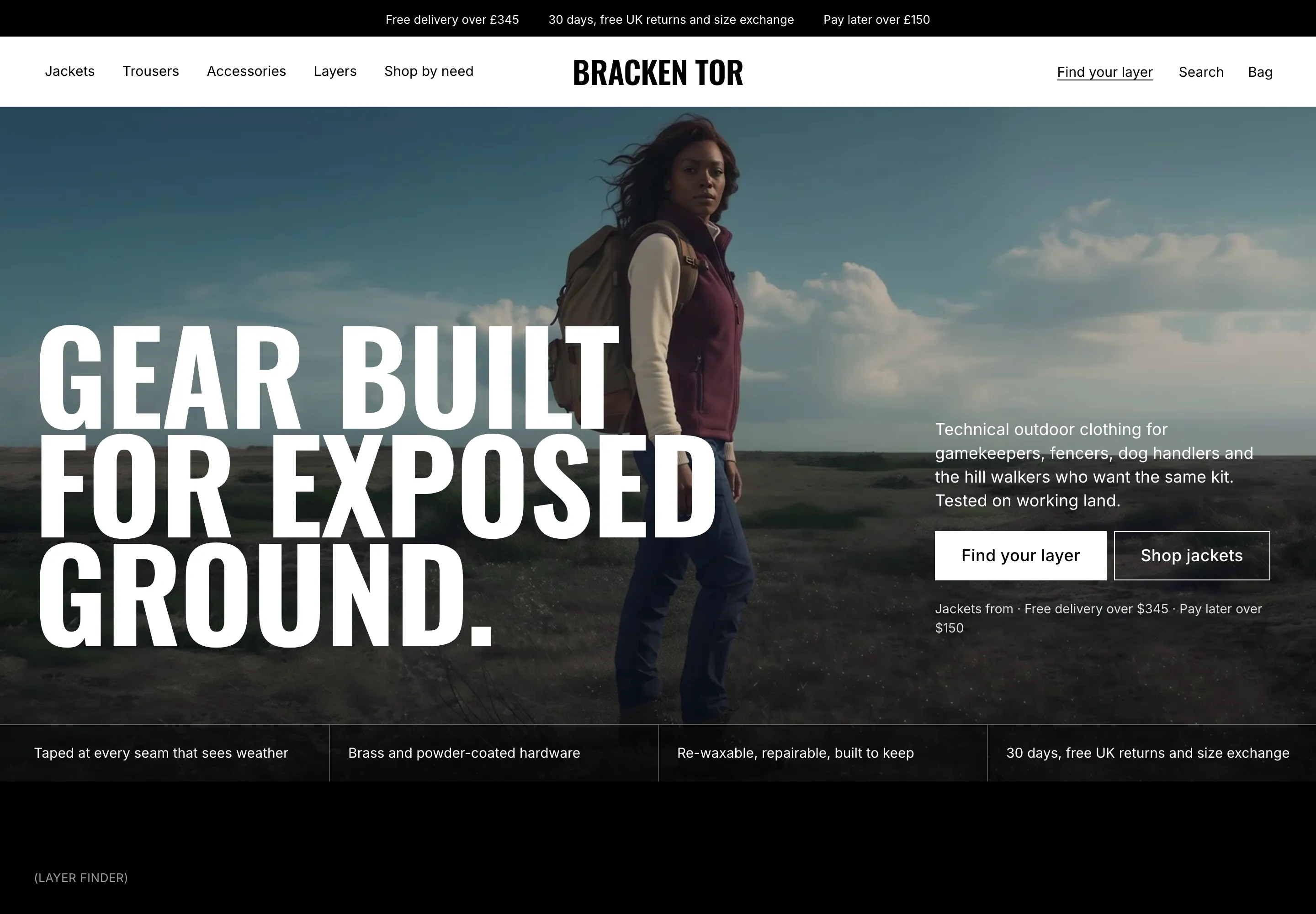 Bracken Tor
Clothing & Apparel
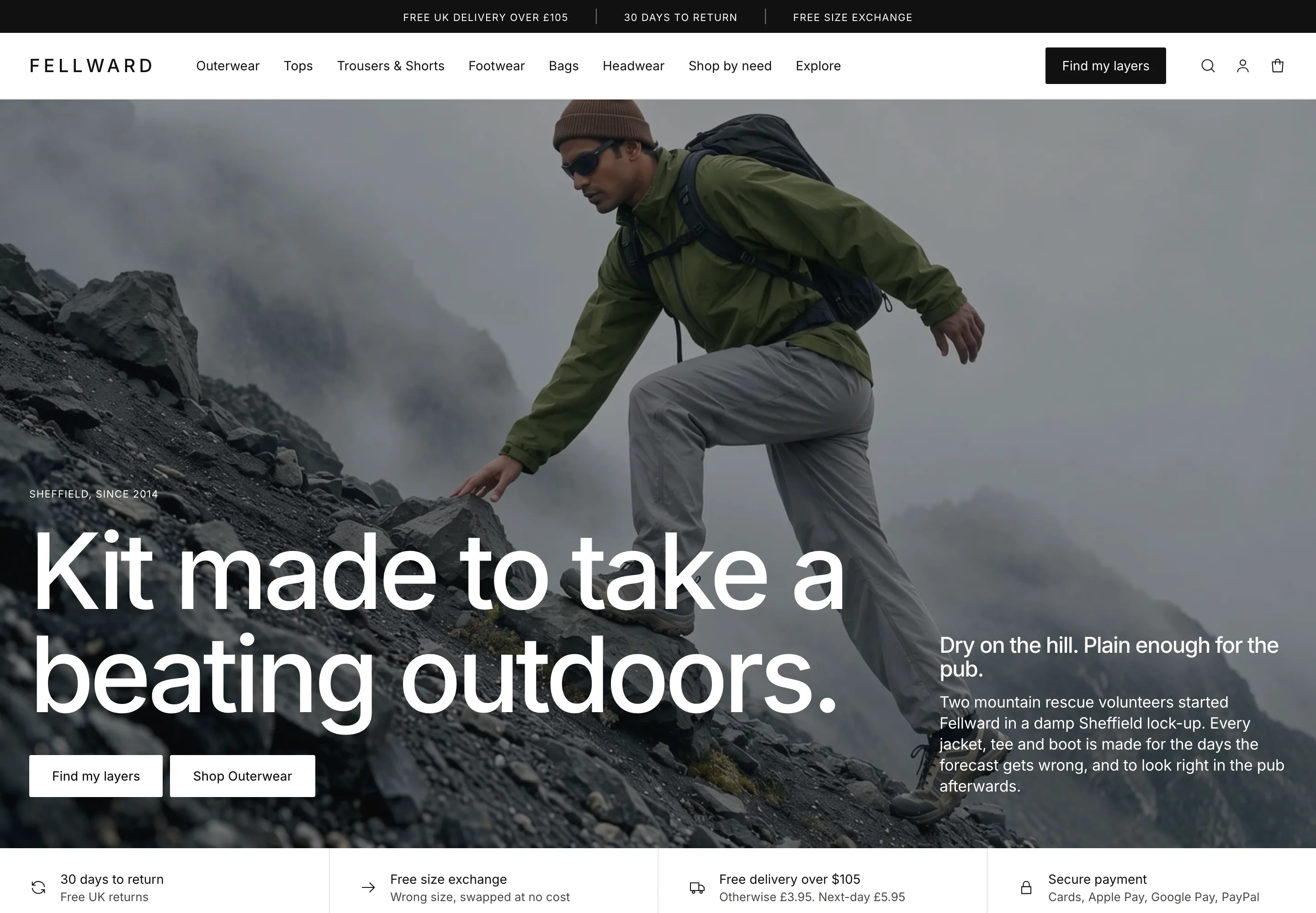 Fellward
Clothing & Apparel
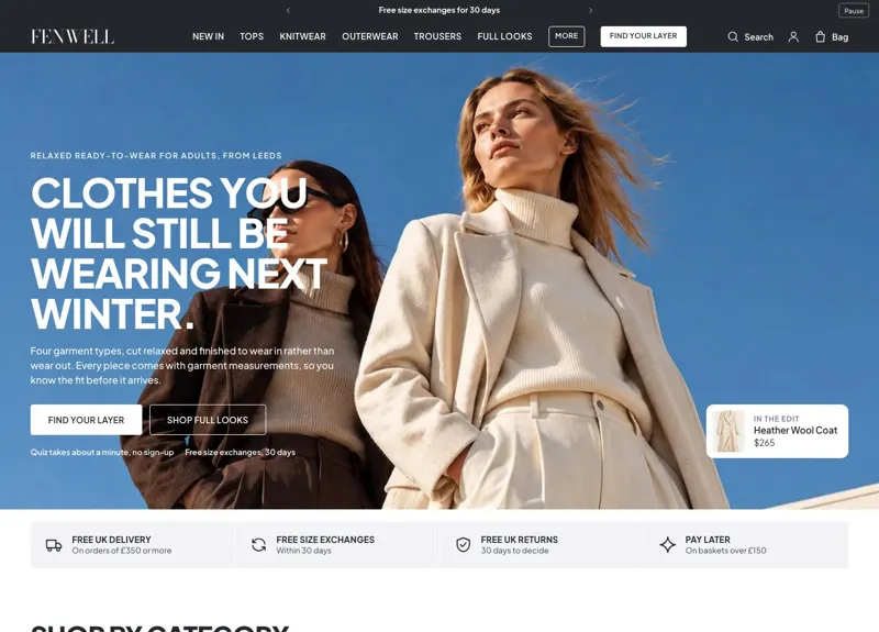 Fenwell
Clothing & Apparel
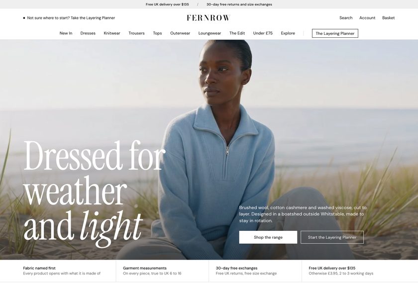 Fernrow
Clothing & Apparel
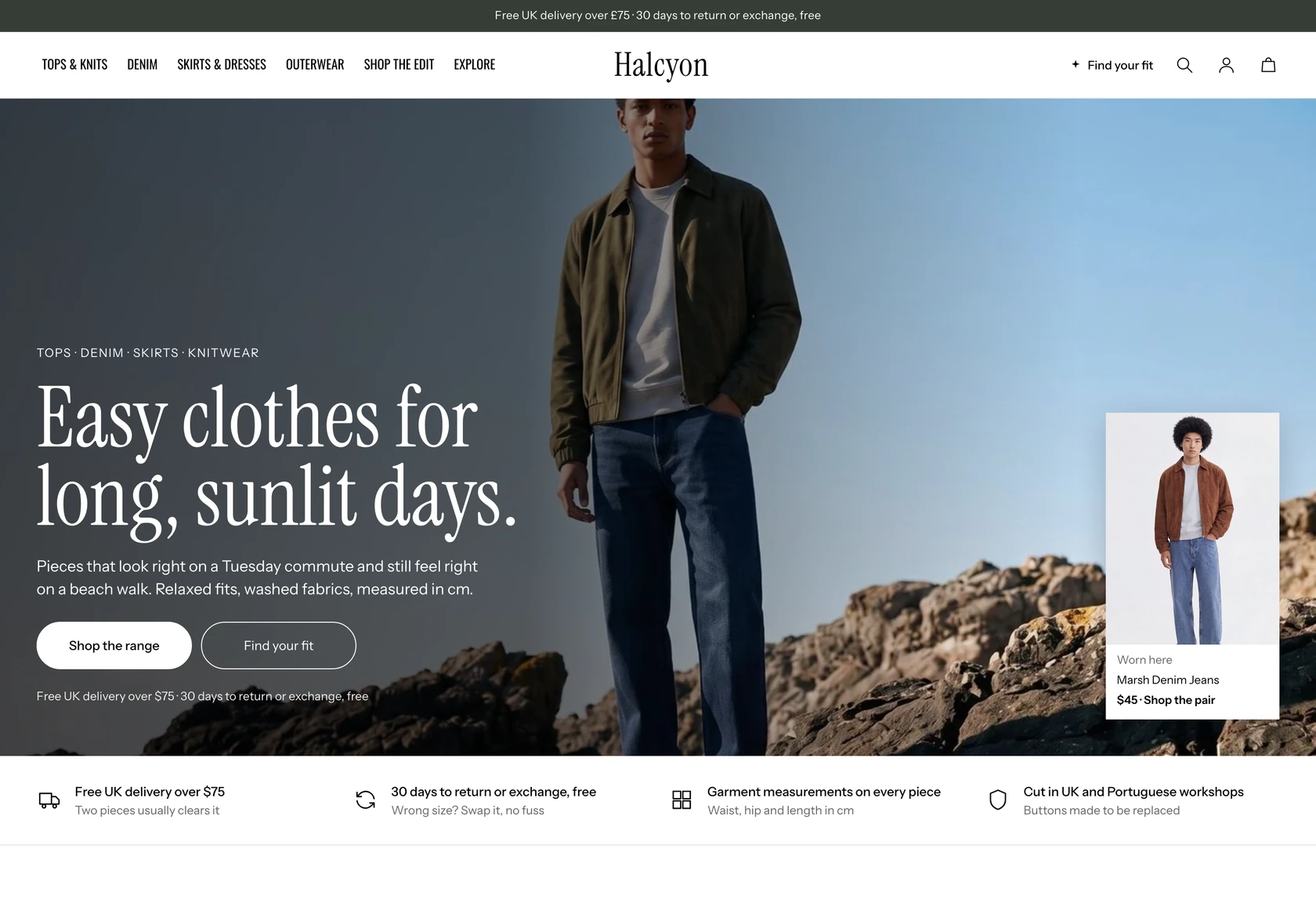 Halcyon
Clothing & Apparel
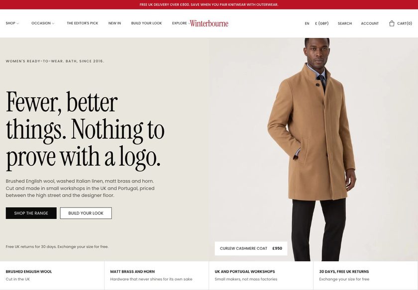 Winterbourne
Clothing & Apparel
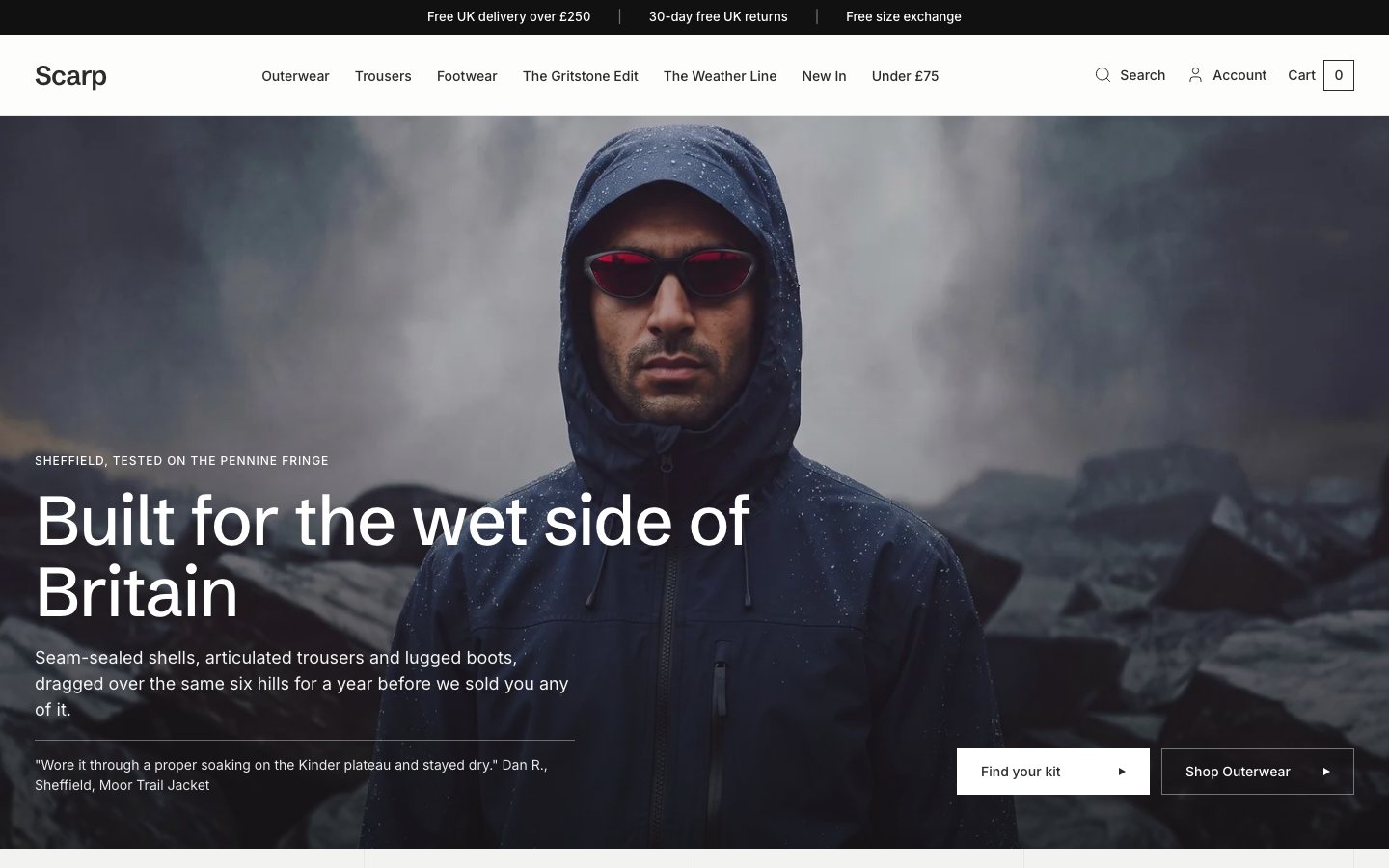 Scarp
Clothing & Apparel
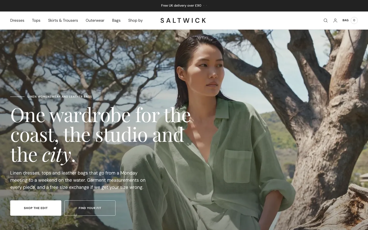 Saltwick
Clothing & Apparel
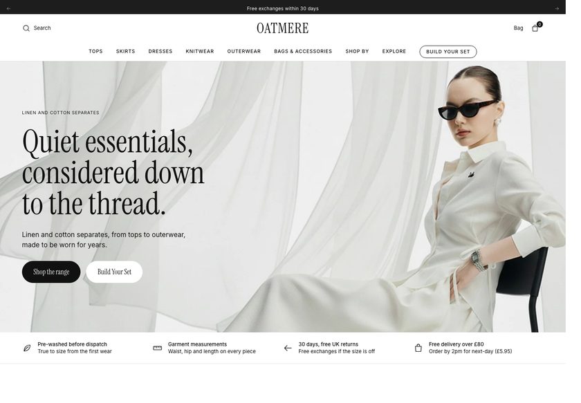 Oatmere
Clothing & Apparel
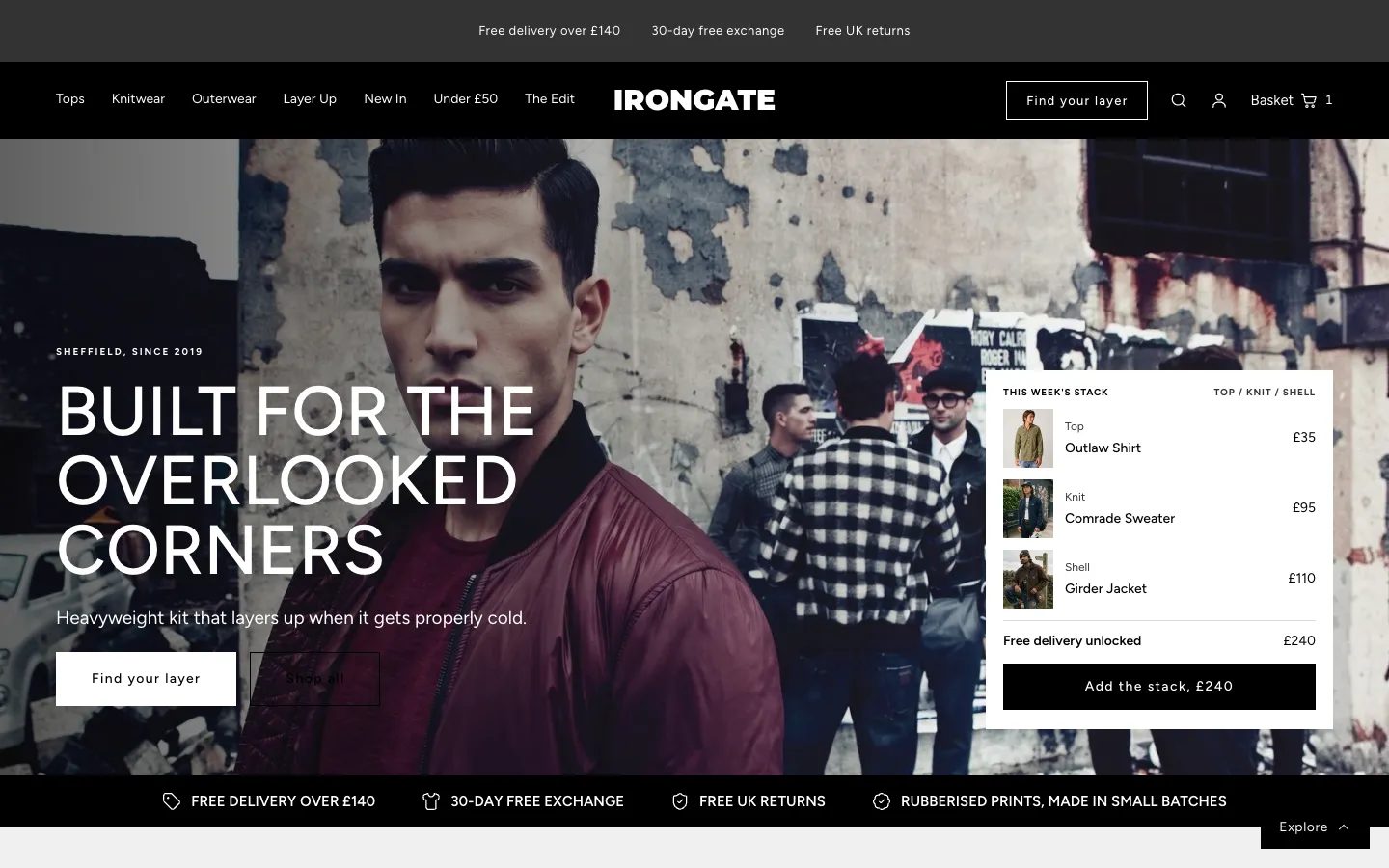 Irongate
Clothing & Apparel
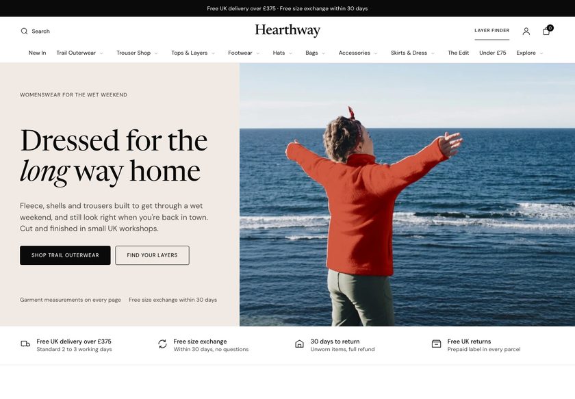 Hearthway
Clothing & Apparel
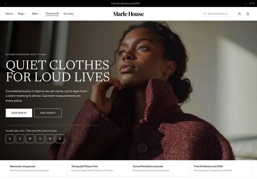 Marle House
Clothing & Apparel
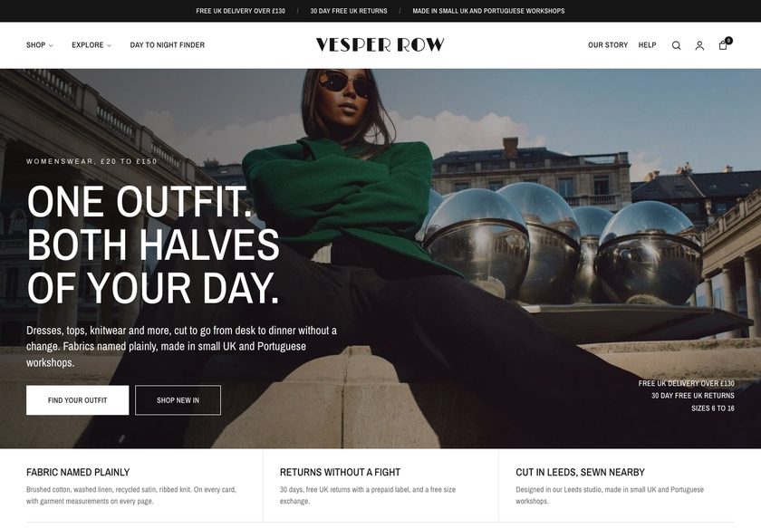 Vesper Row
Clothing & Apparel
A CRO teardown of Be & Beauty, a UK skincare and haircare store with dermatologist-approved products, covering the homepage, the cleansers collection page and a product page, plus a redesign concept.
Pressing play loads the video from YouTube — you can allow it for every teardown under cookie preferences.
Be & Beauty sells a wide range of skincare and haircare, including the NovaClear brand, and the products are approved by a dermatologist. The navigation bar already gives visitors clear routes into the store, which most sites get wrong. Reviews exist, 193 of them at 4.7, and the product page shows free UK shipping, a quantity picker and an upsell beside the add to cart button.
The problem is that the homepage behaves like a catalog. It shows acne-prone skincare, SPF and anti-hair loss products the moment someone arrives, before telling them what the business is, who it serves, or why anyone should trust it. The dermatologist approval and the reviews are the strongest things the store has, and both sit where a first-time visitor will not look.
The same pattern repeats further down. The collection page lists cleansers with an image, a name and a price, so every product looks the same and comparing two means opening two pages. The product page carries a single review, a long description that nobody will read, and no word on delivery times or returns next to the button that asks for money. Nothing on the page justifies the price.
The direction our CRO strategist set out is to make the site work like a salesperson instead of a shelf. Lead with the dermatologist and the reviews, ask the visitor what they need through a short routine finder, then use product cards and filters that carry real decision points. The one idea worth remembering: the ingredients for conversion are already on the site, they are just in the wrong places.
The homepage, collection page and product page all behave like a catalog: products with an image, a name and a price, shown before the site has said what the business is, who it is for, or why a stranger should trust it.
A store that leads with its dermatologist approval and its 193 reviews, asks visitors what their skin needs through a short routine finder, and uses product cards and filters that let people choose without opening every page.
More first-time visitors reaching a collection with confidence, fewer leaving a product page over unanswered delivery and returns questions, and larger baskets through routines, bundles and subscripti
Five dimensions, each scored out of ten.
15 issues found, 18 fixes proposed.
A visitor can guess from the name and the imagery that this is skincare, but the first screen never states what the business does, who it is for, or whether other people trust it.
The products are approved by a dermatologist, which is the strongest trust signal the store has, yet it is not at the top of the homepage where a first-time visitor would see it.
The store has 193 reviews at 4.7, but the only place that number appears on the homepage is the footer. Visitors expect reviews near the hero and beside products, not at the bottom of the page.
The first thing the homepage does is offer acne-prone skincare, SPF and anti-hair loss products for sale. It is the equivalent of a shop assistant pitching before asking what the customer came in for.
The bestsellers block shows each product with a name and a price and nothing else, so it lists what is available but gives no way to compare one bestseller against another at a glance.
A second hero section further down reads only Shop NovaClear. It does not explain what the brand is, who it suits, or why a visitor should click, so it adds a scroll without adding a reason.
Trending Skincare, Bundles and Care, and Trending Hair Care each present another grid of image, name and price. Four catalog blocks in a row do not help anyone discover the right product.
The reviews, the dermatologist, the routines and the bestsellers are all present on the homepage, but spread out in the wrong order, so none of them does its job of building confidence before the pitch.
The cleansers collection has a clear title and a short description, but the cards below carry only an image, a name and a price, so two cleansers cannot be told apart without opening both product pages.
There are no filters by skin type, key active or brand, no useful sorting, and no sub-categories or visual cues, so the page cannot do its one job of helping a visitor find the right product.
The product page says free UK shipping but not when the order will arrive, what happens if the product is not as expected, or how returns work. Those questions sit in the buyer's mind at the exact moment of the click.
The product page shows one review. The store has nearly two hundred across the site, but none of that social proof reaches the page where the purchase decision is actually made.
Product information is written as one long block of text. Nothing on the page is readable at a glance, and nothing justifies the price or explains what the product will do for this visitor's skin.
The only cross-sell is a generic You May Also Like row at the bottom. It is fine, but it does nothing to show which products belong together in a routine or to lift the average order.
The navigation bar is already better than most, but it is organised by product category only. A visitor with acne or sensitive skin has no route that starts from their problem.
State in the first screen what Be & Beauty sells, who it is for, and why it can be trusted. The redesign puts the dermatologist approval and the review count in the hero so those questions are answered in seconds.
Put the dermatologist approval in the hero and give Dr. Helena a dedicated section lower down, with a photo and a short note on which products she has approved, so the claim is visible and credible.
Show the 4.7 rating and review count in the hero, under the bestsellers, and in a dedicated trust section with real customer photos and the routines real people have used.
Add a Find My Routine in 2 Minutes button that asks about main concern, current products, fragrance preference and whether the visitor wants one product or a full routine, then recommends products with reviews attached.
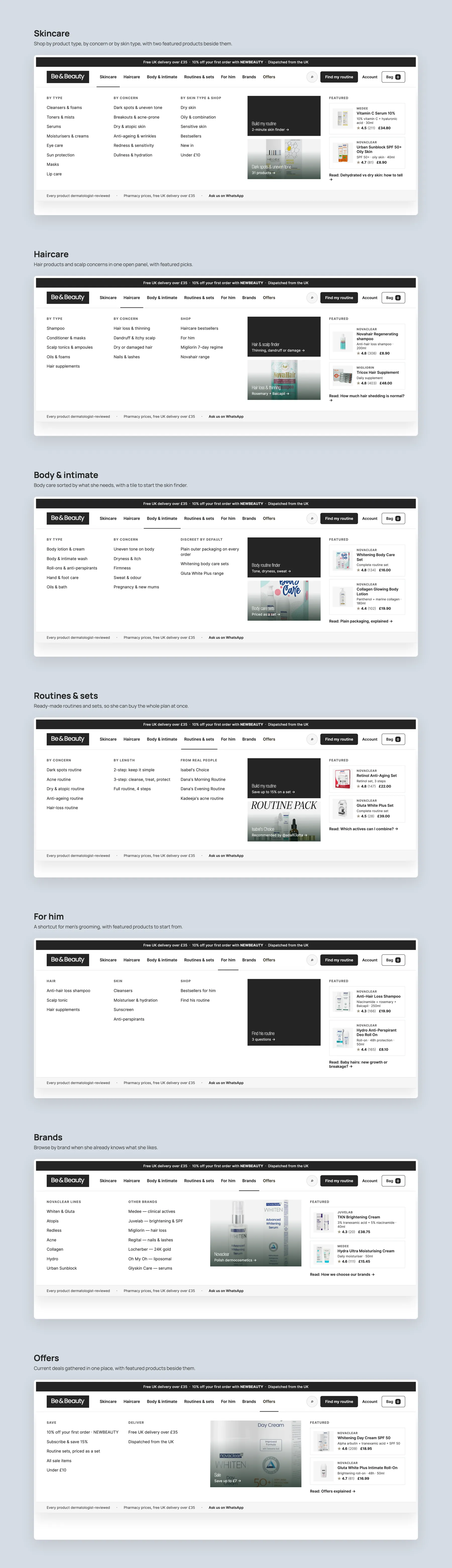
Keep the existing routes but group them into Skincare by type, by concern and by skin type, with Hair Care, Body and Intimate, Routines, For Him, Brands and Offers alongside, so every visitor has a path that starts from their need.
Right under the hero, offer tiles such as breakouts and acne-prone, dry and atopic, or sensitive skin, each linking to a collection, so a visitor who is unsure can start from the problem rather than the product.
Give every card a badge, a clear name, two or three decision-making points such as what it is for and what it contains, the size in millilitres, the review rating and the price, so bestsellers can be compared without clicking.
Show bestsellers only after the hero, the routine finder, the concern tiles and the dermatologist section, so by the time products appear the visitor already knows what the store is and whether to trust it.
Add a routines section with ready-made sets and a Build Your Own Routine button that runs the finder and assembles the products, so the site sells three products to one person instead of one product to three.
Let visitors choose a 4, 6 or 8 week routine or a monthly subscription, and offer subscribe and save at 15 percent on the product page, so repeat skincare purchases become automatic rather than occasional.
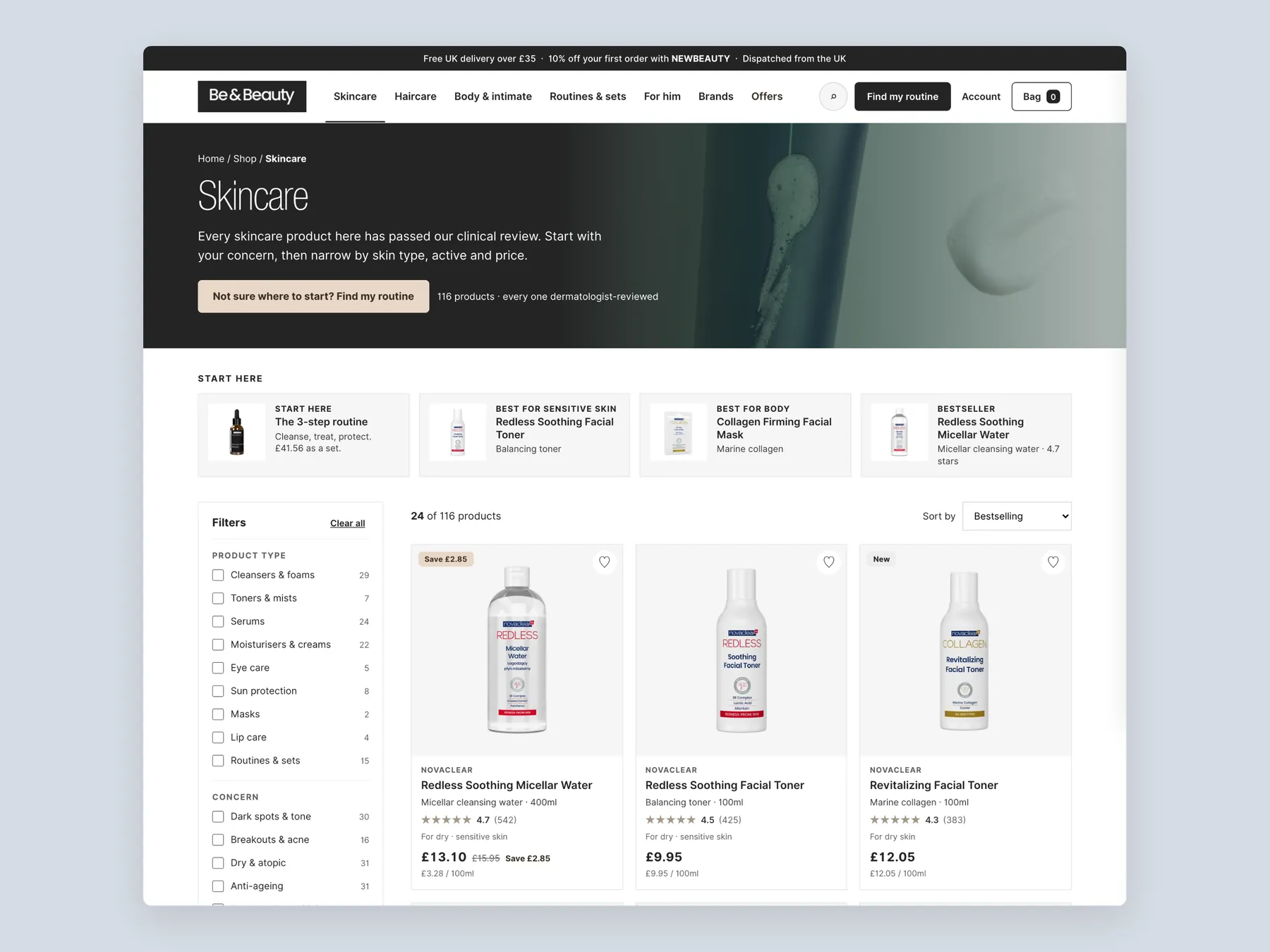
Add filters by product type, skin type, key active and brand, plus a price range slider, and quick entry tiles such as start here, 3-step routine, sensitive skin, body and bestsellers at the top of the cleansers page.
After the product grid, offer an add the whole routine to bag section, then a trust block and frequently asked questions, so the page lifts the order value and reassures before the visitor leaves.
Beside the Add to Bag button, state the dispatch time, the expected delivery day, the returns policy and the review rating, so every question a buyer has at the moment of purchase is answered on the spot.
Show a bar reading add this much more for free UK delivery under the price, so visitors have a reason to add a second product or a routine instead of checking out with one item.
Include a Make It a Gift toggle that adds wrapping and a note field, since many skincare purchases are for a partner, a daughter or a son rather than for the buyer.
Replace the long text with short blocks covering what it does, how to use it, and what to expect from day one to week four, so the page justifies the price without asking anyone to read.
Add a buy all three routine offer, a frequently bought together block and a people who bought this also bought row, then end with a more from this concern section and the shipping and returns reassurance.
Pull the storewide review count and rating onto each product page alongside any product-specific reviews, so a product with one review still shows the full weight of the store's happy customers.
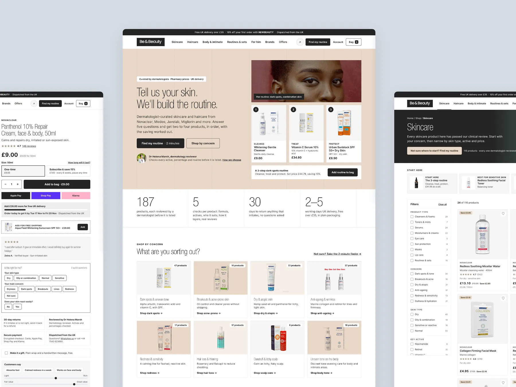
A concept redesign created by Convertica Studio from this audit. It shows how the store could work, it is not the live store.
The top of the page leads with the skin routine offer, and the lower half carries the page down to the footer.
Three pages side by side: the product page on the left with its buy column, the homepage in the centre and the skincare collection on the right.
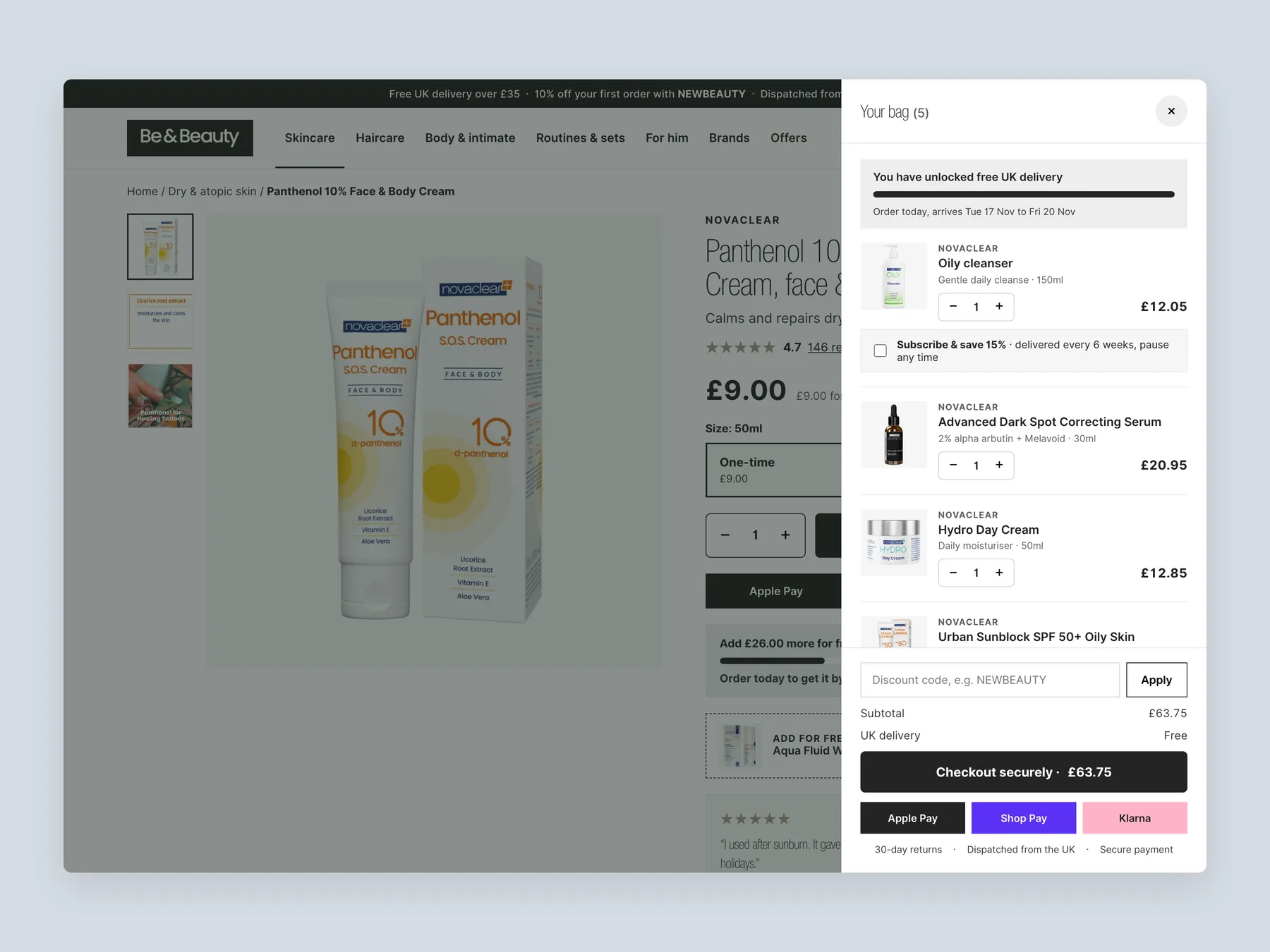
The whole drawer is visible with five lines and the order summary, while the page behind stays readable.
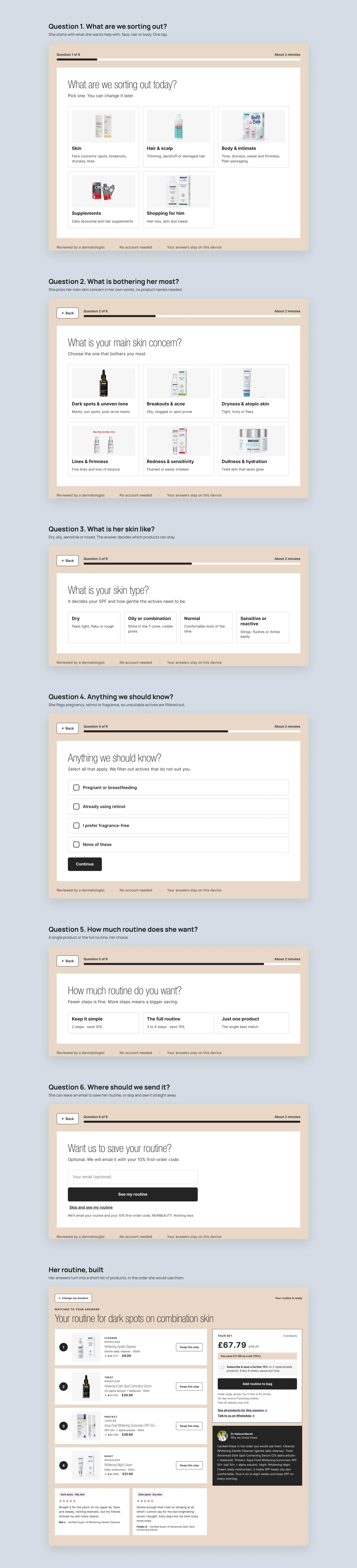
Six short questions, each with its own screen, ending in a routine built from her answers.
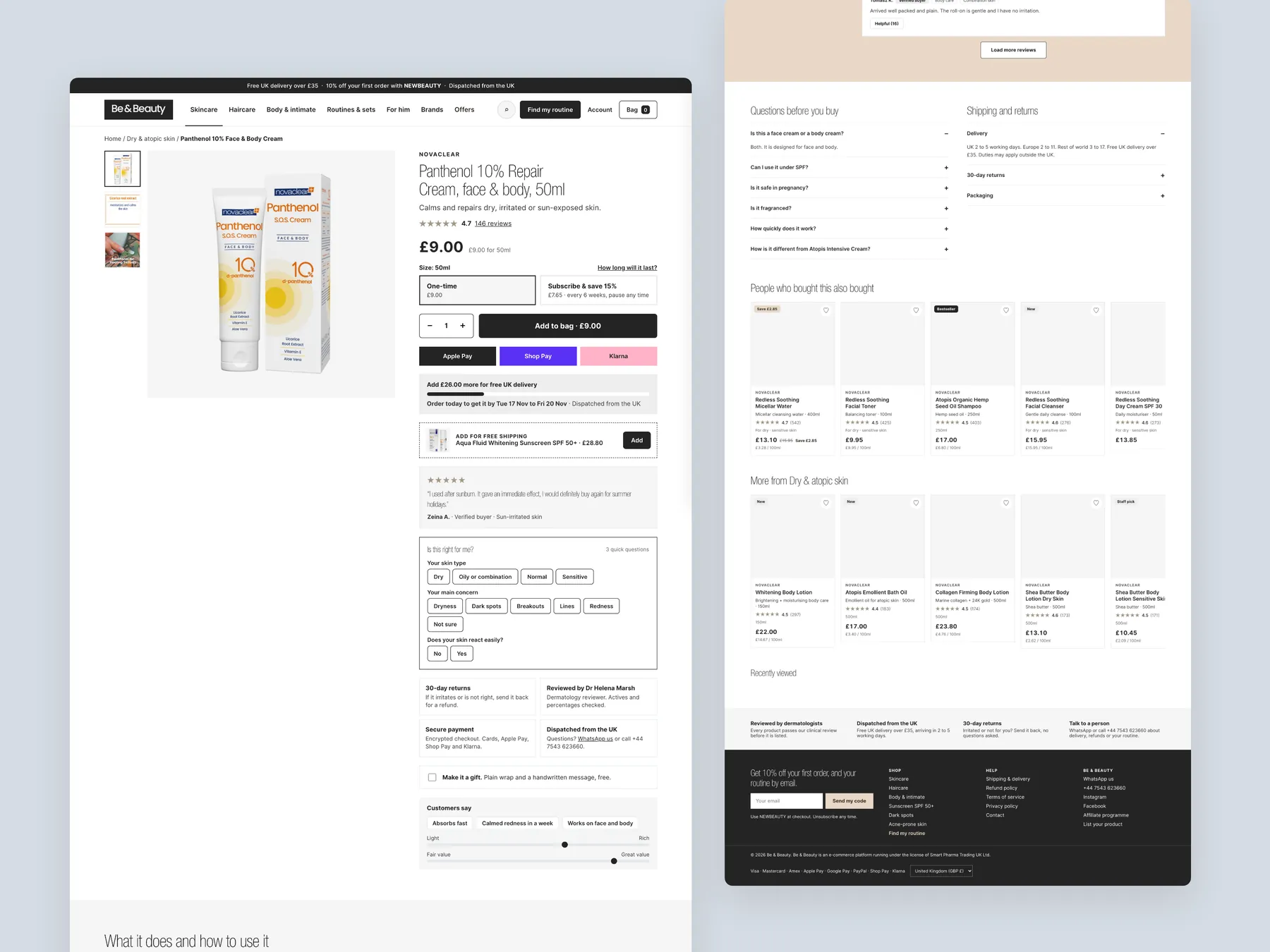
The buy box sits whole in the first screen and the page runs on to the footer.
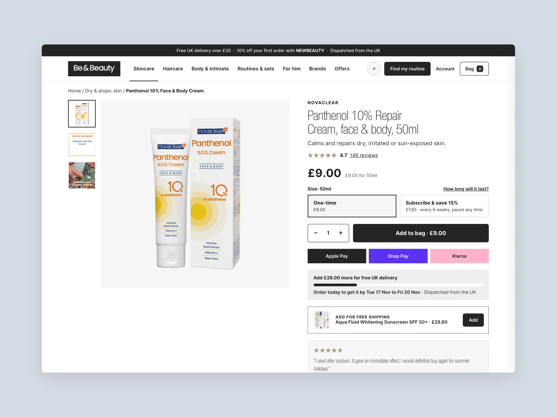
The product page first screen: header and buy box together, so the shopper sees the product, the price and the button at once.
The skincare collection first screen with the header, the start-here row, the filters and the first row of products.
Each panel is open to show its columns, tiles and featured products.
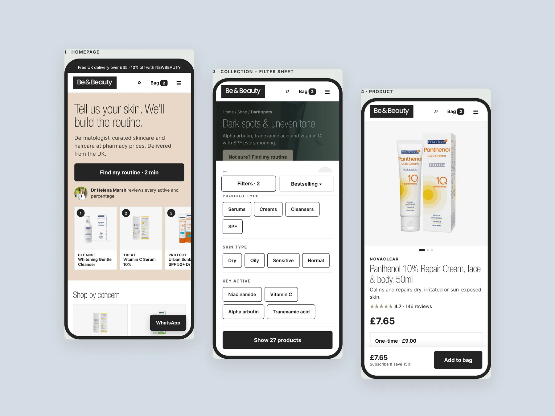
Three phone screens, staggered: home, collection and product with a sticky buy bar, designed for the phones most shoppers use.
Be & Beauty is a UK store selling skincare and haircare, including the NovaClear brand, with bundles and routines alongside individual products. The products are approved by a dermatologist, which our CRO strategist called the best part of the store.
The homepage behaves like a catalog. It starts selling acne-prone skincare, SPF and anti-hair loss products the moment someone lands, before saying what the business is, who it is for or why anyone should trust it. The trust signals exist but sit where visitors will not look.
No. The audit is explicit that the products are not the problem and that the collection is wide and dermatologist-approved. The issue is the presentation layer, which does not help the traffic the store already has feel confident enough to buy.
The store is not currently running ads. The audit recommends first making sure the site converts the visitors it already gets, then adding paid traffic once that is proven, because at that point more traffic reliably means more conversions rather than more wasted spend.
The store has 193 reviews at 4.7, but on the homepage that number only appears in the footer, and the product page reviewed shows a single review. The audit recommends moving reviews to the hero, under bestsellers and beside the add to cart button, and using storewide reviews on every product page.
It is a short finder in the redesign concept that asks about the visitor's main concern, what they already use, whether they prefer fragrance-free, and whether they want one product or a full routine. It then recommends products with reviews attached. Our CRO strategist describes it as the digital version of asking how can I help you.
The redesign keeps the clear title and short description but adds entry tiles such as start here and sensitive skin, filters by product type, skin type, key active and brand, a price range, and product cards with badges and decision points. It closes with an add the whole routine section, a trust block and FAQs.
Delivery, dispatch, returns and the review rating move next to the Add to Bag button, with a subscribe and save option and a free delivery progress bar. The long description becomes scannable blocks on what it does, how to use it and what to expect from day one to week four, followed by routine bundles, frequently bought together and FAQs.
The audit is clear that this is not about colours, fonts or cosmetic changes. The redesign concept is about the order in which information appears, what each page answers, and where friction and hesitation are removed. Any images or prices in the prototype that differ from the live site are placeholders.
Through pre-built and build-your-own routines, 4, 6 and 8 week routine options, a monthly subscription, a buy all three offer on the product page, frequently bought together blocks, a gift option and a bar showing how much more to add for free UK delivery.
The recording gives two options. A complete rebuild is £3,500, paid as £1,000 to start, £1,500 once the design is approved and £1,000 on completion, with a timeline of four to five weeks. Quick fixes to the current site are £2,200, paid as £1,200 to start and £1,000 on completion.
The recording runs 29 minutes. It covers the homepage, the cleansers collection page and a product page on the live site, then walks through a clickable redesign concept for all three pages, and ends with the three ways forward and the pricing.
Tell us about your store and we'll send a personalized 5-minute video showing exactly where you're losing buyers — and how to win them back.
Takes about 40 seconds. No call required.