




Most of your buyers get the worse version.
Around seventy percent of ecommerce traffic arrives on a phone, and almost every store is designed on a 27-inch monitor. Mobile does not need a narrower layout. It needs a different order of argument.
Six screens, in the order the decision needs them.
Tap through a product page rebuilt for a thumb. The highlighted element is what that screen is responsible for.
Six things desktop gets away with.
The bottom third is the only comfortable place to act.
Easy reach
Bottom third. Add to cart, quantity, variant selection, sticky bar.
Reachable
Middle. Price, reviews, reassurance, the primary claim.
Stretch
Top. Logo, search, menu — things tapped once per session, not per decision.
Six deliverables, all device-tested.
Three to five weeks typically, depending on how many templates need reordering. Quoted fixed from the audit.
Mobile audit against the real thing
Recorded on a phone, not a resized desktop window. Throttled connection, real thumb.
Reordered mobile argument
A per-template running order for what appears when — homepage, collection, product, cart.
Rebuilt buy box and sticky bar
The decision block redesigned for one column, plus a persistent add-to-cart.
Navigation and search rework
Menu, filters and search built for a thumb rather than ported from desktop.
Touch-target and legibility pass
Every interactive element brought to standard across every template.
Before-and-after on device
Side-by-side recordings so the change is visible, not asserted.
Responsive is not the same as optimised.
Responsive means it fits. Optimised means the argument is reordered for the context. A responsive theme takes a desktop running order — hero, categories, products, reviews, trust — and stacks it into a nine-screen scroll where proof arrives four screens after the price. Fitting and persuading are different problems.
Some gap is normal — mobile carries more discovery traffic and more interrupted sessions. A large gap is not. The useful question is whether your mobile conversion is below your own desktop by more than the category typically is, and that is answerable from your analytics in about ten minutes.
Often yes, and that is frequently the cheapest engagement we run. Where the structure is shared — the buy box, the navigation, the data model — changing one changes both, and we will say so before quoting.
No. Separate mobile sites split your SEO, double your maintenance and go stale. One responsive theme, with mobile-specific ordering and components where the context genuinely differs.
On real devices, on throttled connections, with the recordings included in the handover. A layout that only works on the newest phone on office wifi is not tested.
Yes — every rebuild is designed mobile-first as standard. This service exists for stores that do not need a rebuild and only need mobile fixed.
The first screen of a phone is roughly 380 by 500 points — a carousel and a logo can consume all of it. We give mobile its own running order per template: name, price and one reason visible without scrolling, proof beside the title rather than in a tab, the decision block in one column, reassurance directly under the add-to-cart, and a sticky bar once the buy box scrolls away.
Four, applied to every template: every touch target clears 44 by 44 points, including swatches and quantity steppers; body text never drops below 16px, because below that iOS zooms the viewport on input focus and breaks the form; one column, always; and zero hover-only affordances — if it only reveals on hover, on mobile it does not exist.
The screen splits into three zones. The bottom third — about 34% — is easy reach, so it carries add to cart, quantity, variant selection and the sticky bar. The middle 38% is reachable: price, reviews, reassurance, the primary claim. The top 28% is a stretch, so it holds only what is tapped once per session — logo, search, menu — rather than once per decision.
Six deliverables: a mobile audit recorded on a real phone over a throttled connection; a reordered per-template running order for homepage, collection, product and cart; the rebuilt buy box and sticky bar; navigation, filters and search reworked for a thumb; a touch-target and legibility pass across every template; and side-by-side before-and-after recordings on device, so the change is visible rather than asserted.
Watch your store judged on a phone.
Every free audit includes a mobile section recorded on a real device. No call, no obligation, two to three business days.
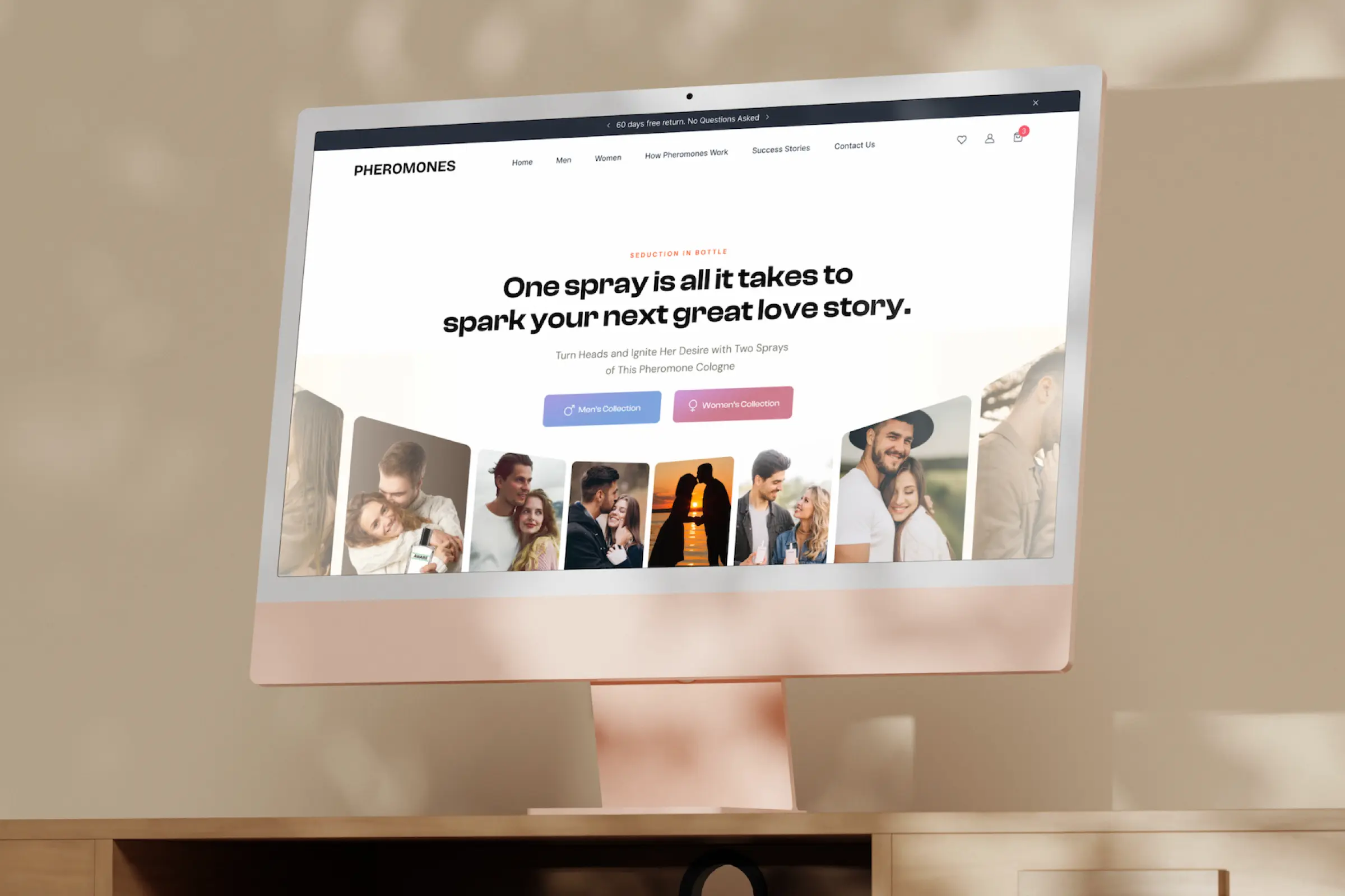
Mobile-first work is part of the measured record: Pheromones: Increased Conversion Rate by 84% and BLIV: Increased Consultation Requests by 52%.