Convertica Studio
CRO teardown Engraved Gifts & Mugs

Above The Rest CRO Audit

A CRO teardown of Above The Rest, a Shopify gift store selling engraved mugs, journals and boxed gifts, covering the homepage, the mugs collection and the product page, followed by a proposed redesign of all three.

14
Issues found
18
Fixes proposed
37
Minutes of tape
4.2
Overall / 10
37 min watch
01The teardown

Watch the full 37-minute recording.

Pressing play loads the video from YouTube — you can allow it for every teardown under cookie preferences.

02Executive summary

What we found.

Above The Rest sells engraved mugs, journals and boxed gifts, and the products themselves hold up. Our CRO strategist singled out the mug range as genuinely attractive, the standard and luxury box options as a sensible choice, and the note that most products are assembled and shipped from the USA as a real guarantee. The product page already shows secure checkout, stock counts and a delivery estimate.

The core problem is that nothing tells a new visitor where they are or why to trust the site. The hero shows a big logo, a stock photo of an anxious man and the line shop new trending gifts every day. It never says what the brand does, who the gifts are for, or whether anyone else has bought here. Reviews are missing from every page, and the reviews button opens nothing.

That gap repeats further down. Under the hero every bestseller is on sale, so the discount means nothing, and add to cart only appears on hover. The mugs collection marks every item as a bestseller and every item as reduced, with no filters, no sizes and no way to compare. The product page has the right pieces, urgency, delivery timing, secure checkout, but they sit scattered and the sticky header eats the screen.

The redesign turns the homepage into a salesperson. The hero says what the store does and who it is for, backed by reviews and a shipping and guarantee bar. A gift finder asks who it is for, the occasion, the budget and the date, then recommends products. Collection cards explain themselves and the product page adds gift wrap and a bundle. The one idea to keep: win trust first, then show a path.

03The verdict

Problem, opportunity, impact

Core problem

The site never tells a new visitor what the store does, who the gifts are for, or whether anyone has bought here before. There are no reviews on any page, and the hero shows a logo and a stock photo instead of answering those questions.

Main opportunity

The products are already good and the gifting angle is clear once you dig. With a hero that states the offer, a review strip, a gift finder and shop by recipient, occasion and gift type paths, the same traffic could be guided from landing to checkout.

Estimated impact

The recording does not state traffic or revenue. It argues that visitors already arriving would hesitate less, find a gift faster, and add wrap, cards and paired items, lifting orders and average orde

04How we audited

Scored across five dimensions.

4.2 Overall

Five dimensions, each scored out of ten.

The five passes
  1. 01
    Homepage & PDP review Where attention leaks and buyers hesitate, section by section.
  2. 02
    Mobile UX audit 70% of your traffic — judged on its own terms.
  3. 03
    Trust & credibility check The signals that make first-time buyers convert.
  4. 04
    Collection & discovery Filtering, merchandising and guidance from browse to buy.
  5. 05
    Prioritized CRO roadmap Ranked by impact vs. effort, ready to ship.
3 of 5 dimensions scoring four or below
Branding 5/10
UX 4/10
Trust 3/10
Product Page 5/10
Conversion 4/10
05What we'd fix

Every issue, paired with its fix.

14 issues found, 18 fixes proposed.

Problems identified

The Hero Does Not Say What The Store Is

A visitor lands on a large logo, a stock photo of an anxious man and the line shop new trending gifts every day. Nothing states what the brand sells, who it is for, or why it can be trusted.

The Sticky Header Covers Most Of The Screen

The bar holding the search field, cart and logo stays fixed as you scroll and takes up a large share of the viewport on every page, so nothing below can be seen in full without extra scrolling.

Every Bestseller Is On Sale At Once

The first section under the hero shows bestsellers with every single item discounted. When everything is on sale, no discount reads as a reason to choose one product over another.

Product Cards Hide The Add To Cart Button

Homepage and collection cards show a percentage off, a name and a price. The quick buy button only appears on mouse hover, so a visitor is shown products with no visible way to act on them.

Most Popular Gifts Has No Context

A section titled most popular gifts lists products without saying who they suit or which occasion they fit. A gift shopper cannot tell whether any of them is right for the person they have in mind.

Trust Guarantees Sit At The Bottom Of The Homepage

The delivery, shipping and secure checkout reassurances exist, but they are placed at the very foot of the page, long after the point where a visitor decides whether to keep going.

The Homepage Offers No Buying Path

There is no route by recipient, occasion, budget or gift type. The page shows products but never asks who the gift is for, so a visitor has to work out the catalogue on their own.

The Collection Page Only Sorts, It Never Filters

The mugs collection offers a sort by best selling or alphabetical order and nothing else. There is no way to narrow by recipient, size or style, so the page reads like a catalogue rather than a guide.

Every Mug Is A Bestseller And Every Mug Is Reduced

Sorting by best selling returns the whole collection, and every mug carries a discount. With no visual cues to separate products, the labels stop meaning anything and comparison becomes impossible.

Collection Cards Give Nothing To Compare

Each mug card shows an image, a name and a price. All are listed as ceramic with no sizes stated, so a visitor has to open every product page to learn the basics that should help them choose.

Reviews Are Missing From Every Page

There is no social proof anywhere on the site. The product page has a reviews button, but clicking it shows nothing, which is worse than having no button at all.

Box Options Are Not Explained

The product page offers a standard box and a luxury box without saying what makes the luxury box different, and choosing the standard box means scrolling back down past everything to see the result.

Urgency Elements Feel Fragmented

Only 30 left, eight people buying, a countdown to a delivery date and secure checkout notes all sit on the page, but they are scattered pieces, and the emoji in the urgency line undercuts a professional store.

Related Products Are The Only Next Step

After the add to cart button the page shows related products and nothing more. There is no gift wrap, no message card, no pairing and no reason to add a second item, so leaving is as easy as buying.

Recommendations

Rewrite The Hero To Answer The Three Questions

State what the store sells, who it is for and why it can be trusted in the first screen. Replace the stock photo with the gifts themselves and make the gifting purpose unmistakable in the headline.

Put A Review Rating Strip Directly In The Hero

Show a star rating and review count next to the headline so the first thing a visitor learns is that other people have bought here and been happy. This is the single fastest trust signal the site lacks.

Move Shipping, Returns And Guarantees Under The Hero

Lift the delivery, returns and money back reassurances from the footer into a bar directly beneath the hero, where they answer the hesitation at the moment it forms.

Add A Shipping Promise Bar At The Top

Run a thin bar above the header stating that orders ship within one business day with an arrival estimate, plus a free shipping progress line such as you are a set amount away from free shipping.

Reorganise The Menu By Recipient, Occasion, Budget And Gift Type

Replace the flat menu with routes for her, for him, by occasion, by budget and by gift type so a shopper can pick the path that matches how they already think about buying a gift.

Build A Gift Finder That Acts As The Salesperson

Add a finder that asks who the gift is for, the occasion, the message for the card, the gift type, the budget and the date needed, then recommends a short set of matching products.

Add Shop By Person, Occasion And Gift Type Sections

Below the hero, give three guided sections in that order: start with the person, then shop by occasion such as birthday or Mother's Day, then shop by gift type such as mugs or journals.

Curate A Small Bestseller Section With Self Explaining Cards

Pick a few genuine bestsellers and show each with the engraved saying, name, a one line description, a review rating, the two box options and a visible plus button to add to cart without opening the page.

Justify The Price Against Marketplaces

Add a comparison chart showing why buying here beats Amazon, Temu or other gifting sites, covering the hand boxed gift, the message card, delivery and the guarantee.

Show Reviews With Photos And How The Gift Is Packed

Add a reviews section with customer images, a someone here boxes your gift by hand section, and a how we ship section so the visitor can picture what arrives and who prepared it.

Offer A Birthday Reminder Feature

Add a never miss her birthday section where a visitor can set a reminder and pick a gift ahead of time, giving a reason to return even if they do not buy today.

Open The Collection With Sizes And Materials

Start the mugs collection with a short intro stating that every gift comes with a message, and that mugs are available as 11 oz and 15 oz ceramic and insulated camping mugs, so basics are clear before browsing.

Add Filters, Badges And Recipient Tags To Collection Cards

Let shoppers filter by recipient, show badges such as for daughter or for anyone, and give each card a description, price and rating so products can be compared without opening each one.

Use Pairing Offers Instead Of Blanket Discounts

Replace the all on sale approach with a pair it with section offering a journal, a second mug or wrap with a personalised message, giving a reason for a discount only when the order grows.

Place Reviews, Price And Box Thumbnails At The Top Of The Product Page

Put the rating under the product name, follow with price and a short description, and show the standard and premium box as image thumbnails so the choice is visible without scrolling.

Sell Gift Wrap With A Personal Message At The Add To Cart

Add a gift wrap and personal message option at seven dollars beside the cart button, with a field for the note, so the emotional part of the purchase also raises the order value.

Group Delivery, Guarantees And Secure Checkout Into One Block

Bring the arrival date, the delivery and returns guarantees and the secure checkout note into a single tidy block under the add to cart, and drop the emoji from the urgency line.

Add A Buy Three Bundle And A Questions Before You Buy Section

Offer a choose three and get free shipping bundle below the fold, then close with will it fit, will it last reassurances and a questions before you buy section that handles the last objections.


06The redesign

The version we'd build.

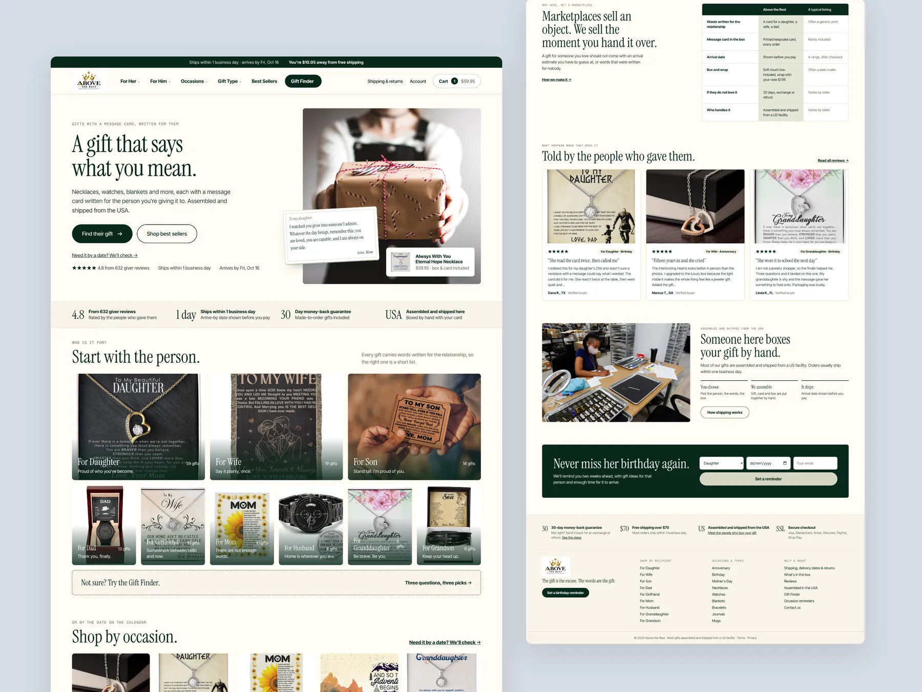
A concept redesign of Above The Rest, a US store selling message-themed gifts: necklaces, watches, bracelets, blankets, journals, mugs and plaques, each with words written for one person. Homepage, mega menu, gift finder, collection, product page and cart, built from the findings of a conversion audit of the live store. Nobody buys a necklace here. A dad buys the words "I'm proud of you" for his daughter, and the necklace is how they arrive. The live store presents like a product feed: every card wears the same sale badge, the free-shipping bar reads "Spend $x", the urgency widget and the delivery estimate render with blanks, and the Reviews tab opens on nothing. The product page asks for a finish and a box before it shows what the card says or what the box looks like. The navigation has the right three paths, by recipient, occasion and gift type, but none of them guides anyone, and the Birthday collection holds almost the whole catalogue. Most single-item orders land just under the free-shipping line, and the gift wrap that would carry them over sits as a separate product nobody is offered. We made the store ask before it shows. The homepage opens on the box with the card visible and one button, Find their gift, then routes by person, occasion and gift type, with the USA story told as three steps and a place for giver reviews and unboxing photos. The mega menu gives each path its own panel with the finder one tap away. A six-question Gift Finder takes who it is for, the occasion, what the card should say, the kind of gift, the budget and the date, and returns three picks with the card message in full, the box choice and an arrive-by line. The collection gets a one-line intro, chips, real filters and cards that carry the recipient, the size and the delivery date. The product page leads with the card and the box, puts delivery and the guarantee under the button, offers gift wrap with a personal note at the point of decision, and replaces the alphabetical related list with gifts matched to the same recipient. The cart shows the free-shipping progress and the wrap, and the phone screens keep the button pinned. Every screen uses the store's own product photography and voice.

A concept redesign created by Convertica Studio from this audit. It shows how the store could work, it is not the live store.

Homepage

The whole page in two columns: the open box and the words in the first screen, the proof ribbon, start with the person, shop by occasion, shop by gift type and the most-given gifts; then the comparison with marketplaces, the giver stories, the USA story, the birthday reminder and the footer.

Above The Rest concept redesign: Homepage, two tall columns

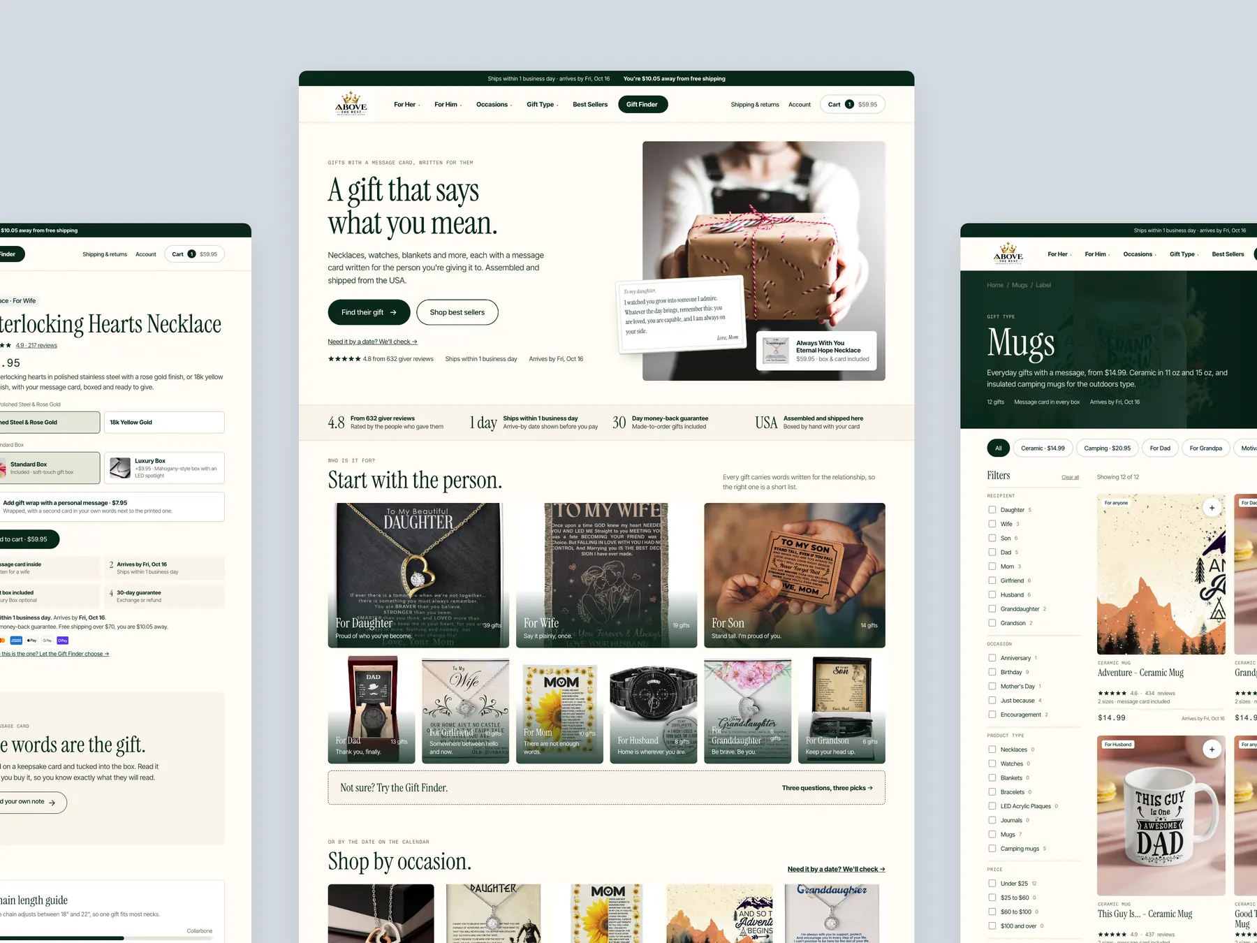
Three pages side by side

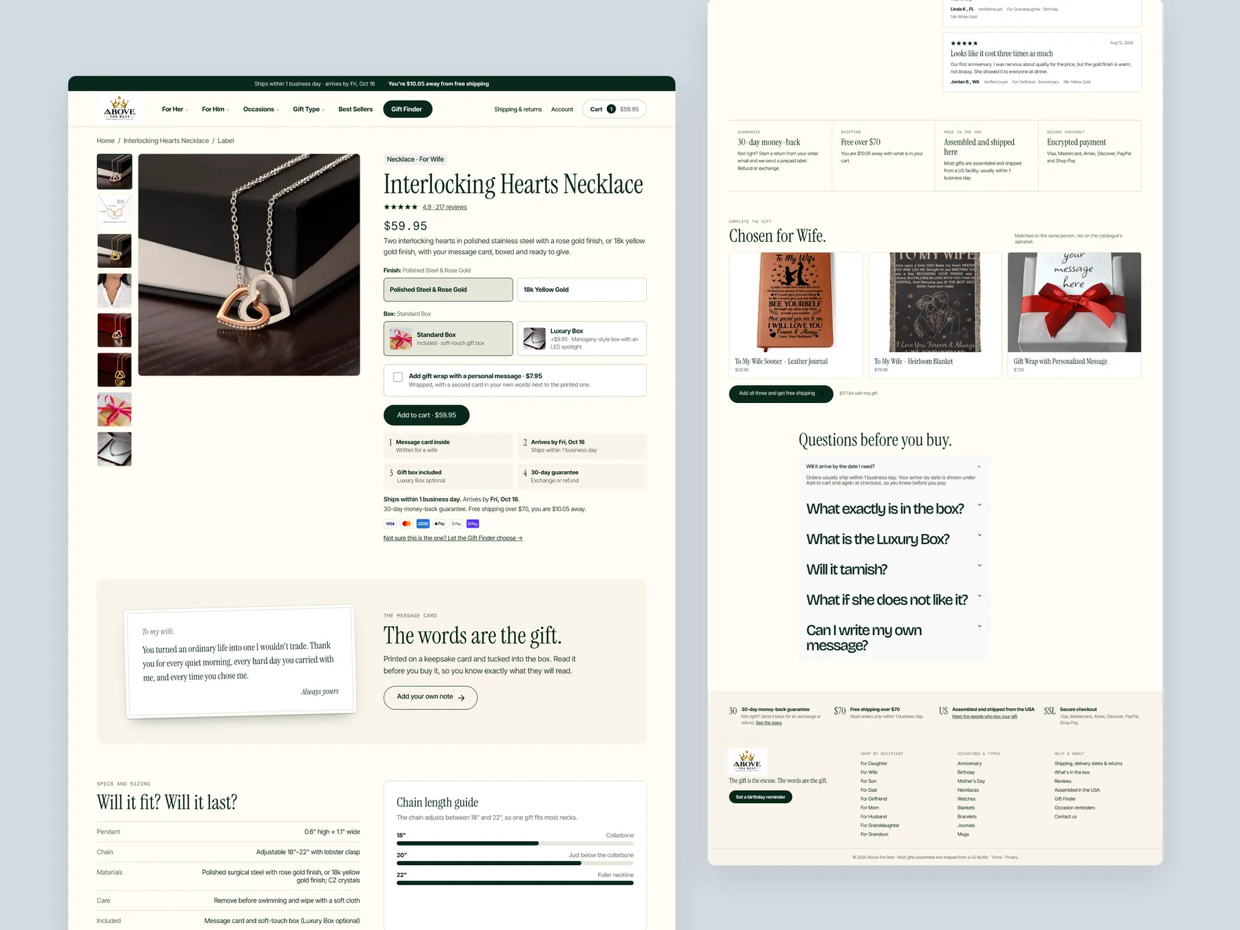
The homepage in the centre, the product page's buy column on the left with its finish and box choices, Add to cart and the four reasons to buy here, the Mugs collection on the right with its banner, chip row and filter column. One system across every page.

Above The Rest concept redesign: Homepage centre, product left, collection right

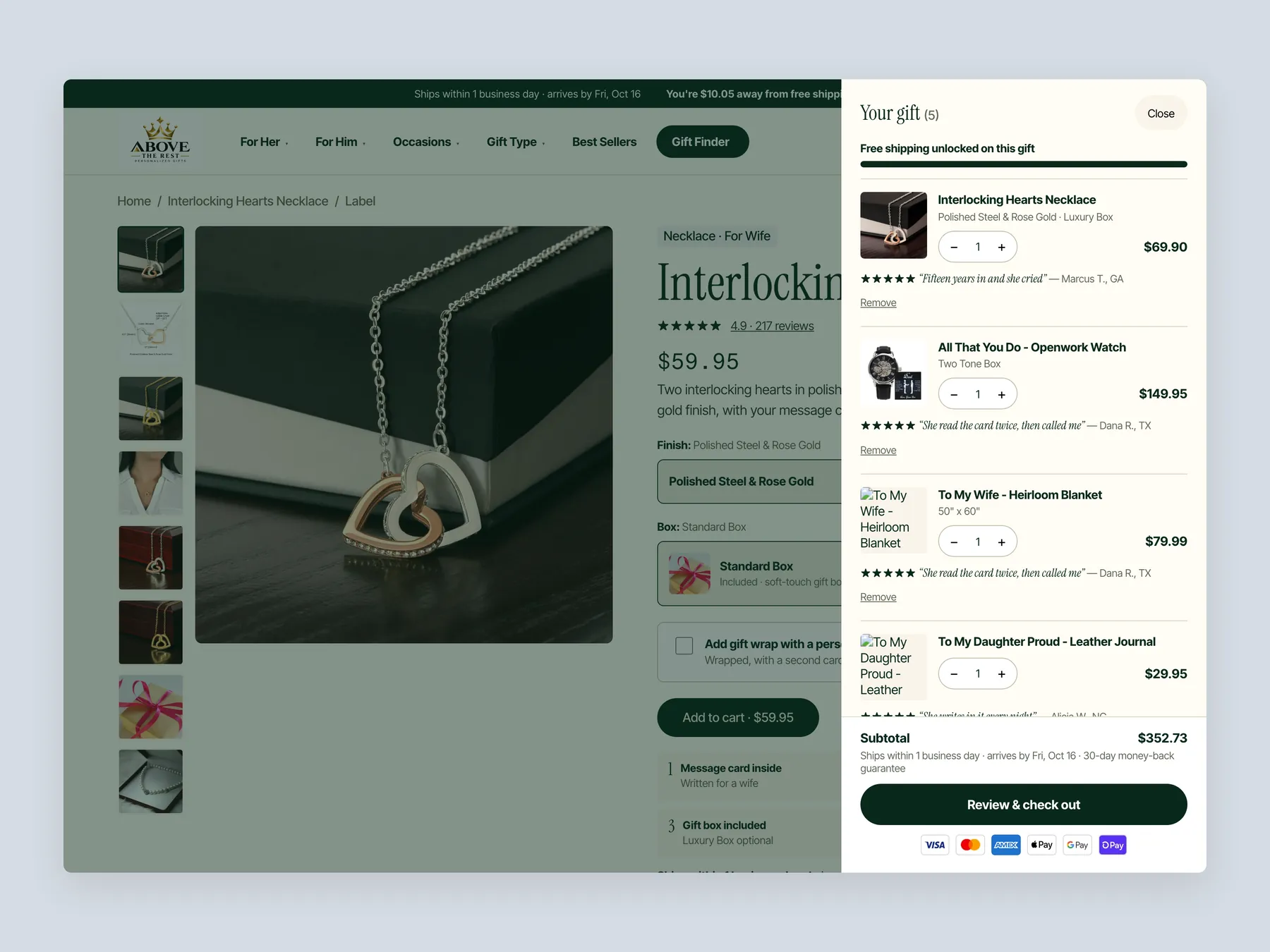
The cart

A slide-over, not a page: the free-shipping bar at the top, one line per gift with its finish, box or size and a short giver quote, then the subtotal, the ships-by line with the money-back guarantee, Review & check out and the payment marks.

Above The Rest concept redesign: Cart slide over open over the product page, whole screen

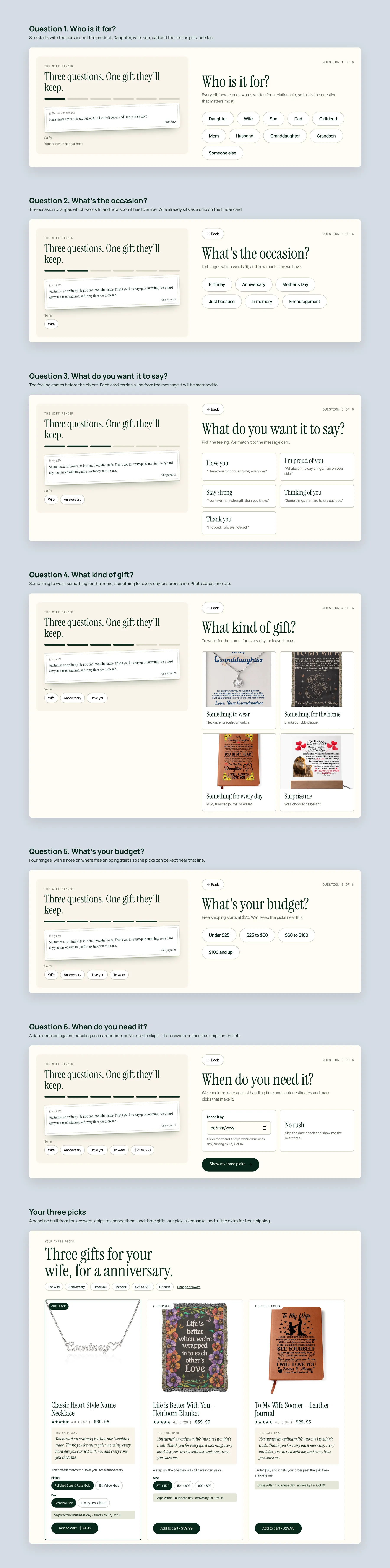
Gift Finder, step by step

Who is it for, what's the occasion, what do you want it to say, what kind of gift, what's your budget, when do you need it, then three picks for that person and that day: our pick, a keepsake and a little extra, each with the card message in full and an arrive-by line.

Above The Rest concept redesign: Gift Finder, step by step

Product page

The whole page in two columns: gallery and buy box, the card printed in full, the fit and care answers, reviews with the opened box, why buy here, the gifts that complete this one, the questions before you buy and the footer.

Above The Rest concept redesign: Product page, two tall columns

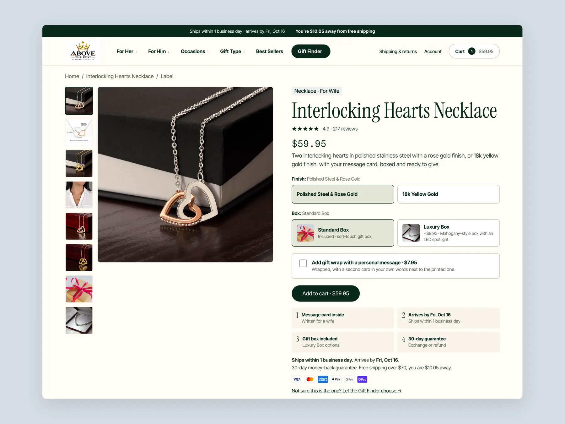
Buy box

Thumbnail rail and hero photo, recipient tag, title, review line and price, finish swatches, the box choice with the luxury box as a priced upgrade, gift wrap with a note as a tick box, Add to cart, the four perks, the ships-by and arrives-by lines, payment marks and the Gift Finder link.

Above The Rest concept redesign: Product page first screen: header and buy box

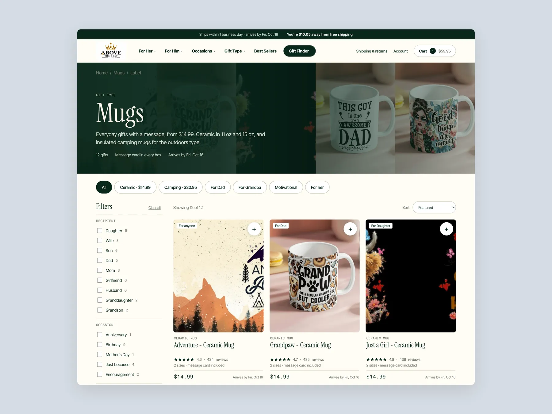
Collection

Breadcrumb, the dark Mugs banner with one line on sizes and materials, the chip row by type and recipient, the filter column by recipient, occasion and product type, the Showing and Sort row, and the first row of cards with a recipient tag, sizes, the price and the arrival date.

Above The Rest concept redesign: Collection page first screen: header, banner, filters, first row

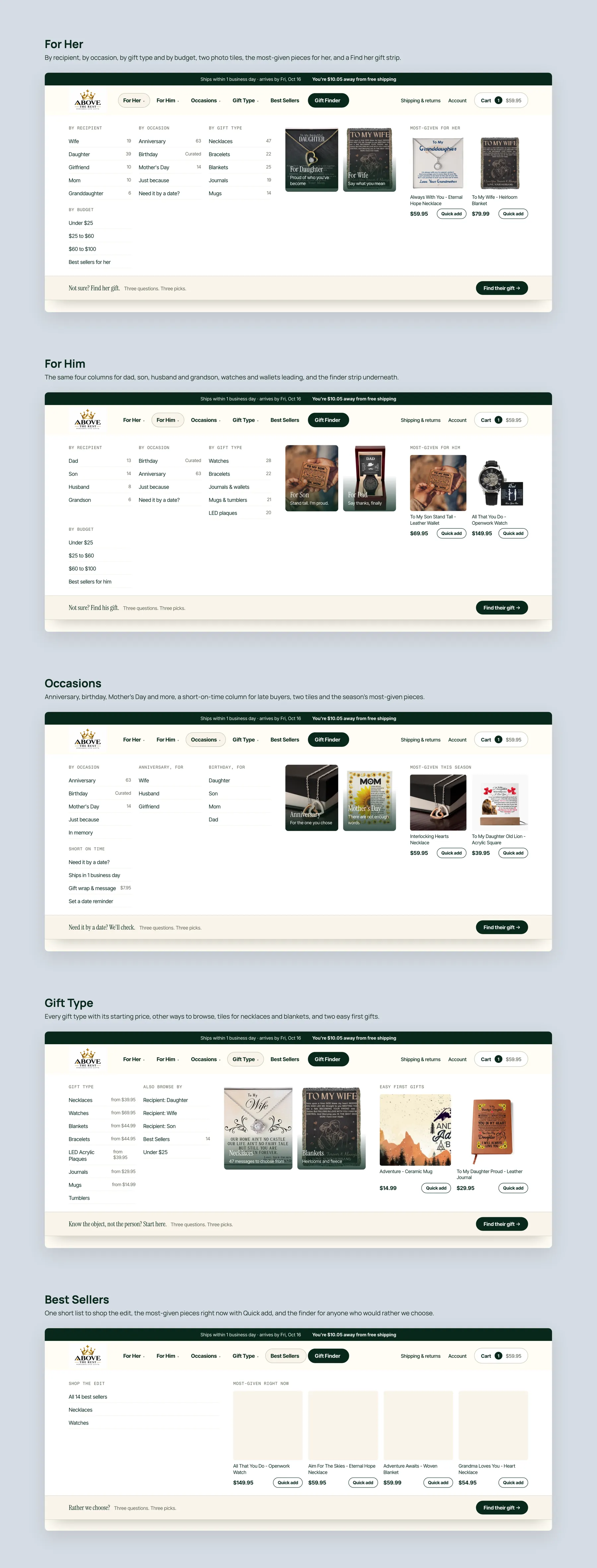
Mega menu, every panel

For Her and For Him with four columns, two tiles and the most-given pieces; Occasions with a short-on-time column for late buyers; Gift Type with starting prices and two easy first gifts; Best Sellers as one short edit. Every panel ends on the finder strip.

Above The Rest concept redesign: Mega menu, every panel open

On the phone

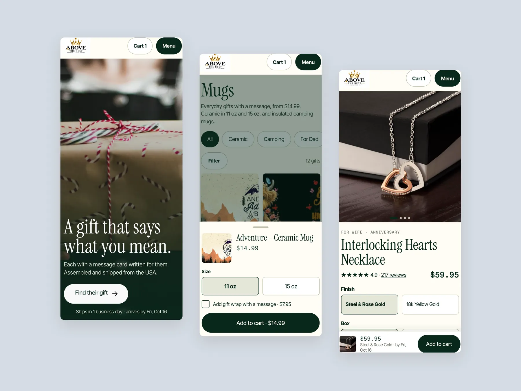
The first screen with the box and Find their gift, the Mugs collection with the quick-add sheet open over it, and the product page with its pinned Add to cart bar. One thumb, one decision at a time.

Above The Rest concept redesign: Three phone screens: home, collection, product
07Key takeaways

The teardown in 7 lines.

  • The biggest opportunity for this store is not more traffic but helping the traffic it already has feel confident enough to buy.
  • A homepage has three to five seconds to say what the brand does, who it is for and why it can be trusted, and this one answers none of them.
  • When every product is on sale and every product is a bestseller, neither label helps anyone choose.
  • Reviews are missing from every page, and a reviews button that opens nothing damages trust more than no button at all.
  • A collection page should remove the work of comparing products, not hand the visitor a catalogue and a sort menu.
  • The product page already has urgency, delivery timing and secure checkout, but the pieces are scattered rather than assembled.
  • A gift finder that asks who, what occasion, what budget and by when is the digital version of a good salesperson.
08Questions

Questions this audit answers.

Above The Rest is a Shopify gift store selling engraved mugs, journals and boxed gifts. Products can be ordered in a standard or luxury box and posted directly to the recipient. Our CRO strategist noted that most products are assembled and shipped from the USA.

The site never establishes trust or direction. The hero shows a logo and a stock photo rather than stating what the store does and who it is for, and there are no customer reviews anywhere on the site. Without those two things a visitor hesitates before they ever reach a product.

Because the products themselves are attractive and the gifting model is sound. Our CRO strategist called out the mug range in particular. The weakness is the presentation layer, which does not help a visitor discover the right gift, trust the store, or follow a path to checkout.

If every product is discounted, no discount gives a reason to choose one item over another, and the sale badge stops meaning anything. The audit found the same issue with bestseller labels, where sorting by best selling returned the entire mugs collection. The redesign uses discounts only for pairing or bundling.

The mugs collection shows an image, a name and a price per card, with no sizes and no filters beyond a basic sort. Every mug is marked as reduced and as a bestseller, and there are no trust signals on the page. The proposed version adds an intro, filters, badges, descriptive cards and a pair it with section.

Partly. It already has stock counts, a delivery countdown, secure checkout messaging and reasons to buy, which the audit describes as kind of working. But the box options are unexplained, the urgency line uses an emoji, the reviews button opens nothing and the only next step is a list of related products.

It is a short guided flow on the homepage that asks who the gift is for, the occasion, the message for the card, the gift type, the budget and the date needed, then recommends a handful of products. The audit describes it as the digital version of a shop assistant who asks what you are looking for.

Through gift wrap with a personal message offered at the add to cart, a pair it with section on the collection page, and a choose three and get free shipping bundle on the product page. The idea is to give a discount only when the order grows rather than marking everything down by default.

Directly under the hero rather than in the footer. The proposed homepage shows a review rating in the hero, then a bar covering delivery, reviews, returns and the money back guarantee, and repeats reassurances near every add to cart button so they appear at each point of hesitation.

No. The recording does not state traffic, revenue or conversion rate for Above The Rest. It points to a revenue calculator on the Convertica Studio site where an owner can enter their own visitor numbers and average order value to see what a change in conversion rate would mean.

Two routes. The owner can make the changes themselves, which the audit notes tends to take months of small edits, or they can schedule a call with Convertica Studio to discuss timeline, scope and investment. The recording mentions that the studio prices well below what agencies typically charge for this kind of setup.

The recording runs 37 minutes. It audits the homepage, the mugs collection page and a product page of Above The Rest, then walks through proposed redesigns of all three pages and closes with the revenue calculator and next steps.

Free CRO audit

See what's quietly costing you sales.

Tell us about your store and we'll send a personalized 5-minute video showing exactly where you're losing buyers — and how to win them back.

Takes about 40 seconds. No call required.

What's included
  • 5-minute video teardown
    A personalized walkthrough of your store, recorded by Eva.
  • Homepage & PDP review
    Where attention leaks and buyers hesitate.
  • Mobile UX audit
    70% of your traffic — judged on its own terms.
  • Trust & credibility check
    The signals that make first-time buyers convert.
  • Prioritized CRO roadmap
    Ranked by impact vs. effort, ready to ship.