










Homepage
Wear what you believe: the hero, the message tiles, the finder strip, then verse tees, conservative and pro-life tees, questions and footer.
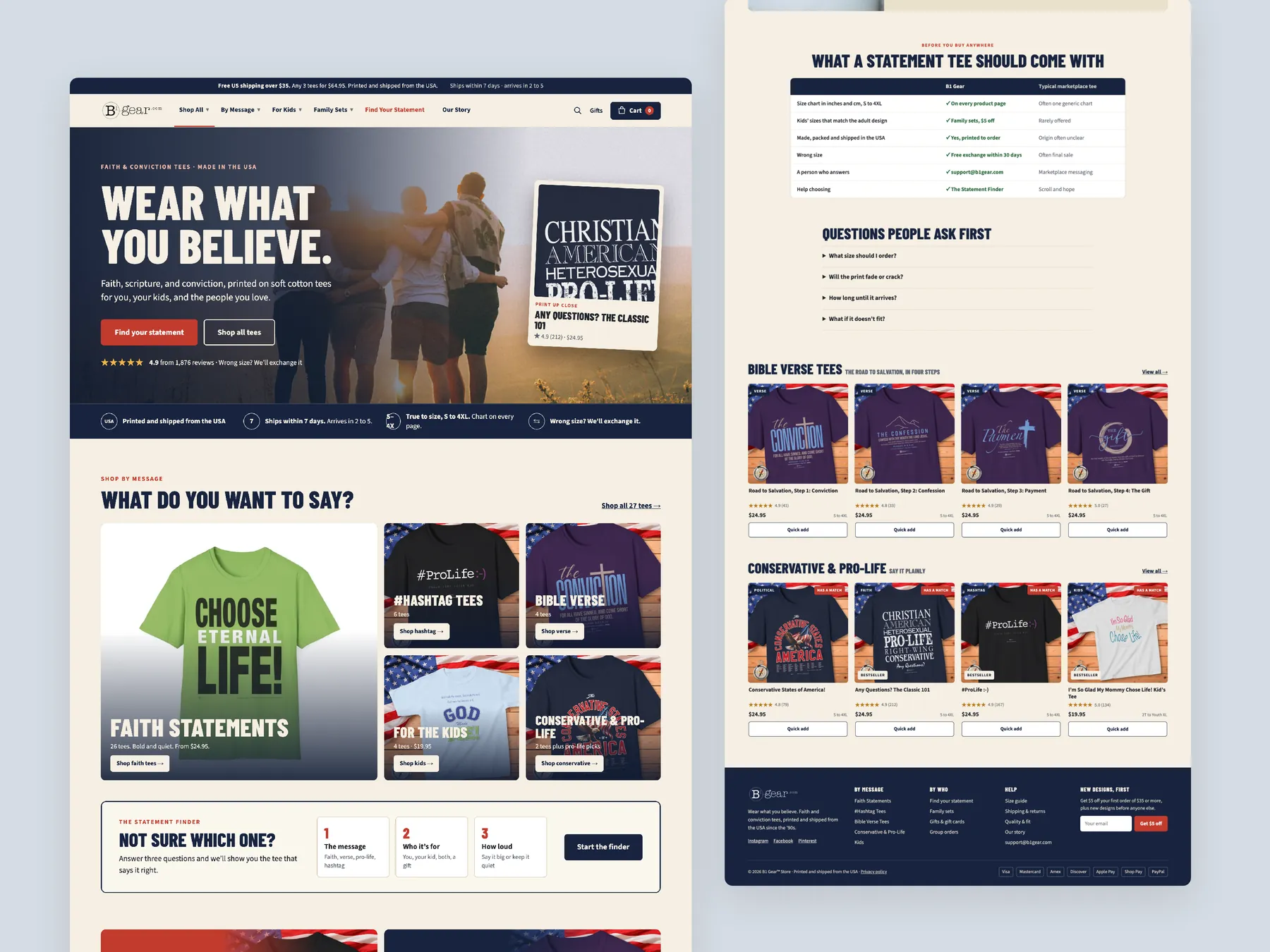
Storefronts we designed and built, across supplements, fragrance, health, wellness and skincare.
All 35 projectsFour engagements, measured before and after. What changed, why it changed, and by how much.
All case studiesDiagnosis, design and development from one studio — so the recommendation and the build never disagree.
All five services160 real Shopify stores torn down page by page, scored, and shown beside the version we would build. Free to watch.
Browse all teardownsSix conversion-first themes, each built for one industry’s buying journey. Zero required apps, $300, one licence.
Compare all sixA teardown of the B1 Gear Store homepage, collection page and product page, showing where its faith message tees lose shoppers to doubt and how a guided buying path would win them back.
Pressing play loads the video from YouTube — you can allow it for every teardown under cookie preferences.
B1 Gear Store sells message tees built around Christian faith and conservative values, with designs for adults and kids. The shirts are the strong part of the business; our CRO strategist called them beautiful. The collection page already says plainly that it serves Christian kids, and the product page already shows a 30 day guarantee, fast shipping and returns badges, which are the right instincts.
The weakness is the presentation layer. The homepage hero does not say what the brand does, who it is for or why a stranger should trust it, and the page then drops straight into best sellers. The shipping bar reads free shipping on orders $X plus, a placeholder that leaves the threshold unknown. Ads are already sending people to the site, and so far none of them have bought.
The same pattern repeats further in. The collection page shows four tees at the same price, each with only an image, a name and a price. There are no useful filters, badges, quick add buttons or ways to compare. The product page shows name, price, colors and sizes, but not delivery dates, fabric, a size chart or what happens if the fit is wrong. No page on the site has a single review.
The fix is a guided buying path, not a cosmetic refresh. The redesign answers the basic questions in the hero, splits the range by message, by recipient and by style, and adds a finder that asks questions the way a shop assistant would. It also places sets and bundles where they raise order value. Hold back on ads until the site converts, because traffic only pays once every page does its own job.
Ad traffic lands on a grid of tees that never says what the brand stands for, who the shirts are for or why to trust it. With no reviews anywhere on the site, no visitor has yet felt confident enough to buy.
B1 Gear Store could become the place a believer or parent goes to find the right message tee for themselves, their kids or the whole family. A finder, clear message categories, family sets and bundles would guide them there.
Visitors who now leave without buying would get answers, proof and a clear route to the right shirt. More visits would become first orders, and more of those orders would include a second or third tee
Five dimensions, each scored out of ten.
12 issues found, 16 fixes proposed.
The homepage hero shows message tees, but it never says what B1 Gear Store is, who the shirts are for or why a first time visitor should trust it within the first few seconds.
Just below the hero sits a best seller grid. The page starts pushing individual shirts before it has offered any route by message, by recipient or by style.
The announcement bar reads free shipping on orders $X plus. The real threshold is unknown, so shipping cost surprises the shopper at checkout, which is exactly where shoppers abandon.
The menu has only a few top level links and home. A visitor has to open each one to see what is inside instead of choosing a route at a glance.
The homepage, the collection page and the product page have no reviews and no real photos of people wearing the shirts, so a new visitor has no social proof to rely on.
The collection page shows four tees with only an image, a name and a price. A shopper has to open every product to check sizes, colors and details.
The prices are identical, there are no badges or descriptions, and sorting does little across four items. The collection page gives no help in choosing which tee suits the buyer.
Collection cards have no quick add, so every purchase needs an extra page load and an extra decision before anything reaches the cart.
Under the add to cart button there is no delivery estimate, no fabric detail, no size chart and no plain explanation of what happens if the size or shirt is wrong.
Nothing on the site explains why a buyer should choose a B1 Gear tee over a similar message shirt on Amazon, Etsy or eBay. Print quality, fabric and where the shirts are made all go unmentioned.
The product page makes no attempt to raise order value. It offers no pairings, no family sets and no multi tee deal alongside the shirt being viewed.
Ads are already running and no sales have come through yet. The spend is buying visits that the current homepage, collection page and product page cannot turn into orders.
Rewrite the hero to say what the brand sells, who it is for and why to trust it. Put review stars and one line each on printing, shipping, sizing and returns directly underneath.
Show the actual free US shipping threshold in dollars. Use the same bar for a multi tee offer, so it encourages a second shirt instead of hiding a cost.
Organise the menu by message, by who the shirt is for, and by family sets. Add price and size shortcuts so a visitor can pick a route without opening every link.
Build a short quiz that asks what the buyer wants to say, who it is for, which style, which size and what budget. Then recommend two or three matching tees.
Give each message its own homepage section, such as Faith Over Fear and Walk By Faith. Add bold and quiet print routes so shoppers see the theme they came for first.
Add routes for me, for my kids, match the family and as a gift, plus occasion sets for church and school. These routes also suggest gifts a visitor had not considered.
Place best sellers after the hero and the shop routes. That way they catch visitors who are still undecided instead of being the first thing everyone sees.
Give each card a theme badge, a one line description, review stars, the size range, the price and a quick add button, so shoppers can compare without clicking through.
Add filters for message, style, kids or adults, size and price band. Put a build your own set option at the top of the collection page.
Gather customer reviews and real photos of people wearing the shirts. Show them on the homepage, on collection cards and directly under the product name.
Add short lines under the button covering dispatch time, delivery window, printed in the USA, a true to size chart from small to 4XL and how a wrong size is handled.
Explain the fabric, the fit and how the print is made. Include a short comparison with typical market tees to show why a B1 Gear shirt holds up.
Add adult plus kid sets, couple sets and a build your own bundle with a saving per set. Show them on the homepage, collection page and product page to raise order value.
Show the product page tee in each available color, including navy, black and white, so shoppers can see each version before they choose.
Add a short founder section on who stands behind the shirts and why. That makes the store read as a brand with conviction rather than an anonymous print shop.
Hold or reduce ad spend until all three pages are rebuilt. Then resume, and test Meta channels such as Facebook and Instagram once orders start coming in.
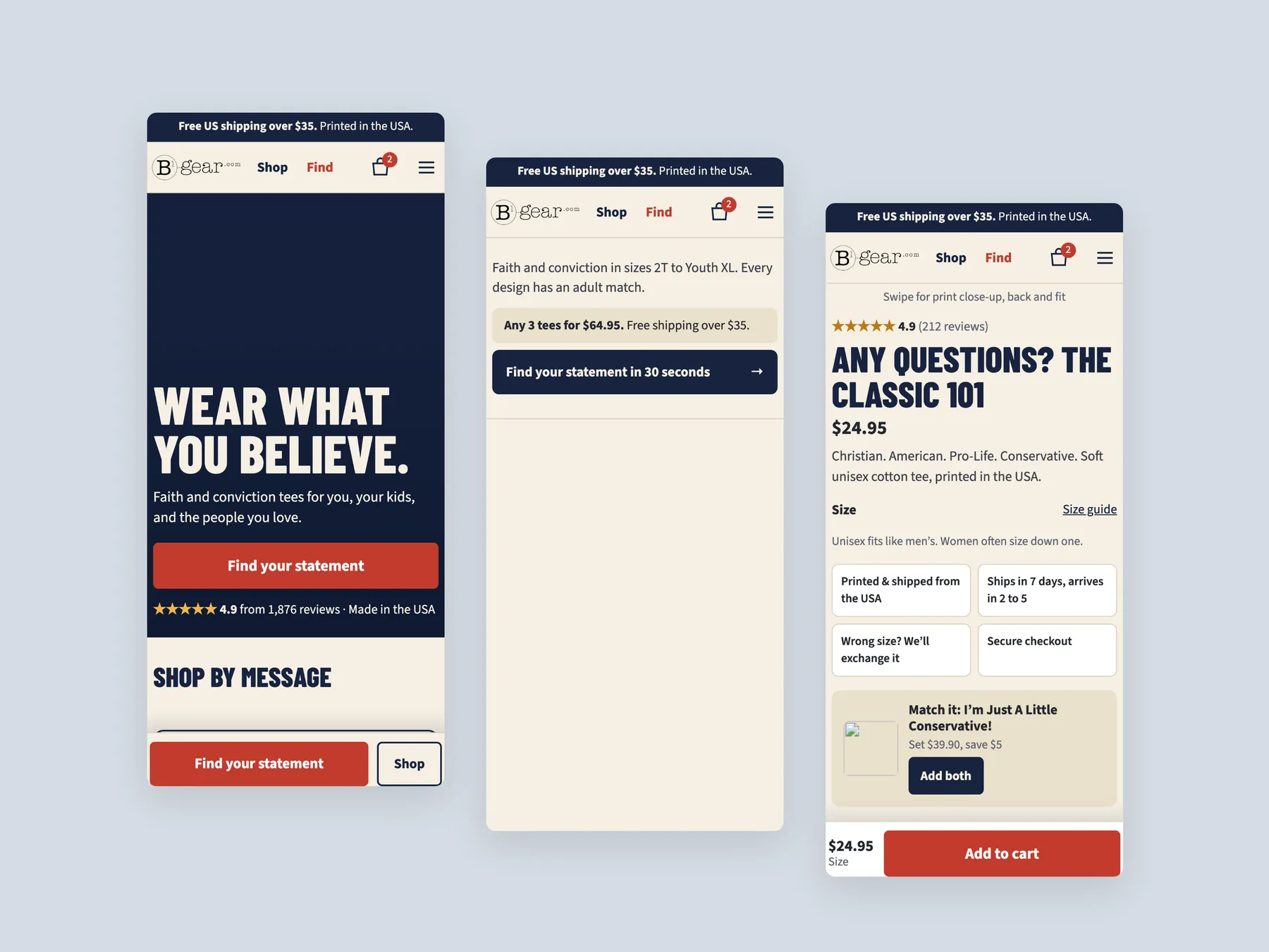
A concept redesign of B1 Gear Store, a faith and conviction tee brand printed in the USA. Homepage, mega menu, statement finder, collection, product page and cart, built from the findings of a conversion audit of the live store. The live store sells by product list. The shopper arrives with something to say, not a product name in mind, and the size question for unisex tees goes unanswered until checkout. The store asks what you want to say before it shows a grid: a five-step finder, message tiles on the homepage, and a mega menu organised by message and by who it is for. The buy box carries the chest measurement under each size, the any-three price and a matching kid's tee.
A concept redesign created by Convertica Studio from this audit. It shows how the store could work, it is not the live store.
Wear what you believe: the hero, the message tiles, the finder strip, then verse tees, conservative and pro-life tees, questions and footer.
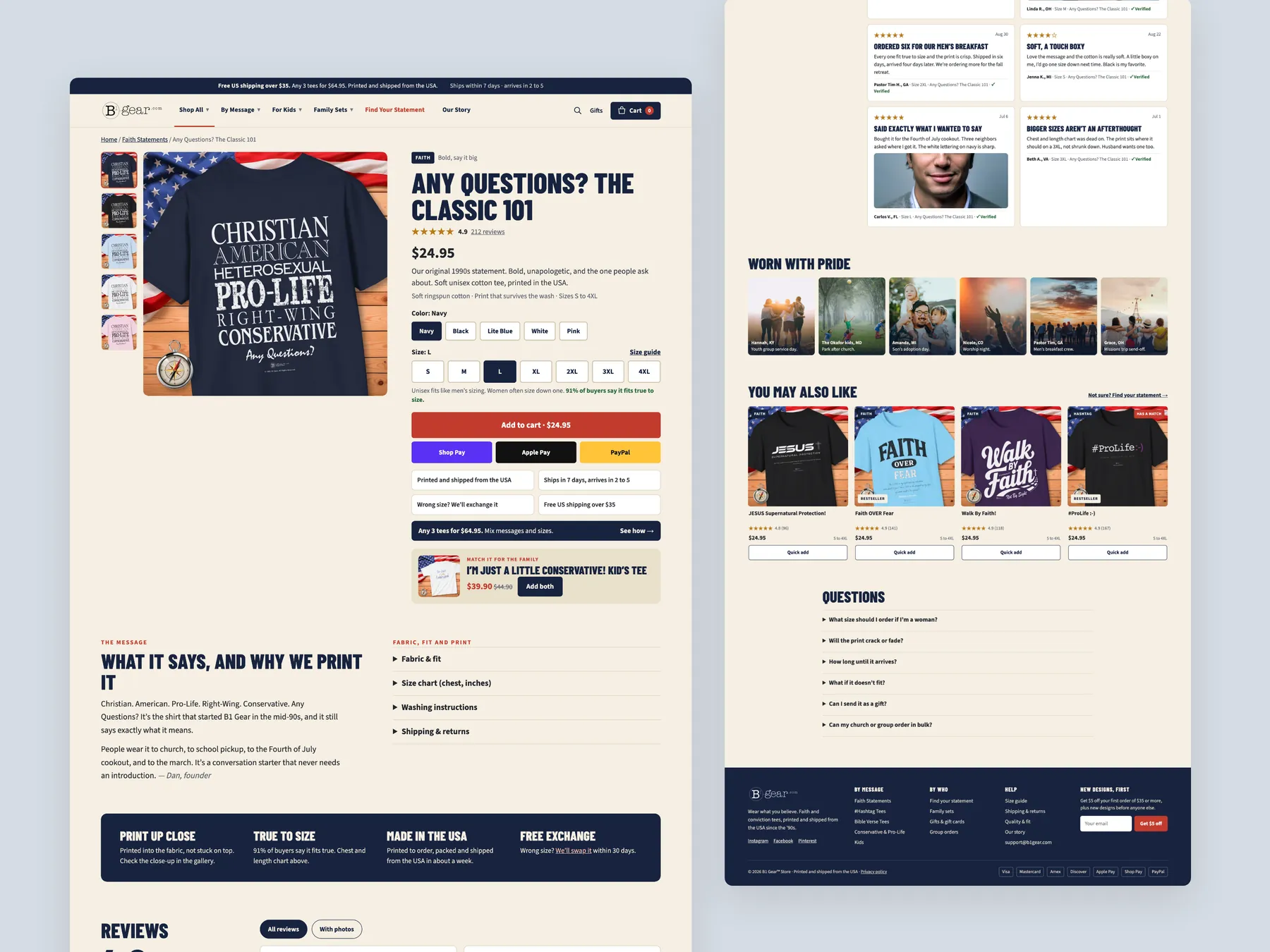
The homepage in the centre, the product buy column on the left, Shop All on the right.
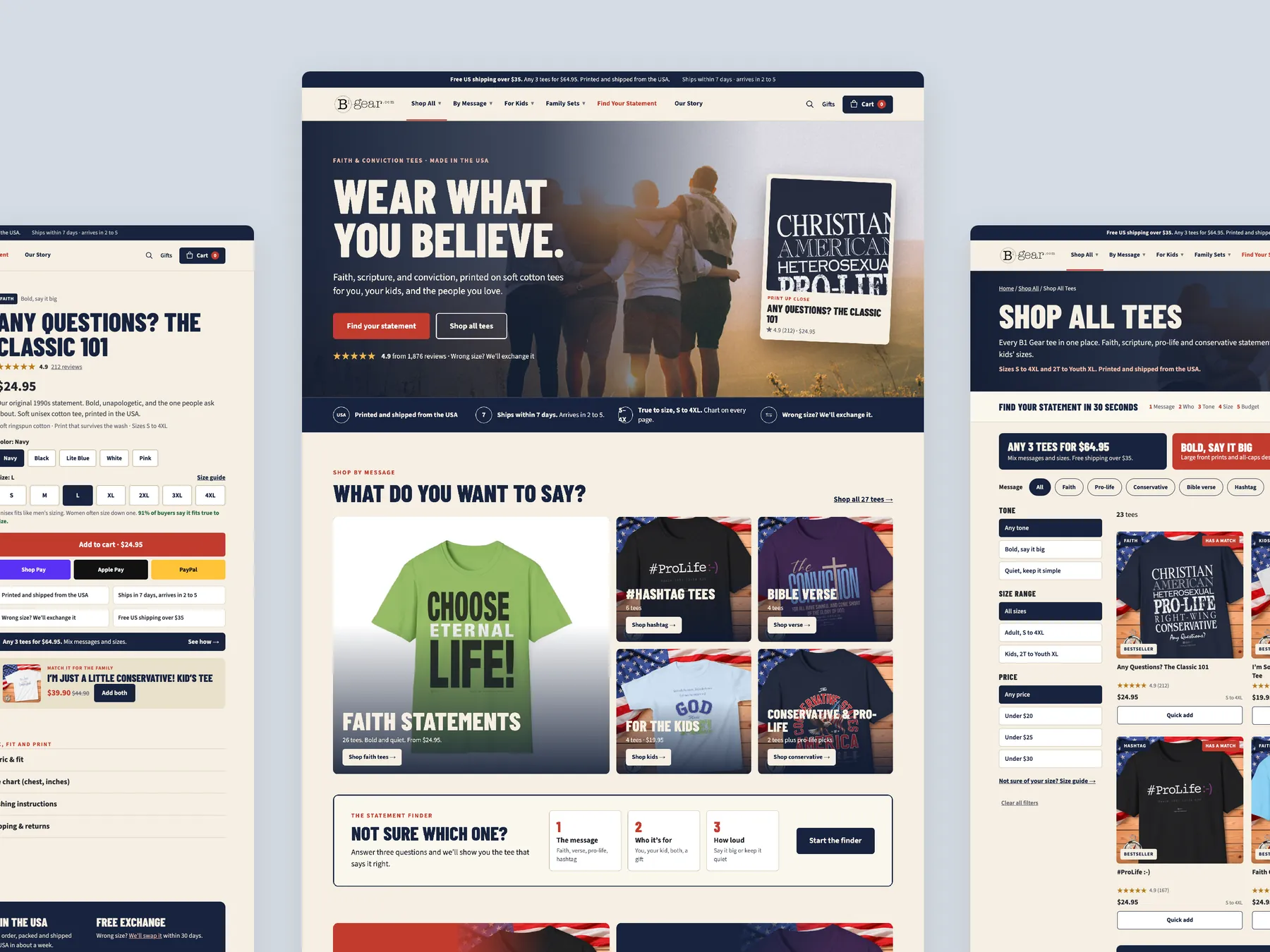
A slide-over with the free-shipping and any-three bars, five lines, Checkout securely and the wallet buttons.
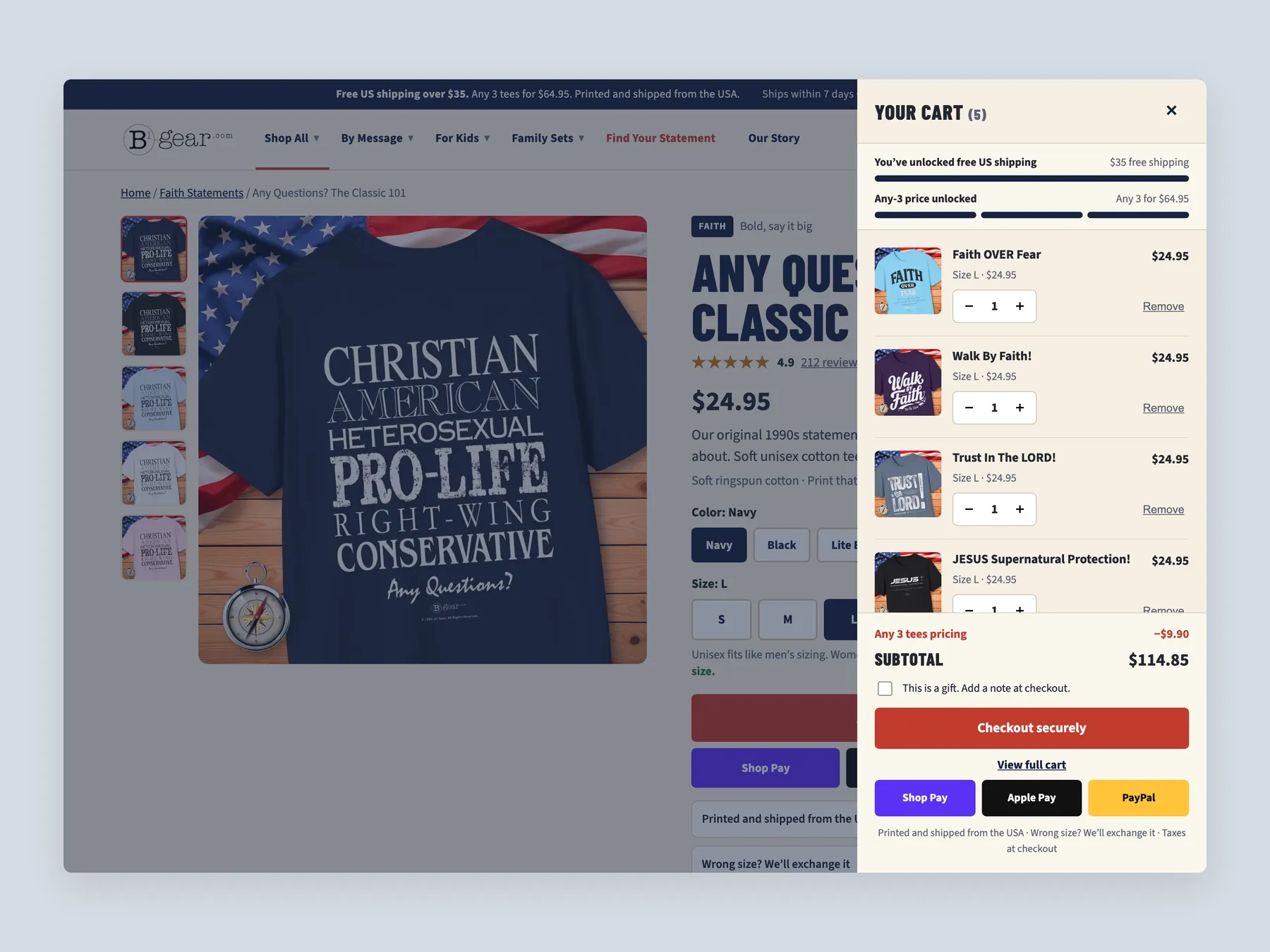
What do you want to say, who is it for, how loud, your size, your budget, then the tees that say it best with why each was picked.
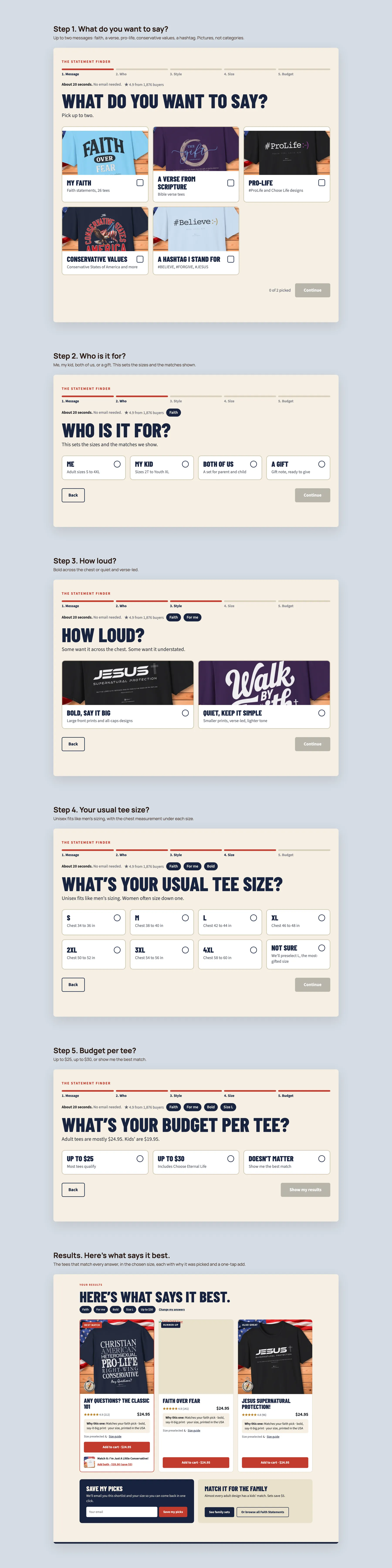
Buy box, what it says and why we print it, fit and shipping facts, reviews, worn with pride, you may also like, questions.
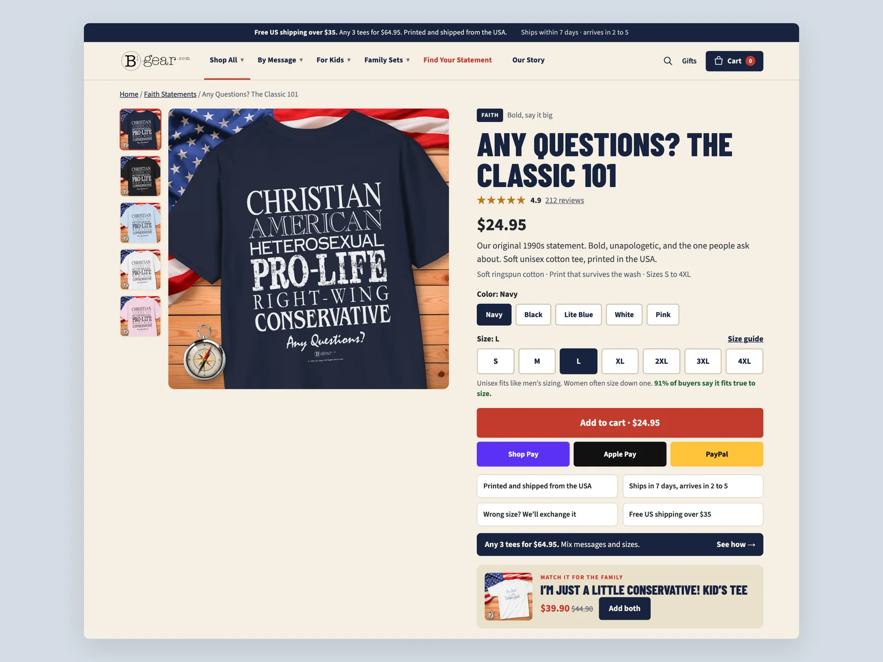
Title, price, colours, sizes with chest measurements, Add to cart, wallets, the four promises, the any-three price and a matching kid's tee.
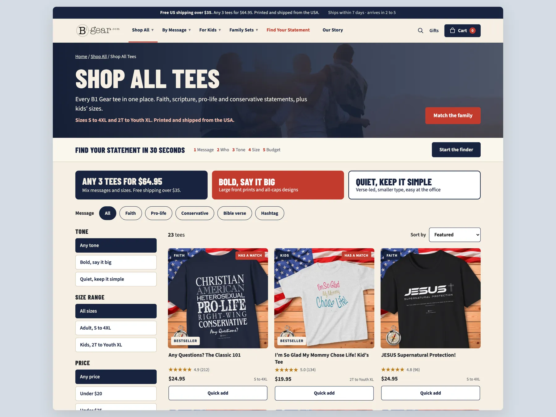
Shop All Tees with the finder strip, three ways in, message chips and the tone, size and price filters beside the grid.
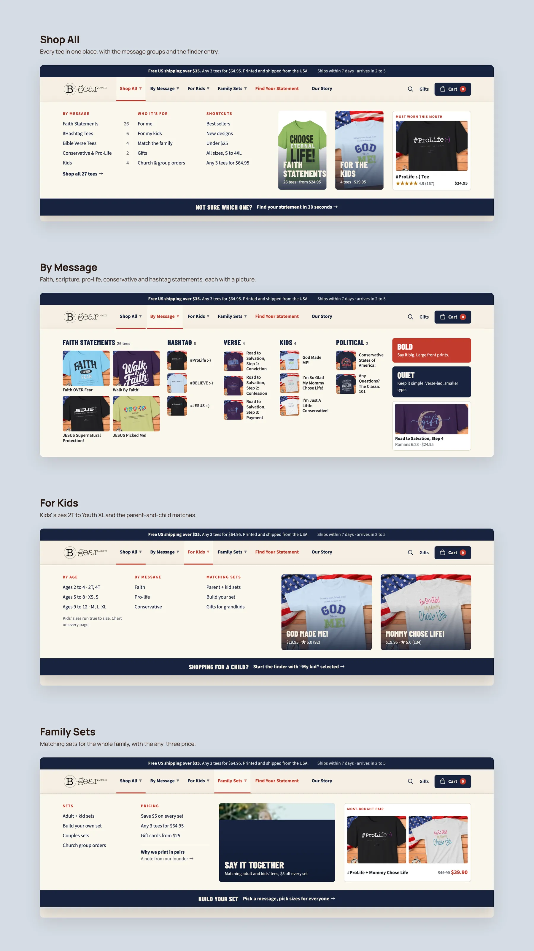
Shop All, By Message, For Kids and Family Sets, each with its link columns and pictured tees.
The first screen, the collection with the finder entry, and the product with its pinned Add to cart.
The site does not help visitors feel confident enough to buy. The homepage never says what the brand does or who it is for, and there are no reviews anywhere. Shoppers who like the shirts still have no reason to enter their card details.
No. The audit found the tees well designed and the messages clear. The problem is how the shirts are presented and how little help the site gives a visitor in choosing one.
It currently reads free shipping on orders $X plus, so the real threshold is unknown. Shoppers find out what shipping costs at checkout, and an unexpected cost there is a common reason to abandon. Stating the real number, and pairing it with a multi tee offer, turns the bar into a reason to add a second shirt.
The audit recommends holding back until the pages convert. Traffic is already arriving without sales, so more traffic would mostly buy more of the same result. Once orders start coming in, ads can resume and Meta channels can be tested.
It is a short quiz that works like a shop assistant asking how they can help. It asks what the buyer wants to say, who the shirt is for, which style, which size and what budget, then recommends a few matching tees.
The hero now answers the basic questions and shows review stars, with shipping, sizing and returns underneath. The page then offers routes by message, by recipient, by bold or quiet style and by occasion, and only shows best sellers once those routes have been offered.
The bare grid of four products becomes a page with filters, sorting and a set builder. Each product card carries a badge, a short description, review stars and a quick add button, so shoppers can compare tees without opening each one.
Reviews under the product name, and short lines under the add to cart button covering dispatch, delivery, fabric, sizing and returns. It also needs a fabric, fit and print section explaining why the shirt is worth buying here rather than on Amazon or Etsy.
Offer family sets, couple sets, adult plus kid pairings and a build your own bundle with a saving per set. The redesign places these offers on the homepage, the collection page and the product page, so a buyer who came for one shirt sees a reason to take more.
A message brand is easier to trust when shoppers can see who stands behind the messages. A short founder story explains why the shirts exist and separates the store from anonymous print sellers.
The audit argues it will not. Each page has a different job: the homepage builds trust and shows routes, the collection page helps the shopper choose, and the product page answers the remaining questions. The whole path has to work together.
The teardown reviews the B1 Gear Store homepage, collection page and product page, then walks through a redesigned version of each. The recording runs for 36 minutes and ends with next steps.
Tell us about your store and we'll send a personalized 5-minute video showing exactly where you're losing buyers — and how to win them back.
Takes about 40 seconds. No call required.