










JRStudio CRO Audit
A CRO teardown of JRStudio's home, collection and product pages, showing why original art and printed gifts go undiscovered and how a guided, gift-led redesign helps visitors choose and buy.
Watch the full 27-minute recording.
Pressing play loads the video from YouTube — you can allow it for every teardown under cookie preferences.
What we found.
JRStudio starts with the hardest thing to fake: original paintings that are genuinely good to look at. The catalogue is broad too, with 224 items covering wall art, printed T-shirts, mugs, shoes, bags and smaller accessories, all carrying the same artwork. The products are not the weak point. A visitor who finds the right piece has every reason to like it and to want it.
The problem is the presentation layer. The home page reads as a painter's portfolio, with a navigation of only Home and Contact and a hero that says original art for your home. Nothing tells a visitor that mugs, totes and T-shirts exist until they click Shop Now, and there is no guided path from that first screen to a product that suits them or the person they are buying for.
The same gap repeats further down. The collection page is a grid of image, name and price, with price, availability and a basic sort as the only tools for 224 items. The product page lists name, price, colour and size above a block of text, with no delivery timing and no returns policy. There is not a single review anywhere on the site, and no attempt to add a second item to the order.
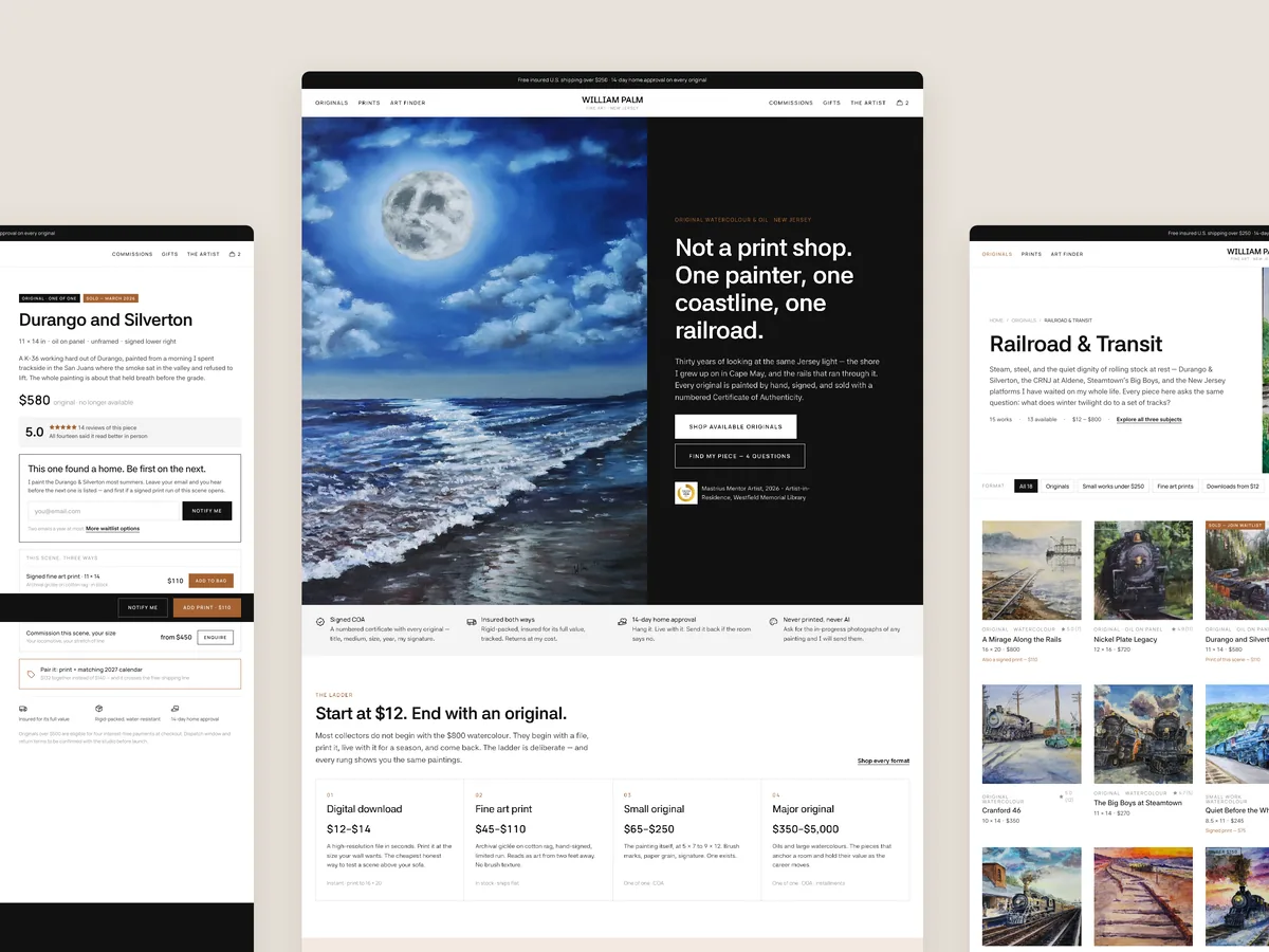
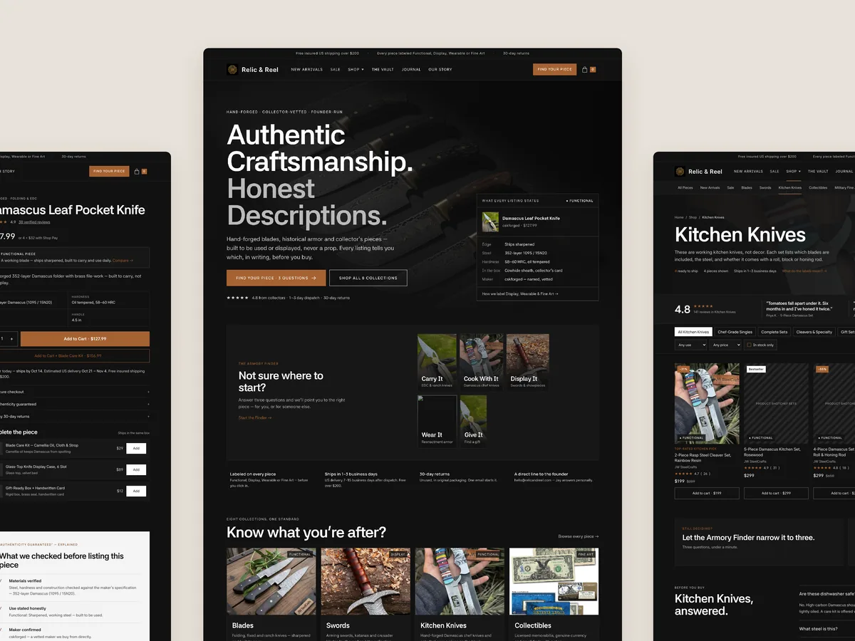
The redesign organises the store around how people actually shop for art: by department, by painting, by recipient and by price, with a gift finder for anyone unsure. Product cards carry the details, product pages answer delivery and returns, and series bundles invite a second and third piece. The art is already strong enough; the store now has to guide people to it.
Problem, opportunity, impact
The home page presents JRStudio as a painter's portfolio with only Home and Contact in the menu, so visitors never learn that mugs, bags and T-shirts exist and get no guided path to a product that suits them.
JRStudio could become a guided art and gift shop where visitors browse by department, painting, recipient or price, use a gift finder when unsure, and leave with a painting plus the matching mug or T-shirt from the same series.
More visitors would reach a relevant product without opening dozens of tabs, more would buy once delivery, returns and reviews are visible, and more orders would include a second piece from the same s
Scored across five dimensions.
Five dimensions, each scored out of ten.
-
01
Homepage & PDP review Where attention leaks and buyers hesitate, section by section.
-
02
Mobile UX audit 70% of your traffic — judged on its own terms.
-
03
Trust & credibility check The signals that make first-time buyers convert.
-
04
Collection & discovery Filtering, merchandising and guidance from browse to buy.
-
05
Prioritized CRO roadmap Ranked by impact vs. effort, ready to ship.
Every issue, paired with its fix.
12 issues found, 17 fixes proposed.
Hero Section Hides Most Of What Sells
The hero says original art for your home, so visitors assume this is a painting site. The T-shirts, mugs, shoes and bags only appear after clicking Shop Now.
Navigation Offers Only Home And Contact
With 224 items across several product types, the menu gives visitors two links and no way to head straight to wall art, wearables, bags or gifts.
Home Page Has No Guided Buying Path
After the hero, the home page gives the visitor something to read and then a single Shop Now button. There is no route by product type, painting, recipient or price.
Home Page Never Answers Who It Is For
The first screen does not say who the store serves or why anyone should trust it, which leaves first-time visitors hesitant in the seconds that matter most.
Collection Filters Too Thin For 224 Items
The collection page offers only price, availability and a basic sort. A shopper looking for a tote or a gift has to scroll the whole list to find it.
Collection Grid Behaves Like An Inventory List
Each card shows an image, a name and a price and nothing else. It does not say what the item is, what it is made from or what it holds.
No Way To Compare Products At A Glance
To choose between similar pieces, a visitor has to open many product pages in separate tabs and compare them by memory, which is where many give up.
Product Description Is Not Scannable
Below name, price, colour and size, the detail sits in a block of text. Visitors have to read all of it to learn what the product is.
Delivery Timing Missing From Product Page
The product page does not say how long delivery takes or when the order will arrive, a basic question for anyone buying art or a gift.
Returns Policy Absent Where Decisions Happen
Nothing on the product page explains what happens if something goes wrong, so the risk of buying sits entirely with the visitor.
No Reviews Anywhere On The Site
The audit found no reviews on the home page, the collection page or the product page, so nothing confirms that other people have bought and liked the work.
No Upsell Or Cross Sell Offered
Paintings, mugs and T-shirts share the same artwork, yet the product page never suggests pairing them. Every order stops at one item.
Rewrite The Hero To Show Every Product Type
State in the first screen that the store sells original paintings plus printed T-shirts, mugs, bags and accessories, with images of each, so the range is clear in seconds.
Put Review Proof In The Hero
Place a review rating and short customer quote beside the headline so a first-time visitor sees early on that other people have bought and trusted the studio.
Add A Holiday Order By Banner
Run a banner under the hero with the order-by date for holiday delivery in the US and a Shop Holiday Gifts link, giving seasonal visitors a reason to act now.
Build A Department Mega Menu
Replace Home and Contact with menus for Wall Art, Wearable Art, Bags and Accessories, Home and Living and Shop by Painting, each split by type, recipient and price.
Launch A Gift Finder Quiz
Ask who the gift is for, what they love, what kind of piece and the budget, then recommend matching products. It acts as the studio's digital shop assistant.
Group Products Into Painting Series
Present each painting with its T-shirt, mug and tote in one series section, with the story behind the piece and a See the Series link.
Make Every Product Card Self Explanatory
Show a badge, available colours, the artist's name, a star rating, a one-line description and the price on each card so visitors can compare without clicking.
Introduce The Artist On The Home Page
Add a founder section with a photo and a few lines on how each piece is made, so visitors see a real artist behind the store and not a print warehouse.
Show Why The Studio Is Worth Paying For
Add a comparison chart setting the studio's original artwork and quality against mass-market prints and generic gift shops, so the price makes sense.
Add A Customer Photo And Review Gallery
Feature customer photos of the work on real walls, tables and shoulders alongside their reviews, giving visitors social proof they can see as well as read.
Add Category And Gift Filters To Collections
Give the collection page category tabs, a finder shortcut and a Most Gifted This Month section so shoppers can narrow 224 items down quickly.
Close Collections With Reviews And Series Links
End each collection with reviews, links to other painting series showing how many pieces each holds, and a short FAQ before the visitor leaves the page.
Restructure The Product Page For Scanning
Lead with name, a one-line description, rating and price, then show options and practical detail such as what a tote fits, before any long copy.
Show Delivery And Returns Beside Add To Cart
Place an estimated arrival date, the holiday order-by date, the printed-to-order note and the returns promise directly under the Add to Cart button.
Use Storewide Reviews Where Products Have None
Where a single product has no reviews yet, show reviews from across the store on its page so trust is never missing at the point of purchase.
Offer A Send As A Gift Option
Let buyers mark an order as a gift on the product page, so people shopping for someone else know the studio has thought about their situation.
Bundle The Full Series With A Small Discount
Offer the painting's tote, T-shirt and mug together as a set with a modest discount, turning a single item order into three pieces from the same artwork.
The version we'd build.
The teardown in 7 lines.
- JRStudio's art is strong; what holds the store back is how it is presented and how visitors are guided to it.
- A hero that only mentions art for your home hides the mugs, bags and T-shirts that make up much of the range.
- A menu with only Home and Contact cannot support a catalogue of 224 items across several product types.
- A collection grid of image, name and price forces visitors to open tab after tab just to compare two pieces.
- Delivery timing, returns and reviews belong on the product page, because that is where the decision is made.
- When every product shares artwork with others, a series bundle is the most natural way to raise order value.
- A gift finder lets the store help people buying for someone else, not just people who already know what they want.
Questions this audit answers.
The site presents itself as a painter's portfolio and hides most of what it sells. The hero only mentions original art for the home, the menu has just Home and Contact, and visitors only discover mugs, bags and T-shirts after clicking Shop Now.
No. The audit is clear that the artwork is strong and the range is broad. The issue is the presentation layer, which does not help visitors find the right product for themselves or for someone else.
The store has 224 items across paintings, wearables, bags and homeware. Without department menus, a visitor who wants a tote or a gift has no direct route and has to scroll through everything.
It behaves like an inventory list. Each card shows only an image, name and price, and the only tools are price, availability and a basic sort, so comparing products means opening many tabs.
It splits the store into departments such as Wall Art, Wearable Art, Bags and Accessories, Home and Living and Shop by Painting. Each department can be browsed by type, by recipient or by price.
It asks who the gift is for, what they love, what kind of piece they would like and the budget. Based on the answers it recommends specific products, acting like a shop assistant asking how it can help.
Each painting has matching products such as a T-shirt, mug and tote. Grouping them with the story behind the painting lets a visitor who loves one artwork see every way to own it.
Delivery timing, a returns policy and reviews. The description is also a block of text rather than something a visitor can scan, and nothing suggests a second item.
The audit recommends showing storewide reviews on that product page. Trust should never be absent at the point where the buying decision is made.
It offers the tote, T-shirt and mug from the same painting as a set, with a small discount for taking all three. Because the pieces share artwork, the pairing feels natural rather than forced.
It shows that a real artist stands behind the store and explains the thinking behind each piece. That builds authority and helps justify buying original work over mass-market prints.
Our CRO strategist reviewed the JRStudio home page, collection page and product page, then walked through a clickable redesign concept for each. The recording runs 27 minutes.
See what's quietly costing you sales.
Tell us about your store and we'll send a personalized 5-minute video showing exactly where you're losing buyers — and how to win them back.
Takes about 40 seconds. No call required.
-
5-minute video teardownA personalized walkthrough of your store, recorded by Eva.
-
Homepage & PDP reviewWhere attention leaks and buyers hesitate.
-
Mobile UX audit70% of your traffic — judged on its own terms.
-
Trust & credibility checkThe signals that make first-time buyers convert.
-
Prioritized CRO roadmapRanked by impact vs. effort, ready to ship.