Convertica Studio
CRO teardown Faith & Motivational Apparel

StrykZone CRO Audit

A CRO teardown of StrykZone's homepage, collection page and product page, followed by a redesign concept built around guided routes, a product finder, on-site reviews and bundles.

14
Issues found
18
Fixes proposed
36
Minutes of tape
3.4
Overall / 10
36 min watch
01The teardown

Watch the full 36-minute recording.

Pressing play loads the video from YouTube — you can allow it for every teardown under cookie preferences.

02Executive summary

What we found.

StrykZone already has the part most stores struggle with: a real range. Tees, long sleeves, hoodies, denim, mugs, wall clocks and table linens sit across many collections, with faith, motivational, patriotic and funny designs that look good on screen. The homepage already features a holiday collection, and a secure checkout note appears on the homepage and beside the buy button.

The problem is the presentation layer. The homepage does not tell a first visitor what the brand does, who it is for or why they should trust it. It lays out the range as a long catalog under in-house names like Steel and Stitch that a stranger cannot decode. Someone looking for a long sleeve tee has to scroll the whole page and open every category to find one.

The same pattern carries into the collection and product pages. One collection mixes pants, shorts, barrel jeans, trousers and men's and women's items, with only basic sorting and cards that show a name, a photo and a price. The product page has no size guide and a long description to dig through. There are no reviews anywhere on the site, and no way to buy a matching piece with the tee.

The direction is a store that acts like a good salesperson in a department store. That means routes by style, product type, budget and gifting, a finder that asks a few questions, cards that explain themselves, reviews on the page, and bundles that complete the look. The traffic is already arriving. The site needs to walk each visitor to the right product instead of leaving them to find it.

03The verdict

Problem, opportunity, impact

Core problem

The range is strong, but the site shows it as a catalog. Visitors get no clear routes to the product they want, no reviews on the site, and in-house collection names they cannot decode, so they leave without buying.

Main opportunity

StrykZone could work like a good department store salesperson. It would ask what the visitor needs, send them to the right tees, hoodies or gifts by style and budget, show proof from other buyers, and suggest a complete look rather than one shirt.

Estimated impact

More of the visitors already arriving would reach a product that fits them, trust the store enough to pay, and add a second or third piece through bundles, so the existing traffic would produce more o

04How we audited

Scored across five dimensions.

3.4 Overall

Five dimensions, each scored out of ten.

The five passes
  1. 01
    Homepage & PDP review Where attention leaks and buyers hesitate, section by section.
  2. 02
    Mobile UX audit 70% of your traffic — judged on its own terms.
  3. 03
    Trust & credibility check The signals that make first-time buyers convert.
  4. 04
    Collection & discovery Filtering, merchandising and guidance from browse to buy.
  5. 05
    Prioritized CRO roadmap Ranked by impact vs. effort, ready to ship.
4 of 5 dimensions scoring four or below
Branding 5/10
UX 3/10
Trust 3/10
Product Page 3/10
Conversion 3/10
05What we'd fix

Every issue, paired with its fix.

14 issues found, 18 fixes proposed.

Problems identified

Hero Section Does Not Answer The Basics

In the first few seconds, the homepage hero does not say what StrykZone sells, who it is for, or why a stranger should trust it with their card details.

Homepage Reads Like A Product Catalog

The homepage is a long run of product grids. There is no guided path, so a visitor looking for a specific tee has to scroll the whole page and check every category.

In-House Collection Names Confuse New Visitors

Labels like Featured: Steel and Stitch mean something to the brand but nothing to a first-time visitor, who cannot tell what is inside before clicking.

Reviews Live Off The Site

The store has reviews on Google and Trustpilot, but visitors have to open those separately. No reviews appear on the homepage, collection pages or product pages.

Collections Mix Unrelated Product Types

The Stitch and Steel collection puts pants, shorts, barrel jeans, trousers and men's and women's pieces on one page, with nothing to narrow them down.

Sorting Options Do Not Help Discovery

Visitors can only sort by name, price or availability, plus a best selling option. There are no filters by style, fit, size or occasion to cut down the choice.

Product Cards Show Only Name And Price

Each card shows a photo, a name, a price and an add to cart button. It gives no reason to choose that piece, so visitors have to open page after page to compare.

Imagery Does Not Match The Product

The men's vintage wash straight leg jeans are photographed on a woman, which leaves the shopper unsure about the fit and who the product is for.

Nothing Justifies The Price Against Marketplaces

Nothing on the collection or product page explains why someone should pay $70 for the jeans here rather than look on Etsy, eBay or Amazon.

Size Selection Has No Guidance

The product page lists sizes but gives no size guide or measurements, so the shopper has to guess whether a medium will fit.

Key Product Answers Are Buried In Text

Fabric, quality and the reasons to buy the alien art long sleeve shirt sit inside a long block of description that most shoppers will not read.

Returns And Delivery Are Not Addressed

Near the buy button, the product page does not answer what happens with a misprint, a wrong item, a return or the delivery time.

No Bundles Or Complete The Look Offers

The product page sells one tee at a time. It never offers a hoodie, jeans or trousers to pair with it, so the average order stays at a single item.

Gifting Is Not Presented As A Route

Visitors who are not shopping for themselves get no gift path, even though mugs, clocks and printed apparel suit gifting and the season is close.

Recommendations

Rewrite The Hero To Answer Four Questions

State what StrykZone sells, who it is for and why to trust it in the hero. Show review proof and a clear shop button above the fold.

Add A Trust Strip Under The Hero

Place delivery timing, misprint and damage cover, where items are printed, and the accepted payment methods directly under the hero so they are seen first.

Build A Menu Around Real Shopping Routes

Organise the menu by product type, by message such as faith, the grind, patriotic and funny, by budget, and by home and gifting, keeping the brand's own names in place.

Add A Product Finder Quiz

Ask who the purchase is for, which message they want, what kind of piece, their size and their budget. Then recommend a short set of matching products.

Add Shop By Message Funnels On The Homepage

Give each theme its own homepage tile so a visitor who wants funny tees or faith designs reaches the right collection in one click.

Add Shop By Product Type Using Plain Names

Add a row with tees, long sleeves, hoodies, wall clocks, mugs, denim and table linens, so visitors who think in product types have a direct route.

Bring Google And Trustpilot Reviews On Site

Show review counts and customer quotes with photos on the homepage, collection cards and product pages, so visitors do not have to leave to check them.

Make Product Cards Self Explanatory

Add colour swatches, a one line summary of fabric and weight, a star rating and quick size selection to each card so shoppers can compare without opening pages.

Split Collections And Add Useful Filters

Separate men's, women's, pants, shorts and denim. Let shoppers filter by size and price, and put the theme funnels and the finder at the top of each collection.

Add A Size Guide And Fit Finder

Place a size guide link and a fit finder next to the size selector, with measurements shown directly, so shoppers stop guessing whether a medium fits.

Lead With Scannable Product Facts

Under the title, show reviews, price, the shipping offer, fabric weight and where the piece is printed. Move the long story further down the page.

Place Delivery And Returns Under Add To Cart

State the expected arrival window, the return policy and the secure checkout directly beneath the add to cart button, where the decision is made.

Explain Why The Price Is Worth It

Add a short section on each product page and the homepage covering how pieces are made and printed and why StrykZone stands apart from Amazon, Etsy and eBay.

Offer Complete The Look Bundles

Offer a three piece set, such as a tee, jeans and a hoodie, with a set discount on the product page. Let shoppers build their own bundle as well.

Add Pre Built Sets On The Homepage

Show ready made three piece sets with a clear saving on the homepage so the larger order is suggested before a shopper reaches a product page.

Create A Dedicated Gifting Route

Add a for me or a gift choice to the finder and a gifting section on the homepage and product pages so visitors buying for others have a clear path.

Introduce The Founder And The Brand Story

Add a short founder story near the bottom of the homepage that ties the faith and motivation themes to the people behind the store.

Add FAQs To Collection And Product Pages

Answer common questions about fit, fabric, printing, delivery and returns in an FAQ on each collection and product page.


06The redesign

The version we'd build.

A concept redesign of StrykZone, a made-to-order store selling faith and motivational tees and hoodies, state and country wall clocks, mugs and tablecloths, and heavyweight denim. Homepage, mega menu, search, the Find what fits you finder, collection, product page and cart, built from the findings of a conversion audit of the live store. The live store sells identity but is organised like inventory. The shopper arrives thinking faith, Georgia, leg day or a gift for Dad, and the site answers with sub-brand names that tell a first-time visitor nothing. When they do reach a product, it is made to order with no sizing returns, and nothing beside the button helps them pick a size or know when it arrives. The store routes people the way they think: by what they stand for and by the kind of thing they want. A four-question finder takes who it is for, what they stand for, the kind of thing, the size and the budget, and returns six picks with a reason under each. The mega menu is organised the same way. On the product page the size guide and fit finder sit beside the size row, personalization is explained with its price, and free shipping with an arrival window, the remake promise and secure checkout sit under the button. The cart suggests the matching piece and carries a gift note.

A concept redesign created by Convertica Studio from this audit. It shows how the store could work, it is not the live store.

Homepage

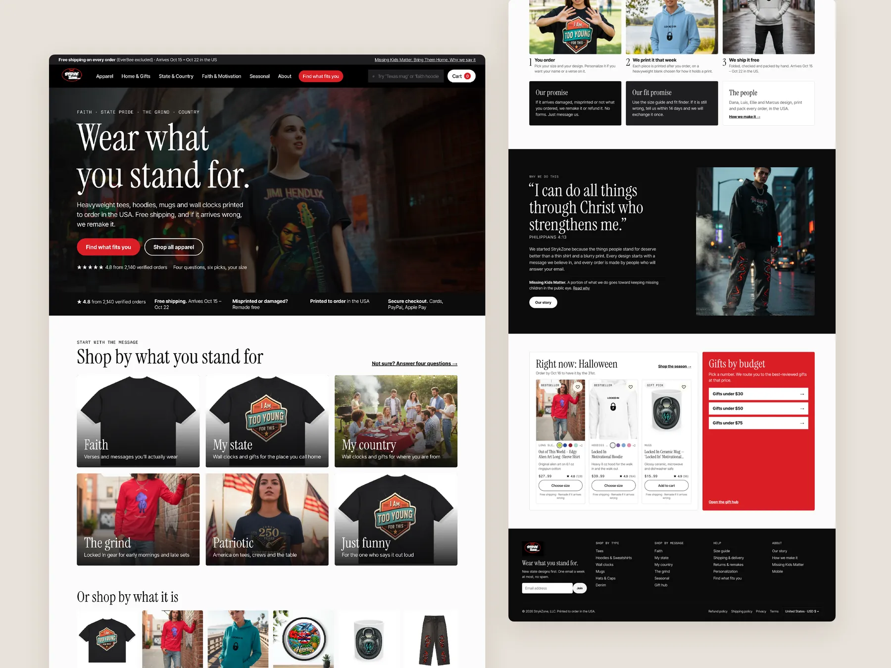
The whole page in two columns: a hero that says Wear what you stand for, the trust strip, shop by message and shop by type, the finder, the state sets and bestsellers; then the proof section, the process and promise, the story and verse band, seasonal and gifts, and the footer.

StrykZone concept redesign: Homepage, two tall columns

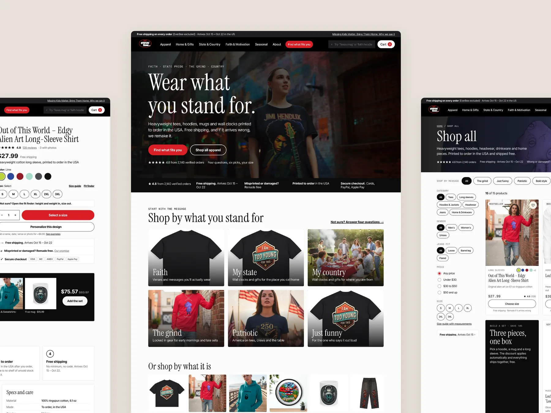
Three pages side by side

The homepage in the centre, the product page's buy column on the left with its colour swatches, size pills and the red button, the Shop all collection on the right with its banner, message chips and filter sidebar. One system across every page.

StrykZone concept redesign: Homepage centre, product left, collection right

The cart

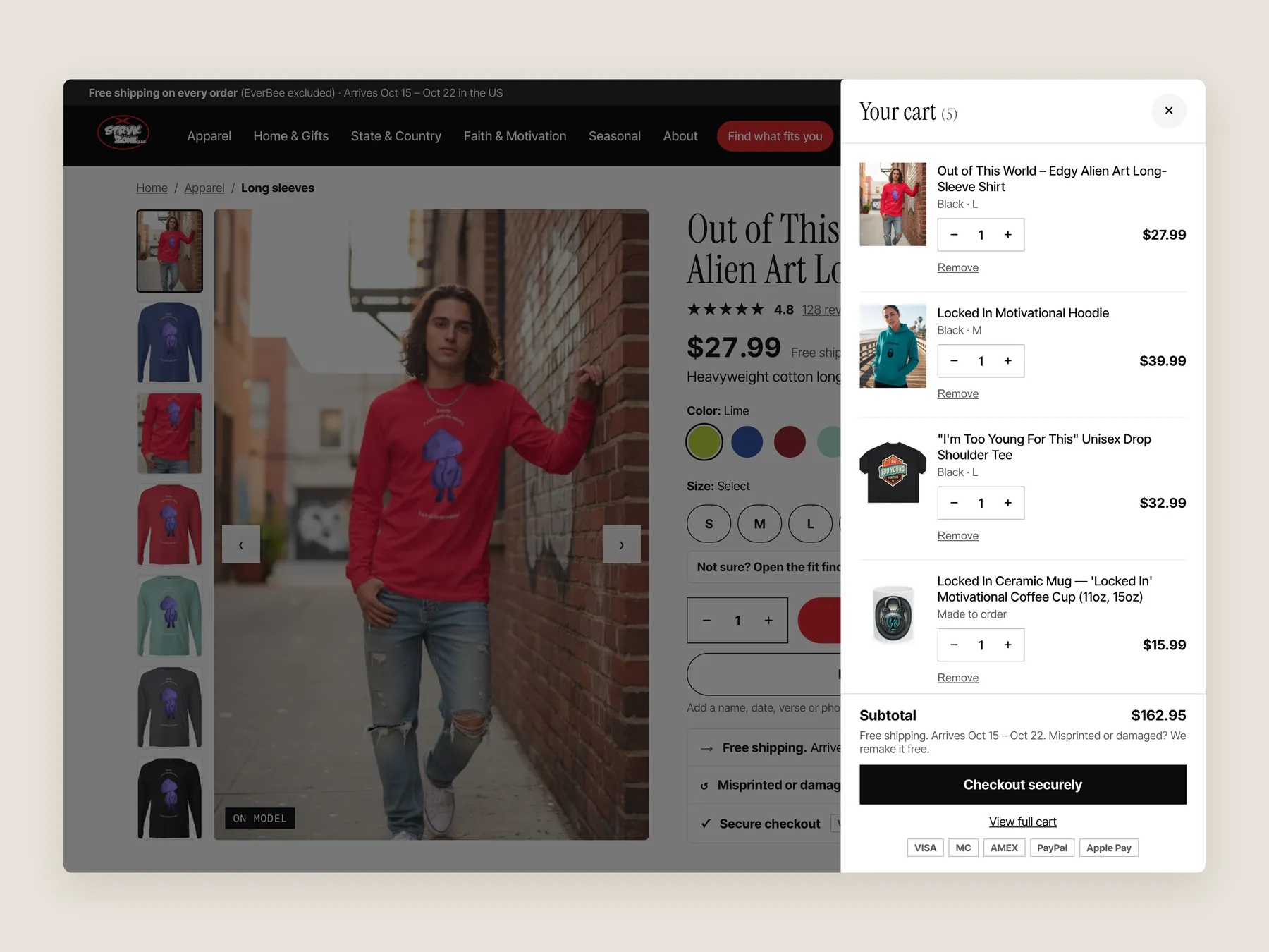
A slide-over, not a page: one line per item with colour and size, quantity and remove on each, then Subtotal, the free shipping and remake line, Checkout securely, View full cart and the card logos.

StrykZone concept redesign: Cart slide over open over the product page, whole screen

Find what fits you, step by step

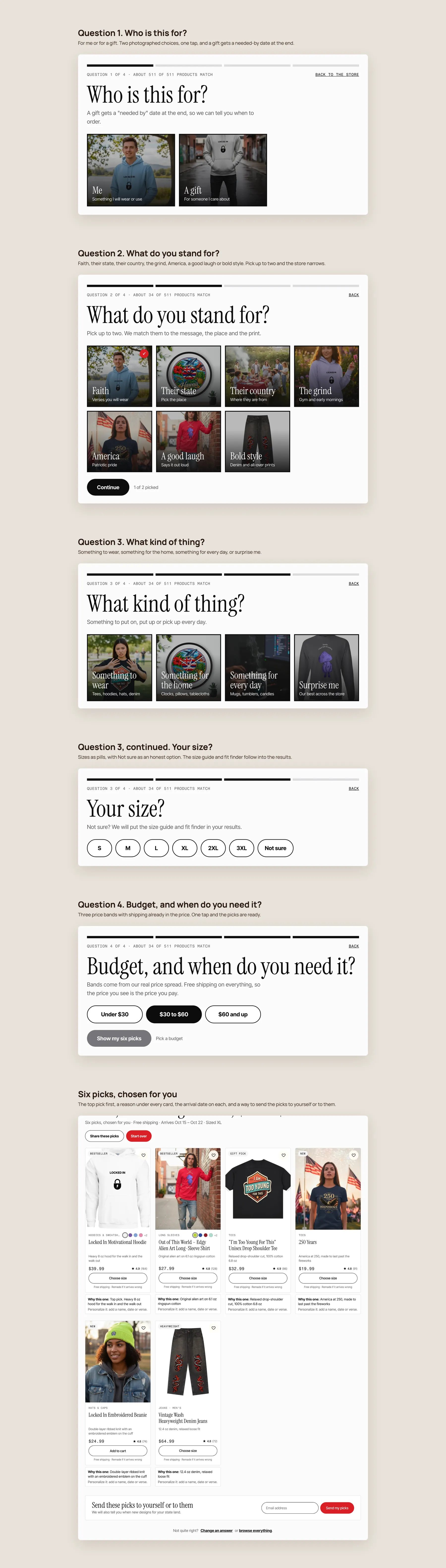
Who is this for, what do you stand for, what kind of thing, your size, budget and when you need it, then six picks with a reason under each, the arrival date on every card, and a way to send the picks to yourself or to them.

StrykZone concept redesign: Find what fits you, step by step

Product page

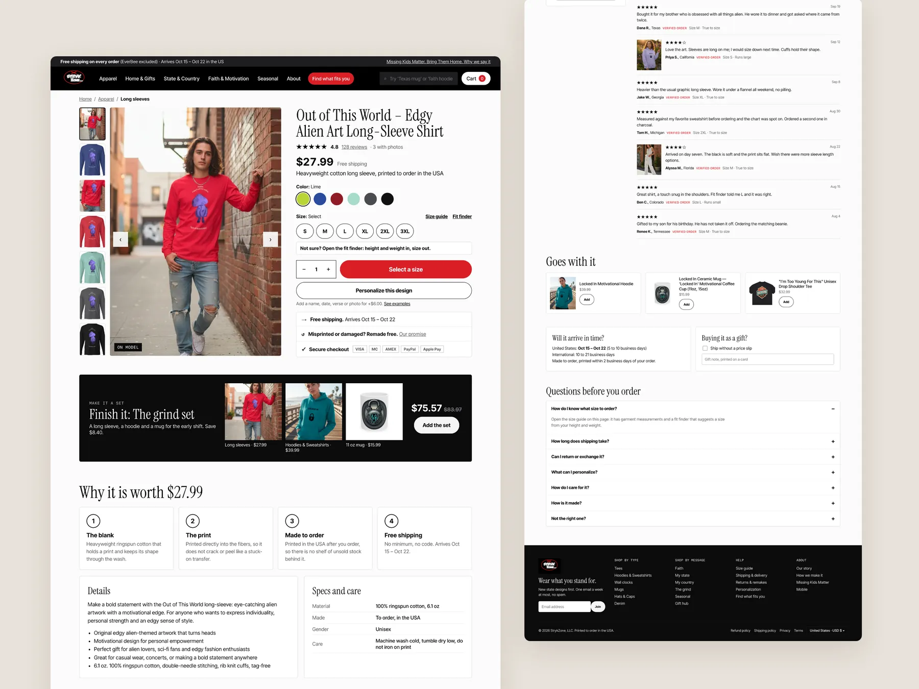
The whole page in two columns: gallery and buy box, make it a set, the value stack, the compare table, the promise, reviews, companions, delivery and gift, questions and the footer.

StrykZone concept redesign: Product page, two tall columns

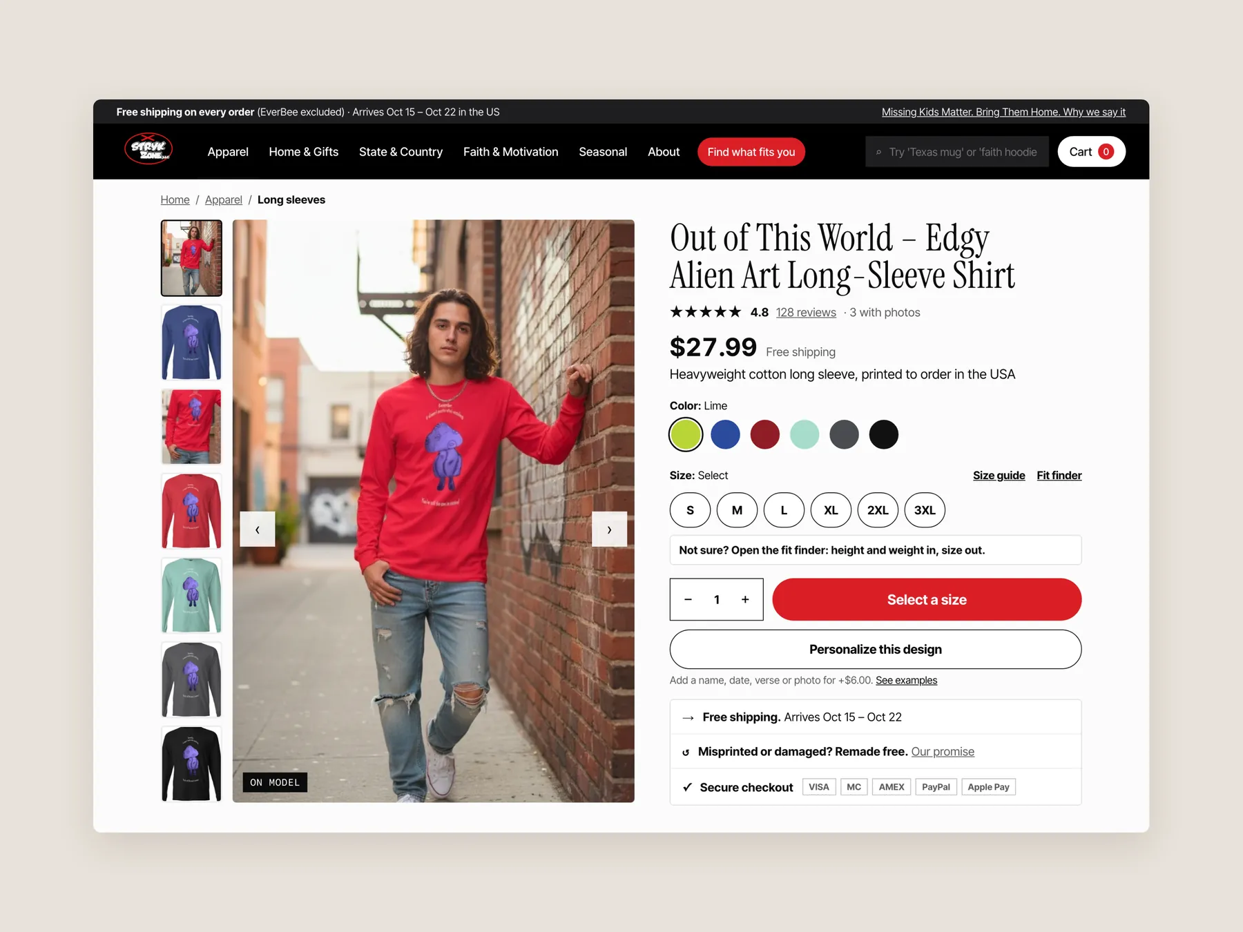
Buy box

Breadcrumb, the review line, title, price with free shipping, one sentence on the garment, colour swatches, the size row with Size guide and Fit finder beside it, the Not sure line, quantity and the red button, Personalize this design with its price, then the three-line box: arrival window, remade free if misprinted, secure checkout with the card logos.

StrykZone concept redesign: Product page first screen: header and buy box

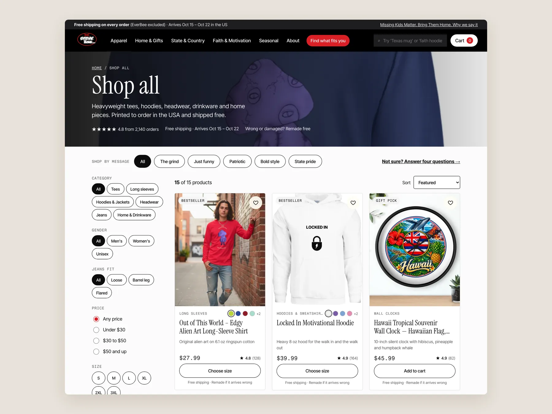
Collection

The Shop all banner with its one-line promise, shop by message chips with the finder link, the category, gender, jeans fit, price and size filters beside the grid, and the first row of cards with price, rating line, Choose size and the free shipping line.

StrykZone concept redesign: Collection page first screen: banner, message chips, filters, first row

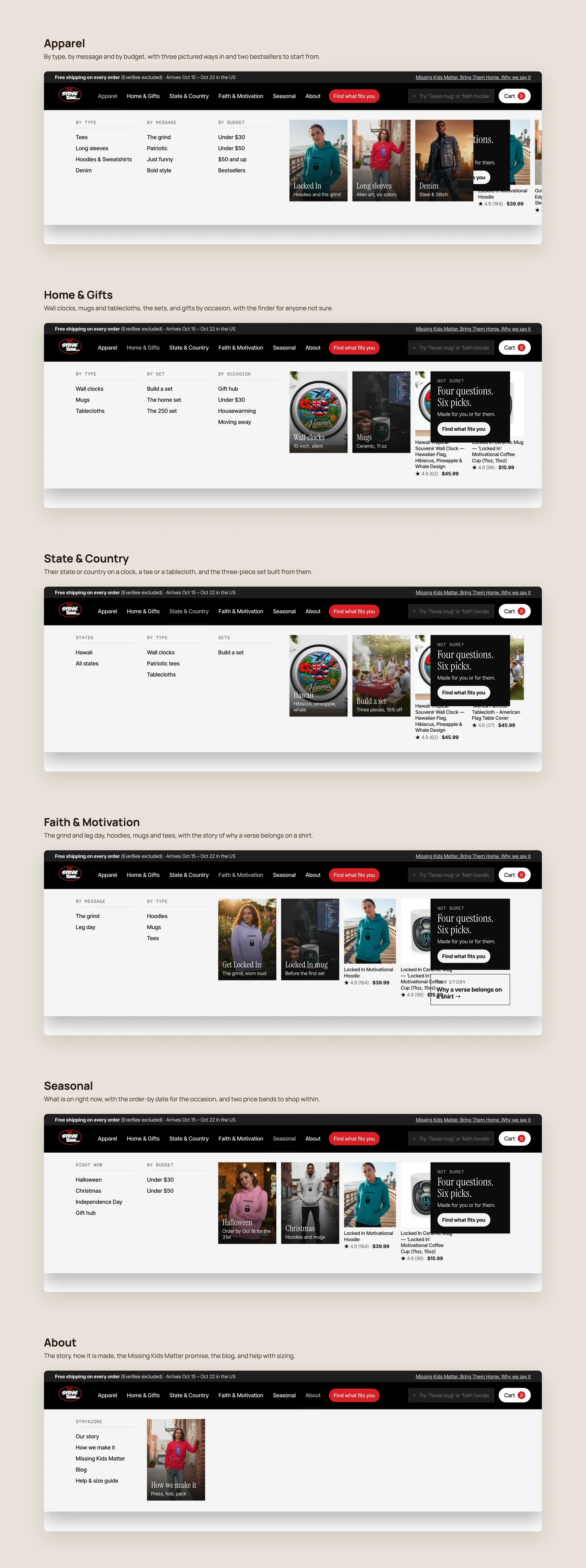
Mega menu, every panel

Apparel by type, message and budget; Home & Gifts with clocks, mugs, sets and occasions; State & Country with the three-piece set; Faith & Motivation with the story card; Seasonal with the order-by date; About with the story, the process and the size guide. Each with its link columns, pictured tiles and featured pieces.

StrykZone concept redesign: Mega menu, every panel open

Search

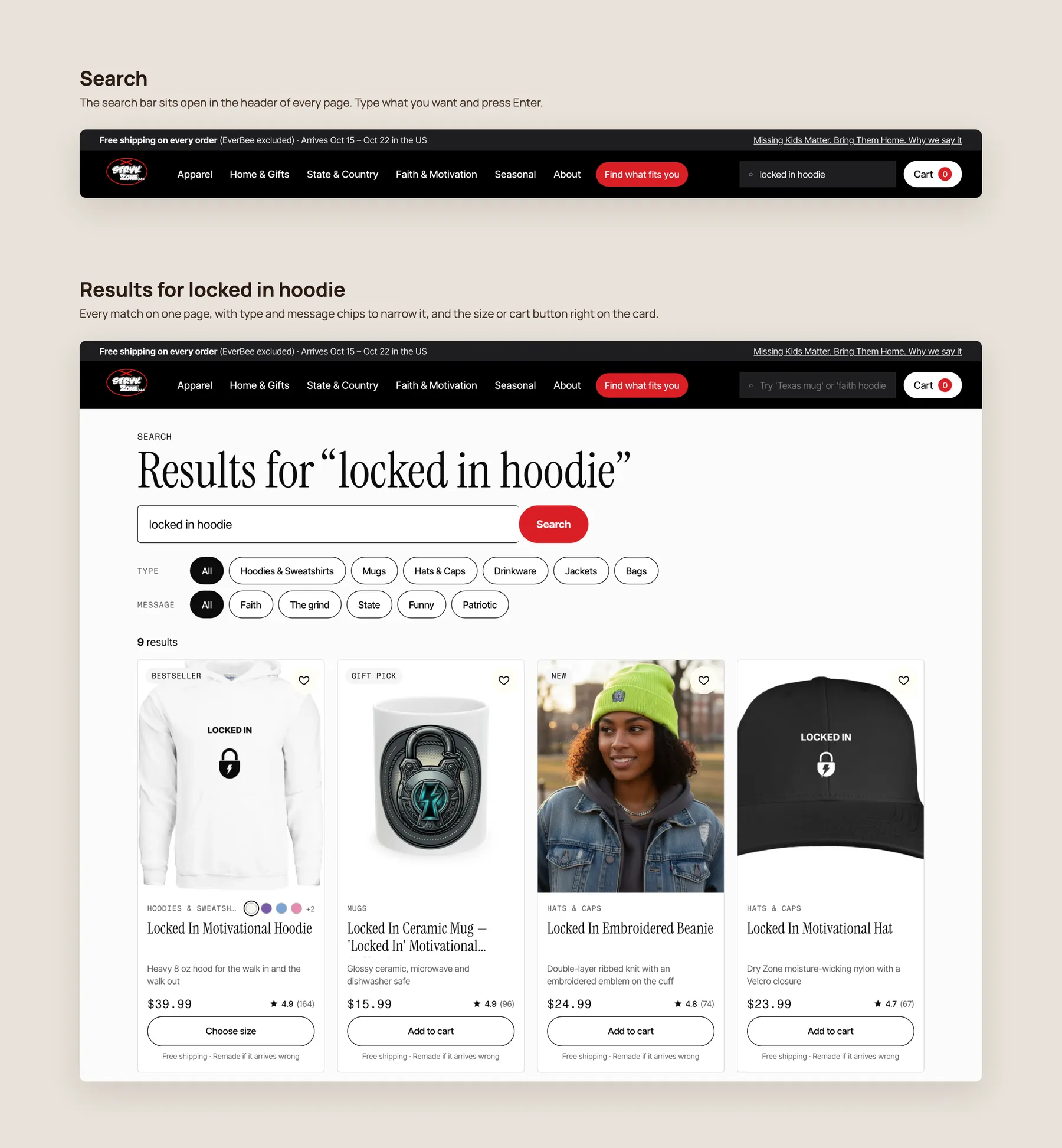
The bar sits open in the header of every page; a query lands on a results page with type and message chips to narrow it and the size or cart button on every card.

StrykZone concept redesign: Search: the bar and the results

On the phone

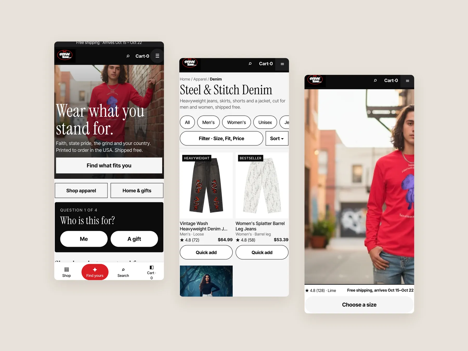
The first screen with the finder's first question, the denim collection, and the product page with its pinned Choose a size bar. One thumb, one decision at a time.

StrykZone concept redesign: Three phone screens: home, collection, product
07Key takeaways

The teardown in 7 lines.

  • StrykZone's products are not the problem; the way the site presents them is.
  • A homepage that shows every product but points to none leaves the visitor to do the selling.
  • In-house names like Steel and Stitch need a plain label beside them before a stranger will click.
  • Reviews on Google and Trustpilot do nothing for a shopper who never leaves the product page.
  • A collection that mixes jeans, shorts and trousers with no filters asks the visitor to open every page.
  • Nobody wants to be the first to review a shirt, so proof has to sit beside the buy button.
  • Selling three pieces to one person beats selling one piece to three people, and bundles make that easy.
08Questions

Questions this audit answers.

The presentation layer. The products and designs are strong, but the site shows them as a catalog with no guided path. Visitors have to work out on their own where to find what they came for.

The audit found that the bigger opportunity is converting the visitors who already arrive. The site already gets meaningful traffic, and the fixes focus on helping those visitors buy.

The hero does not explain what the brand sells, who it is for or why to trust it. Below that, the page is a long run of product grids under in-house names, so a shopper looking for one kind of tee has to scroll everything.

Names like Steel and Stitch carry meaning for the brand but not for a first-time visitor. The redesign keeps those names and adds plain routes by product type, message and budget beside them.

Those reviews only help if shoppers see them. At the moment visitors have to leave the site to check them. The audit recommends bringing reviews onto the homepage, collection cards and product pages.

The redesign separates product types, adds filtering by price and size, puts theme funnels and the finder at the top, and turns each card into a summary with colours, a short description, ratings and quick size selection.

It is a short quiz that does the job of a salesperson asking how they can help. It asks who the item is for, which message they like, the type of piece, their size and their budget, then recommends matching products.

Reviews and the price near the title, quick product facts, a size guide and fit finder, and delivery and returns details under the add to cart button. It also adds a section explaining the price, bundles that complete the look, a gift option and FAQs.

A shopper buying a tee would be offered a matching hoodie and jeans as a set with a discount. They could also choose a pre built set on the homepage or build their own three piece set.

Mugs, wall clocks and message apparel make natural gifts, and the gifting season is close. A clear gift route gives visitors who are not shopping for themselves a reason to buy rather than leave.

Most of the recommendations change how the existing range is organised and explained, such as menus, cards, reviews, size guidance and bundles. They work with the current products and collections rather than replacing them.

The recording is 36 minutes long. It reviews the current homepage, collection page and product page, then walks through redesign concepts for all three, including the product finder and bundles.

Free CRO audit

See what's quietly costing you sales.

Tell us about your store and we'll send a personalized 5-minute video showing exactly where you're losing buyers — and how to win them back.

Takes about 40 seconds. No call required.

What's included
  • 5-minute video teardown
    A personalized walkthrough of your store, recorded by Eva.
  • Homepage & PDP review
    Where attention leaks and buyers hesitate.
  • Mobile UX audit
    70% of your traffic — judged on its own terms.
  • Trust & credibility check
    The signals that make first-time buyers convert.
  • Prioritized CRO roadmap
    Ranked by impact vs. effort, ready to ship.