Convertica Studio
CRO teardown Ayurvedic Tea & Natural Body Care

Shop Daily Ritual CRO Audit

A CRO teardown of Shop Daily Ritual, a wellness store selling Ayurvedic teas, soaps, oils and body care, covering the homepage, collection page and product page, plus a redesign of all three.

14
Issues found
18
Fixes proposed
34
Minutes of tape
4.4
Overall / 10
34 min watch
01The teardown

Watch the full 34-minute recording.

Pressing play loads the video from YouTube — you can allow it for every teardown under cookie preferences.

02Executive summary

What we found.

Shop Daily Ritual sells Ayurvedic teas, soaps, oils and skin, hair and body care from small makers, and the basics of a trustworthy store are already in place. The site is certified, it has collected a healthy number of reviews, the product page shows a clear price, free shipping and an instalment option, and the review on display is verified and dated. The structure is sound and the products are not the weak point.

The problem is the presentation layer. A new visitor can tell what the brand does within seconds, but nothing near the top of the homepage tells them whether it is for them or whether other people trust it. The reviews and the certification that would settle that question are pushed to the bottom of the page, where most of the ad traffic the store is paying for will never scroll to find them.

The same pattern repeats further down the funnel. Teas, soaps and oils share one grid with sorting by price, availability and name, and sorting by best selling returns almost the same order, so nothing stands out. The product page shows one review, then a long block of text before any further proof, and makes no attempt to add a second item to the basket despite a 10% offer over $75 sitting in the top bar.

The redesign puts proof in the hero, adds a short quiz that recommends a ritual, splits the catalogue into funnels by need, moment and dosha, badges a handful of real bestsellers, bundles pairs at 10% off and rebuilds the product page to justify the price per day. The idea to keep: a store that only lists products is a catalogue, and a catalogue does not sell. Guide the visitor to the right product and the sale follows.

03The verdict

Problem, opportunity, impact

Core problem

Visitors can see what Shop Daily Ritual sells, but nothing near the top of the page tells them it is for them or that other people trust it. The reviews and certification that would answer that sit at the bottom of the homepage.

Main opportunity

A store that greets each visitor with proof, then guides them by need, moment or dosha to the right tea or body care product, pairs it with a second item for a discount, and justifies the price on the product page before asking for the sale.

Estimated impact

More of the ad traffic the store already pays for would reach a product it understands, more carts would hold two items instead of one, and price doubts would be answered before the shopper leaves to

04How we audited

Scored across five dimensions.

4.4 Overall

Five dimensions, each scored out of ten.

The five passes
  1. 01
    Homepage & PDP review Where attention leaks and buyers hesitate, section by section.
  2. 02
    Mobile UX audit 70% of your traffic — judged on its own terms.
  3. 03
    Trust & credibility check The signals that make first-time buyers convert.
  4. 04
    Collection & discovery Filtering, merchandising and guidance from browse to buy.
  5. 05
    Prioritized CRO roadmap Ranked by impact vs. effort, ready to ship.
3 of 5 dimensions scoring four or below
Branding 5/10
UX 4/10
Trust 4/10
Product Page 5/10
Conversion 4/10
05What we'd fix

Every issue, paired with its fix.

14 issues found, 18 fixes proposed.

Problems identified

Trust Signals Buried At The Bottom Of The Homepage

The store is certified and has a good number of reviews, but both sit at the foot of the homepage. A visitor arriving from an ad sees neither before deciding whether to scroll or leave.

Homepage Never Says Who The Products Are For

The hero makes it clear that the brand sells wellness products, but it does not tell a new visitor whether these teas and body care items are meant for them or what problem they solve.

Hero Section Offers No Guided Buying Path

After landing, a shopper has no obvious next step. There is no route by need, by moment or by product type, so the homepage leaves the work of discovery entirely to the visitor.

Discounts And Free Shipping Live Only In The Top Bar

Free shipping on all orders, 15% off a first order and 10% off orders over $75 are announced once in the announcement bar. Anyone who misses that line never sees the offers again.

Collection Page Mixes Teas, Soaps And Oils In One Grid

Every product type sits together on a single collection page. A shopper looking for a soap has to scan past teas and oils, and nothing on the page separates one category from another.

Sorting Limited To Price, Availability And Name

The only ways to reorder the grid are price, availability, alphabet, relevance and best selling. There is no filter by need, by format or by dosha, which is how a tea buyer actually chooses.

Best Selling Sort Shows The Same Products As Default

Switching the collection to best selling returns almost the identical order. When every product appears to be a bestseller, none of them is, and the signal stops helping anyone choose.

No Way To Compare Products On The Collection Page

The cards show an image, a name and a price, so a shopper has to open each product page to learn what it does. Comparing two teas means opening two tabs and reading two long descriptions.

Product Cards Give Nothing Beyond Name And Price

Nothing on the card says what the blend is for, whether it is caffeine free or who it suits. The card works as a catalogue entry rather than as a reason to click through.

Product Page Shows A Single Review

One review appears under the product name. The storewide review count that would reassure a first time buyer is not shown, so the page reads as though almost nobody has bought.

Long Text Block Separates Price From Social Proof

Below the price and instalment option there is a long run of text before the shopper reaches the review they are looking for. The proof exists, but it arrives after most people have stopped reading.

Product Page Makes No Attempt To Raise Order Value

A you may also like block sits at the foot of the page, but nothing pairs the product with a complementary item or reminds the shopper how close they are to the 10% threshold.

Kit Pages Do Not Say What Is Inside

The kit on offer does not list its contents clearly, so a shopper cannot tell what they are getting or compare the kit against buying the pieces separately.

Product Pages Behave Like A Catalogue, Not A Sales Page

The page lists facts about the product but does not justify the price, answer the questions a hesitant buyer has, or explain why this is worth more than a cheaper marketplace alternative.

Recommendations

Move Reviews And Certification Into The Hero

Bring the review count and the certification badge up beside the headline so the first screen answers whether other people trust the store, instead of leaving that answer at the bottom of the page.

State Who Each Ritual Is For Above The Fold

Add a line under the headline that names the shopper and the moment, so a visitor knows within seconds that these plant based, small batch products are made for their morning, evening or wind down.

Add A Find Your Ritual Quiz To The Homepage

Place a short quiz in the hero that asks a few questions and recommends products based on the answers. It turns a browsing visitor into a guided one and removes the need to read every product.

Rebuild The Navigation Around Need, Moment And Dosha

Replace the flat shop link with a menu that lets people browse by collection, by need, by moment such as morning, evening or weekend, and within tea by need, dosha and format.

Repeat Free Shipping And Returns On Every Page

Show free shipping, dispatch time and easy returns under the hero, on product cards and beside the add to bag button, rather than relying on one line in the announcement bar.

Split The Collection Into Teas, Body And Home

Give teas their own collection with a tea room header and a find my blend button, and group skin, hair and bath under body and home, so shoppers only see the category they came for.

Add Filters For Need, Format And Dosha

Let a shopper filter by what they want help with, such as energy or hormone balance, then by format such as loose leaf, so the grid narrows to the few products that actually fit them.

Badge Only A Handful Of True Bestsellers

Mark the two or three products that genuinely sell most with a bestseller badge and leave the rest unmarked. The contrast is what makes the badge persuasive.

Write A One Line Summary On Every Product Card

Add a short line to each card that says what the product is for, whether it is caffeine free and how it is made, so shoppers can compare products side by side without opening them.

Offer Paired Bundles At 10% Off

Build a ritual section that pairs products, such as hair and skin or evening unwind, at the 10% discount already promised, so a shopper leaves with two items instead of one.

Show Storewide Review Totals Under The Product Name

Replace the lone review under the product title with the overall review count and rating, so a first time buyer sees that many people have bought and been satisfied.

Break The Price Down To A Cost Per Day

Translate the pack price into a cost per morning or per cup and show it near the price. It justifies a premium product against cheaper marketplace alternatives before the doubt forms.

List What Is Inside Every Kit

Add a what is inside section to each kit page with every item named and a way to compare the kit against buying the pieces separately, so the kit reads as a saving rather than a mystery.

Nudge Shoppers Toward The $75 Discount Threshold

On the product page and in the bag, tell the shopper how much more they need to add to reach $75 for 10% off, and suggest the product that gets them there.

Explain Each Ingredient And Why The Price Is Premium

Below the fold on the product page, list the ingredients with a line on why each is there, then say plainly what makes the product premium and why it costs more than a mass market version.

Add A Complete The Ritual Cross Sell

Under the product details, offer the full ritual of three complementary items, such as the oil, the soap and the tea, with the discount applied, so the order grows without a hard sell.

Add Customer Photos, A Founder Note And An FAQ

Place reviews with customer photos, a short founder section and a frequently asked questions block on the homepage and product page to answer hesitation at the point it appears.

Add Occasion And Gifting Paths For Buyers Shopping For Others

Create an occasion and gifting section with self explanatory cards, so a visitor who is not buying for themselves still has a clear route to a purchase.


06The redesign

The version we'd build.

A concept redesign of Shop Daily Ritual, a curated Ayurvedic tea, oral care and natural body care store that carries small makers. Homepage, mega menu, Ritual Finder, collection, product page and bag, built from the findings of a conversion audit of the live store. The live store sells products that need explaining, at a premium price, through pages that mostly show a name and a price. The product page for a $48 oral care kit shows the title, the price, a Sale badge and a button, with nothing on what is in the kit, how to use it or who makes it. The homepage shows four teas, so a store whose largest collection is skin and body care reads as a tea shop. The collection puts single blends named Pitta, Vata and Kapha beside a gift box, a kit and a pancake mix, with filters by price and availability only. A buyer who does not yet know what oil pulling is, or what a dosha is, leaves to find the answer and usually buys where she finds it. The store does the explaining before it asks for the sale. The homepage says what the edit is, names the makers, and offers a guided way in before it offers a grid. A four-question Ritual Finder turns what she is hoping for, when she would keep a ritual, how she likes to take care of herself and her dosha into one named ritual of two products with the reason for each. The mega menu routes by collection, need, moment, dosha, area, maker, recipient and budget. The collection gets need and dosha chips, a one-line benefit and a maker on every card, and a plain-language dosha note. The product page puts what is in the kit, the price per morning, Add to bag, the shipping and returns lines and the ten percent nudge in the first screen, then teaches the routine and the ingredients below. The bag is a slide-over with the saving bar, one line per product and Checkout securely.

A concept redesign created by Convertica Studio from this audit. It shows how the store could work, it is not the live store.

Homepage

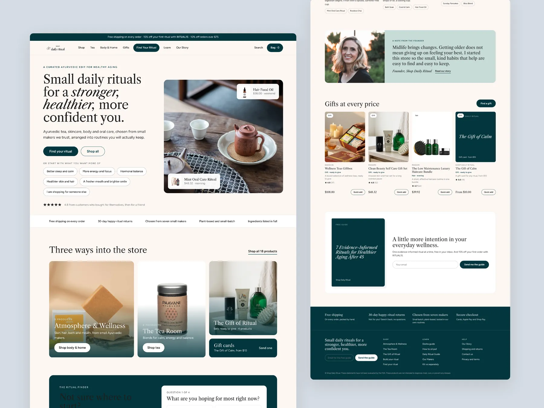
The whole page in two columns: the hero that names the edit and the makers, the Find your ritual button, three doors into the store, the offers up top, the build a ritual grid, then the makers, how a ritual works, what people say and the footer.

Shop Daily Ritual concept redesign: Homepage, two tall columns

Three pages side by side

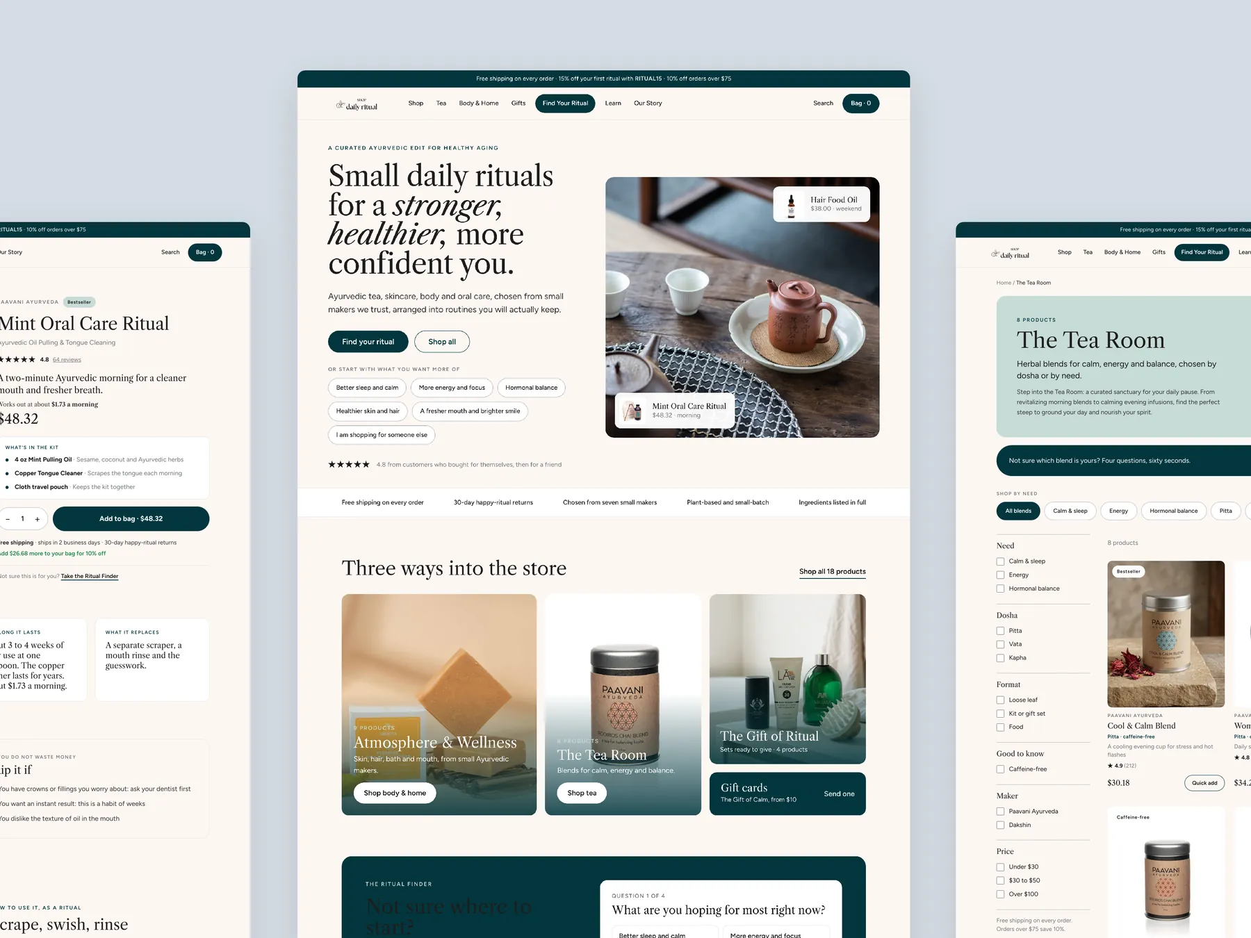
The homepage in the centre, the product page's buy column on the left with the kit list and Add to bag, The Tea Room collection with its banner, the Not sure strip and the chips on the right. One system across every page.

Shop Daily Ritual concept redesign: Homepage centre, product left, collection right

The ritual bag

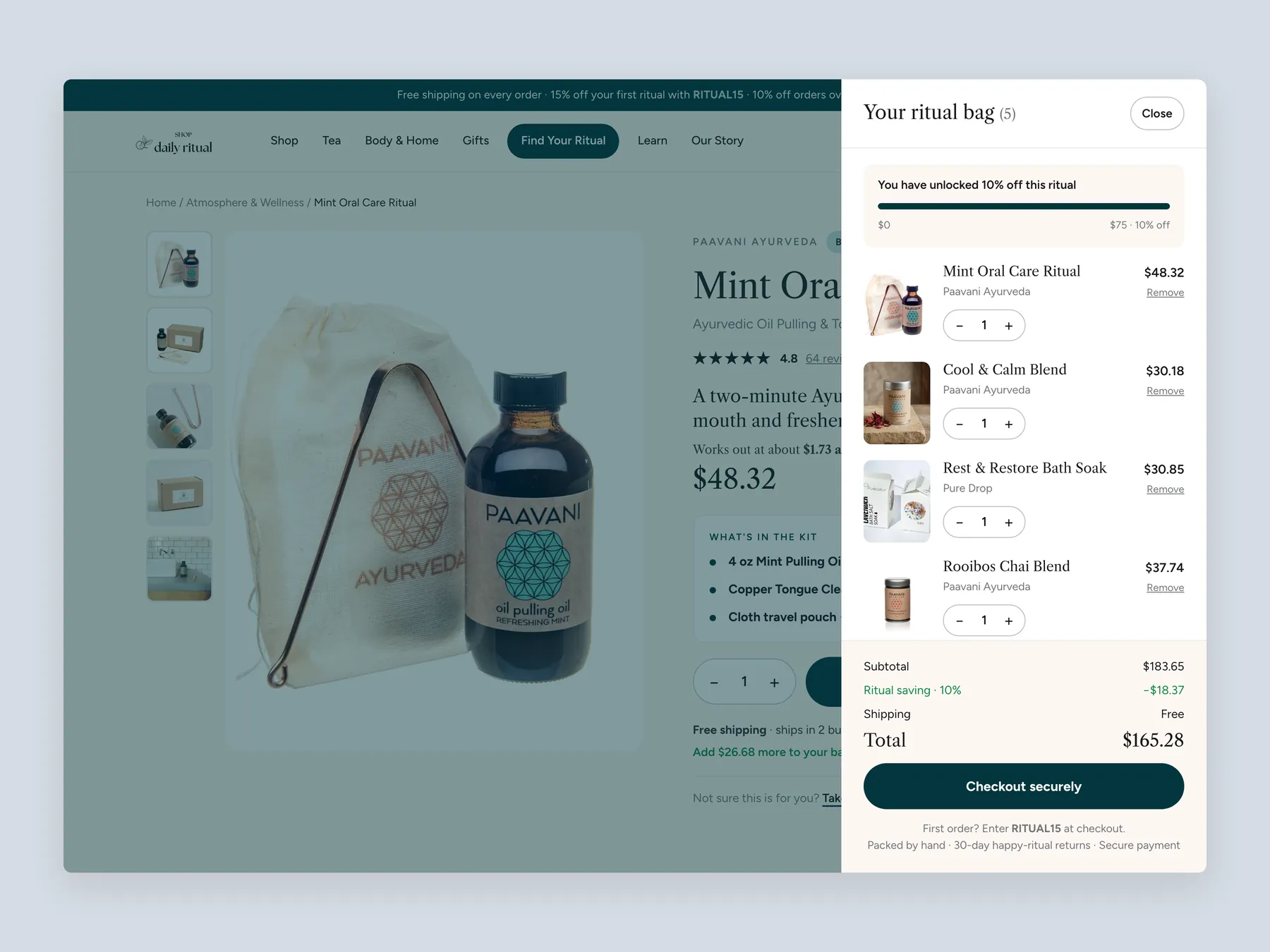
A slide-over, not a page: the saving bar at the top, one line per product with its maker and quantity, the subtotal with the saving and free shipping, Checkout securely and the first order code under it, over the dimmed product page.

Shop Daily Ritual concept redesign: Ritual bag slide over open over the product page, whole screen

The Ritual Finder, step by step

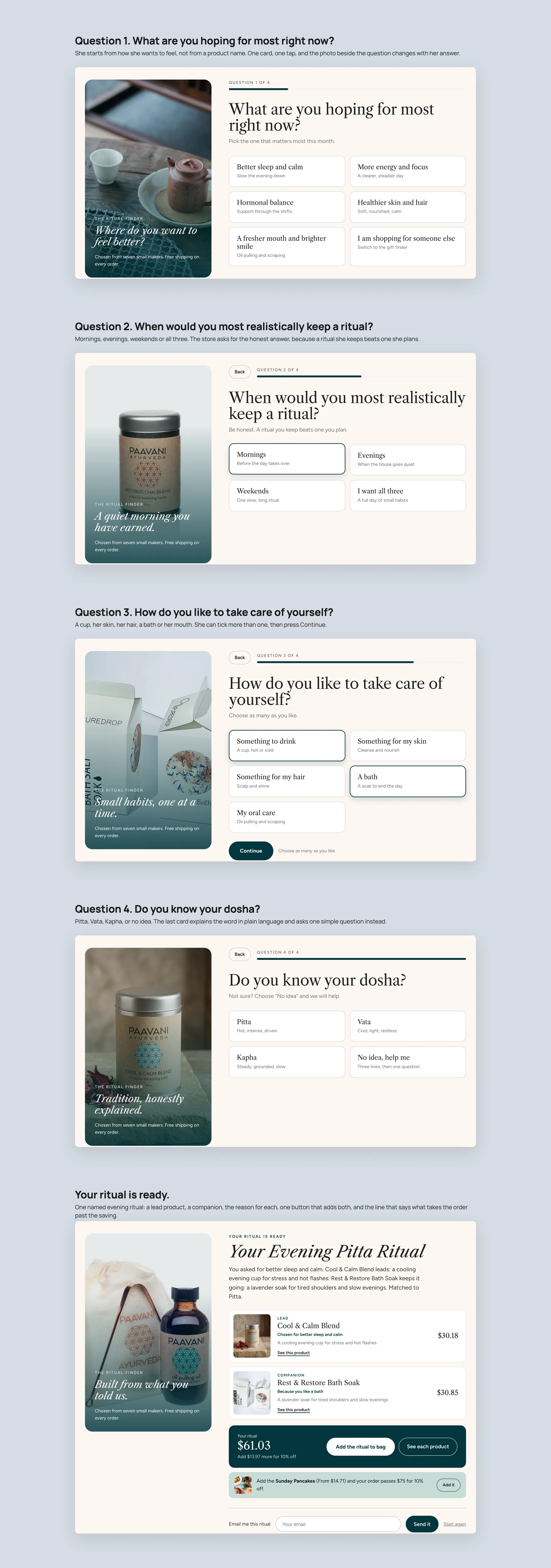
What are you hoping for most right now, when would you keep a ritual, how do you like to take care of yourself, do you know your dosha, then one named evening ritual with a lead product, a companion, the reason for each, one button that adds both and a line on what takes the order past the saving.

Shop Daily Ritual concept redesign: The Ritual Finder, step by step

Product page

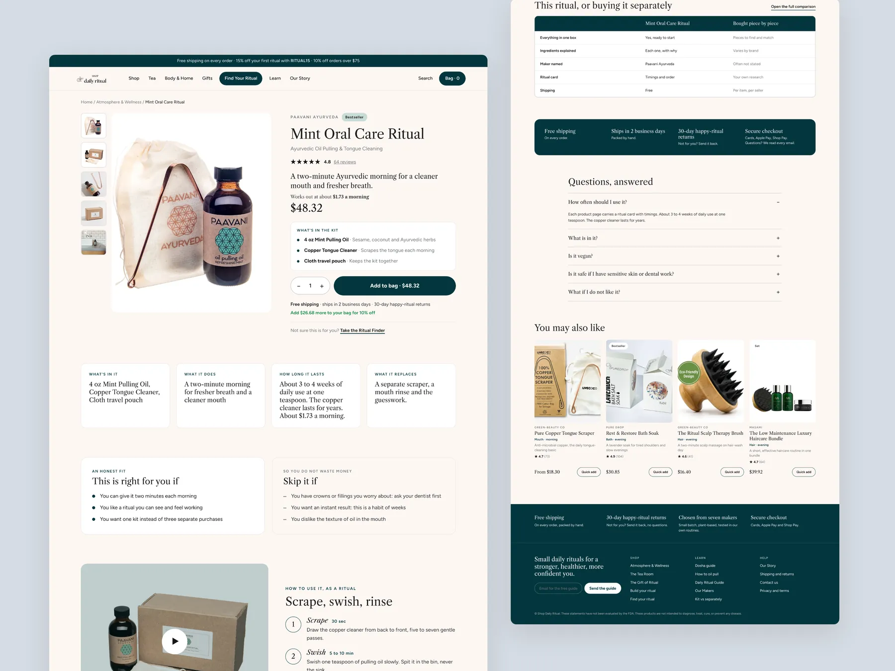
The whole page in two columns: gallery and buy column with the kit list, Add to bag and the shipping and returns lines, what is in it, the routine in three steps, the ingredients with a reason for each, the maker, reviews, complete the ritual, and the footer.

Shop Daily Ritual concept redesign: Product page, two tall columns

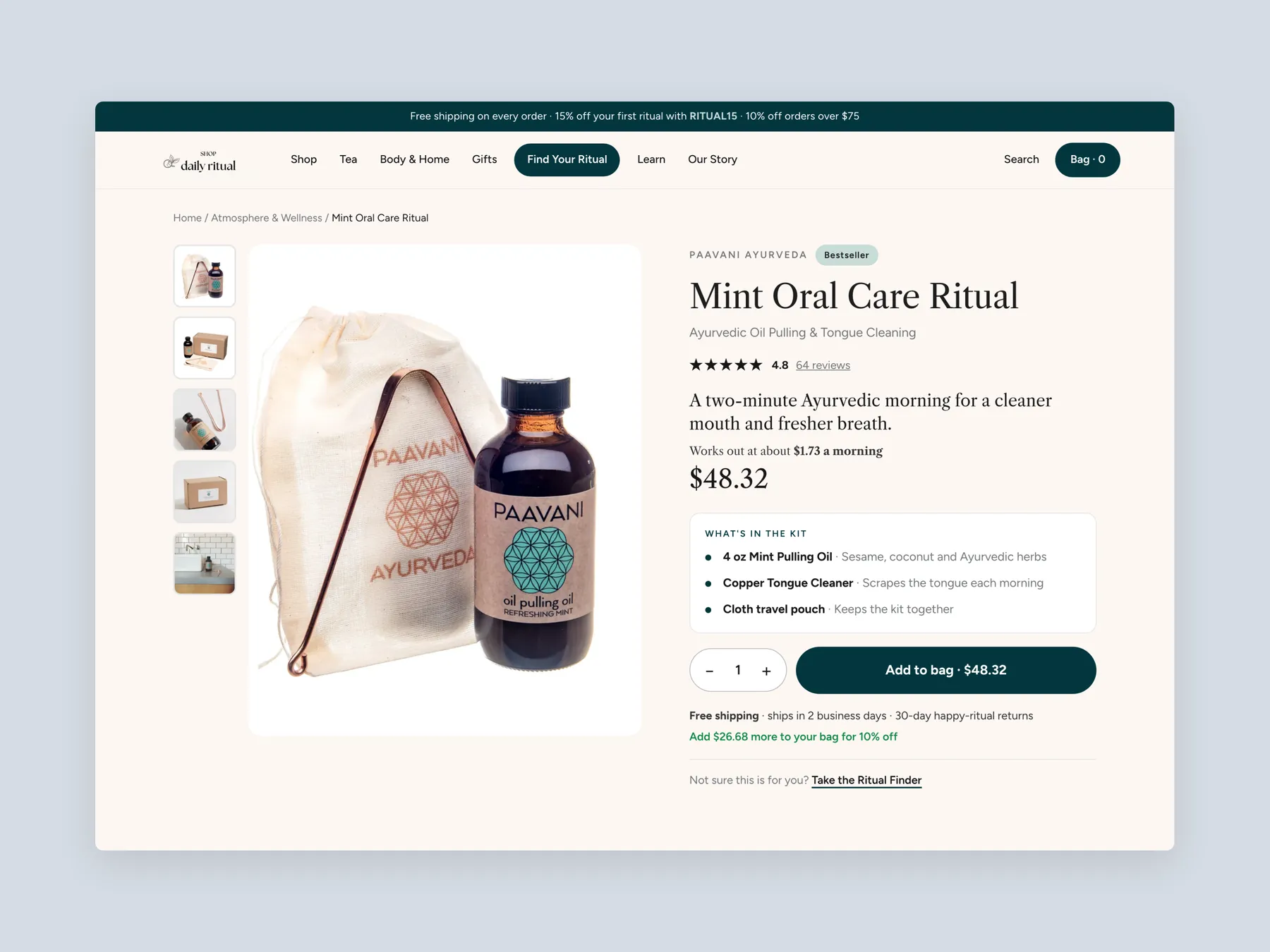
Buy box

Maker, bestseller badge, title, one line on what the ritual does, the price per morning, the price, what is in the kit, quantity, Add to bag, free shipping with the dispatch time and the returns window, the ten percent nudge, and Take the Ritual Finder for anyone still unsure.

Shop Daily Ritual concept redesign: Product page first screen: header and buy box

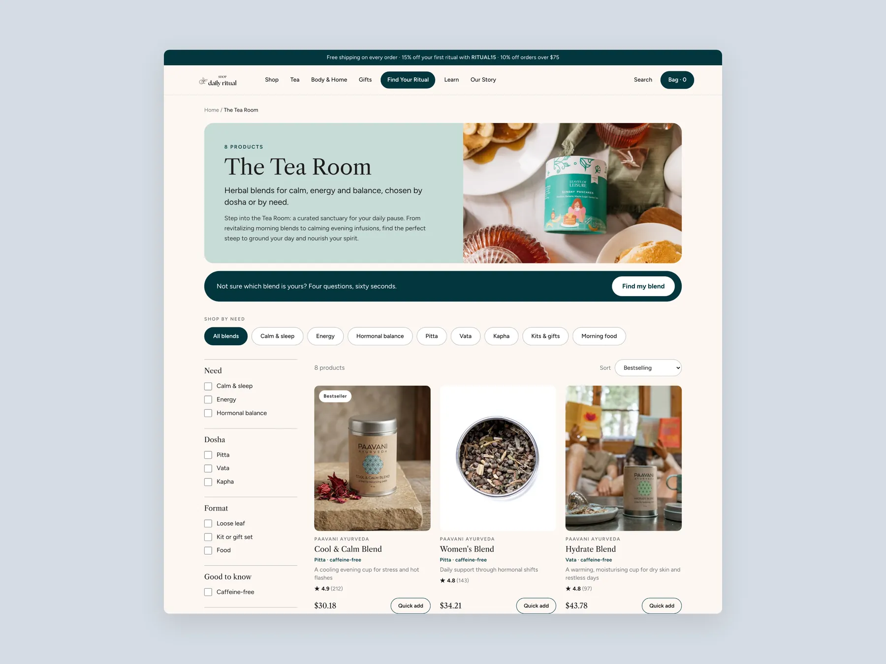
Collection

The Tea Room banner with a line on what the collection is for, the Find my blend strip, shop by need chips, filters by need, dosha, format and maker, and the first row of blends with a badge, dosha and caffeine tags, a one-line benefit, the price and Quick add.

Shop Daily Ritual concept redesign: Collection page first screen: header, banner, chips, filters, first row

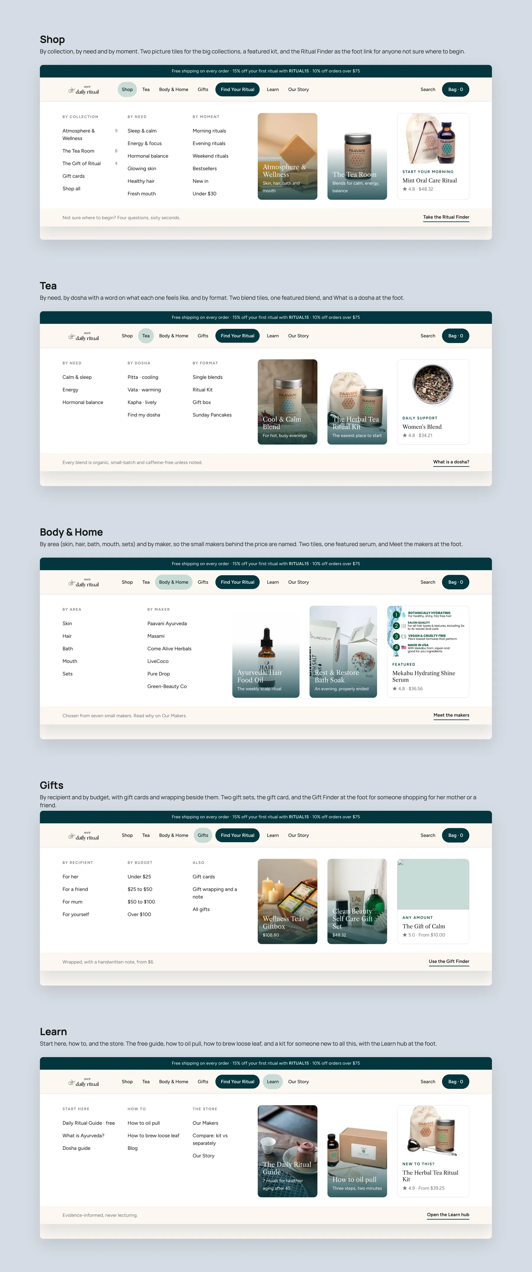
Mega menu, every panel

Shop by collection, need and moment; Tea by need, dosha and format; Body & Home by area and by maker; Gifts by recipient and budget; Learn with start here, how to and the store. Two picture tiles and one featured product in each panel, and a note strip at the foot.

Shop Daily Ritual concept redesign: Mega menu, every panel open

On the phone

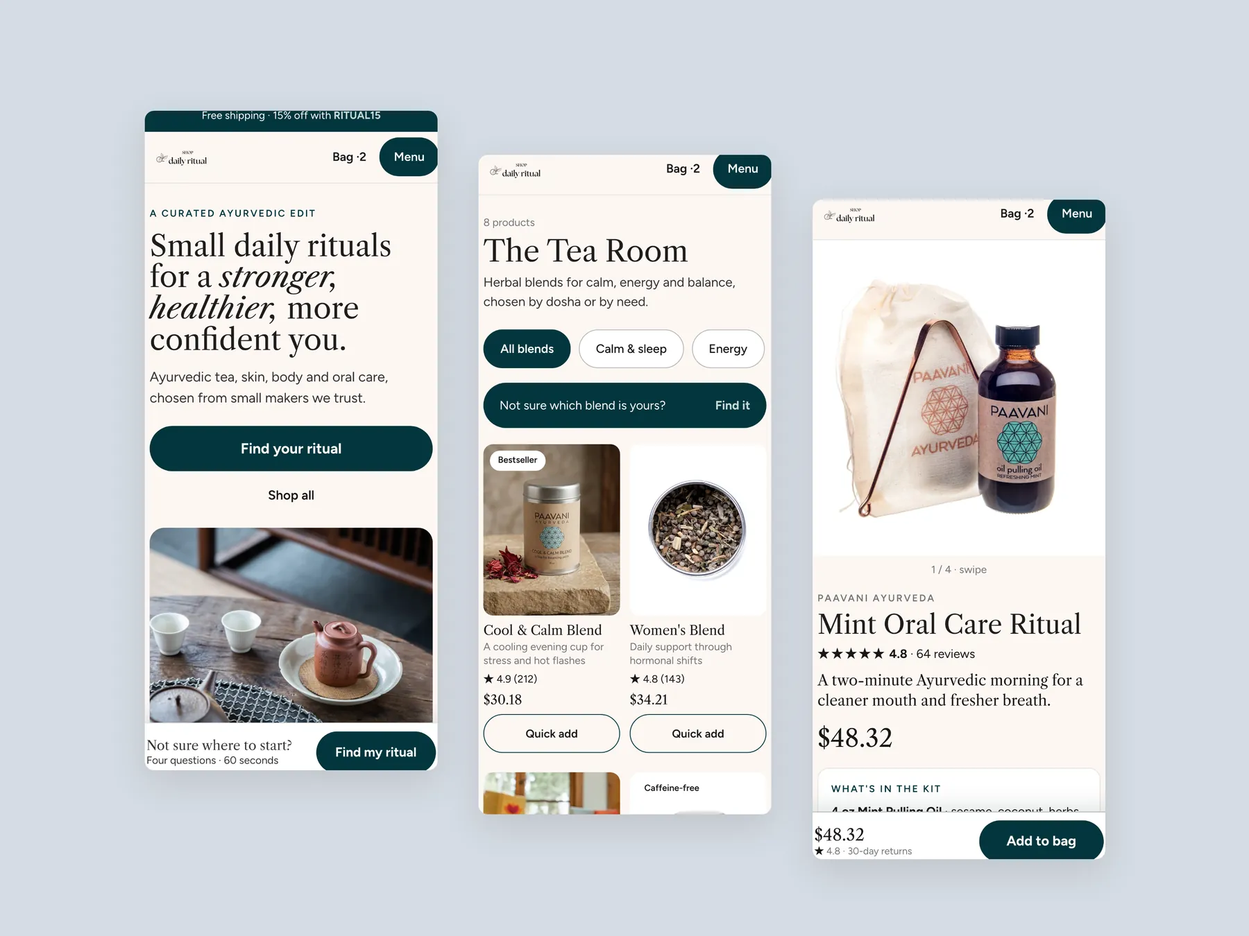
The home first screen with Find your ritual and the pinned Not sure where to start bar, The Tea Room with its chips and the Not sure strip, and the product page with its pinned Add to bag. One thumb, one decision at a time.

Shop Daily Ritual concept redesign: Three phone screens: home, collection, product
07Key takeaways

The teardown in 7 lines.

  • The store's biggest opportunity is not more traffic but helping the traffic it already pays for feel confident enough to buy.
  • A homepage has to answer what the brand does, who it is for and whether others trust it, and this one only answers the first.
  • Proof that sits at the bottom of the page does not exist for the visitor who never scrolls.
  • If every product is a bestseller, no product is a bestseller.
  • A collection page that shows everything in one grid is a catalogue, and a catalogue does not help anyone choose.
  • The product page already has price, free shipping and instalments; it is missing the proof and the price justification that turn interest into a purchase.
  • A 10% offer over $75 is only an order value lever if the shopper is reminded of it where they add to bag.
08Questions

Questions this audit answers.

Shop Daily Ritual is a wellness store selling Ayurvedic teas alongside soaps, oils and skin, hair and body care products. The audit describes the products as plant based and small batch, sourced from small makers, and treats the range itself as a strength rather than a problem.

The homepage tells a new visitor what the brand does but not whether it is for them or whether other people trust it. The certification and the reviews that would answer those questions are at the bottom of the page, so most paid traffic never sees them before deciding to leave.

Yes. The site is certified, it has collected a good number of reviews, and the product page shows a verified and dated review. The audit's point is placement, not absence. The proof exists but it is not where the visitor looks first.

Teas, soaps and oils all sit in one grid with sorting limited to price, availability, name, relevance and best selling. Sorting by best selling returns almost the same order as the default, and the cards show nothing beyond name and price, so there is no way to compare products without opening each one.

A bestseller badge only persuades when it marks a few products out from the rest. When the best selling sort shows the whole catalogue in nearly the same order, the label stops carrying any information. The recommendation is to badge only the handful of products that genuinely sell most.

It shows a review under the product name, a clear price, free shipping included and an instalment option, and the review on display is verified and dated. The audit notes these are the right ingredients and that the job is to strengthen them rather than start again.

The rebuilt product page adds a one line summary under the name, the storewide review count, a cost per day breakdown, a what is inside section, an ingredient list with a reason for each item, and a plain explanation of why the product is premium compared with cheaper marketplace alternatives.

It pairs products in build a ritual bundles at the 10% discount the store already offers over $75, adds a complete the ritual cross sell of three complementary items on the product page, and reminds the shopper in the bag how much more they need to add to unlock the discount.

It is a short set of questions placed in the homepage hero and repeated further down the page and on the collection page. Based on the answers it recommends specific products, so a visitor who does not know the range is guided to a fit rather than left to browse.

The shop menu is split into departments and categories. Shoppers can browse by collection, by need or by moment such as morning, evening or weekend, or go straight to bestsellers. Within tea they can choose by need, dosha or format, and body and home is split into skin, hair, bath and maker.

No. The store had run some low budget ads, but the recording does not state visitor numbers or revenue. The revenue calculator shown near the end uses hypothetical visitor and order value inputs to illustrate the effect of a higher conversion rate, not the store's actual figures.

The recording runs 34 minutes. It walks through the current homepage, collection page and product page, then presents a CRO focused redesign of each of the three pages, and closes with a revenue calculator and the two routes the store owner can take next.

Free CRO audit

See what's quietly costing you sales.

Tell us about your store and we'll send a personalized 5-minute video showing exactly where you're losing buyers — and how to win them back.

Takes about 40 seconds. No call required.

What's included
  • 5-minute video teardown
    A personalized walkthrough of your store, recorded by Eva.
  • Homepage & PDP review
    Where attention leaks and buyers hesitate.
  • Mobile UX audit
    70% of your traffic — judged on its own terms.
  • Trust & credibility check
    The signals that make first-time buyers convert.
  • Prioritized CRO roadmap
    Ranked by impact vs. effort, ready to ship.