Homepage, two tall columns
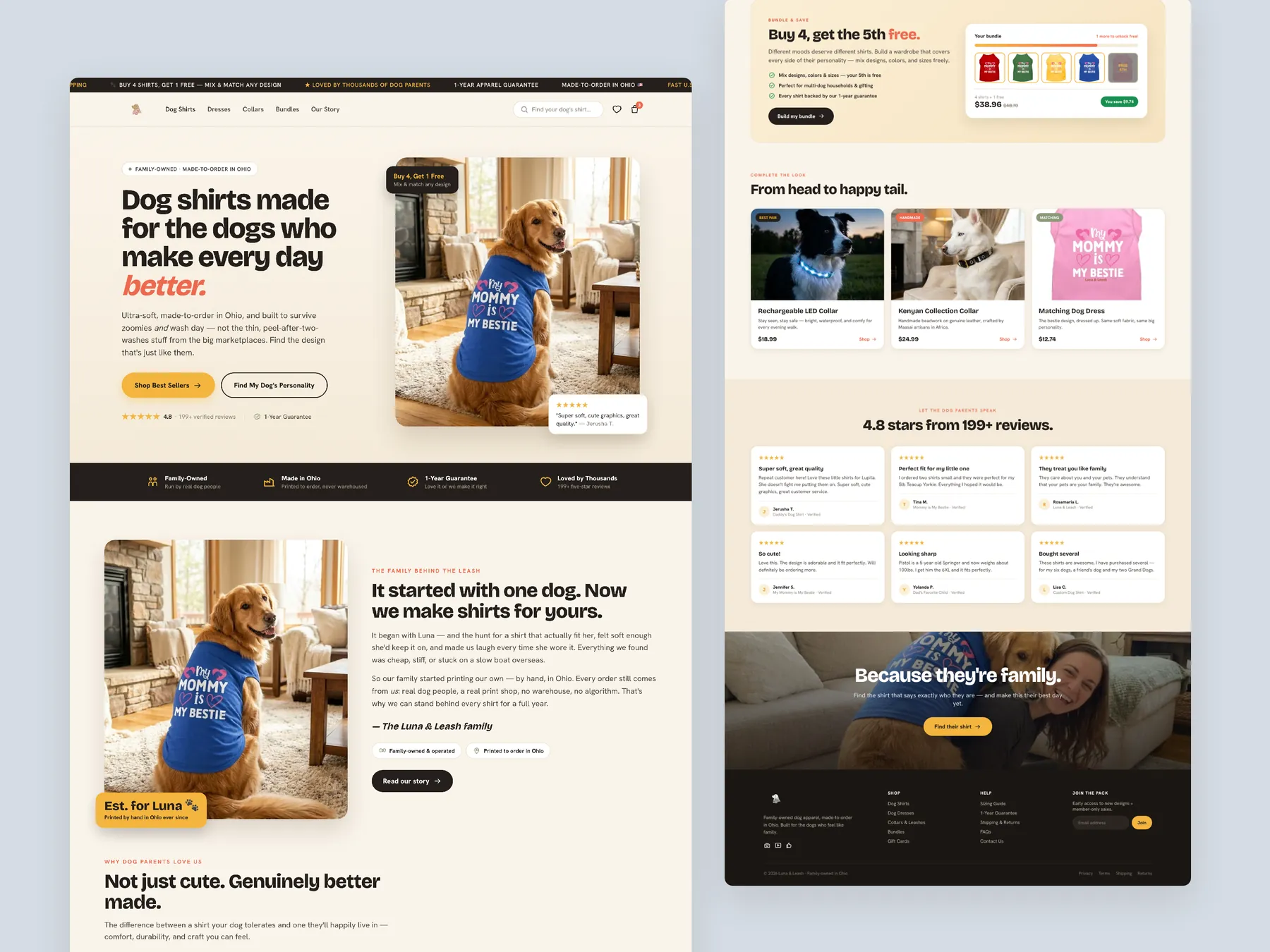
Homepage in two tall columns, from the first screen down to the footer.
Storefronts we designed and built, across supplements, fragrance, health, wellness and skincare.
All 35 projectsFour engagements, measured before and after. What changed, why it changed, and by how much.
All case studiesDiagnosis, design and development from one studio — so the recommendation and the build never disagree.
All five services147 real Shopify stores torn down page by page, scored, and shown beside the version we would build. Free to watch.
Browse all teardownsSix conversion-first themes, each built for one industry’s buying journey. Zero required apps, $300, one licence.
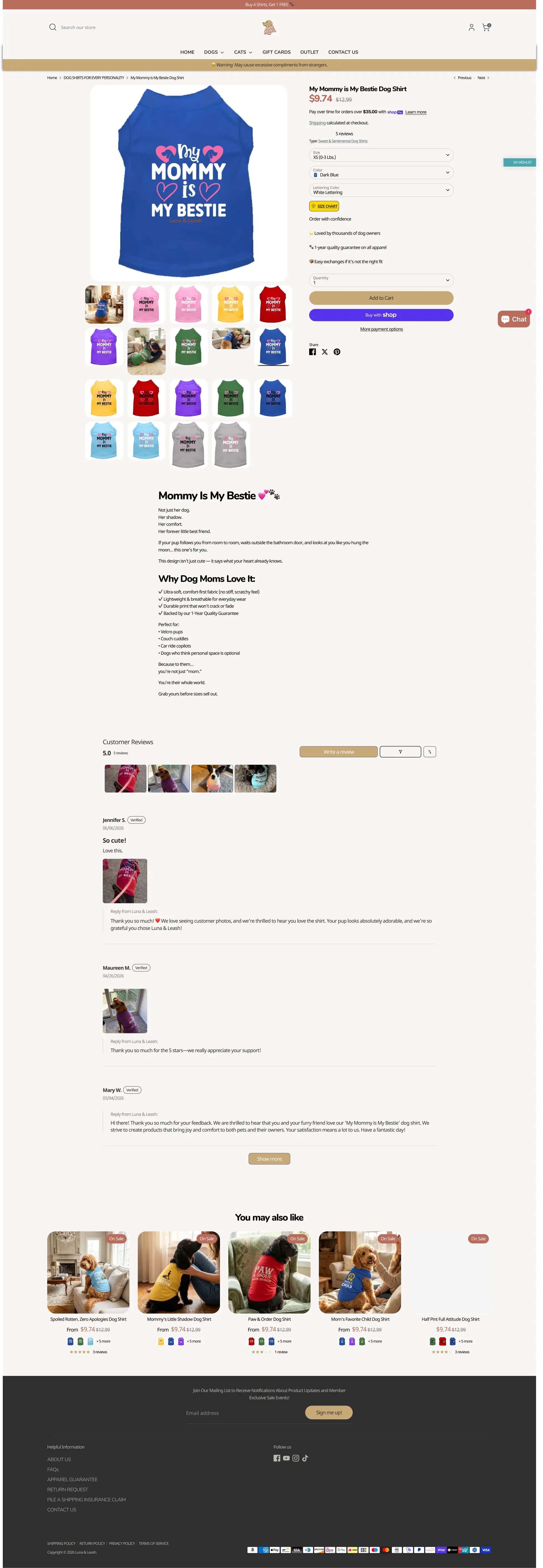
Compare all sixThe website has a warm brand feel, but it moves too quickly into product selling, overuses sale pricing, and does not use trust, reviews, sizing reassurance, or emotional storytelling strongly enough.
Pressing play loads the video from YouTube — you can allow it for every teardown under cookie preferences.
This audit found that Luna Leash already has a warm, joyful brand feeling, which is better than many standard Shopify catalog-style websites. The tone feels friendly, pet-focused, and emotionally relevant.
The main issue is that the website moves too quickly into selling products before fully building trust. The homepage should first establish credibility, explain the brand story, show proof, and emotionally connect with dog parents before showing product grids.
Another major issue is the overuse of discounts. Because nearly every product appears to be on sale, the sale loses meaning and can reduce trust. A better approach would be to use fewer strategic discounts and focus more on free shipping, guarantees, product quality, and bundles.
The collection page currently feels like a product dump instead of a guided shopping experience. Luna Leash has a strong opportunity to organize products by dog personality, such as boss of the house, mama’s shadow, tiny tornado, or sweet and sentimental.
The product page has a decent foundation, but it needs stronger visible reviews, better trust messaging near the add-to-cart button, clearer size guidance, free shipping reassurance, and stronger cross-sell or bundle sections to increase average order value.
The website has a warm brand feel, but it moves too quickly into product selling, overuses sale pricing, and does not use trust, reviews, sizing reassurance, or emotional storytelling strongly enough.
Position Luna Leash as a family-owned, made-in-Ohio dog apparel brand that helps dog parents find shirts based on their dog’s personality while increasing trust and average order value.
Stronger trust, clearer product discovery, better size confidence, fewer checkout surprises, higher conversion rate, and increased average order value through bundles and personality-based shopping.
Average of the five scores below, as judged at the time of recording. Weak overall — the detail is in which dimension is dragging.
Every finding below was called out on the recording. Open one to read what was found and what we would change. Nothing is hidden from the page source.
The first message users see is buy four shirts and get one free. This jumps into selling before building trust.
Show review stars and review count near the product title and price so users see trust before buying.
The hero image and message create a warm feeling, but the section does not fully explain the brand, build trust, or guide visitors.
Use a more emotional headline such as dog shirts made for the dogs who make every day better.
The main hero image appears low resolution and does not maximize the most valuable real estate on the website.
This one is addressed by the wider recommendations below rather than a single change.
The strongest proof, such as being trusted by thousands of dog owners, appears too late on the page.
Lead with messages such as made to order in Ohio, free U.S. shipping, family owned, or one-year guarantee before pushing sales.
Using smileys or emojis can make sections feel AI-generated or less polished. Proper icons would feel more credible.
Use clean icons instead of smileys to make trust sections feel more polished and intentional.
The homepage moves into product grids before enough story, trust, and emotional connection are built.
Use sale pricing only for selected hero products and let other products appear at regular price.
When every product is on sale, the discount loses meaning and may make users feel the pricing is artificial.
Instead of discounting every product, keep pricing cleaner and promote free shipping as the value driver.
Showing a crossed-out price on every product can feel like the price was raised just to show a discount.
Add trust signals such as family-owned, made in Ohio, one-year guarantee, fast shipping, and thousands of happy dog parents.
The collection page lists products but does not guide users based on dog personality, occasion, gift intent, or product type.
Let users filter by dog personality, gift type, sentiment, funny shirts, custom shirts, and best sellers.
Users have to scan through too many products without enough filters, cues, or buying guidance.
Use badges like best seller, most gifted, new, custom, or fan favorite to help users decide faster.
The product has reviews, but they are not prominent enough near the decision area.
This one is addressed by the wider recommendations below rather than a single change.
Shipping calculated at checkout creates uncertainty and can feel like a surprise cost waiting at checkout.
Replace shipping calculated at checkout with clear free shipping or shipping threshold messaging.
The product title and price are visible, but the page does not clearly explain the emotional value or outcome of buying the shirt.
Explain what the product does emotionally, such as making the dog’s personality visible or turning everyday walks into compliment moments.
Guarantees, exchanges, shipping, and reassurance should appear near the add-to-cart button where the decision happens.
Add one-year guarantee, easy exchange, fast U.S. shipping, and secure checkout near the purchase button.
The product page ends too quickly and misses opportunities to sell bundles, matching collars, multiple shirts, or complete wardrobes.
Add matching collars, additional shirts, or complete-the-look recommendations to increase average order value.
Tell the story of Luna and explain that the brand treats customers’ dogs like family.
Bring customer reviews, happy dog parent quotes, and trust proof closer to the top of the homepage.
Organize products by dog personality such as tiny tornado, mama’s shadow, boss of the house, sassy and statement, or sweet and sentimental.
Add a clearer size guide and reassurance that exchanges are easy if the size is wrong.
Remove share, tweet, and pin buttons because they add distraction and are rarely used.
Promote buy four, get one free directly on product pages where purchase decisions happen.
Add product-specific FAQs around sizing, shipping, exchanges, materials, washing, and personalization to improve search and AI answer visibility.
Drag each frame to move between what is live today and the version built on the recommendations above.
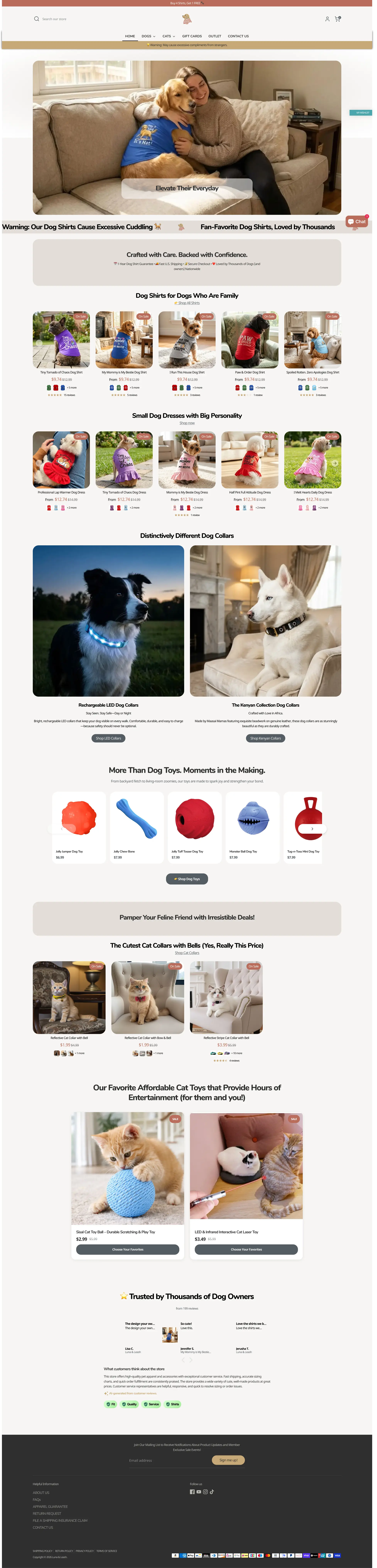
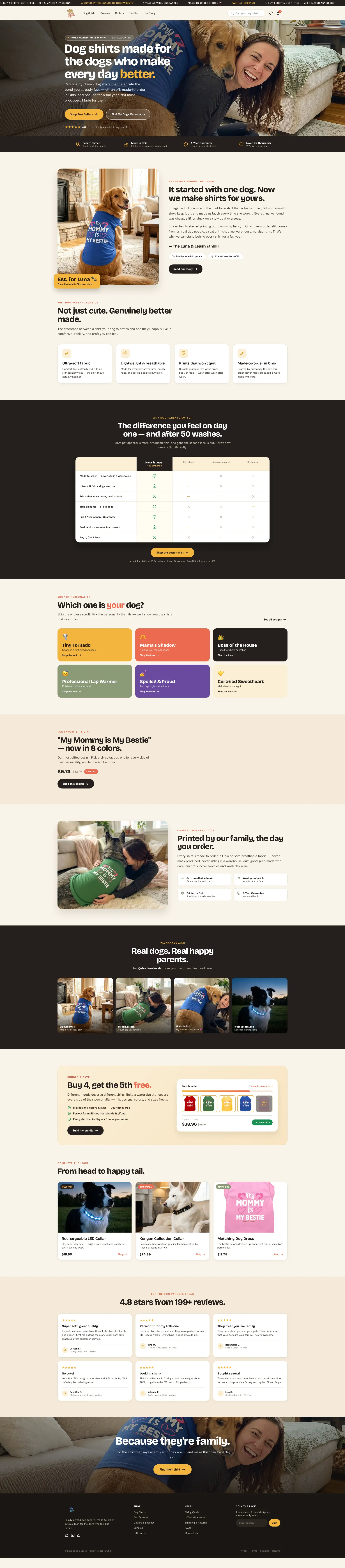 After
Before
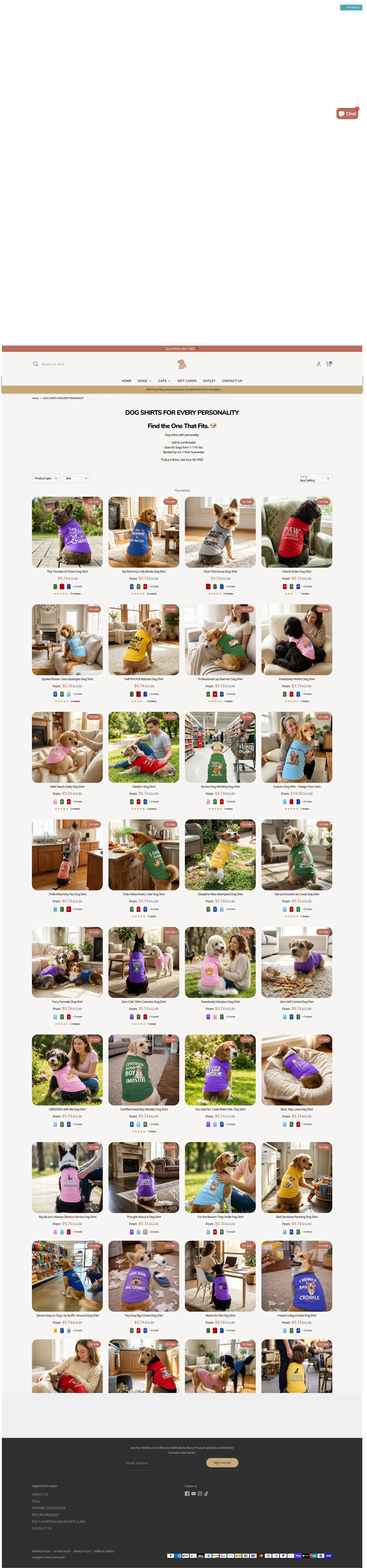
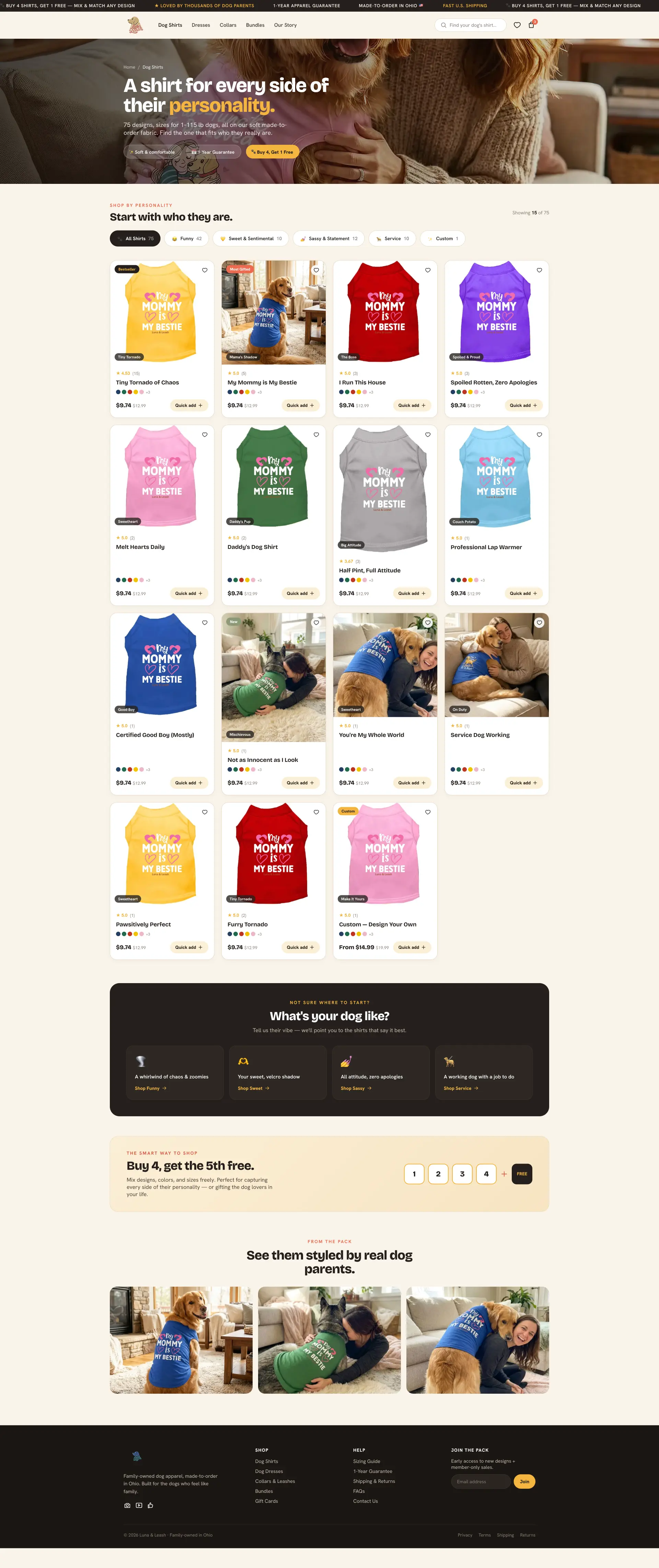 After
Before
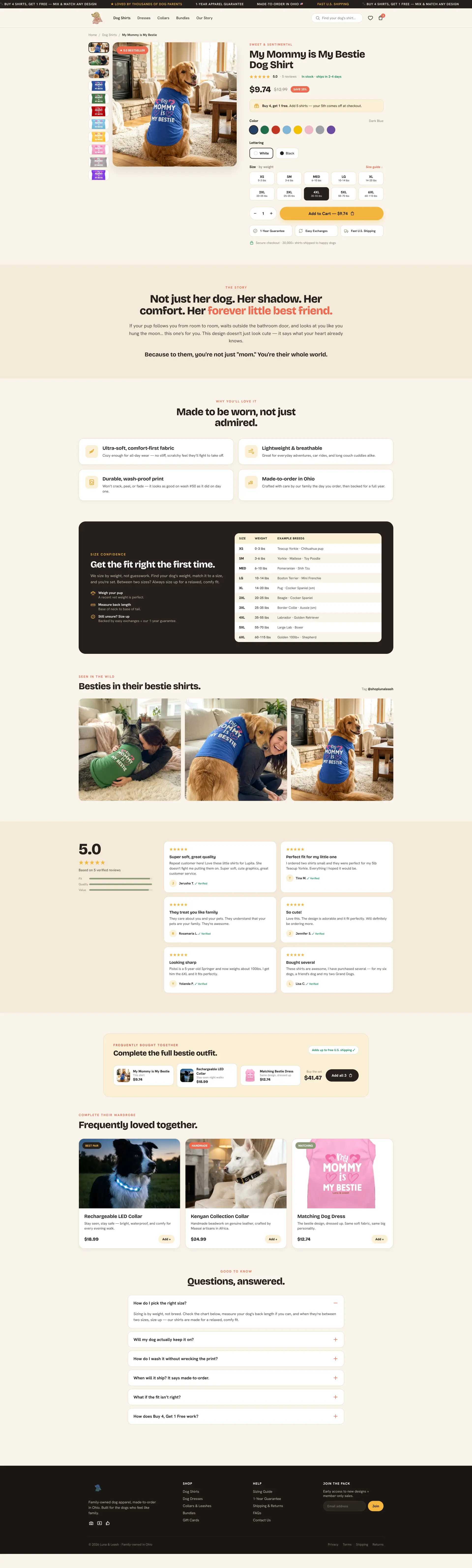 After
Before
Luna Leash already has a warm and joyful brand feel.
The homepage should build trust before showing products.
The sale strategy should be simplified because everything on sale reduces trust.
Free shipping may be more persuasive than discounting every product.
Customer proof should appear much higher on the page.
The collection page should guide shoppers by dog personality.
Product reviews should be more visible near the buying area.
Shipping calculated at checkout can hurt conversion.
Size guidance and easy exchanges can reduce hesitation.
Bundles, matching collars, and buy-four-get-one offers can increase average order value.
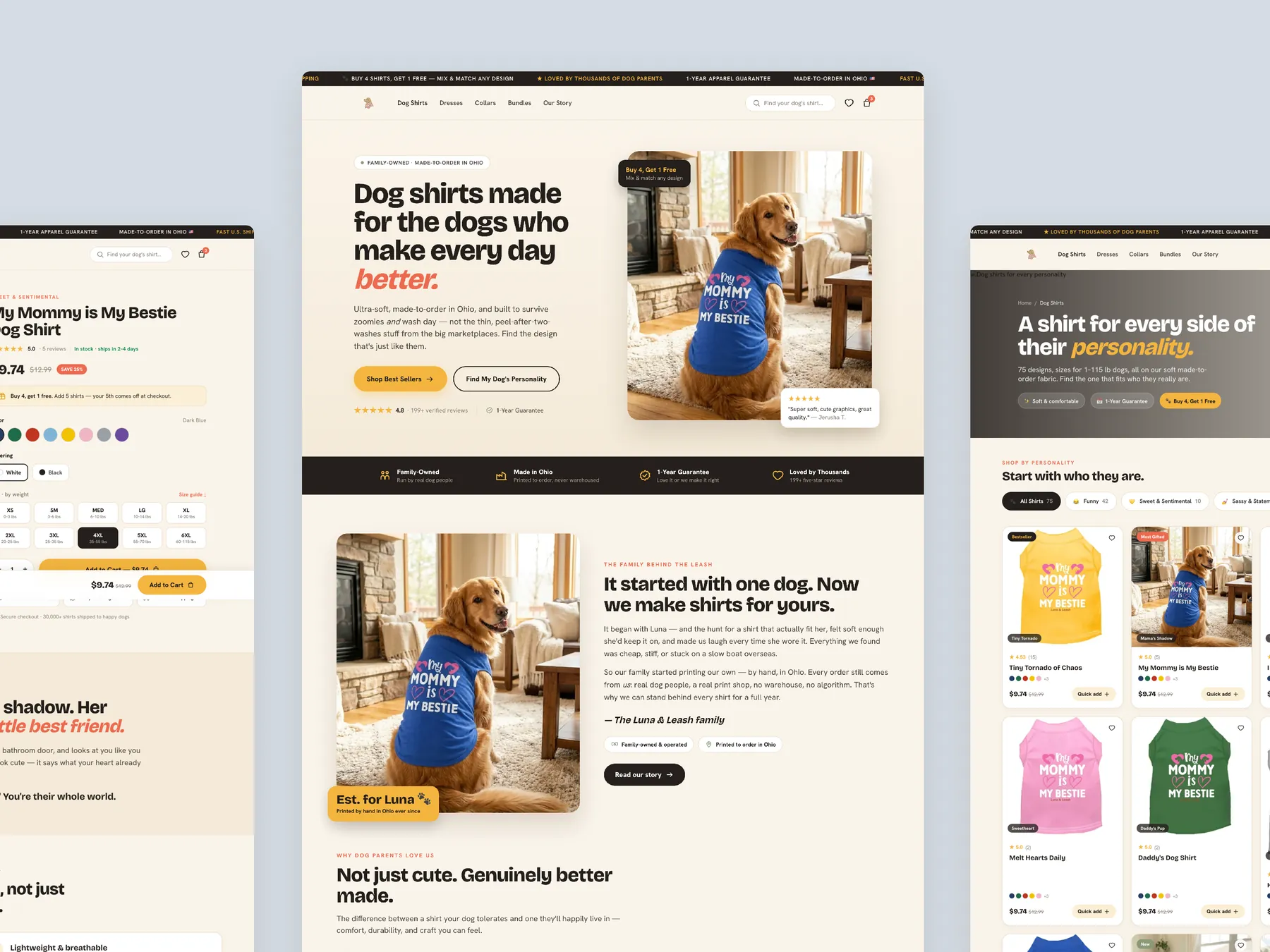
A concept redesign created by Convertica Studio from this audit. It shows how the store could work, it is not the live store.
Homepage in two tall columns, from the first screen down to the footer.
Homepage in the centre with the product page on the left and the collection page on the right, so the three templates read as one system.
Product page in two tall columns, with the buy box whole in the first column and the story and details running down to the footer in the second.
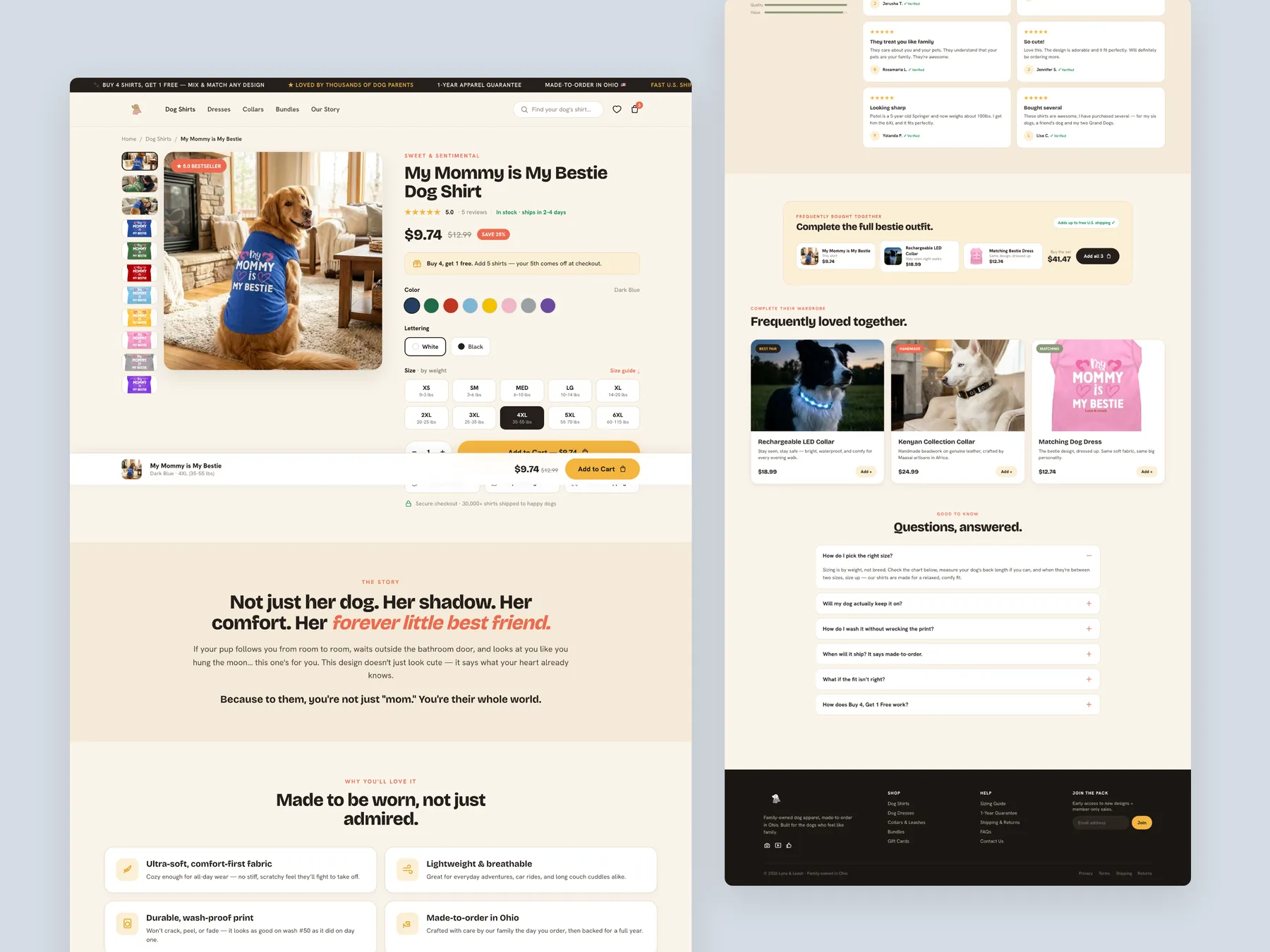
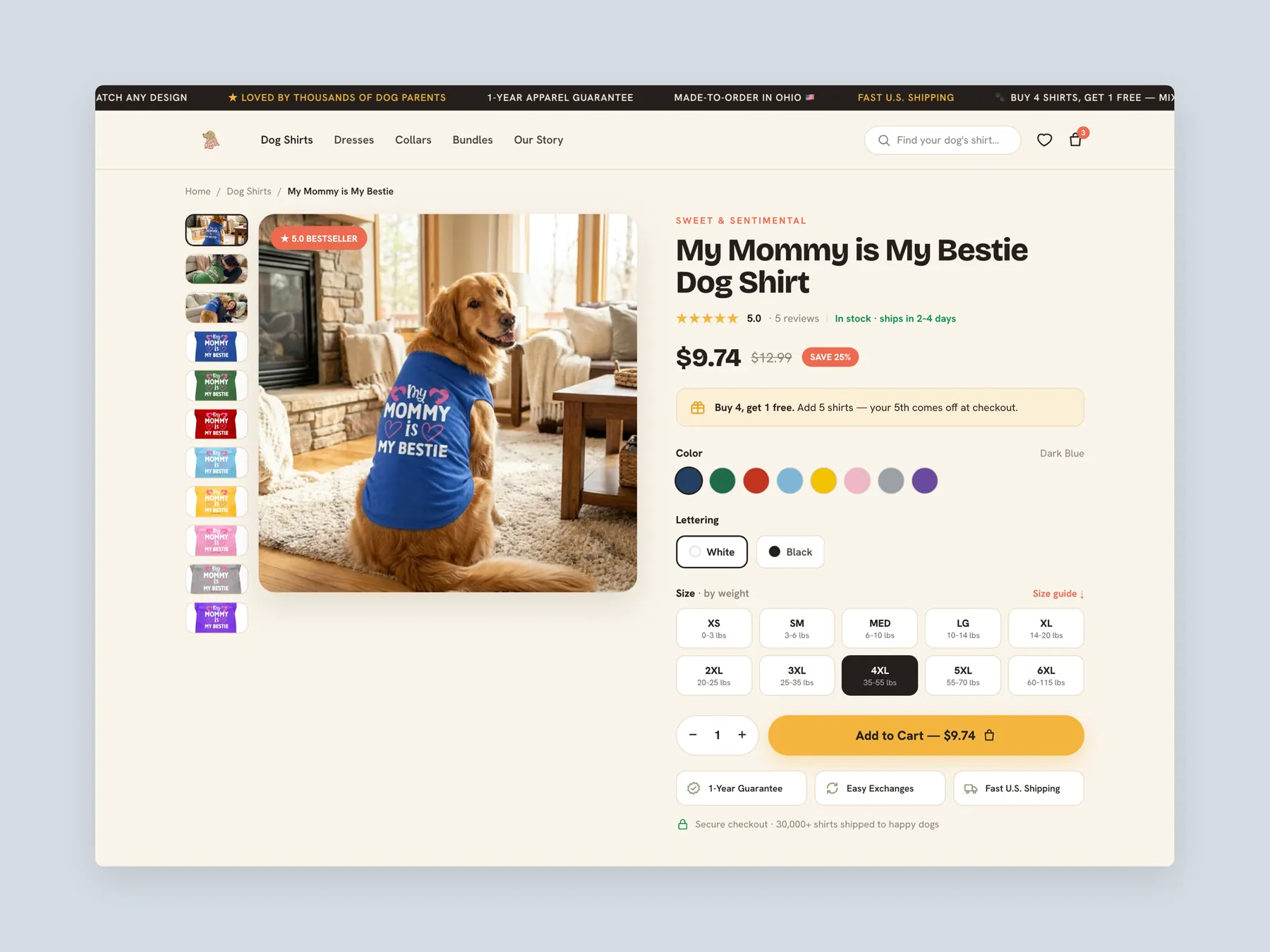
Product page first screen: header, photo gallery and the buy box with colour, lettering, size, quantity and the add to cart button.
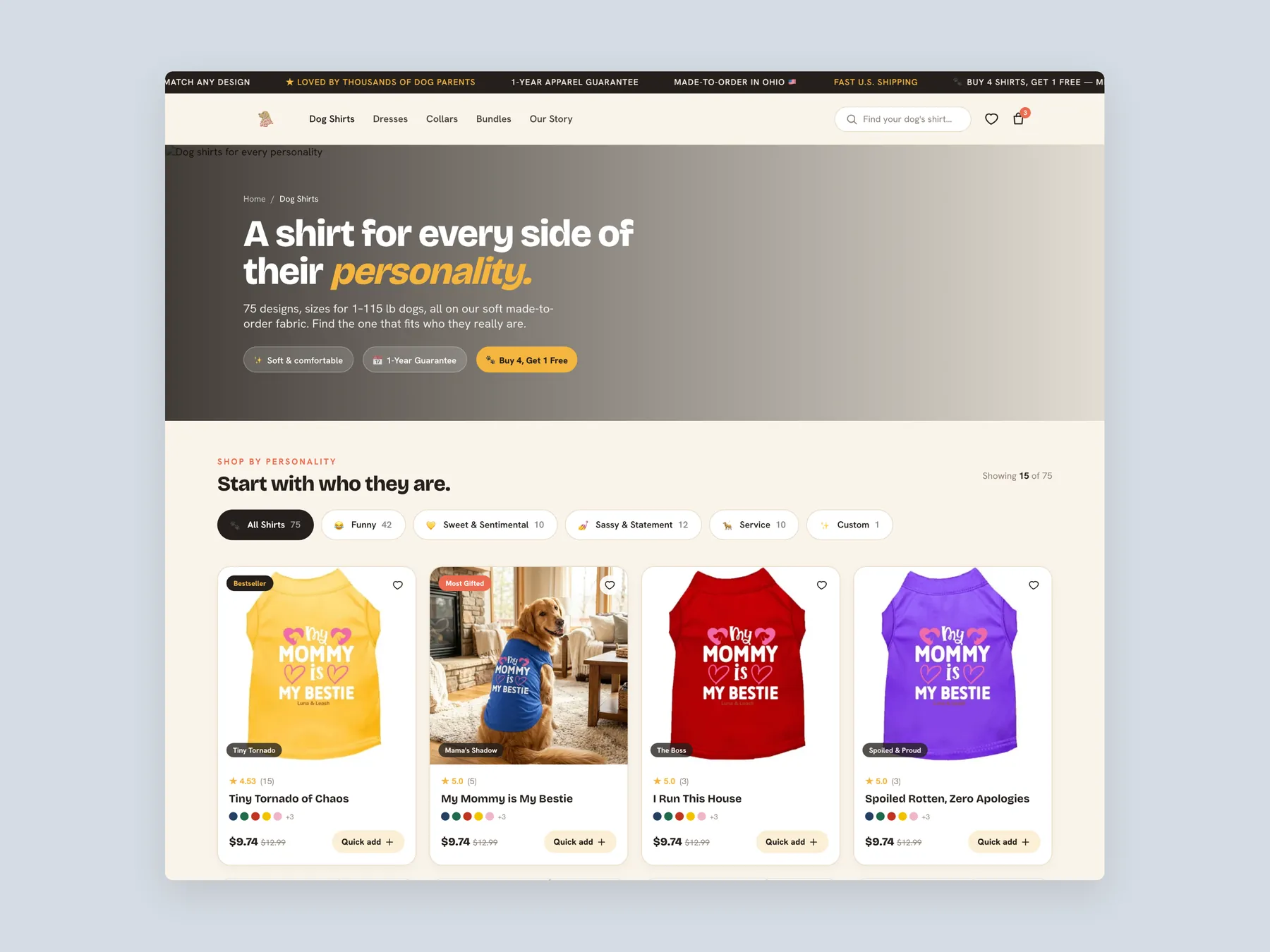
Collection page first screen: header, personality chips and the first row of shirts with prices.
12 answers drawn from the recording and the written report — the questions store owners in pet apparel & dog accessories ask after watching this one.
Ask about your own store →The website has a warm brand feel, but it moves too quickly into product selling, overuses sale pricing, and does not use trust, reviews, sizing reassurance, or emotional storytelling strongly enough. This audit found that this store already has a warm, joyful brand feeling, which is better than many standard Shopify catalog-style websites. The tone feels friendly, pet-focused, and emotionally relevant.
User experience was the weakest of the five dimensions at 5/10, against 6/10 for brand and positioning. Top Bar Focuses Too Quickly On Sale: The first message users see is buy four shirts and get one free. This jumps into selling before building trust.
The hero image and message create a warm feeling, but the section does not fully explain the brand, build trust, or guide visitors. The fix: Strengthen The Hero Section — Use a more emotional headline such as dog shirts made for the dogs who make every day better.
The main hero image appears low resolution and does not maximize the most valuable real estate on the website.
The strongest proof, such as being trusted by thousands of dog owners, appears too late on the page. The fix: Use The Top Bar For Trust — Lead with messages such as made to order in Ohio, free U.S. shipping, family owned, or one-year guarantee before pushing sales.
Using smileys or emojis can make sections feel AI-generated or less polished. Proper icons would feel more credible. The fix: Replace Emojis With Proper Icons — Use clean icons instead of smileys to make trust sections feel more polished and intentional.
The homepage moves into product grids before enough story, trust, and emotional connection are built. The fix: Stop Showing Every Product On Sale — Use sale pricing only for selected hero products and let other products appear at regular price.
Start with Make Reviews Prominent On Product Pages — Show review stars and review count near the product title and price so users see trust before buying.
Use Free Shipping Instead Of Fake-Looking Discounts; Remove Shipping Surprise; Cross-Sell Matching Products. Instead of discounting every product, keep pricing cleaner and promote free shipping as the value driver.
Mostly targeted work, with one structural piece. The average is 5.2/10: brand and positioning is already at 6/10, but user experience at 5/10 needs rebuilding rather than adjusting.
Size guidance and easy exchanges can reduce hesitation. Bundles, matching collars, and buy-four-get-one offers can increase average order value.
A free 33:13 CRO teardown recorded by Convertica Studio for a pet apparel & dog accessories store, walking the live site page by page. It produced 15 issues and 20 written fixes, plus scores across brand, UX, trust, product page and conversion. Any Shopify store can request the same review.
Tell us about your store and we'll send a personalized 5-minute video showing exactly where you're losing buyers — and how to win them back.
Takes about 40 seconds. No call required.