










Reliable Translations CRO audit
The website has strong credibility signals, but they are not presented clearly, and the main quote form is hidden or cropped, creating major conversion friction.
Watch the 30:57 teardown.
Pressing play loads the video from YouTube — you can allow it for every teardown under cookie preferences.
The short version.
This audit found that Reliable Translations already has many strong credibility assets, including years of experience, professional services, client history, testimonials, and language expertise. However, these strengths are not being presented in a way that quickly builds trust or drives users toward conversion.
The most urgent issue is the quote form. The homepage quote form appears hidden or cropped, making it difficult or impossible for users to submit a request. Since this is the main conversion action on the site, this is a major conversion blocker.
The homepage also does not clearly communicate what the company does above the fold. The headline welcomes users to the website but does not explain the service, credibility, or next step. Visitors have to work too hard to understand why they should trust the company and what action they should take.
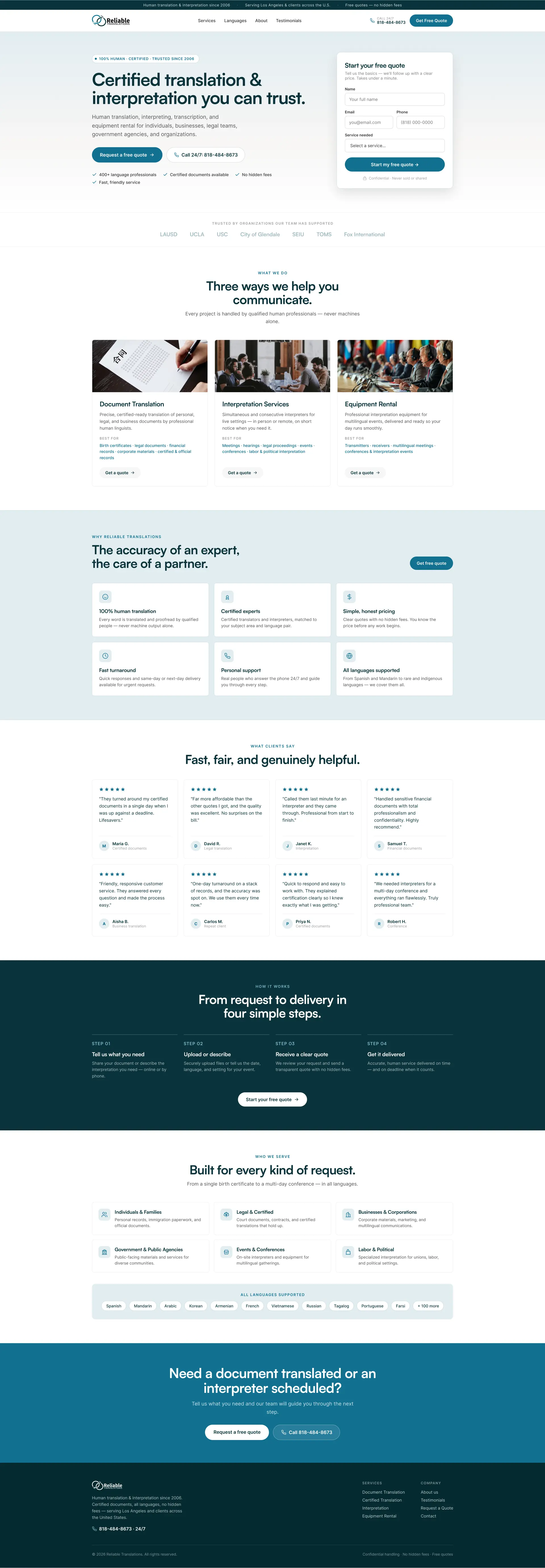
The recommendation is to redesign the homepage, about page, and quote page around clarity, trust, and a modern quote flow. The site should immediately communicate that Reliable Translations provides certified human translation and interpretation services, trusted since 2006, with clear options to request a quote or call directly.
The website has strong credibility signals, but they are not presented clearly, and the main quote form is hidden or cropped, creating major conversion friction.
Make the quote form usable, modernize the request flow, surface credibility faster, and restructure the homepage around clear services, trust signals, and direct calls to action.
Improved lead generation, higher quote form submissions, stronger trust, reduced friction, and more phone call inquiries.
Scored across five dimensions.
Average of the five scores below, as judged at the time of recording. Weak overall — the detail is in which dimension is dragging.
13 findings, each with the fix beside it.
Every finding below was called out on the recording. Open one to read what was found and what we would change. Nothing is hidden from the page source.
01 Homepage Quote Form Is Hidden Fix included
The main quote form on the homepage appears cropped or inaccessible, preventing interested users from completing the primary conversion action.
Fix The Homepage Quote Form Immediately
Repair the cropped or hidden quote form so users can successfully submit quote requests from the homepage.
02 Weak Above-The-Fold Messaging Fix included
The homepage headline welcomes users to the website but does not clearly explain what the company does, why users should trust it, or what to do next.
Use A Clear Service-Focused Hero Message
Replace the generic welcome headline with a clear message such as certified human translations and interpretations users can trust.
03 Credibility Is Not Capitalized Fix included
The company has strong credibility, including client work, testimonials, years of experience, and professional expertise, but these trust signals are not presented prominently.
Lead With Credibility
Show strong credibility signals above the fold, such as trusted since 2006, certified human translation, client experience, and professional language support.
04 Trust Signals Are Buried Fix included
Important details such as being in business since 2006, client logos, testimonials, and service credibility are hidden within pages or long text sections.
Add Trust Signals To The Quote Page
Include testimonials, client logos, privacy reassurance, FAQs, human translation messaging, and process details near the form.
05 Quote Form Feels Outdated Fix included
The quote request form looks dated and may reduce confidence in the company’s ability to deliver modern, reliable service.
Create A Short Homepage Lead Form
Use a simple starter form on the homepage that feels quick and easy, then send users to the full quote flow after initial engagement.
06 Quote Form Is Too Long And Generic Fix included
The form asks for too much information in one view, which can overwhelm users and reduce submissions.
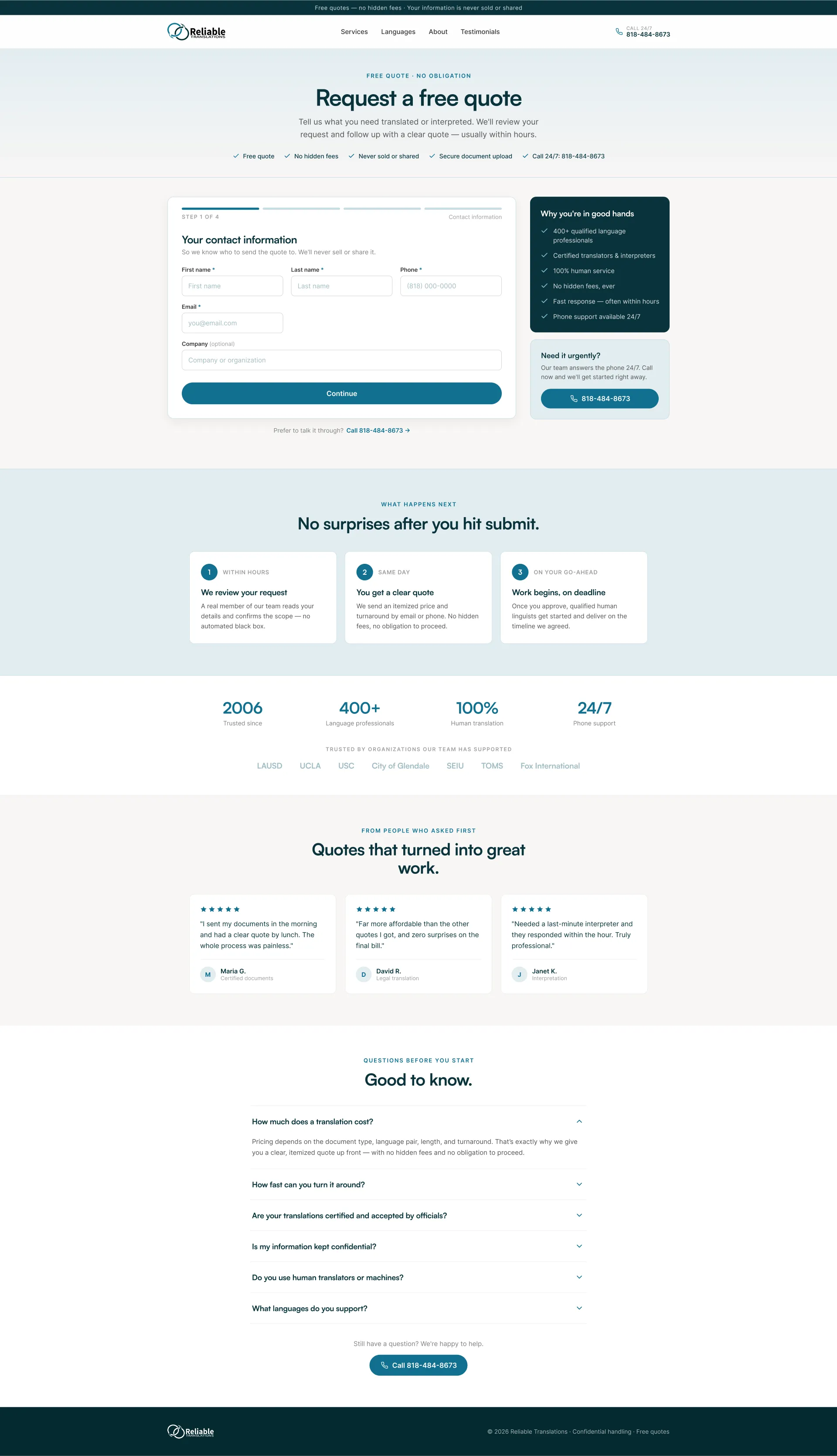
Convert The Quote Form Into A Step-Based Flow
Break the quote form into multiple steps, starting with contact information, then service type, document upload if needed, and final project details.
07 Quote Page Lacks Supporting Trust Elements Observation
The quote page does not include enough testimonials, FAQs, client logos, guarantees, privacy reassurance, or process explanation.
This one is addressed by the wider recommendations below rather than a single change.
08 Services Are Not Scannable Fix included
Service information is buried in long text blocks, especially on the About page, making it difficult for users to quickly understand what the company offers.
Restructure The About Page
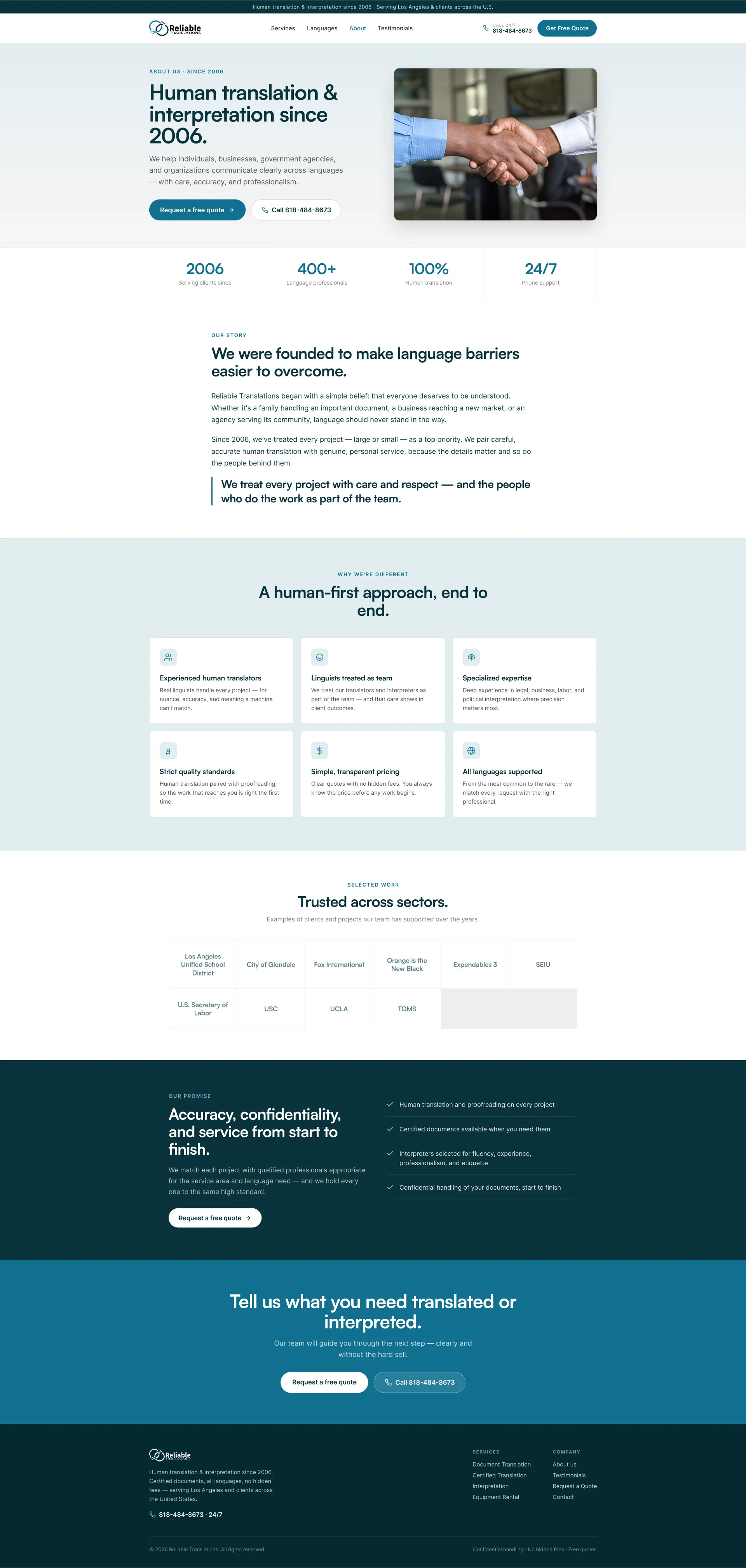
Convert long paragraphs into scannable sections covering company history, experience, human translators, supported languages, pricing clarity, and quality standards.
09 About Page Is Too Text Heavy Observation
The About page contains valuable information, but it is difficult to scan and does not present key differentiators clearly.
This one is addressed by the wider recommendations below rather than a single change.
10 Call To Action Is Not Persuasive Enough Fix included
The request quote buttons do not strongly communicate value, urgency, or what happens after the user clicks.
Explain What Happens After Submission
Tell users that the team reviews the request, sends a clear quote, confirms timeline, and then begins the work after approval.
11 Phone Call Option Is Underused Observation
The website does not emphasize phone calls enough, even though urgent translation and interpretation requests may convert faster through a call.
This one is addressed by the wider recommendations below rather than a single change.
12 Process Is Not Clearly Explained Fix included
Users are not clearly told how the quote process works, what happens after they submit a request, or how quickly they can expect a response.
Add Two Primary CTAs
Use both Request A Free Quote and Call Us as primary actions so users can choose between standard and urgent paths.
13 Brand Visuals Feel Outdated Fix included
The current visual style, especially the existing color palette and form design, feels less modern and may reduce perceived trust.
Modernize The Visual Identity
Explore a more modern, trustworthy color palette and cleaner visual design to improve perceived professionalism.
6 further recommendations that cut across the whole store.
Make Services Easier To Scan
Present document translation, interpretation services, and equipment rental as clear cards with short descriptions and use cases.
Show Best Use Cases For Each Service
Explain when users need each service, such as legal documents, meetings, hearings, conferences, or equipment-based interpretation needs.
Surface Client Logos And Selected Work
Show recognizable organizations or sectors served to build authority quickly.
Add Industry Sections
Clarify who the company serves, such as legal, medical, government, corporate, education, immigration, and conference clients.
Highlight Language Coverage
Prominently communicate the number and range of languages supported.
Use Privacy And Security Messaging
Reassure users that uploaded documents are secure, confidential, and never sold or shared.
What the fixed version looks like.
Drag each frame to move between what is live today and the version built on the recommendations above.
Home page
Drag to compare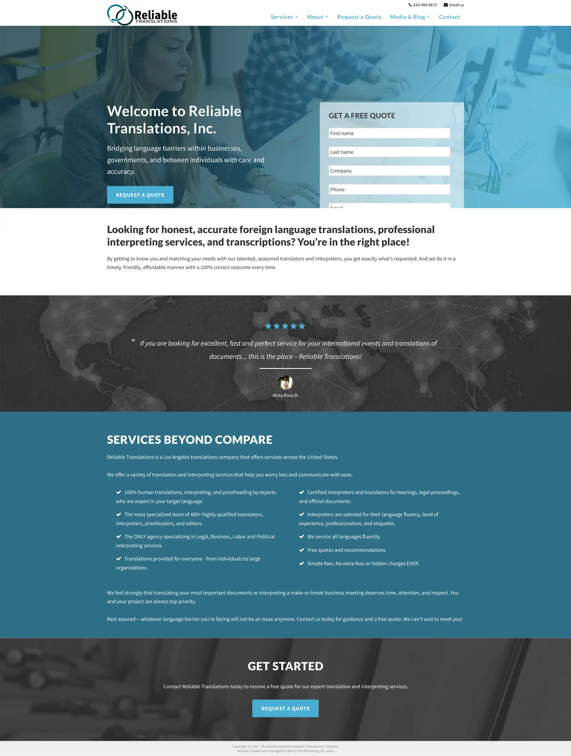
 After
Before
After
Before
About page
Drag to compare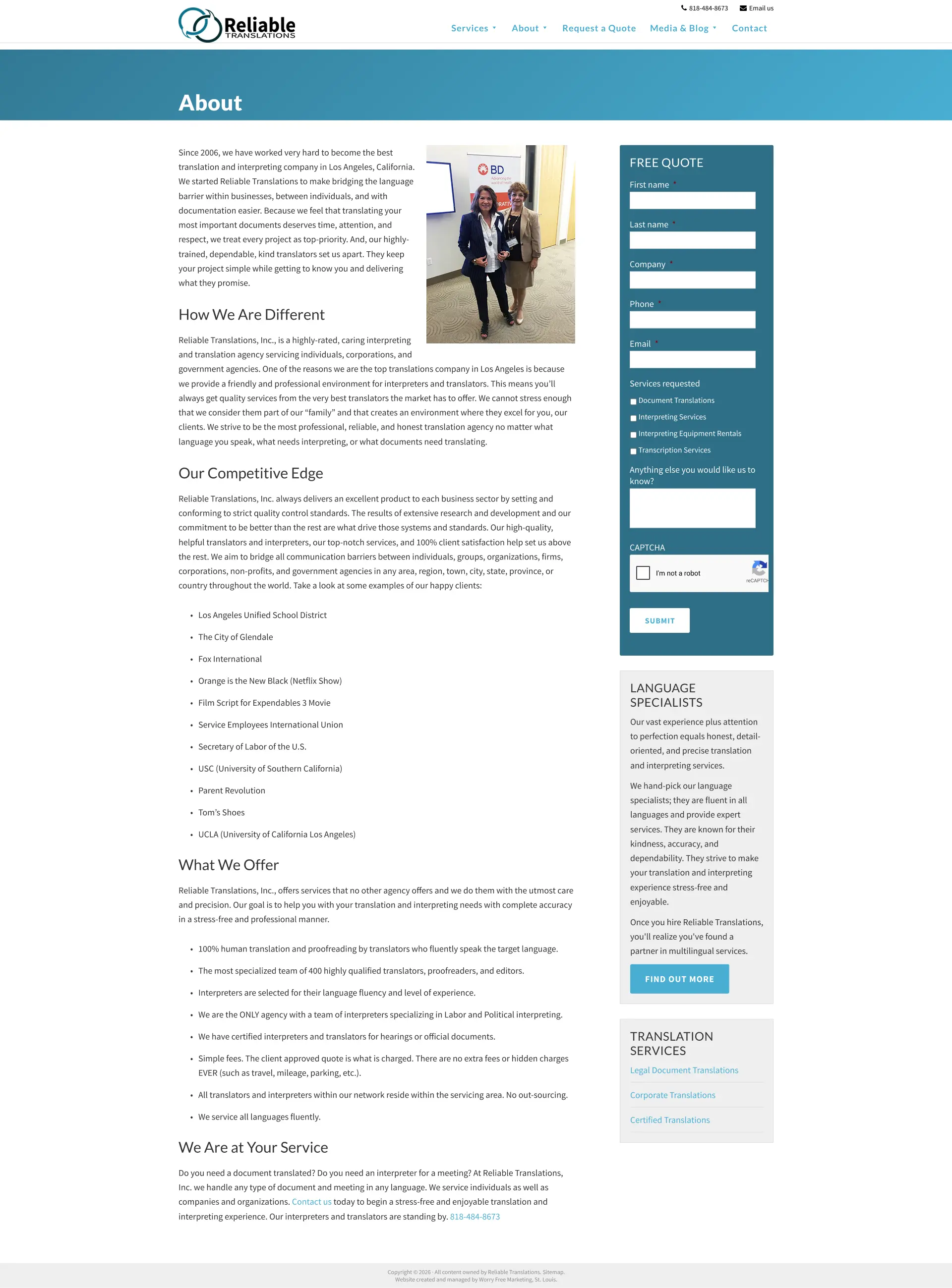
 After
Before
After
Before
Quote page
Drag to compare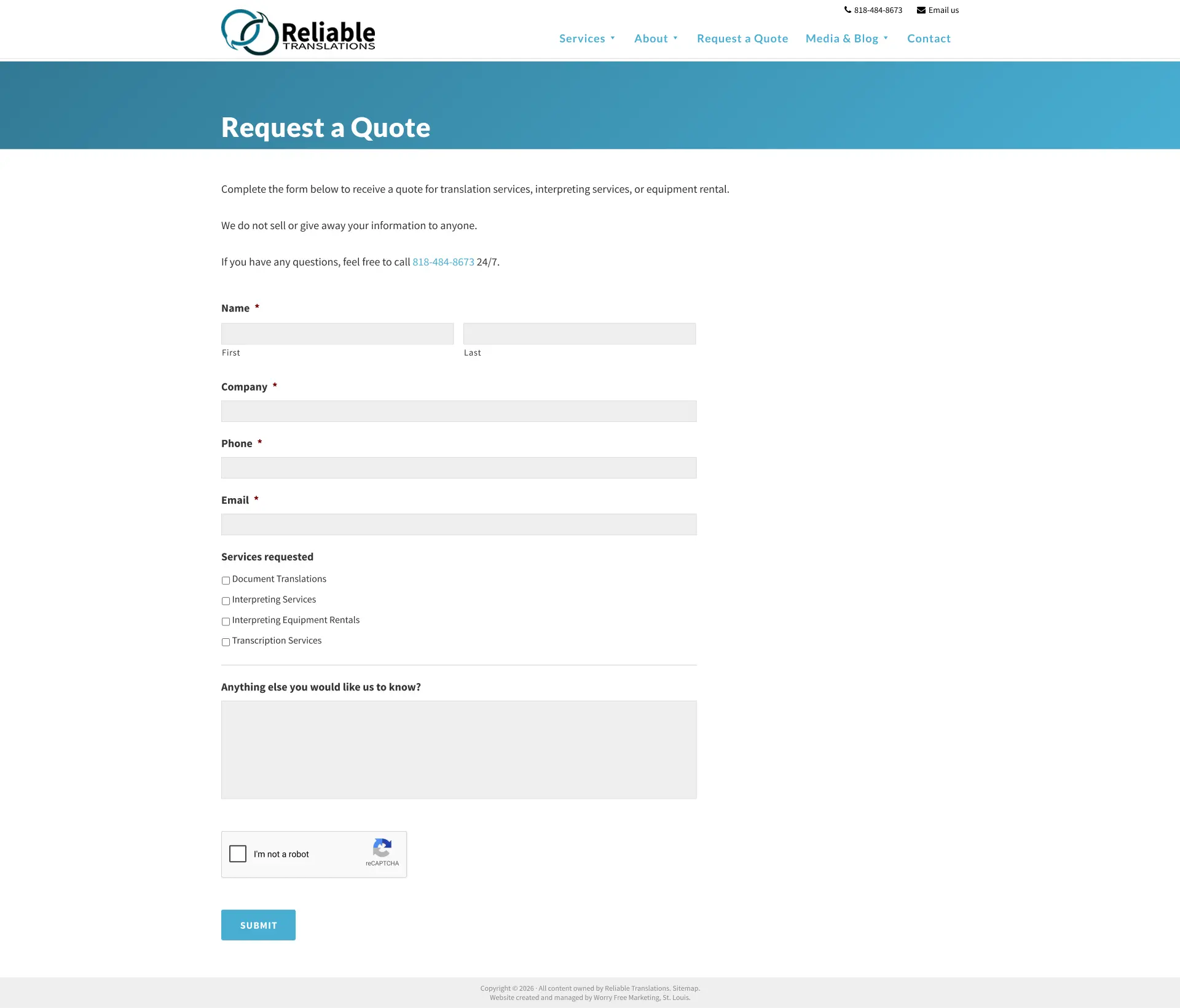
 After
Before
After
Before
What to take from this teardown.
The homepage quote form is the most urgent conversion issue.
The website has credibility, but it is not presented clearly enough.
The hero headline should explain the service instead of simply welcoming users.
Trust signals such as clients, testimonials, and since 2006 should appear higher on the page.
The quote form should become a modern multi-step flow.
The quote page needs testimonials, FAQs, privacy reassurance, and process clarity.
Services should be presented in scannable cards rather than long text blocks.
Phone calls should be promoted as a fast option for urgent requests.
The About page should be redesigned for trust and readability.
Modernizing the visual design can improve perceived professionalism.
What people ask about this teardown.
12 answers drawn from the recording and the written report — the questions store owners in translation & interpretation services ask after watching this one.
Ask about your own store →
What is the biggest conversion problem on this store?
The website has strong credibility signals, but they are not presented clearly, and the main quote form is hidden or cropped, creating major conversion friction. This audit found that this store already has many strong credibility assets, including years of experience, professional services, client history, testimonials, and language expertise. However, these strengths are not being presented in a way that quickly builds trust or drives users toward conversion.
Why did this store score 3/10 on the product page?
The product page was the weakest of the five dimensions at 3/10, against 5/10 for trust and credibility. Quote Form Is Too Long And Generic: The form asks for too much information in one view, which can overwhelm users and reduce submissions.
Homepage Quote Form Is Hidden: what does that mean in practice?
The main quote form on the homepage appears cropped or inaccessible, preventing interested users from completing the primary conversion action. The fix: Fix The Homepage Quote Form Immediately — Repair the cropped or hidden quote form so users can successfully submit quote requests from the homepage.
Why is “Weak Above-The-Fold Messaging” costing this store sales?
The homepage headline welcomes users to the website but does not clearly explain what the company does, why users should trust it, or what to do next. The fix: Use A Clear Service-Focused Hero Message — Replace the generic welcome headline with a clear message such as certified human translations and interpretations users can trust.
How do you fix “Credibility Is Not Capitalized”?
The company has strong credibility, including client work, testimonials, years of experience, and professional expertise, but these trust signals are not presented prominently. The fix: Lead With Credibility — Show strong credibility signals above the fold, such as trusted since 2006, certified human translation, client experience, and professional language support.
Is “Trust Signals Are Buried” worth prioritising?
Important details such as being in business since 2006, client logos, testimonials, and service credibility are hidden within pages or long text sections. The fix: Add Trust Signals To The Quote Page — Include testimonials, client logos, privacy reassurance, FAQs, human translation messaging, and process details near the form.
What would change if “Quote Form Feels Outdated” were fixed?
The quote request form looks dated and may reduce confidence in the company’s ability to deliver modern, reliable service. The fix: Create A Short Homepage Lead Form — Use a simple starter form on the homepage that feels quick and easy, then send users to the full quote flow after initial engagement.
What should be fixed first?
Start with Fix The Homepage Quote Form Immediately — Repair the cropped or hidden quote form so users can successfully submit quote requests from the homepage.
What is the biggest opportunity here?
Make the quote form usable, modernize the request flow, surface credibility faster, and restructure the homepage around clear services, trust signals, and direct calls to action. Improved lead generation, higher quote form submissions, stronger trust, reduced friction, and more phone call inquiries.
Does this store need a full redesign or targeted fixes?
Structural. The average is 4.0/10 and the weakest dimension, the product page, sits at 3/10 — the recommendations amount to rebuilding how the store presents itself, not tuning what is there.
What is the one-sentence takeaway?
The About page should be redesigned for trust and readability. Modernizing the visual design can improve perceived professionalism.
What was reviewed in this audit, and how long is it?
A free 30:57 CRO teardown recorded by Convertica Studio for a translation & interpretation services store, walking the live site page by page. It produced 13 issues and 16 written fixes, plus scores across brand, UX, trust, product page and conversion. Any Shopify store can request the same review.
More teardowns from the library.
See what's quietly costing you sales.
Tell us about your store and we'll send a personalized 5-minute video showing exactly where you're losing buyers — and how to win them back.
Takes about 40 seconds. No call required.
-
5-minute video teardownA personalized walkthrough of your store, recorded by Eva.
-
Homepage & PDP reviewWhere attention leaks and buyers hesitate.
-
Mobile UX audit70% of your traffic — judged on its own terms.
-
Trust & credibility checkThe signals that make first-time buyers convert.
-
Prioritized CRO roadmapRanked by impact vs. effort, ready to ship.