










Only Shapewear CRO audit
The website feels like a basic Shopify catalog rather than a trusted shapewear brand, leaving visitors unsure which product is right for them.
Watch the 36:20 teardown.
Pressing play loads the video from YouTube — you can allow it for every teardown under cookie preferences.
The short version.
This audit found that Only Shapewear currently feels more like a basic Shopify catalog than a trusted shapewear brand. The website shows products, but it does not yet provide enough guidance, education, trust, or emotional reassurance to help visitors feel confident buying.
The biggest issue is that shapewear customers often need help choosing the right product. They may not know their compression level, size, fit, coverage, use case, or whether a product is right for post-surgery, daily wear, events, or body sculpting. The current website does not guide them through those decisions clearly enough.
The homepage does not build enough trust above the fold. It uses generic messaging, limited navigation, weak brand positioning, and AI-style imagery that may reduce credibility. Visitors are not immediately shown why Only Shapewear is different, why the products are trustworthy, or how to find the right fit.
The recommendation is to rebuild the experience around education, confidence, and guided selling. The site should help customers find their compression level, shop by goal, compare shapewear types, understand recovery use cases, and feel safe purchasing through clear guarantees, reviews, fit guidance, and product-specific reassurance.
The website feels like a basic Shopify catalog rather than a trusted shapewear brand, leaving visitors unsure which product is right for them.
Reposition the store as a trusted shapewear authority by guiding customers by use case, compression level, fit, size, recovery needs, and product benefits.
Improved trust, higher product confidence, better collection engagement, increased conversion potential, and higher average order value through bundles and guided product selection.
Scored across five dimensions.
Average of the five scores below, as judged at the time of recording. Critical overall — the detail is in which dimension is dragging.
15 findings, each with the fix beside it.
Every finding below was called out on the recording. Open one to read what was found and what we would change. Nothing is hidden from the page source.
01 Generic Welcome Message Fix included
The announcement bar says “welcome to our store,” which makes the website feel unfinished and does not communicate any meaningful value.
Replace The Welcome Message
Use the top announcement area to communicate trust-building messages such as guarantees, handmade Colombian quality, free shipping thresholds, or fit support.
02 Very Limited Navigation Observation
The navigation only includes basic links such as Home and Catalog, which makes the site feel like a simple product catalog rather than a full brand experience.
This one is addressed by the wider recommendations below rather than a single change.
03 Weak Brand Positioning Observation
The site does not clearly present Only Shapewear as a trusted company, authority, or specialist in shapewear.
This one is addressed by the wider recommendations below rather than a single change.
04 Hero Section Does Not Build Trust Fix included
The homepage hero does not clearly explain the customer benefit, why the brand should be trusted, or how visitors should choose the right product.
Add Social Proof Above The Fold
Show customer reviews, ratings, testimonials, or trust messages near the hero section to prove that real customers buy and trust the brand.
05 AI-Generated Imagery Reduces Trust Observation
The hero imagery appears AI-generated, which can create doubt and make the brand feel less authentic.
This one is addressed by the wider recommendations below rather than a single change.
06 Homepage Structure Feels Like A Basic Store Observation
The homepage quickly moves from hero to featured products, FAQs, and history without building a strong brand story or customer journey.
This one is addressed by the wider recommendations below rather than a single change.
07 Missing Social Proof Fix included
The site does not show enough reviews, testimonials, ratings, or customer validation to build confidence.
Use Reviews And Real Customers
Add customer reviews, testimonials, and real images to make the brand feel more legitimate and trustworthy.
08 Collection Page Lacks Product Guidance Fix included
Visitors are shown many products without enough help understanding which product is right for their goal, body area, compression need, or occasion.
Improve Collection Page Filtering
Add filters for compression level, body area, occasion, size, color, and use case so customers can quickly narrow down the right product.
09 Products Are Not Categorized By Use Case Fix included
Customers cannot easily shop by post-surgery, daily shaping, event wear, body suits, face sculpting, or other specific needs.
Shop By Customer Goal
Organize the homepage and collection pages around goals such as post-surgery recovery, daily shaping, formal events, body sculpting, and face sculpting.
10 Product Page Lacks Strong Benefit Explanation Fix included
The product page shows product details but does not clearly explain why the product is beneficial or when customers should use it.
Explain When Each Product Is Right
Tell customers whether the product is best for formal dresses, weddings, events, everyday confidence, post-op recovery, or other use cases.
11 Size And Fit Guidance Is Not Prominent Enough Fix included
Size information exists, but it is hidden or not positioned where customers need it most during the purchase decision.
Add Fit And Size Guidance Near Purchase Area
Place size charts, fit support, compression level, and “find my size” prompts close to the add-to-cart button.
12 Not Enough Trust Near Add To Cart Fix included
The product page needs stronger reassurance around fit, shipping, returns, secure checkout, stock status, and guarantees.
Add Trust Signals Near Add To Cart
Show fit guarantee, secure checkout, 90-day returns, in-stock messaging, 24-hour shipping, free U.S. shipping, and free returns near the purchase button.
13 No Strong Cross-Sell Or Upsell Strategy Fix included
The product page focuses on one product instead of encouraging bundles, multipacks, related products, or alternative styles.
Add Alternative Product Recommendations
If a product is not the right fit, show nearby alternatives so customers continue shopping instead of leaving.
14 Customer Concerns Are Not Fully Answered Fix included
Questions around compression, size, comfort, fit, post-surgery use, daily wear, and returns are not addressed strongly enough.
Build A Stronger Navigation
Add meaningful navigation items such as Shop By Goal, Compression Guide, Post-Surgery, Daily Wear, Best Sellers, Fit Quiz, and About.
15 Website Does Not Educate Enough Observation
The brand should teach customers how to choose, wear, and benefit from shapewear, but that educational role is currently underdeveloped.
This one is addressed by the wider recommendations below rather than a single change.
12 further recommendations that cut across the whole store.
Use Authentic Product And Lifestyle Photography
Replace AI-style imagery with real product, model, and lifestyle photography that feels trustworthy and authentic.
Create A Stronger Hero Section
Lead with a message that speaks to the customer outcome, such as sculpted support, confidence, recovery, and invisible shaping.
Highlight Product Credibility
Emphasize surgical-grade Colombian fajas, adjustable closures, compression levels, fit guarantee, and premium materials.
Create A Find My Compression Tool
Add a guided fit or compression quiz to help customers choose the right product based on their goal, coverage, size, and compression need.
Use The Quiz For Lead Capture
Collect email addresses through the fit quiz so visitors can be retargeted later with product recommendations, discounts, and education.
Add Visual Product Badges
Use badges such as Best Seller, Firm, Extra Firm, New, Post-Op, and Daily Wear to guide purchase decisions.
Educate Customers On Compression Levels
Explain light, medium, firm, extra firm, and post-op compression so customers understand what they need.
Improve Product Page Hierarchy
Make the product name, discount, price, fit information, size guidance, and stock status easy to scan above the fold.
Quantify Discounts
Show savings clearly, such as 23% off, instead of only showing old and new prices.
Show Product Construction Details
Explain what is inside the garment, including fabric, support zones, closures, compression, and comfort features.
Create Bundle Offers
Offer multipacks or buy-three discounts to increase average order value and encourage customers to buy multiple shapewear pieces.
Address Recovery And Post-Op Needs
Create dedicated sections explaining how compression supports healing after procedures and why the product is safe and useful for recovery.
What the fixed version looks like.
Drag each frame to move between what is live today and the version built on the recommendations above.
Home page
Drag to compare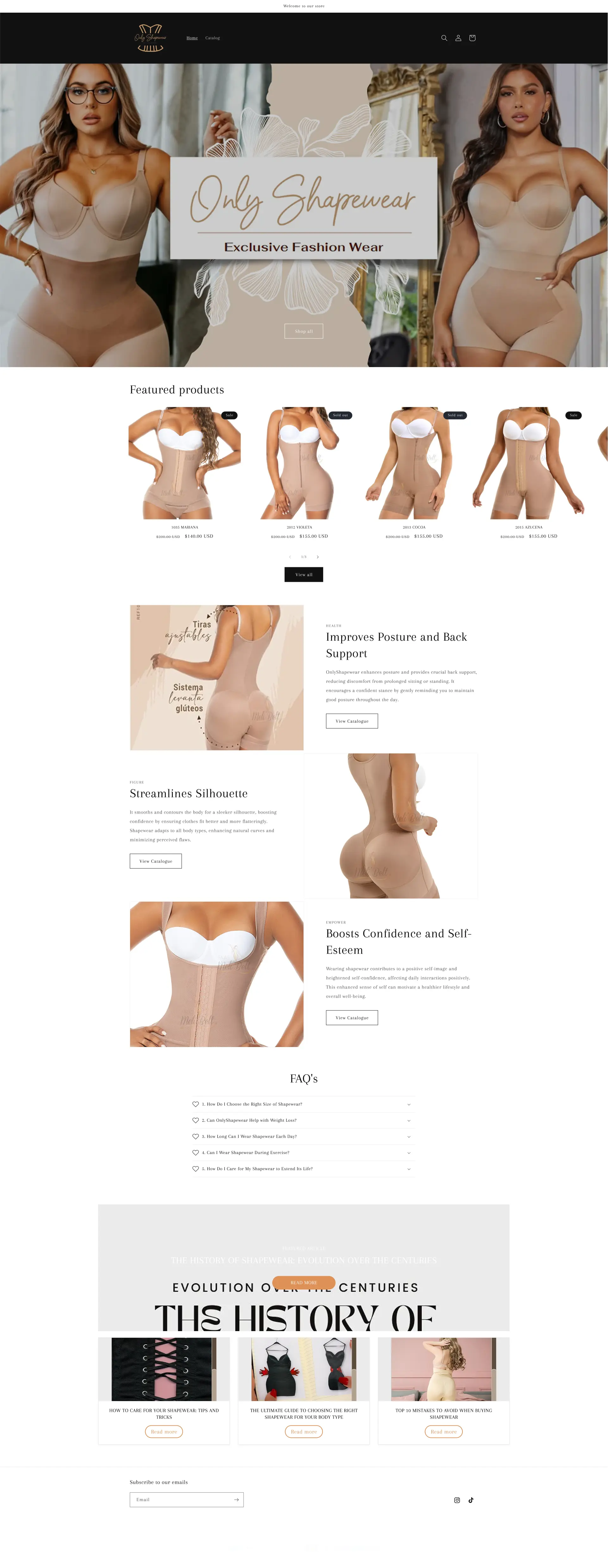
 After
Before
After
Before
Collection page
Drag to compare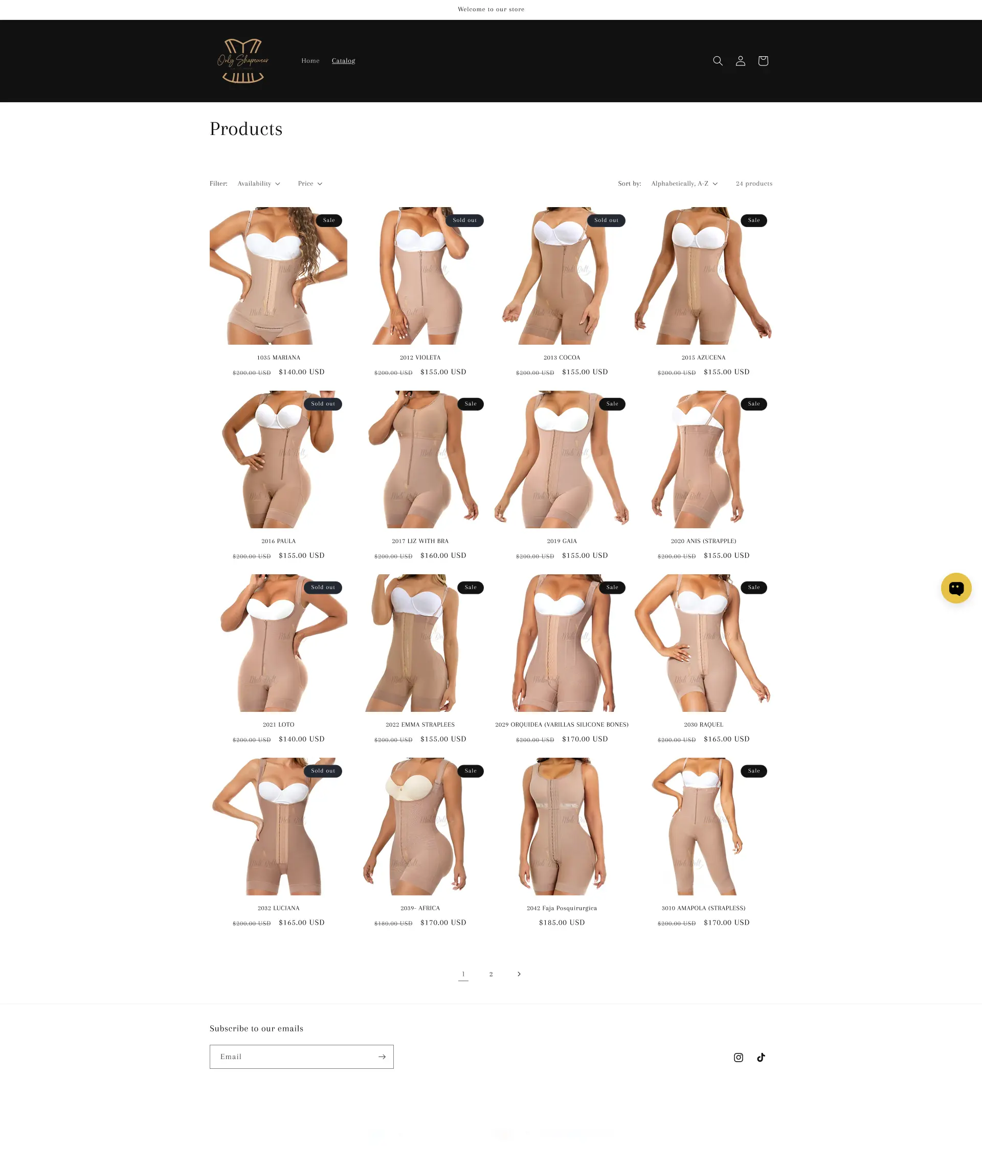
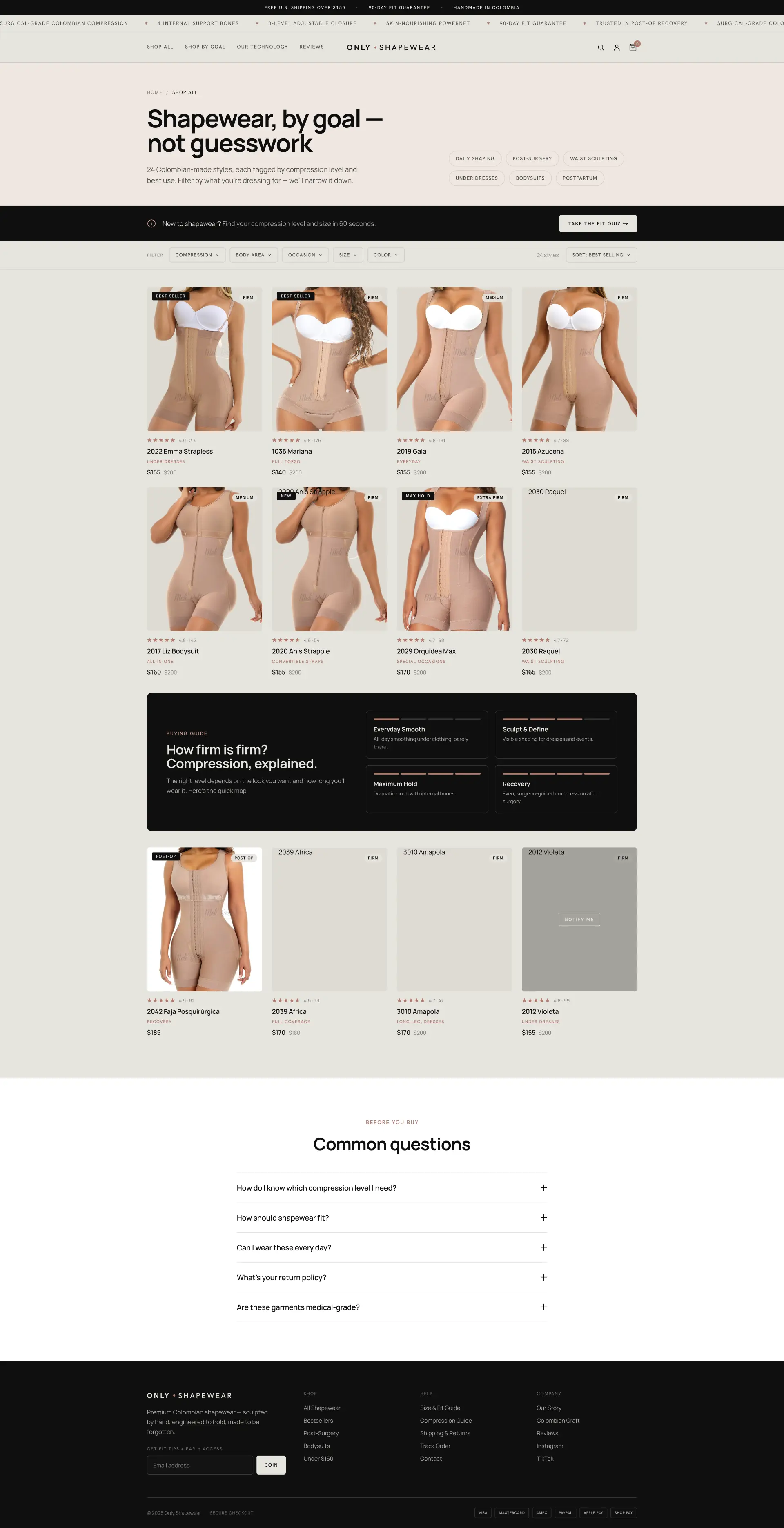 After
Before
After
Before
Product page
Drag to compare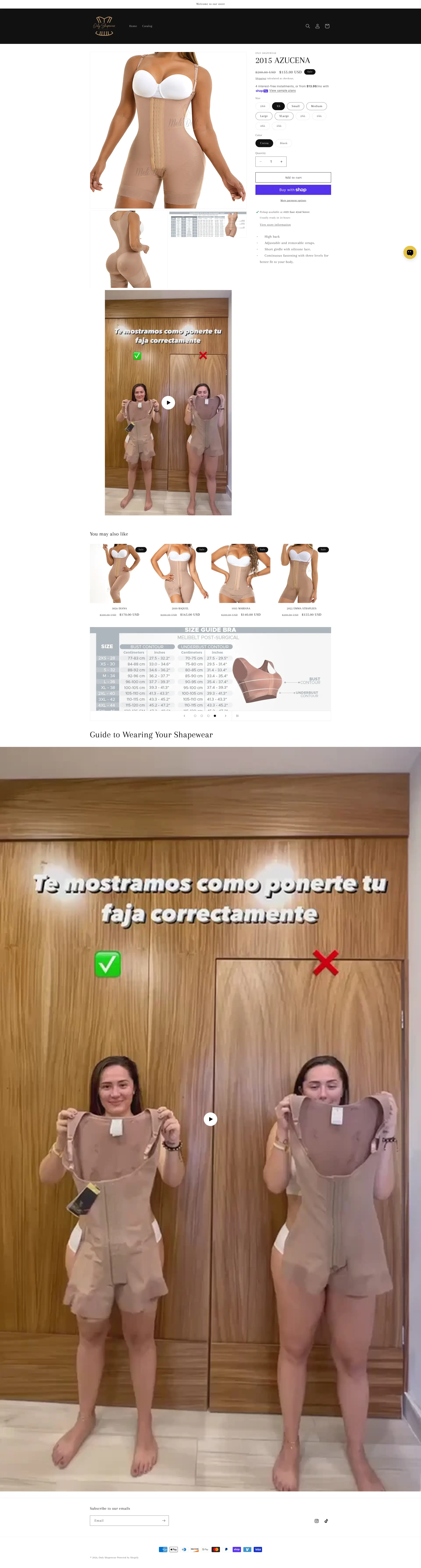
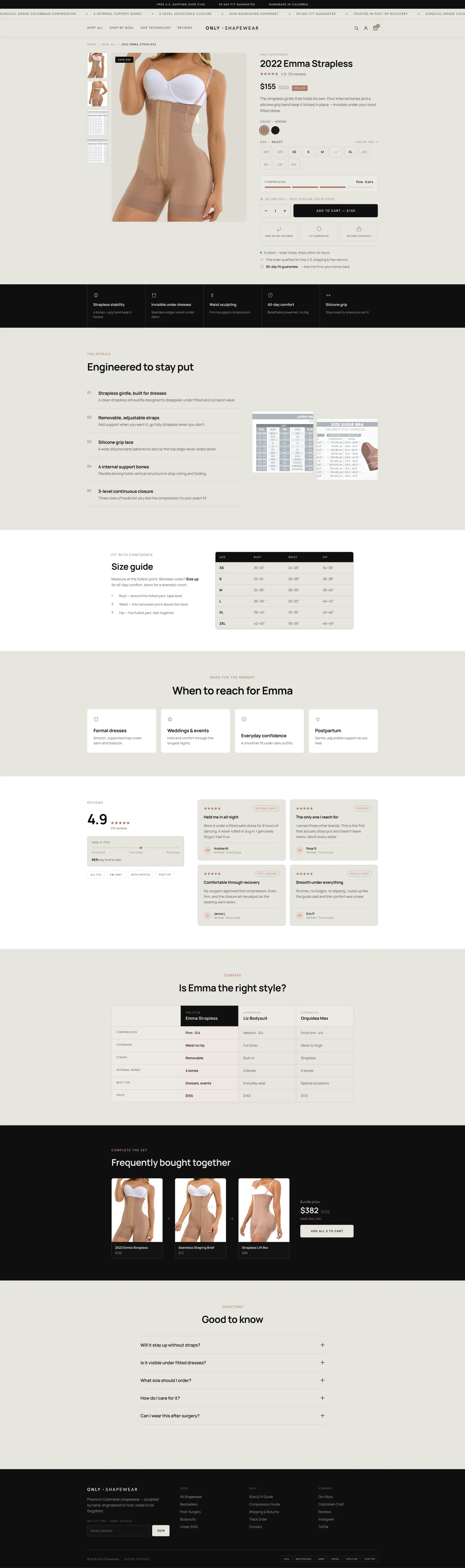 After
Before
After
Before
What to take from this teardown.
The website currently feels like a basic Shopify catalog, not a trusted shapewear brand.
The homepage needs stronger navigation, trust signals, and customer-focused messaging.
AI-style imagery may reduce trust and should be replaced with authentic visuals.
Customers need help choosing the right shapewear product.
Shop-by-goal navigation can reduce confusion and increase confidence.
A fit or compression quiz could become a major conversion tool.
Collection pages need filters by compression, occasion, size, color, and body area.
Product pages need stronger sizing, fit, trust, and benefit explanations.
Post-surgery and recovery positioning is a major sales opportunity.
Bundles and multipacks can increase average order value.
What people ask about this teardown.
12 answers drawn from the recording and the written report — the questions store owners in shapewear & fashion ask after watching this one.
Ask about your own store →
What is the biggest conversion problem on this store?
The website feels like a basic Shopify catalog rather than a trusted shapewear brand, leaving visitors unsure which product is right for them. This audit found that this store currently feels more like a basic Shopify catalog than a trusted shapewear brand. The website shows products, but it does not yet provide enough guidance, education, trust, or emotional reassurance to help visitors feel confident buying.
Why did this store score 2/10 on brand and positioning?
Brand and positioning was the weakest of the five dimensions at 2/10, against 3/10 for the conversion path. Weak Brand Positioning: The site does not clearly present this store as a trusted company, authority, or specialist in shapewear.
Generic Welcome Message: what does that mean in practice?
The announcement bar says “welcome to our store,” which makes the website feel unfinished and does not communicate any meaningful value. The fix: Replace The Welcome Message — Use the top announcement area to communicate trust-building messages such as guarantees, handmade Colombian quality, free shipping thresholds, or fit support.
Why is “Very Limited Navigation” costing this store sales?
The navigation only includes basic links such as Home and Catalog, which makes the site feel like a simple product catalog rather than a full brand experience.
How do you fix “Hero Section Does Not Build Trust”?
The homepage hero does not clearly explain the customer benefit, why the brand should be trusted, or how visitors should choose the right product. The fix: Add Social Proof Above The Fold — Show customer reviews, ratings, testimonials, or trust messages near the hero section to prove that real customers buy and trust the brand.
Is “AI-Generated Imagery Reduces Trust” worth prioritising?
The hero imagery appears AI-generated, which can create doubt and make the brand feel less authentic.
What would change if “Homepage Structure Feels Like A Basic Store” were fixed?
The homepage quickly moves from hero to featured products, FAQs, and history without building a strong brand story or customer journey.
What should be fixed first?
Start with Replace The Welcome Message — Use the top announcement area to communicate trust-building messages such as guarantees, handmade Colombian quality, free shipping thresholds, or fit support.
How can a store like this increase average order value?
Replace The Welcome Message; Create Bundle Offers. Use the top announcement area to communicate trust-building messages such as guarantees, handmade Colombian quality, free shipping thresholds, or fit support.
Does this store need a full redesign or targeted fixes?
Structural. The average is 2.6/10 and the weakest dimension, brand and positioning, sits at 2/10 — the recommendations amount to rebuilding how the store presents itself, not tuning what is there.
What is the one-sentence takeaway?
Post-surgery and recovery positioning is a major sales opportunity. Bundles and multipacks can increase average order value.
What was reviewed in this audit, and how long is it?
A free 36:20 CRO teardown recorded by Convertica Studio for a shapewear & fashion store, walking the live site page by page. It produced 15 issues and 22 written fixes, plus scores across brand, UX, trust, product page and conversion. Any Shopify store can request the same review.
More teardowns from the library.
See what's quietly costing you sales.
Tell us about your store and we'll send a personalized 5-minute video showing exactly where you're losing buyers — and how to win them back.
Takes about 40 seconds. No call required.
-
5-minute video teardownA personalized walkthrough of your store, recorded by Eva.
-
Homepage & PDP reviewWhere attention leaks and buyers hesitate.
-
Mobile UX audit70% of your traffic — judged on its own terms.
-
Trust & credibility checkThe signals that make first-time buyers convert.
-
Prioritized CRO roadmapRanked by impact vs. effort, ready to ship.