










Mill Creek Farms CRO Audit
A 32 minute teardown of a Georgia pecan and honey farm store, looking at why paid Google traffic browses the catalogue and leaves without a clear path to a purchase.
Watch the full 32-minute recording.
What we found.
Mill Creek Farms sells pecans, honey and farm gift boxes, and the products themselves hold up well. The descriptions read clearly, the range has real variety, and the packaging looks premium enough to sit on a gift table. The site is clean, calm and easy to look at, and the welcome line at the top of the homepage does begin to introduce the farm behind the products.
The problem is that the website behaves like a catalogue rather than a salesperson. It shows what is available and waits. A visitor landing from a Google ad can see what is being sold, but not who it is for or why this farm is worth trusting, so the premium the packaging implies is never actually explained in words anywhere on the page.
That gap repeats at every step. The collection page is a grid of products that look alike, so choosing means opening six tabs and holding the differences in memory. The product page carries no reviews, no shipping or freshness answers, no arrival date for a gift order, and an add to cart button that is not visible, which breaks the one action the ad spend was paying for.
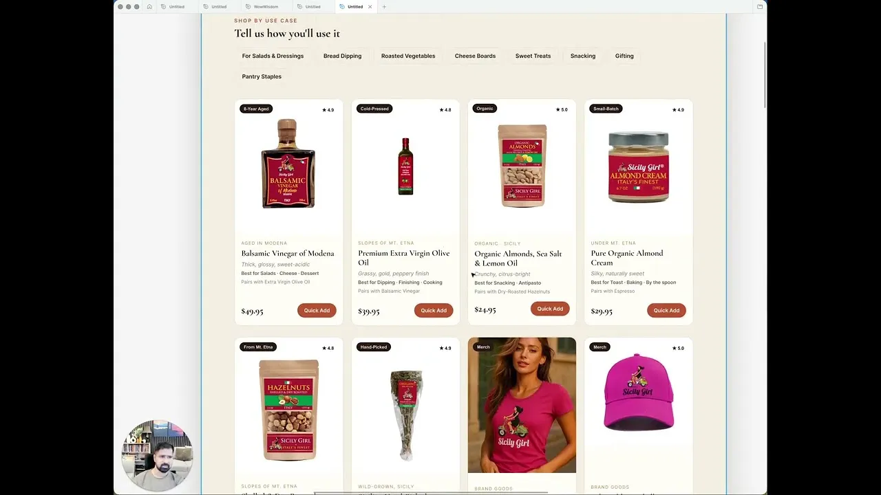
The direction is a guided buying journey: the homepage builds trust and routes people, the collection page helps them compare and filter, the product page removes doubt and asks for a second item. The biggest opportunity here is not more traffic. It is helping the traffic already arriving feel confident enough to buy.
Problem, opportunity, impact
The site presents a clean catalogue instead of selling. It never explains who the products are for, why they are worth more than supermarket pecans, or which one a first-time visitor should pick.
The products and the packaging are already strong. Turned into a guided buying journey, the homepage can build trust and route people, the collection page can help them compare, and the product page can close and lift order value.
More of the Google Ads traffic already arriving reaches a product it feels confident in, the add to cart becomes findable, and gift and multi-pack buyers have a reason to add a second item.
Scored across five dimensions.
Five dimensions, each scored out of ten.
-
01
Homepage & PDP review Where attention leaks and buyers hesitate, section by section.
-
02
Mobile UX audit 70% of your traffic — judged on its own terms.
-
03
Trust & credibility check The signals that make first-time buyers convert.
-
04
Collection & discovery Filtering, merchandising and guidance from browse to buy.
-
05
Prioritized CRO roadmap Ranked by impact vs. effort, ready to ship.
Every issue, paired with its fix.
16 issues found, 21 fixes proposed.
The Site Reads As A Catalogue, Not A Salesperson
The homepage lists what is available and waits for the visitor to decide. Nothing on the page guides, asks, reassures or recommends, which is the job a salesperson would do in a farm shop.
Two Of The Three Landing Questions Go Unanswered
A visitor can tell what the store sells, but not who it is for or whether the business can be trusted. Both gaps sit in the buying journey from the first screen.
Featured Products Appear Before Any Reason To Care
After a short welcome line the homepage jumps straight into featured products, before explaining what makes these pecans different from the thousand other places selling pecans.
The Premium Of The Products Is Never Explained
The packaging looks premium but the copy never says why the product justifies more than a supermarket bag. The visitor is left to infer the value from the photography alone.
No Social Proof Anywhere On The Homepage
Nothing on the homepage shows that other people have bought these products and were happy with them. There is no review, quote or count to borrow confidence from.
The Homepage Offers No Paths To Explore
Between the featured products, the pecan club block and the contact form there is no routing by product type, by occasion or by who the buyer is shopping for.
The Collection Page Is A Bare Grid Of Products
The collection page shows products and nothing else. There is no indication of which one suits which buyer, so the page refines nothing after the visitor has chosen a category.
Comparing Products Forces Tab Juggling And Memory
Because the grid gives no detail, comparing options means opening five or six product pages in new tabs and trying to remember what each one said. That is too much work for a first visit.
No Best Sellers Or Recommendation Cues
Nothing marks a best seller, a most gifted item or a safe starting point. The visitor gets no hint from the store about which product is the popular choice.
The Product Page Carries No Reviews
The product page shows no reviews and no borrowed proof from elsewhere in the store, so a first-time buyer has nothing beyond the store's own claims to go on.
The Add To Cart Button Is Not Visible
On the product page the add to cart button cannot be seen, so a visitor who has decided to buy has no obvious next step. Every other improvement is wasted while that holds.
Shipping, Returns And Freshness Questions Go Unanswered
The product page does not address shipping cost, returns, product quality or how fresh the pecans arrive, leaving the doubts that stop a purchase sitting unresolved.
No Arrival Date For Gift And Occasion Buyers
Much of this range is bought as a gift, but nothing on the product page says when an order would arrive. A buyer shopping for a party or birthday cannot tell whether ordering now is safe.
Nothing Asks The Buyer To Add A Second Item
The product page sells one bag and stops. A willing buyer is never offered a second flavour, a variety pack or a bundle, so the larger order is left on the table.
The Pecan Club Sign-Up Gives No Reason To Join
The join the pecan club block asks for the action without saying what a member gets in return, so it reads as a request rather than an offer.
The Gifting Season Is Not Set Up For
Gift boxes are among the strongest items in the range and the gifting season is close, but nothing on the site organises the experience around buying for someone else.
Answer All Three Landing Questions Above The Fold
State what the farm sells, who it is for and why it can be trusted in the first screen of the homepage, so no visitor has to scroll to work out whether they are in the right place.
Give The Homepage One Clear Primary Action
Lead with a single call to action such as find your pecan, so the hero does one job: sending the visitor toward the product that fits them instead of the whole catalogue.
Add A Short Product Finder Quiz
Ask four questions, starting with who it is for, and recommend products from the answers. That turns browsing into a guided path and does the work of the salesperson asking how they can help.
Build Trust Blocks Before The Product Grid
Place the farm's credibility, its story and its proof ahead of featured products on the homepage, so the visitor has a reason to care before they are shown anything to buy.
Put Reviews On The Site Even Without Online Ones
Use what existing customers have already said in person or over email, as wording only, no photographs needed. A handful of genuine quotes is enough to close the trust gap.
Create Routes By Product And By Occasion
Add homepage paths for pecans, for honey and for building a gift box, so a visitor with a specific intent can move straight there instead of scanning everything.
Add A Shop By Who It Is For Section
Group the same products by buyer: for yourself, for snacking, for baking, for a gift. The catalogue does not change, only the way the visitor finds their way into it.
Mark Best Sellers And Most Gifted Items
Label the popular choices with small cues such as most gifted or can't decide, start here. These read as quiet guidance rather than noise and they make the decision easier.
Put Comparison Detail On The Collection Cards
Give each product a short summary of what makes it different, so a visitor can compare in the grid instead of opening six tabs and relying on memory.
Add Quick Filters To The Collection Page
Let visitors narrow by intent in one click: for gifting, sweet, spicy, for baking. A visitor who came for gifts should not have to look at everything else.
Make The Add To Cart Button Impossible To Miss
Fix the visibility of the add to cart control on the product page first. It is the single action the ad spend is buying, and nothing else matters until it is findable.
Lead The Product Page With Proof And Status
Open the product page with trust signals and any best seller or most gifted status, then explain the value and the premium of the product in words, not just packaging.
Answer Shipping, Returns And Freshness On The Page
Set out what shipping costs, what happens if the product is not right, where the pecans came from and how fresh they arrive, in the place the decision is being made.
Show When The Order Will Arrive
Give an expected arrival date on the product page so a gift buyer with a date in mind can see whether ordering today works, rather than guessing and leaving.
Offer A Reason To Buy Two
Add a plain multi-buy offer such as take two bags and save, so a willing buyer is given a logical next step instead of being left to buy the single item they came for.
Add Logical Pairings And Variety Packs
Suggest the honey alongside the pecans, or a variety pack for the undecided buyer. Offer it as an obvious next choice rather than a push, so it lifts order value without pressure.
Keep The Gift Option One Click Away
Because much of the range is gifted, put send this as a gift in front of the buyer on the product page rather than leaving them to hunt for how to do it.
Say What The Pecan Club Membership Gives
Spell out the value a member receives before asking for the sign-up. People act on a reward, so the offer has to come before the button.
Tell The Farm Story On The Page
Add a section on how the farm started and how the product is grown. It builds the emotional attachment that separates a family farm from a bag on a supermarket shelf.
Design The Mobile Screens Deliberately
Most of the traffic arrives on a phone, so lay out the hero, the finder, the collection cards and the product page for mobile first rather than letting them reflow.
Treat The Three Pages As One Journey
Fix the homepage, collection page and product page together. Each part depends on the others, and improving one page alone will not move the result on its own.
The version we'd build.
The teardown in 7 lines.
- The biggest opportunity here is not more traffic; it is helping the traffic already arriving feel confident enough to buy.
- The website is clean and well presented, but it is acting as a catalogue rather than as a salesperson.
- A visitor can see what this store sells, but not who it is for or why the farm can be trusted.
- An add to cart button that cannot be seen breaks the one action every Google ad is paying for.
- A grid of similar products asks the visitor to compare in their memory across six open tabs.
- Most of this range is bought as a gift, so the page has to say when the order will arrive.
- A willing buyer bought one bag instead of three because nobody asked them to buy more.
Questions this audit answers.
No. The audit found the products strong and the descriptions well written, and the packaging reads as premium. The issue is that the site never puts that quality into words a first-time visitor can act on. The product is doing its job; the page is not selling it.
Clean and persuasive are different things. This site looks tidy and calm, which helps, but it does not guide, reassure or recommend anywhere. A visitor can browse comfortably and still leave without ever being given a reason to choose one product and buy it.
It is the site doing what a good salesperson does in a shop: asking who the purchase is for, narrowing the options, pointing out the popular choice, and answering the doubts before they are raised. On this store it means a product finder, routes by occasion and buyer, comparison detail in the grid, and reassurance on the product page.
The add to cart button on the product page. It is not visible, so a visitor who has already decided to buy has nowhere to click. Every other improvement on this list depends on that action being findable, and paid traffic is arriving while it is not.
What customers have already said in person or over email can be used as wording, with no photographs required. Store-wide reviews can also be shown on individual product pages. A visitor who sees that other people bought from this farm and were happy will extend that confidence to the product in front of them.
Because the products look alike. With only names and pictures, a visitor has to open several product pages in new tabs and hold the differences in memory to choose. A short line on each card explaining what makes that product different moves the comparison into the grid where it belongs.
Small cues like most gifted or start here work quietly. The visitor does not consciously register them, but they carry a recommendation from the store and remove the burden of deciding alone. On a grid of similar products, that is often the difference between a click and a back button.
A large share of this range is bought as a gift for a birthday, a party or the holidays. A buyer with a date in mind cannot commit without knowing whether the order will make it. Showing an expected arrival date removes a hard blocker rather than a soft hesitation.
By asking. The product page currently sells one item and stops, so a buyer who would happily have taken two or three flavours takes one. A plain multi-buy offer, a variety pack and a logical pairing with the honey give that buyer an obvious next step without pressure.
No. It is a strategic design concept built in Figma to show what fixing these problems looks like in practice, page by page. The layout, copy and structure would be worked through properly before anything is built on Shopify.
It can be improved, but the result will be limited. The three pages work as one engine: the homepage builds trust and routes, the collection page refines, the product page closes. If one part is not working, the others cannot make up for it, so the audit recommends treating them together.
The video runs 32 minutes and covers the homepage, the collection page and the product page as a shopper would move through them, then walks through a redesigned concept for each of those three pages. It closes with the mobile screens, a summary of the strategy and the next steps. No analytics accounts or ad accounts were reviewed; this is an experience audit based on using the site as a visitor.
See what's quietly costing you sales.
Tell us about your store and we'll send a personalized 5-minute video showing exactly where you're losing buyers — and how to win them back.
Takes about 40 seconds. No call required.
-
5-minute video teardownA personalized walkthrough of your store, recorded by Eva.
-
Homepage & PDP reviewWhere attention leaks and buyers hesitate.
-
Mobile UX audit70% of your traffic — judged on its own terms.
-
Trust & credibility checkThe signals that make first-time buyers convert.
-
Prioritized CRO roadmapRanked by impact vs. effort, ready to ship.