Girish Kadegiya CRO Audit
A page by page teardown of the homepage, collection page and product page of a wide ranging gift and lifestyle store, followed by a clickable redesign concept built to guide shoppers toward a decision.
Watch the full 23-minute recording.
Pressing play loads the video from YouTube — you can allow it for every teardown under cookie preferences.
What we found.
The store has a real strength: a wide, genuine range of products across beauty, home and kitchen, tech, wellness, fashion, gifts, toys, pets and security. The traffic it already receives has plenty to choose from, and the products themselves are not the weak point. Colour options are listed and the price is shown clearly, so the raw material for a strong shop is already in place.
The core problem is the presentation layer. The homepage hero says to browse the latest products, which does not tell a new visitor what the business does, who it is for or why it can be trusted. The navigation uses labels such as Product Supply, Shop and Xmas, which hint at nothing inside, so visitors are left to search alone and hesitation builds.
The same pattern repeats further down the funnel. Collection pages offer only the standard theme sorting, with no filters or visual cues for comparison. Product cards show a picture, a name and a price. Product pages add a very long description, no reviews, and no answers on delivery or returns, so an interested shopper still has reasons to leave.
The direction is to swap the catalogue for a salesperson. Guide visitors by person, occasion, need and budget, let cards and filters do the comparing, and answer delivery, returns and trust on the product page. Bundles and a free delivery bar can lift order value. The idea to remember: guide the shopper, do not just display the range.
Problem, opportunity, impact
The store shows a large range of products but never guides a shopper through it. The homepage, collections and product cards all behave like a catalogue, so visitors must work out what to buy on their own.
Turn the range into a guided shop: clear paths by person, occasion, need and budget, richer product cards, and product pages that answer delivery, returns and trust questions before the shopper hesitates.
Less searching and fewer abandoned visits, more confident add to cart clicks, and a higher average order value from bundles and a free delivery threshold, without needing more traffic.
Scored across five dimensions.
Five dimensions, each scored out of ten.
-
01
Homepage & PDP review Where attention leaks and buyers hesitate, section by section.
-
02
Mobile UX audit 70% of your traffic — judged on its own terms.
-
03
Trust & credibility check The signals that make first-time buyers convert.
-
04
Collection & discovery Filtering, merchandising and guidance from browse to buy.
-
05
Prioritized CRO roadmap Ranked by impact vs. effort, ready to ship.
Every issue, paired with its fix.
12 issues found, 14 fixes proposed.
Hero Does Not Say What The Store Sells
The homepage hero reads 'Browse our latest products'. It does not say what the business does, who it is for or why a stranger should trust it in the first few seconds.
Mixed Products With No Guided Paths
The homepage shows a broad mix of products with no routes by person, occasion, need or budget. The shopper has to search alone, much like a large marketplace.
Navigation Labels Reveal Nothing Inside
Menu items such as Product Supply, Shop and Xmas give no hint of the departments behind them, so visitors cannot tell where to click to find makeup, pet items or tech.
Product Cards Behave Like A Catalogue
Cards show only a picture, a name and a price. Nothing on them helps a shopper compare items, spot a bestseller or decide without opening every product page.
Collection Pages Offer Little Discovery Help
Collections such as toys, which holds only two products, lean on the standard theme layout with no filters or visual cues to help shoppers narrow down and compare.
Sorting Is Only The Theme Default
The only sorting available is the standard Shopify option. There is nothing by price band, occasion or category to help a shopper reduce a long list.
Product Pages Repeat The Catalogue Pattern
The product page gives the name, the price and the colours, then a picture gallery. It does not justify the product, the price or the brand, so the buying decision is left unsupported.
Long Description Nobody Will Read
The description runs as a very long block of text. A shopper cannot scan it for the few points that matter, so most of it goes unread.
Delivery And Returns Questions Go Unanswered
The product page does not say when an order will arrive or what happens if something goes wrong. Those unanswered questions are exactly where a hesitant buyer leaves.
No Reviews Anywhere On The Site
Reviews are missing across the whole website, including the product page where the decision is made. Without them a shopper has little reason to trust a store they do not know.
No Effort To Raise Order Value
Nothing suggests a second item, such as a pillow or charging cable beside a sleeping mask. There are no bundles and no free delivery threshold to encourage a bigger basket.
Trust Signals Are Missing From The Homepage
The homepage shows no happy customer proof, delivery promise or returns policy. A first time visitor gets no reassurance before being asked to browse.
Rewrite The Hero To Say Who It Is For
State what the store sells and who it suits, such as gifts for a partner, friend or parent, and place customer proof, a delivery date and a 30 day return promise beside it.
Rename The Navigation By Department
Replace vague labels with clear departments such as Beauty, Home and Kitchen, Tech, Wellness, Fashion, Gifts and Toys, Pets and Security, so shoppers can click straight to what they want.
Add Menu Paths By Need And Budget
Under each department, offer routes by category, by need, by price band such as under 10, 10 to 25 and 25 to 50, and by discovery such as bestsellers, new arrivals and sale.
Add Category Tiles Below The Hero
Show the available categories as clear tiles beneath the hero, so a shopper interested only in fashion or pets can enter that path without scanning mixed products.
Upgrade Product Cards With Decision Cues
Add badges such as bestseller, new, staff pick and gift ready, along with small details that let shoppers compare products at a glance and go straight to the product page.
Add Shop By Occasion Sections
Create gift focused sections such as stocking fillers, home refresh and self care, so shoppers buying for someone else, or for themselves, have a clear route to follow.
Build A Product Finder Like A Salesperson
Add a short question based finder that recommends products from the answers given. It acts as the online version of a shop assistant asking how they can help.
Add Filters And Quick Switches To Collections
Give collection pages sub category toggles and filters by category, brand, occasion and price, so shoppers can remove what they do not want without opening each product.
Add A How To Choose Guide To Collections
Place a short buying guide, customer reviews and an FAQ below each collection, to help undecided shoppers choose and to give search and AI tools clear answers to quote.
Turn The Description Into Scannable Points
Replace the long text with a short summary, a simple how it works section and a specification list, keeping only the points a shopper needs before buying.
Answer Delivery And Returns Beside Add To Cart
Put the delivery estimate, the 30 day returns promise and secure checkout reassurance next to the button, so safety questions are answered at the point of decision.
Add Reviews And Customer Photos Everywhere
Show star ratings under the product name, a reviews section on the product page and customer photos on the homepage and collections, so trust is built before the click.
Justify The Price And The Brand
Explain why this product costs what it does, how it compares with a plain alternative, and why a shopper should buy here rather than from a marketplace or another retailer.
Add Bundles And A Free Delivery Progress Bar
Offer ready made bundles and a build your own option, plus a bar showing how far the basket is from free delivery, with recommended add ons that complete the order.
The version we'd build.
The teardown in 7 lines.
- The biggest opportunity on this store is not more traffic, but helping the existing traffic feel confident enough to buy.
- A homepage hero should answer what the business does, who it is for and whether it can be trusted within the first few seconds.
- Product cards that show only a picture, a name and a price make a store behave like a catalogue instead of a salesperson.
- Collection pages exist to make discovery easier, which means filters, sorting and visual cues, not just a grid of products.
- A product page must justify the product, the price and the brand, and answer delivery and returns questions before the shopper hesitates.
- A store with no reviews gives a stranger little reason to trust it, and the decision page is where that gap costs the most.
- Bundles and a free delivery threshold let a store raise order value from shoppers who are already willing to spend.
Questions this audit answers.
The presentation layer. The store has plenty of products, but the homepage, collections and product pages do not guide a shopper toward a decision. Visitors must search alone and are left with unanswered questions.
A new visitor decides within a few seconds whether they understand the business and trust it. A hero that only says to browse the latest products answers neither question, so hesitation starts straight away.
It means the site displays products without helping anyone choose. Cards show a picture, a name and a price, and the shopper has to open many pages to compare. A salesperson would ask what the shopper needs and point them to a few options.
By department, with clear paths inside each one. The concept groups items by category, by need, by price band and by discovery, such as bestsellers, new arrivals and sale, so a shopper can reach the right collection in one click.
Its job is discovery. It should offer filters, richer sorting, visual cues on cards such as bestseller or new, and some buying guidance. Shoppers can then compare products without opening each one.
Most shoppers will not read a textbook. A short summary, a how it works section and a clear specification list give them the points that matter, and keep the page easy to scan.
Delivery and arrival time, returns if something goes wrong, secure checkout, and why this store is worth buying from. Those answers belong near the Add to Cart button, where the decision is made.
Reviews are missing across the whole site. For a shopper who does not know the brand, that removes the most important trust signal exactly where they decide, and many will leave to buy elsewhere.
By suggesting items that go with the product, such as a pillow or a charging cable beside a sleeping mask, offering ready made bundles, and showing a free delivery bar that rewards adding one more item.
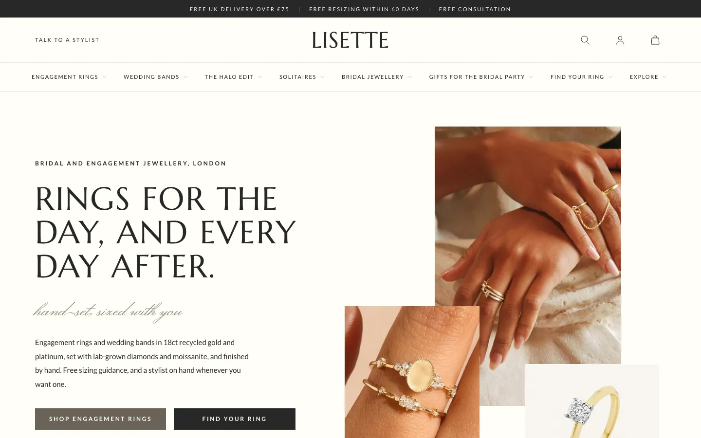
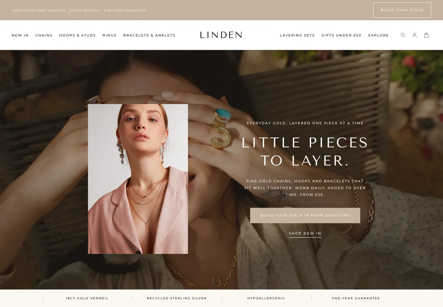
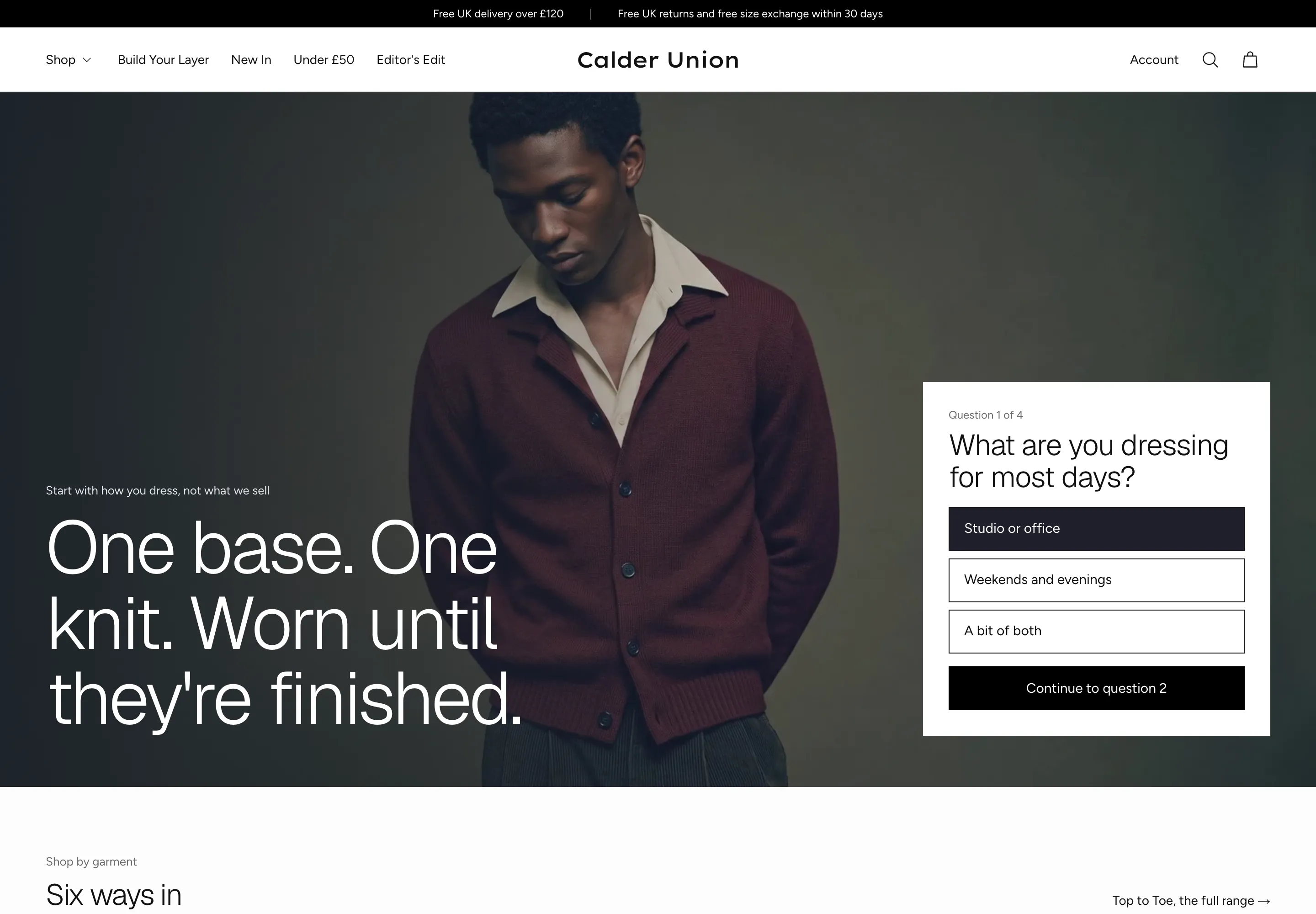
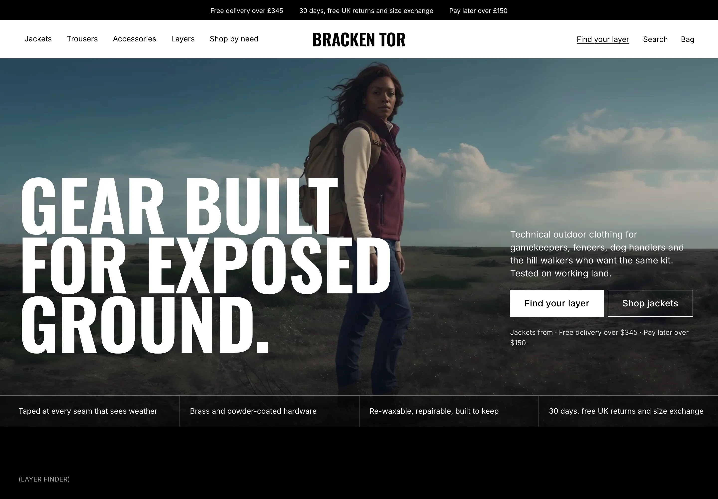
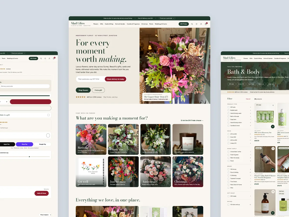
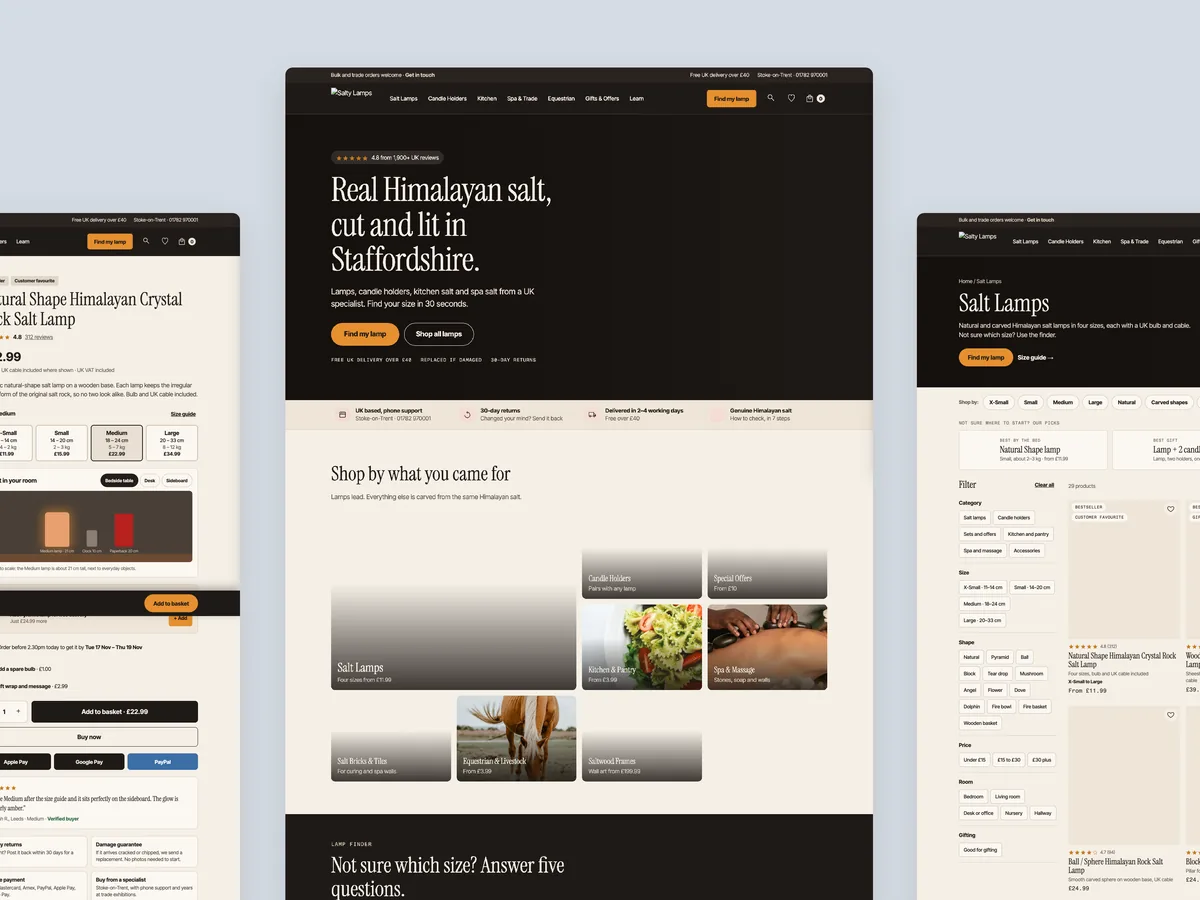
A clickable prototype of the homepage, a collection page and a product page. It is not a final design. It shows what the outcome could look like if guided paths, richer cards, reviews and bundles are in place.
The full concept build is 3,500, paid in milestones of 1,000, 1,500 and 1,000. Improving the existing homepage, collection page and product page is 2,200, with 1,200 to start. A theme alone is 350, or 1,000 with installation.
The video reviews the homepage, a collection page and a product page, then walks through a redesign concept for each, and ends with pricing and next steps. The recording runs for 23 minutes.
See what's quietly costing you sales.
Tell us about your store and we'll send a personalized 5-minute video showing exactly where you're losing buyers — and how to win them back.
Takes about 40 seconds. No call required.
-
5-minute video teardownA personalized walkthrough of your store, recorded by Eva.
-
Homepage & PDP reviewWhere attention leaks and buyers hesitate.
-
Mobile UX audit70% of your traffic — judged on its own terms.
-
Trust & credibility checkThe signals that make first-time buyers convert.
-
Prioritized CRO roadmapRanked by impact vs. effort, ready to ship.