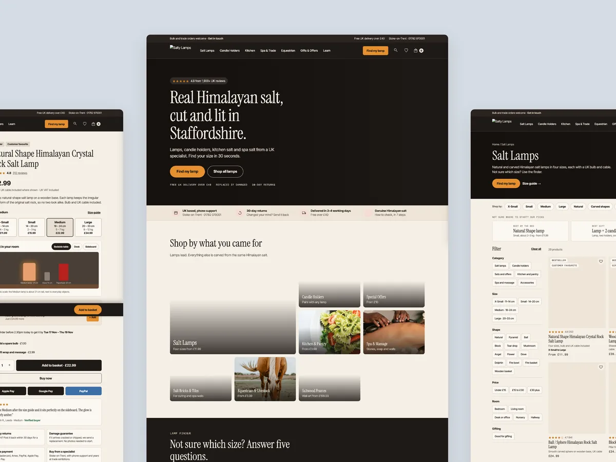
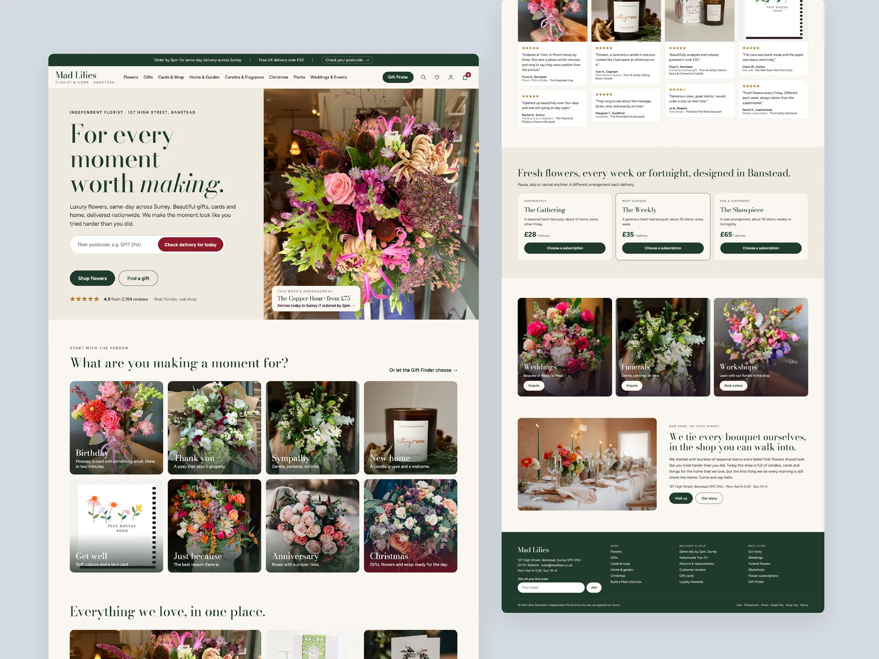
Homepage in two tall columns
The first column opens on the hero and categories, the second runs through to the footer.
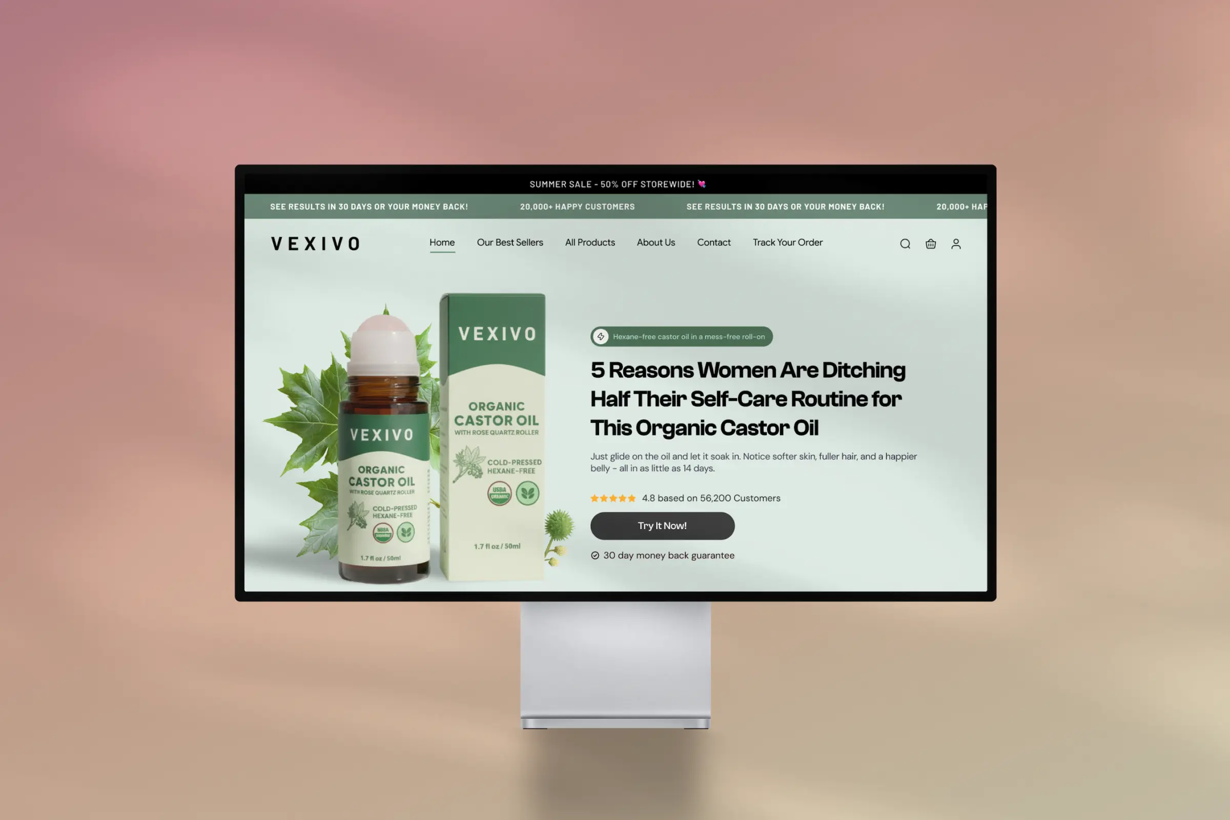
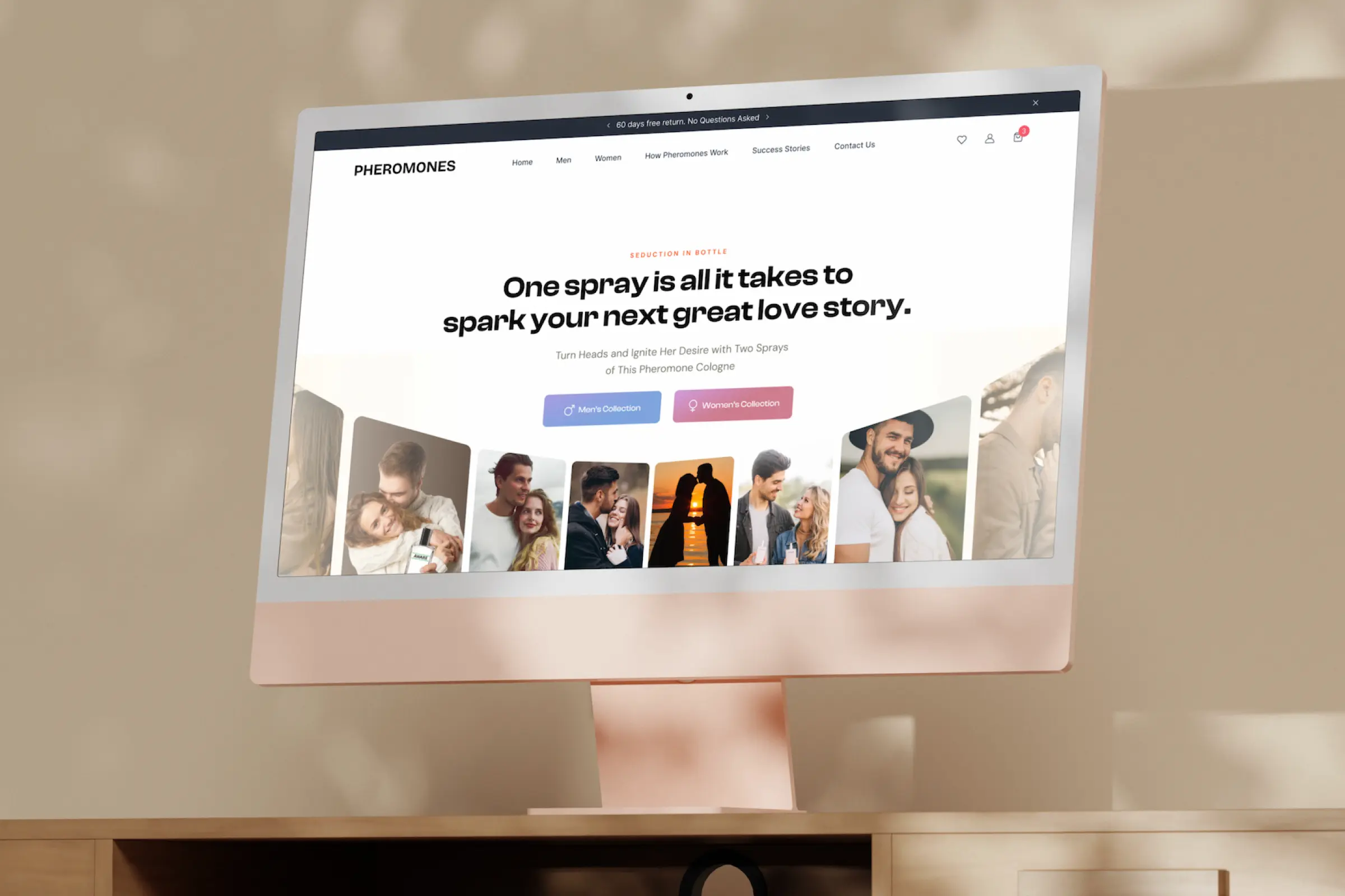
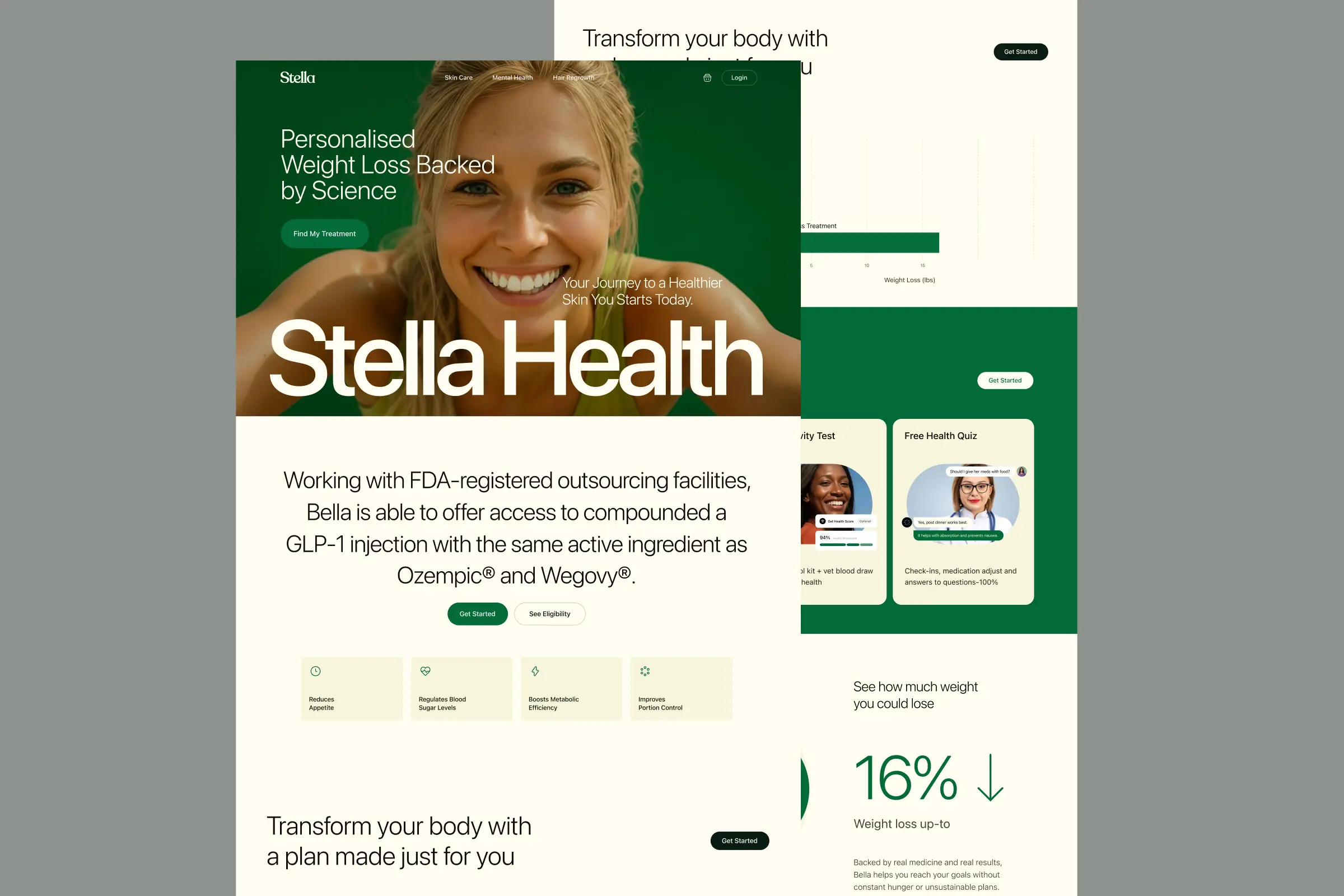
Storefronts we designed and built, across supplements, fragrance, health, wellness and skincare.
All 35 projectsFour engagements, measured before and after. What changed, why it changed, and by how much.
All case studiesDiagnosis, design and development from one studio — so the recommendation and the build never disagree.
All five services192 real Shopify stores torn down page by page, scored, and shown beside the version we would build. Free to watch.
Browse all teardownsConversion-first Shopify themes, each built for one industry’s buying journey. No required apps, no monthly theme fee, one licence per store.
See all themes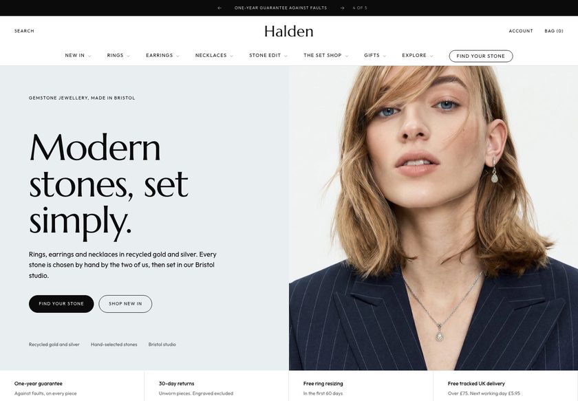 Halden
Jewelry & Accessories
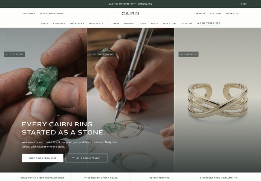 Cairn
Jewelry & Accessories
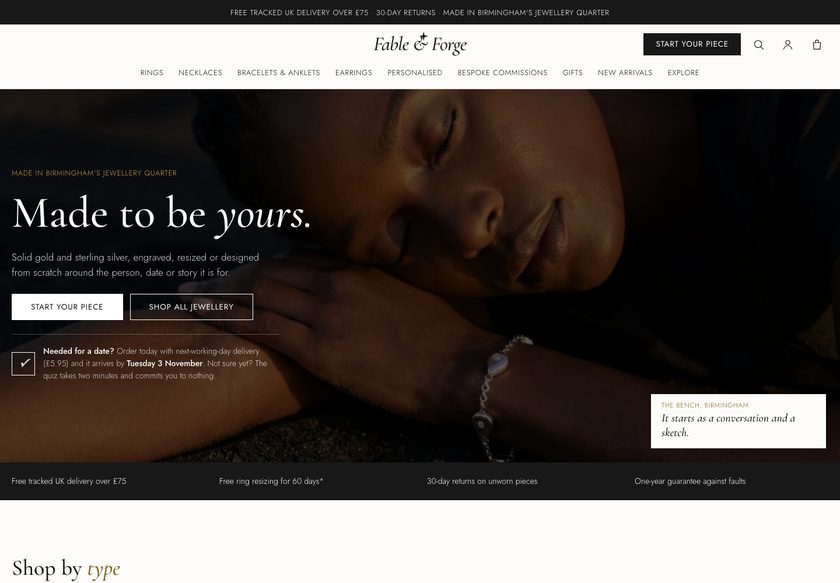 Fable & Forge
Jewelry & Accessories
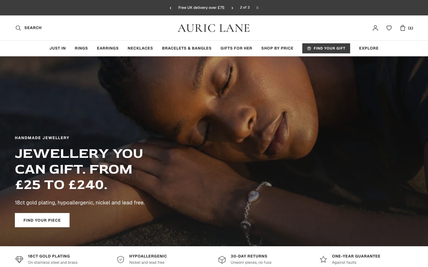 Auric Lane
Jewelry & Accessories
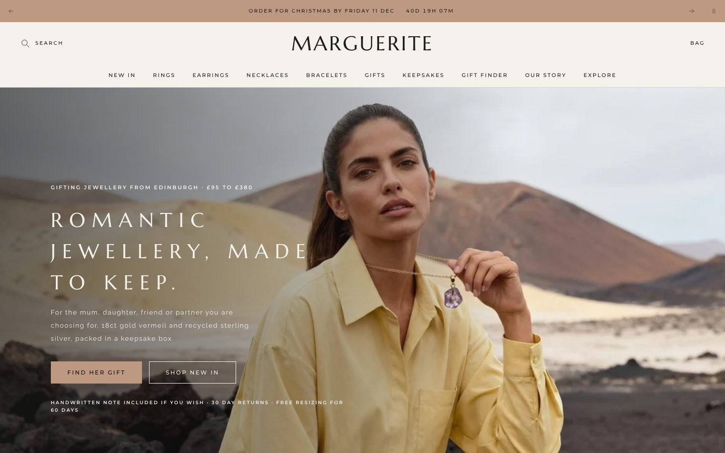 Marguerite
Jewelry & Accessories
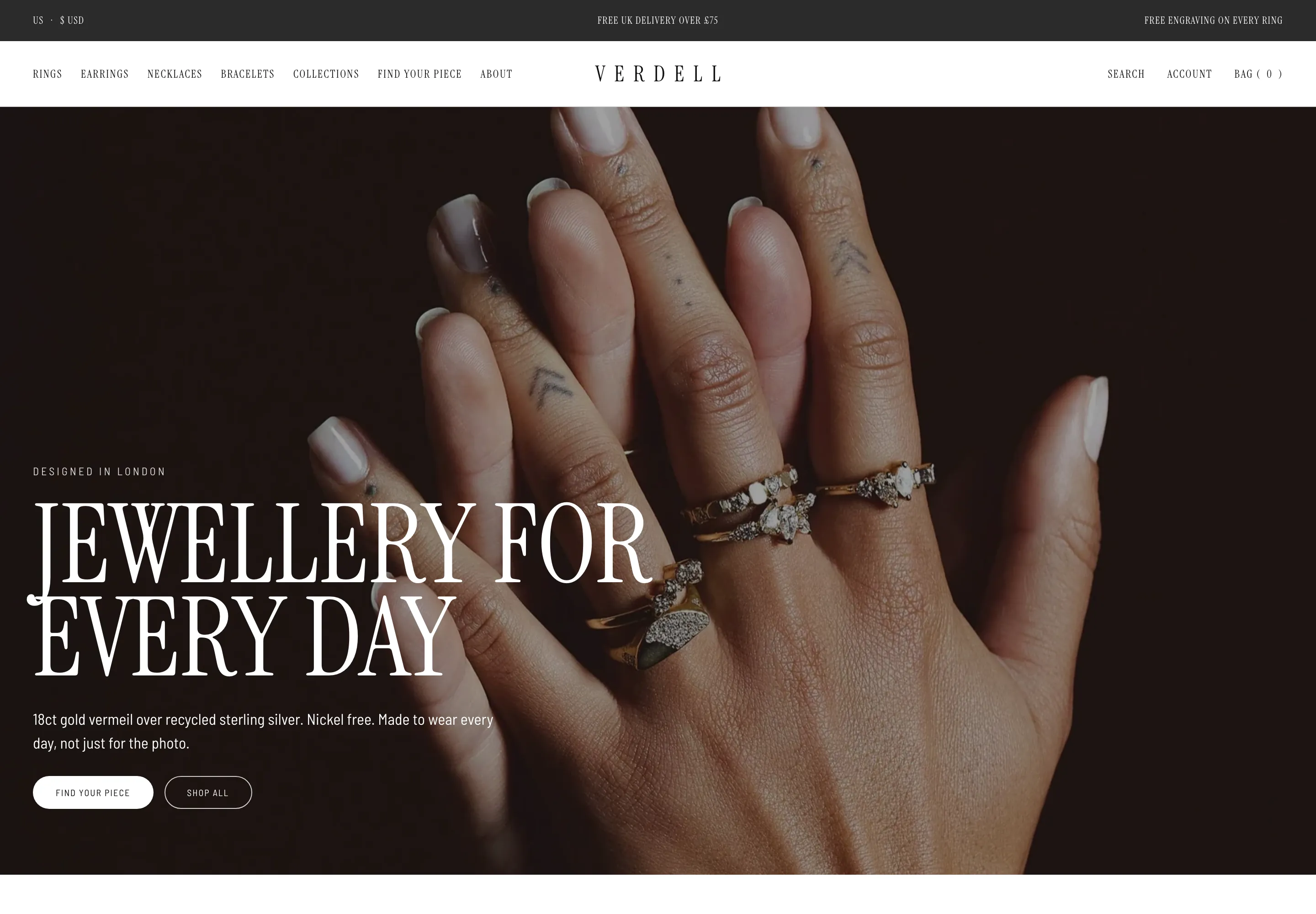 Verdell
Jewelry & Accessories
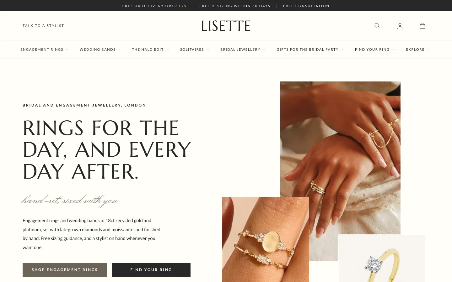 Lisette
Jewelry & Accessories
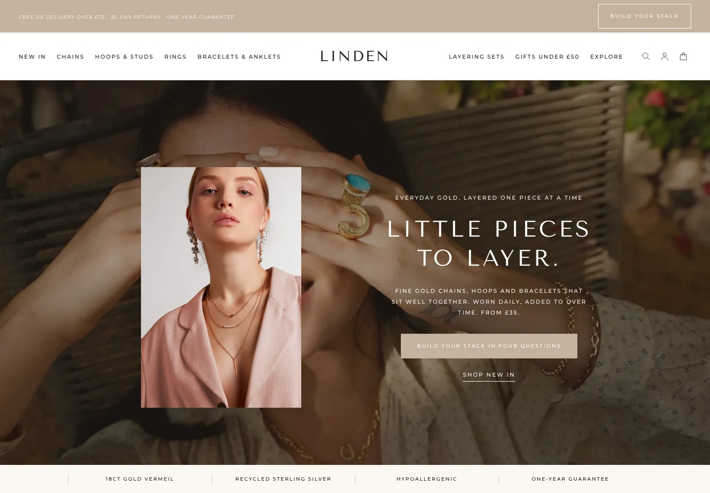 Linden
Jewelry & Accessories
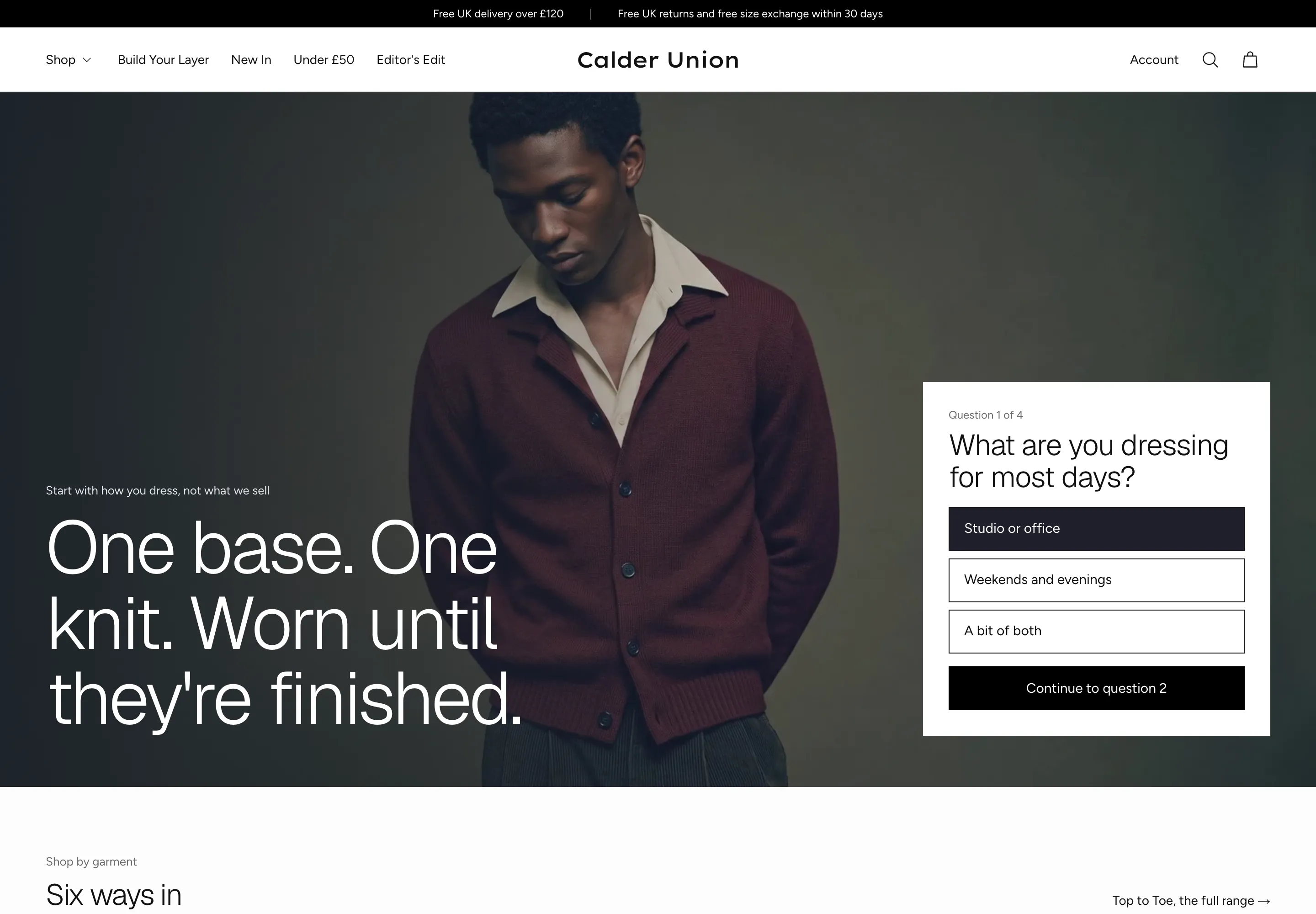 Calder Union
Clothing & Apparel
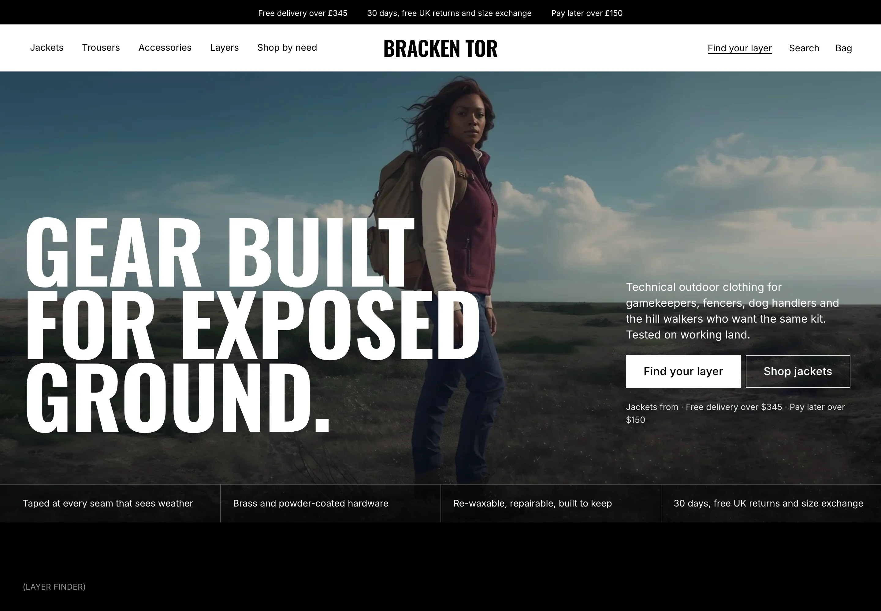 Bracken Tor
Clothing & Apparel
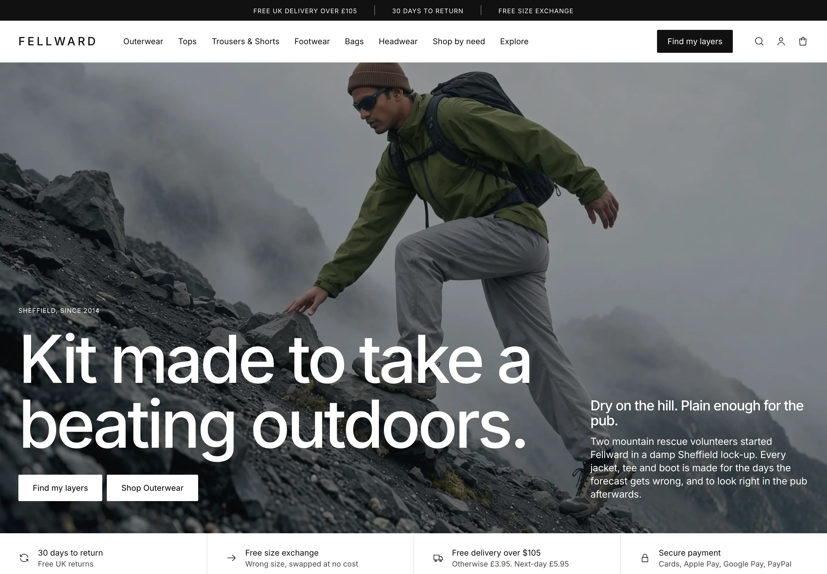 Fellward
Clothing & Apparel
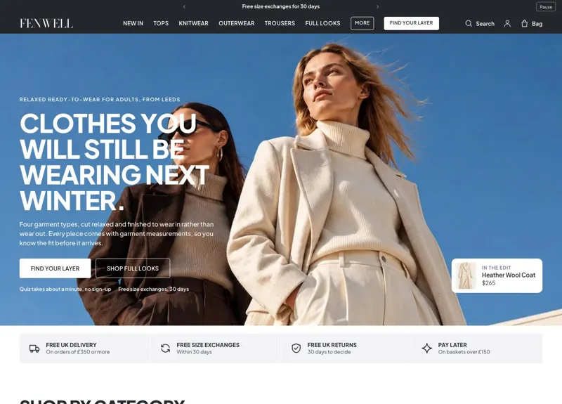 Fenwell
Clothing & Apparel
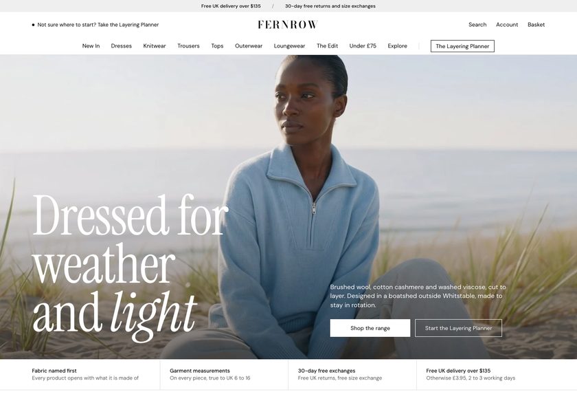 Fernrow
Clothing & Apparel
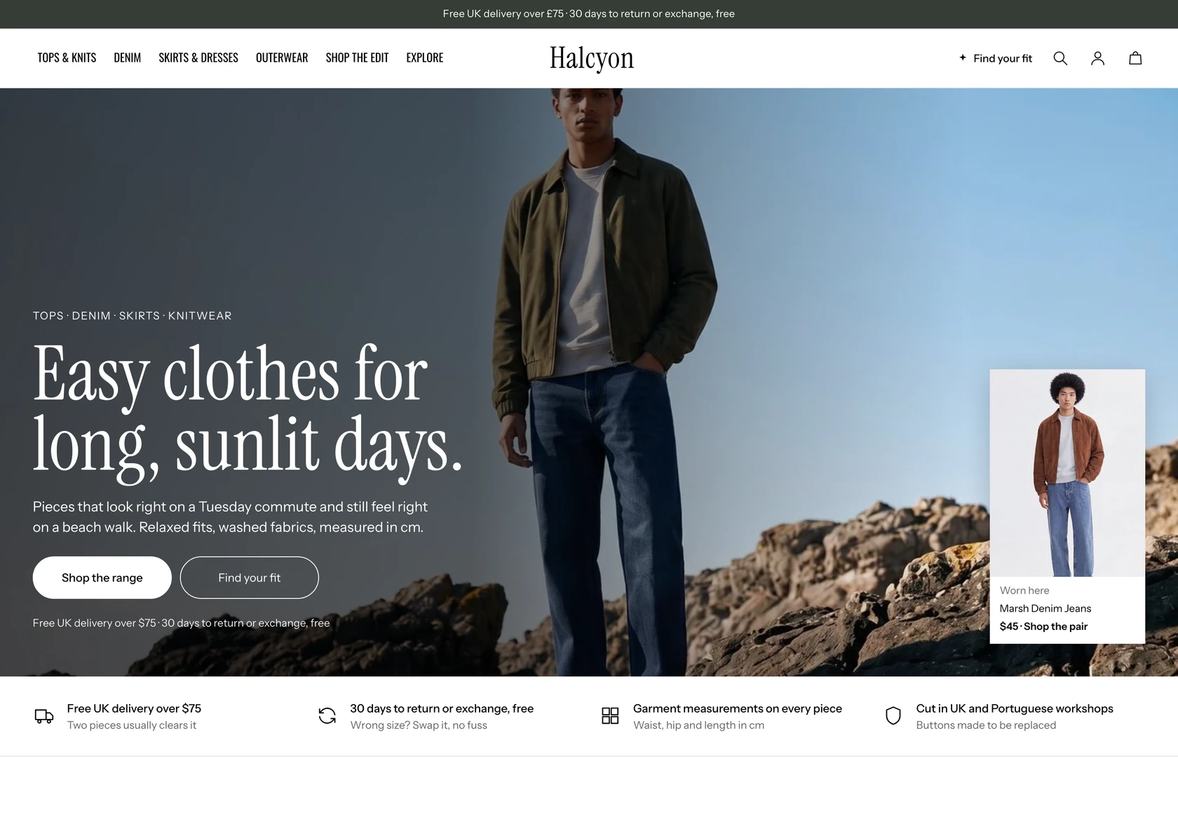 Halcyon
Clothing & Apparel
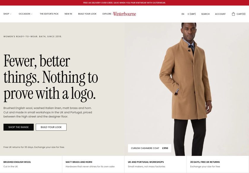 Winterbourne
Clothing & Apparel
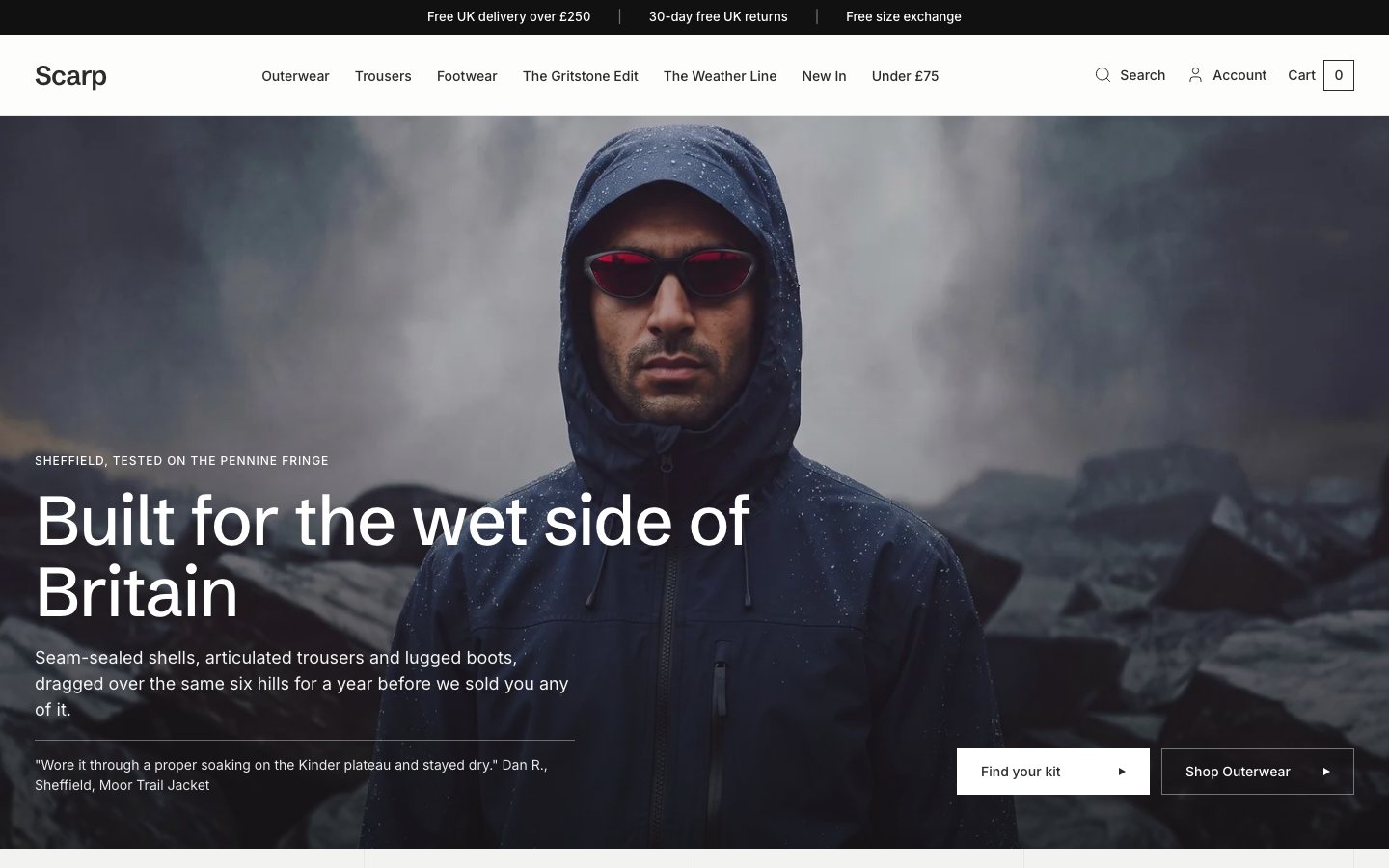 Scarp
Clothing & Apparel
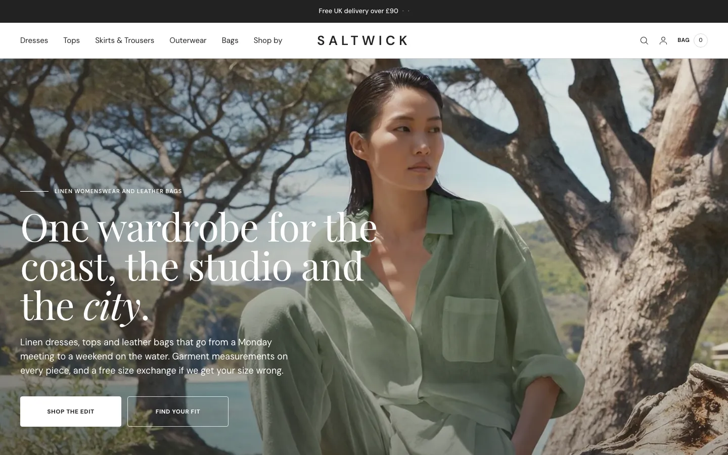 Saltwick
Clothing & Apparel
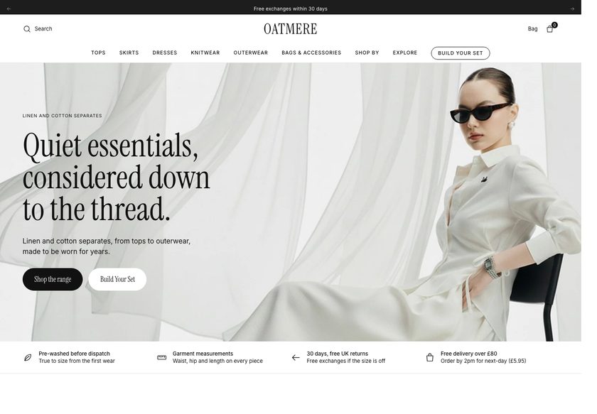 Oatmere
Clothing & Apparel
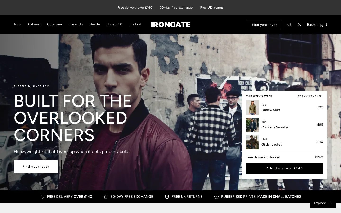 Irongate
Clothing & Apparel
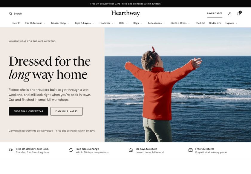 Hearthway
Clothing & Apparel
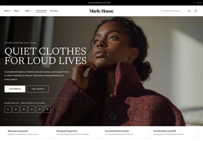 Marle House
Clothing & Apparel
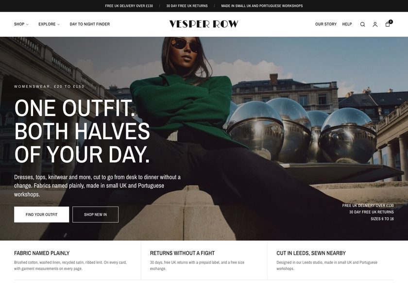 Vesper Row
Clothing & Apparel
A conversion teardown of the Mad Lilies home page, bath and body collection page and recycled green glass product page, with a clickable redesign concept for the flowers, gifts and wedding range.
Pressing play loads the video from YouTube — you can allow it for every teardown under cookie preferences.
Mad Lilies sells a broad and attractive range: fresh flowers, gifts, cards, candles, bath and body, plants, Christmas lines and ready to wear and custom wedding dresses. The photography looks good, the navigation is already organised by department, collections have filters, and reviews appear on the home page. Most of the ingredients of a converting store are already there.
The core problem is the presentation layer, not the products. The hero section shows flowers but does not say what the business does best, who it is for, or why other people trust it. A visitor has to work out the shop alone, and the wedding range stays hidden until they scroll a long way down the home page, so hesitation sets in early.
The same gap repeats lower down. Collection pages show a plain grid where two hand and body washes at the same price look identical, so shoppers must open each page to compare. On the recycled green glass product page, reviews are missing near the buy button, the description is long, and delivery, returns and shipping cost are left vague.
The direction is to make the site behave like the shop floor. Ask the visitor how to help, offer guided paths for flowers, gifts and weddings, put the differences on the product cards, and answer delivery, returns and reviews beside the button. Remove the reasons not to buy and only the reasons to buy remain. Treat the site as a salesperson, not a catalogue.
The site has a lovely range but behaves like a catalogue. The hero does not say who it is for or why to trust it, and the product page leaves delivery, returns and reasons to buy unanswered at the key moment.
Mad Lilies could work online like the helpful shop assistant it already has in person, asking what the visitor needs, guiding them to flowers, gifts or wedding wear, and answering every doubt before add to cart.
Visitors who already arrive would find the right product faster, trust the store sooner and add more to each order, so existing traffic and ad spend would turn into more completed purchases.
Five dimensions, each scored out of ten.
13 issues found, 15 fixes proposed.
The home page hero shows flowers but never states what the business does best, who it serves or why anyone should trust it. A new visitor has to guess, and hesitation starts in the first few seconds.
Reviews exist on the home page, but not where a first time visitor expects to see them. Nothing near the hero tells a stranger that other people have bought from Mad Lilies and been happy.
The home page pushes best sellers almost immediately, like a shop assistant recommending a product before asking what the customer wants. Visitors who came for something else have no route to it.
Ready to wear and custom wedding dresses are a strong offer, but they are absent from the navigation and only appear far down the home page. Visitors who do not scroll never learn they exist.
The navigation is tidy and organised by department, but it does not guide shoppers by occasion, recipient, price or delivery. Someone with a gift in mind has to browse rather than be led.
There is no equivalent of the question a shop assistant asks at the door. Nothing asks whether the visitor wants flowers, gifts or plants, or helps them narrow down what they need.
The bath and body collection is a grid of products with filters. It shows what is available but does not help the shopper decide what to buy or point to the right choice.
Two hand and body washes from the same brand sit at the same price and look identical in the grid. Without key details on the card, shoppers must open each product page just to compare.
On the recycled green glass product page there are no reviews around the decision making button. Storewide reviews could fill the gap, but nothing currently reassures the buyer at that moment.
The product page never explains why this item should be bought from this shop. There is no case made for the brand, the quality or the choice, so the purchase is left unjustified.
The product description is long and dense. A buyer deciding quickly cannot pick out the few facts that matter, so the page asks for effort rather than helping the decision.
The only shipping note is that taxes are included and shipping is calculated at checkout. Arrival time, delivery cost and what happens if something goes wrong are not answered on the page.
The product page offers no free delivery incentive, add on or bundle. Nothing encourages one buyer to take a second item, so each order stays as small as the first product.
State what Mad Lilies does, who it is for and why it can be trusted within the first screen. Place a short line and a few customer reviews in the hero so a stranger is reassured at once.
Replace the passive hero with two clear calls to action that ask how you can help. One leads to flowers and one to gifts, mirroring the question asked at the door of the physical shop.
Ask who the gift is for, the delivery date, the budget and the taste, then show matching products and a ready made bundle. This turns a hesitant gift buyer into someone with a shortlist.
Group flowers by type, moment and delivery, and gifts by recipient, occasion and price bands. Shoppers with a budget or occasion in mind can reach the right products straight from the menu.
Add weddings as its own menu item covering wedding wear and florals, so the dress range is visible without scrolling. Repeat it later in a home page section with consultation and shop options.
Let visitors choose a path first, then show best sellers and most loved items as a fallback. This keeps the recommendation for people who have not yet found what they were looking for.
Create entry points for birthday, thank you, sympathy, new home and get well soon, each leading to a curated set. Occasion shoppers then land on products already chosen for their need.
Add a badge, a clear image, the size or contents, a rating and a one line difference to each card. Shoppers can then tell the two hand and body washes apart without opening either page.
Give collection pages buttons such as gift, under a set price, hand and bath, plus a finder at the top. Extend the filters to scent family, brand, gift ready and rating.
Show review stars and a short quote beside the price and again near the button. Where a product has none, reuse storewide reviews so buyers see that others have bought and were happy.
Add a short section on the product page that gives the reasons to buy this item here, covering quality, the shop behind it and the pricing. Keep it to a few points a buyer can scan.
Cut the long description to the few facts that decide the purchase, such as size, what is included and what it is made from. Move any extra detail into a collapsible section.
Show when the item will arrive, what delivery costs, who gets free delivery and how returns work, next to the price. Repeat the key points in a short FAQ so no doubt is left.
Show how far the basket is from free delivery and suggest an item, such as a diffuser, that closes the gap. Pair it with a bundle so one buyer takes two products.
Let gift buyers add a card note, choose gift wrap and hide prices without leaving the product page. This removes a step for the visitors most likely to spend more.
A concept redesign created by Convertica Studio from this audit. It shows how the store could work, it is not the live store.
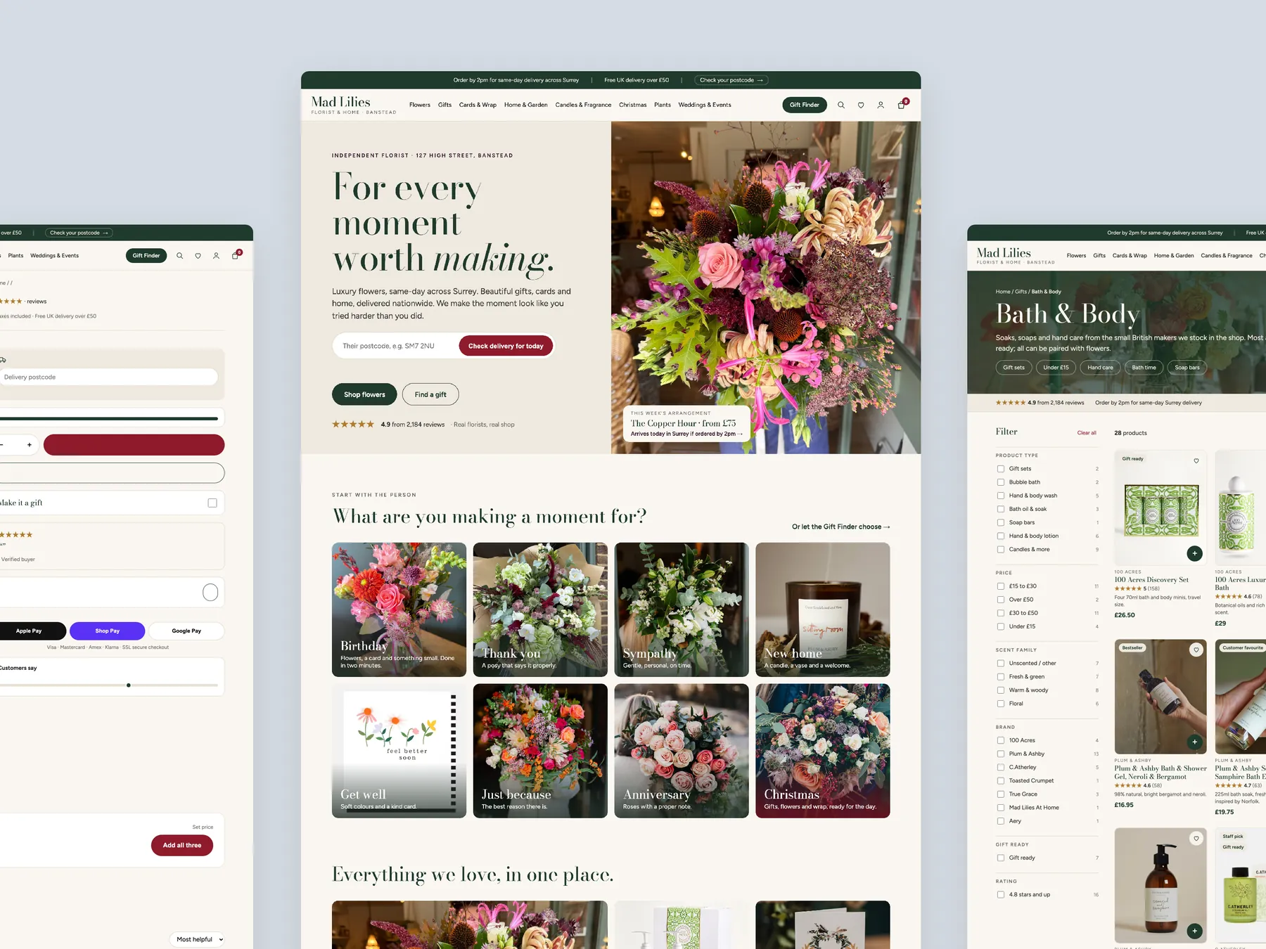
The first column opens on the hero and categories, the second runs through to the footer.
Three pages side by side: the product page on the left, the homepage in the centre and a collection page on the right.
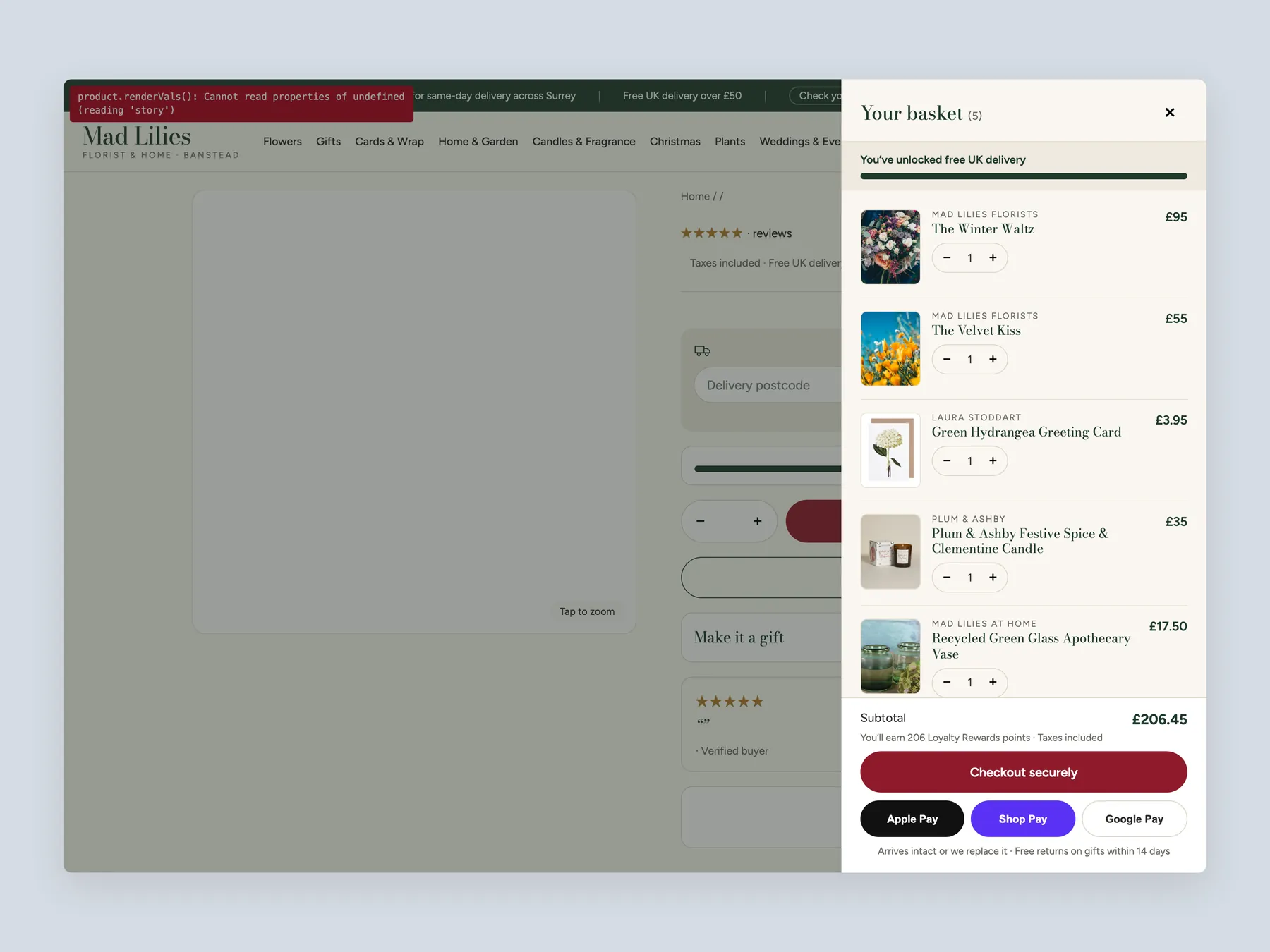
The basket slide-over open over the product page, shown whole from top to bottom with the page dimmed behind it.
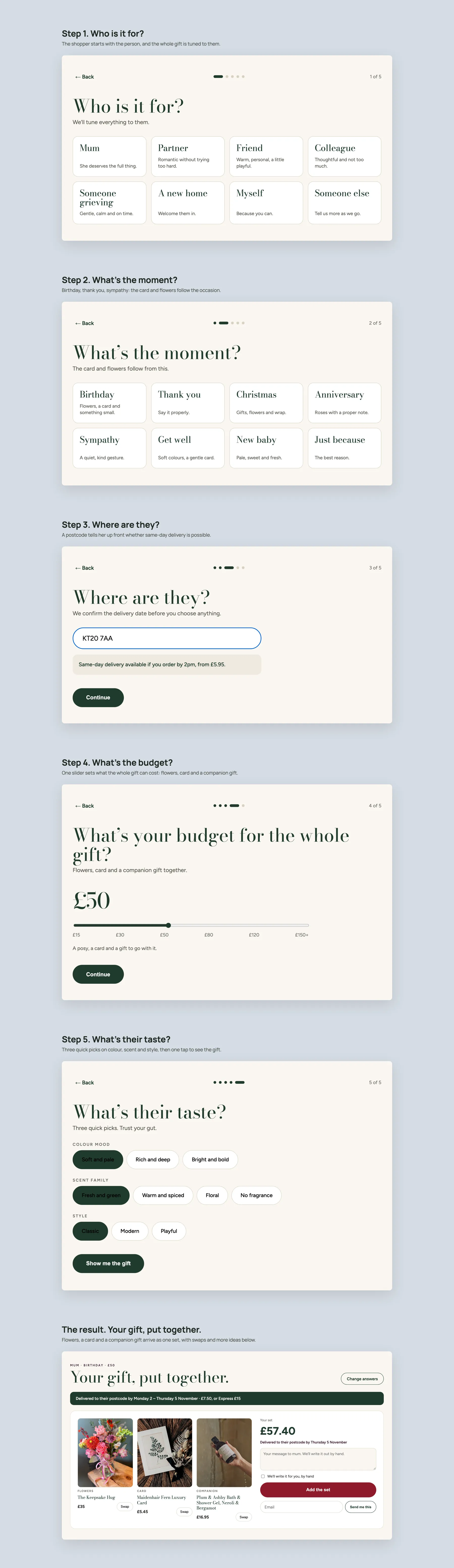
The Gift Finder quiz, step by step: who it is for, the moment, the postcode, the budget and their taste, ending on a finished gift set.
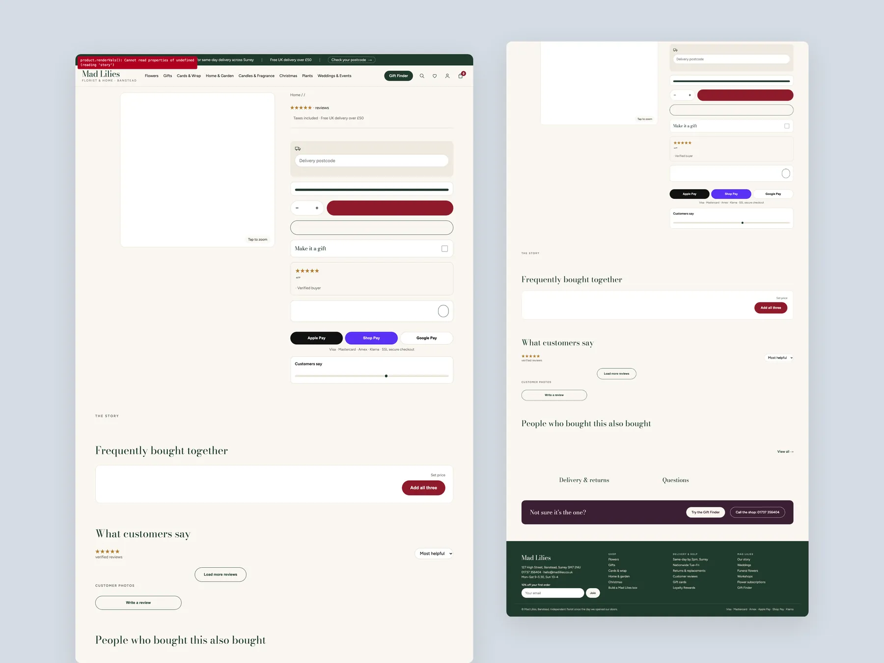
The product page in two tall columns, from the photos and buy box down to the footer.
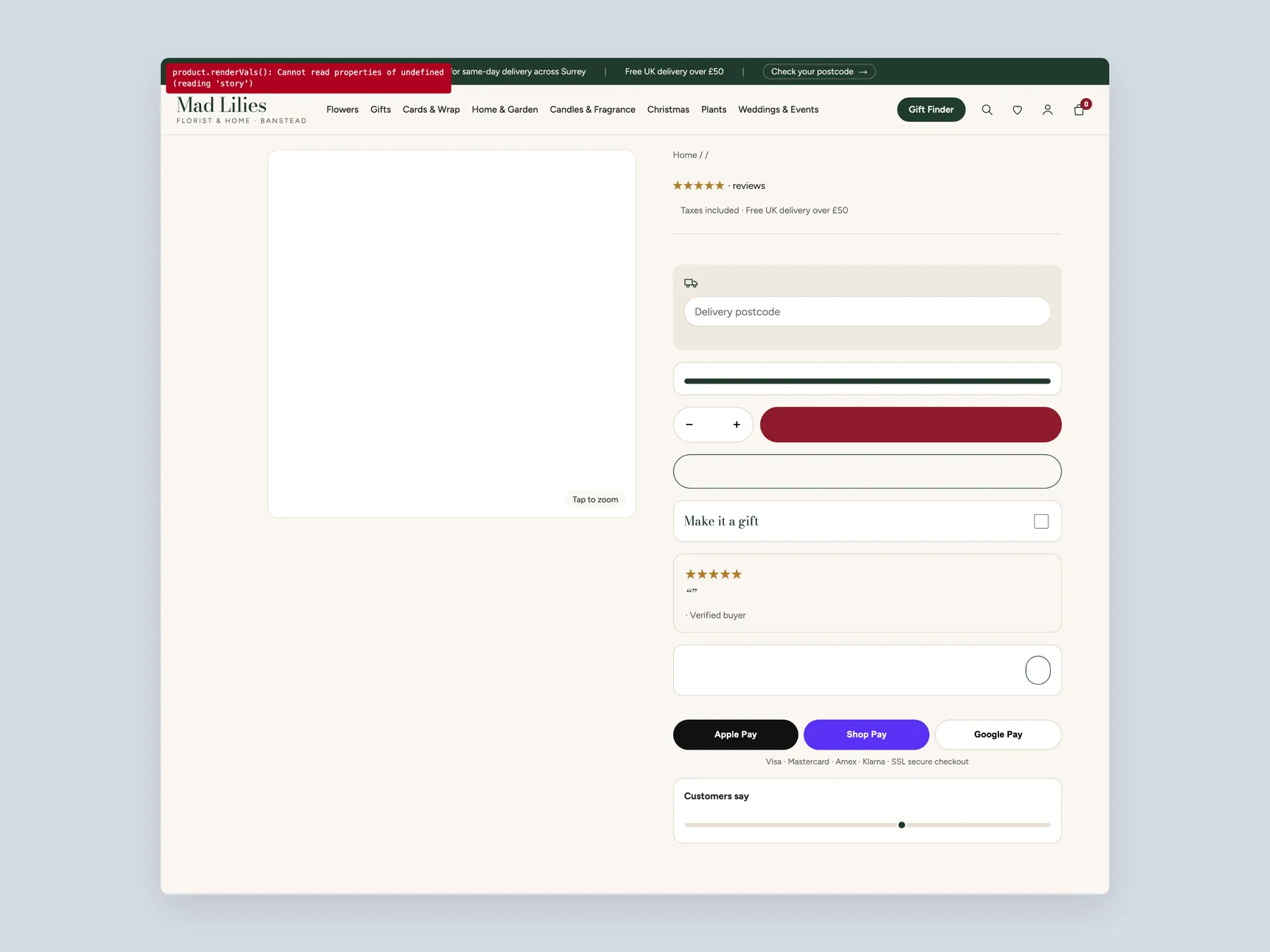
The product page first screen: header, photos and the buy box with sizes, button and delivery lines.
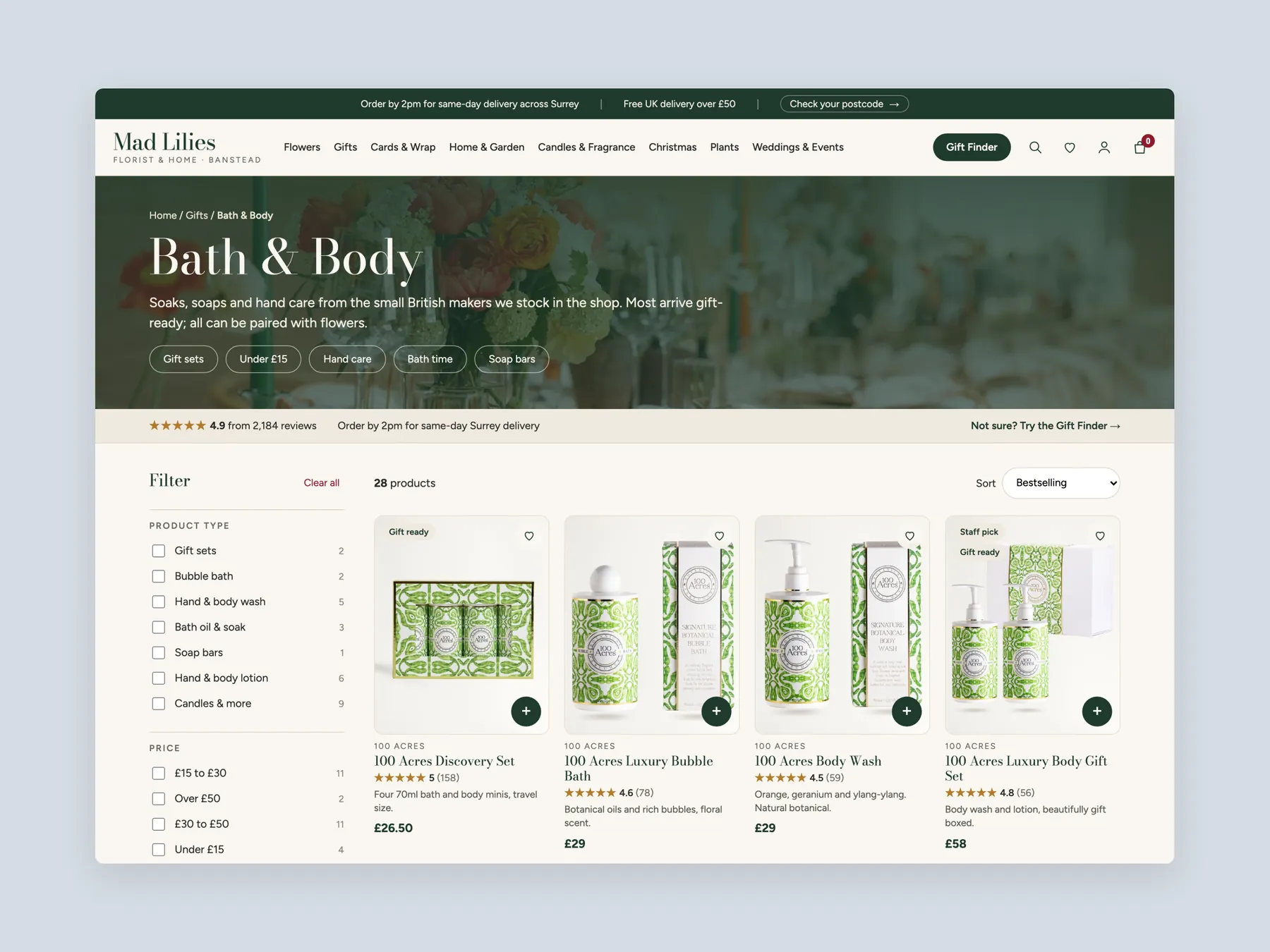
A collection page first screen with the banner, filters and the first row of product cards with prices.
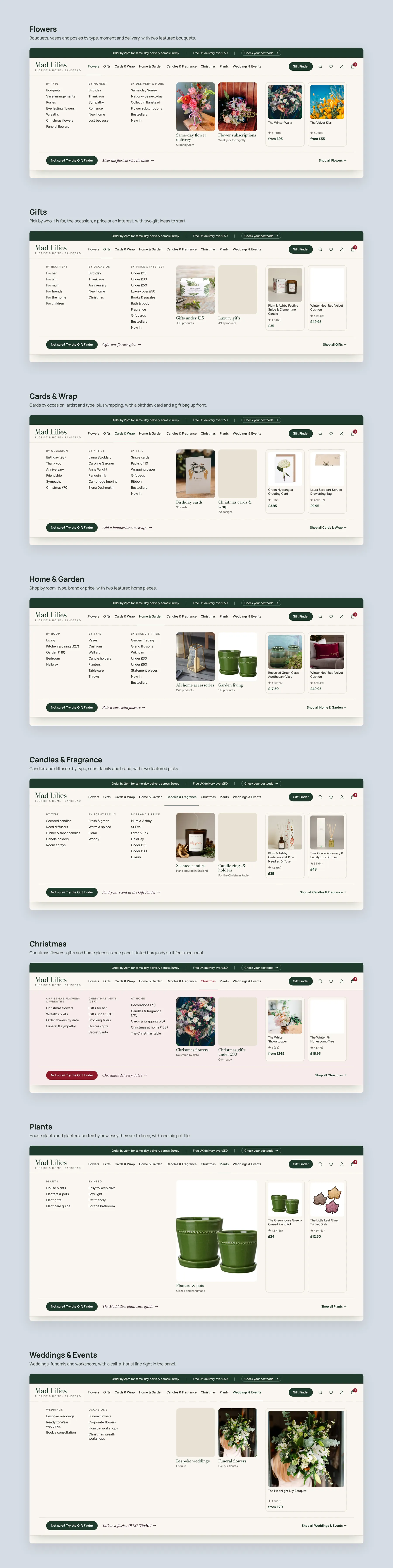
The mega menu, one panel per nav item: Flowers, Gifts, Cards & Wrap, Home & Garden, Candles & Fragrance, Christmas, Plants and Weddings & Events.
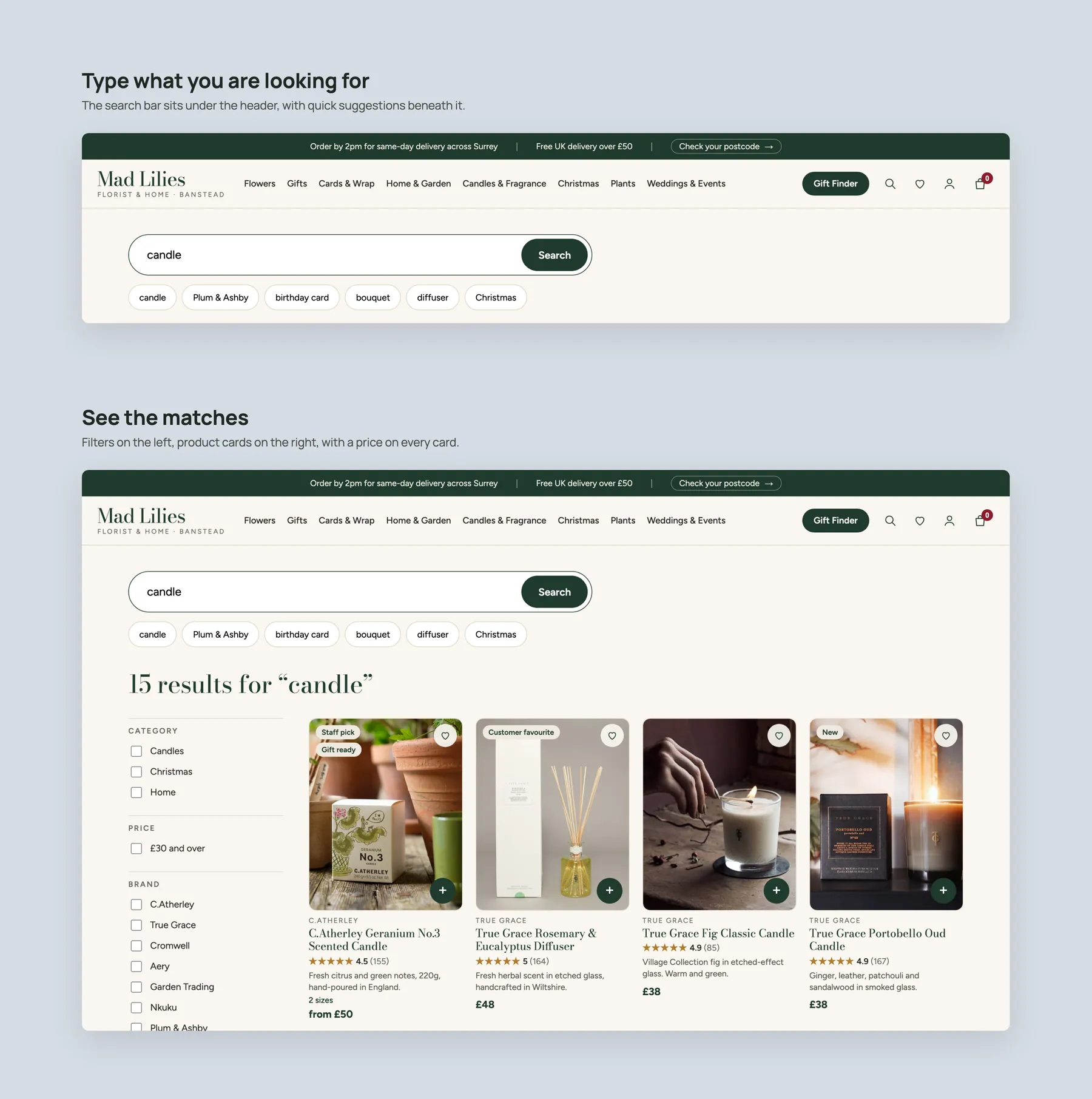
Search: the bar with quick suggestions, then the results with filters and product cards.
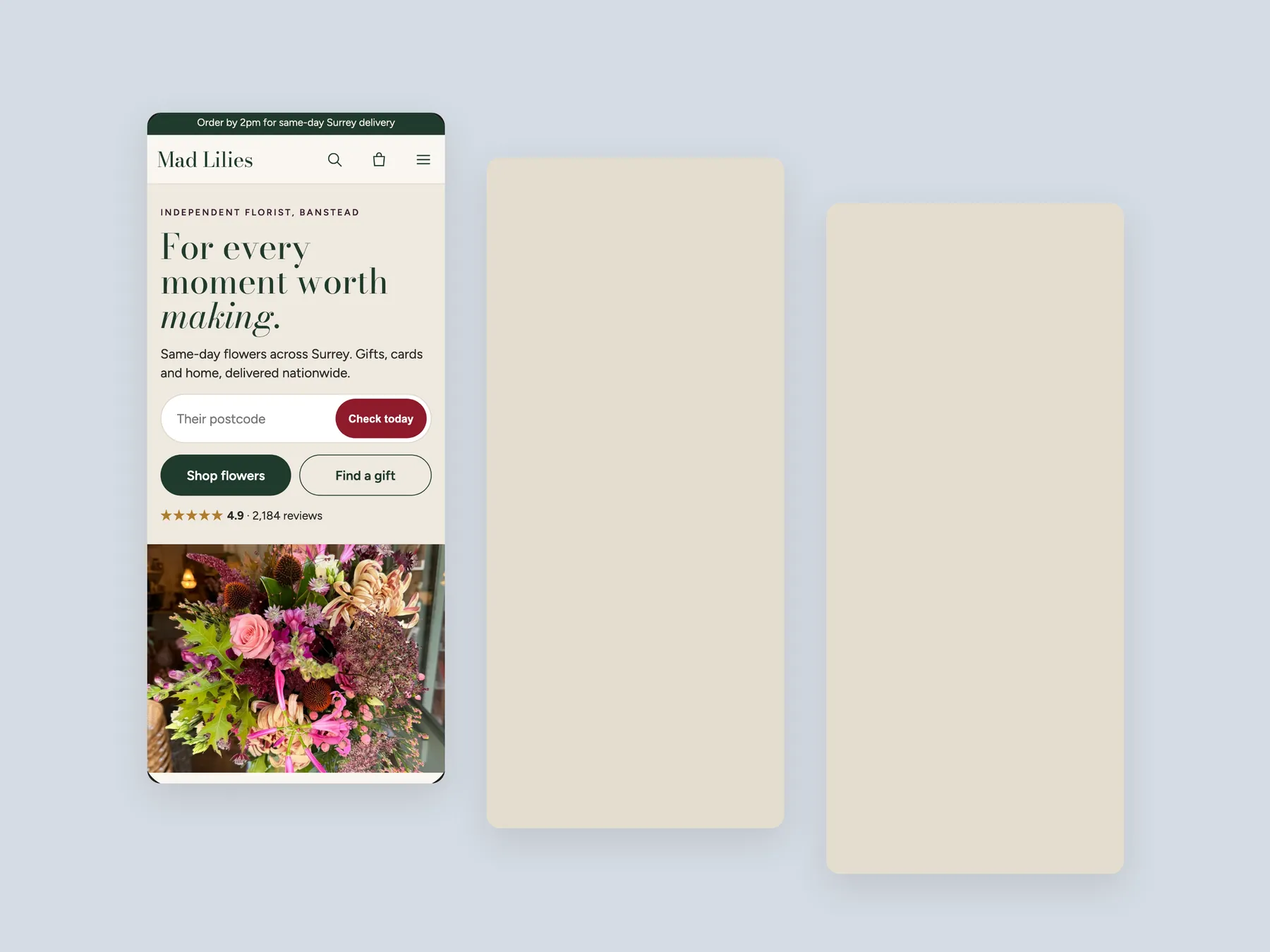
Three phone screens, staggered: home, collection and product.
The biggest issue is not weak products or low traffic. It is the presentation layer, which does not help visitors discover the right product or feel confident enough to buy. The hero, collection pages and product page all leave key questions unanswered.
A visitor should learn what the business does, who it is for and whether others trust it within the first few seconds. The current hero shows flowers but does not say these things, so hesitation starts before the visitor has seen any products.
Ready to wear and custom wedding dresses are a distinct and valuable offer. Today they only appear after a long scroll, so anyone who does not scroll that far never learns they exist. A menu item makes the whole range clear at once.
In a physical shop, staff ask what you are looking for and then lead you to flowers, gifts or plants. A website can do the same with clear buttons, a short gift finder and guided paths, rather than showing best sellers straight away.
The filters help, but the grid itself behaves like a catalogue. Two hand and body washes at the same price look identical, so shoppers must open each page to find the difference. Cards need badges, contents, ratings and a clear point of difference.
That is the moment a careful buyer decides whether to spend money. Reviews on the home page do not help there. If a product has none, storewide reviews can be reused to show that people have bought from the shop and were satisfied.
It should say when the item will arrive, what delivery costs, whether there is free delivery for UK customers and what happens if something goes wrong. Currently the page only notes that shipping is calculated at checkout.
Show how close the basket is to free delivery and suggest a matching add on, such as a diffuser. Bundles that pair flowers, a card and a gift item also encourage one buyer to take two products instead of one.
The recommendation is to fix the site first. Ads already bring people who know the business, and each extra visitor is worth more once the site converts better. Sending more traffic to the current pages simply repeats the same leaks.
No. The concept is a clickable prototype built in Figma to show the strategy for the home page, a collection page and a product page. It illustrates how the presentation could change and is not the final visual design.
No. The audit is about conversion, not a makeover. Many of the right elements are already on the site, such as reviews, filters and a good navigation structure. The work is mostly about placement, clarity and a few additions.
The video reviews the Mad Lilies home page, the bath and body collection page and the recycled green glass product page, then walks through a clickable redesign concept. The recording runs for 29 minutes.
Tell us about your store and we'll send a personalized 5-minute video showing exactly where you're losing buyers — and how to win them back.
Takes about 40 seconds. No call required.