










Barrel & Iron Candle Co CRO audit
The full California Proposition 65 warning — complete with cancer and birth defect language — sits beside the buy button for every visitor, and combined with shipping calculated at checkout it kills purchases at the exact moment of decision.
Watch the 32:12 teardown.
Pressing play loads the video from YouTube — you can allow it for every teardown under cookie preferences.
The short version.
The homepage here is genuinely well done — a seven out of ten. It has an about-us story, a collections section, a what's-your-vibe starting point, and testimonials, so the solid elements a candle brand needs are largely in place. There are no big structural weaknesses on that first page.
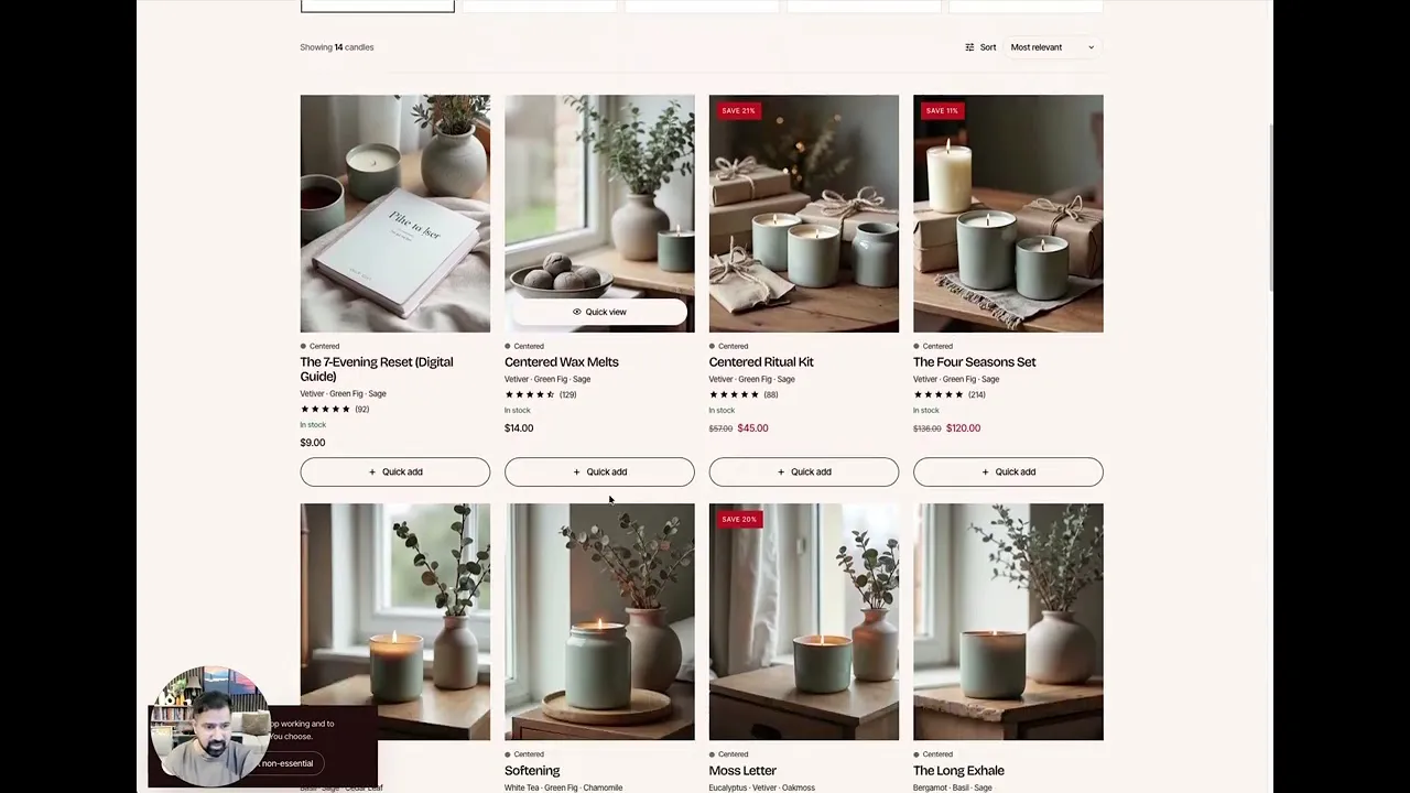
What is missing is the brand feel and the guidance. The site reads as a website that sells candles rather than a premium brand, trust signals sit too far down the page, and shoppers get little help choosing a scent — a real problem for a product that cannot be smelled through a screen. The collection page is a plain grid with no bestseller cues or storytelling, the most ignored page on most Shopify stores and also one of the most important.
The product page is where the real damage happens. The full California Proposition 65 text, with its cancer and birth defect wording, sits in plain view near the add-to-cart button for every visitor worldwide, even though the law only concerns California. Add shipping calculated at checkout, Shop Pay installment clutter on a low-priced product, no subscription option, no gifting flow, and no bundles, and the page repeatedly gives shoppers reasons to hesitate rather than reasons to buy.
The direction is a premium identity with a guided scent journey: a quiz that matches moments to scents, collection pages that tell a story with comparison charts, a Prop 65 treatment shrunk to its legal minimum and shown only to California visitors, transparent shipping, subscribe-and-save refills, and a gifting flow. Done properly, a three to four percent conversion rate is the realistic target.
The full California Proposition 65 warning — complete with cancer and birth defect language — sits beside the buy button for every visitor, and combined with shipping calculated at checkout it kills purchases at the exact moment of decision.
Give the store a premium brand identity and a guided scent experience — quiz funnels, comparison charts, subscriptions, and gifting — so shoppers who cannot smell the product can still buy with confidence.
A stronger brand feel, guided scent discovery, a compliant but harmless Prop 65 treatment, fewer checkout surprises, recurring subscription revenue, and higher conversion rate and average order value through bundles and gifting.
Scored across five dimensions.
Average of the five scores below, as judged at the time of recording. Weak overall — the detail is in which dimension is dragging.
12 findings, each with the fix beside it.
Every finding below was called out on the recording. Open one to read what was found and what we would change. Nothing is hidden from the page source.
01 The Store Feels Generic, Not Premium Fix included
Landing on the site feels like visiting a website that sells candles — the brand association and premium feel that separate a brand from a shop are missing.
Attach A Premium Brand Identity
Add distinctive typography and a visual identity so the store feels like a brand rather than a plain white grid of candles.
02 Trust Signals Arrive Too Late Fix included
Testimonials and reviews exist but sit too far down; there is no early signal that the store is trusted by real customers.
Move Trust To The Top
Surface a testimonial summary and trusted-by signals as soon as visitors land instead of burying them down the page.
03 Shoppers Get No Help Choosing A Scent Fix included
Fragrance is hard to buy online, and beyond a partial what's-your-vibe section the site does not aid the decision or match scents to shoppers.
Add A Scent-Matching Quiz
Build a tell-us-the-moment quiz that recommends the right candle, captures emails for future outreach, and doubles as a Meta ad funnel.
04 Wasted Homepage Real Estate Observation
One homepage section adds little and could be made far more compelling with the same space.
This one is addressed by the wider recommendations below rather than a single change.
05 The Collection Page Is Just A Grid Fix included
No bestseller cues, no collection description, no guidance — the most ignored page on most Shopify stores is also one of the most important for conversion.
Give Collections A Story
Open each collection with a description, its average rating, and when-to-reach-for-it guidance so picky scent buyers get their questions answered.
06 The Prop 65 Warning Kills Conversions Fix included
The full cancer and birth defect text appears near the buy button for every visitor, even though the disclosure is only a California requirement and may not apply to these materials at all.
Shrink The Prop 65 Warning To Its Legal Minimum
Show only the short California Prop 65 warning line with an expandable detail link — the full cancer text is not required and is scaring buyers away.
07 Shipping Is A Checkout Surprise Fix included
Shipping calculated at checkout tells shoppers a surprise is waiting for them, one of the most reliable ways to lose an order.
End The Checkout Shipping Surprise
Replace shipping calculated at checkout with a flat rate or a free-shipping threshold shoppers can see upfront.
08 No Subscription Or Refill Option Fix included
Candles are a natural repeat purchase, yet there is no subscribe-and-save path to turn one-time buyers into returning customers.
Add Subscribe-And-Save Refills
Introduce a subscription for refills and reorders — retaining existing customers beats hunting new ones every month.
09 The Buy Area Lacks A Benefit-Led Description Observation
The title and price are clear, but the short description of why to buy — what changes after the purchase — is missing from the decision zone.
This one is addressed by the wider recommendations below rather than a single change.
10 Shop Pay Clutters A Low-Price Product Fix included
Pay-over-time messaging on products mostly under $50 adds confusion and pollutes prime real estate that should sell benefits.
Remove Shop Pay Installments
Drop pay-over-time for these price points and use that space to state why the product is worth buying.
11 Gifting Is Ignored Fix included
Candles are one of the most gifted products there is, yet there is no gift wrap, personal note, or gift positioning anywhere.
Sell Candles As Gifts
Add gift wrapping and personal notes, and run gift-angled campaigns, because gifting is one of the store's strongest natural sales channels.
12 Scent Education Stops At Basic Notes Observation
The notes are listed but never explained — no comparisons, no room or mood guidance, none of the education picky scent buyers need.
This one is addressed by the wider recommendations below rather than a single change.
6 further recommendations that cut across the whole store.
Highlight Most-Loved Categories And Bestsellers
Mark the most-loved category and bestselling products so attention and sales concentrate where you want them.
Add A Scent Comparison Chart
Translate invisible scents into a visible comparison — warm versus cozy, soft versus woody — so shoppers can confidently pick between products.
Geo-Target The Warning To California
Use IP-based geolocation to show the notice only to California visitors, and confirm whether the wax and fragrance materials even trigger the requirement.
Guide The Variant Choice
Label variants with hints such as most loved and best value so size selection helps conversion and average order value.
Reassure On Delivery And Returns
State that orders ship within one to two business days with 30-day returns right in the buy area — the guarantee matters more than it ever gets used.
Keep Selling Below The Fold
Continue past add-to-cart with the experience, scent notes, best-for rooms, intensity, what's inside, a burn guide, layer-the-mood bundles that save 15%, testimonials, and FAQs.
What to take from this teardown.
The homepage is genuinely strong; the brand feel and guidance are what is missing.
The full Prop 65 text near the buy button is the store's single biggest conversion killer.
The warning should be its four-word legal minimum, shown only to California visitors.
Shipping calculated at checkout promises shoppers a surprise — and loses orders.
Scent buyers need education: comparisons, moods, rooms, intensity, and burn time.
A scent quiz converts undecided visitors and captures emails for future campaigns.
Subscriptions and gifting turn one-time candle buyers into recurring revenue.
A three to four percent conversion rate is a realistic target for this redesign.
What people ask about this teardown.
12 answers drawn from the recording and the written report — the questions store owners in scented candles ask after watching this one.
Ask about your own store →
What is the biggest conversion problem on this store?
The full California Proposition 65 warning — complete with cancer and birth defect language — sits beside the buy button for every visitor, and combined with shipping calculated at checkout it kills purchases at the exact moment of decision. The homepage here is genuinely well done — a seven out of ten. It has an about-us story, a collections section, a what's-your-vibe starting point, and testimonials, so the solid elements a candle brand needs are largely in place.
Why did this store score 3/10 on the product page?
The product page was the weakest of the five dimensions at 3/10, against 6/10 for user experience. The Buy Area Lacks A Benefit-Led Description: The title and price are clear, but the short description of why to buy — what changes after the purchase — is missing from the decision zone.
The Store Feels Generic, Not Premium: what does that mean in practice?
Landing on the site feels like visiting a website that sells candles — the brand association and premium feel that separate a brand from a shop are missing. The fix: Attach A Premium Brand Identity — Add distinctive typography and a visual identity so the store feels like a brand rather than a plain white grid of candles.
Why is “Trust Signals Arrive Too Late” costing this store sales?
Testimonials and reviews exist but sit too far down; there is no early signal that the store is trusted by real customers. The fix: Move Trust To The Top — Surface a testimonial summary and trusted-by signals as soon as visitors land instead of burying them down the page.
How do you fix “Shoppers Get No Help Choosing A Scent”?
Fragrance is hard to buy online, and beyond a partial what's-your-vibe section the site does not aid the decision or match scents to shoppers. The fix: Add A Scent-Matching Quiz — Build a tell-us-the-moment quiz that recommends the right candle, captures emails for future outreach, and doubles as a Meta ad funnel.
Is “Wasted Homepage Real Estate” worth prioritising?
One homepage section adds little and could be made far more compelling with the same space.
What would change if “The Collection Page Is Just A Grid” were fixed?
No bestseller cues, no collection description, no guidance — the most ignored page on most Shopify stores is also one of the most important for conversion. The fix: Give Collections A Story — Open each collection with a description, its average rating, and when-to-reach-for-it guidance so picky scent buyers get their questions answered.
What should be fixed first?
Start with Attach A Premium Brand Identity — Add distinctive typography and a visual identity so the store feels like a brand rather than a plain white grid of candles.
How can a store like this increase average order value?
Add Subscribe-And-Save Refills; Guide The Variant Choice; Keep Selling Below The Fold. Introduce a subscription for refills and reorders — retaining existing customers beats hunting new ones every month.
Does this store need a full redesign or targeted fixes?
Structural. The average is 4.4/10 and the weakest dimension, the product page, sits at 3/10 — the recommendations amount to rebuilding how the store presents itself, not tuning what is there.
What is the one-sentence takeaway?
Subscriptions and gifting turn one-time candle buyers into recurring revenue. A three to four percent conversion rate is a realistic target for this redesign.
What was reviewed in this audit, and how long is it?
A free 32:12 CRO teardown recorded by Convertica Studio for a scented candles store, walking the live site page by page. It produced 12 issues and 15 written fixes, plus scores across brand, UX, trust, product page and conversion. Any Shopify store can request the same review.
More teardowns from the library.
See what's quietly costing you sales.
Tell us about your store and we'll send a personalized 5-minute video showing exactly where you're losing buyers — and how to win them back.
Takes about 40 seconds. No call required.
-
5-minute video teardownA personalized walkthrough of your store, recorded by Eva.
-
Homepage & PDP reviewWhere attention leaks and buyers hesitate.
-
Mobile UX audit70% of your traffic — judged on its own terms.
-
Trust & credibility checkThe signals that make first-time buyers convert.
-
Prioritized CRO roadmapRanked by impact vs. effort, ready to ship.