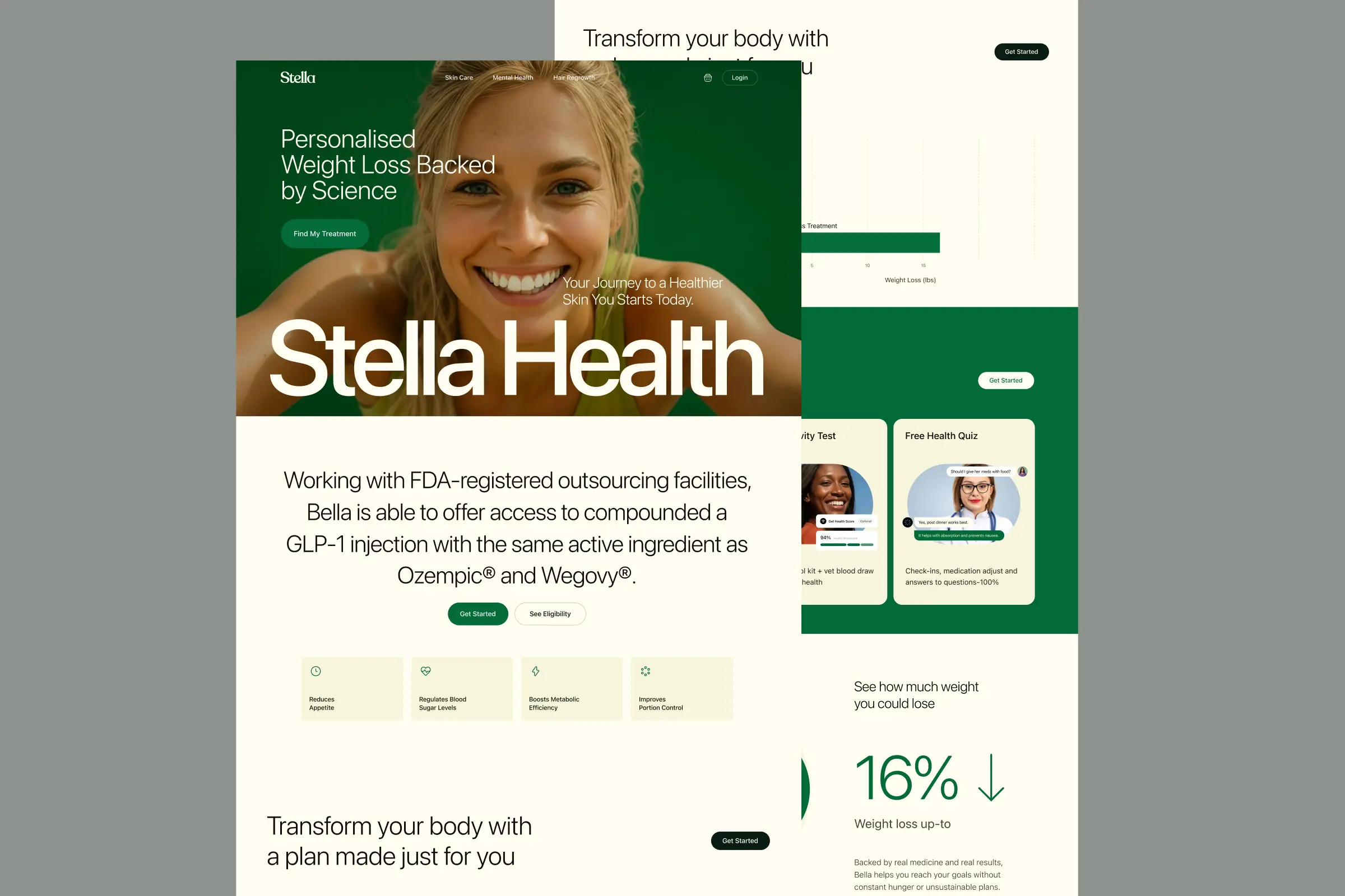
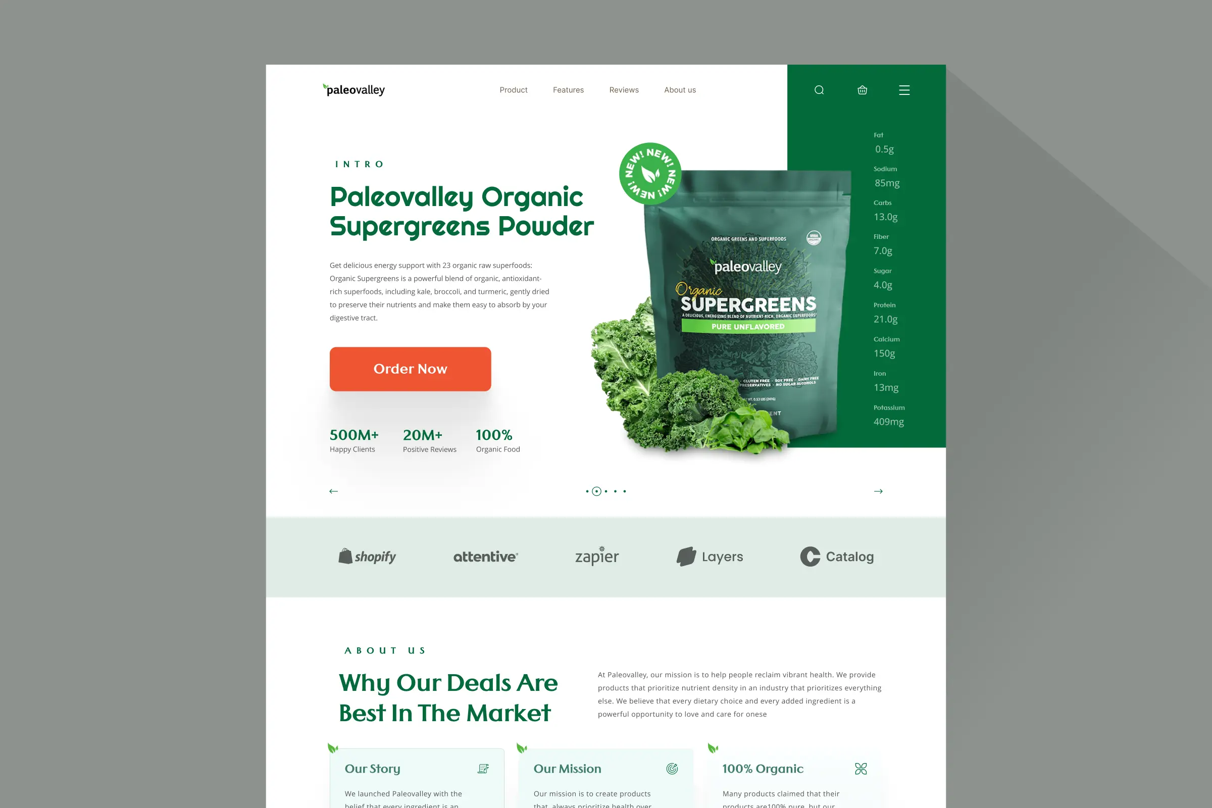
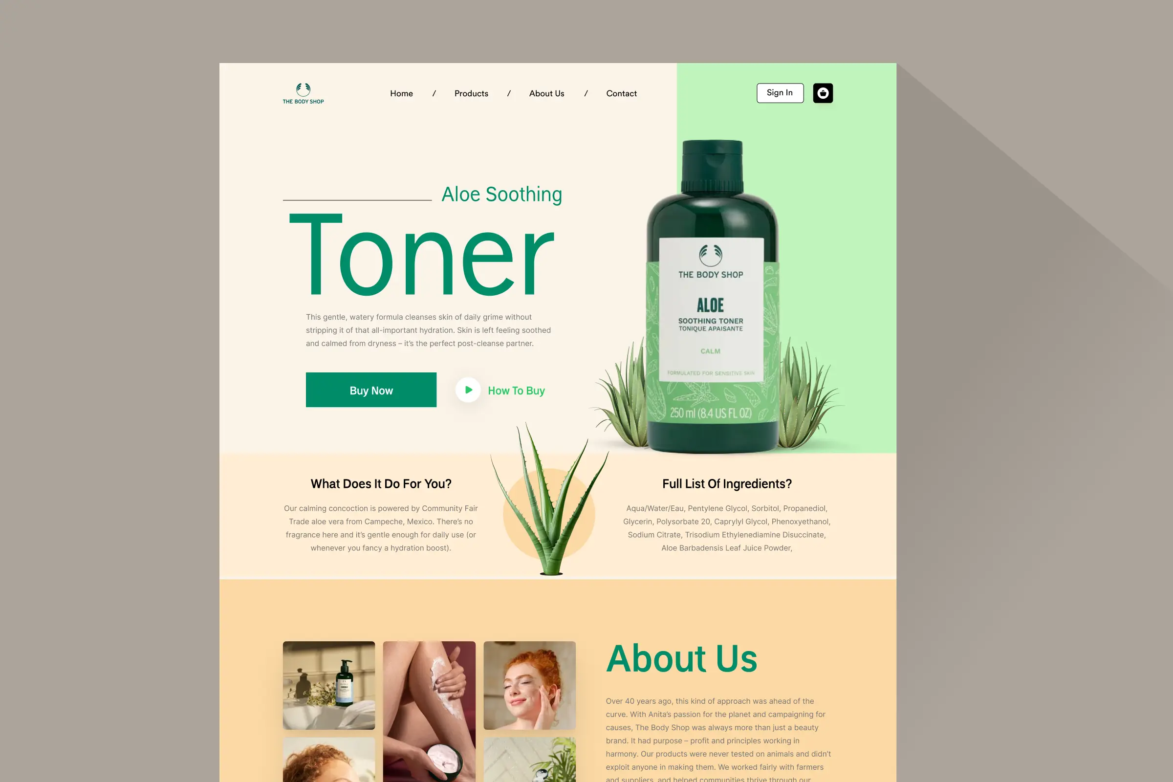
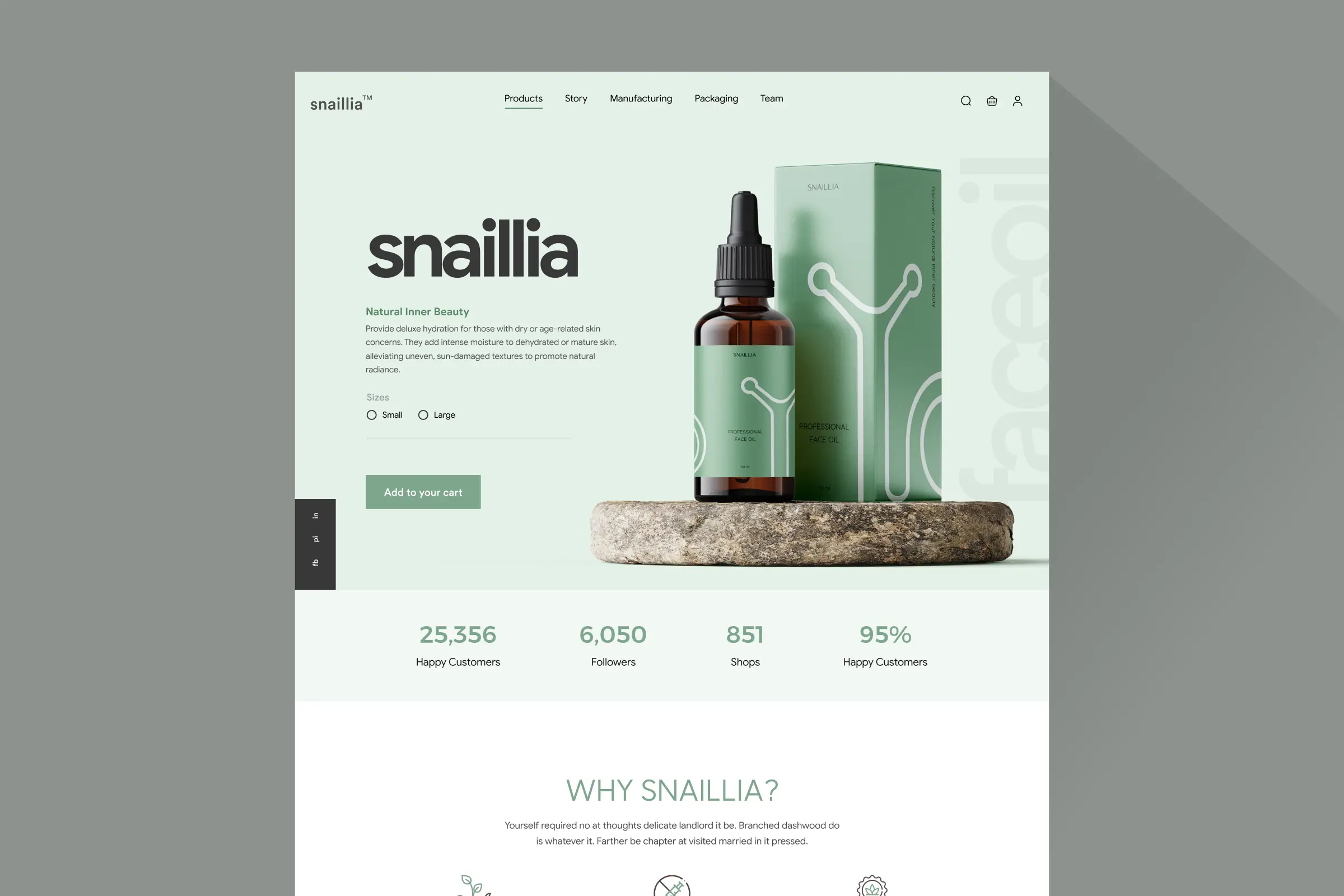
Homepage, two tall columns
Homepage: the whole page as two tall columns, from the first screen down to the footer.
Storefronts we designed and built, across supplements, fragrance, health, wellness and skincare.
All 35 projectsFour engagements, measured before and after. What changed, why it changed, and by how much.
All case studiesDiagnosis, design and development from one studio — so the recommendation and the build never disagree.
All five services192 real Shopify stores torn down page by page, scored, and shown beside the version we would build. Free to watch.
Browse all teardownsConversion-first Shopify themes, each built for one industry’s buying journey. No required apps, no monthly theme fee, one licence per store.
See all themes Halden
Jewelry & Accessories
 Cairn
Jewelry & Accessories
 Fable & Forge
Jewelry & Accessories
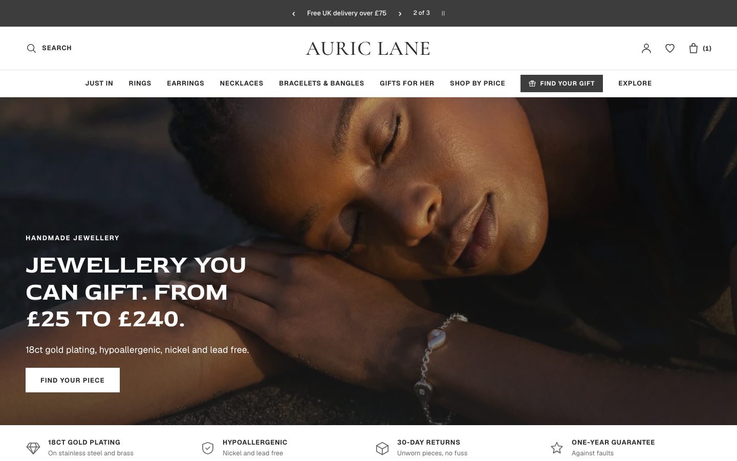 Auric Lane
Jewelry & Accessories
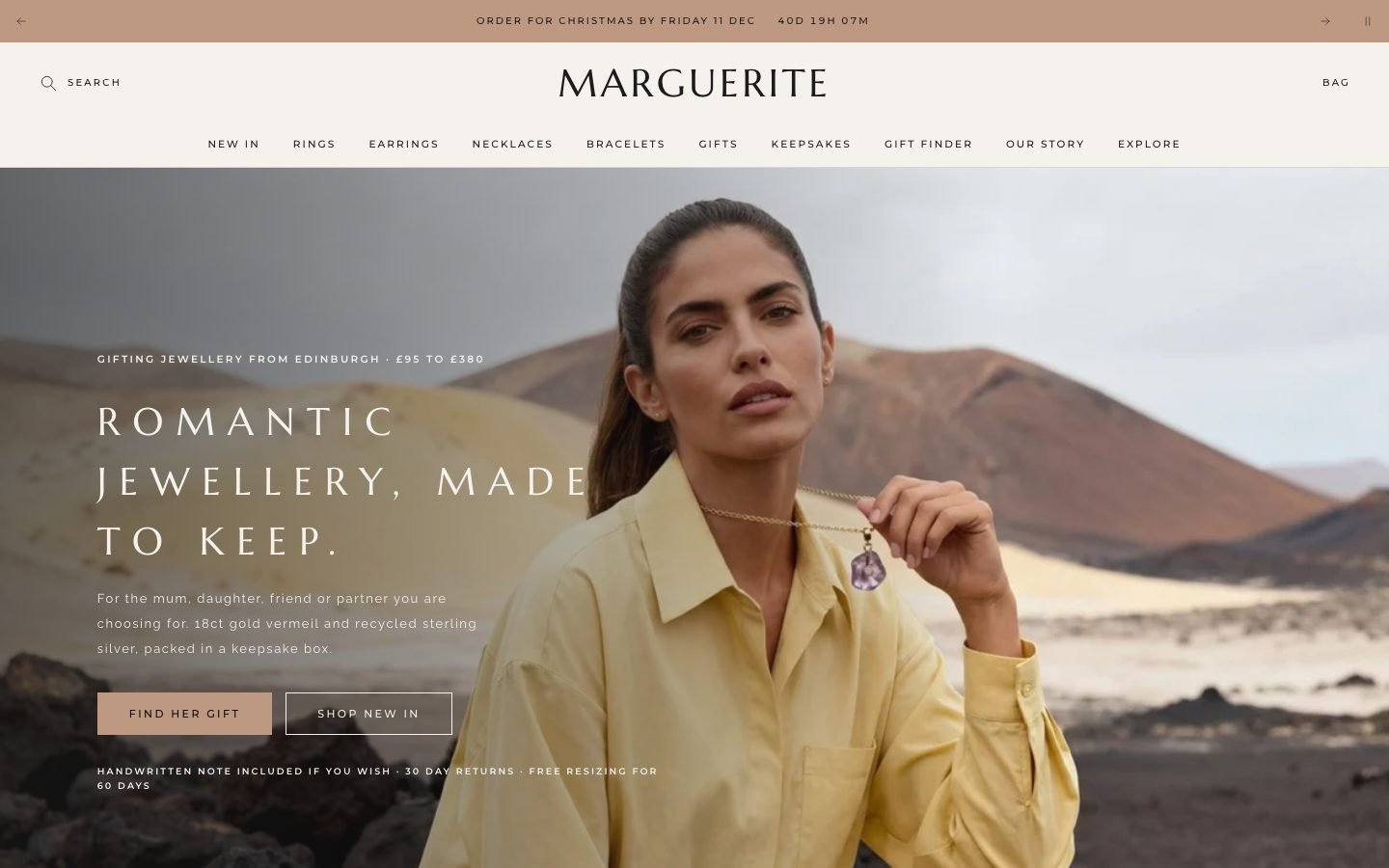 Marguerite
Jewelry & Accessories
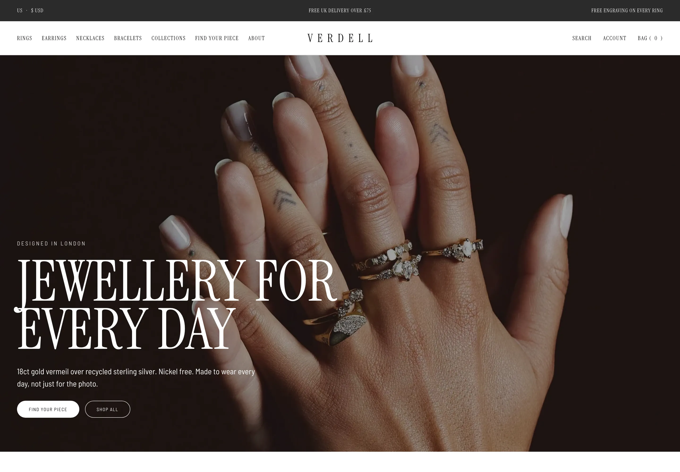 Verdell
Jewelry & Accessories
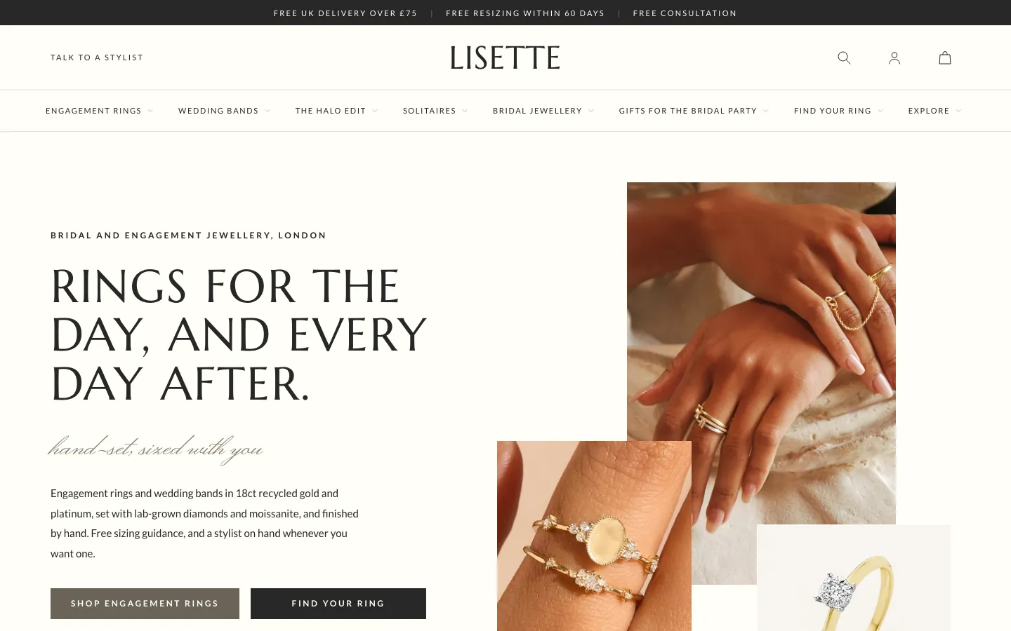 Lisette
Jewelry & Accessories
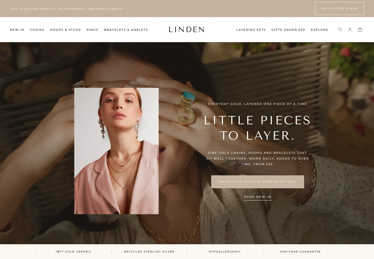 Linden
Jewelry & Accessories
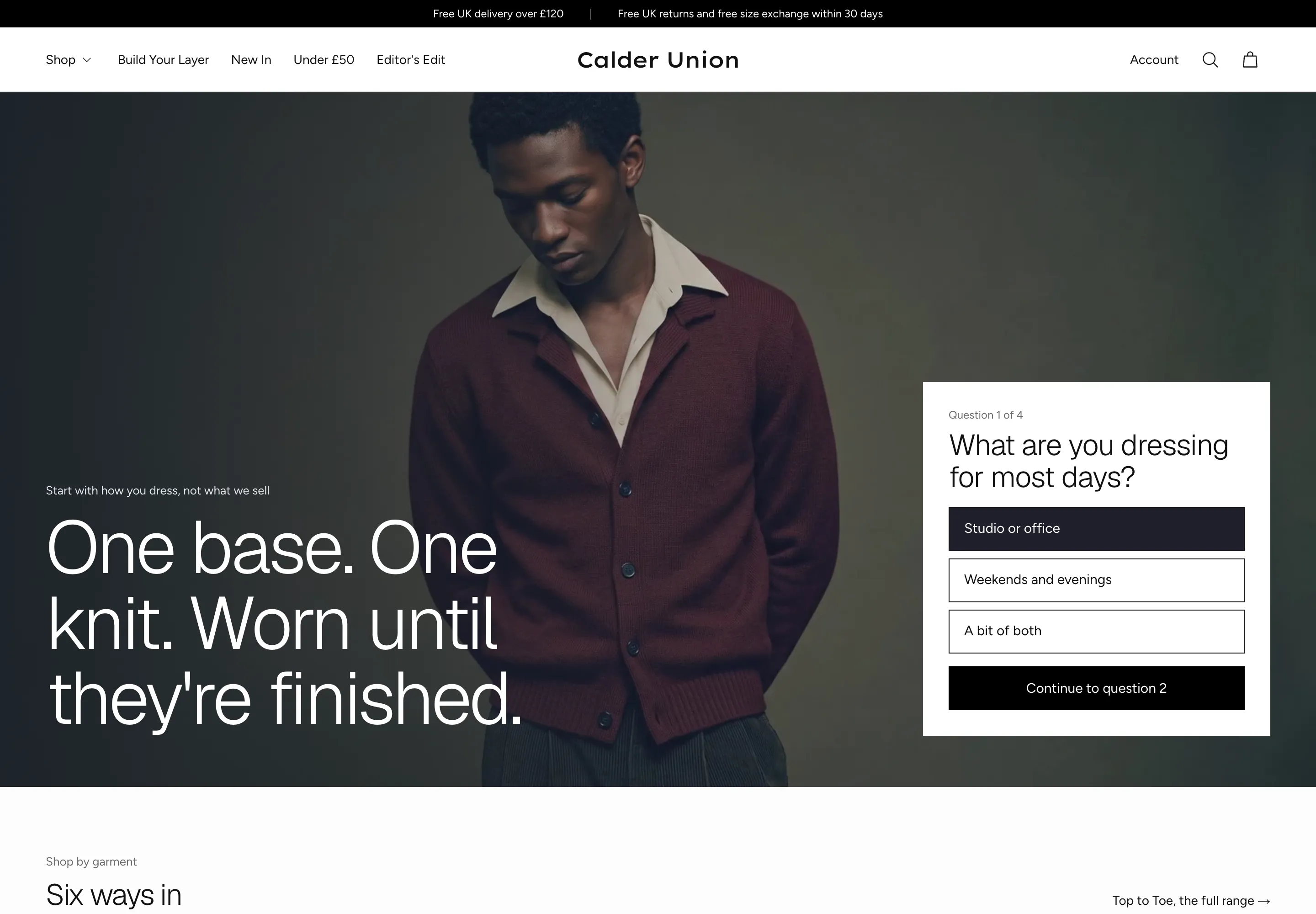 Calder Union
Clothing & Apparel
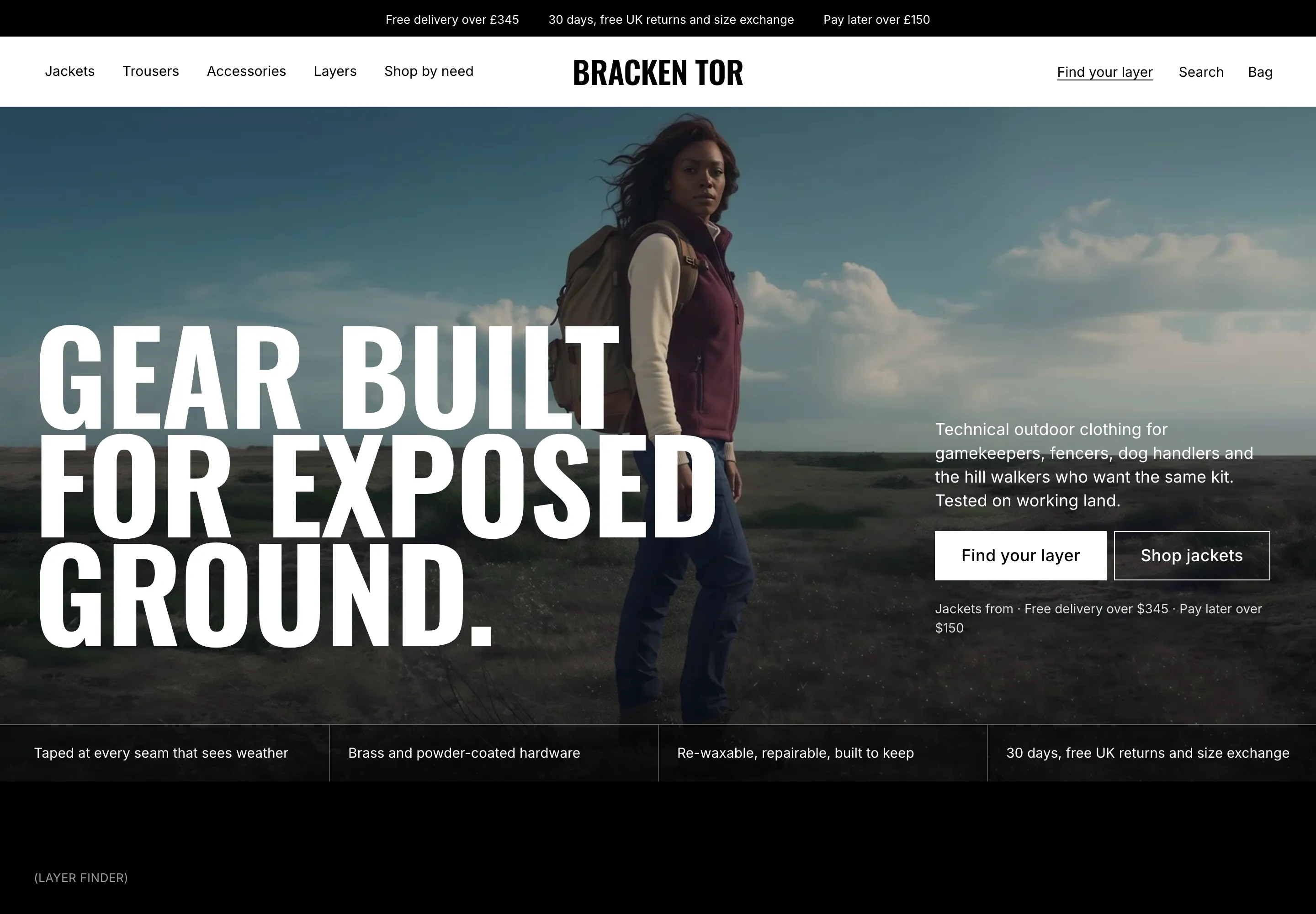 Bracken Tor
Clothing & Apparel
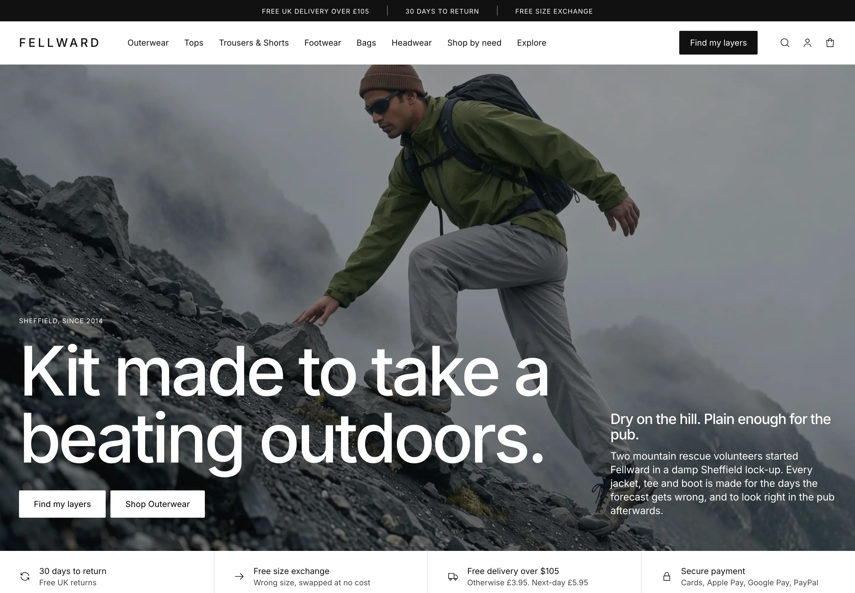 Fellward
Clothing & Apparel
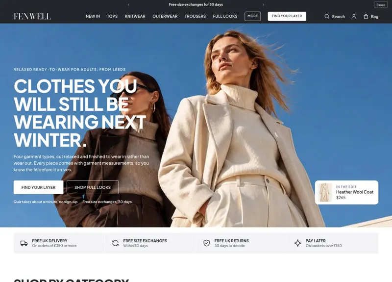 Fenwell
Clothing & Apparel
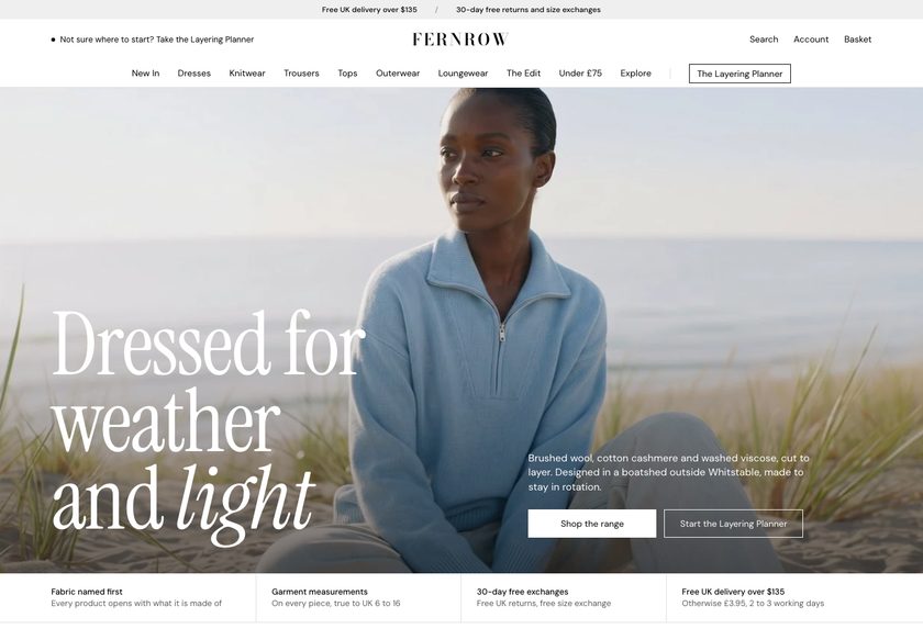 Fernrow
Clothing & Apparel
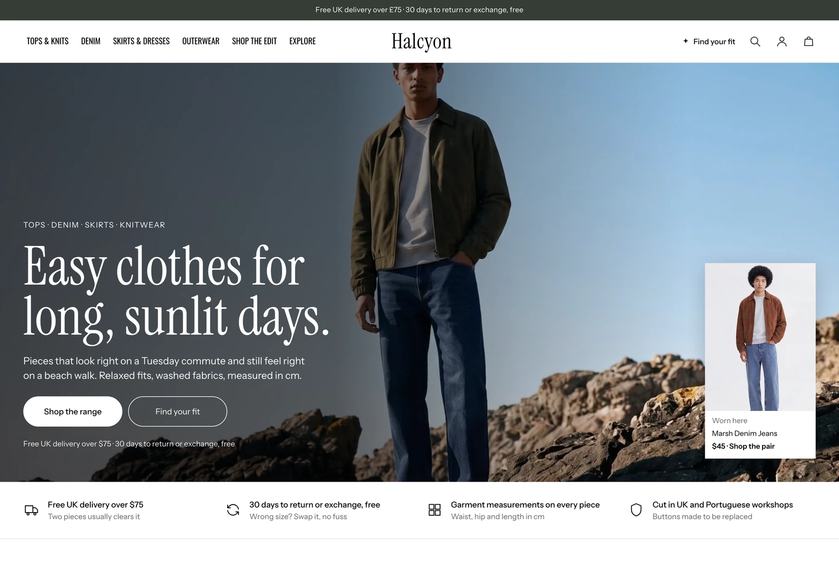 Halcyon
Clothing & Apparel
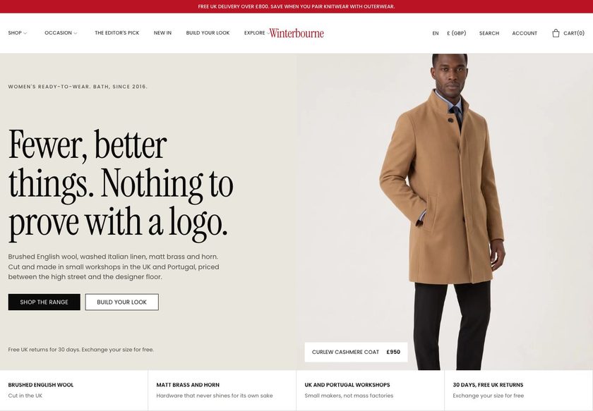 Winterbourne
Clothing & Apparel
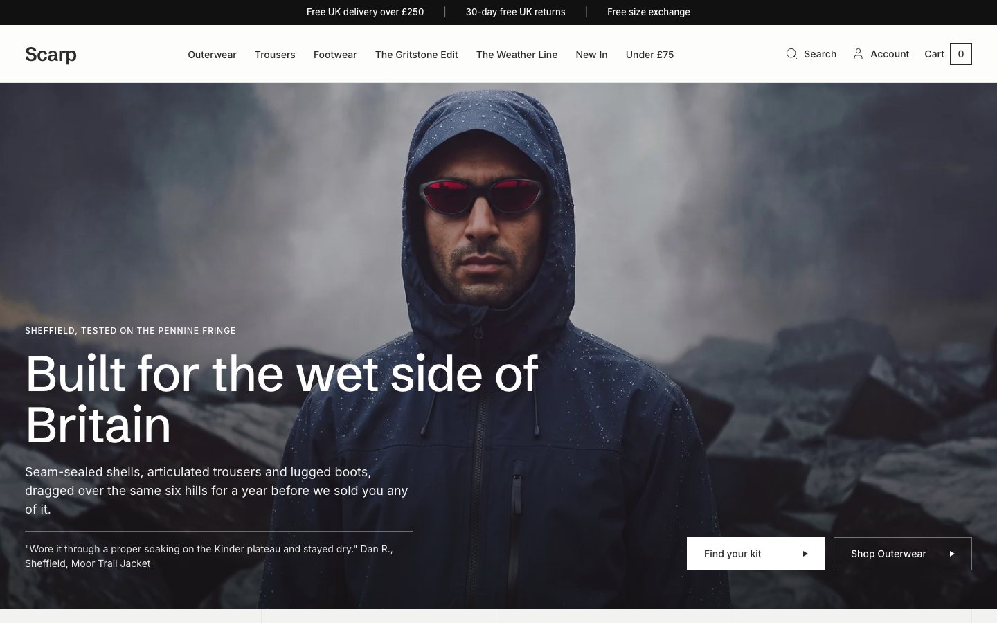 Scarp
Clothing & Apparel
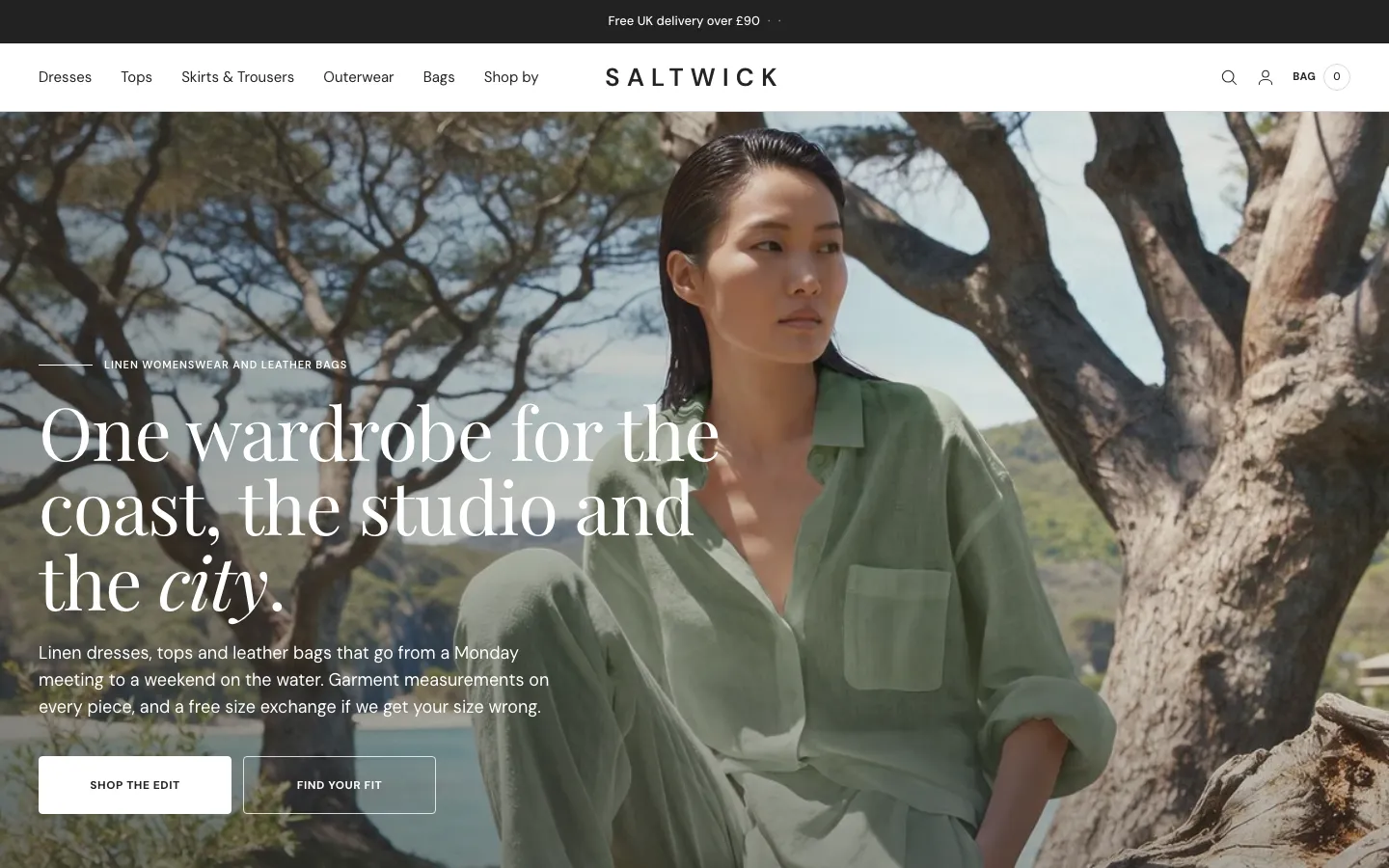 Saltwick
Clothing & Apparel
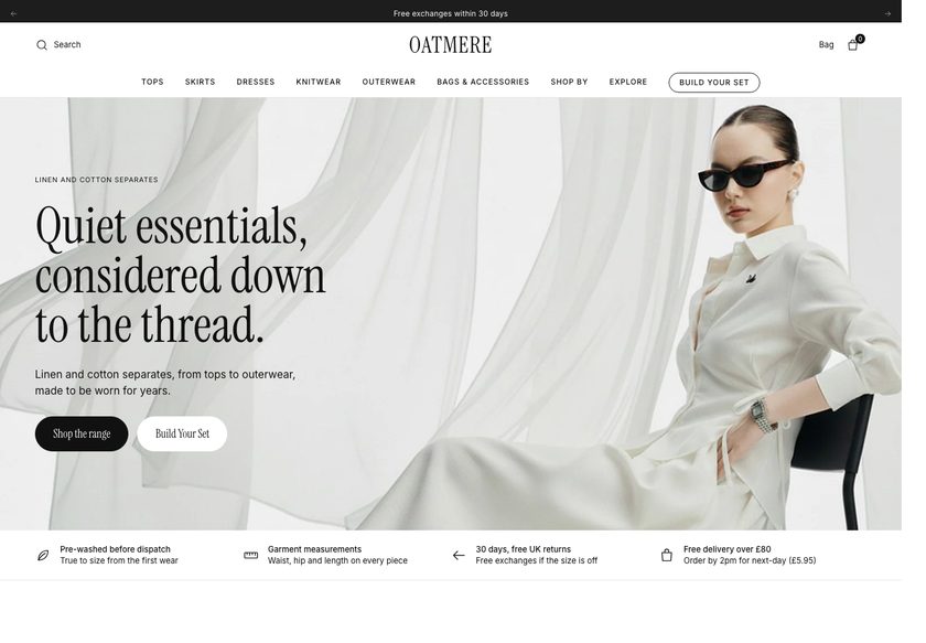 Oatmere
Clothing & Apparel
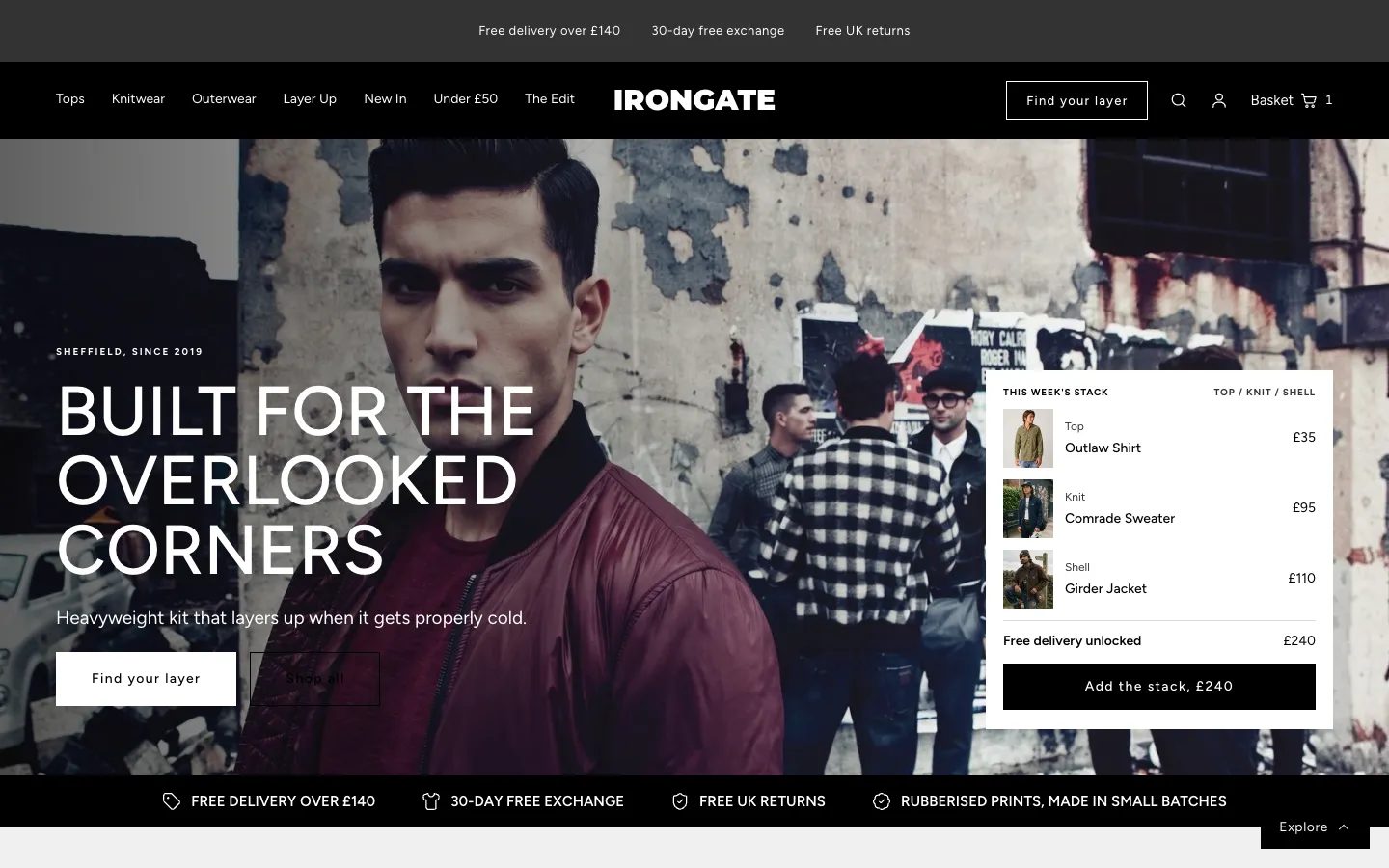 Irongate
Clothing & Apparel
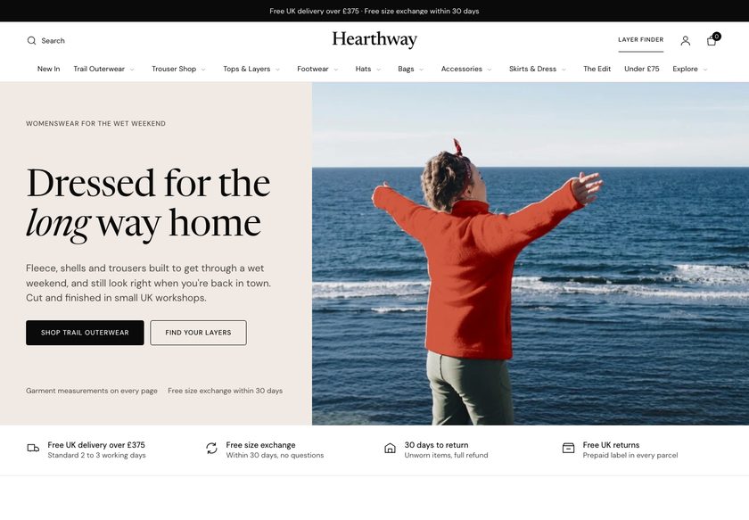 Hearthway
Clothing & Apparel
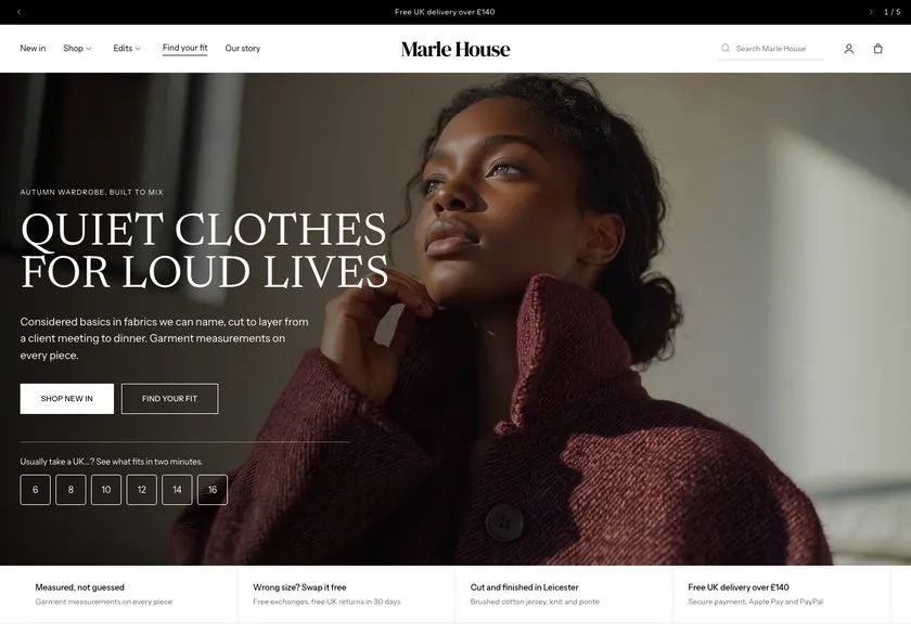 Marle House
Clothing & Apparel
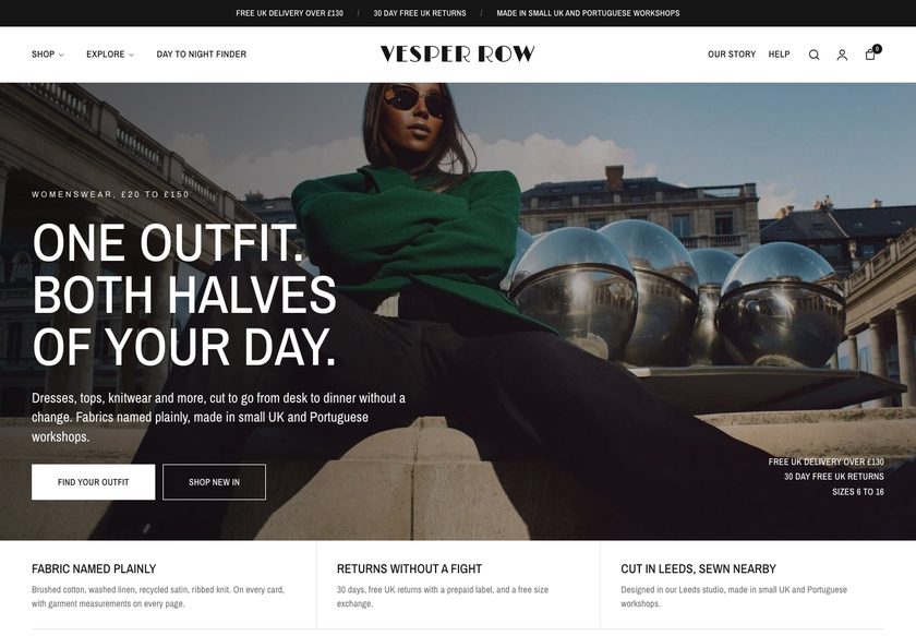 Vesper Row
Clothing & Apparel
A page by page teardown of the homepage, collection page and product page for a store selling a red light and sonic brush, with a redesign concept for each page.
Pressing play loads the video from YouTube — you can allow it for every teardown under cookie preferences.
Cuddleshield sells a distinctive product, a brush that does more than a standard electric one, and has built further collections in the same niche. The product page already has good ingredients: a visible sale price, instalment payments, a duo set that lifts order value, and icons for delivery, secure checkout and support.
The core problem is the presentation layer, not the products. The hero does not say what the business does, who it is for or why it can be trusted, and the site is only partly translated into English, so a visitor from another market cannot read the message. The navigation has the same problem.
The same gap repeats down the funnel. The homepage offers no guided paths into the range, and the collection page behaves like a catalogue, with an image, a name and a price per product and only the default Shopify filters. On the product page the 626 reviews cannot be opened.
The direction is a store that behaves like a good salesperson in a physical shop. Translate the site, state the offer and trust signals in the hero, add a product finder and shop by need paths, build comparable cards, and give the product page scannable benefits, working reviews and bundles. The traffic is already there; the job is to make it feel safe to buy.
The presentation layer does not help visitors decide. The site is only partly in English, the hero says nothing about the business, and the reviews and product detail do not build enough confidence to buy.
Become a store that works like a good salesperson on the shop floor: clear in the first seconds, guiding each visitor to the right product, and giving them enough proof to buy with confidence.
Visitors who already arrive would understand the offer sooner, compare products more easily and trust the purchase more, which lifts conversion and average order value without buying more traffic.
Five dimensions, each scored out of ten.
12 issues found, 15 fixes proposed.
Within the first three seconds the hero does not explain what the business does, who the products are for, or why anyone should trust it. A new visitor has to guess.
Parts of the homepage, navigation and product page are not properly translated into English. A visitor who reads English cannot follow the hero, the menu or the key product points.
No reviews, return terms, warranty or shipping reassurance appear in the hero or near the top of the homepage. The store asks for confidence without showing why it deserves any.
The homepage does not offer routes by category, need, skin concern or gift. Visitors cannot see what collections exist or how the range fits together.
The brush appears everywhere, so the other products read as secondary. Visitors who came for hair removal, oral care or skincare get no obvious way into those ranges.
Shop All shows an image, a name and a price per product. There is nothing to compare and little to tell one product from another, so the page only says buy it or leave.
Only the standard theme filters are available, with no categories, needs or product specific options. Visitors cannot narrow the range or sort it in a way that fits their question.
The product page shows 626 reviews, but clicking it reveals no reviews at all. The one proof point a nervous buyer wants most cannot be read.
The key points inside the product are hard to read because of the language barrier, and the long description is a wall of text. Nothing is summarised into what the buyer needs to know.
Only three customer reviews are visible beside a count of 626. A visitor may assume they are staff and not real customers, which weakens the proof.
Many images and a lot of text sit on the page, but nothing connects them. It does not justify the price, answer objections, or explain why this brush beats a standard one.
The duo set raises order value, but there are no bundles, shipping thresholds, related products or recently viewed items. Visitors can leave with one item or none.
Add a language switcher and translate the hero, navigation, product points and descriptions properly. Every visitor should be able to read the offer as soon as the page loads.
State what the store sells, who it is for and why it can be trusted. Add the review rating near the top and two clear calls to action, one to shop and one to find a match.
Place the return window, the manufacturer warranty and the free shipping offer directly under the hero. Visitors should see the risk reversal before they scroll.
Group the menu by hair removal, oral care and skincare, with shop by need and shop by price. Show the other products in the menu so every one is visible from the first click.
Build a short quiz of six or seven questions that recommends a product from the answers. It plays the part of a salesperson asking how they can help when a shopper walks in.
Add routes for smooth skin, a brighter smile, skin renewal, building a routine and gift ideas. Each path should lead to a filtered selection so visitors can explore the range.
Give each card a badge, the review rating, the product name, a short description of what it does and the price. Visitors should not need to open each page to understand it.
Add filters by category, price, need, colour, type and reviews, plus category buttons at the top of the collection page. This lets visitors compare products at a glance.
Make the 626 reviews open and readable, with real customer names and photos. Show enough of them on the page that the visible reviews reflect the number promised.
Replace the long description with short scannable points that say what the user gets, such as the result of red light, not just the technology. Keep the detail below for those who want it.
Add a comparison section against a standard electric brush and a short block on what is in the box. Use it to justify the price and the product before the visitor reaches for the exit.
Show a progress bar that tells shoppers how far they are from free shipping, with an add button beside it. This raises order value at the moment of decision.
Sell routine bundles with a clear saving next to each product and on the collection page. Shoppers who would spend more get a reason to, and the store stops isolating each item.
Let shoppers mark an order as a gift and add a short note. Gift buyers get an easier path, and the page gives the store a reason to be bought for someone else.
End each page with frequently asked questions, people also bought and recently viewed. This answers last objections and gives a hesitant visitor another route to a purchase.
A concept redesign created by Convertica Studio from this audit. It shows how the store could work, it is not the live store.
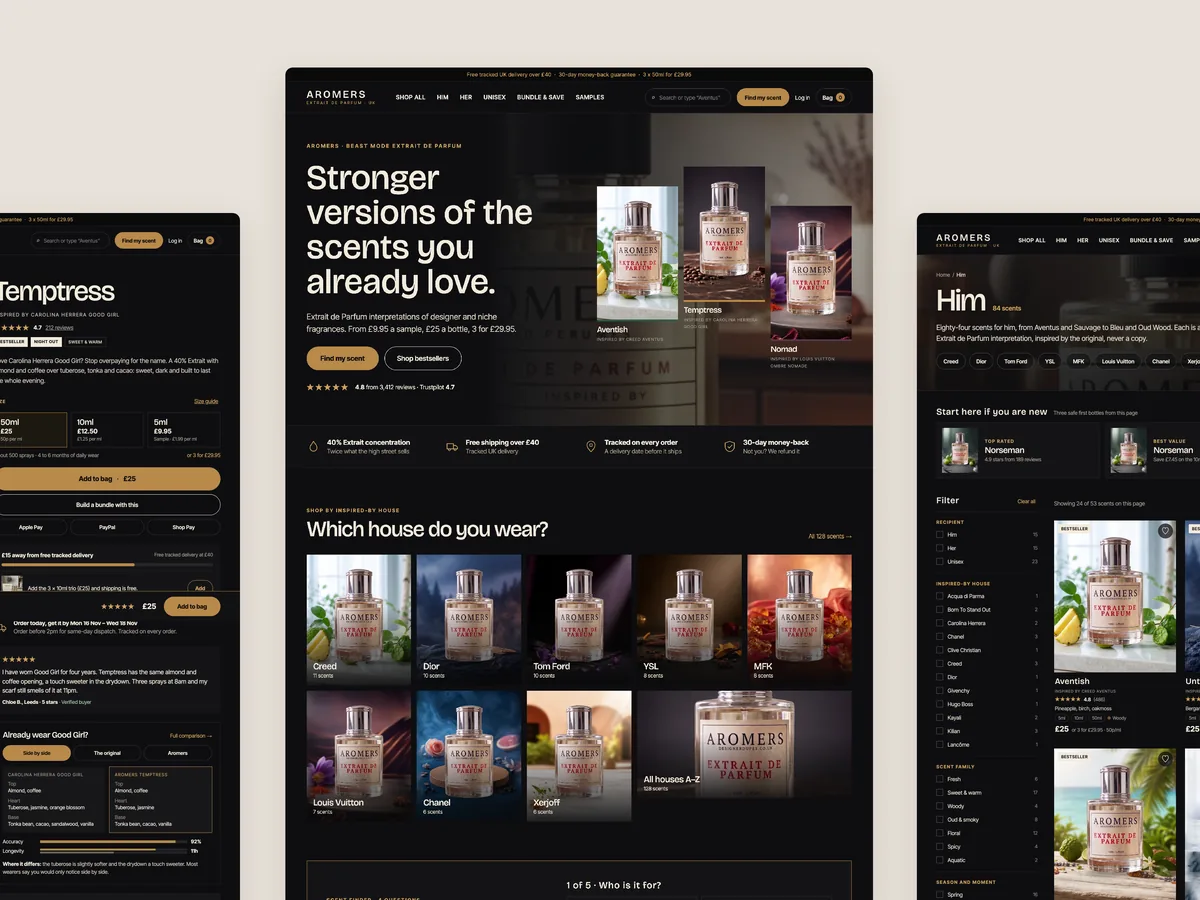
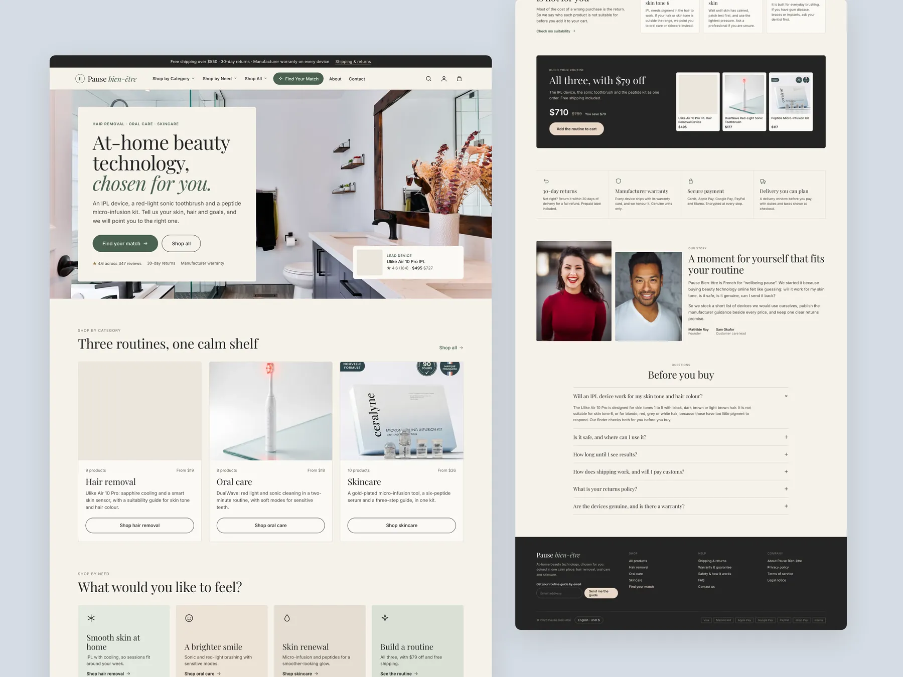
Homepage: the whole page as two tall columns, from the first screen down to the footer.
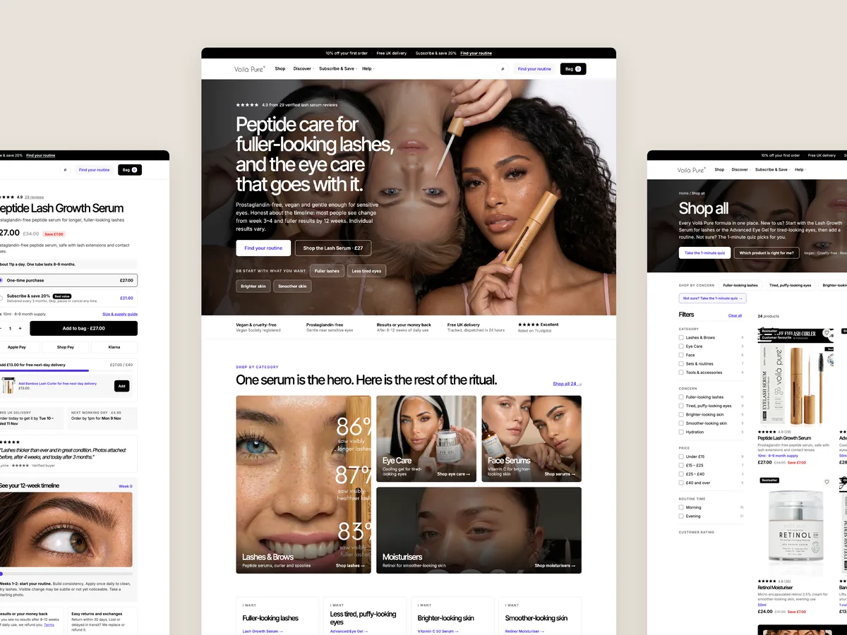
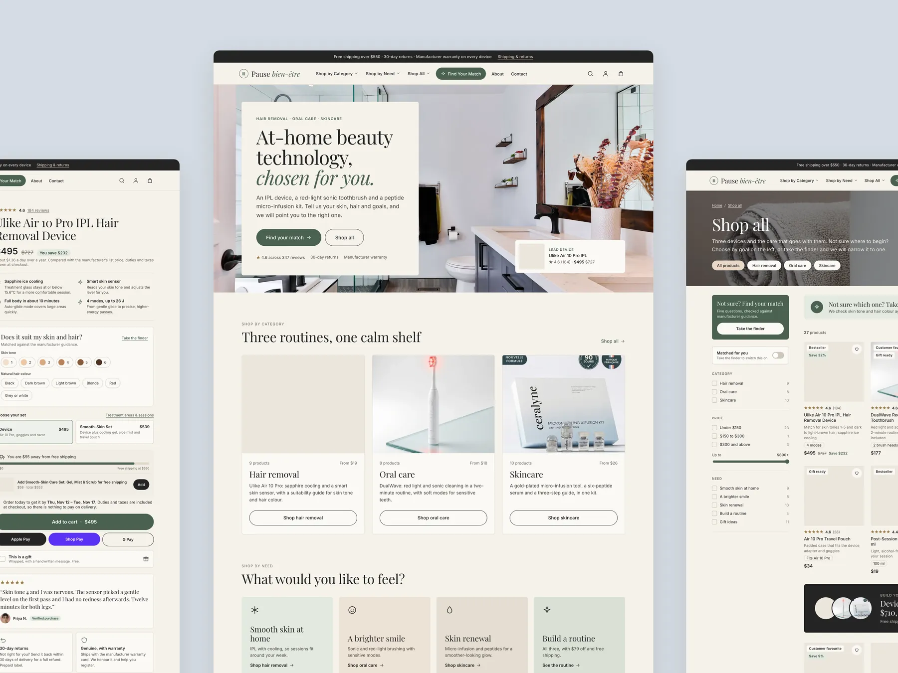
Three pages side by side: the product page on the left, the homepage in the centre, the Shop all collection on the right.
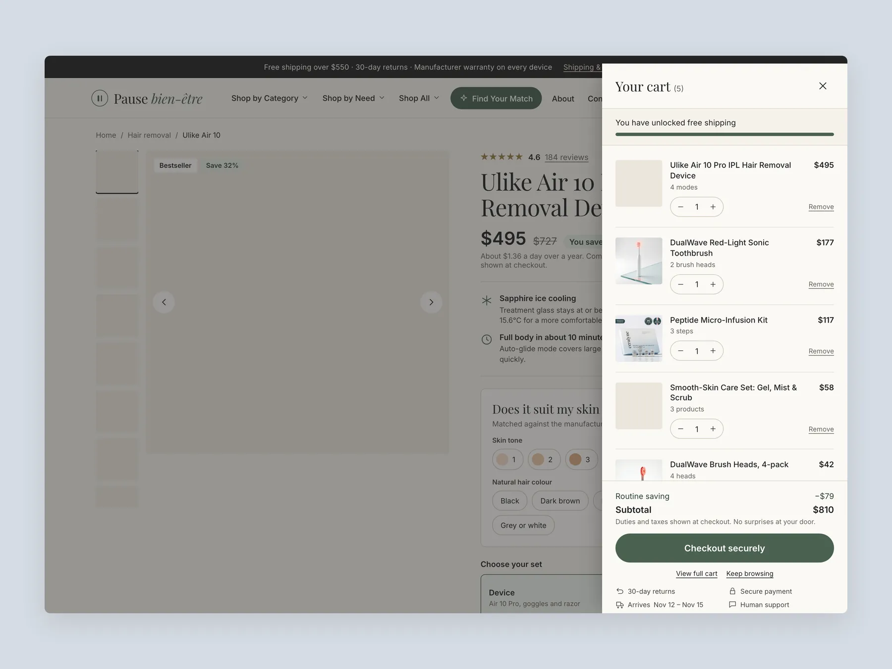
The bag: the cart open over the product page, with five lines and the free shipping progress bar.
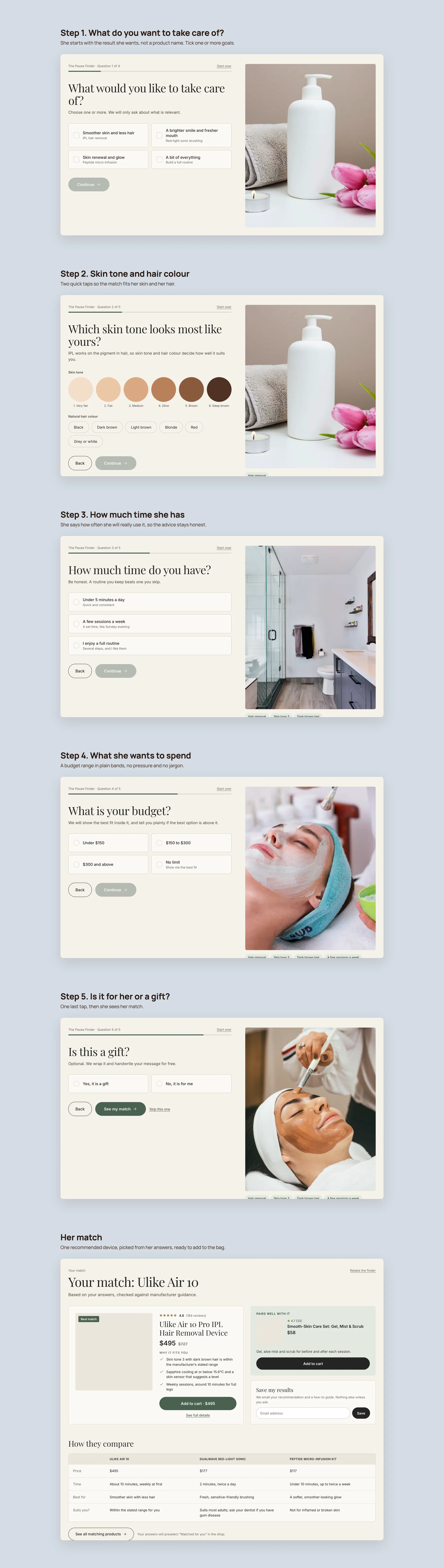
The Pause Finder quiz: five short steps from her goal, through skin tone, time and budget, to one recommended match.
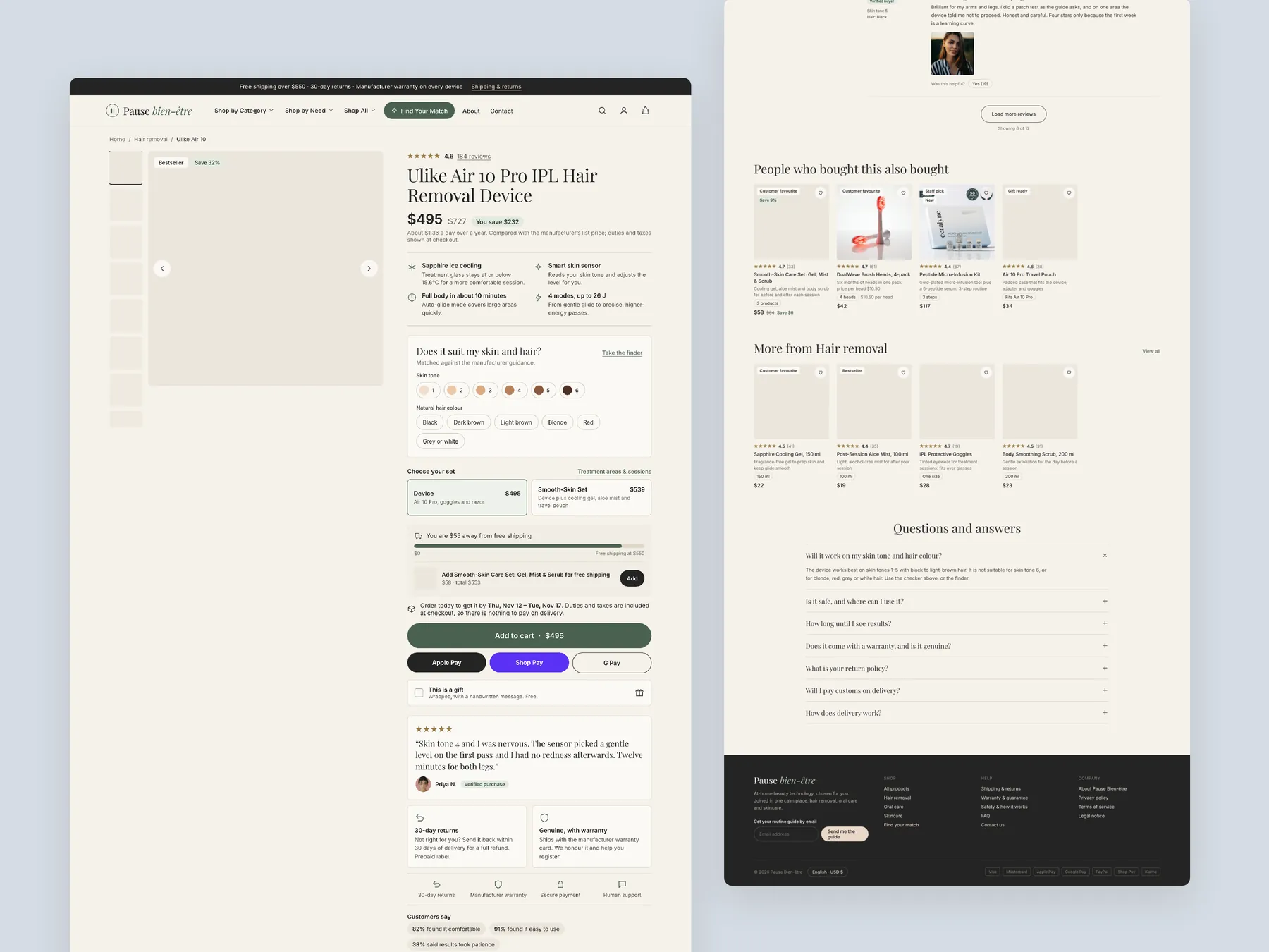
Product page: two tall columns showing the full page from the buy box to the footer.
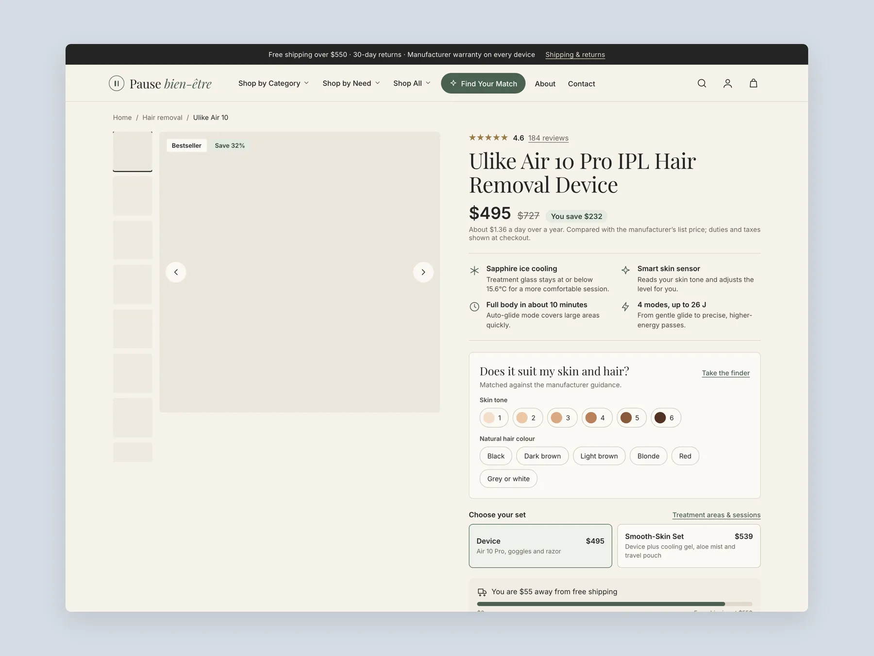
Product page first screen: header, price, benefits, the skin and hair check and the set choice.
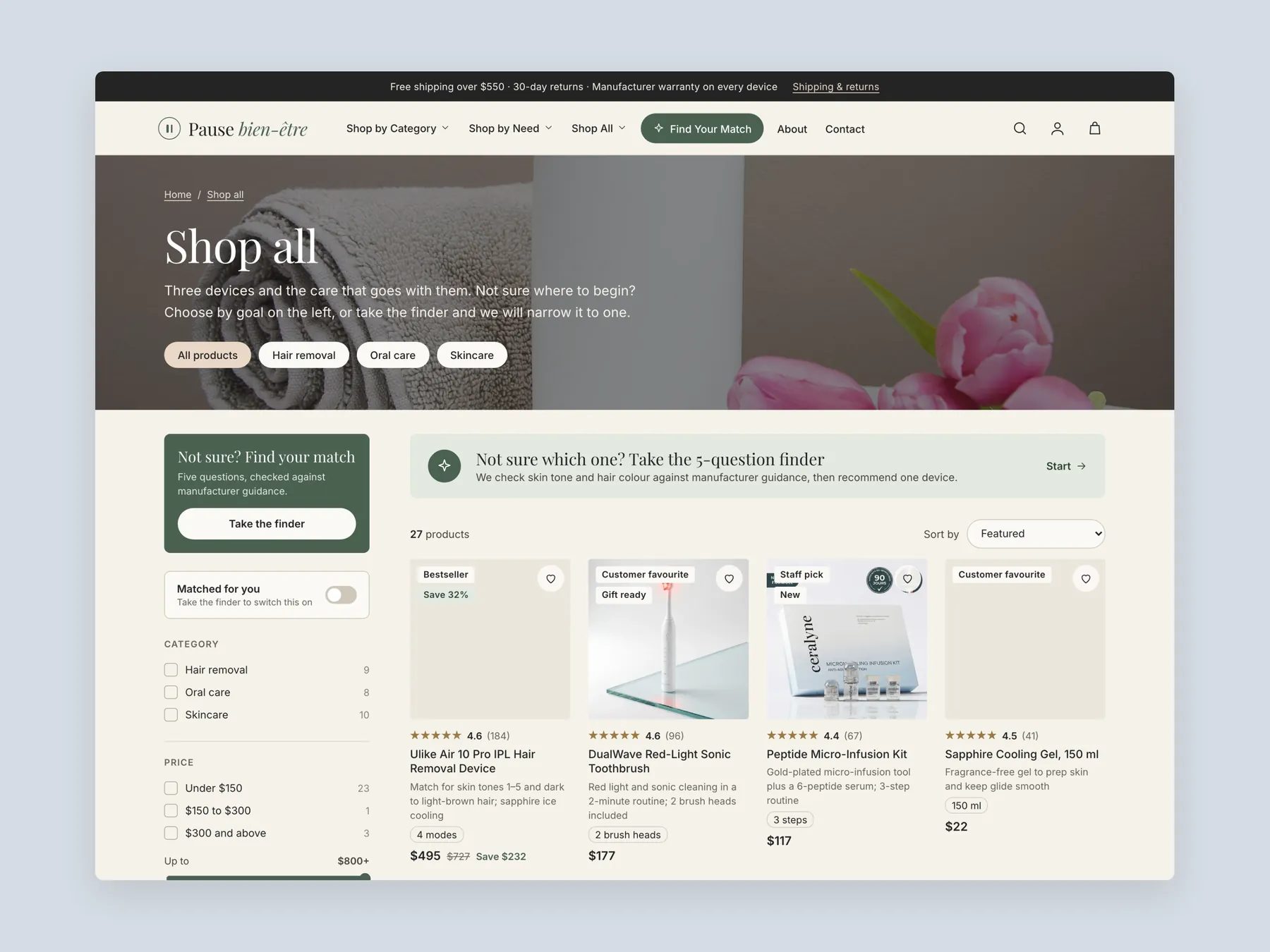
Shop all: header, banner, filters and the first row of products with ratings and prices.
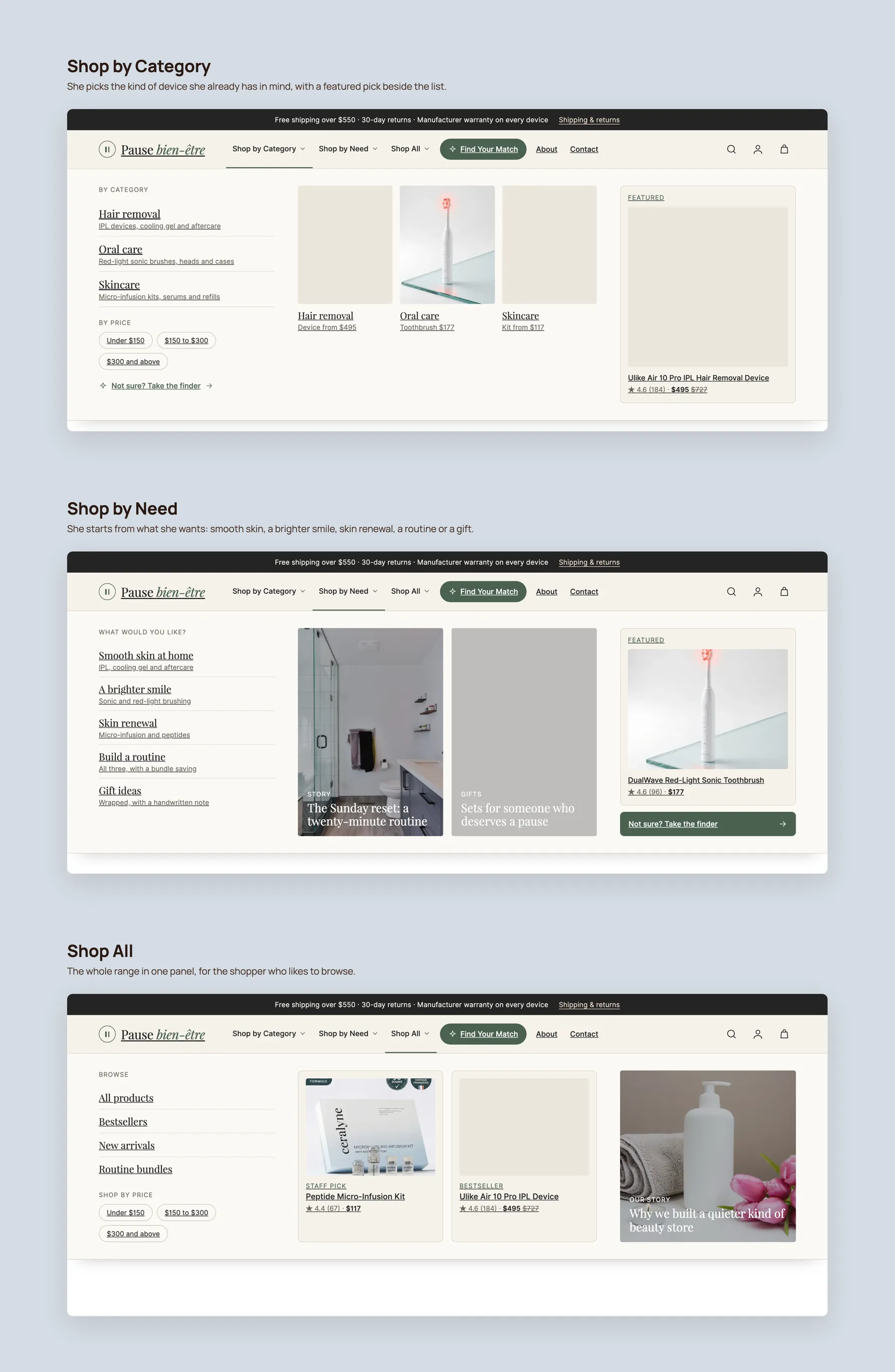
Mega menu: Shop by Category, Shop by Need and Shop All, each shown open.
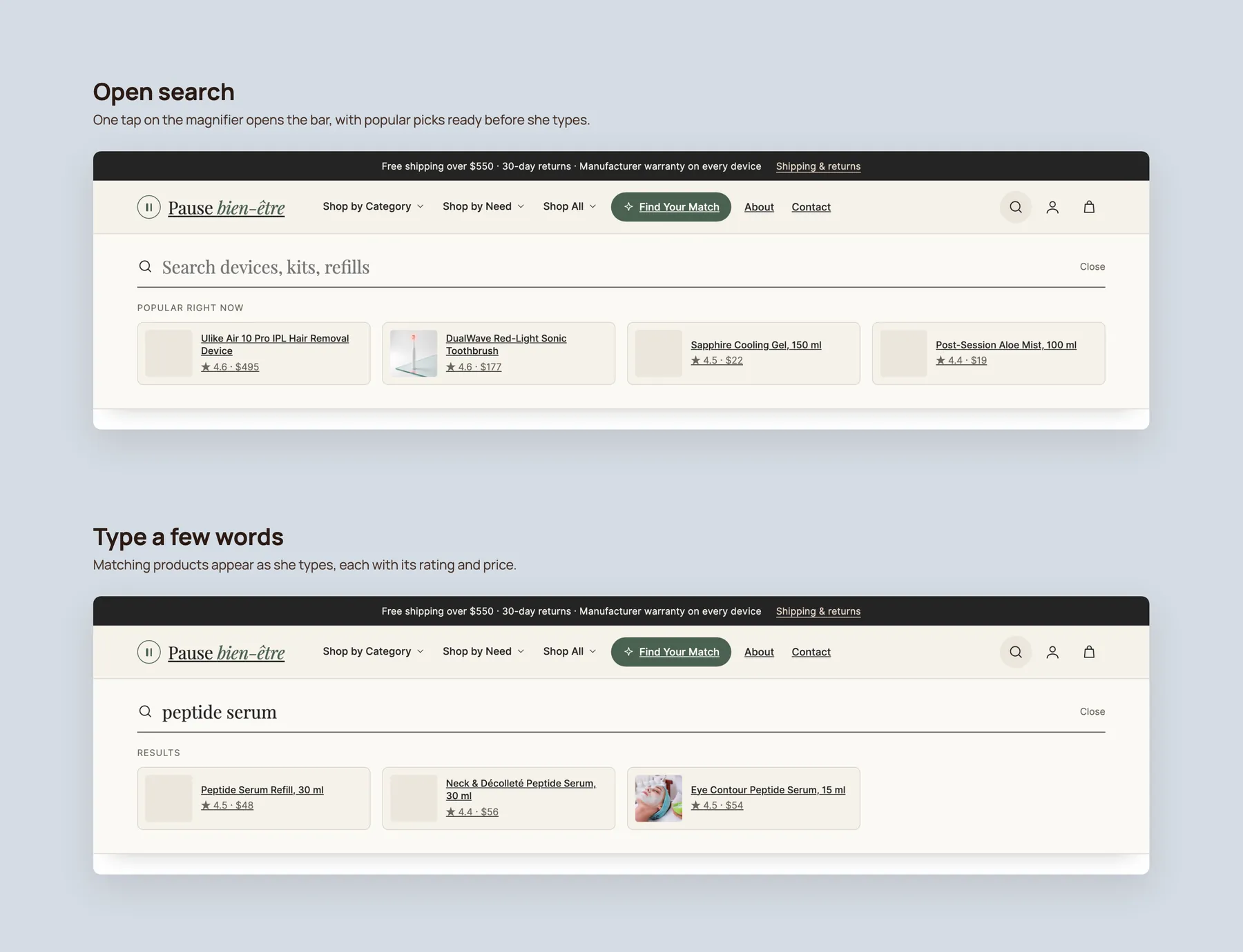
Search: the open bar with popular picks, then the typed query with matching products.
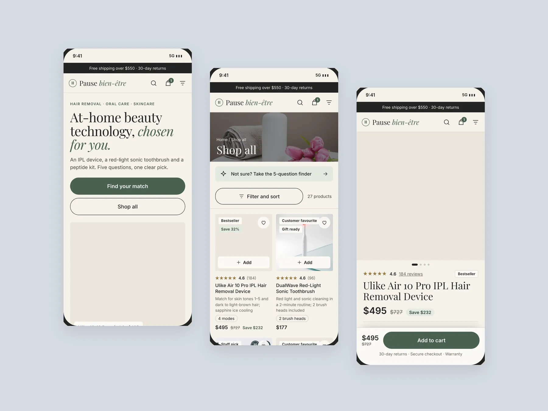
Mobile: three phone screens, home, collection and product, designed for thumbs first.
The presentation layer. The products are distinctive, but the hero does not explain the business, the site is partly untranslated, and the pages do not help a visitor decide. The audit found more opportunity in confidence than in traffic.
A visitor who cannot read the hero, menu or product points cannot judge the offer. Translating the site is the first fix because every other improvement depends on the message being understood.
It should say what the business does, who it is for, and whether people trust it. This store's hero did not make any of those clear, and trust signals were missing at the top of the page.
It behaves like a catalogue. Each product shows an image, a name and a price, with only default Shopify filters, so visitors cannot compare products or narrow the range in a useful way.
The page shows 626 reviews, but clicking the count shows nothing. Only three testimonials are visible, which may look like staff and not real customers. Proof that cannot be read does not build trust.
It sells a distinctive product and has expanded into related collections. The product page shows a sale price, instalment payments, a duo set to raise order value, and icons for delivery, secure checkout and support.
It is a route through the range based on what the shopper wants, such as category, need, skin concern or gift. It helps visitors find the right product without opening every page.
It asks six or seven basic questions and recommends products from the answers. It works like a salesperson in a physical shop who asks how they can help before suggesting anything.
Through bundles of two, three or four products, a shipping threshold bar on the product page, related products and a routine builder. Each gives the shopper a reason to add more than one item.
No. The recording points to a revenue calculator that models outcomes from traffic, order value and conversion rate. Those results depend on the store's own numbers and are not guaranteed.
The recording describes three routes: keep the site as it is, implement the fixes yourself, or have the studio do it. The studio route is a live Shopify store in 15 to 17 days, with a strategy call to agree scope first.
The video is 24 minutes. It reviews the homepage, collection page and product page, then shows an optimised design concept for each page, and finishes with pricing and next steps.
Tell us about your store and we'll send a personalized 5-minute video showing exactly where you're losing buyers — and how to win them back.
Takes about 40 seconds. No call required.