Ttskinglow CRO Audit
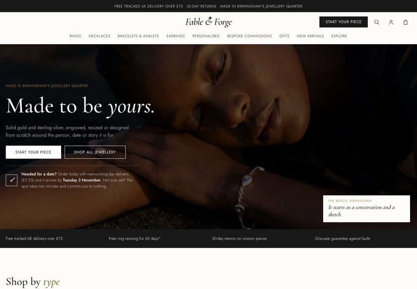
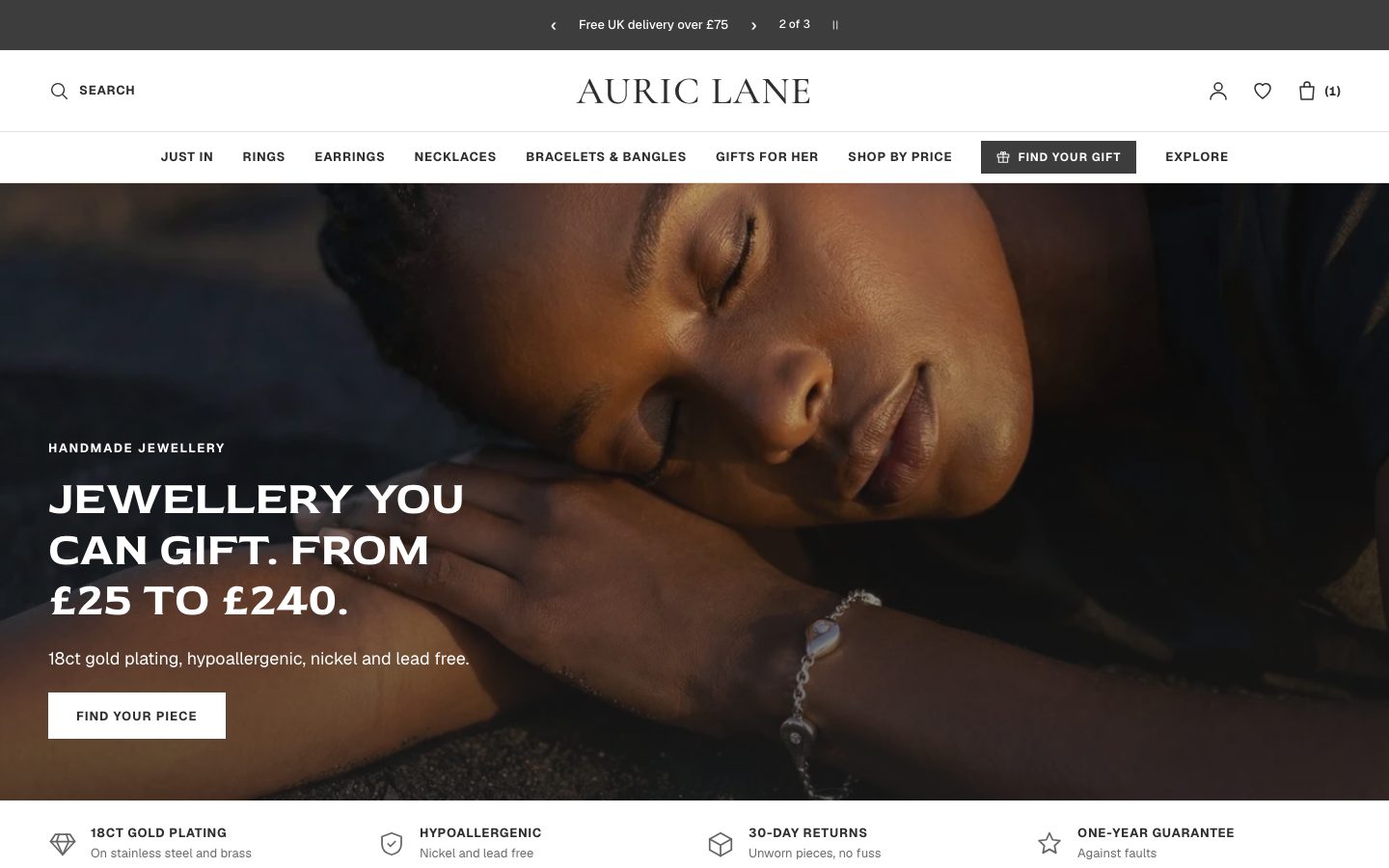
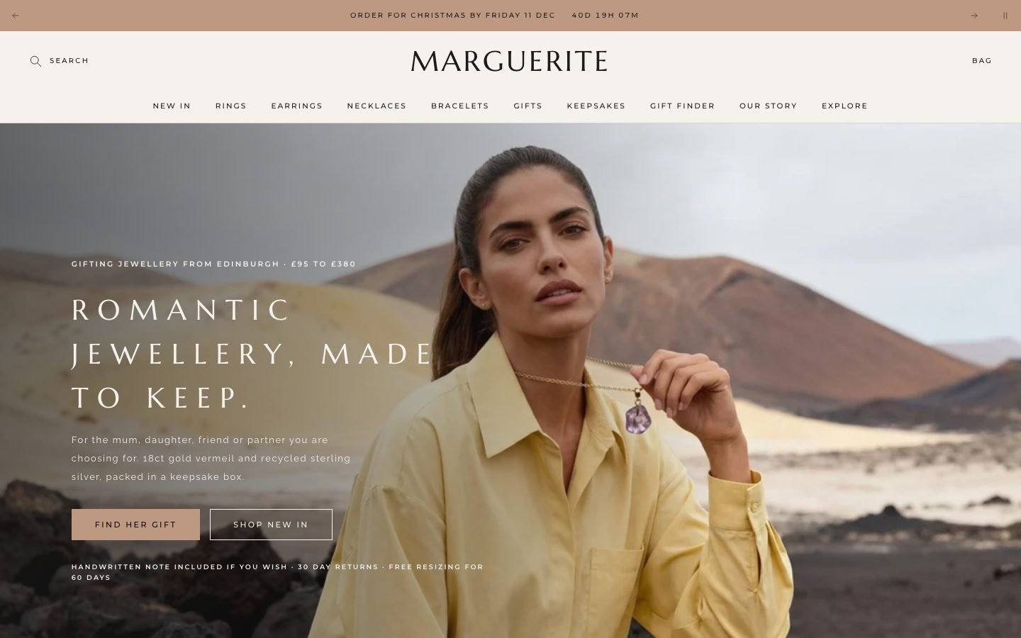
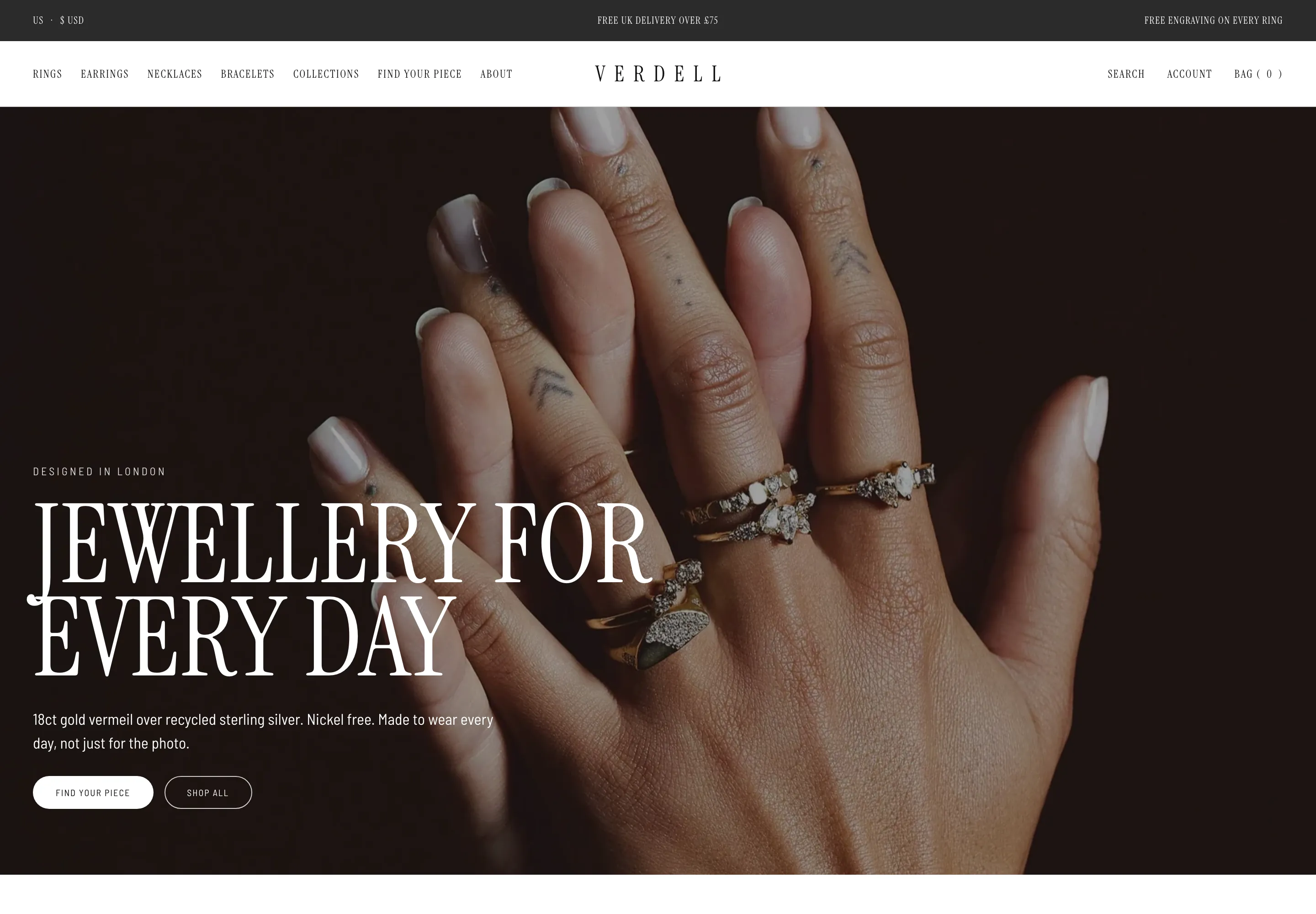
A walkthrough of the Ttskinglow homepage, collection page and product page, followed by a redesigned version built to guide shoppers toward the right skincare product.
Watch the full 27-minute recording.
Pressing play loads the video from YouTube — you can allow it for every teardown under cookie preferences.
What we found.
Ttskinglow sells skincare and body care that the audit calls genuinely worth selling, and the storefront has real assets. The homepage hero uses a warm image of someone applying lotion, a couple of sections already work well, and the range covers lotions, creams, washes, scrubs and oils. The product is not the weak point. The raw material for a strong store is already here.
The core problem is that the site behaves like a catalog instead of a salesperson. A first time visitor is not told what the product is, who it is for, or why the brand can be trusted within the first few seconds. The hero line invites people to discover essentials, and the next thing they meet is a row of best sellers, like an assistant pushing products at someone who has just walked in.
The same pattern repeats further down. The collection page is labelled as a catalog, with a grid of images in mixed landscape and portrait shapes and cards that show only a name and a price. The product page gives a long block of text rather than reasons to buy, with little reassurance and no routine cross sells. The add to cart button could not be found at all, which may be location related.
The direction is a guided buying experience. The redesign adds navigation by glow and routine, a four question Find My Glow quiz, product cards that carry decision cues, filters on the collection page, and a product page that settles doubts inside the buy box. The idea worth remembering is simple: sell the solution to a skin concern, not a shelf of products.
Problem, opportunity, impact
The site works like a catalog. It lists skincare and body care products but never asks what the visitor needs, never explains why to buy, and on the product pages no add to cart button could be found.
Ttskinglow could become a guided shop that asks about skin concerns, recommends a product or routine, and resolves doubts at every step, so the products it already has are sold as solutions to a problem.
Shoppers who can find the right product, trust the brand and actually add it to a cart are far more likely to complete an order, and routine bundles and free delivery prompts raise order value.
Scored across five dimensions.
Five dimensions, each scored out of ten.
-
01
Homepage & PDP review Where attention leaks and buyers hesitate, section by section.
-
02
Mobile UX audit 70% of your traffic — judged on its own terms.
-
03
Trust & credibility check The signals that make first-time buyers convert.
-
04
Collection & discovery Filtering, merchandising and guidance from browse to buy.
-
05
Prioritized CRO roadmap Ranked by impact vs. effort, ready to ship.
Every issue, paired with its fix.
12 issues found, 14 fixes proposed.
Hero Message Does Not Name A Pain Point
The homepage hero shows someone applying cream with the line about skincare and body care essentials for an everyday routine. It invites discovery but does not address a skin concern or say why this brand.
First Three Questions Go Unanswered Above The Fold
A new visitor cannot tell right away what the product is, who it is for, or whether the brand can be trusted. All three need an answer within the first few seconds of landing.
Best Sellers Appear Before Any Explanation
Straight after the hero, the homepage shows best selling products. Shoppers are asked to buy before they know why this brand, which product suits them, or what the story behind it is.
Homepage Has No Guided Product Finder
Nothing on the current homepage asks the visitor what they are looking for or recommends a product based on their answer. A few sections are good, but they use only a fraction of the potential.
Collection Page Reads As A Catalog
The collection page is a grid of products with no help finding the right one by use case, problem or scenario. The page even describes itself as a catalog.
Product Card Images Differ In Shape
Some product images are landscape and others are portrait, so the grid looks uneven. The lack of symmetry makes the collection feel unfinished and harder to scan.
Product Cards Show Only Name And Price
Each card carries an image, a name and a price and nothing else. Cards have no cue explaining who the product suits, so they do little to earn a click.
Product Page Is A Long Block Of Text
The product page explains the product in a long paragraph but gives few reasons to buy. Benefits, reassurance and key decision points are not set out in a form a shopper can scan.
No Reassurance Near The Purchase Decision
The page does not tell shoppers when an order would arrive, what delivery costs, or why it is safe to buy. These are common worries at the moment of purchase.
Complementary Products Are Not Cross Sold
Skincare products naturally pair, such as a lotion with a cream or moisturizer, yet the page offers no routine suggestions. This leaves order value on the table.
No Free Delivery Prompt To Lift Basket Size
There is no progress message showing how much more a shopper needs to spend to qualify for free delivery, so nothing encourages adding another item.
Add To Cart Button Could Not Be Found
No buy button appeared on any product page during the review. It may depend on location, but if not, shoppers who reach a product have no way to add it to a cart.
Confirm Add To Cart Works In Every Market
Check the buy button on every product from different locations and devices before anything else. If it is hidden or broken, fix it first, because no other change matters until shoppers can buy.
Rewrite The Hero Around A Skin Concern
Replace the discover essentials line with a headline that names what the products do and who they are for, supported by a short trust signal, so the first three questions are answered at once.
Add Shop By Glow And Routine Navigation
Give the menu clear routes such as shop by glow, shop by routine and body care, so shoppers can explore by what they want rather than by what the store chooses to push.
Introduce A Four Question Find My Glow Quiz
Ask what the skin should do, what else bothers it, a further concern and how to start, then recommend three matching products. This turns the store from a catalog into a consultant.
Ask Which Glow The Visitor Is After
Place a short question on the homepage that sends shoppers to products by glow, such as caramel, Arabian or snow white, so recommendations follow their goal instead of the shelf.
Move Best Sellers Below The Guidance
Introduce the brand, explain why shoppers can trust it and ask what they need before showing best sellers, so products arrive as an answer to a question the visitor has already asked.
Add Skin Education And Ingredient Content
Explain what is going on with the skin and what is behind each product, with ingredients and routines, so shoppers understand why a product works before they are asked to buy it.
Standardize Product Image Shapes And Ratios
Use one consistent image ratio across every card so the collection grid is symmetrical and easy to scan, and so the products look equally cared for.
Give Product Cards Decision Cues And Badges
Add a short line on who each product suits and quiet badges such as customer favorite, best seller, gift ready or staff pick, which reduce the effort of choosing without shouting.
Add Filters And Benefit Browsing To Collections
Let shoppers narrow products by type, benefit and routine, and offer ways to browse such as lotions, washes, scrubs and oils, so the collection page helps people find a product.
Show Delivery Timing And Free Delivery Progress
Place an order today message with an expected arrival right under the product summary, and a progress line showing how much more is needed for free delivery, to ease worry and lift basket size.
Restructure The Buy Box With Reassurance
Inside the buy box, add key decision points, a not sure about your glow prompt that points to a starter product or the finder, a match to your skin quiz, and a featured review.
Add Routine Cross Sells And Frequently Bought Together
Suggest the products that pair with each item, offer them as a routine or a bundle, and show a related products section, so order value rises through natural combinations.
Add A Comparison Chart And Product FAQs
Below the buy box, add how to use instructions, a chart comparing similar products, reviews and product specific questions, so unsure shoppers can choose with confidence instead of leaving.
The version we'd build.
The teardown in 7 lines.
- The products are not the problem; the website presents them like a catalog instead of guiding a shopper to the right one.
- A homepage should answer what the product is, who it is for and whether the brand can be trusted within the first few seconds.
- Showing best sellers before explaining anything is like a shop assistant rushing at someone who has just walked through the door.
- A collection page should help people find a product by problem or use case, not simply list everything for sale.
- Product cards have a job to do, and a name, an image and a price alone rarely earn a click.
- A product page should give reasons to buy, reassure on delivery and safety, and suggest products that complete a routine.
- If shoppers cannot add a product to their cart, no design improvement matters until that is fixed.
Questions this audit answers.
No. The audit found the products to be strong and worth selling. The issue is how the website presents them, with a catalog layout that lists items instead of helping a shopper decide.
It shows products and prices and expects shoppers to choose alone. A guided store asks what the visitor needs, answers their questions and recommends a product or routine, much as a good salesperson would.
What the product is, who it is for, and whether the brand can be trusted. The current hero shows a pleasant image and an invitation to discover essentials, but does not address a skin concern or build trust.
It asks for a purchase before the visitor knows why to buy from this brand or which product suits them. Explaining the brand and asking what the visitor needs should come first.
It is a four question flow in the redesign. It asks what the shopper wants their skin to do, what else bothers them and how they want to start, then recommends three matching products.
Cards can say who a product suits and carry quiet badges such as customer favorite, best seller, gift ready or staff pick. This lowers the effort of choosing and gives shoppers a reason to click.
Delivery timing, a free delivery progress prompt, key decision points, a featured review, routine cross sells, usage guidance, a comparison chart, reviews and product specific FAQs, so doubts are settled before checkout.
Skincare products complement each other, so the page can suggest pairings such as a lotion with a cream. A free delivery progress message and frequently bought together items give shoppers a reason to add more.
No buy button could be found on any product page. It may be due to location, but if it is not, shoppers cannot buy at all, so this should be checked before any design work.
No. The audit describes an overhaul of the buying journey, including navigation, a product finder, collection filters, product cards and the structure of the product page, rather than cosmetic tweaks.
The recording describes keeping the site as it is, fixing it in house, or having the studio do it. The studio offers a full build of about 15 or 16 pages, or a smaller version covering the home, collection and product pages on a current Shopify 2.0 theme.
The video is 27 minutes. It covers the Ttskinglow homepage, collection page and product page, then a fixed design version of those pages with an optimized product page, and finally the scope and pricing options.
See what's quietly costing you sales.
Tell us about your store and we'll send a personalized 5-minute video showing exactly where you're losing buyers — and how to win them back.
Takes about 40 seconds. No call required.
-
5-minute video teardownA personalized walkthrough of your store, recorded by Eva.
-
Homepage & PDP reviewWhere attention leaks and buyers hesitate.
-
Mobile UX audit70% of your traffic — judged on its own terms.
-
Trust & credibility checkThe signals that make first-time buyers convert.
-
Prioritized CRO roadmapRanked by impact vs. effort, ready to ship.