Homepage
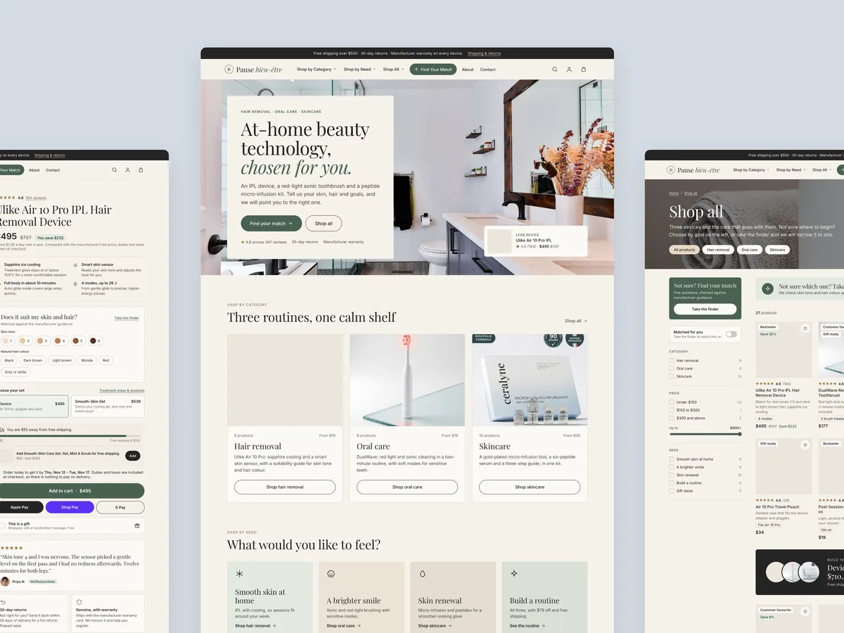
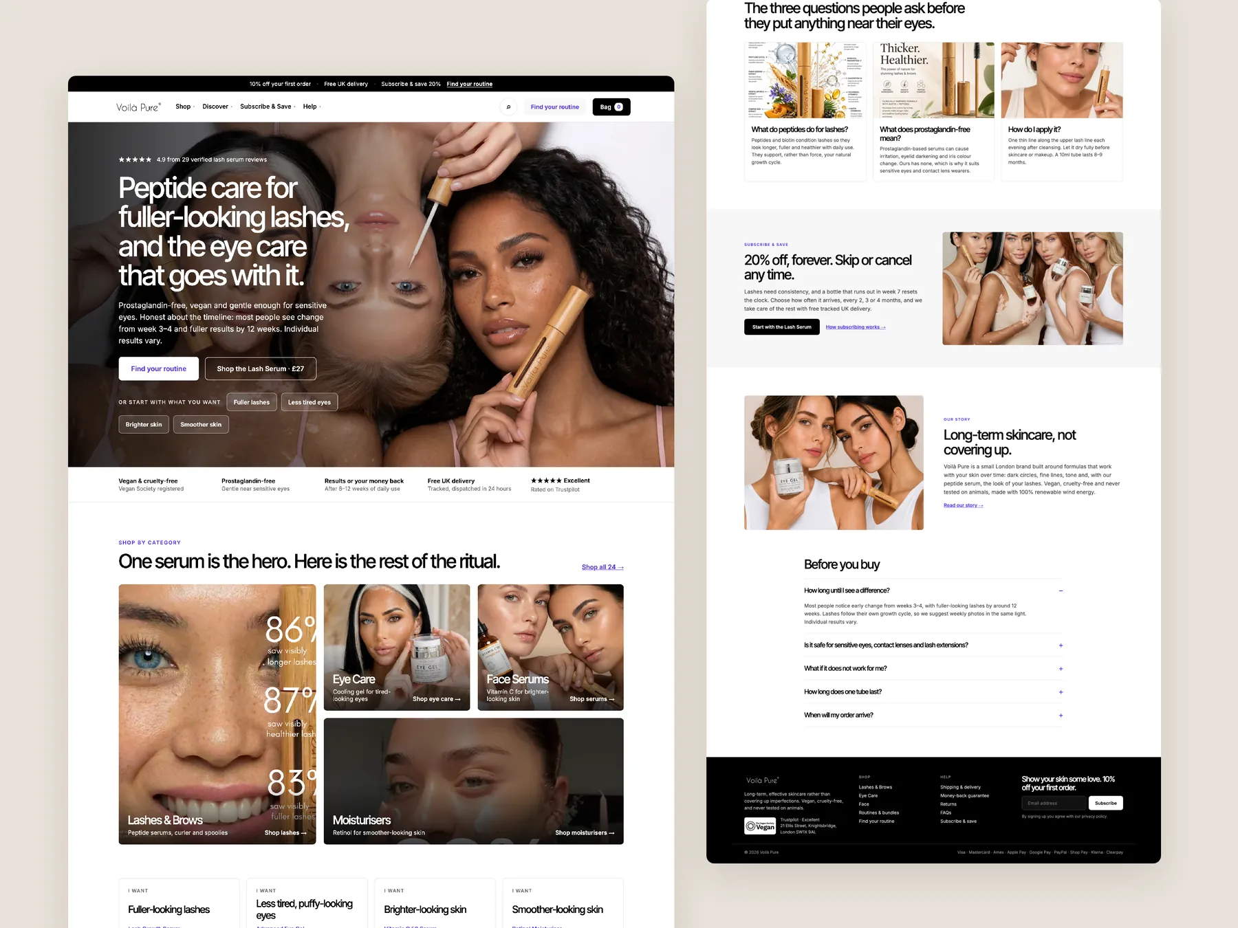
The full page shown as two tall columns, from the first screen down to the footer.
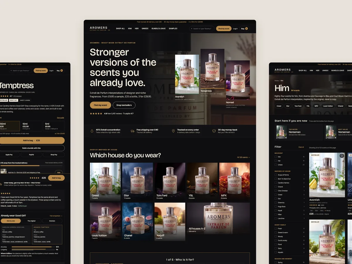
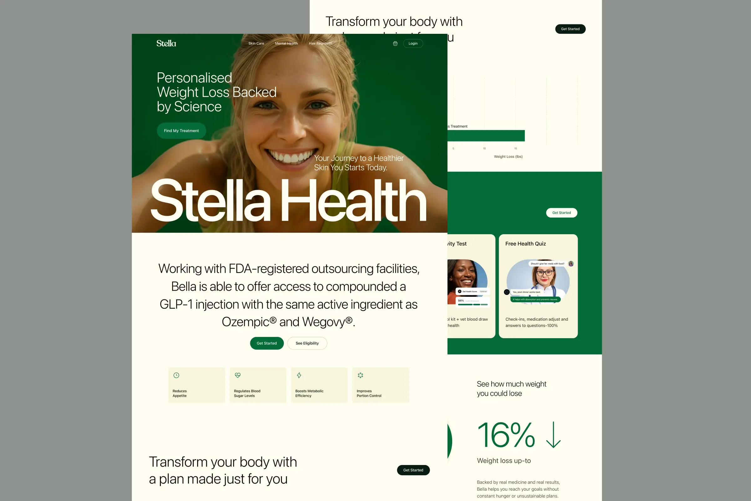
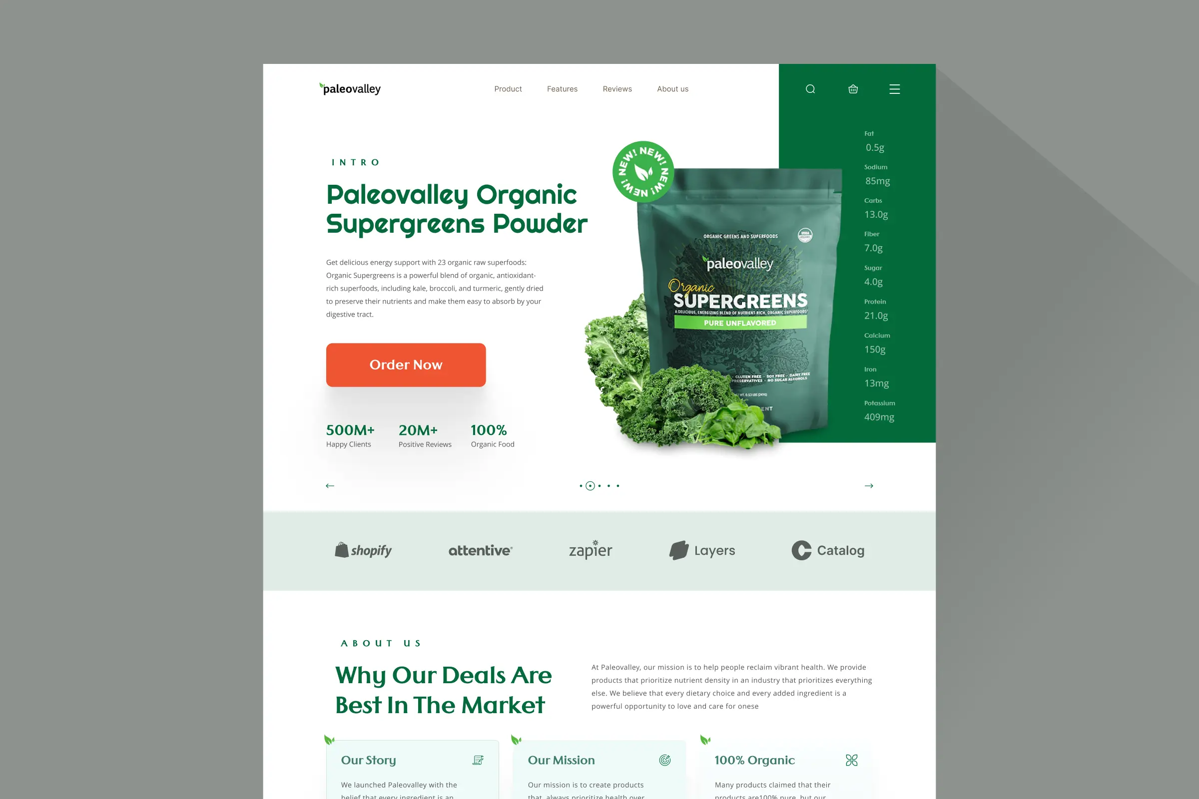
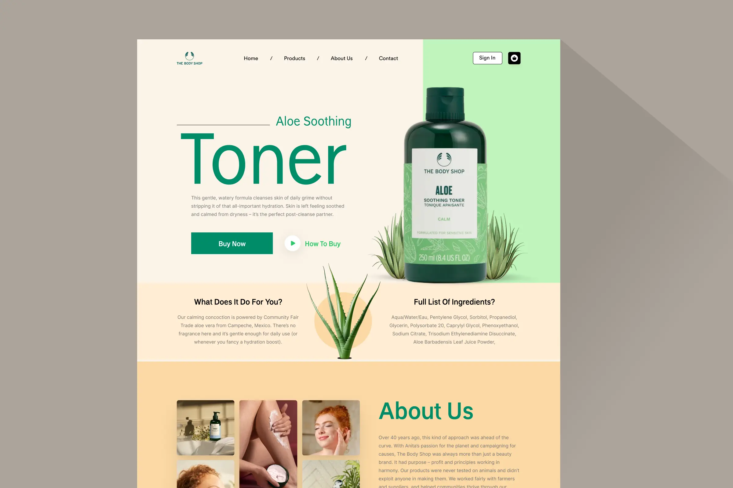
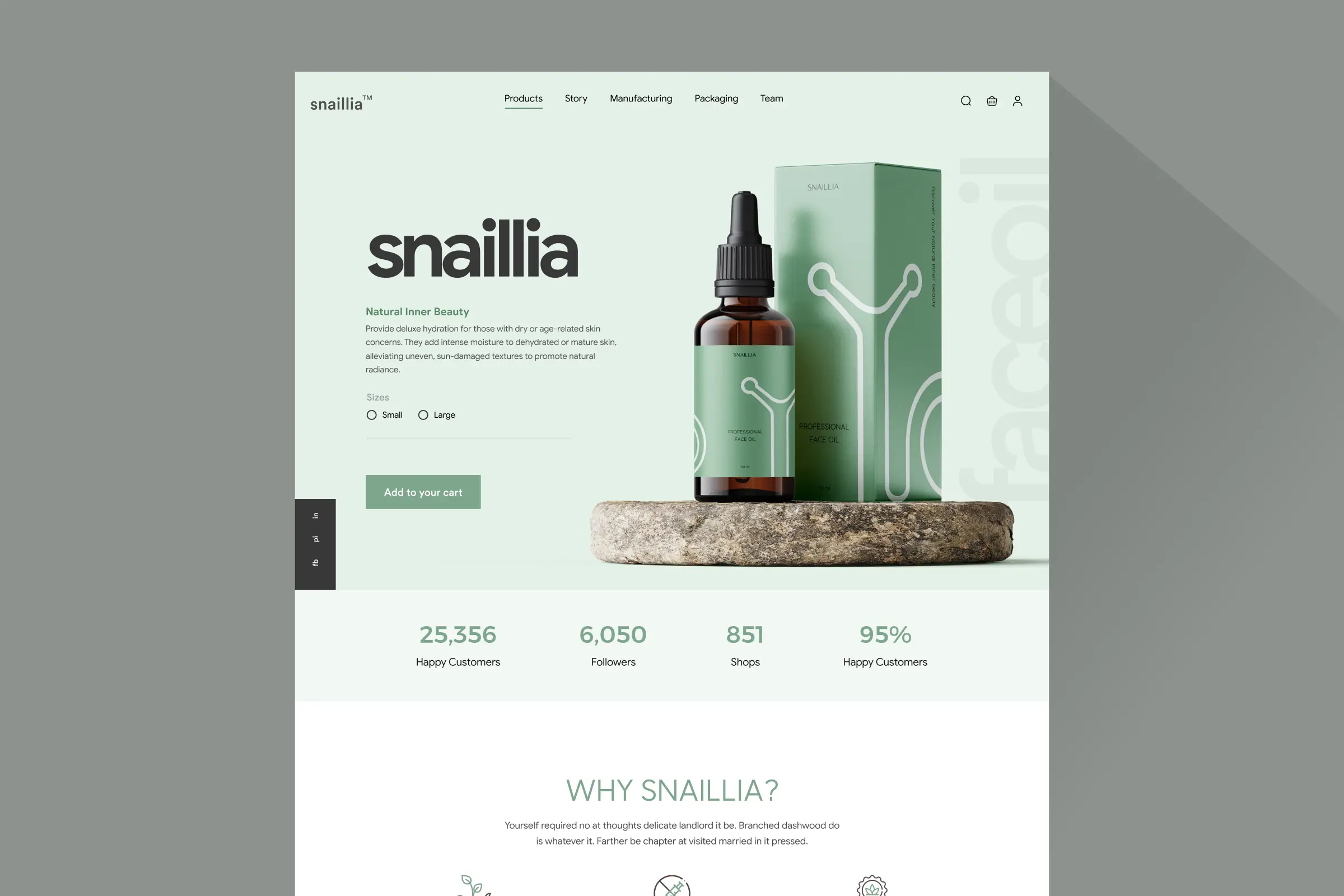
Storefronts we designed and built, across supplements, fragrance, health, wellness and skincare.
All 35 projectsFour engagements, measured before and after. What changed, why it changed, and by how much.
All case studiesDiagnosis, design and development from one studio — so the recommendation and the build never disagree.
All five services192 real Shopify stores torn down page by page, scored, and shown beside the version we would build. Free to watch.
Browse all teardownsConversion-first Shopify themes, each built for one industry’s buying journey. No required apps, no monthly theme fee, one licence per store.
See all themes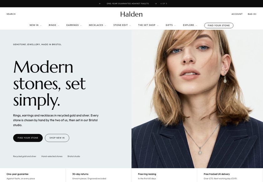 Halden
Jewelry & Accessories
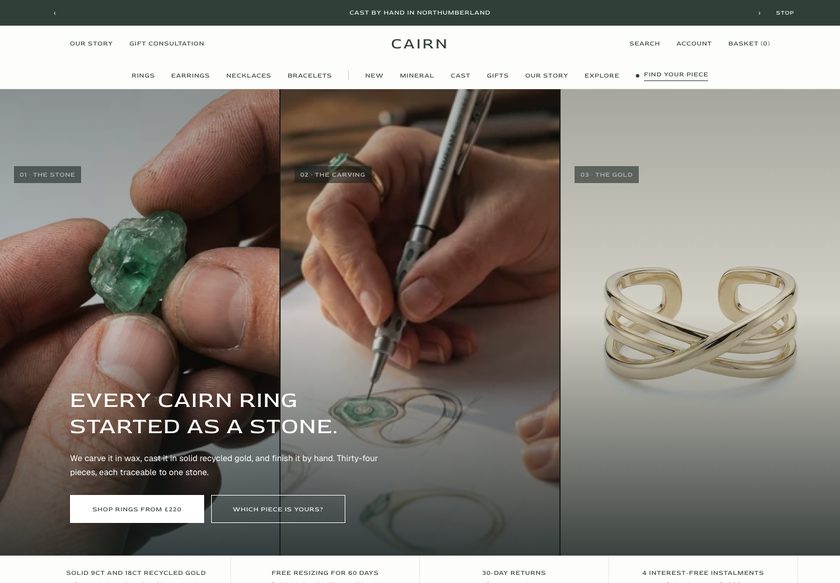 Cairn
Jewelry & Accessories
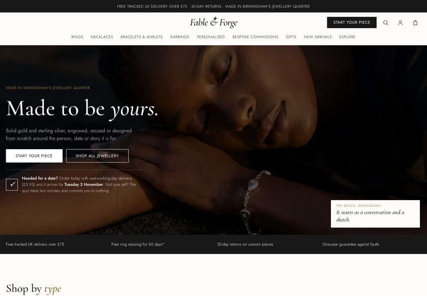 Fable & Forge
Jewelry & Accessories
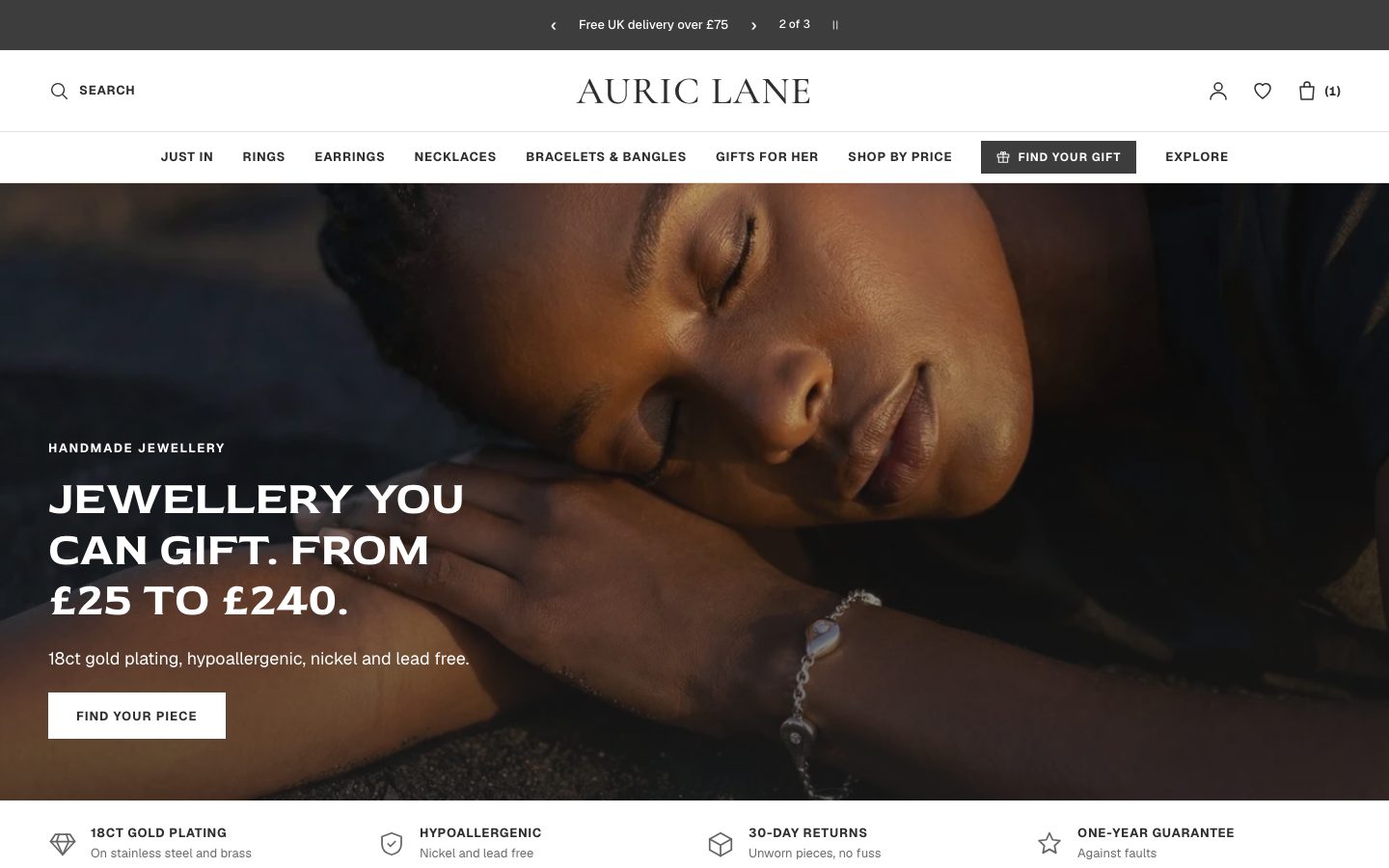 Auric Lane
Jewelry & Accessories
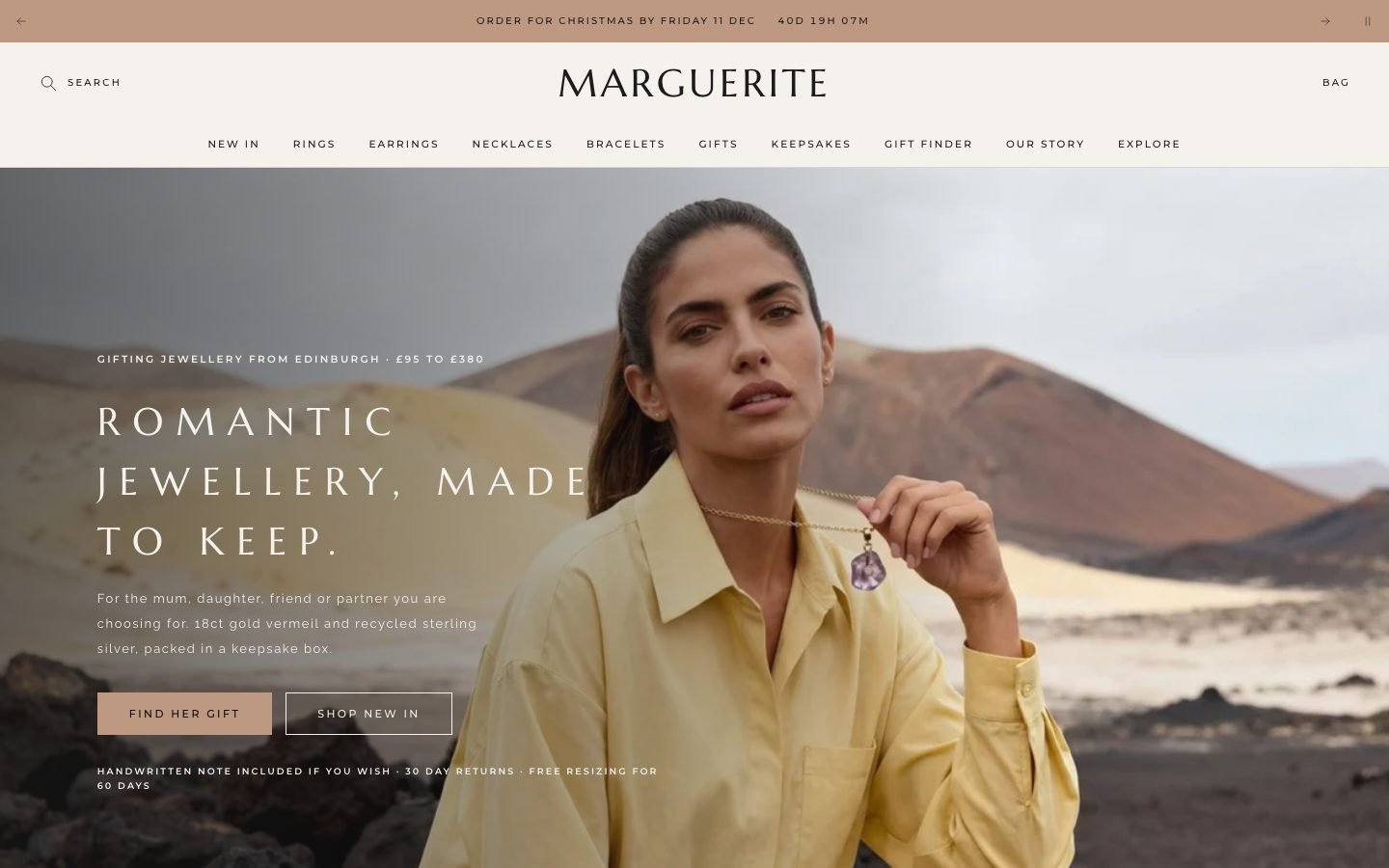 Marguerite
Jewelry & Accessories
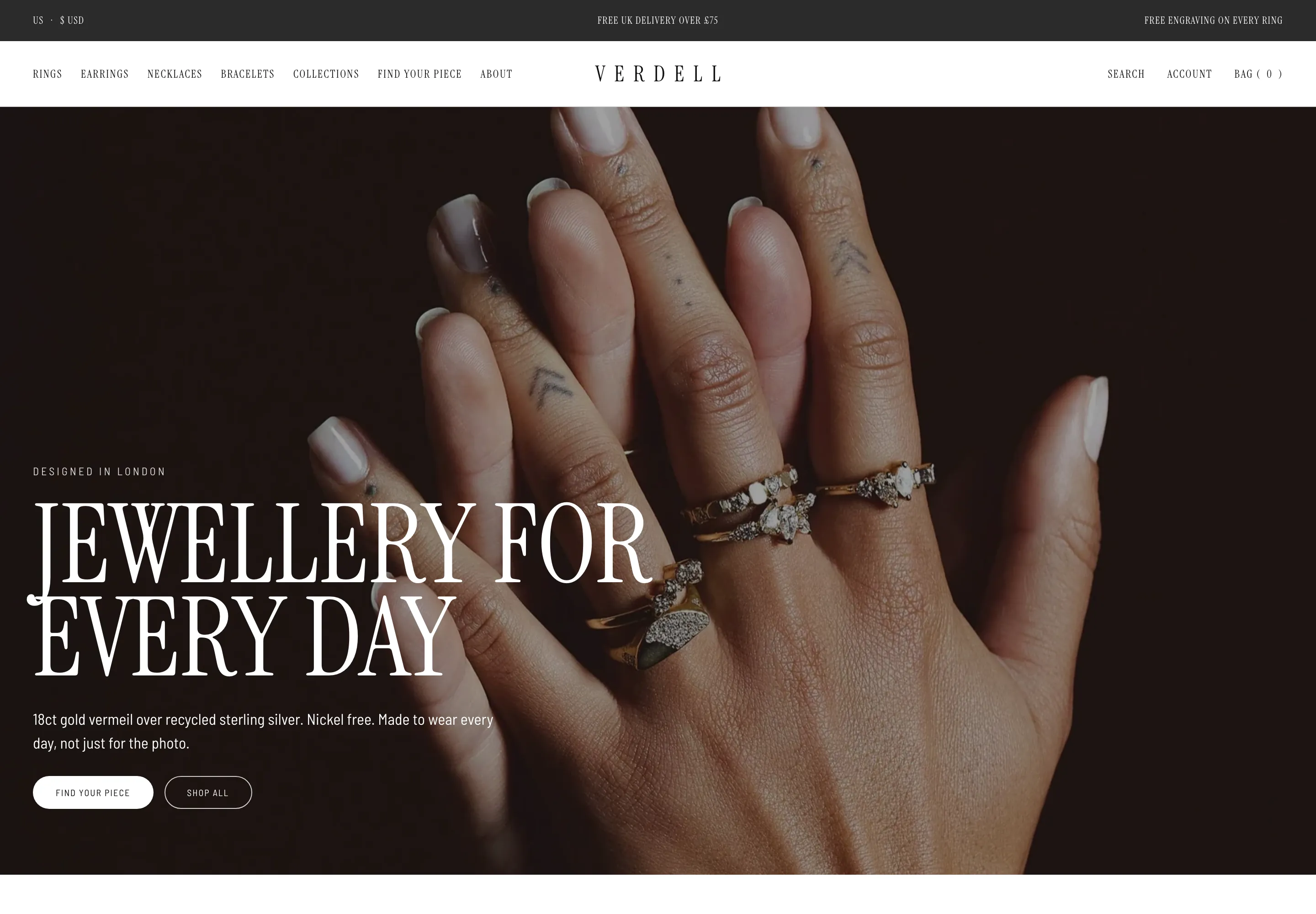 Verdell
Jewelry & Accessories
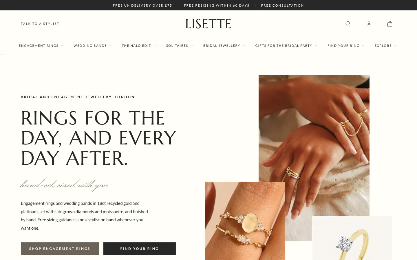 Lisette
Jewelry & Accessories
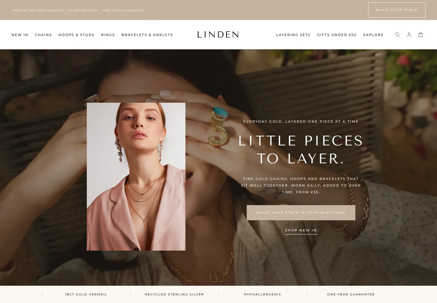 Linden
Jewelry & Accessories
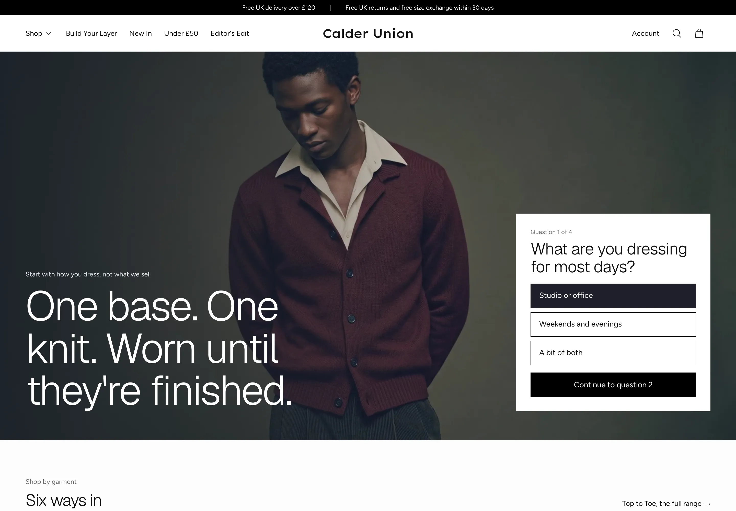 Calder Union
Clothing & Apparel
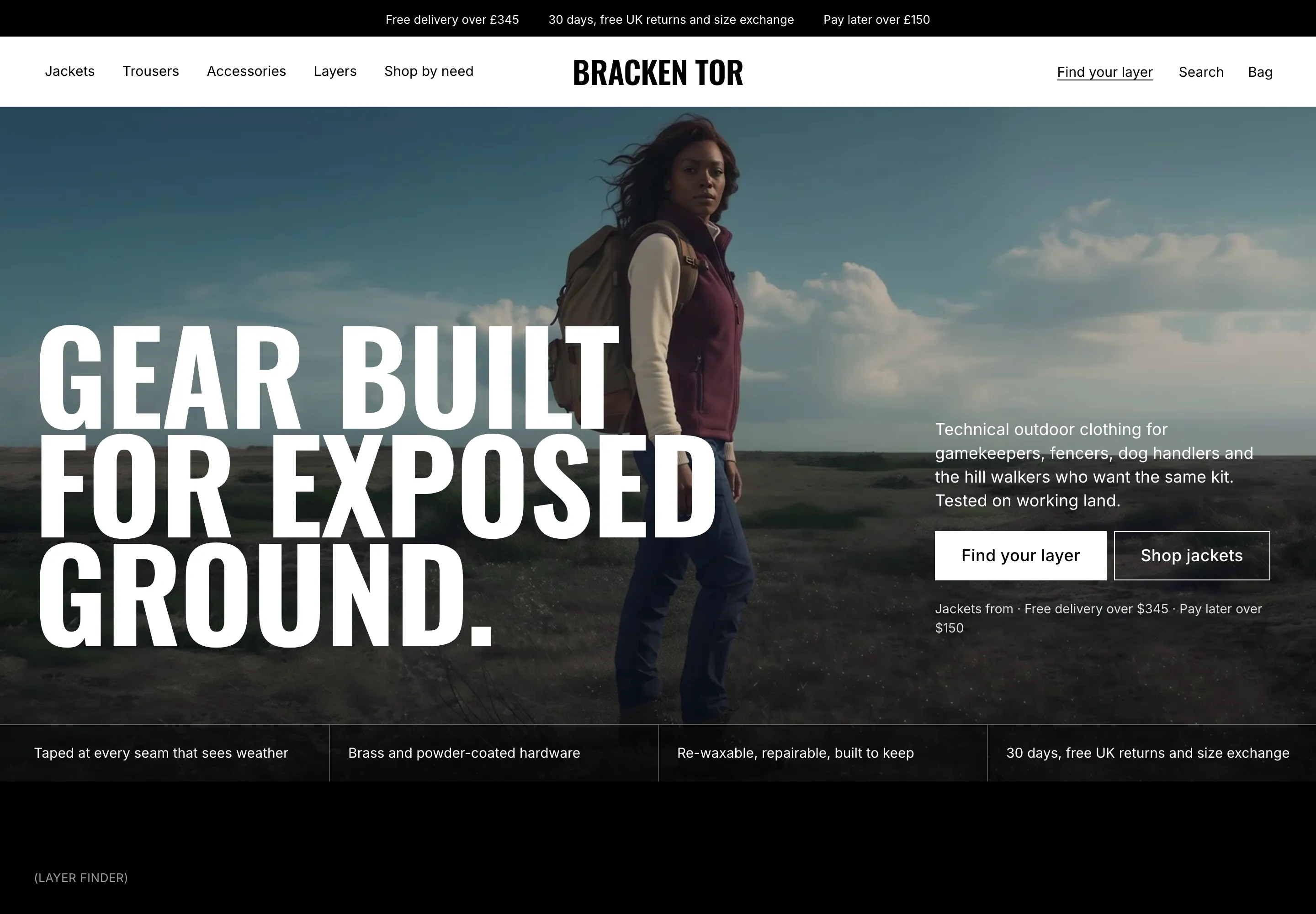 Bracken Tor
Clothing & Apparel
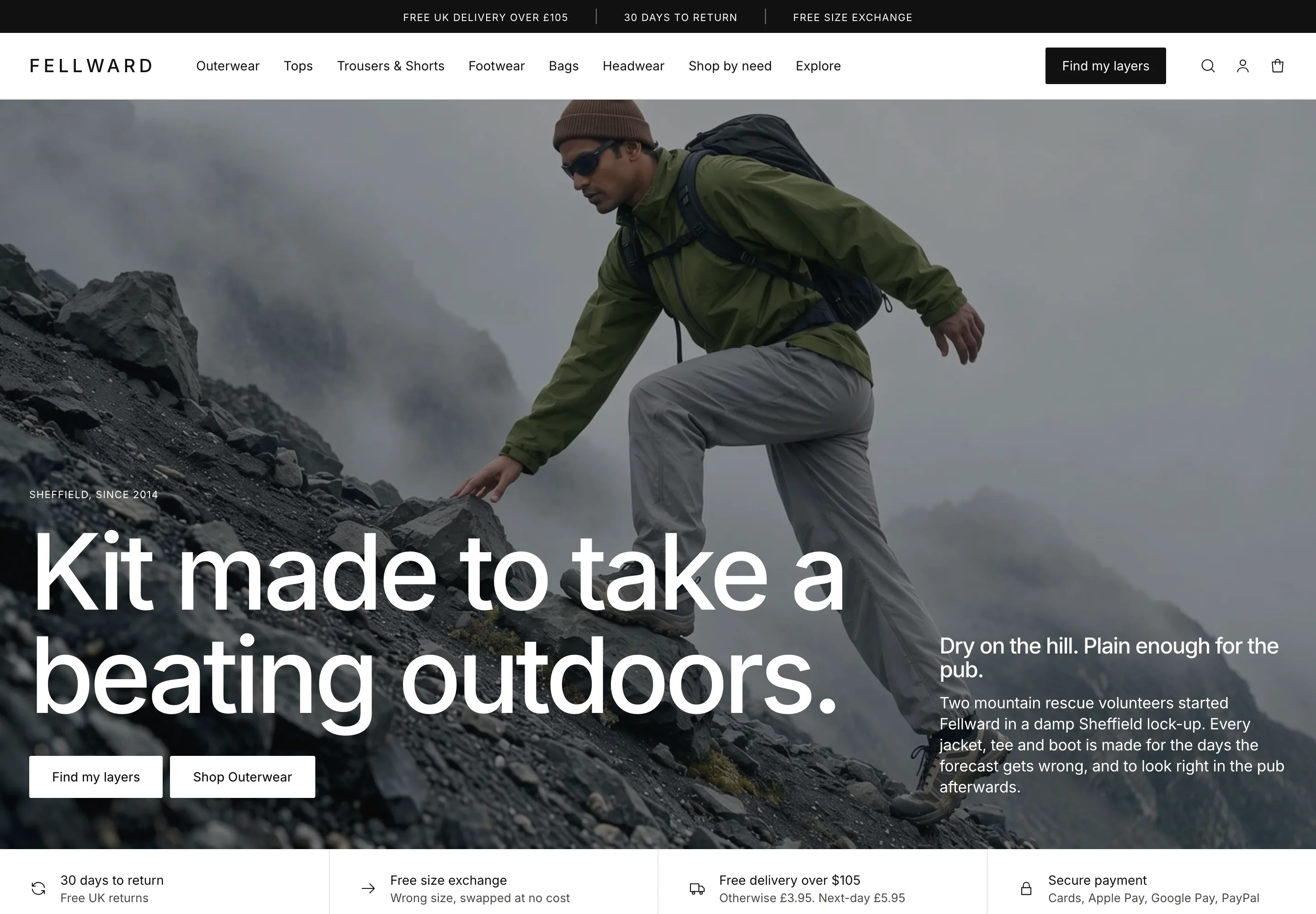 Fellward
Clothing & Apparel
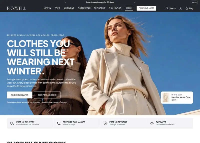 Fenwell
Clothing & Apparel
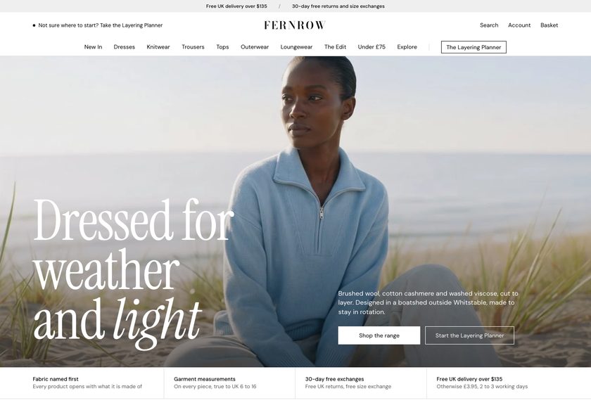 Fernrow
Clothing & Apparel
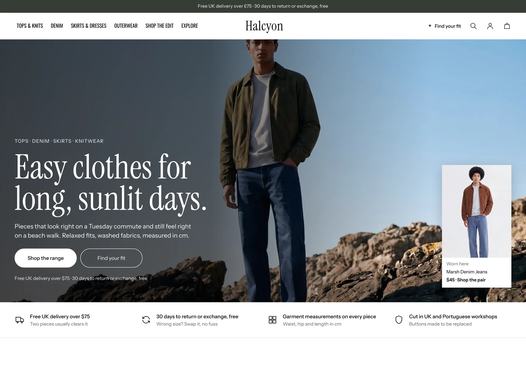 Halcyon
Clothing & Apparel
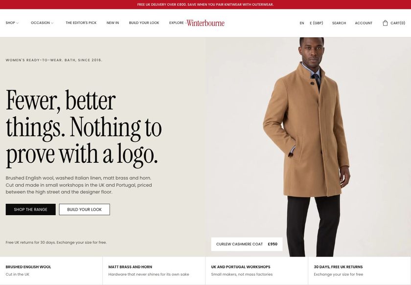 Winterbourne
Clothing & Apparel
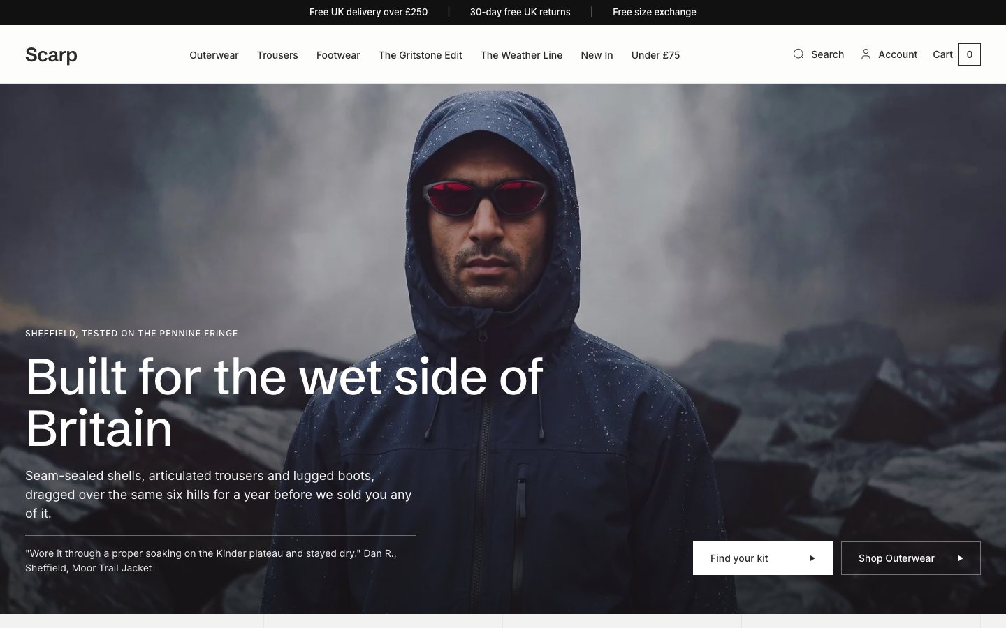 Scarp
Clothing & Apparel
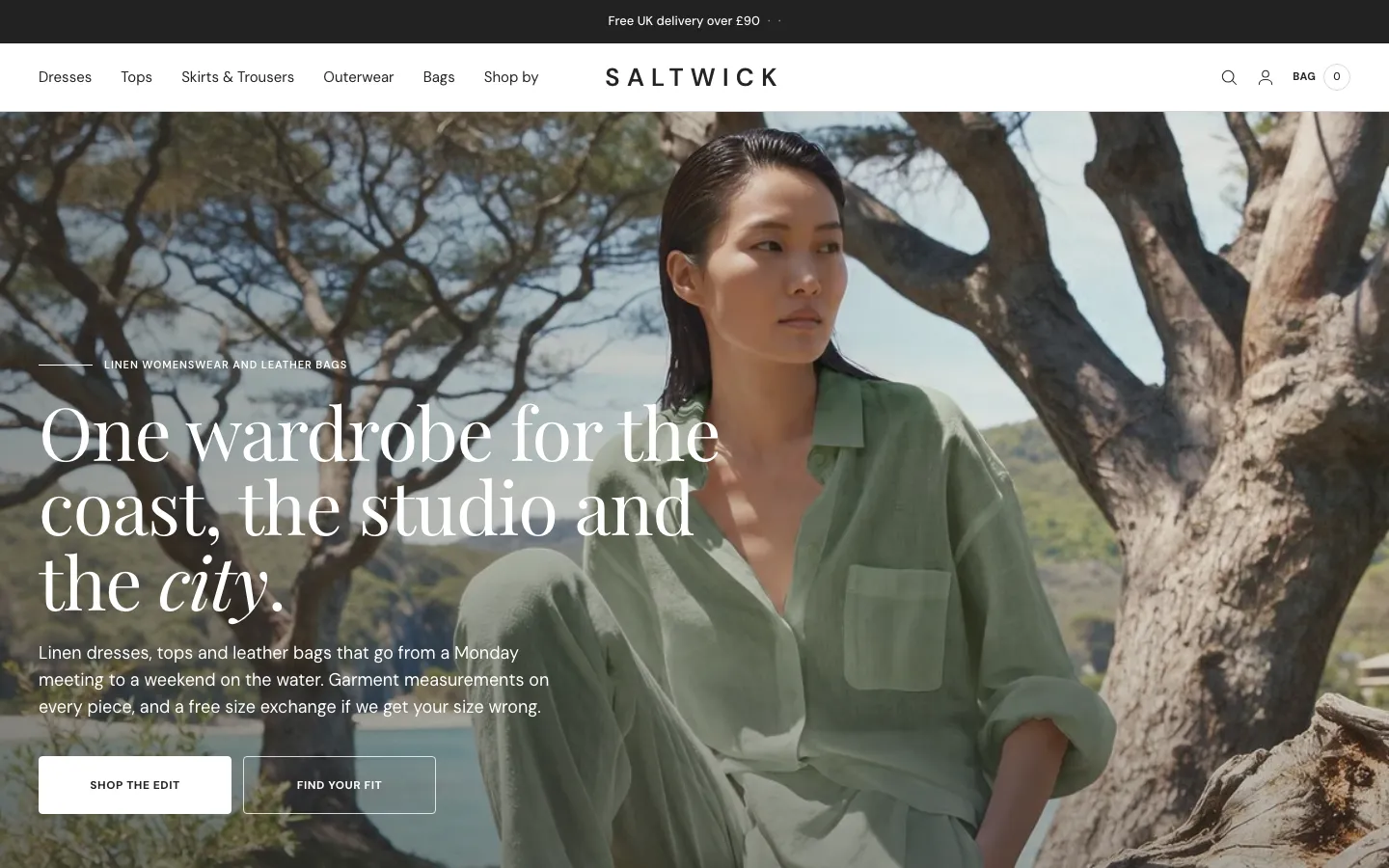 Saltwick
Clothing & Apparel
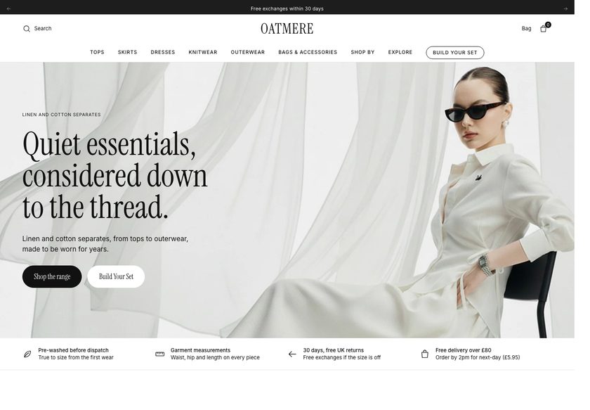 Oatmere
Clothing & Apparel
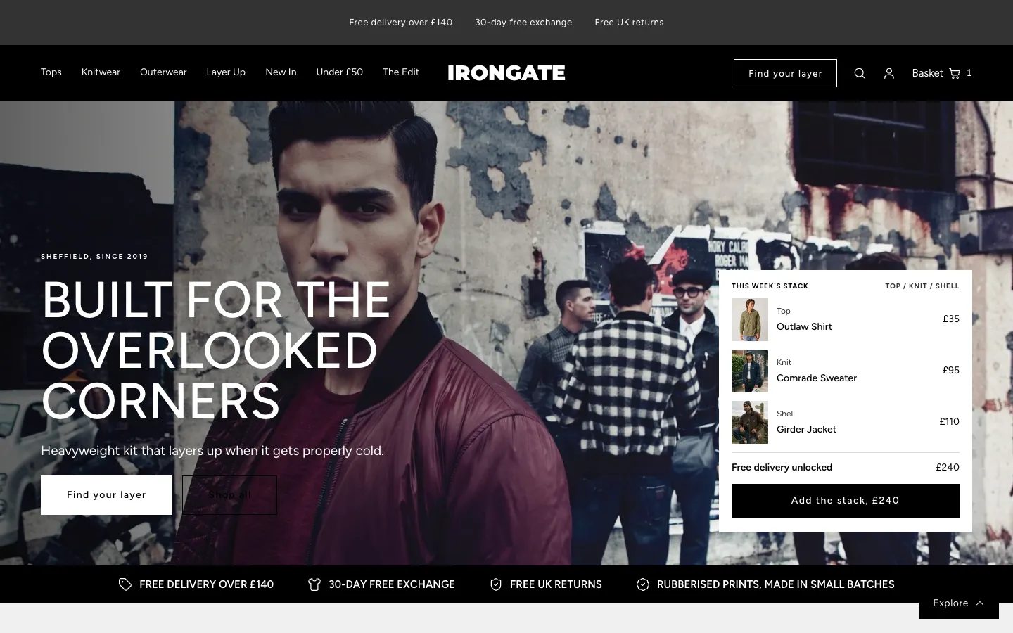 Irongate
Clothing & Apparel
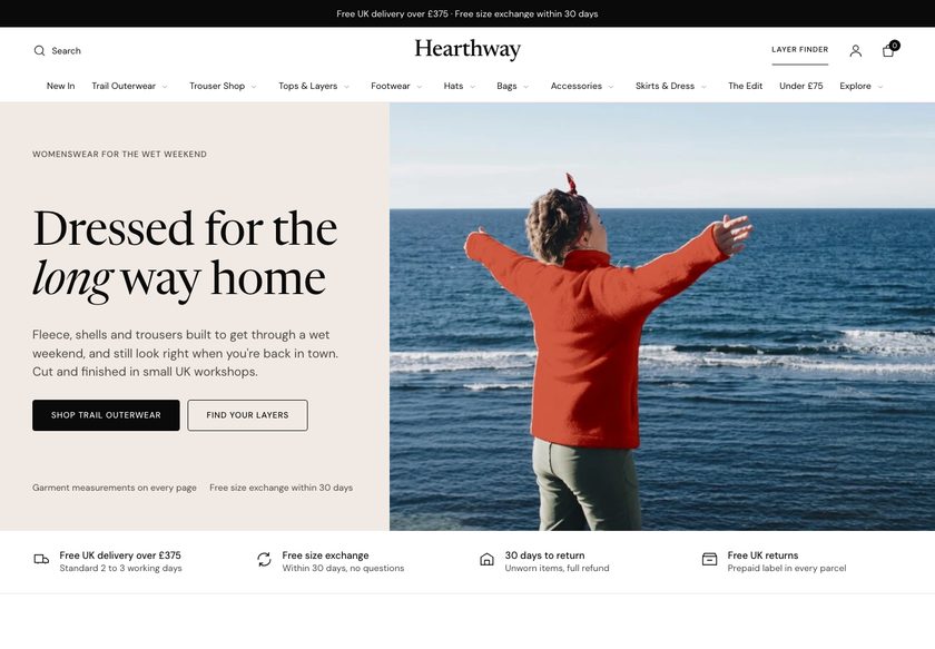 Hearthway
Clothing & Apparel
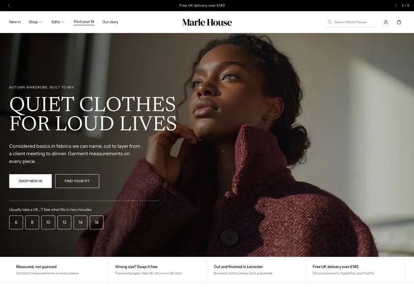 Marle House
Clothing & Apparel
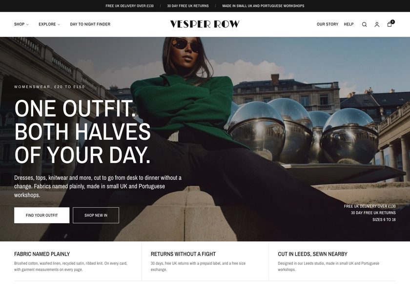 Vesper Row
Clothing & Apparel
A page by page teardown of a UK skincare and lash serum store, covering the homepage, collection page and product page, plus a CRO redesign concept built around guided buying paths.
Pressing play loads the video from YouTube — you can allow it for every teardown under cookie preferences.
Voila Pure sells a peptide lash serum, an eye gel and a cream to a skincare audience, and the products are not the weak point. The navigation already groups Shop, Discover and Subscribe, the homepage browses by category, and a physical shop, influencer content, a money back guarantee, instalments and free UK delivery are all in place. Our CRO strategist rated the product page seven out of ten.
The core problem is the presentation layer. The hero makes it clear this is skincare, but not who it is for or why the brand can be trusted. A homepage should answer what the business does, who it is for and whether people trust it, all in one place. When it does not, the visitor hesitates, and hesitation is what stops a first purchase.
The same gap repeats further down the funnel. The collection page offers few products to compare and little to filter or sort by. Review counts differ from one section to the next, and social posts stand in where reviews should be. On the product page, several prices appear, a long paragraph has to be read, and the guarantee says nothing about the first four weeks.
The direction is a guided journey, like a good assistant in the physical shop. Welcome the visitor, ask what they are looking for, take them to the right collection, help them compare, then justify one product with one price, real proof and answers beside the button. The idea to remember: every page has one job, and when all three do it, visitors become buyers.
The homepage, collection page and product page do not guide a visitor from unsure to confident. Trust signals, review counts and prices disagree with each other, so hesitant shoppers leave to think about it later.
Voila Pure could behave online like a good shop assistant: say what it does, who it is for and why to trust it in the hero, then guide each visitor by concern to one product with proof, one clear price and answers by the button.
Clearer proof, one consistent price and guided discovery should reduce hesitation, move more visitors to add to cart, and lift order value through routines and bundles, all without needing extra traff
Five dimensions, each scored out of ten.
12 issues found, 14 fixes proposed.
The homepage hero shows this is a skincare brand, but it does not tell the visitor whether the products are for them, and it carries no sign that other people trust the brand.
Guarantee, free UK delivery and review proof are not stated where the visitor first lands. Credibility has to be built in the hero, not left for the visitor to hunt down.
Instagram and TikTok creator posts fill the space where proof should be. Shoppers know how paid and gifted content works, so it adds little credibility without real customer evidence beside it.
The homepage cites a high approval figure, yet the reviews shown are a small set, such as 12, 28 or 29 per product. Mismatched numbers make a shopper doubt what is real and leave to check elsewhere.
Category tabs and a navigation bar exist, but nothing asks the visitor what they are looking for. There is no concern based route, no finder and no comparison to help them reach one product.
Shop, Discover and Subscribe is a good start, yet there is no way to browse by concern, by price or by proof. A shopper whose worry is money or results has no obvious door.
The page shows only a cream, a gel and a lash serum, with little to compare them by. Filters, categories and sorting are thin, so discovery is harder than it needs to be.
The site shows results but does not talk about the concerns behind them, such as fuller looking lashes, puffy tired eyes or hydration. Shoppers think in concerns, not product names.
The £27 price, a per fluid ounce figure and a 270 ml comparison all appear on the same page. Competing numbers confuse the buyer at the exact moment they are deciding.
The money back guarantee is there, but the page does not say what a customer can expect to see in the first four weeks of a twelve week routine, which leaves the promise vague.
A long block of text on the product page forces the shopper to read to find the facts. Details should be scannable so nobody has to work to understand the product.
Instalments and a subscription are offered, but there is no clear percentage saving, no routine pairing and no nudge towards free delivery, so order value is left on the table.
State what Voila Pure does, who it is for and why to trust it in the hero, with a review rating beside the headline so the visitor knows within seconds that this brand is for them.
Show vegan, cruelty free and gluten free badges with the money back guarantee, free UK delivery and an excellent reviews line, so every basic reassurance is visible without scrolling.
Add a short product finder on the homepage that asks a few questions about the visitor's concern and recommends a product, then suggests a pairing, as an assistant in the physical shop would.
Group the menu by category, by concern and by price, and add proof and learning links for customer reviews, results and support, so each type of shopper finds a door in one hover.
Show only real reviews with the date, a verified buyer tag and the customer's words, and gather customer photos and videos in one place instead of scattering them across the page.
Use one source for review numbers and display it consistently on the homepage, the collection page and the product page, so no figure contradicts another.
Let shoppers narrow products by concern such as fuller looking lashes, tired puffy eyes, brighter eyes, smoother skin and hydration, with sorting and a quiz for those who are unsure.
Give every card an image, a rating, a name, a short summary of what is inside and a badge such as bestseller or gift ready, so shoppers can choose without opening each product.
Place a routine bundle between the product rows so a shopper who wants more than one product can add the set in one click, and a gift minded buyer can see a ready option.
Keep a single price and the saving on offer above the button, and move the per fluid ounce and bottle size figures into the details, so there is nothing to decode before buying.
Explain what changes at weeks four, eight and twelve and how to stay consistent, and link the review score to a results gallery so the buyer can compare real before and after images.
Replace the dense text with short headed sections covering what is inside, how to use it and what to expect, so the facts can be read in seconds.
Show the subscribe discount clearly, and add a message such as how far the basket is from free next day delivery, with a related product to close the gap and raise order value.
Put returns, the guarantee, delivery dates and ingredient assurances directly beside the button, and end the page with FAQs, so every doubt is answered at the moment of decision.
A concept redesign created by Convertica Studio from this audit. It shows how the store could work, it is not the live store.
The full page shown as two tall columns, from the first screen down to the footer.
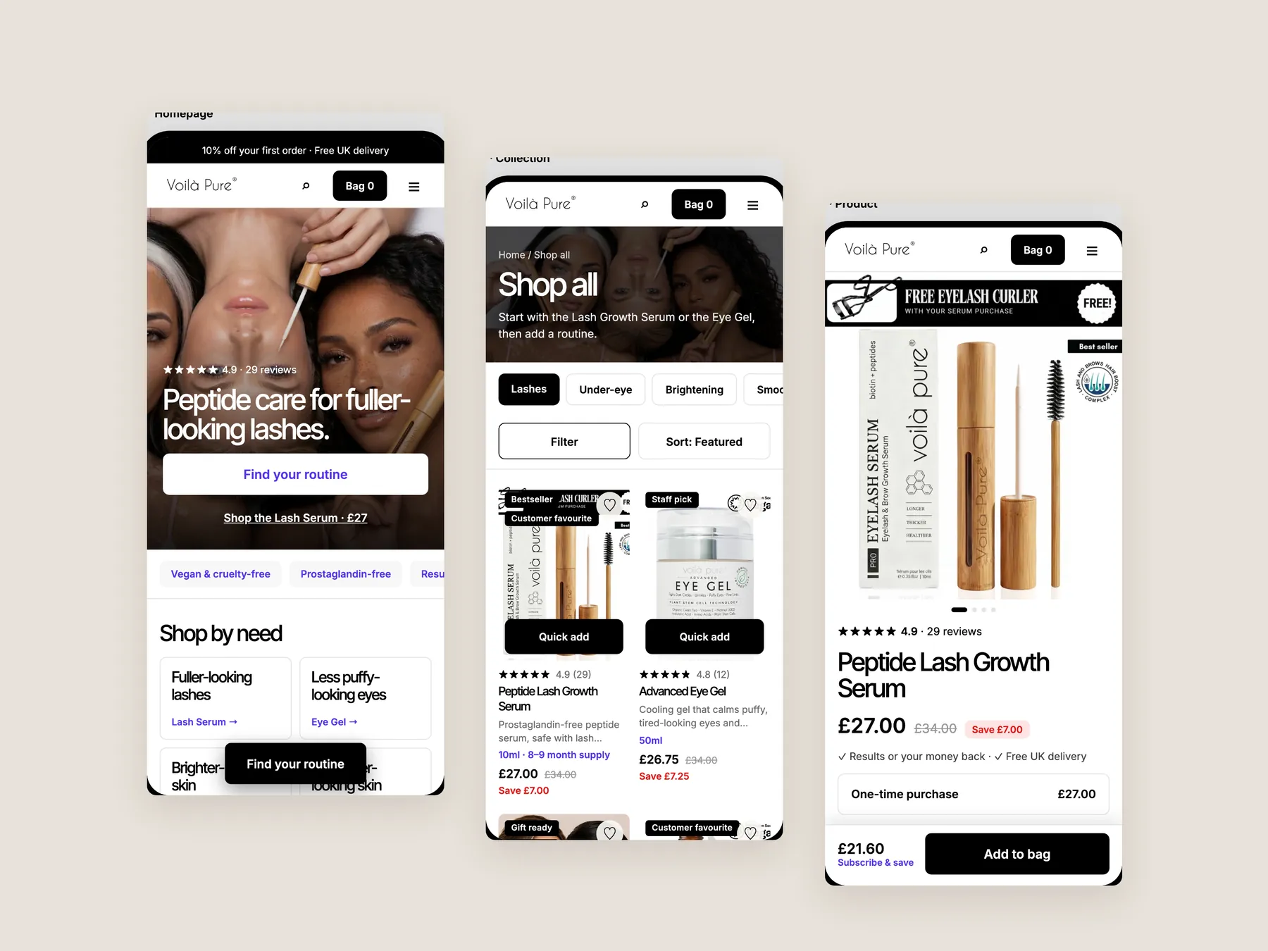
Homepage, product page and collection page side by side, so the structure of the whole shop reads at a glance.
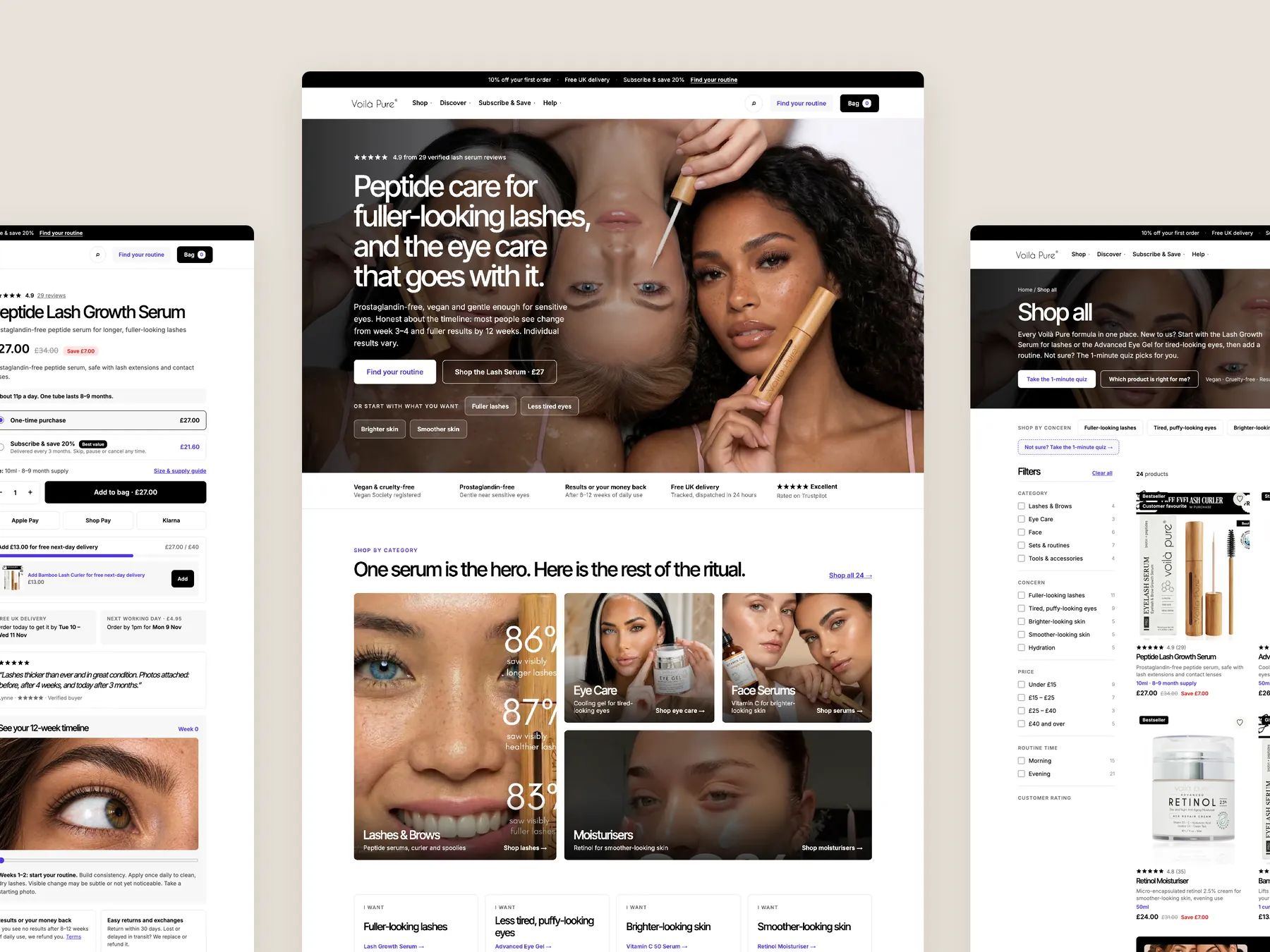
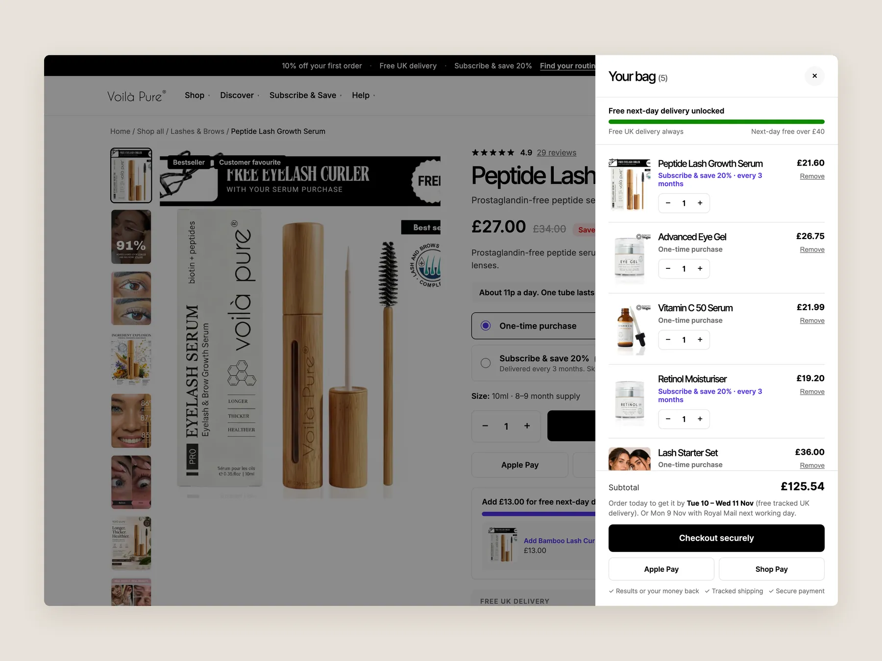
The whole drawer is visible, with its lines, delivery progress and checkout button.
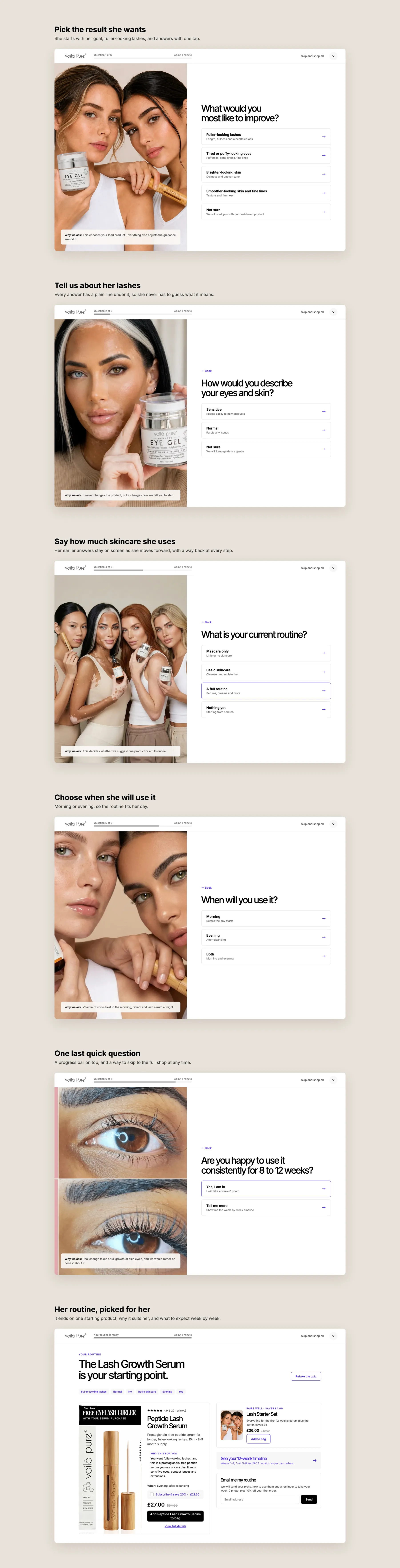
She picks her goal, answers a few plain questions and ends on one starting product with the reason it suits her.
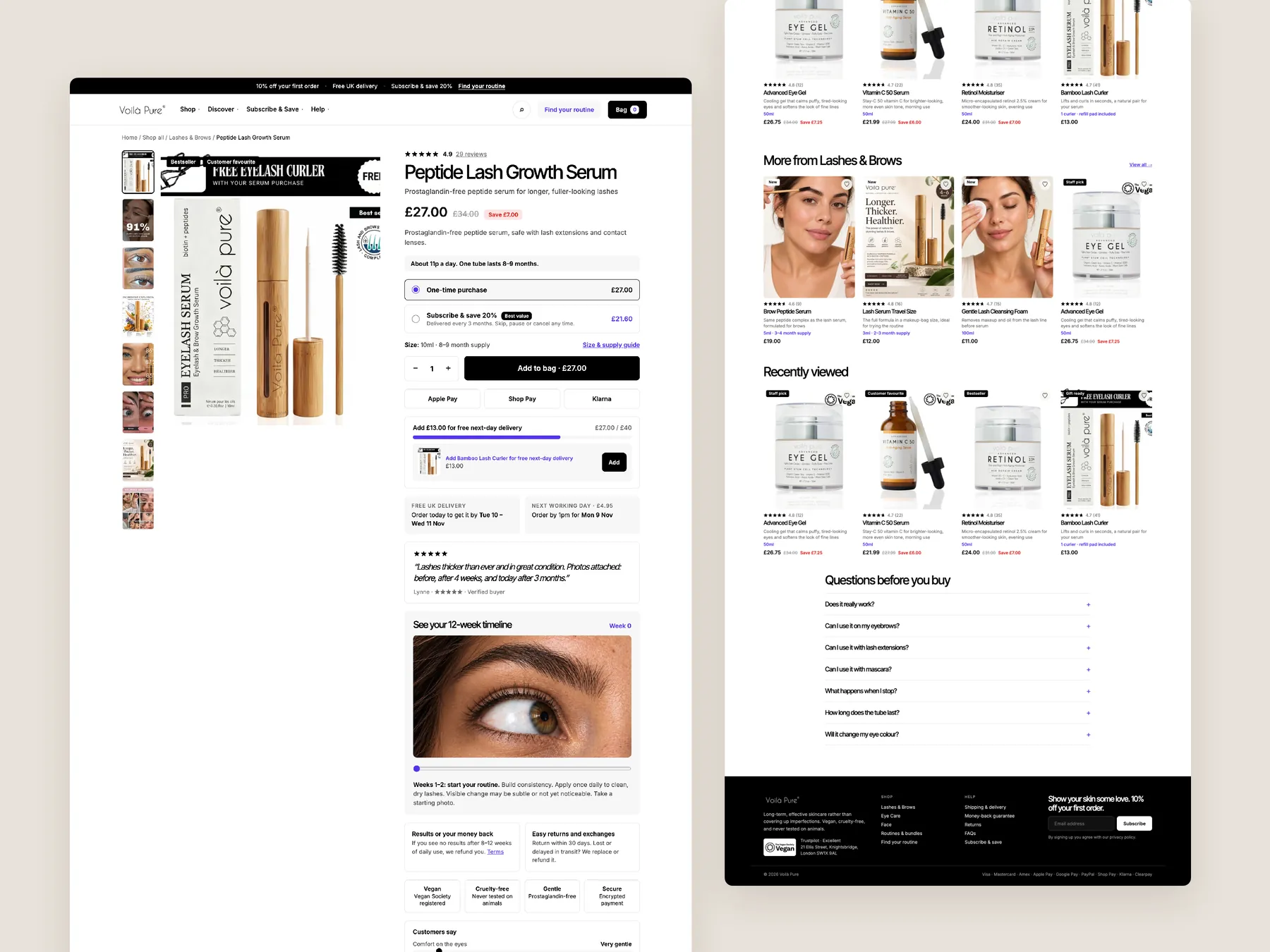
The product page as two tall columns, from the buy box to the footer.
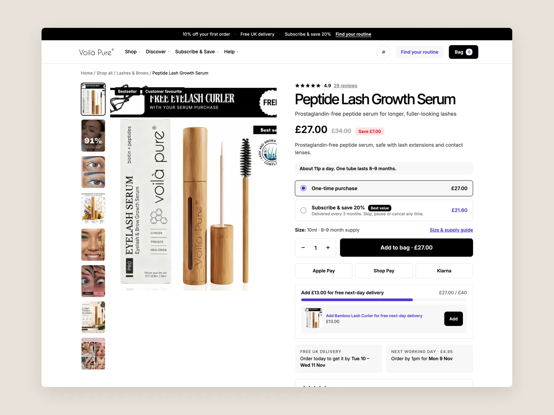
The first screen of the product page: header, title, price, purchase options and add to bag together.
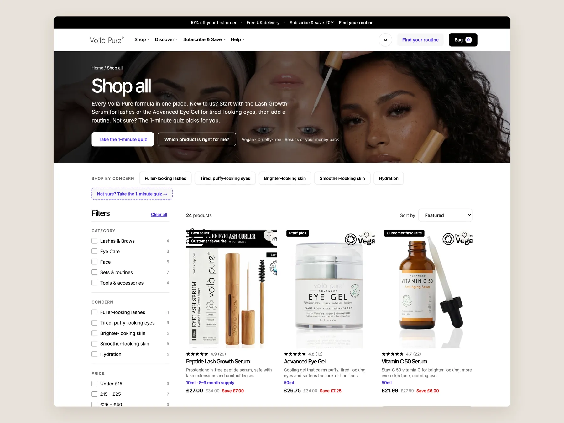
The collection page first screen: header, shop by concern, filters and the first row of products.
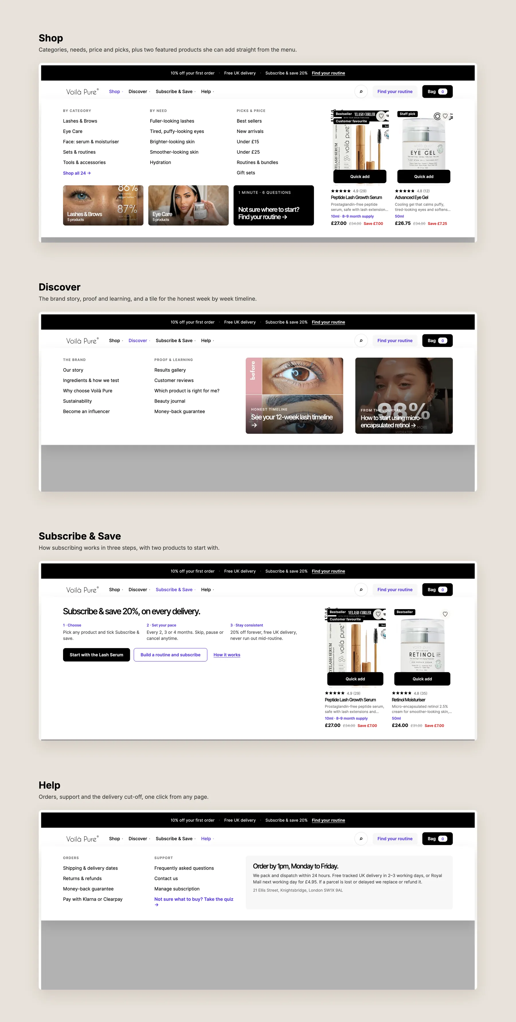
The mega menu, one screen per item: Shop, Discover, Subscribe & Save and Help, each with its panel open.
Three phone screens: home, collection and product with the sticky add to bag bar.
The products are not the problem. The pages do not help a visitor feel confident enough to buy, because the hero, review counts and prices do not give one consistent, trustworthy story.
It is the first thing a visitor reads. If it does not say what the brand does, who it is for and why to trust it, the visitor starts to hesitate before they have seen a single product.
On their own, no. Shoppers know how paid and gifted creator content works, so the homepage also needs real reviews, customer photos and clear guarantees to earn credibility.
Different counts across the homepage and product pages make the shopper wonder which is real. That doubt often ends in a decision to bookmark the page and check back later, which rarely happens.
It is a route that helps a visitor reach the right product without searching. It works like a shop assistant who asks what you need, then takes you to the right collection and product.
It should help people compare and choose. That means more filters, sorting, concern based categories and cards that summarise what is inside, so the shopper does not have to open every product.
It is solid. Our CRO strategist rated it seven out of ten, with a clear name, reviews, bundles, FAQs and a guarantee. The gaps are pricing clarity, scannable content and expectation setting.
When a price, a per ounce figure and a bottle size comparison all appear together, the buyer has to work out which one matters. One price with the saving shown removes that friction.
It should be paired with clear expectations. The routine runs for twelve weeks, so the page should say what to expect at each stage, rather than leaving the first weeks unexplained.
No. It is a clickable prototype that shows what the outcome could look like if the issues are fixed. The final designs would be developed with the store after a scoping conversation.
There are three paths: leave the site as it is, implement the changes in house, or have the studio do it. Payments are tied to stages of work, so nothing has to be paid in full upfront.
The audit covers the homepage, the collection page and the product page, followed by a redesign concept for each and the next steps. The recording runs for 26 minutes.
Tell us about your store and we'll send a personalized 5-minute video showing exactly where you're losing buyers — and how to win them back.
Takes about 40 seconds. No call required.