










Favorite Band Books CRO Audit
A 13 minute CRO teardown of a music puzzle book store, covering the homepage, the 260 product Rock and Roll collection, and the Aerosmith crossword product page.
Watch the full 13-minute recording.
What we found.
The product idea here is strong and distinctive. Favorite Band Books takes something people already have an emotional attachment to, their favourite bands, artists and music history, and turns it into crosswords, word searches and trivia books. The homepage says the puzzle books are music themed, the artist selection is wide, and customer reviews are already on the site supporting the product.
The issue is not the product and it is not the colours or the fonts. It is that the website makes visitors do too much of the work to understand what makes these books special, find the right one and decide what to buy. Choice across artists, genres and formats is a real strength, but that choice is not organised around the way people actually shop for a puzzle book.
The same gap repeats further down. The Rock and Roll collection holds 260 products, mixing single crosswords, trivia books, word searches, physical bundles and digital downloads in one run of near identical cards with no way to narrow by artist or format. On the Aerosmith crossword page there are images, a price and a long description, but not a clear answer to what is inside the book, who it suits or how shipping and returns work.
The direction is to build a buying journey around the products that already exist. Create clear paths into the catalogue, make each product easier to evaluate, put proof where the decision happens, and merchandise bundles and related artists deliberately. The range does not need reinventing; it needs organising so the visitor never has to work out where to start.
Problem, opportunity, impact
The catalogue is large and genuinely interesting, but it is presented as a flat list of artists and formats, so the visitor has to do the sorting work the site should be doing for them.
The range already covers the artists, genres and puzzle formats people want. Organising it into obvious buying paths, by best seller, artist, puzzle type, bundle and gift, turns the size of the catalogue into the reason to buy.
Faster product discovery, fewer visitors leaving the collection page without a click, more product pages that answer the buying questions, and higher order values from relevant same artist bundles.
Scored across five dimensions.
Five dimensions, each scored out of ten.
-
01
Homepage & PDP review Where attention leaks and buyers hesitate, section by section.
-
02
Mobile UX audit 70% of your traffic — judged on its own terms.
-
03
Trust & credibility check The signals that make first-time buyers convert.
-
04
Collection & discovery Filtering, merchandising and guidance from browse to buy.
-
05
Prioritized CRO roadmap Ranked by impact vs. effort, ready to ship.
Every issue, paired with its fix.
16 issues found, 18 fixes proposed.
The Homepage Offers No Obvious Starting Point
Categories and individual bands compete for attention on the homepage, but there is no direction telling a first time visitor where to begin. The visitor is handed a long list instead of a path.
Range Reads As Work Rather Than Advantage
The breadth across artists, genres and formats is a genuine strength, but presented as an undifferentiated list it feels like more to wade through instead of a bigger chance of finding the right book.
The Catalogue Is Not Organised Around How People Shop
Someone might be buying for themselves, buying a gift, looking for an Aerosmith or Beatles fan, choosing between crosswords and trivia, or weighing a bundle. The site does not answer any of those routes quickly.
Two Hundred And Sixty Products In One Collection
The Rock and Roll category holds 260 products with no filtering, so a visitor with clear intent still has to scroll through dozens of similar cards to find the artist and format they came for.
Formats Are Visually Indistinguishable On Collection Cards
Single crosswords, trivia books, word searches, physical bundles and digital downloads all sit in the same grid looking alike. Nothing on the card signals which is which.
Digital And Physical Products Are Mixed Together
Digital options appear alongside printed books in the same collection without a visual distinction, so a buyer can reach the product page before realising what kind of product it is.
Collection Cards Carry Too Little Information To Decide
The cards do not communicate enough for a visitor to judge what deserves a click, so choosing means opening product page after product page and comparing manually.
The Product Page Leans On One Long Description
The Aerosmith crossword page communicates enthusiasm for the band and explains the general puzzle experience, but the information arrives as a block of copy rather than answers to the questions a buyer has.
No Look Inside The Book
Near the purchase decision there is nothing showing what the inside of the book actually looks like, so the buyer cannot see the puzzles they are paying for.
Substance Of The Book Is Not Stated
How many puzzles, how long the book lasts and how substantial it is are not answered on the product page, which leaves the price sitting without anything to judge it against.
Shipping And Returns Are Not Answered At The Decision
Practical questions about delivery and returns are not handled close to the buy button, so the visitor has to go looking for them at the exact moment they were ready to purchase.
Who The Book Is For Is Left Unstated
The product page does not say who this book is designed for or why an Aerosmith fan specifically would enjoy it, which matters most for a gift buyer who is not the fan.
Cross Sells Ignore The Interest Already Shown
A visitor on the Aerosmith crossword is shown an unrelated wall of digital products from ZZ Top, Woodstock, Van Halen and U2, rather than other Aerosmith formats.
Bundles Are In The Catalogue But Not Merchandised
Two book deals and bundles exist in the range, but they are not positioned as the better value choice at the point where someone is deciding on a single book.
Gift Buying Is Not Addressed Anywhere
The product has natural gift potential, since the artist is the reason someone shops, but there is no gifting path and no help for a buyer shopping on behalf of a fan.
Proof Is Present But Not Placed Where It Counts
Customer reviews already exist on the site, but they are not brought into the moments where hesitation actually happens, on the collection page and beside the purchase decision.
Give The Homepage One Clear Job
Change the homepage from telling people you sell band puzzle books to sending each visitor into the right path. The first section should say what makes the product interesting and give one obvious next action.
Build Five Named Buying Paths On The Homepage
Add shop best sellers, shop by artist, shop by puzzle type, shop bundles and find a gift as distinct entry points, so the size of the range reads as an advantage instead of a list to work through.
Lead With Positioning, Not With A Product Grid
State the proposition up front: puzzle books built around the bands and music people already love. That one line does more than an immediate wall of artist tiles.
Show What Is Inside The Books On The Homepage
Add a section that shows sample pages and explains the puzzle experience, so a visitor understands what they would actually be doing with the book before they browse.
Say Why These Books Beat The Alternatives
Add a short section covering what makes these puzzle books different from a generic crossword book, using the story behind the range rather than a feature list.
Add Artist And Format Filters To Collections
Let a visitor in the 260 product Rock and Roll collection narrow by artist and by format in a click, so they reach the right product page without scrolling the whole grid.
Label Every Collection Card By Product Type
Mark each card clearly as crossword, trivia, word search, digital or bundle, so a buyer can tell the formats apart at a glance instead of opening them to find out.
Flag Bundles As The Better Value Option
Give two book deals and bundles a distinct treatment in the grid that makes the value obvious next to a single book, rather than leaving them to look like another product.
Put More Decision Information On The Cards
Let the collection card carry the essentials someone needs to judge what deserves a click. That cuts the browsing back and forth and moves qualified visitors to the product page faster.
Add A Format Guide To The Collection Page
Include a short which format suits you section and an FAQ on the collection page, so a visitor choosing between crosswords, word searches and trivia can settle it without leaving.
Rebuild The Product Page Top Section
Give the Aerosmith crossword stronger imagery, a concise value proposition, the price, a clear purchase action, and the key reassurances all within the first screen.
Show What The Customer Actually Receives
Add interior page images and a plain description of what arrives, so the buyer can see the puzzles, the layout and the substance of the book before paying.
Structure The Page Around Buyer Questions
Replace the long descriptive block with sections answering what you get, what the puzzles are like, who it is for and why an Aerosmith fan would enjoy it.
Answer Delivery And Returns Beside The Buy Button
Place shipping timings, returns and other practical purchase information at the point where those questions occur, not on a separate policy page.
Make Cross Sells Follow The Artist
On the Aerosmith crossword, recommend the Aerosmith word search, the Aerosmith trivia book and the Aerosmith bundle, so the next offer follows the interest the visitor already declared.
Position The Bundle As The Upgrade At The Decision
Present the same artist bundle as the better value choice on the product page. The products already exist in the catalogue, so this raises order value without making the decision harder.
Merchandise The Range For Gift Buyers
Build a gifting route that starts from the artist, since knowing someone is a Pink Floyd or Beatles fan is the reason most gift buyers arrive.
Move Existing Reviews To The Hesitation Points
Bring the customer reviews you already have onto the homepage sections, the collection page and the area around the purchase decision, where they remove doubt rather than decorate.
The version we'd build.
The teardown in 7 lines.
- The opportunity here is not more traffic, it is helping the traffic already arriving feel confident enough to buy.
- The product is strong; the website makes visitors do too much of the work to understand it.
- A wide range of artists and formats only becomes an advantage once it is organised into buying paths.
- A collection of 260 products with no filters asks the visitor to do the merchandising themselves.
- A buyer needs to see inside the book before the price on the product page means anything.
- Someone who has told you they love Aerosmith should not be shown a wall of unrelated artists.
- This is not a colour or font problem; it is a buying journey problem built on products that already exist.
Questions this audit answers.
No. The audit is clear that the products are good and the concept is distinctive. Taking the emotional connection people have with their favourite bands and turning it into crosswords, word searches and trivia is a genuinely interesting idea. The gap is in how the site helps people discover, understand and choose from that range.
Volume is not the problem, the lack of structure is. The Rock and Roll collection mixes single crosswords, trivia books, word searches, physical bundles and digital products in one grid with no filters. A visitor who knows exactly which artist they want still has to scroll through dozens of similar looking cards to find it.
It should send each visitor down a path rather than showing everything at once. The audit suggests best sellers, shop by artist, shop by puzzle type, bundles and a gifting route as named entry points. That way a person who knows their artist and a person browsing for a gift both get moved forward instead of being handed the same long list.
Neither in the cosmetic sense. The audit says explicitly that this is not about changing colours or fonts. It is about building a stronger buying journey around the products that already exist, which means structure, hierarchy, product information and merchandising rather than a new look.
The Aerosmith crossword page has multiple images, a price, a long description and a buy button. What it does not answer near the purchase decision is what exactly you get, what the inside looks like, who the book is designed for, how substantial it is, and what happens with shipping and returns.
A visitor on the Aerosmith crossword is shown an unrelated spread of digital products from other artists such as ZZ Top, Woodstock, Van Halen and U2. Someone who has already told you which band they love should be offered another Aerosmith format or an Aerosmith bundle. That follows their interest instead of restarting the decision.
By merchandising the bundles and same artist formats that are already in the catalogue. When the next offer matches the interest the visitor has just shown, adding a second book is an easy decision rather than a new one. Nothing new needs to be produced for this to work.
The audit treats it as a natural fit. These books are bought for people as much as by them, and the artist is usually the reason the gift buyer is shopping at all. A path that starts from a band name and helps someone who is not the fan choose confidently covers a real segment of the traffic.
Yes, there are customer reviews on the site supporting the product, and the audit counts that as a foundation to build on. The recommendation is about placement: bring that proof into the moments where hesitation actually happens, on the homepage sections, in the collection and beside the purchase decision.
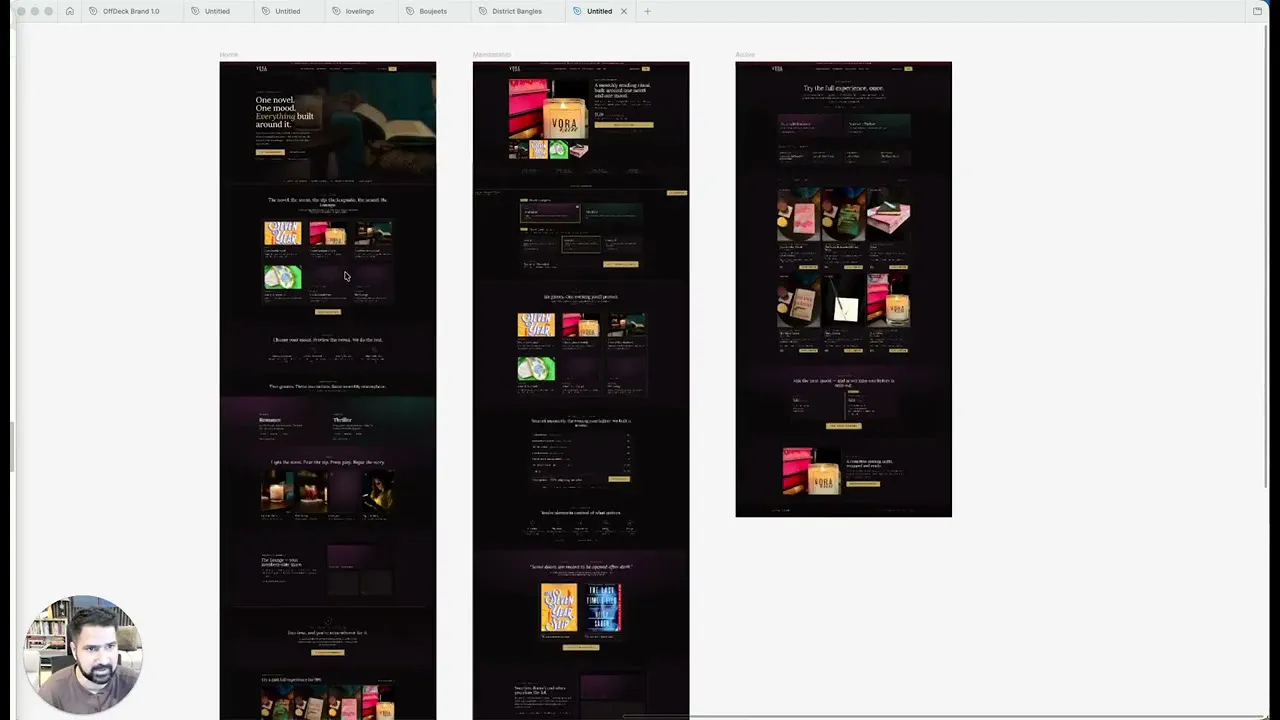
It is a strategic redesign concept, not a final design and not a working website. It shows what the homepage, collection page and product page could look like if the recommendations in the audit were implemented properly. The audit itself is the diagnosis; the concept is the direction.
Turning the direction into a fast, polished, conversion focused Shopify store built around the customer journey. That covers the homepage paths, collection filtering and card design, the restructured product page, and the bundle and related product merchandising. Convertica Studio can take on that build.
The recording runs about 13 minutes. It covers the homepage, the Rock and Roll collection page with its 260 products, and the Aerosmith crossword product page, then walks through a conversion oriented concept for all three. The recurring theme is reducing unnecessary decisions while giving the customer the information and reassurance they need at each stage.
See what's quietly costing you sales.
Tell us about your store and we'll send a personalized 5-minute video showing exactly where you're losing buyers — and how to win them back.
Takes about 40 seconds. No call required.
-
5-minute video teardownA personalized walkthrough of your store, recorded by Eva.
-
Homepage & PDP reviewWhere attention leaks and buyers hesitate.
-
Mobile UX audit70% of your traffic — judged on its own terms.
-
Trust & credibility checkThe signals that make first-time buyers convert.
-
Prioritized CRO roadmapRanked by impact vs. effort, ready to ship.