










Indigo With Stars CRO Audit
This audit reviews Indigo With Stars, a single author's store selling books, art prints, and music, and shows why the homepage and product pages never explain what they are or why to trust them.
Watch the full 9-minute recording.
What we found.
Indigo With Stars sells one author's complete body of work: books, art prints, music, and downloads, with editions available in four languages and eight titles on CD. That is a real catalog built from decades of writing since 1970, and it gives the store a genuine story to tell that most competing sites do not have to work with.
The homepage does not tell that story. It shows a grid of book covers with no author name, no description of what the books are, and no reason to trust the store. A hero section does exist further down the page, but a first time visitor has to scroll past unexplained products before ever reaching it and learning what the site is about.
That same gap repeats further into the site. Collection pages show books as a plain grid with little context and no easy way to add a second title at a discount, and individual product pages list format and price without ever saying why a particular book matters, what condition it is in, or why a stranger should trust buying it online.
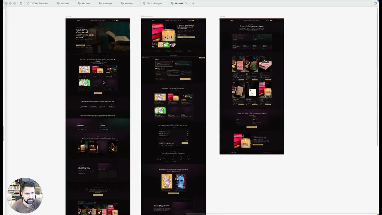
Our CRO strategist's redesign concept opens with a hero that states who the author is, what the store sells, and why to trust it, then walks visitors through organized shelves, a short path finder quiz, and product pages built to answer every hesitation before the buy button. The story already exists here. The site just needs to tell it.
Problem, opportunity, impact
The homepage shows a grid of products with no explanation of what the books are, who wrote them, or why a visitor should trust the store, so people arrive on the site and have to guess everything themselves before they can buy.
The store already has decades of writing history since 1970, work published in four languages, and eight CD albums to draw on. A guided homepage and product pages that use that history could turn browsers into confident buyers.
Once the hero, collection pages, and product pages actually explain and sell the work, paid traffic sent to the site has a real chance of converting instead of arriving and leaving unconvinced.
Scored across five dimensions.
Five dimensions, each scored out of ten.
-
01
Homepage & PDP review Where attention leaks and buyers hesitate, section by section.
-
02
Mobile UX audit 70% of your traffic — judged on its own terms.
-
03
Trust & credibility check The signals that make first-time buyers convert.
-
04
Collection & discovery Filtering, merchandising and guidance from browse to buy.
-
05
Prioritized CRO roadmap Ranked by impact vs. effort, ready to ship.
Every issue, paired with its fix.
13 issues found, 15 fixes proposed.
Homepage Shows Products With No Context
The homepage is a grid of book covers with no title explanation, no author name, and no description of what each product actually is.
Hero Section Sits Too Far Down
The hero copy that explains who the author is and what the store sells sits well below the fold, after visitors have already scrolled past unexplained product grids.
No Immediate Answer To Who This Is
Nothing above the fold tells a new visitor what the business is, what it sells, or why to trust it, the three things a hero should answer first.
Author's Reputation Never Appears On Site
Decades of writing since 1970, work in four languages, and eight CD albums all exist, but none of that history is shown to a first time visitor.
Collection Pages Are Plain Product Grids
Books are listed as a bare grid with no filtering and no guidance toward the right title, so shoppers have to scan everything themselves.
No Bundling Offer On Collection Pages
Shoppers currently have no obvious way to add a second book at a discount, so the store sells one item at a time when many would buy a pair.
Product Pages Do Not Explain The Book
A product page lists format and price but does not say what the book is about, who wrote it, or why it is worth owning.
No Purchase Options Beyond One Listing
There is currently one way to buy each book, with no choice between an original, a signed, or a signed on request copy.
Condition And Scarcity Are Not Shown
Collectible details like remaining copy counts and condition are not displayed, so a shopper cannot tell how rare or how new a book is.
Shipping And Returns Go Unanswered
Product pages do not address who ships the book, what shipping involves, or what returns look like, leaving natural questions unanswered before checkout.
No Reviews On Product Pages
Nothing on the product page shows that other people have bought and liked the book, so a new visitor has no outside reassurance.
Product Pages Give No Reason To Buy
The page shows the product but never makes the case for it, and online shoppers who cannot hold the book need that case made for them.
Paid Traffic Would Be Wasted Right Now
Sending ad traffic to the current pages means paying for visits that arrive interested and leave hesitant, because the site itself is not built to close the sale.
Rebuild The Hero To Answer Three Questions
Open with a hero that states who the author is, what the store sells, and why to trust it, before any product grid appears.
State The Author's History In The Hero
Add the writing since 1970 line, the four language editions, and the eight CD albums directly into the hero to build trust immediately.
Give Visitors Two Clear Starting Actions
Offer two direct paths from the hero, such as start exploring or find what's calling you, so visitors move forward instead of scrolling blind.
Add A Short Path Finder Quiz
Build a short three question quiz that routes shoppers toward books, art prints, music, or downloads based on their answers.
Organize The Homepage By Shelves
Group products into a shop by shelves layout so visitors can browse by category instead of scrolling an unexplained product grid.
Add Filtering To Collection Pages
Let shoppers filter the books collection by what they are actually looking for, instead of scanning every title in one long grid.
Explain Each Book On Its Card
Show the title, a short description, and the price on every book card so the collection page starts selling before a shopper clicks in.
Offer A Paired Discount On Collection Pages
Let shoppers add a second book at a discount directly from the collection page, instead of buying only one title at a time.
Add FAQs To The Collection Page
Place a short FAQ block on each collection page to answer common questions about the books before shoppers reach checkout.
Show Collectible Status On The Product Page
Display remaining copy counts and condition, such as three copies remaining and like new, so scarcity and quality are visible, not assumed.
Add Reviews To The Product Page
Show customer reviews on the product page so a new visitor has outside proof that other people bought and liked the book.
Offer Original, Signed, And Signed On Request Options
Let shoppers choose between an original copy, a signed copy, or a signed on request copy, instead of just one fixed listing.
Build A Decision Making Section On Every Product Page
Add a section covering condition, shipping and returns, and who ships the book, so common hesitations are answered before checkout.
List Publisher And Publication Specifics
Include the publisher, publication date, and condition for every book so shoppers have the reference details a collector expects.
Write A Why This Book Section
Add a section that makes the case for the book directly, explaining its value so the page gives shoppers a reason to buy, not just a listing to read.
The version we'd build.
The teardown in 7 lines.
- The homepage shows a grid of products but never says what they are or who made them.
- The hero section explains the business, but it sits too far down the page to do its job.
- Decades of writing since 1970, four language editions, and eight CD albums are real trust signals that never appear on the site.
- Collection pages list books without filters, descriptions, or a way to bundle a second title at a discount.
- Product pages state format and price but never explain why a book is worth buying.
- Shoppers have no choice between original, signed, or signed on request copies, and no visibility into condition or remaining stock.
- Sending paid traffic to the current site risks paying for visits that arrive interested and leave without buying.
Questions this audit answers.
It shows a grid of products with no explanation of what they are or who wrote them. A hero section does exist further down, but visitors have to scroll past unexplained products to reach it, so the store's story never lands first.
A hero is the first thing a visitor reads, and it should answer what the business is, what it sells, and why to trust it. When that copy sits below unexplained products, visitors form their first impression before the store gets to make its case.
The store has been writing since 1970, publishes in four languages, and has eight albums on CD, but none of that history appears on the site. Those are exactly the kind of details that make a first time visitor feel confident buying.
They need filtering so shoppers can browse by what they want instead of scanning a full grid, and book cards that explain the title and story instead of showing a cover and a price. A short FAQ block would also answer common questions before checkout.
It lets a shopper add a second book at a discount directly from the collection page instead of buying one title at a time. Right now that option does not exist, so the store is leaving multi item orders on the table.
The pages list format and price but never explain what the book is about or why it is worth owning. They also lack reviews, condition details, and a section addressing shipping and returns, all of which online buyers look for before purchasing.
Offering an original, a signed, or a signed on request copy gives collectors a reason to pay more and gives casual buyers a lower priced way in. A single fixed listing serves neither shopper well.
Displaying details like three copies remaining and like new condition tells a shopper exactly what they are getting and how scarce it is. Without that information, a book page reads like a plain listing instead of a collectible item worth acting on.
Online buyers cannot hold the book before buying, so they need condition, shipping, and returns information answered directly on the page. Leaving those questions unanswered creates hesitation right at the point of purchase.
Not yet. Traffic sent to the current pages arrives interested but meets a product page that does not make the case to buy, so ad spend is likely to be lost before the redesign is in place.
The homepage opens with a hero that explains the store, a path finder quiz and shelf layout guide visitors to the right products, and product pages add reviews, purchase options, and a clear case for buying. The goal is a site that can actually convert the traffic it is paid to bring in.
The nine minute recording covers the homepage design concept, the collection pages, and the product page details, then closes with next steps and pricing for implementing the redesign in Shopify.
See what's quietly costing you sales.
Tell us about your store and we'll send a personalized 5-minute video showing exactly where you're losing buyers — and how to win them back.
Takes about 40 seconds. No call required.
-
5-minute video teardownA personalized walkthrough of your store, recorded by Eva.
-
Homepage & PDP reviewWhere attention leaks and buyers hesitate.
-
Mobile UX audit70% of your traffic — judged on its own terms.
-
Trust & credibility checkThe signals that make first-time buyers convert.
-
Prioritized CRO roadmapRanked by impact vs. effort, ready to ship.