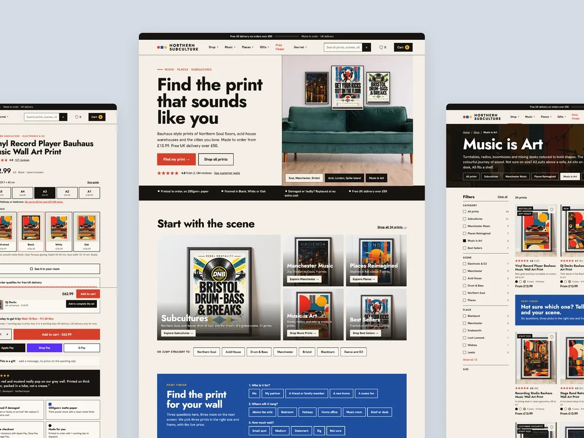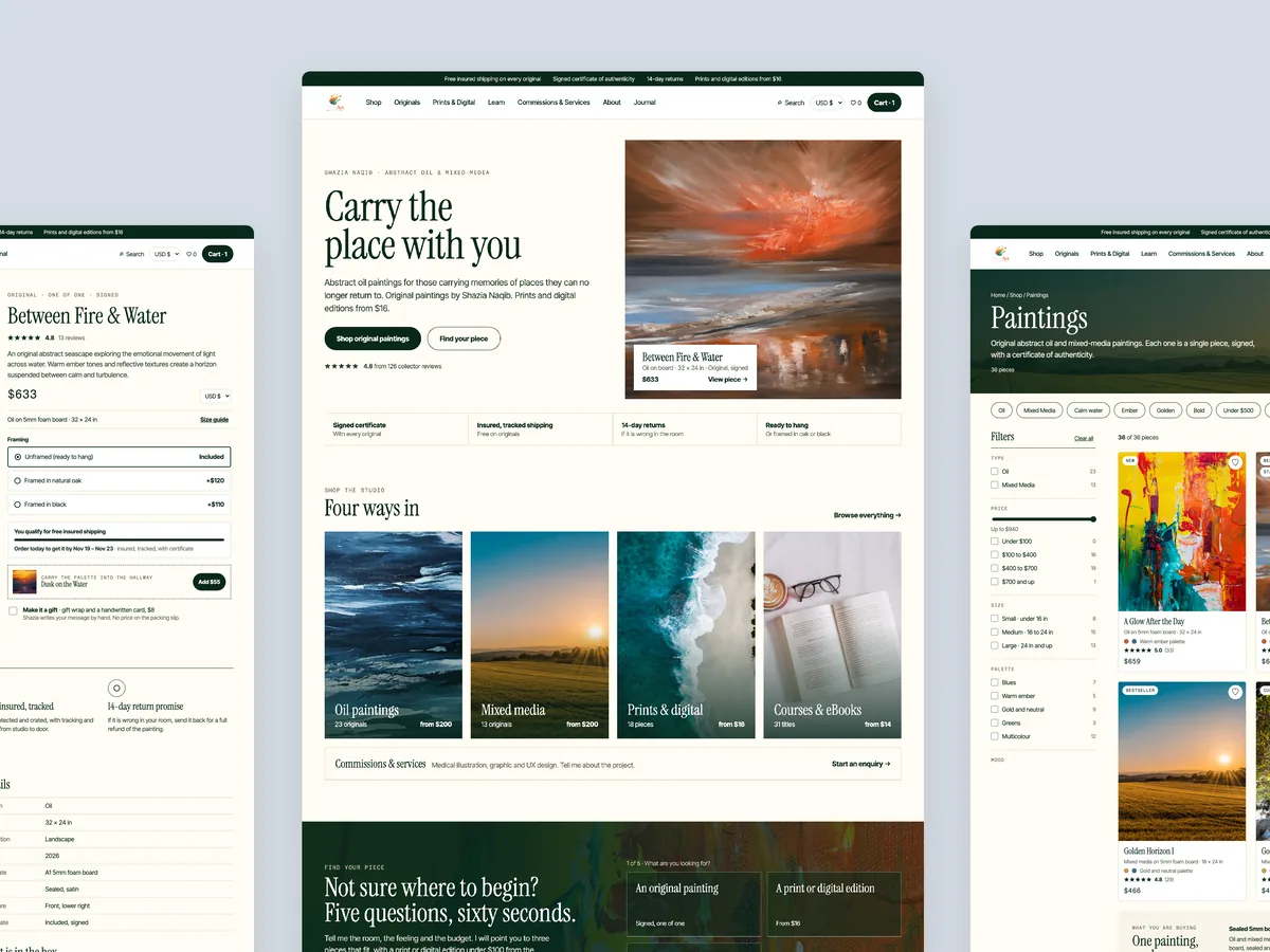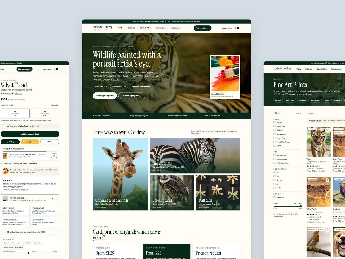
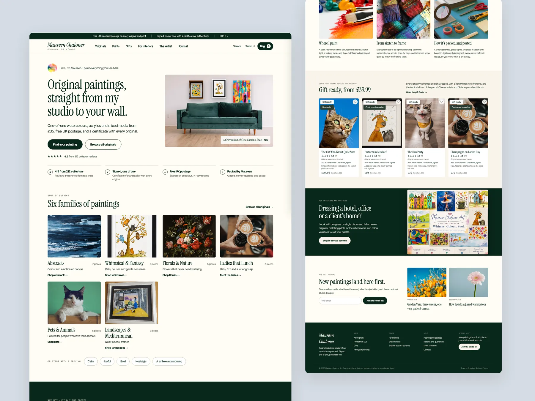
Homepage, two tall columns
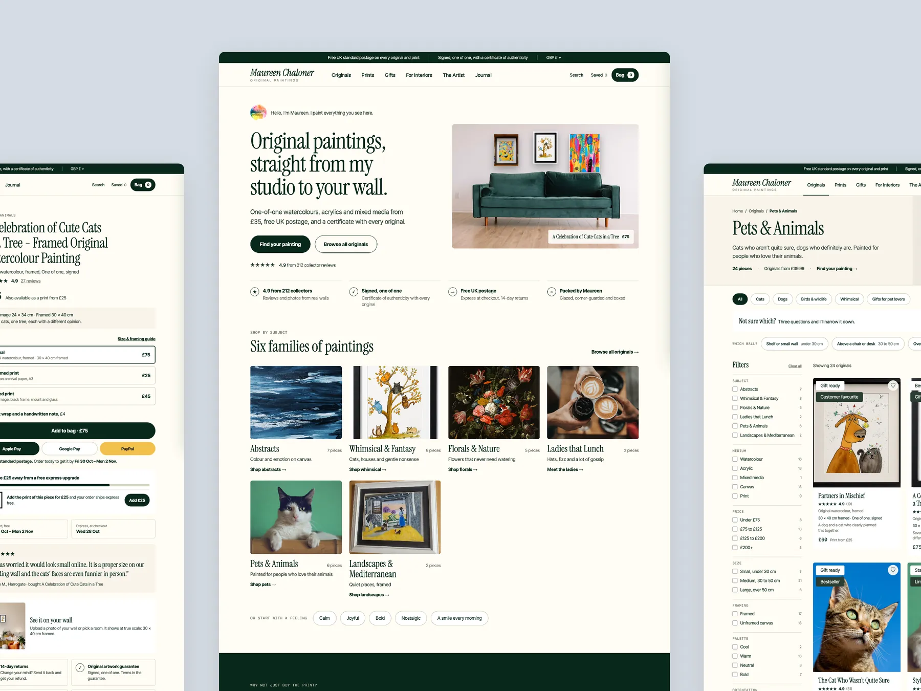
Homepage in two tall columns: the first screens on the left, the run down to the footer on the right.
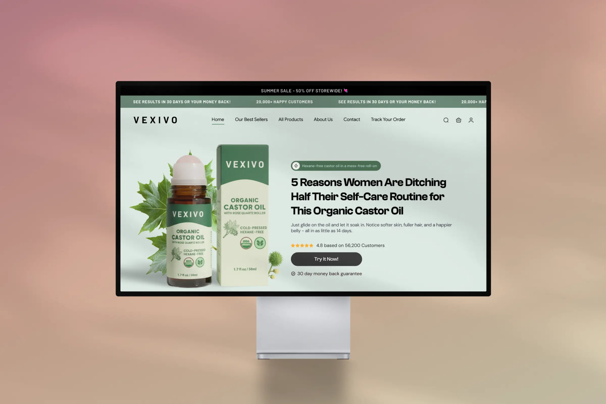
Storefronts we designed and built, across supplements, fragrance, health, wellness and skincare.
All 35 projectsFour engagements, measured before and after. What changed, why it changed, and by how much.
All case studiesDiagnosis, design and development from one studio — so the recommendation and the build never disagree.
All five services192 real Shopify stores torn down page by page, scored, and shown beside the version we would build. Free to watch.
Browse all teardownsConversion-first Shopify themes, each built for one industry’s buying journey. No required apps, no monthly theme fee, one licence per store.
See all themes Halden
Jewelry & Accessories
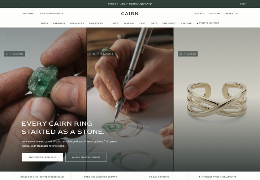 Cairn
Jewelry & Accessories
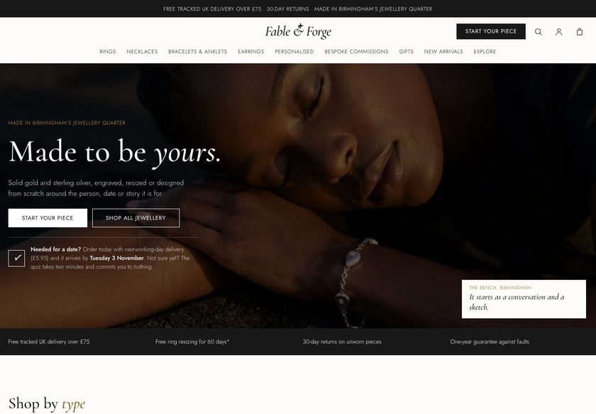 Fable & Forge
Jewelry & Accessories
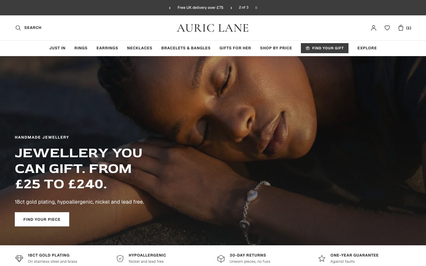 Auric Lane
Jewelry & Accessories
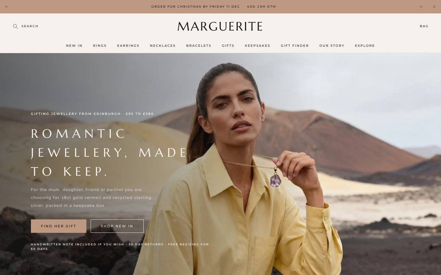 Marguerite
Jewelry & Accessories
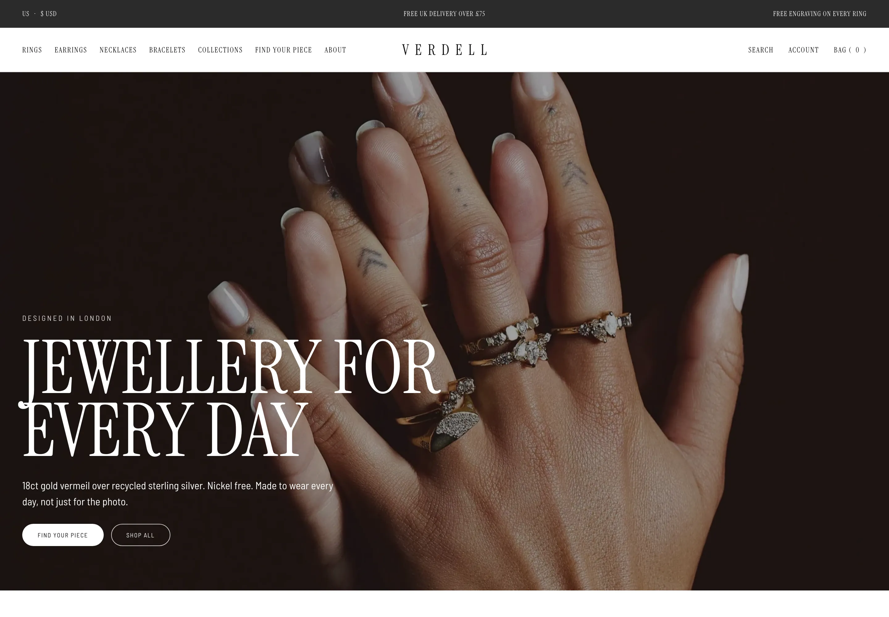 Verdell
Jewelry & Accessories
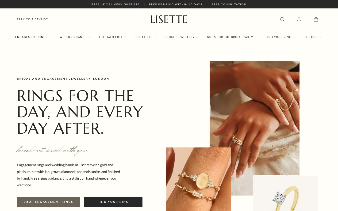 Lisette
Jewelry & Accessories
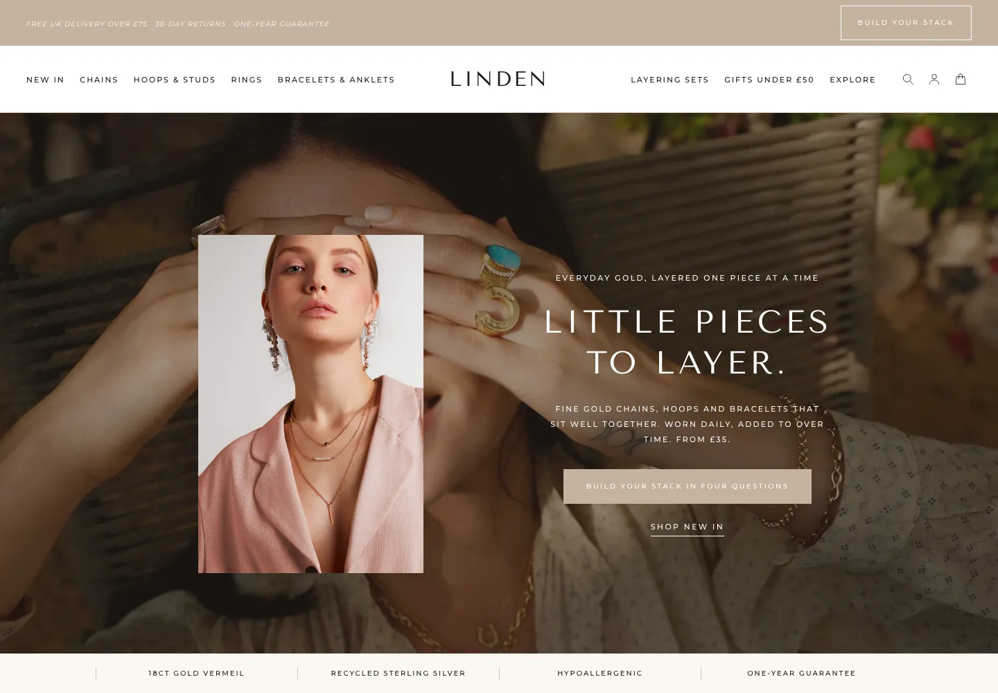 Linden
Jewelry & Accessories
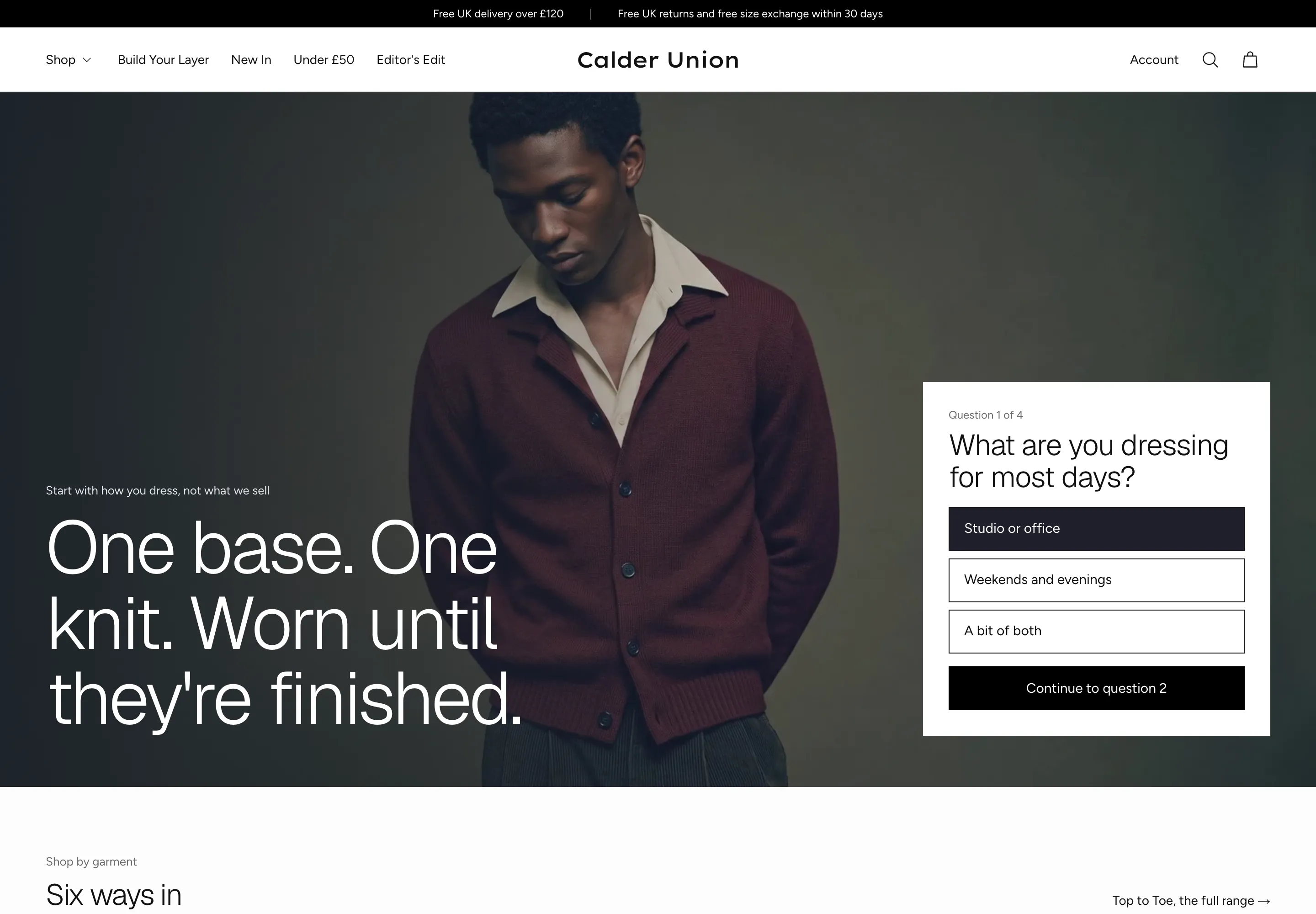 Calder Union
Clothing & Apparel
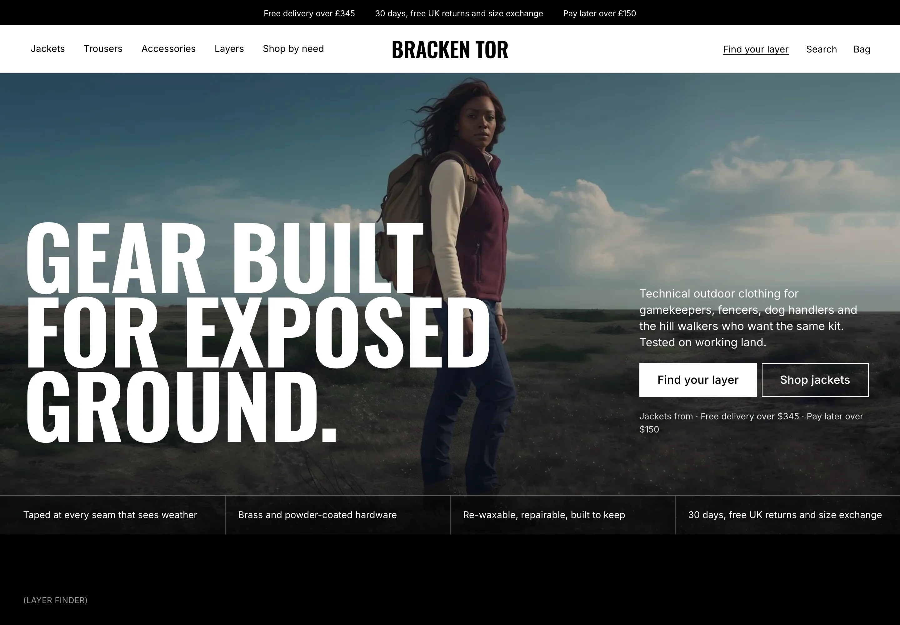 Bracken Tor
Clothing & Apparel
 Fellward
Clothing & Apparel
 Fenwell
Clothing & Apparel
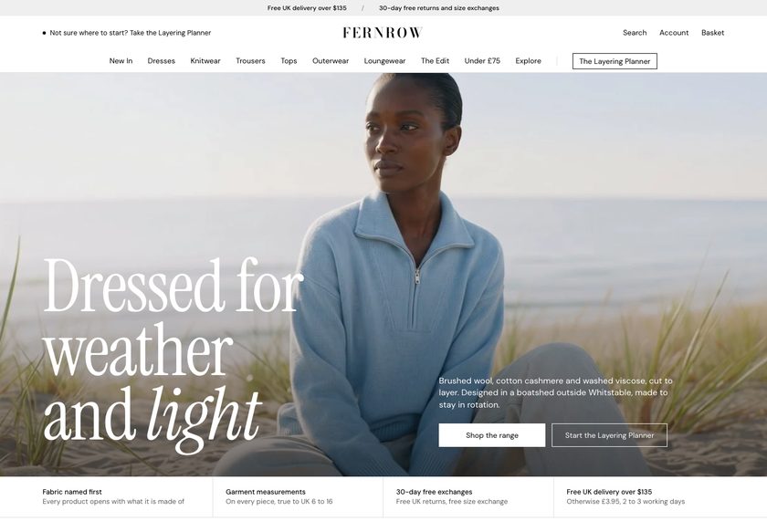 Fernrow
Clothing & Apparel
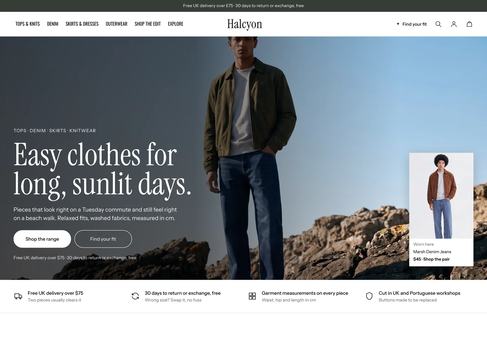 Halcyon
Clothing & Apparel
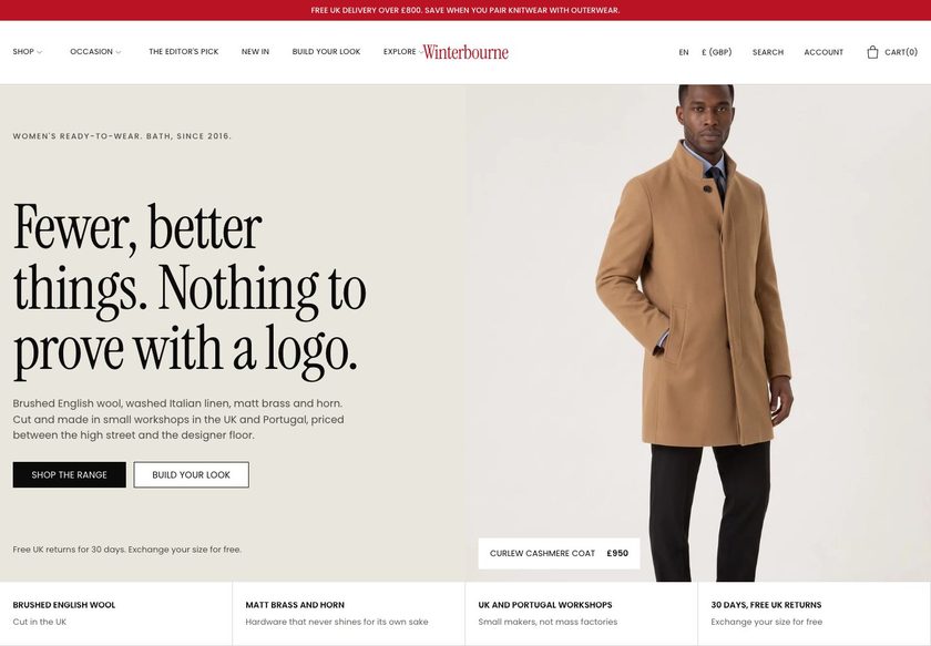 Winterbourne
Clothing & Apparel
 Scarp
Clothing & Apparel
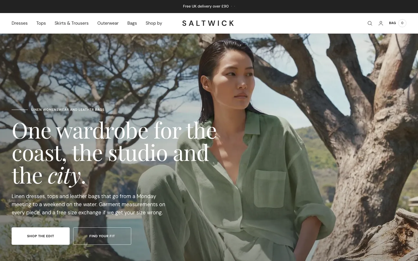 Saltwick
Clothing & Apparel
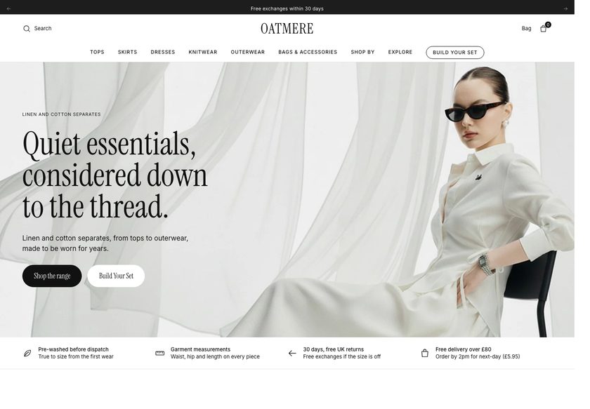 Oatmere
Clothing & Apparel
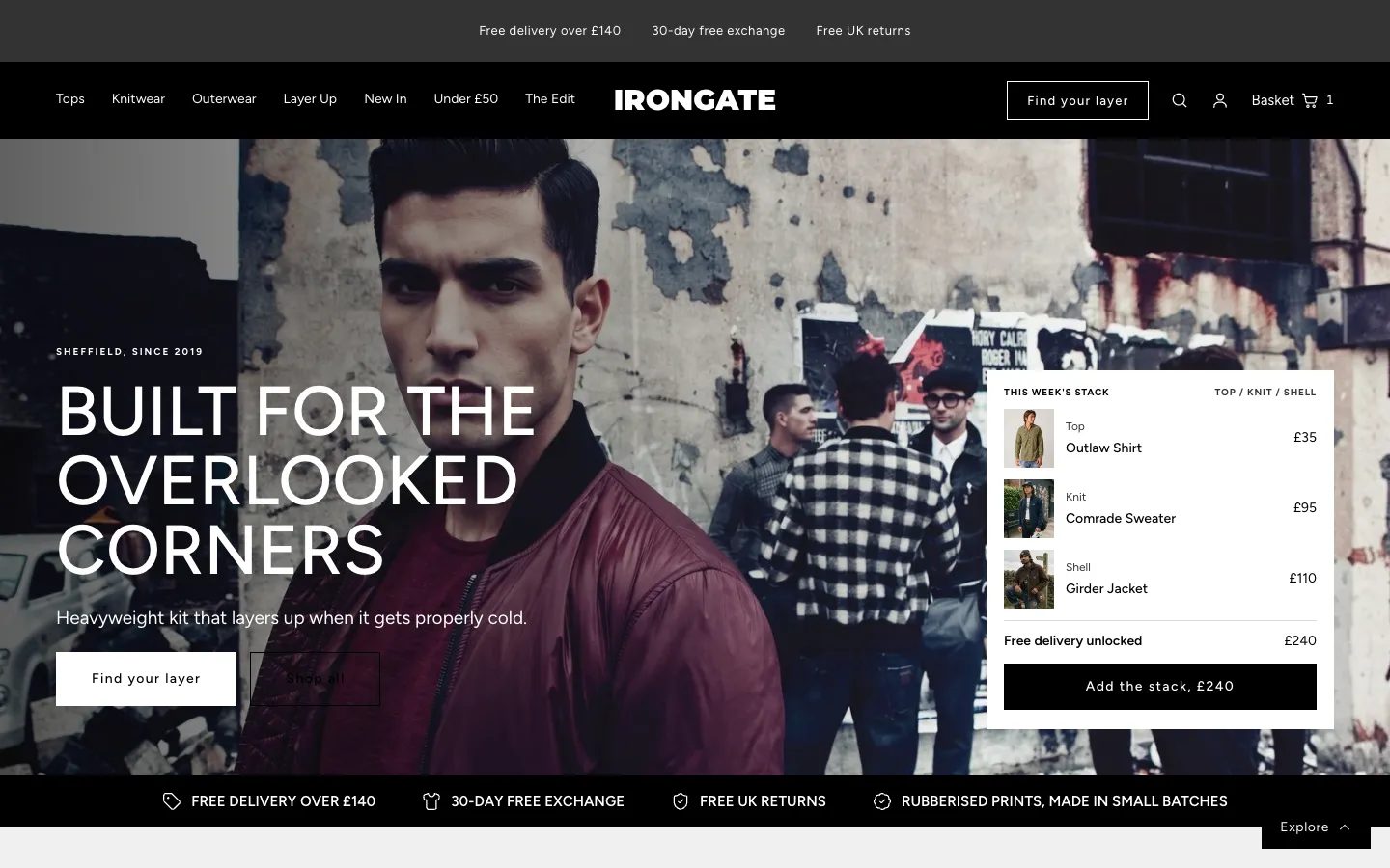 Irongate
Clothing & Apparel
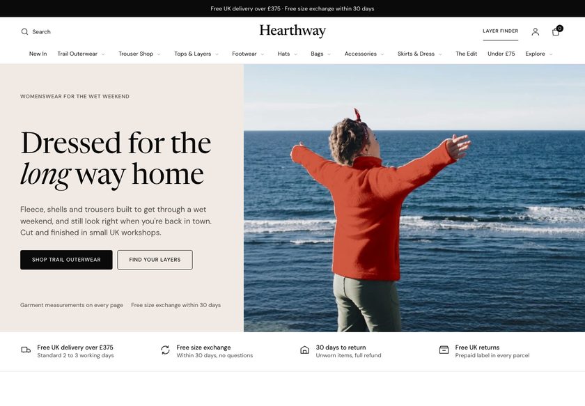 Hearthway
Clothing & Apparel
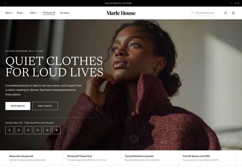 Marle House
Clothing & Apparel
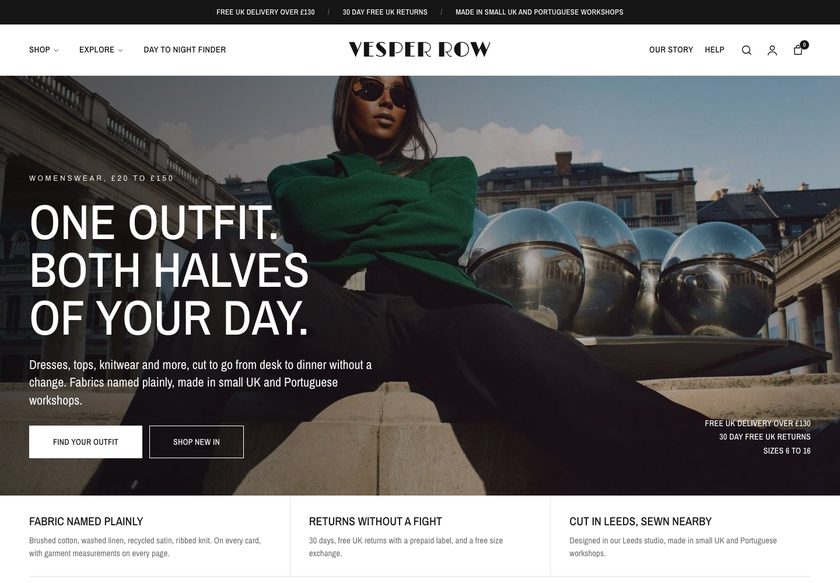 Vesper Row
Clothing & Apparel
A page by page CRO audit of Maureen Jones, a Shopify store selling original paintings and prints, covering the homepage, collection page and product page, plus a redesign concept built for conversion.
Pressing play loads the video from YouTube — you can allow it for every teardown under cookie preferences.
Maureen Jones sells original handmade paintings and prints, and the work itself is not the weak point. The catalog is broad, covering wildlife, florals, abstract and whimsical subjects. The store also gives delivery information and offers price sorting on the collection page, so the foundations of a considered shop are already there.
The core problem is that the presentation layer is fragmented. A visitor lands on a hero that does not say who the art is for or whether other collectors trust the shop, then scrolls past a grid of images, names and prices. Nothing says where to go next, so the store behaves like an inventory list and leaves the visitor to do every job alone.
The same gap repeats further down. Collection cards show only an image, a name and a price, so shoppers must open many product pages to compare. The product page has no reviews, no painting dimensions and no returns or condition information, and its You May Also Like block hands the choice back to the visitor. Nothing pairs pieces to lift order value.
The direction is a guided gallery. Navigation by subject, room, price and gifting, a short painting finder, richer cards, reviews, size and returns answers and paired pieces replace the catalog feel. The visitor already arrives with intent, and the site's job is to turn that intent into a sale. Buying should never be the visitor's job to figure out.
The site behaves like a catalog. Visitors see paintings, names and prices but get no guided path, no reviews and no dimensions, so each buyer must work out alone whether a piece is right for their home.
Turn the catalog into a guided gallery: a painting finder, navigation by subject, room and price, comparable product cards, visible reviews and paired pieces that help a visitor with real intent reach a decision.
More of the visitors already arriving should feel confident enough to buy, and orders should grow in value through paired paintings. Conversion improves as hesitation falls, without needing extra traf
Five dimensions, each scored out of ten.
12 issues found, 14 fixes proposed.
The homepage hero signals original art by feel alone. It does not say who the paintings are for or whether other collectors trust the shop, so a first time visitor has to guess.
There are no reviews, no happy customer evidence and no sign that people have bought before. For paintings priced up to around 175, that leaves the safety of buying unanswered.
Scrolling the homepage gives a run of paintings with names and prices but no direction on where to go next or which piece suits the visitor. It behaves like an inventory.
Collectors expect to browse by category, subject or bestsellers, such as wildlife or florals. That structure is not offered on the homepage, so exploring takes effort.
The price sorting is a good start, but below it the sorting is the default Shopify set. There are few categories and no richer ways to narrow a large range of paintings.
Cards show an image, a name and a price. Shoppers cannot compare pieces without opening many product pages, and many will leave in frustration before finding the right one.
Reviews are absent across the whole site and the gap costs most on the product page, where the decision is made. Nothing shows that buying is safe or that buyers are satisfied.
Without dimensions, a buyer cannot picture the piece on their wall or judge whether it is small or large. Size is a core question for any artwork and it goes unanswered.
Delivery is covered, which helps, but returns and the condition the painting arrives in are not. Those are the questions that tend to decide a hesitant buyer.
The You May Also Like block hands the decision back to the visitor. It gives no reason to choose one piece over another and does not help complete a room.
Nothing pairs paintings or builds a look for a living room or lounge. A visitor who likes cats is not shown a matching jungle or tiger piece, so each order stays at one painting.
A wall preview option appears on the product page, but clicking it does nothing and never asks the visitor to add an image. They are left lost at a key moment.
State what the shop sells, who the paintings are for and why collectors trust it, with signed, original and free UK postage packed by the artist visible at first glance.
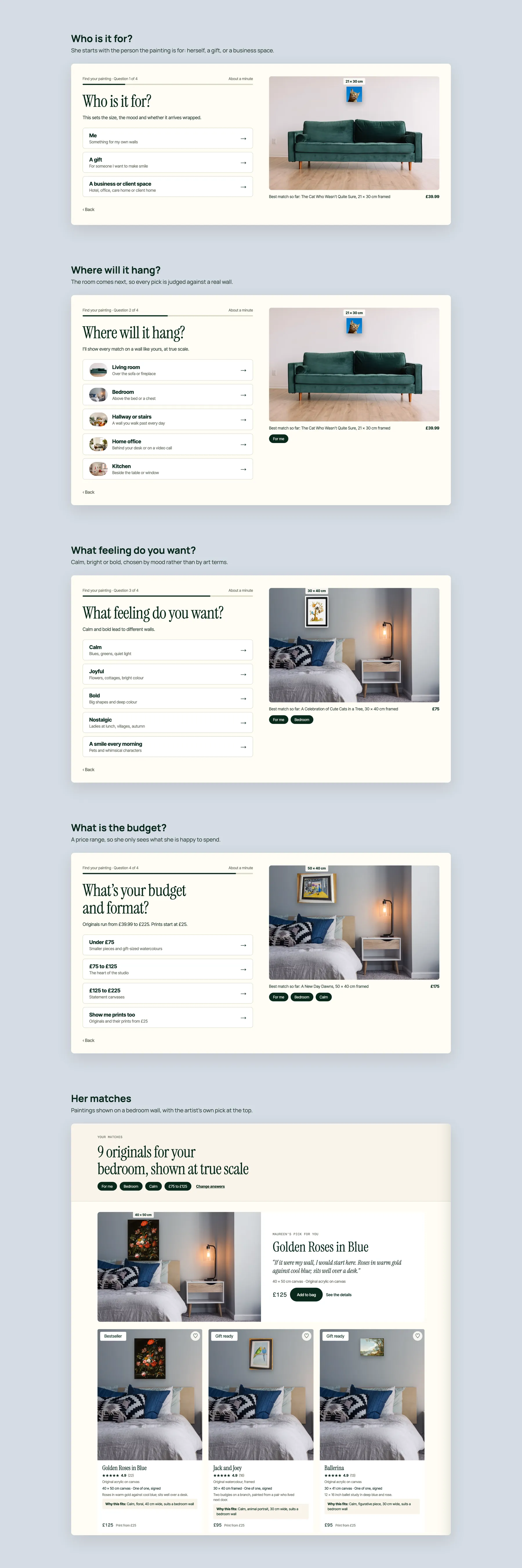
Place a short question flow in the hero asking about room, mood and budget, then recommend matching paintings, like a gallery host asking how they can help.
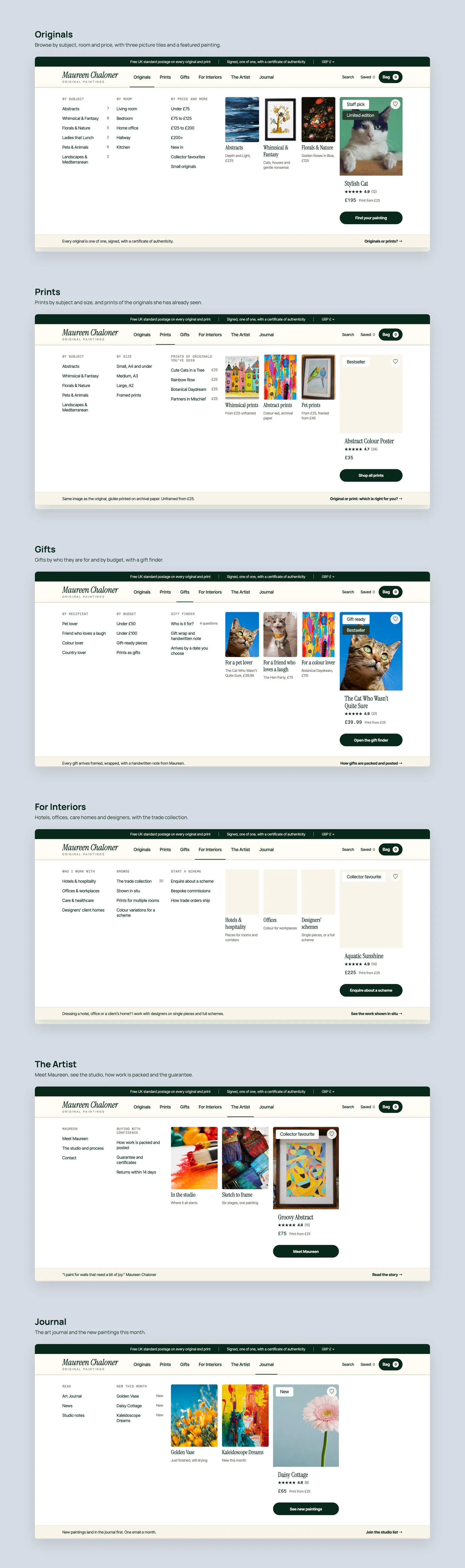
Build menus for originals and prints by subject, room, price and size, with separate gifts and artist sections, so every visitor can start from the route that suits them.
Add gifts organised by recipient, budget and occasion, with gift ready pieces, so shoppers buying for someone else are given a path and a reason to buy.
Show star ratings on cards and product pages, and add a collector section with real photos of paintings in homes alongside what buyers say about them.
Add collections such as abstract, whimsical and fantasy, and floral and nature, plus bestseller, customer favourite and staff pick rows, so browsing has clear entry points.
Offer filters for subject, medium, price, size, framing, palette and orientation, with a short description and piece count at the top of each collection.
Add badges such as gift ready, bestseller and limited edition, plus ratings and the key facts needed to compare, so shoppers can decide without opening every page.
State painting sizes clearly on every product page and add a size guide, so buyers can judge how a piece fits their wall before they commit.
Add clear returns terms, a certified original note, secure checkout, how the painting is packed, and care and hanging advice close to the buy button.
Make the preview work and let visitors add a photo of their own wall, so they can see how a piece looks in their room before they buy.
Let buyers choose the original, an unframed print or a framed print on one page, with gift wrap and a gift note, and explain the honest difference between them.
Offer pre built pairs that complete a wall, such as a cat painting with a jungle piece, and add a progress bar toward a free express upgrade to lift order value.
Tell the story behind each piece to justify its price, add answers to common questions, and give offices and clients an enquiry option for something customised.
A concept redesign created by Convertica Studio from this audit. It shows how the store could work, it is not the live store.
Homepage in two tall columns: the first screens on the left, the run down to the footer on the right.
Three pages side by side: the product page, the homepage and a collection page.
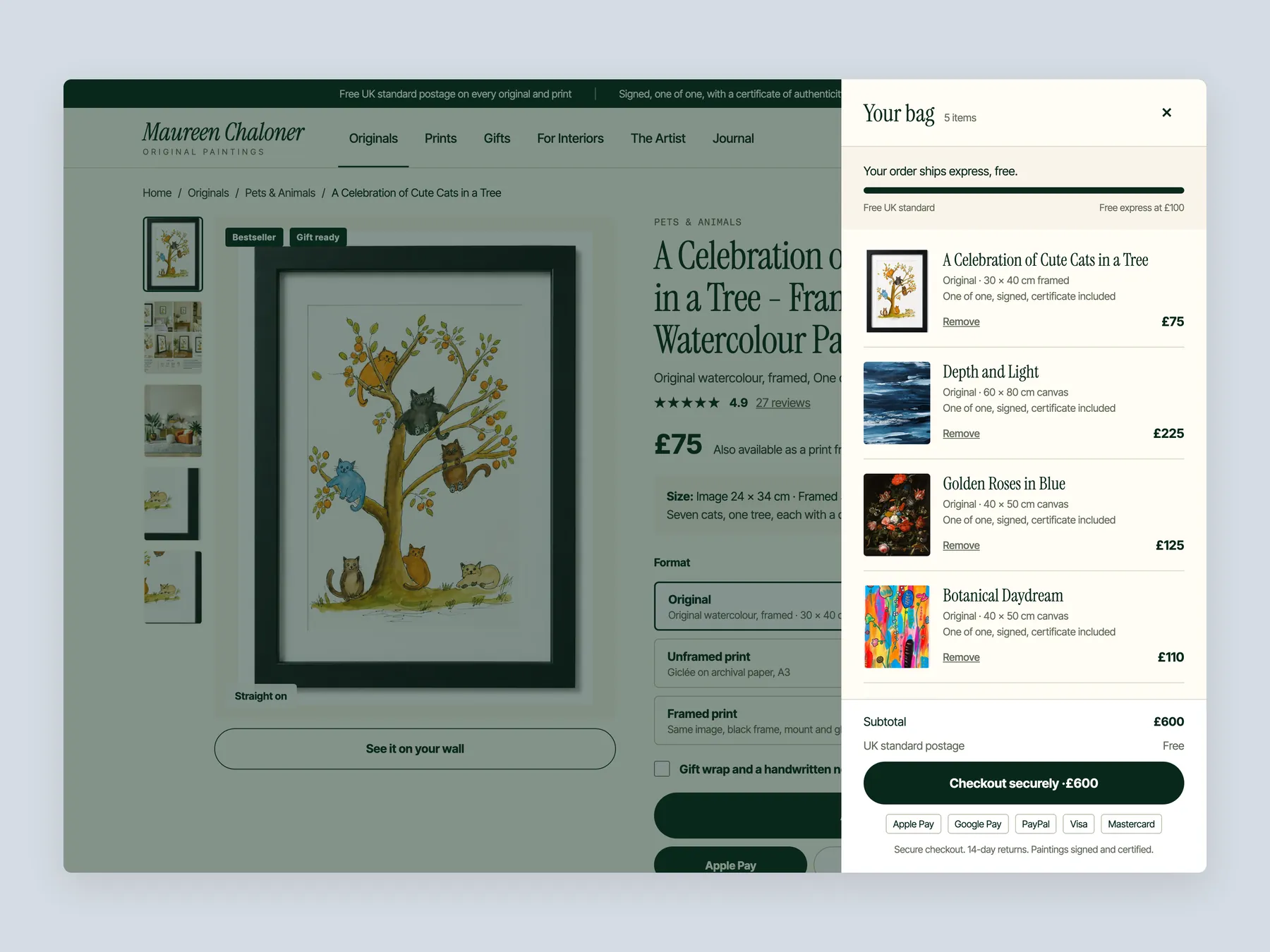
The bag slide-over open over the product page, so the whole drawer is visible from top to bottom.
The Find Your Painting quiz, step by step: who it is for, where it will hang, the feeling and the budget, ending on matches shown on a bedroom wall.
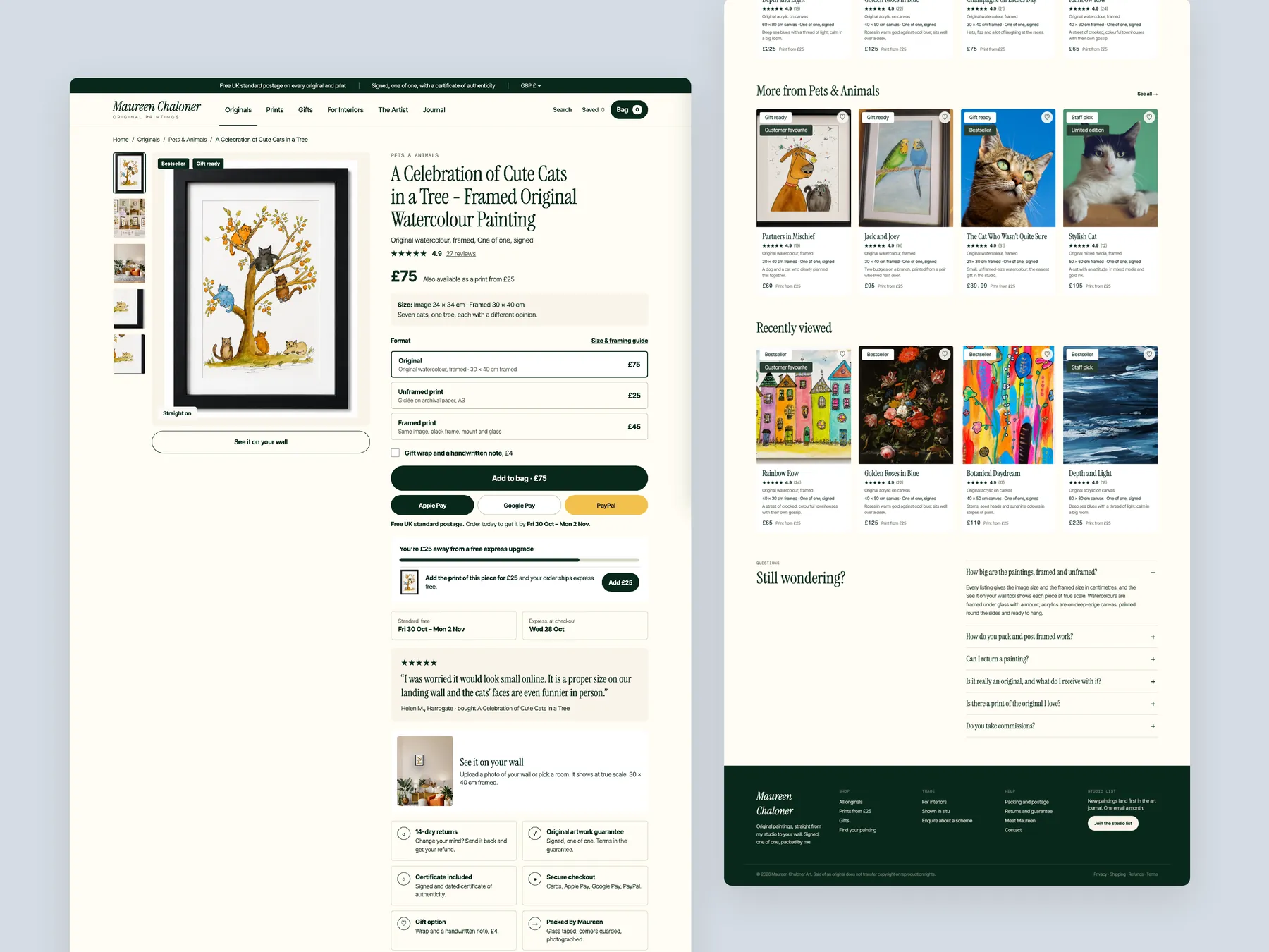
The product page in two tall columns, with the buy box whole on the left and the footer on the right.
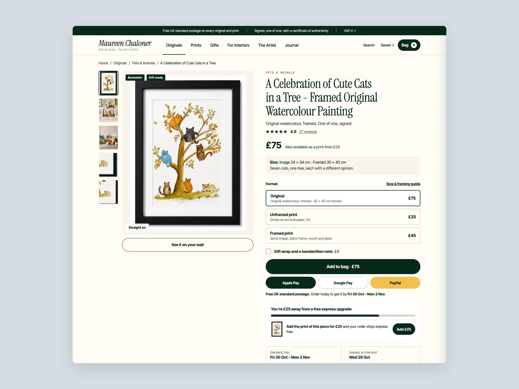
The product page first screen: header, gallery and the buy box with format choices, price and delivery.
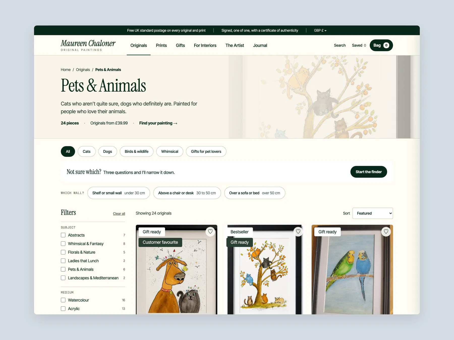
The collection page first screen: header, filters and the first row of paintings.
The mega menu, one screen per nav item: Originals, Prints, Gifts, For Interiors, The Artist and Journal.
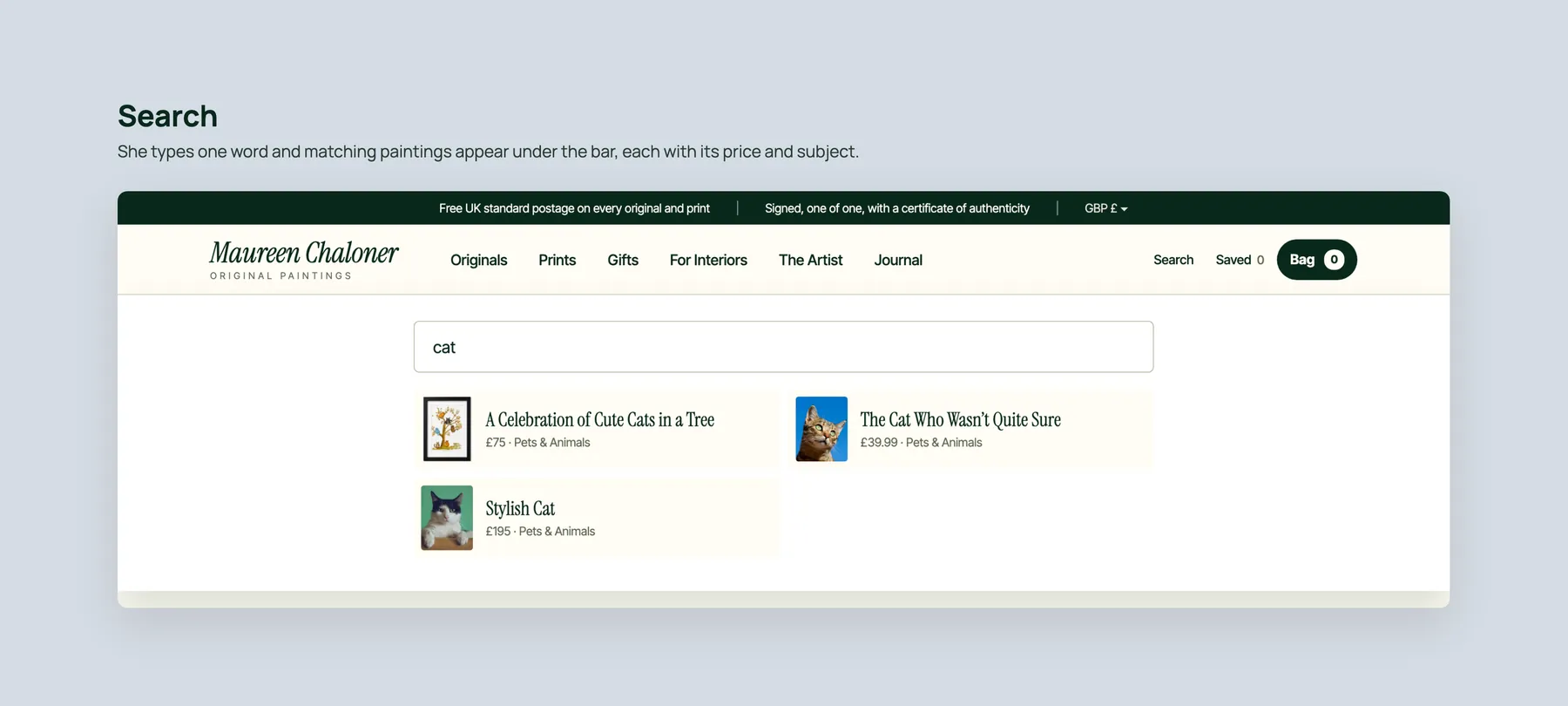
Search: a word typed in the bar and matching paintings appearing under it with price and subject.
Three phone screens: home, collection and product, staggered left to right.
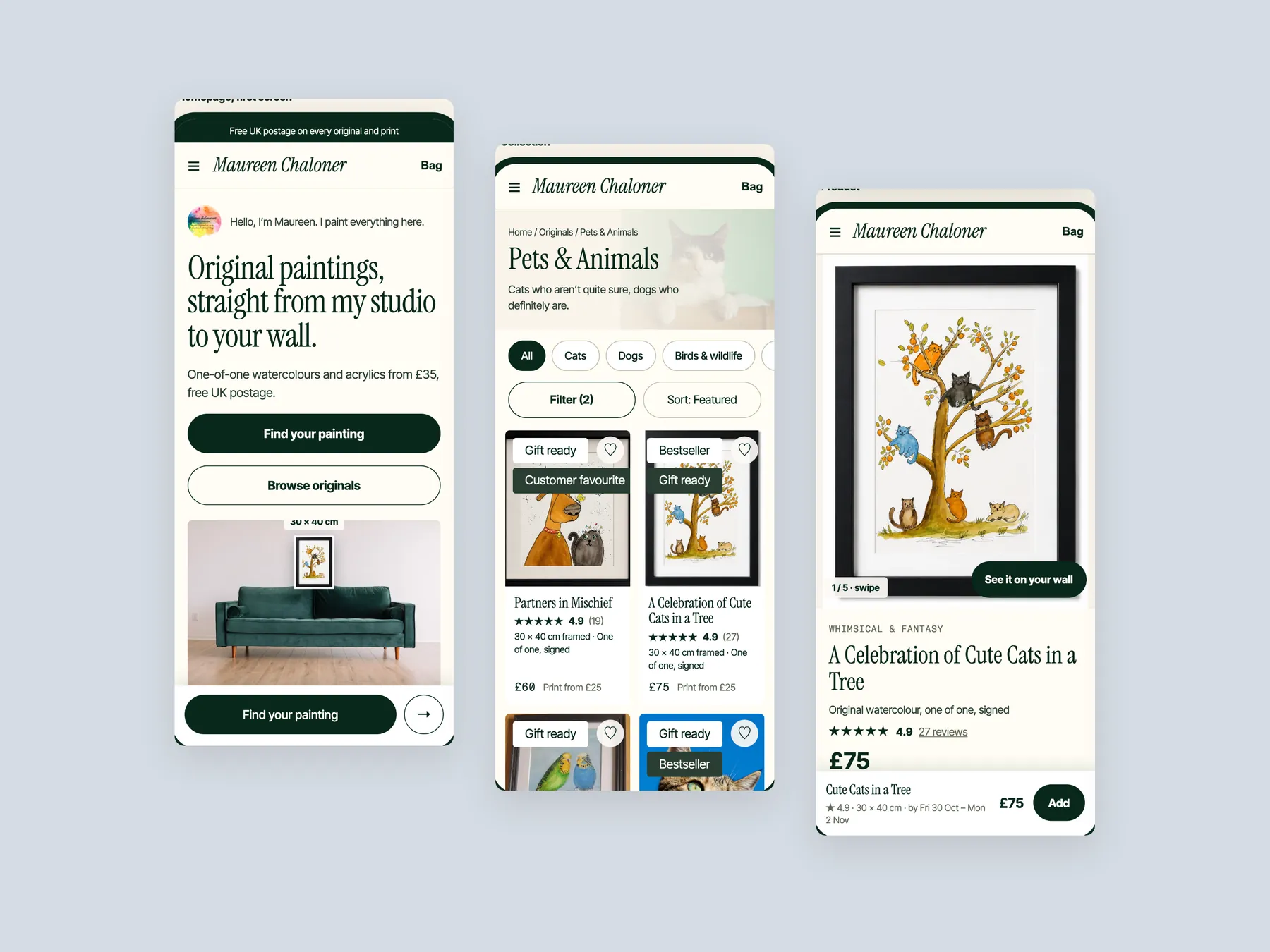
The paintings are strong and visitors already arrive with intent. The site does not help them decide, so adding traffic would send more people into the same hesitation. Fixing confidence and guidance first makes every later visitor worth more.
Visitors see a grid of paintings with names and prices, and nothing more. There is no suggestion of where to go next or which piece suits them. A guided store narrows the choice for the visitor.
Original paintings are a considered purchase, and a buyer needs proof that others have bought safely and been happy. The site currently shows no reviews anywhere, so the question of whether it is safe to buy goes unanswered.
It should say what the shop sells, who it is for and why collectors can trust it. Signals such as signed originals and free UK postage, packed by the artist, answer those questions quickly. Two clear buttons then point the visitor onward.
It asks a few short questions, such as the room, the mood and the budget, and recommends matching pieces. That mirrors a gallery host helping a visitor in person. The shopper gets a short list instead of a long grid.
Each card should show a clear image, the name, the price, a rating and badges such as bestseller or gift ready. It should also carry the key facts needed to compare. This lets shoppers choose without opening many pages.
Reviews, painting dimensions, and information on returns and the condition a painting arrives in are all missing. Delivery is already covered, which is a good base to build on. A working wall preview would also help buyers picture the piece at home.
By pairing paintings that complete a room, such as a cat painting with a jungle piece, and by showing pre built pairs. A progress bar toward a free express upgrade can also encourage a second item. The aim is two paintings for one buyer.
Many visitors may be buying for someone else, or could be nudged to. Gifts organised by recipient, budget and occasion give them a path. It also plants the idea of gifting in visitors who came for themselves.
No. The paintings and the artist's identity stay at the centre. The redesign changes how the pieces are presented, organised and explained, and adds an artist section that tells the story behind the work.
The recording quotes a timeline of four weeks for the full project. It also outlines lighter options, including improving the three existing pages or installing the conversion focused theme independently. The next step suggested is a strategy call.
The audit reviews the homepage, the collection page and the product page of the current site, then walks through a redesign concept for each. It also covers a revenue calculator, project options and next steps. The video runs for 29 minutes.
Tell us about your store and we'll send a personalized 5-minute video showing exactly where you're losing buyers — and how to win them back.
Takes about 40 seconds. No call required.