
Homepage
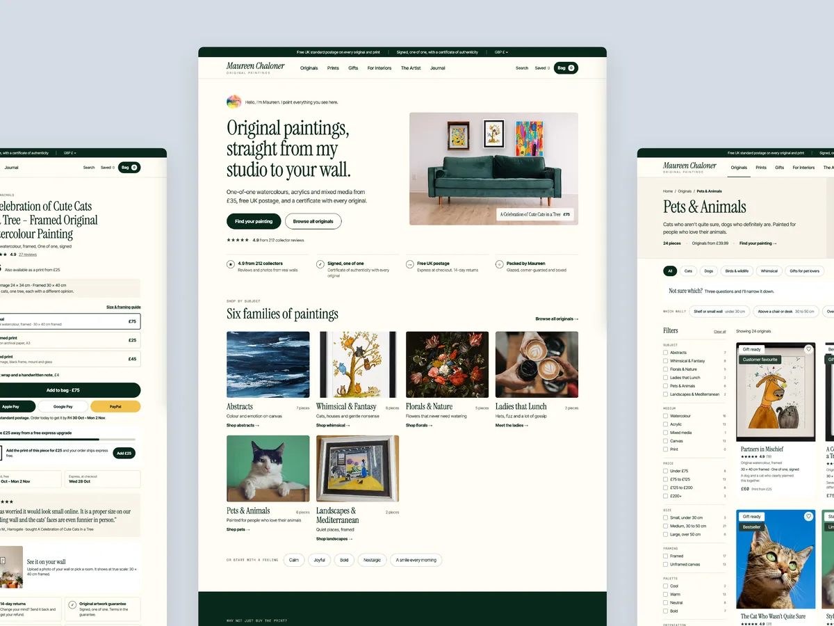
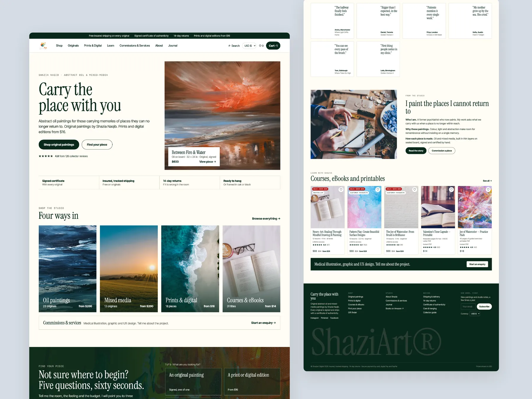
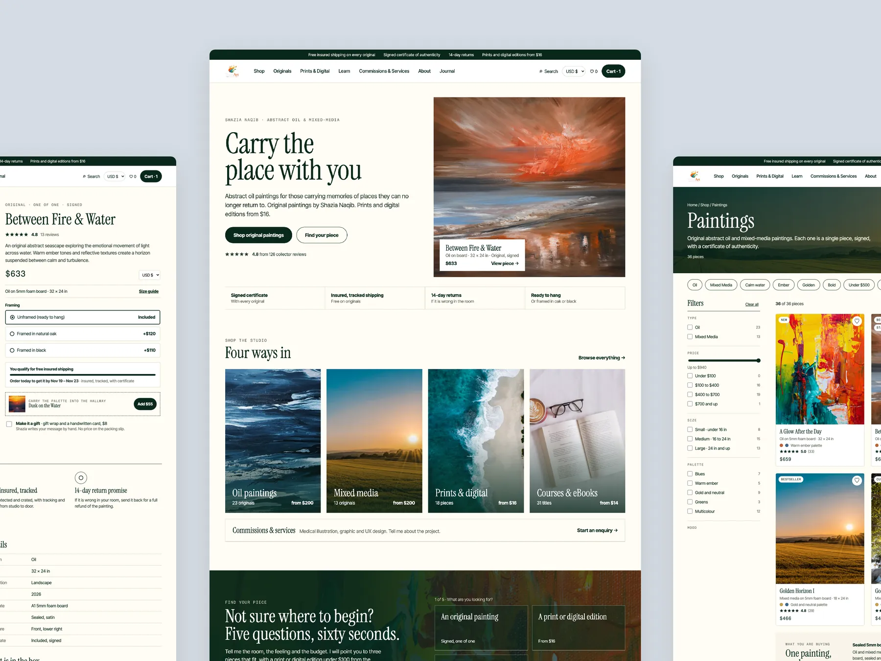
The whole page as two tall columns: a painting-led first screen, the ways in, and a footer that carries the promise of signed, insured originals.
Storefronts we designed and built, across supplements, fragrance, health, wellness and skincare.
All 35 projectsFour engagements, measured before and after. What changed, why it changed, and by how much.
All case studiesDiagnosis, design and development from one studio — so the recommendation and the build never disagree.
All five services192 real Shopify stores torn down page by page, scored, and shown beside the version we would build. Free to watch.
Browse all teardownsConversion-first Shopify themes, each built for one industry’s buying journey. No required apps, no monthly theme fee, one licence per store.
See all themes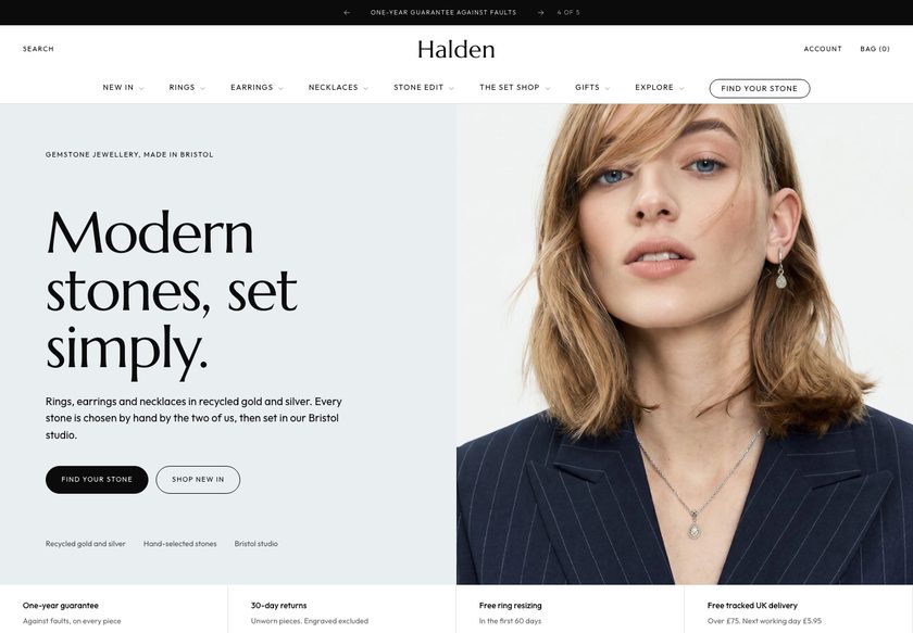 Halden
Jewelry & Accessories
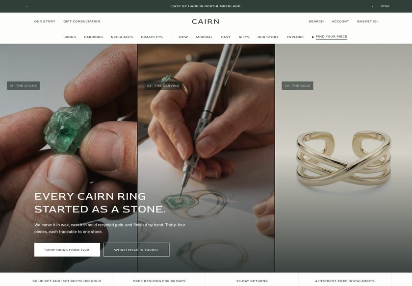 Cairn
Jewelry & Accessories
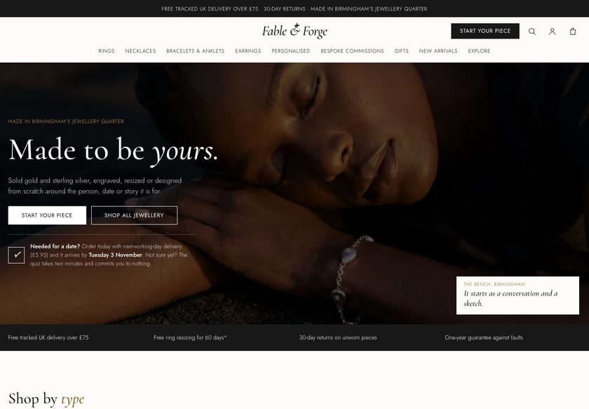 Fable & Forge
Jewelry & Accessories
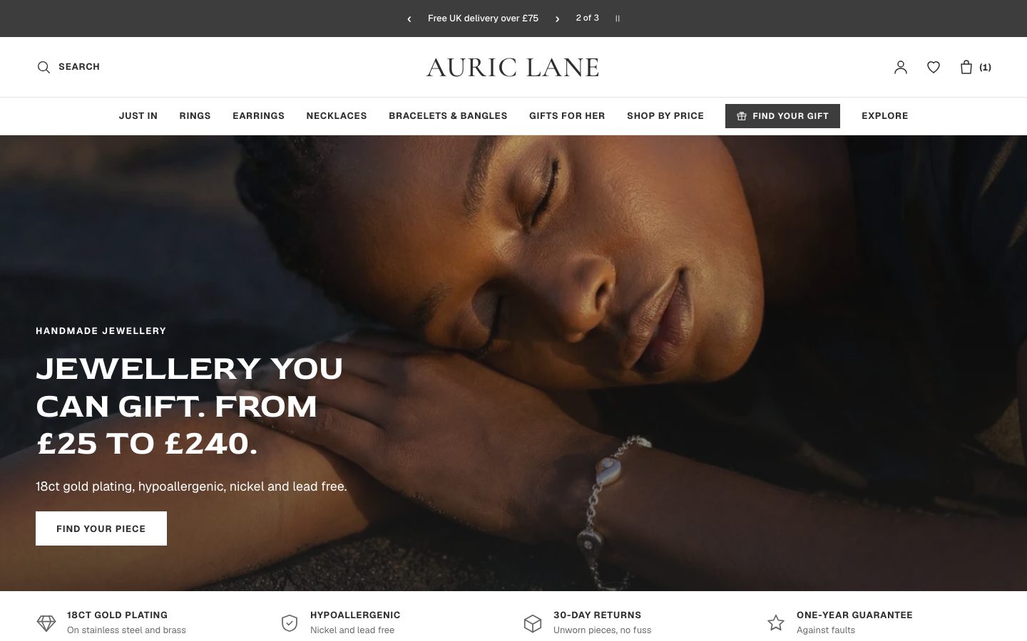 Auric Lane
Jewelry & Accessories
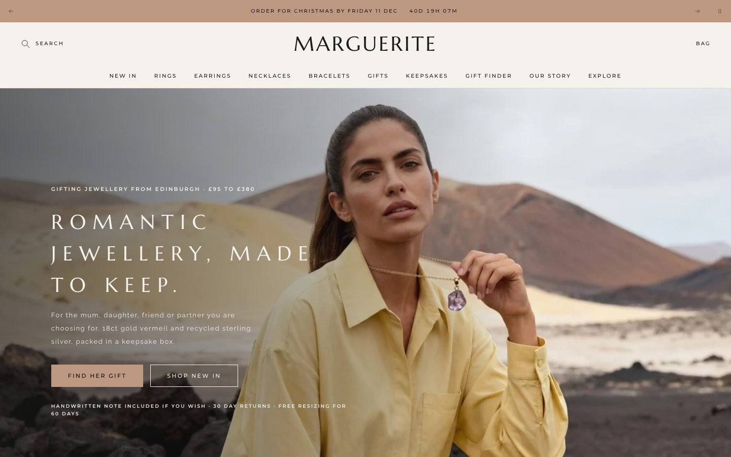 Marguerite
Jewelry & Accessories
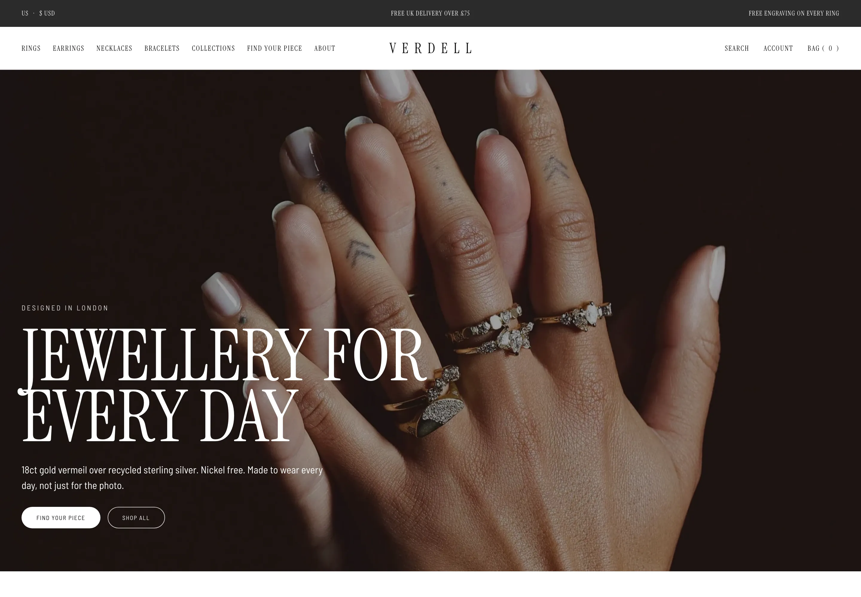 Verdell
Jewelry & Accessories
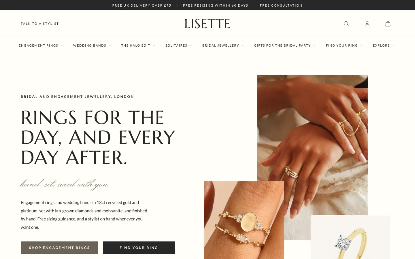 Lisette
Jewelry & Accessories
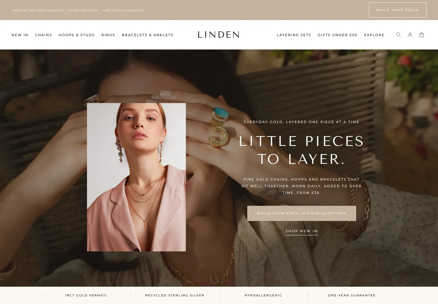 Linden
Jewelry & Accessories
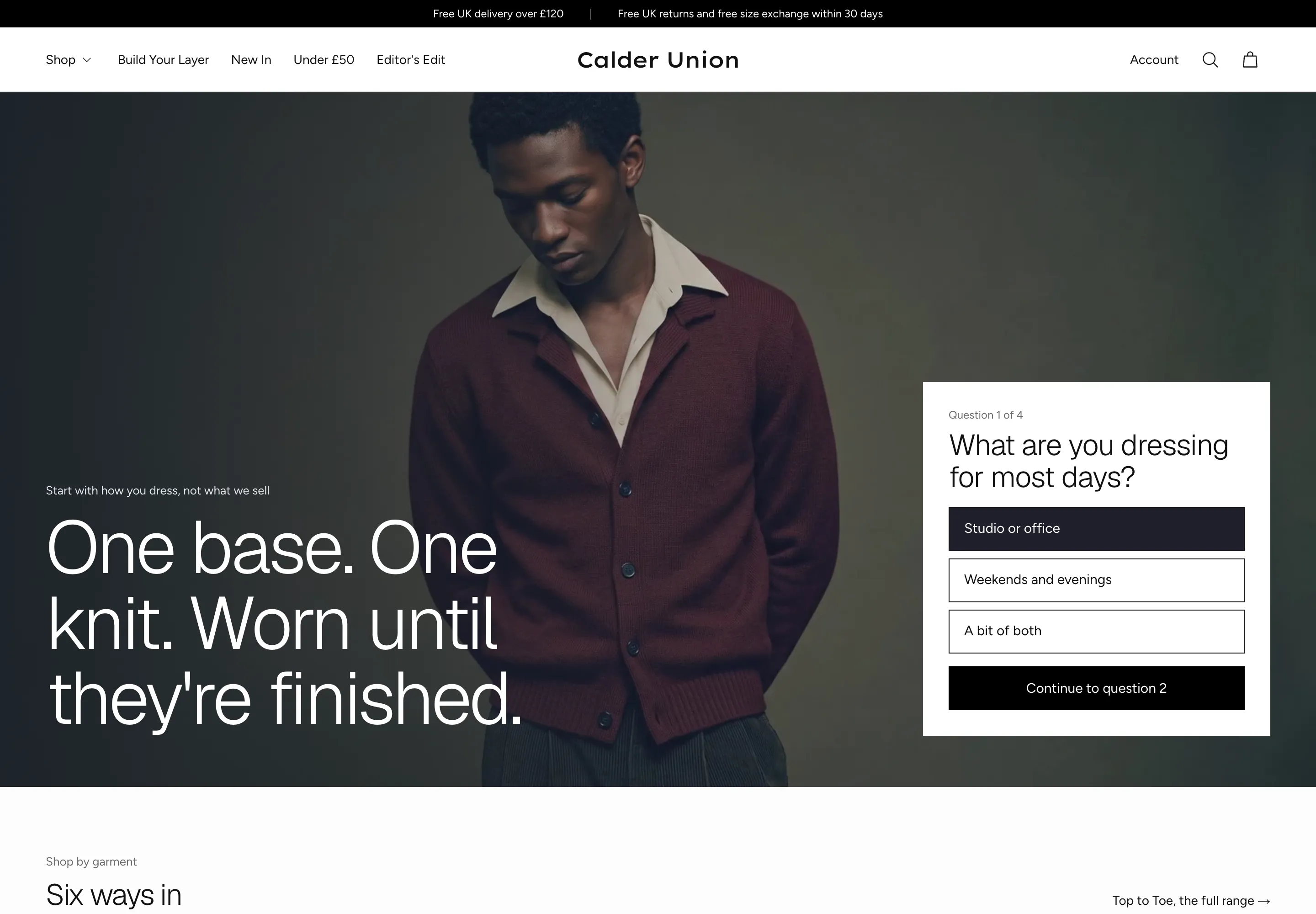 Calder Union
Clothing & Apparel
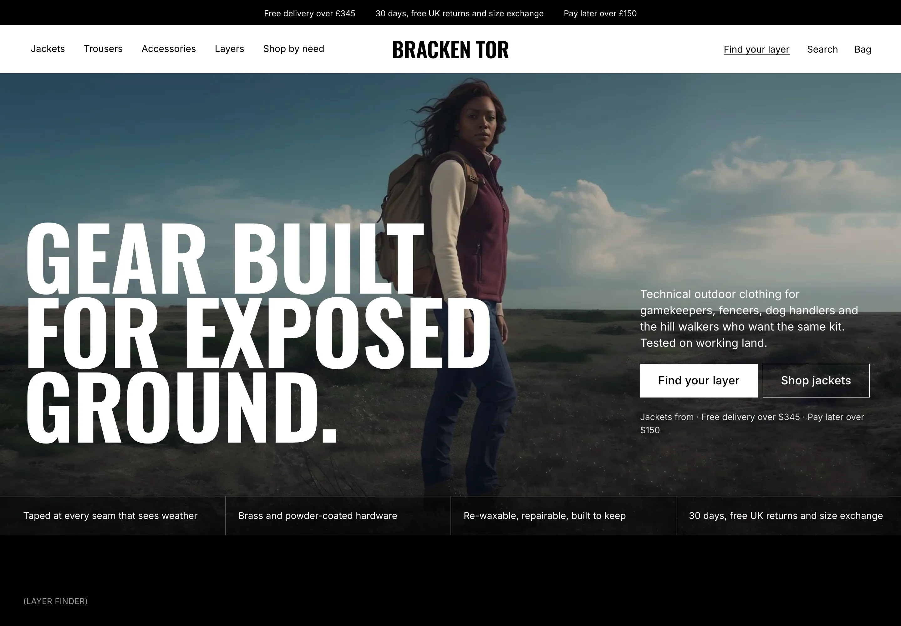 Bracken Tor
Clothing & Apparel
 Fellward
Clothing & Apparel
 Fenwell
Clothing & Apparel
 Fernrow
Clothing & Apparel
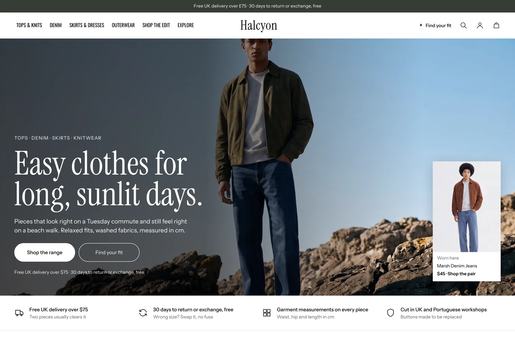 Halcyon
Clothing & Apparel
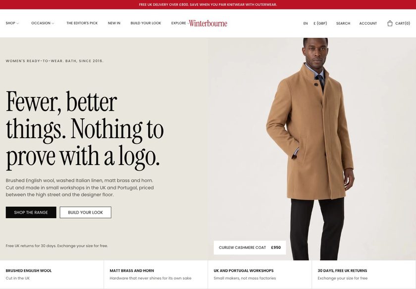 Winterbourne
Clothing & Apparel
 Scarp
Clothing & Apparel
 Saltwick
Clothing & Apparel
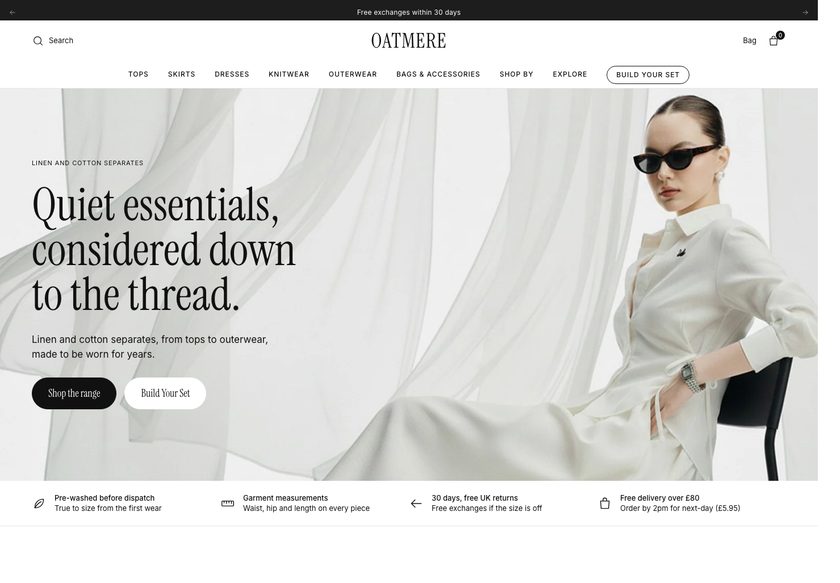 Oatmere
Clothing & Apparel
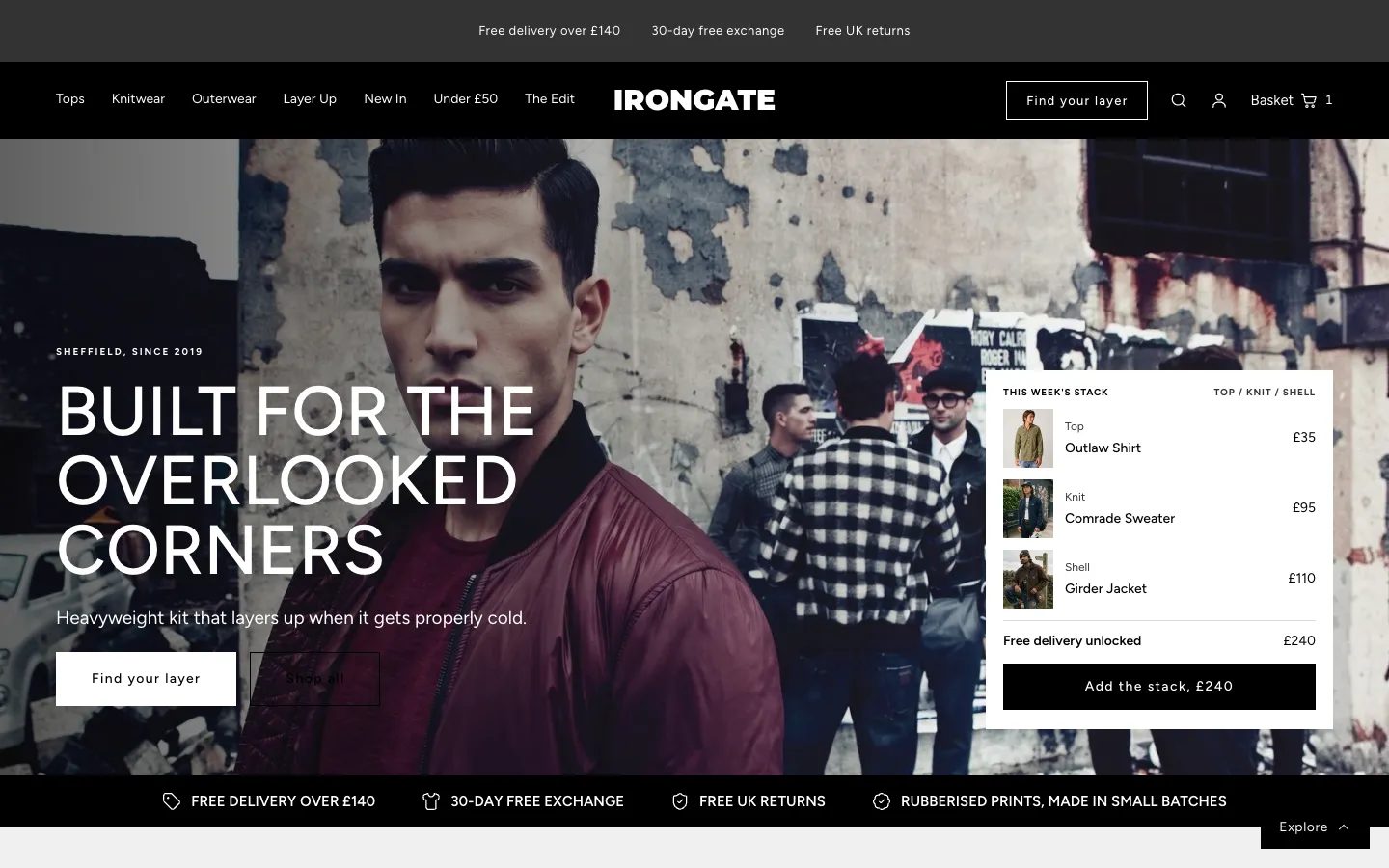 Irongate
Clothing & Apparel
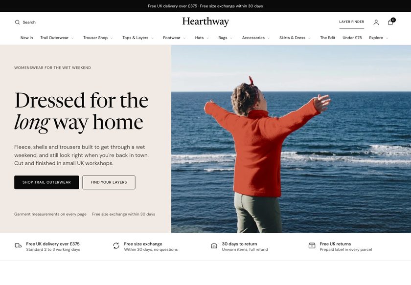 Hearthway
Clothing & Apparel
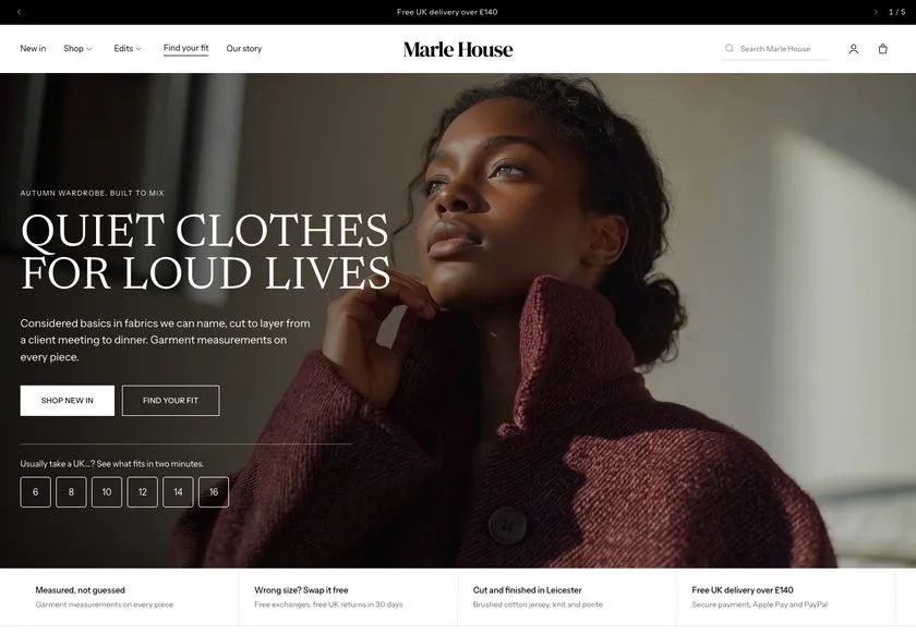 Marle House
Clothing & Apparel
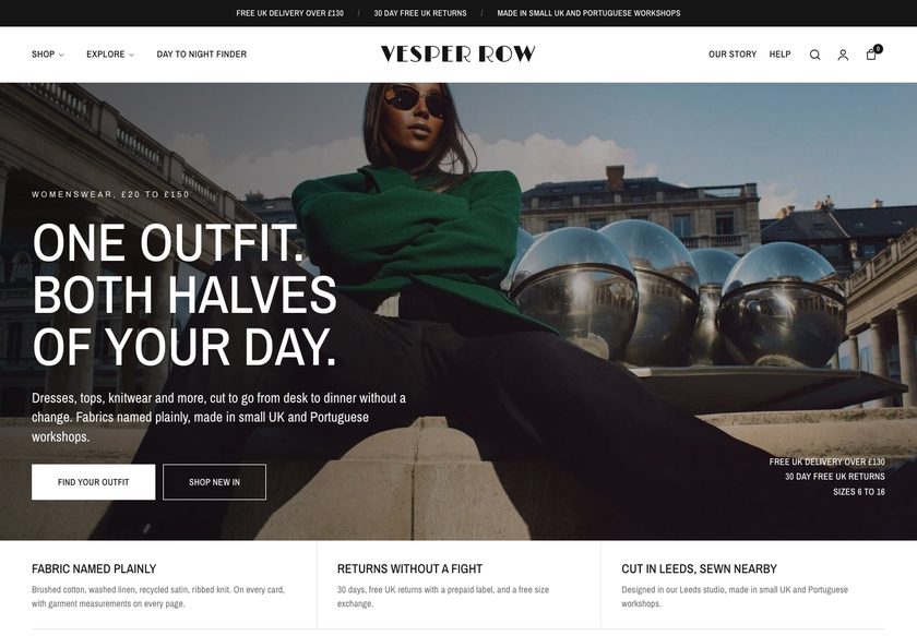 Vesper Row
Clothing & Apparel
A page by page CRO teardown of an original painting store, covering the homepage, the Original Paintings collection page and a product page, with a redesign concept for each of the three.
Pressing play loads the video from YouTube — you can allow it for every teardown under cookie preferences.
ShaziArt sells original oil paintings, mixed media work, prints, digital pieces and courses, and the work itself is strong. From the imagery and the name, a visitor can tell this is art for collectors. The range suits different rooms and budgets, and the store already has real customers who have left kind words about their purchases.
The problem is not the art. It is the website layer around it. The homepage hero does not say who the art is for or why a collector should trust the brand, and the navigation lists gallery, store and services without saying what sits under art or photo. A visitor arrives with intent and is given no clear first step.
The same gap repeats further down. The Original Paintings page works like a catalogue, with a picture, a name and a price, and no sorting, categories or cues to tell the pieces apart. The product page gives a name, a price and a description, but not size, framing, delivery, returns, secure checkout or reviews, so the price is never justified.
The direction is a guided buying experience. A hero that answers the basic questions, navigation organised by medium, budget, size and room, a short piece finder, richer product cards, and a product page that answers every purchase question beside Add to Cart. Help the visitor choose, and the art does the rest.
The site shows art but does not guide a buyer to the right piece. Navigation, collection cards and product pages leave out the size, framing, delivery, returns and reviews a careful collector needs.
The store could behave like a gallery host that asks what a visitor wants, recommends a piece, backs the price with reviews and clear answers, and offers a frame or a second piece at the point of purchase.
More visitors reaching product pages with confidence, fewer leaving with unanswered questions, and a higher order value through framing and bundles. The gains come from traffic already arriving.
Five dimensions, each scored out of ten.
12 issues found, 14 fixes proposed.
The homepage hero tells a visitor this is paintings, but not whether it suits them or why they should trust the brand with a purchase of original art. The first few seconds leave basic questions open.
The menu reads gallery, store and services. Under art there is no sign of what kind of art, and under photo no sign of what kind of photo, so the menu offers no route into the range.
Scrolling down shows nothing that sorts the collection for a visitor looking for a piece for the home or workplace. There is no view of which collections exist, how many, or how to browse them.
The testimonials are placed between two sections and fade into the page. Reassurance works best where the visitor expects to look for it, not where it is convenient to place it.
The Original Paintings page gives a picture, a name and a price and nothing else. It does not explain how the paintings differ or which one a visitor should open first.
The collection page has no sorting, no categories and no collection names. A visitor must scroll the whole list and open piece after piece just to work out what to buy.
Cards carry no size, colour, badge or rating, so there is nothing to compare at a glance. Every comparison means opening another product page.
The page shows a name, a price and a description. It does not say how large the piece is, whether it is framed, or whether it is an original or a print.
Nothing on the product page covers delivery time, secure checkout or returns. For a considered purchase of art, those unanswered questions are reasons to leave.
The store has real customers and real collectors, but their reviews do not appear on the product pages where the buying decision is made. Reassurance sits far from the Add to Cart button.
There is no detail on the canvas, the colours or how the work is made. A buyer paying for original art is given no reason to believe the price is fair.
Nothing on the product page tempts a buyer to add a frame, pair two pieces or send a gift with a note. Each sale is capped at the single painting chosen.
State what the store sells, who it is for and why a collector can trust it, with reviews or a trust line visible in the first screen. Add two clear buttons, one to shop and one to get help choosing.
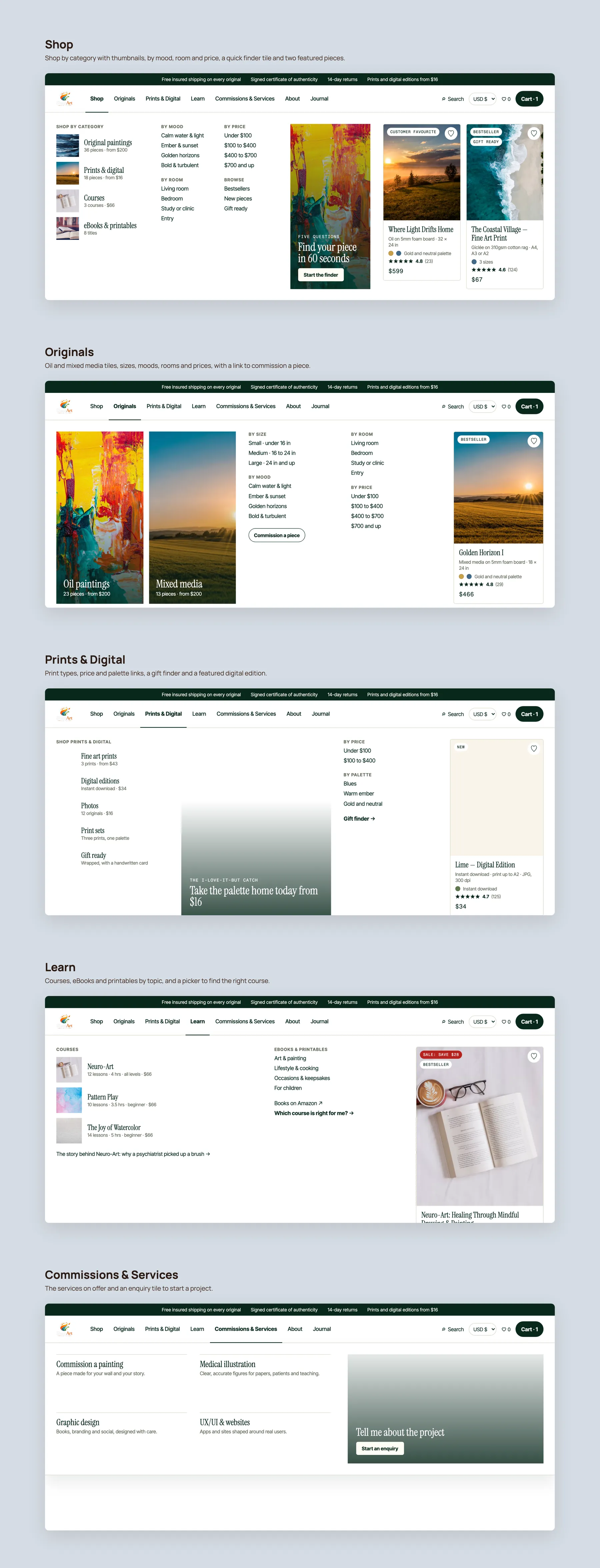
Group the shop menu into original paintings, prints and digital, with routes by price, size and room. Give commissions, the founder and the journal their own clear entries.
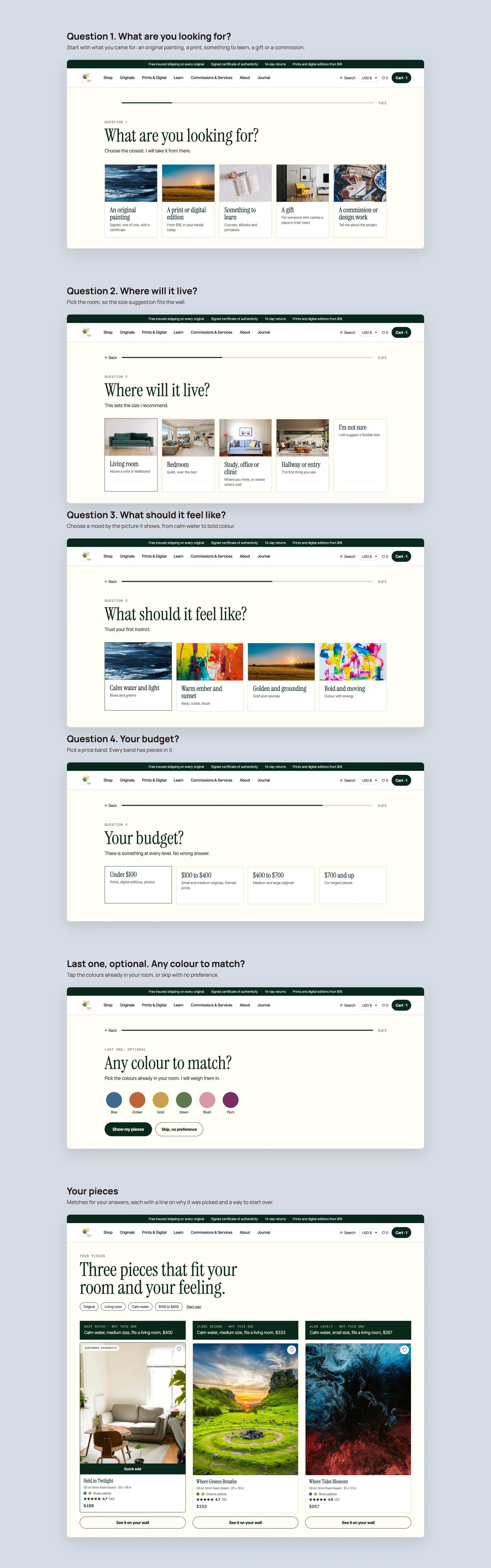
Build a quiet questionnaire asking the type of piece, the room, the budget and a colour. Return a few matching paintings, so the site plays the part of a host in a gallery.
Show the collections by category, such as oil paintings, mixed media, prints and digital, and courses and ebooks. Add routes by wall or mood so a visitor can start from how they want the room to feel.
Place customer reviews directly under the hero and again further down the homepage, where visitors expect reassurance. Pair them with a short founder section so a real person stands behind the work.
Give each card a clear badge, a short line on what makes the piece distinct, its size, its colours, a rating and the price. A visitor should compare pieces without opening each one.
Offer filters for price, size, palette, mood, room and orientation, with category tabs and cues such as bestseller, staff pick and new. Add a collection name and a short description at the top.
Show the exact size, whether the piece is an original, one of one and signed, and let the buyer choose unframed or a frame. Display the updated price as they choose.
Place delivery timing, insured shipping, returns and secure payment directly beside the button. Answer the objections at the moment the buyer is deciding.
Where a painting has no reviews yet, display the store wide rating and real collector comments. Nobody wants to be the first to buy, so show that others have bought and are happy.
Add a section on the canvas, the colours and the process behind the piece. This justifies the price and gives the buyer something to quote when deciding.
Present framing as an add on, or reward a frame or a second piece with a small discount or free shipping. Set a free shipping threshold that nudges buyers to add one more item.
Let buyers add a handwritten card and offer a bundle that completes the room. Many visitors arrive shopping for themselves and leave buying for someone they love.
Close the page with pieces bought together, more from the same medium, recently reviewed work and a set of frequently asked questions. These also give search engines and AI tools clear answers to read.
A concept redesign created by Convertica Studio from this audit. It shows how the store could work, it is not the live store.
The whole page as two tall columns: a painting-led first screen, the ways in, and a footer that carries the promise of signed, insured originals.
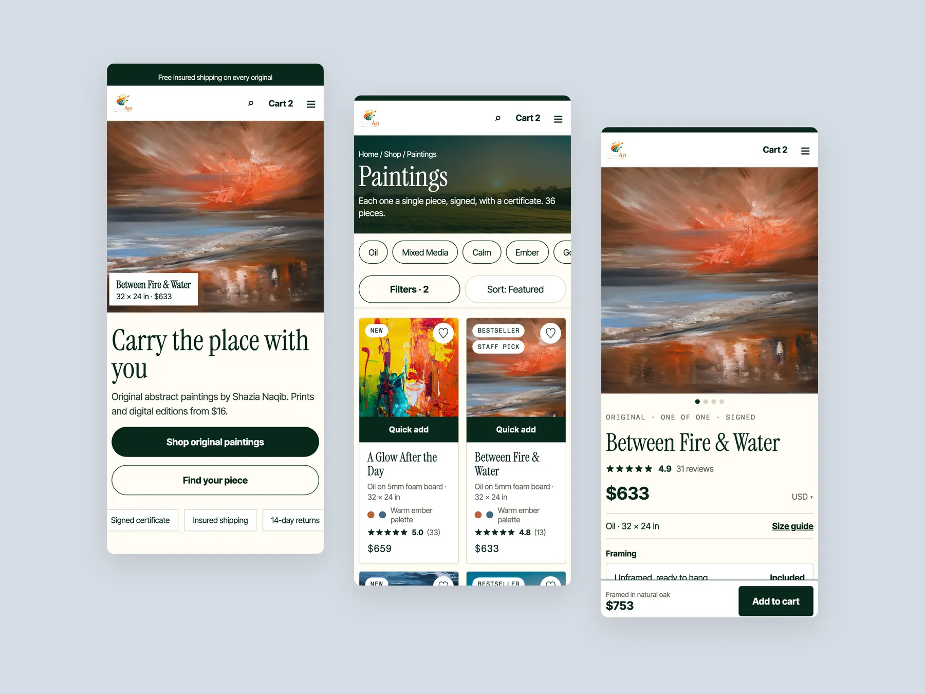
The homepage in the centre, the product page on the left with its buy column, and the Paintings collection on the right with its header, filters and first cards.
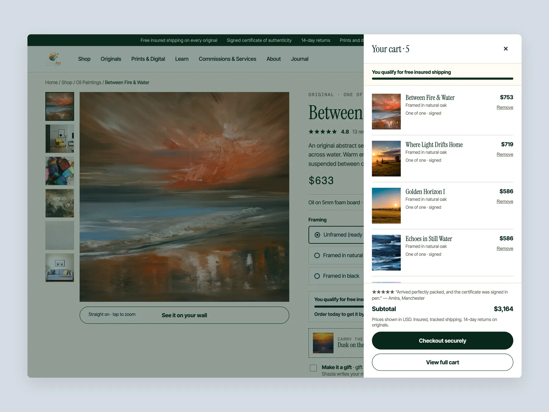
The cart opens over the product page with the page dimmed behind it, five pieces listed, free shipping noted and a full progress bar.
Every step on one board, from what you are looking for, to the room, the mood, the budget and an optional colour, then the matched pieces with a reason for each.
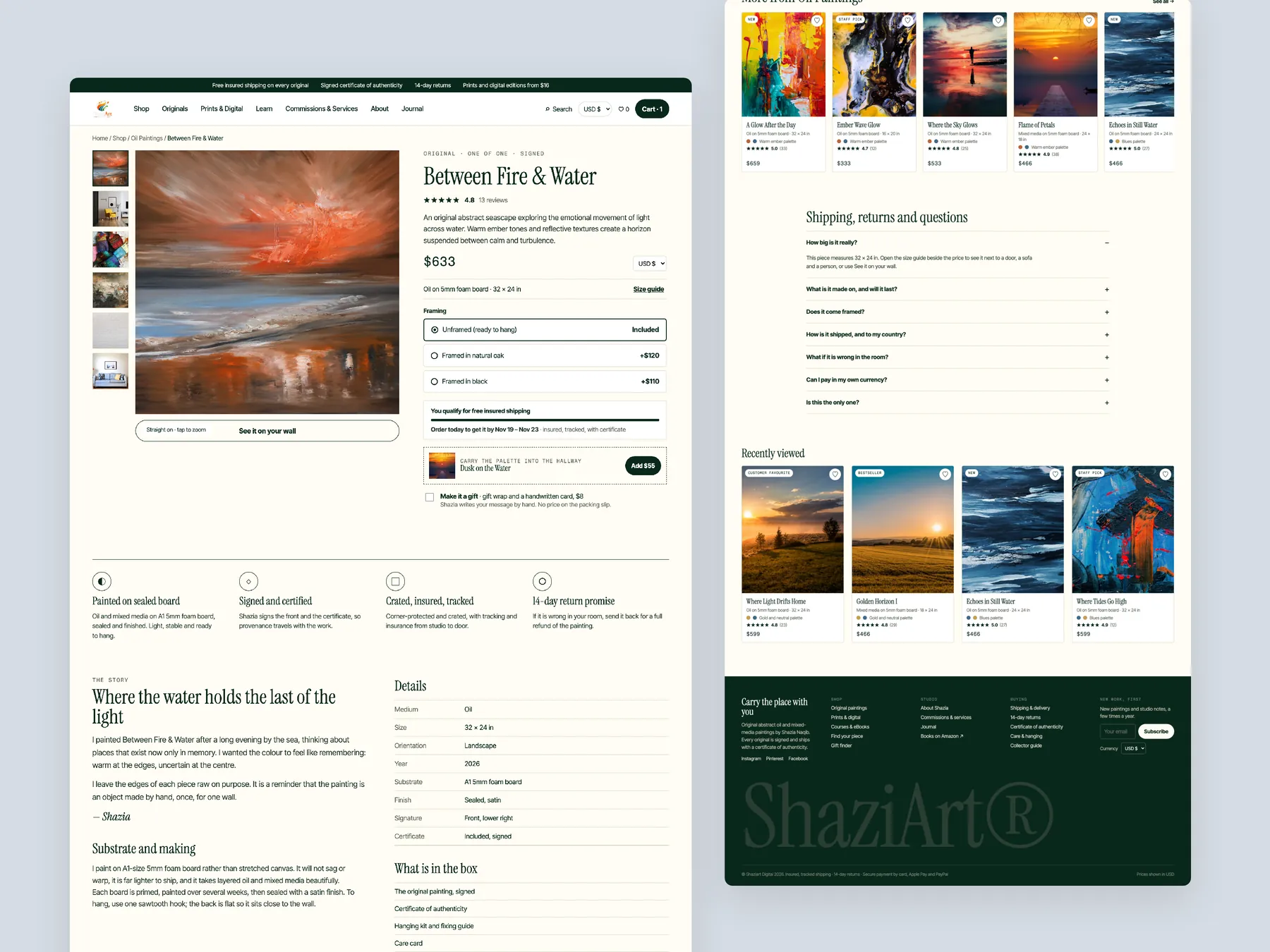
The full product page as two tall columns, with the buy box complete in the first column and the page ending on the footer in the second.
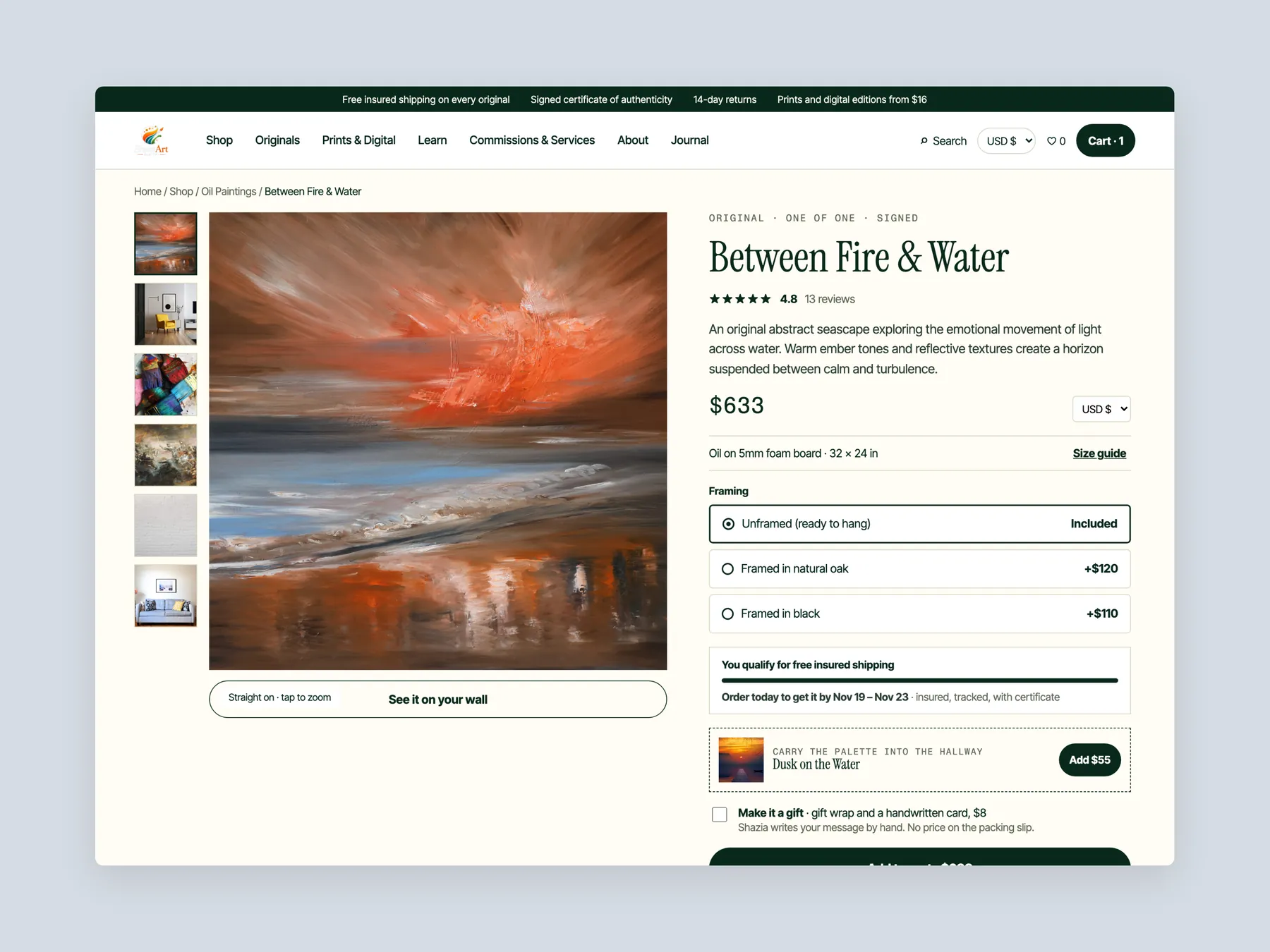
Header and buy box on one screen: the painting, the sizes and finishes, the price, the button and the delivery lines.
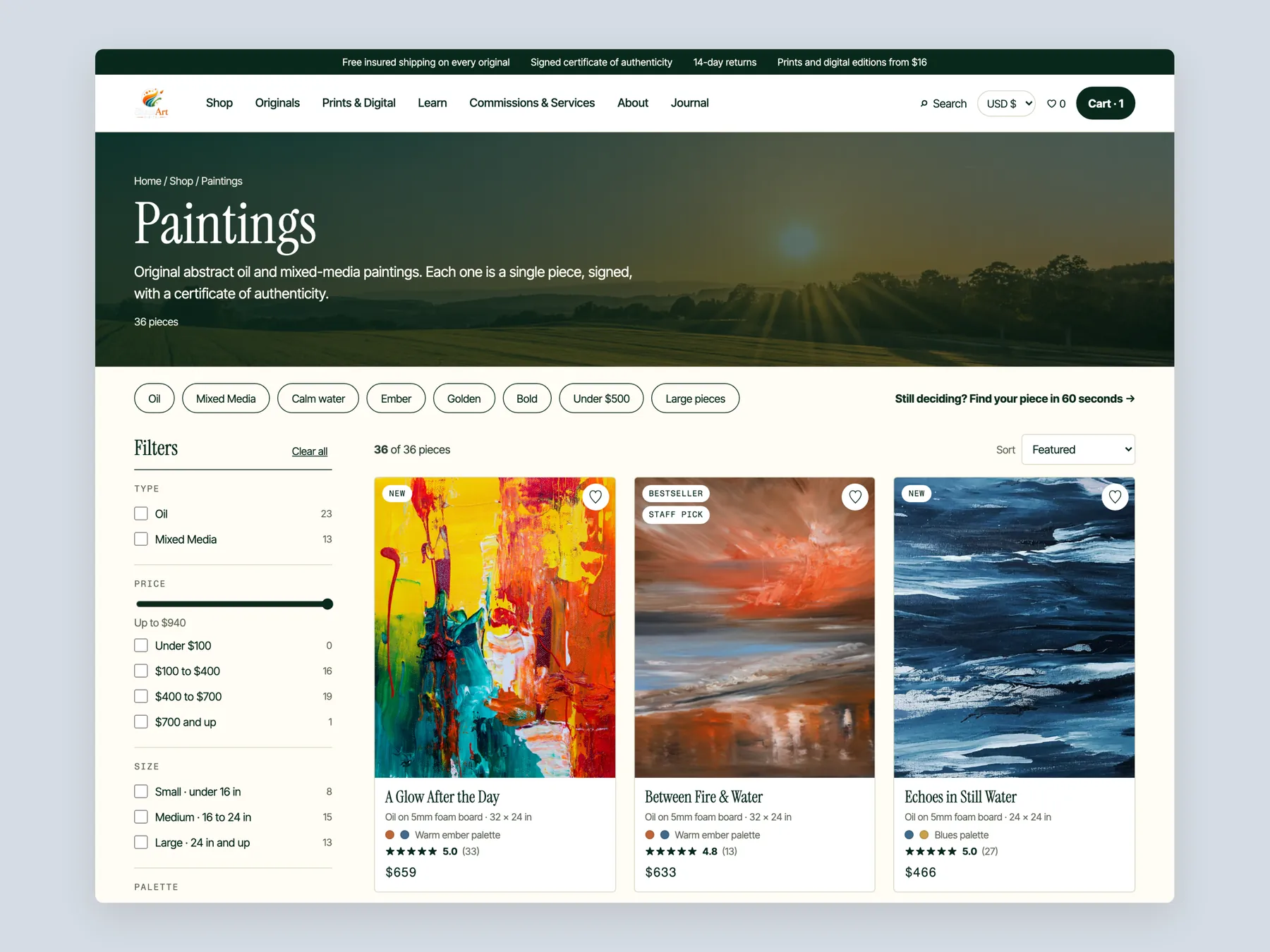
Paintings with the banner, quick filter chips, the filter column and the first full row of cards with prices.
One screen per nav item with its panel open: Shop, Originals, Prints & Digital, Learn, and Commissions & Services.
Three phone screens in a stagger: the homepage, the collection and the product page.
No. The audit describes the work as strong and impressive. The issue is that the site does not help a visitor find the right piece or feel confident paying for it.
It should say what the business does, who it is for and whether it can be trusted. For an art store, that means naming the kind of art and showing proof such as reviews right in the hero.
Labels like art and photo do not say what kind of work sits underneath. Organising the menu by medium, price, size and room gives a visitor several clear routes into the collection.
It is a route that helps a visitor reach a suitable piece without searching alone. Examples are collections by category, routes by wall or mood, and a short finder that recommends paintings from a few answers.
In the concept, a visitor chooses the type of piece, the room, a budget range and a colour. The finder then recommends matching paintings, much like a gallery host asking how they can help.
It behaves like a catalogue. Each painting shows a picture, a name and a price, with no sorting, categories or cues, so a visitor cannot tell the pieces apart without opening each one.
The size, whether it is framed, original or print, delivery timing, returns, secure checkout, reviews and details on the canvas and colours. It should justify the price as well as show the work.
Use the store wide rating and real customer comments. This shows a buyer that others have bought from the shop and been satisfied, even if not this exact piece.
Offer a frame as an add on, give a small saving for adding a frame or a second piece, and set a free shipping threshold. A gift note and a complete the room bundle also help.
The audit says the bigger opportunity is helping existing visitors feel confident enough to buy. Running ads makes more sense once the site converts the traffic it already has.
Three routes: leave the site as it is, implement the changes alone, or have the studio do it. Options included a full rebuild at 3,500 paid in milestones, an improvement of the three pages in two payments, and a theme only option at 1,200.
The video reviews the homepage, the Original Paintings collection page and a product page, then shows a redesign concept for each. It runs 24 minutes and ends with next steps and pricing.
Tell us about your store and we'll send a personalized 5-minute video showing exactly where you're losing buyers — and how to win them back.
Takes about 40 seconds. No call required.