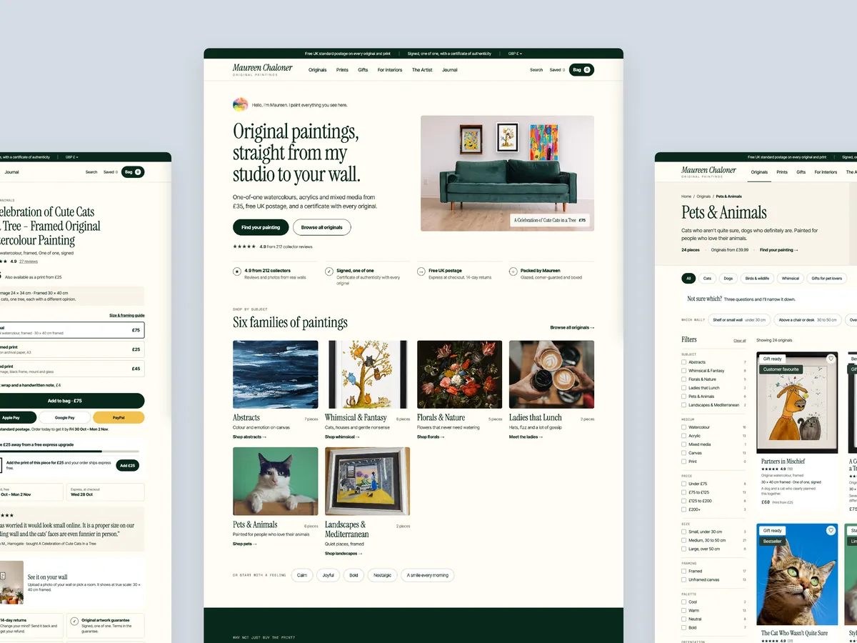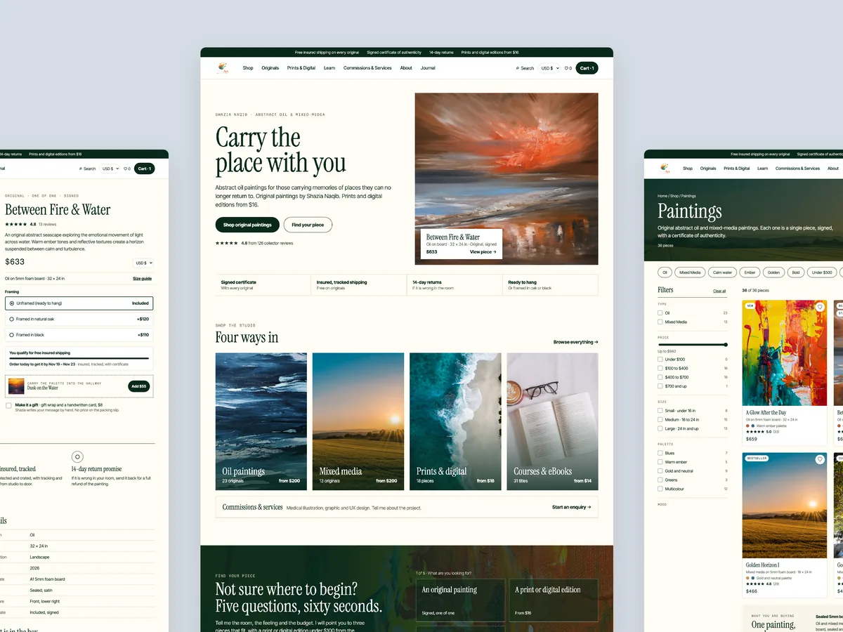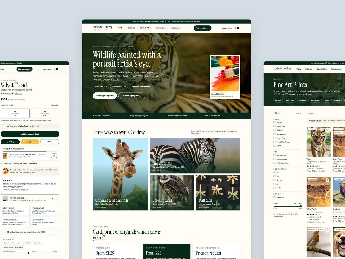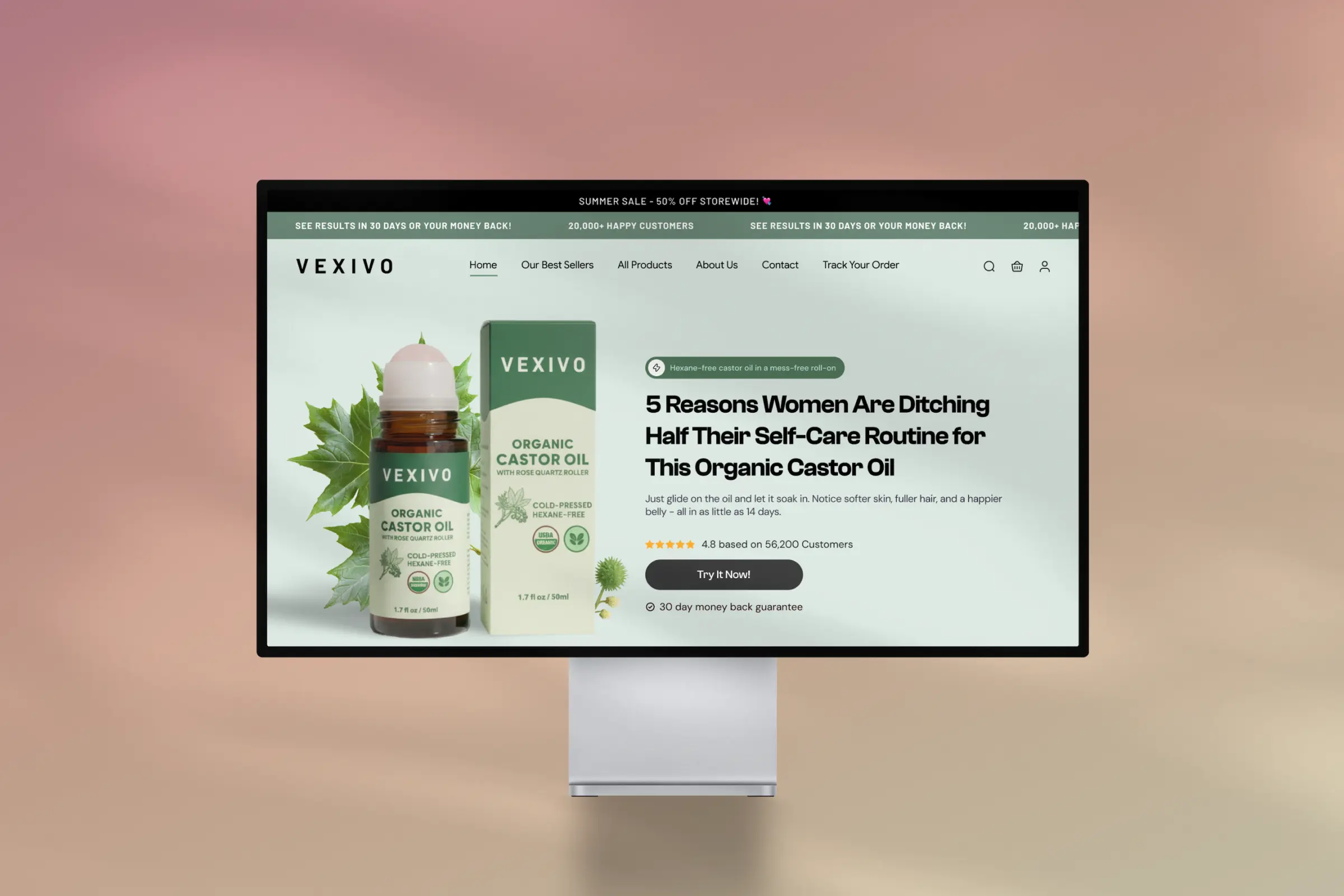
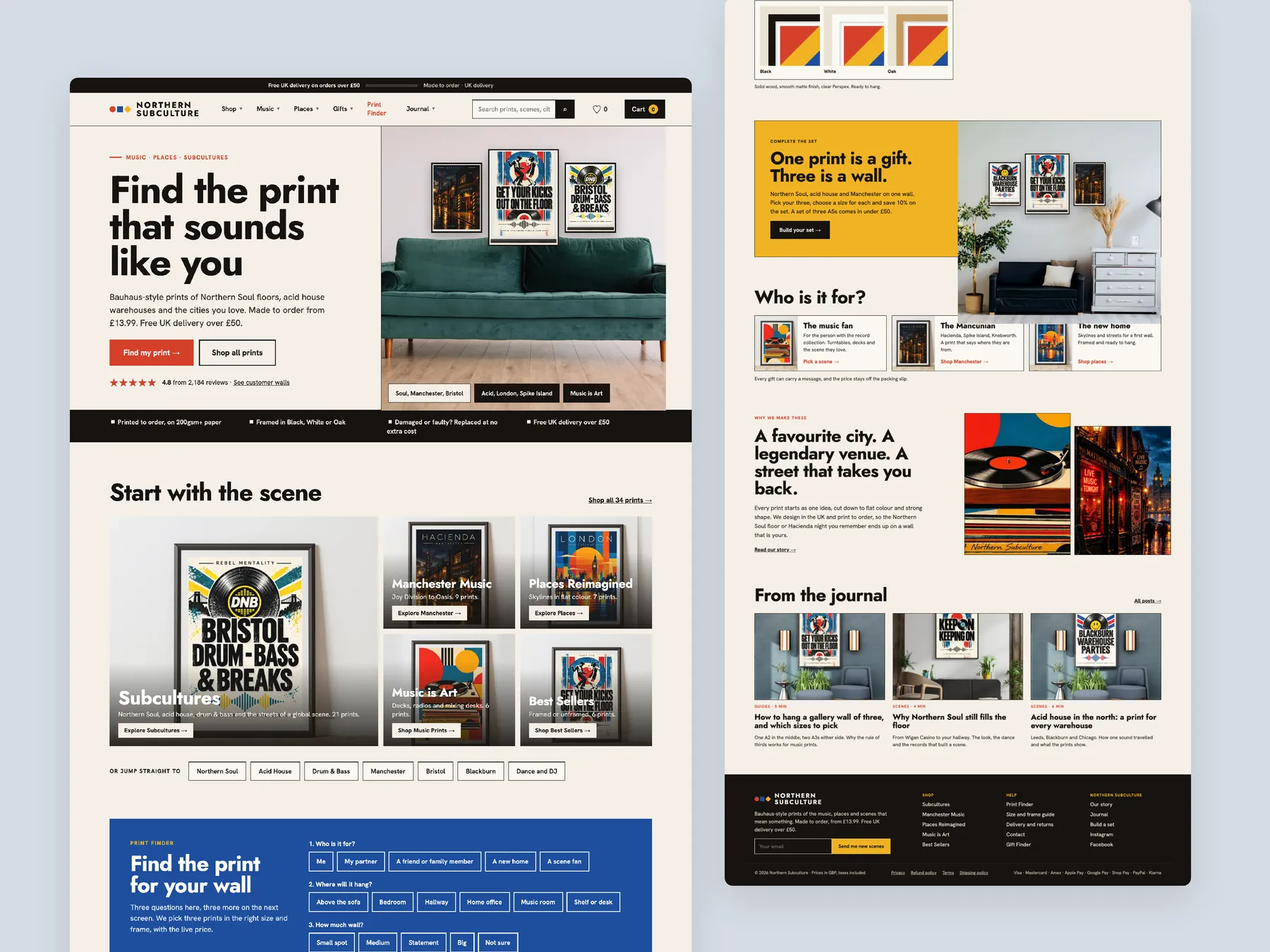
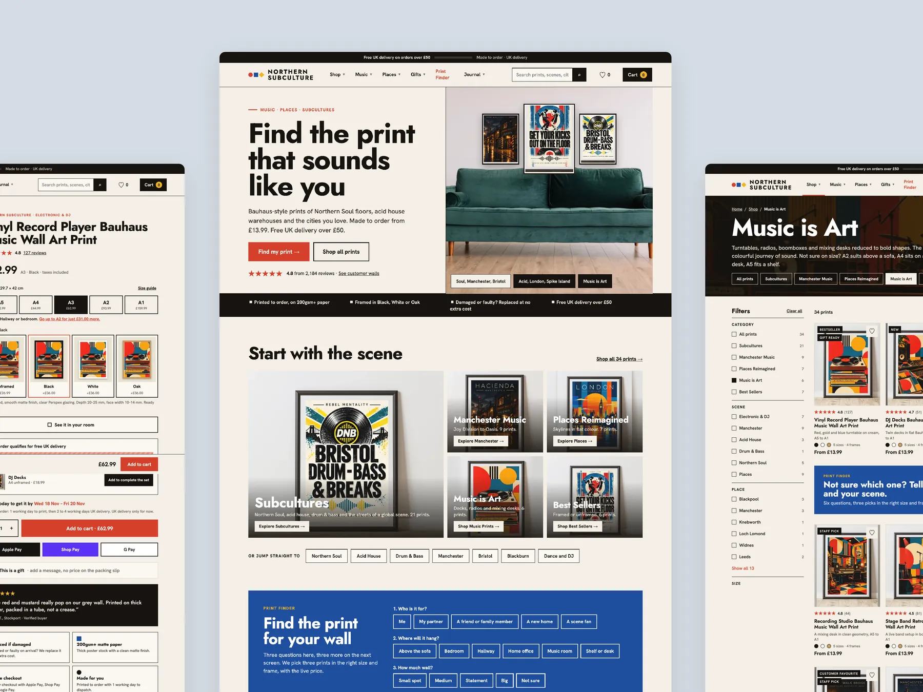
Homepage, two tall columns
Homepage in two tall columns, from the first screen down to the footer.
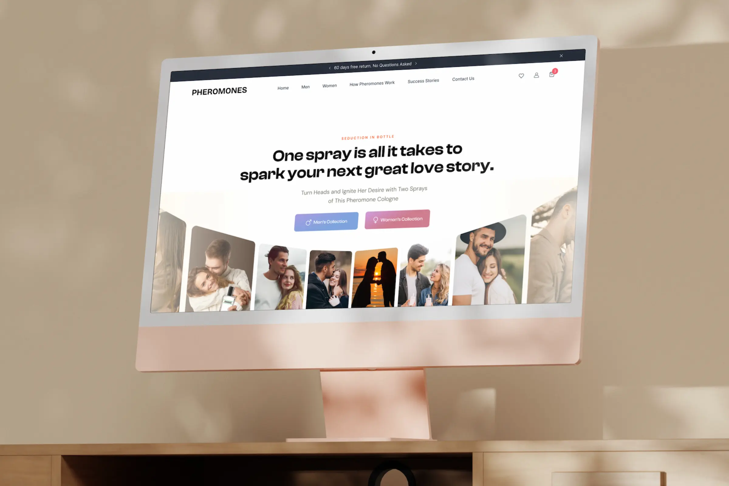
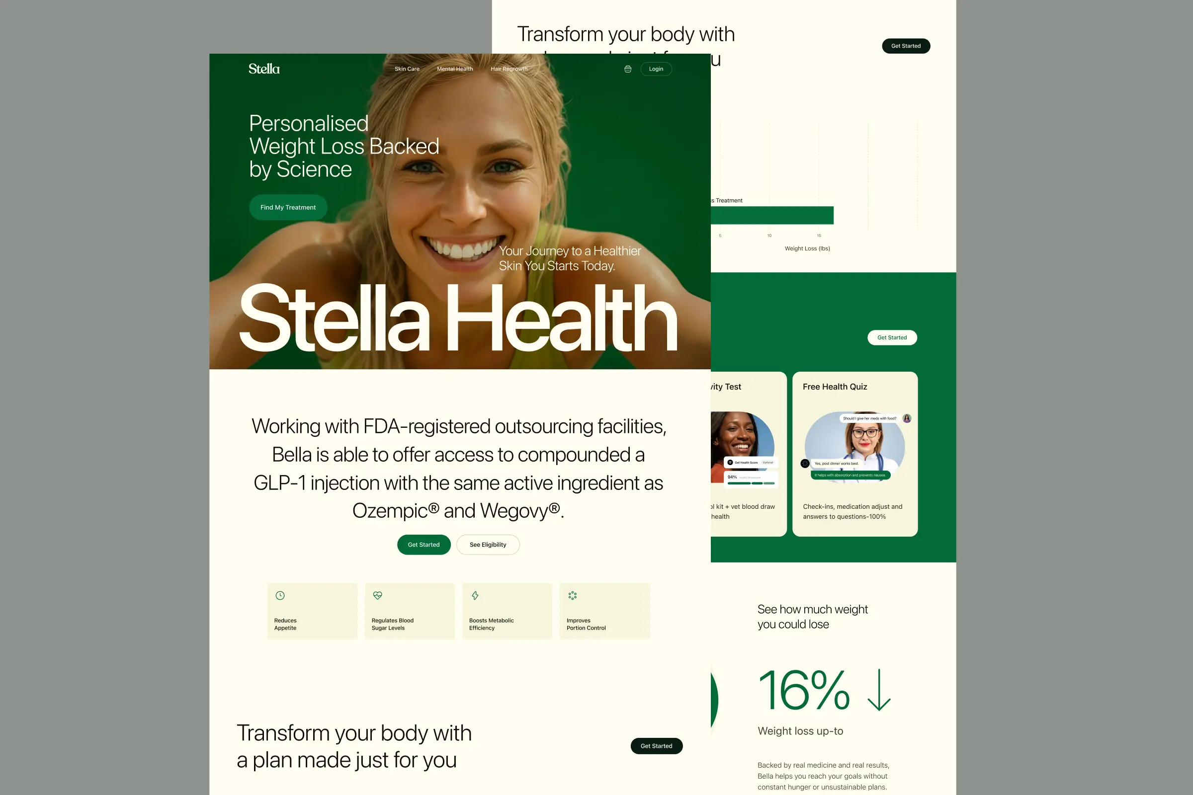
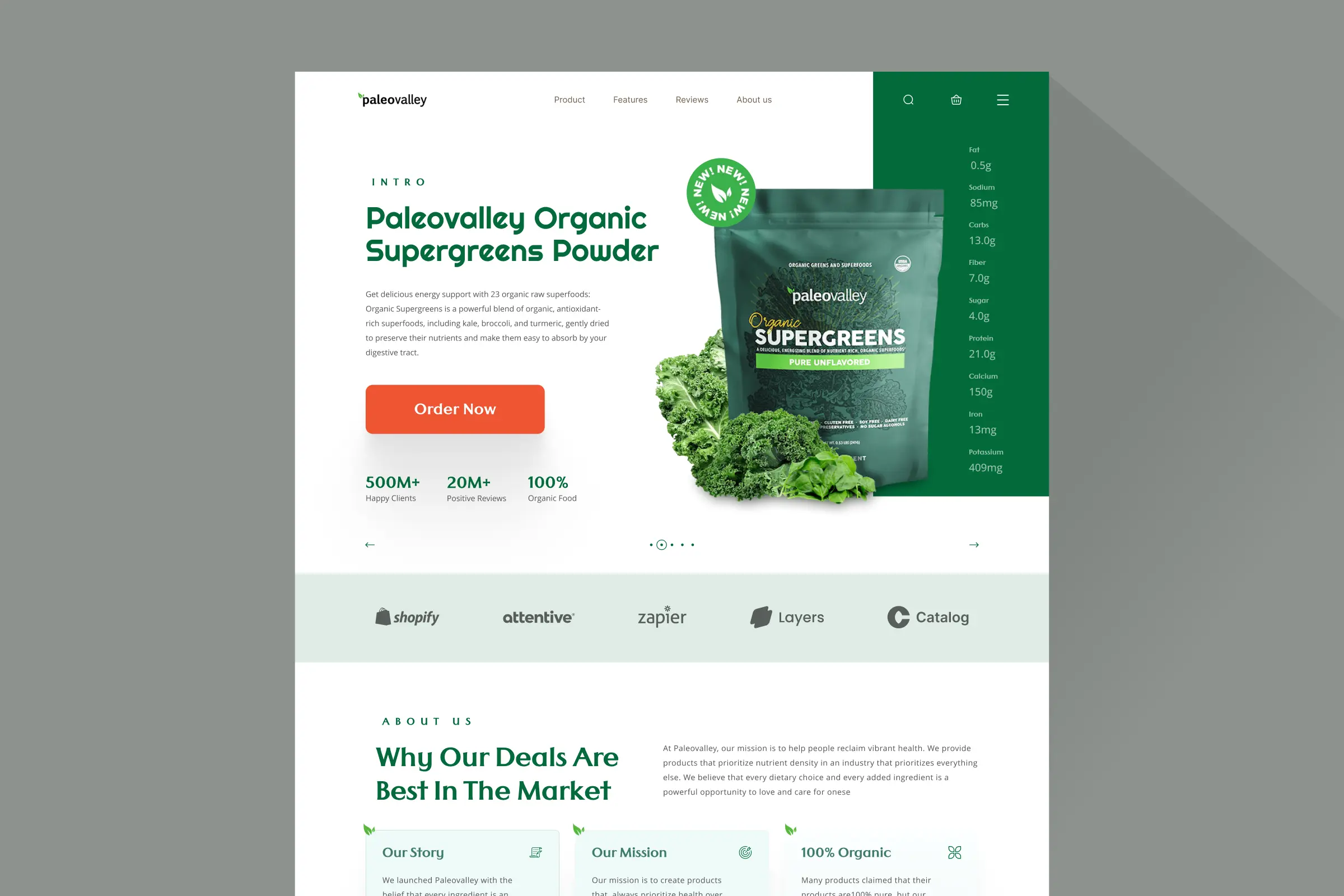
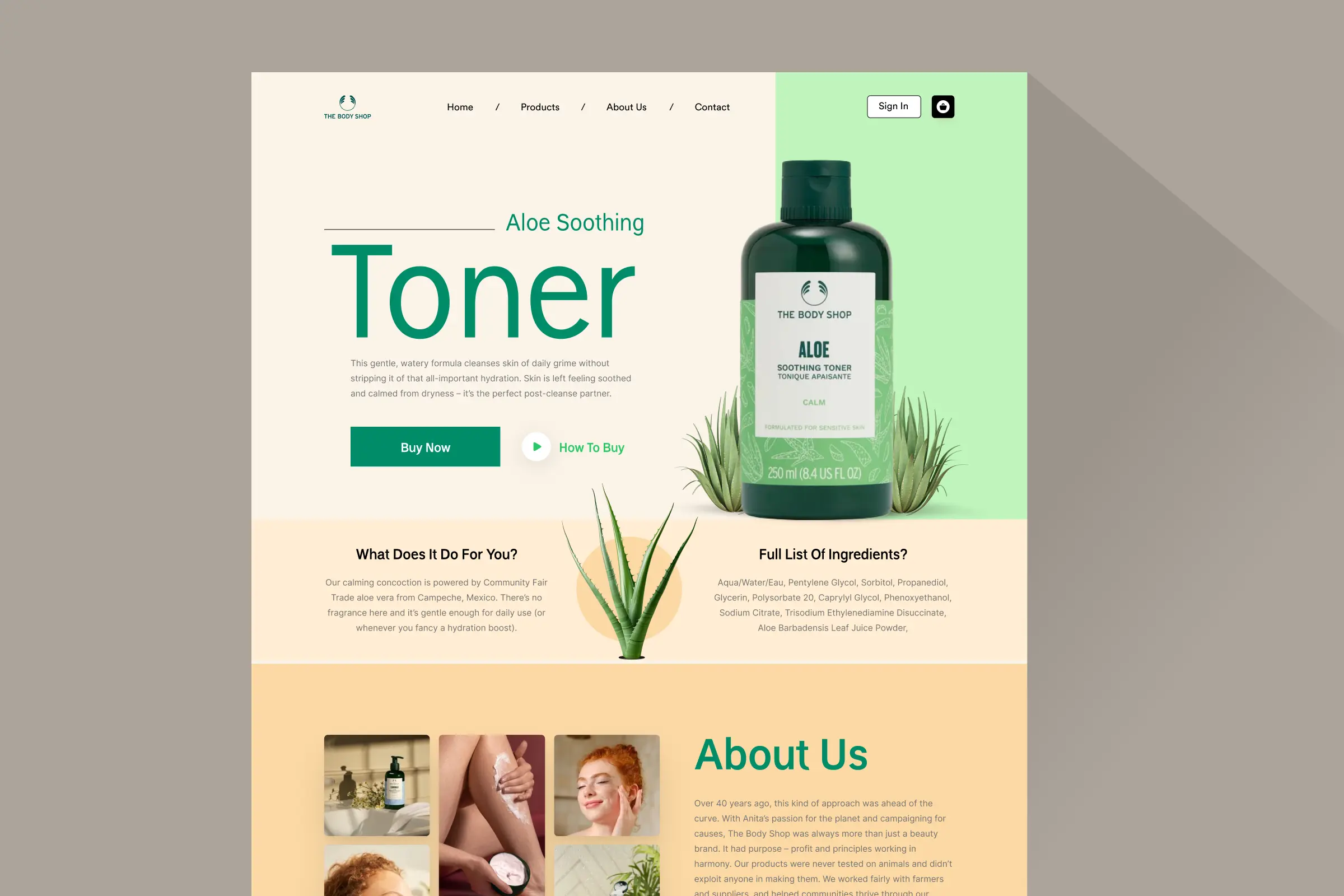
Storefronts we designed and built, across supplements, fragrance, health, wellness and skincare.
All 35 projectsFour engagements, measured before and after. What changed, why it changed, and by how much.
All case studiesDiagnosis, design and development from one studio — so the recommendation and the build never disagree.
All five services192 real Shopify stores torn down page by page, scored, and shown beside the version we would build. Free to watch.
Browse all teardownsConversion-first Shopify themes, each built for one industry’s buying journey. No required apps, no monthly theme fee, one licence per store.
See all themes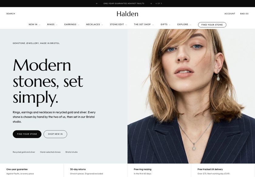 Halden
Jewelry & Accessories
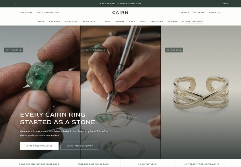 Cairn
Jewelry & Accessories
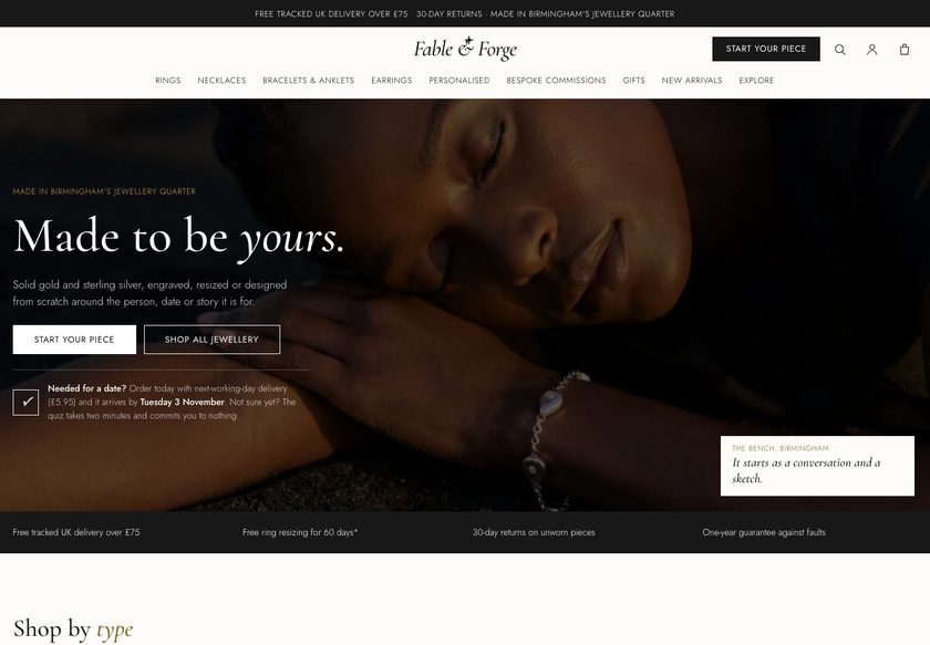 Fable & Forge
Jewelry & Accessories
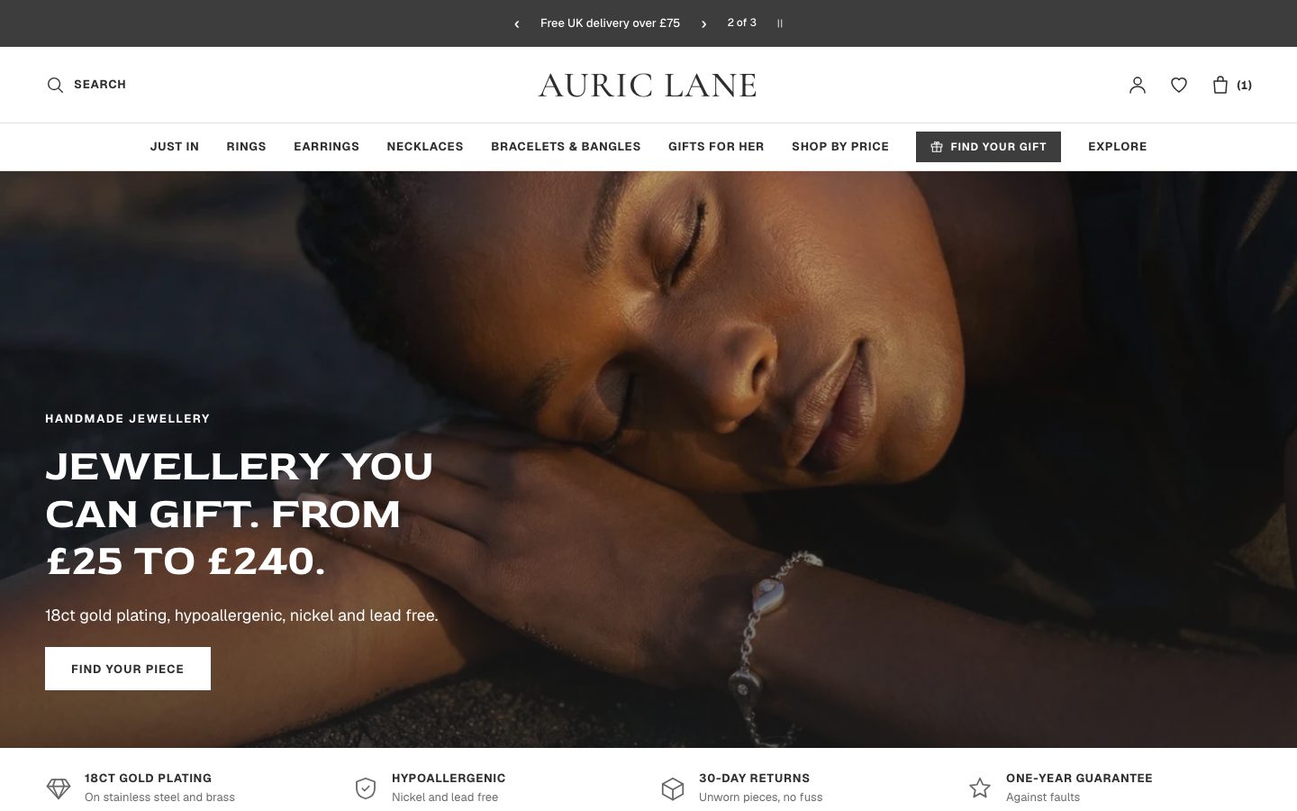 Auric Lane
Jewelry & Accessories
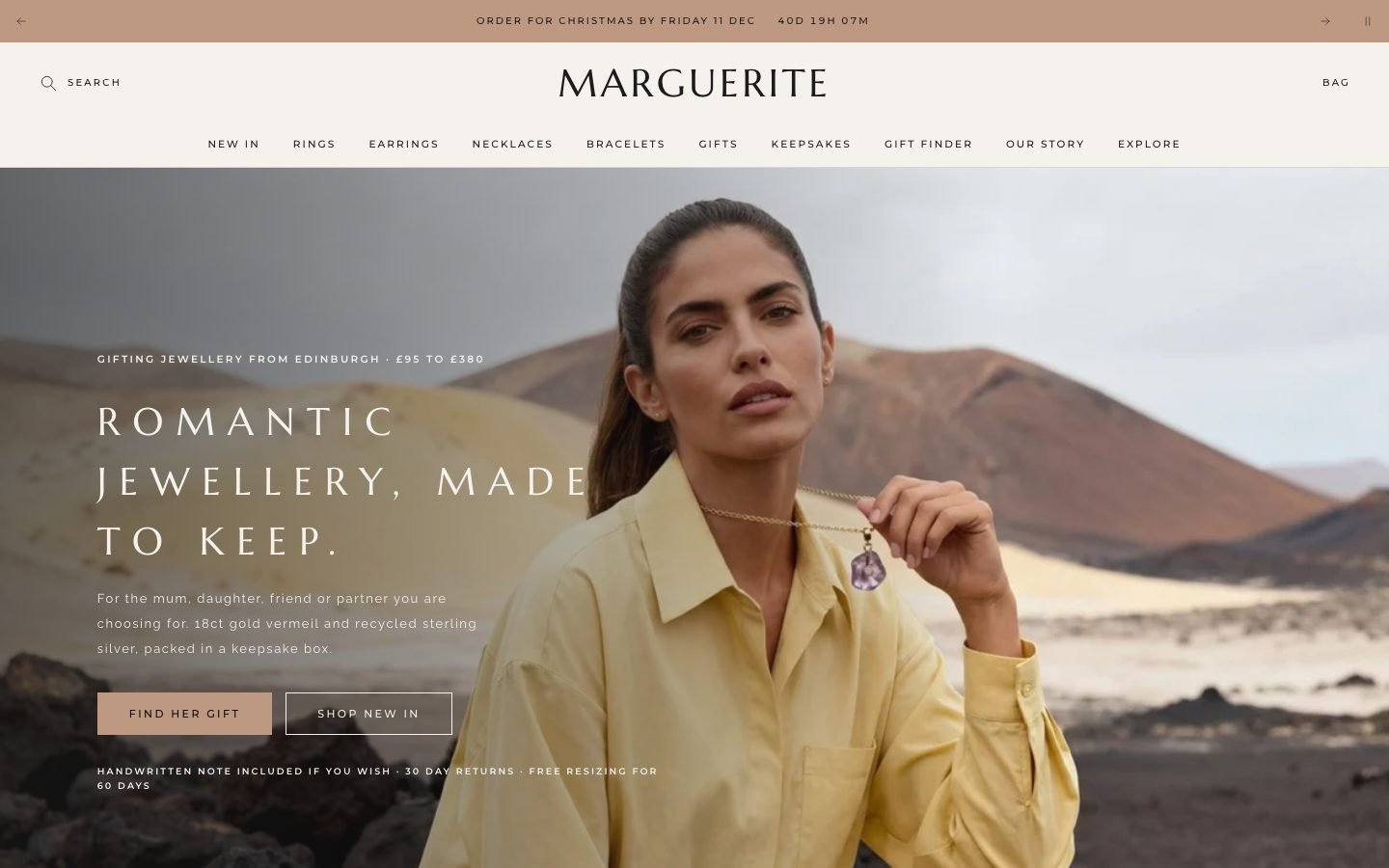 Marguerite
Jewelry & Accessories
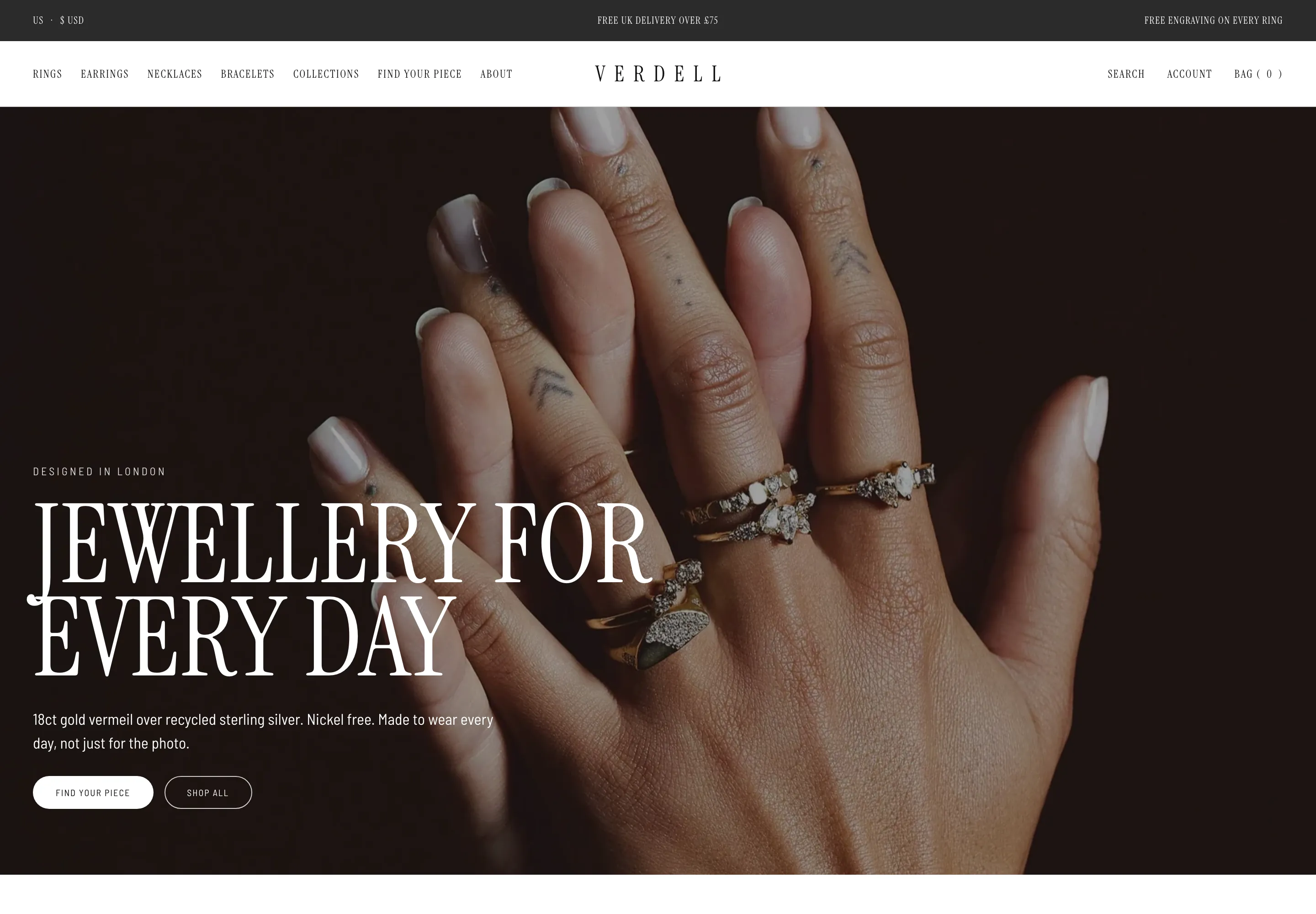 Verdell
Jewelry & Accessories
 Lisette
Jewelry & Accessories
 Linden
Jewelry & Accessories
 Calder Union
Clothing & Apparel
 Bracken Tor
Clothing & Apparel
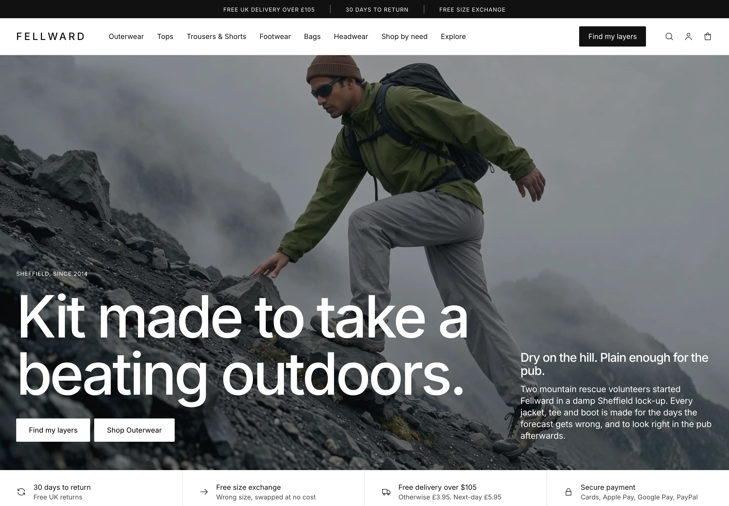 Fellward
Clothing & Apparel
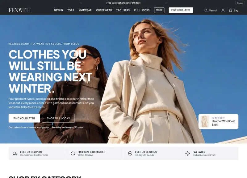 Fenwell
Clothing & Apparel
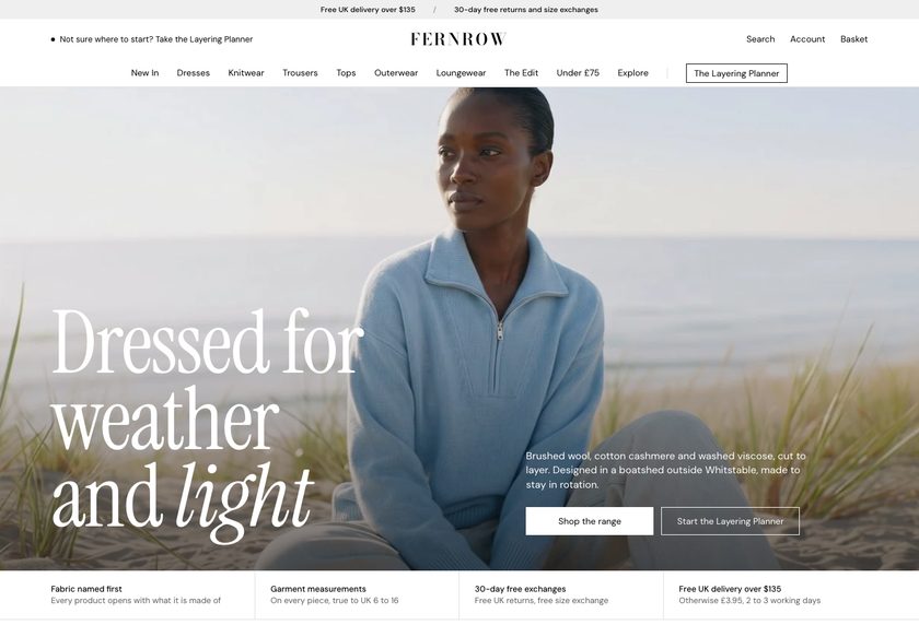 Fernrow
Clothing & Apparel
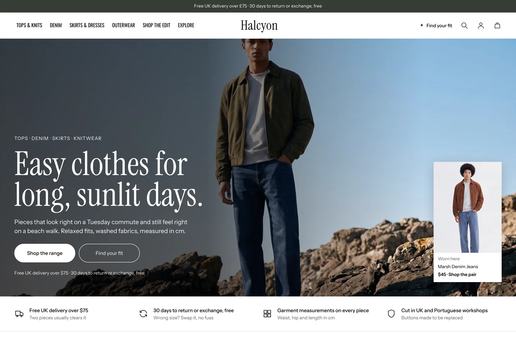 Halcyon
Clothing & Apparel
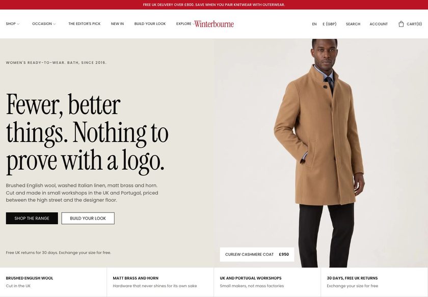 Winterbourne
Clothing & Apparel
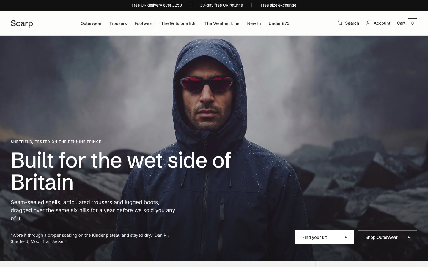 Scarp
Clothing & Apparel
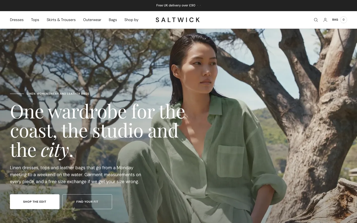 Saltwick
Clothing & Apparel
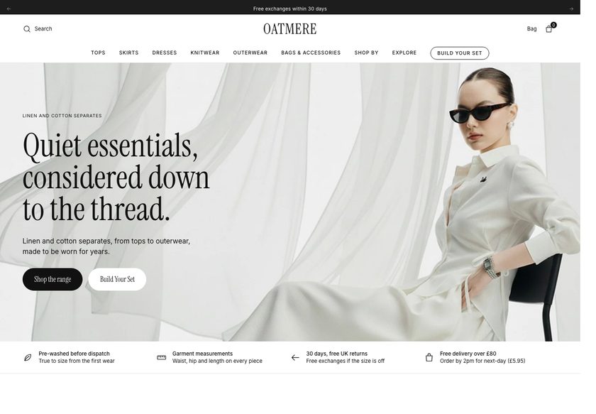 Oatmere
Clothing & Apparel
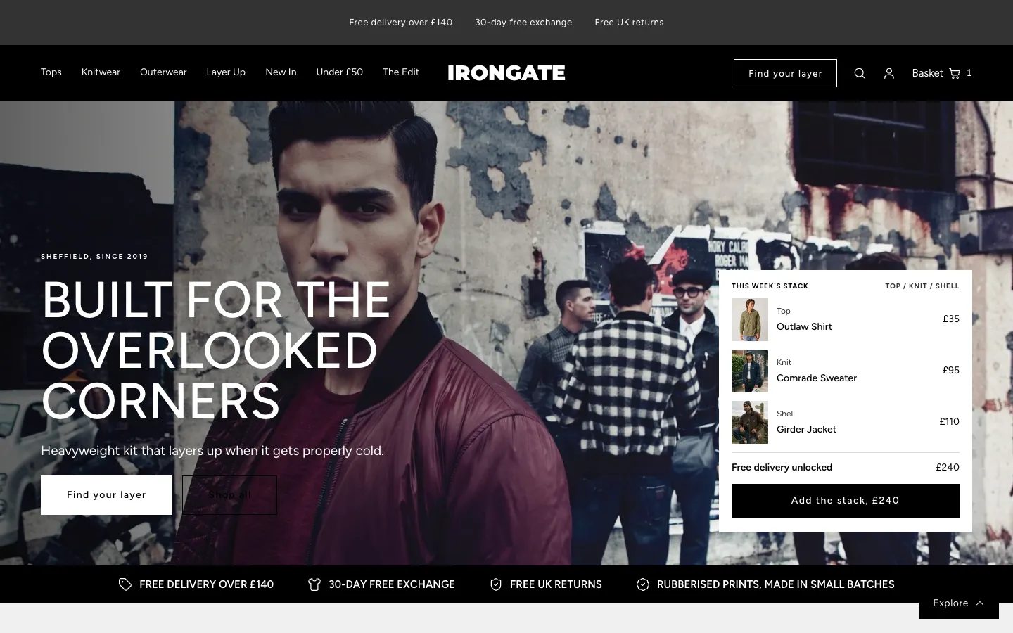 Irongate
Clothing & Apparel
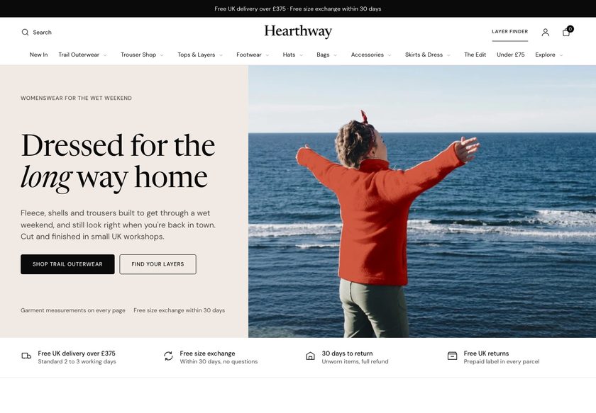 Hearthway
Clothing & Apparel
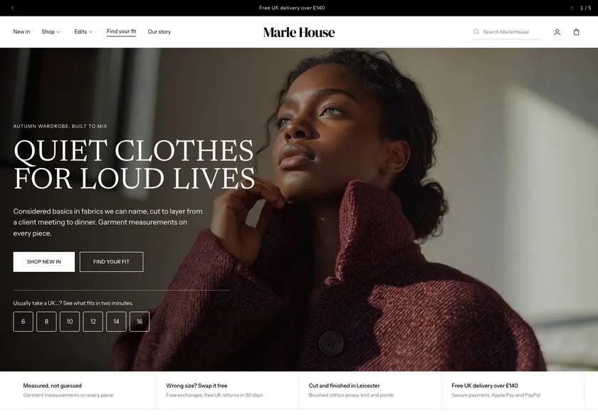 Marle House
Clothing & Apparel
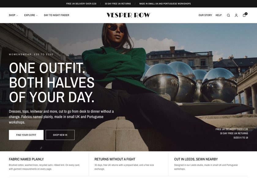 Vesper Row
Clothing & Apparel
A page by page CRO teardown of a Shopify store selling music and subculture art prints, covering the homepage, collection page and product page, with a clickable redesign concept to fix what leaks sales.
Pressing play loads the video from YouTube — you can allow it for every teardown under cookie preferences.
Northern Subculture sells music and place inspired art prints, with framing options and a clear sense of identity. The range is strong enough that our CRO strategist struggled to pick a favourite. The product page already states sizes, offers instalments to lift order value, and explains the brand behind the work, which many stores never do.
The problem is not the art. It is the presentation layer. A first time visitor lands on the homepage and sees images, names and prices, but nothing that says who the shop is for or why it is safe to buy from. The hero does not answer what the business does, who it serves or whether it can be trusted, and that hesitation costs sales.
The same pattern repeats down the funnel. The homepage grid and the collection page both behave like a catalog, with the standard theme sort as the only help. On the product page, shipping is only calculated at checkout, returns are not mentioned, sizing and delivery sit inside a long block of text, and there is no review at all.
The direction is a guided buying experience. Organise the navigation by scene, room, size, budget and gift, add a print finder that asks questions the way a person in a physical shop would, surface reviews early, and make the product page answer every doubt. The idea to remember: do not make visitors work out which print is theirs.
The site presents prints like a catalog, with no trust signals in the hero, no reviews anywhere, basic theme sorting and a long product page that buries sizing, framing, delivery and returns.
Turn the traffic already arriving into buyers with guided paths by room, scene, budget and gift, a print finder that works like a shop assistant, visible reviews, and a product page that answers every doubt.
More visitors reaching the right print, fewer leaving to compare or worry about returns, and larger orders through sets, gifting and free delivery thresholds, all from the traffic the store already ha
Five dimensions, each scored out of ten.
12 issues found, 15 fixes proposed.
The homepage hero shows images, prices and names but does not state what the business does, who it is for, or why it is safe to buy from. A first time visitor gets no reassurance in the first seconds.
The menu has Home, Catalog, Contact and Blog, even though the store has many themes of print. Visitors get no path by scene, room, size, budget or gift, so they have to explore the grid alone.
Products appear as a grid of image, name and price. It shows what is available but never tells a visitor which print is for them, so discovery depends on scrolling and luck.
The Music is Art collection lists many prints with image, name and price, and only the standard Shopify sort. Visitors cannot narrow by size, frame, room or colour, so they open many pages to compare.
The product page says shipping will be calculated at checkout. For a low priced print, an unknown delivery cost is a surprise at the worst moment and a reason to leave.
The product page never says what happens if something goes wrong. A buyer paying for a framed print wants to know about returns and replacements before adding it to the cart.
Sizing, framing, delivery and important product information all sit in a long block of copy. A shopper has to read a lot to find out how big the print is and when it will arrive.
Not a single review appears on the site. Nobody wants to be the first to spend on a print and regret it, so the absence of other customers' experience holds buyers back.
The instalment message is a good start, but there are no bundles, pair offers, set builders or free delivery thresholds. Each visitor is sold one print at most.
There is no gifting path by recipient or occasion. Someone who is not buying for themselves has no way in, and gift buyers are a natural source of extra revenue for art prints.
Cards show image, name and price only. Size, frame options, colours, ratings and badges such as best seller or gift ready are missing, so shoppers must open each card to compare.
Ads are already sending visitors to a site that does not yet help them decide. Spending more on traffic before the site converts the current visitors multiplies the leak.
State what the store sells, who it is for and why it can be trusted in the first screen. Include review stars, print to order on 200 gram paper, framing, returns and delivery next to the main buttons.
Group the menu by collection, scene, room and size, with a budget route for price sensitive shoppers. Add separate music, places and gifting menus so each visitor finds a route that matches their intent.
Build a short quiz that asks about the room, the size and the wall colour, then recommends prints and shows them on a wall. It acts as the digital version of a shop assistant asking how they can help.
Add gifting by recipient and by occasion, plus ready made sets. Offer a gift note at the cart button so a shopper buying for a friend or parent can complete the purchase in one visit.
Let visitors filter by category, scene, place, size, frame, room, colour mode, price and rating. Show a clear collection name, a short description and category toggles so they narrow the range at a glance.
Add badges such as gift ready, best seller and new, plus the rating, size, available colours, frame count and price on every card. Shoppers can then compare prints without opening each one.
Remove the calculated at checkout message. Either fold delivery into the price or state it clearly on the page, and offer free delivery or a small discount on pairs and bundles.
Put a short returns and replacement statement near the Add to Cart button, with a fuller section below. Cover what happens if a print arrives damaged or is not what the buyer expected.
Replace the wall of text with short sections for size, frame, paper, delivery and what is in the box. Make each easy to scan so a buyer finds the sizing answer in seconds.
Show reviews for the specific print, and where none exist, repurpose storewide reviews. Place the rating under the product name and add customer photos further down the page.
Show how much more a shopper needs to add to reach free UK delivery, and offer a small discount on sets. This raises order value while giving the buyer something back.
Add a see it in your room feature on the product page and the homepage, where a visitor enters wall size and sees the print at scale in a bedroom or living room.
Suggest matching prints by room on each product page and let shoppers build a set of two or three. The goal is to sell several prints to one visitor, not one print each to several.
Answer the questions buyers ask before purchase, covering sizing, framing, paper and delivery. Clear FAQs also help the store appear when people ask AI assistants and search engines about art prints.
Hold extra ad spend until the redesigned pages show they turn current visitors into orders. Once the site converts, scaling traffic multiplies a working funnel rather than a leaking one.
A concept redesign created by Convertica Studio from this audit. It shows how the store could work, it is not the live store.
Homepage in two tall columns, from the first screen down to the footer.
The homepage in the centre, with the product page on the left and a collection page on the right.
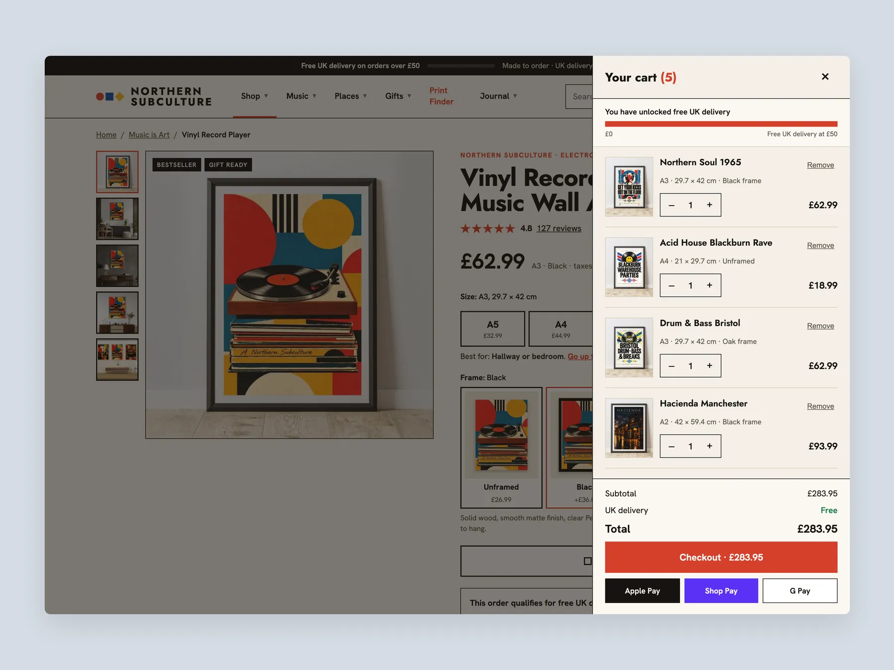
The bag slide-over open over the product page, with five prints and the free delivery bar full.
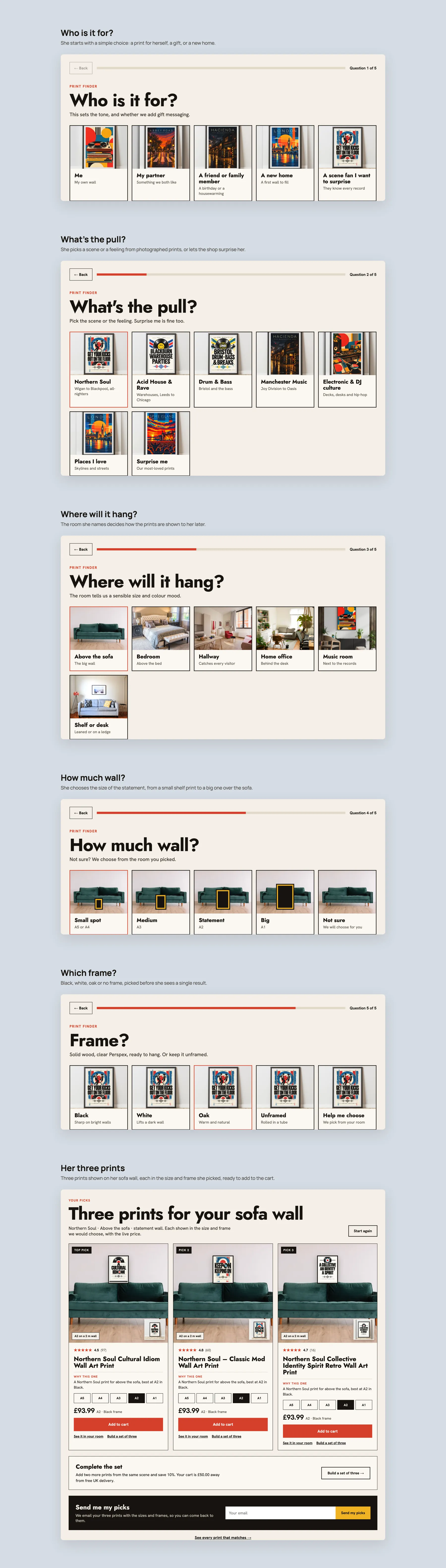
The Print Finder quiz, step by step: who it is for, the pull, the room, the size and the frame, ending on three picks.
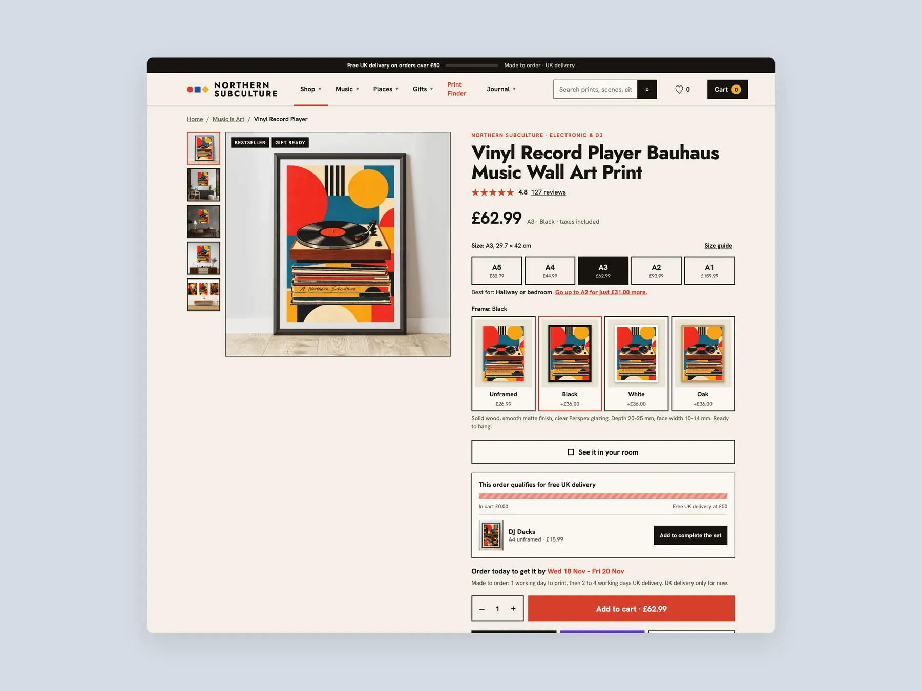
The product page in two tall columns, with the buy box whole in the first.
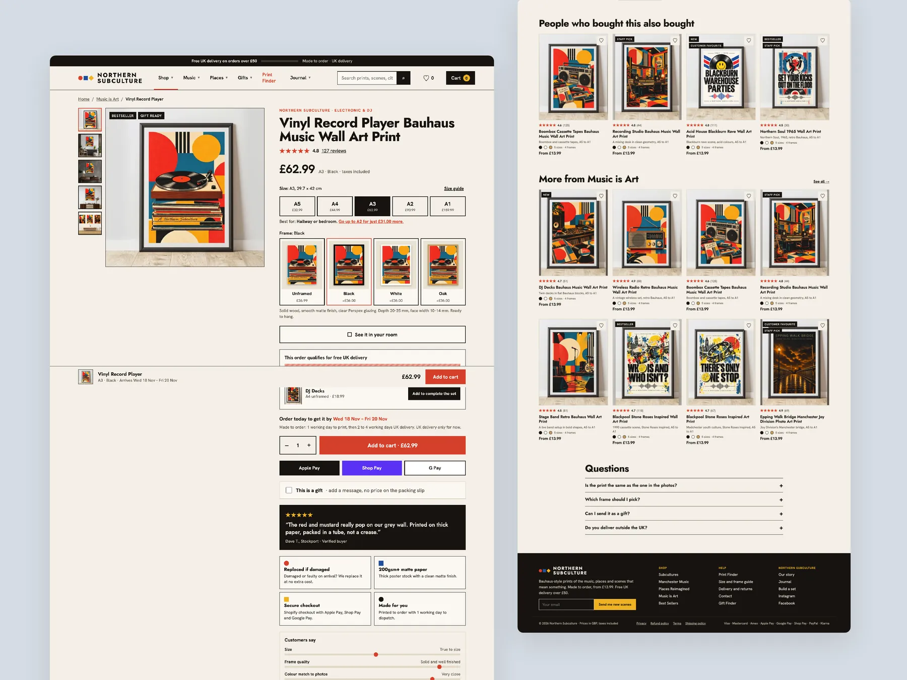
The product page first screen: header, sizes, frames, delivery lines and the add to cart button.
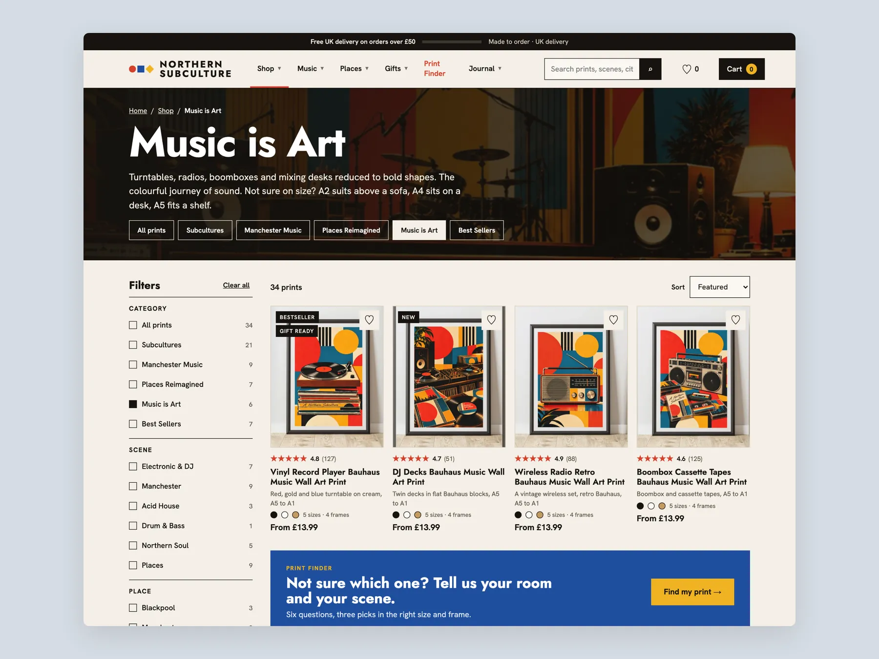
A collection page first screen with the filter bar and the first row of prints.
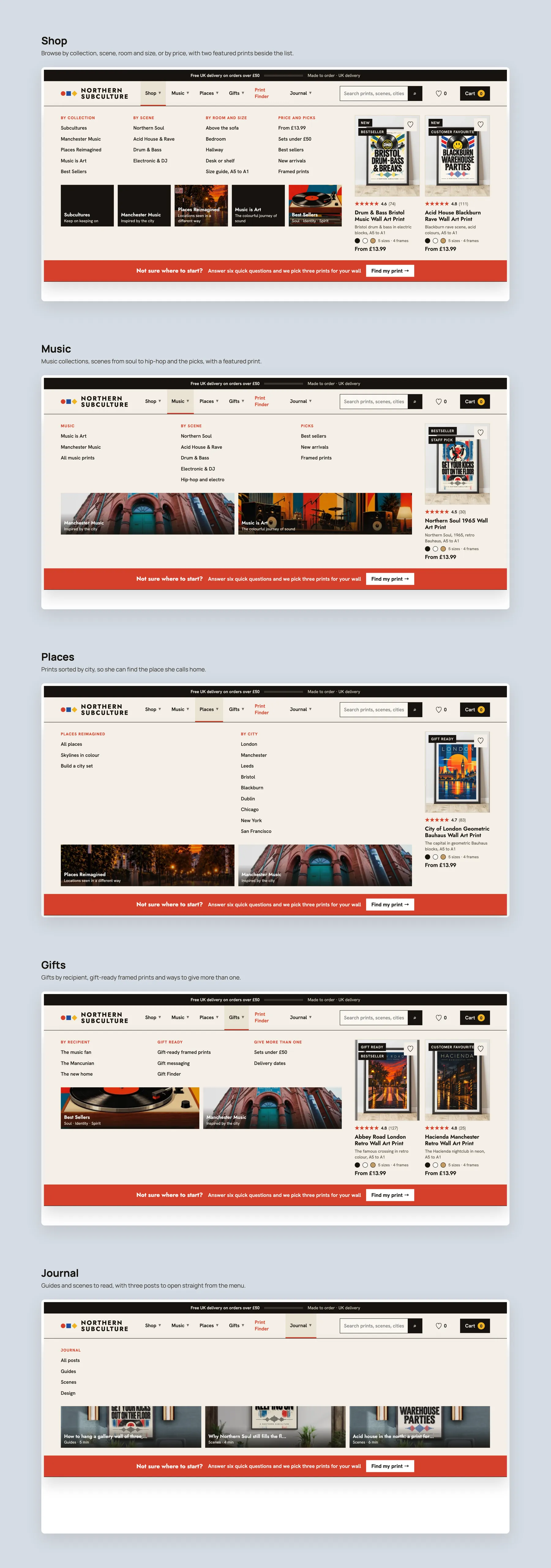
The mega menu for Shop, Music, Places, Gifts and Journal, each panel open.
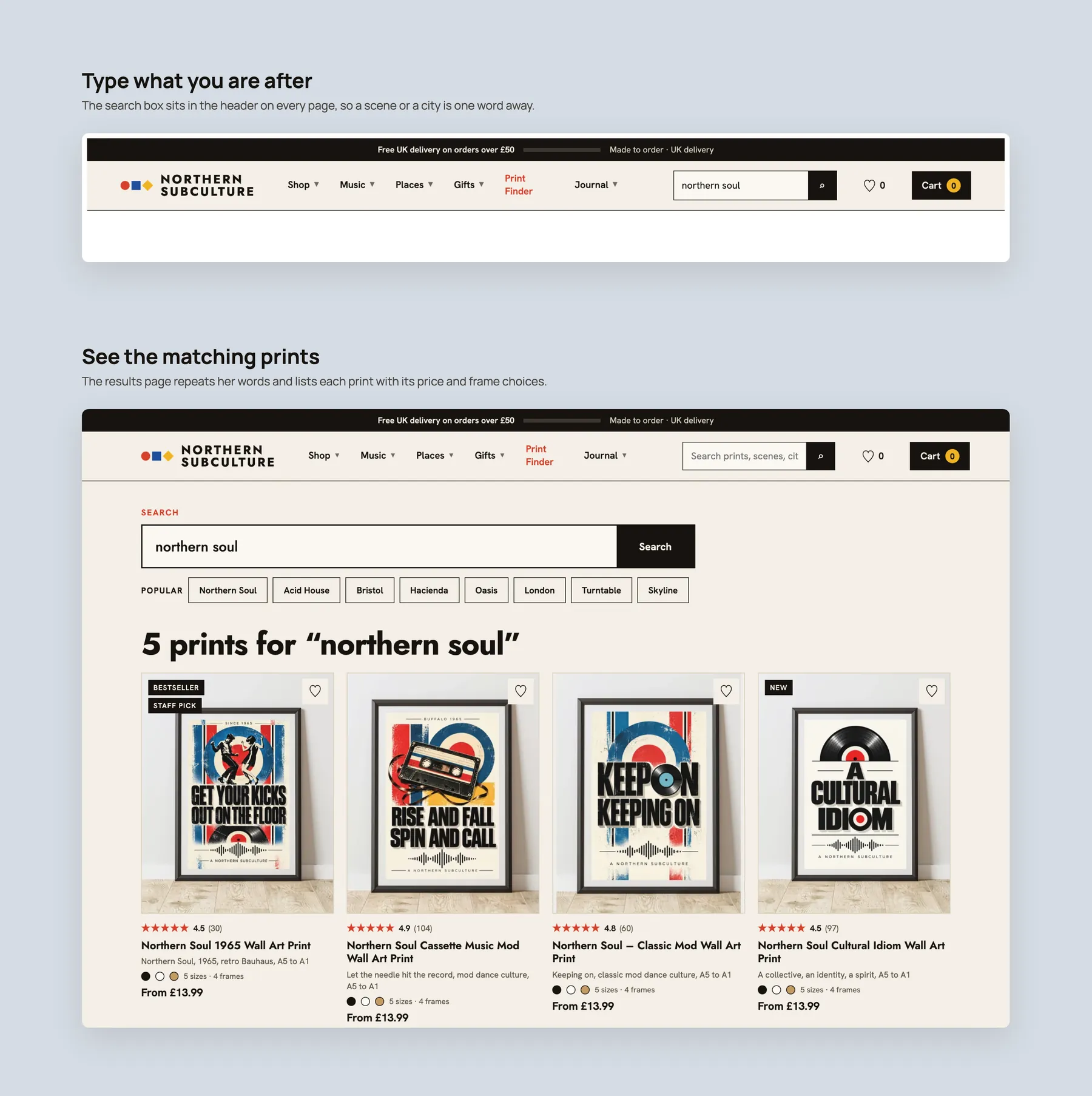
Search: a query typed in the header, then the results page for it.
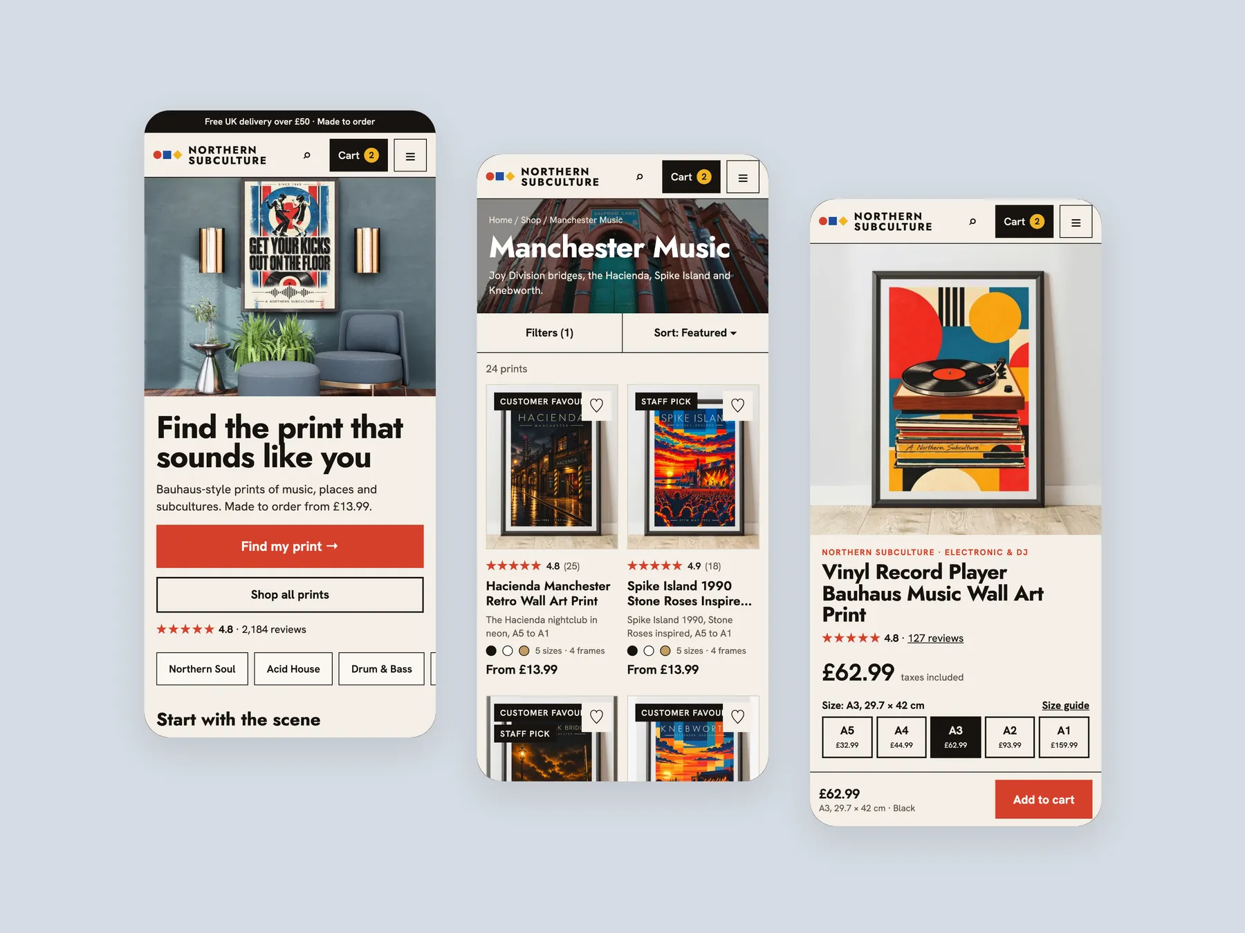
Three phone screens: home, collection and product.
No. The audit found the range of prints and frames strong. The weakness is the presentation layer, which does not help visitors discover the right print or feel confident enough to buy it.
The store is already paying for traffic that the site does not convert well. Fixing discovery, trust and the product page first means any extra traffic later is spent on a site that sells.
It should answer what the business does, who it is for and whether it can be trusted. At the moment it shows products and prices without any of that reassurance for a first time visitor.
They are routes through the store based on how people actually shop, such as by scene, room, size, budget, music or gift recipient. They replace a flat catalog with directions that lead each visitor to a sensible next step.
It asks a few questions about the room, size and wall colour, then recommends matching prints and shows them on a wall. It works like a shop assistant asking how they can help, and it can also be used in ads.
It lists prints with image, name and price, and relies on the standard theme sort. There are no filters for size, frame, room or colour, so visitors cannot narrow the range or compare prints at a glance.
A buyer deciding on a framed print wants to know the full cost and what happens if something goes wrong. Leaving shipping to checkout and omitting returns adds doubt at the moment of decision.
It can show storewide reviews on every product page where an individual print has none, and add customer photos later. Seeing other buyers happy removes the fear of being the first to take the risk.
Offer pair and bundle deals, a free delivery progress message, complete the look suggestions by room, and a set builder. A gifting route also brings in shoppers buying for someone else.
They answer the questions buyers have before purchase and reduce hesitation. Clear question and answer content also helps the store be found when people ask search engines and AI assistants about art prints.
No. It is a clickable prototype made in Figma to show what is possible when the pages are built around conversion. Final design decisions would follow a strategy call and an agreed scope.
The recording reviews the homepage, a collection page and a product page, first as they are today and then as a redesigned concept. It also covers options for working together and next steps. The video runs 28 minutes.
Tell us about your store and we'll send a personalized 5-minute video showing exactly where you're losing buyers — and how to win them back.
Takes about 40 seconds. No call required.