BELL ST CRO Audit
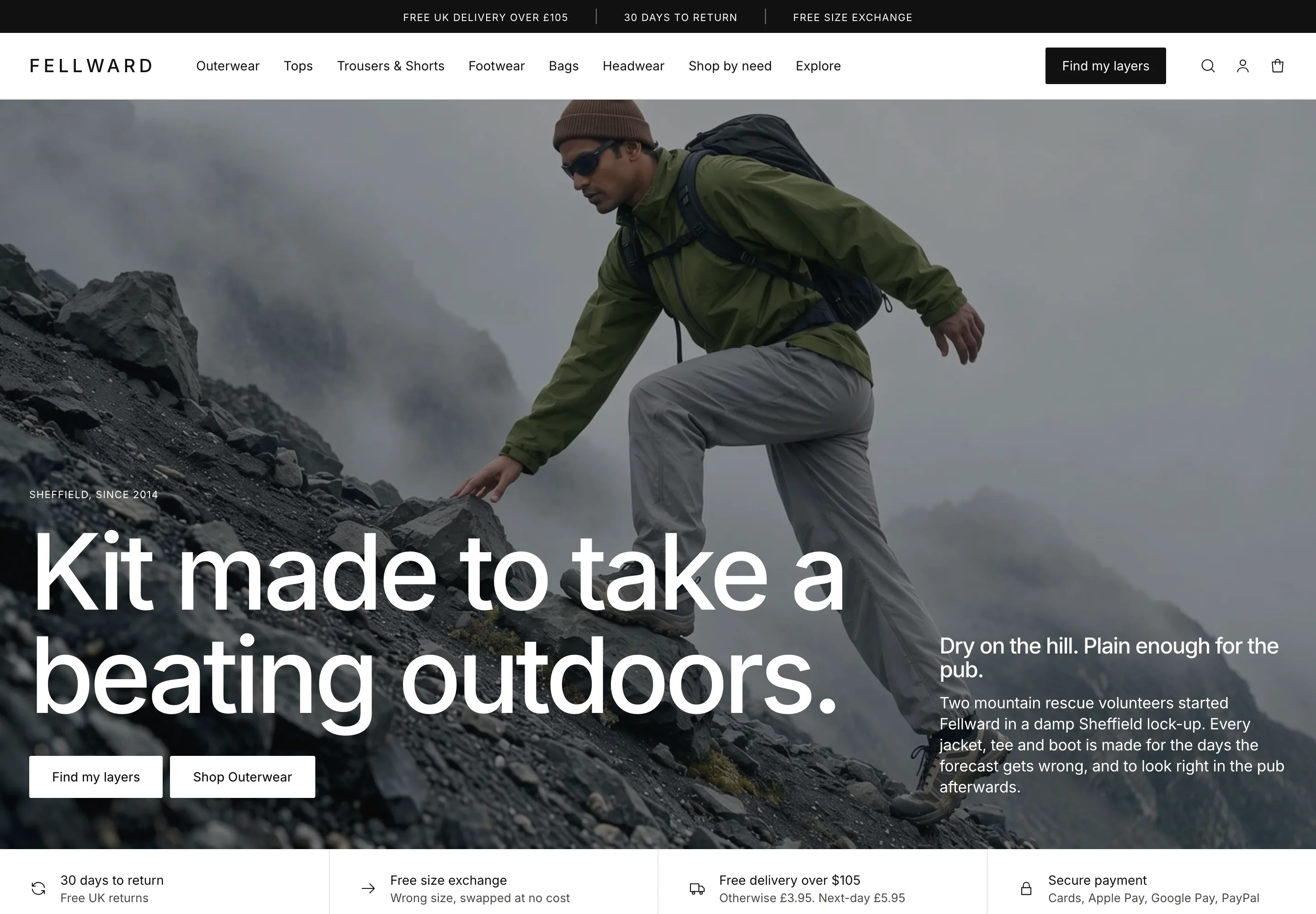
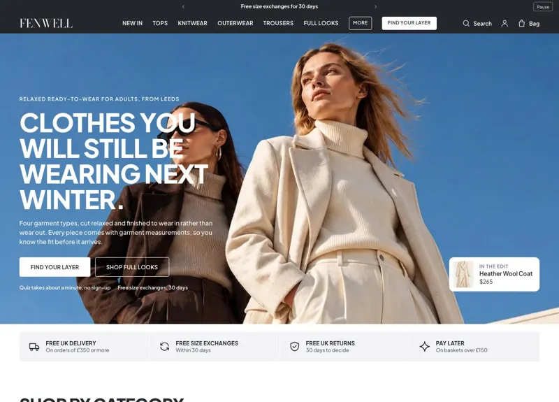
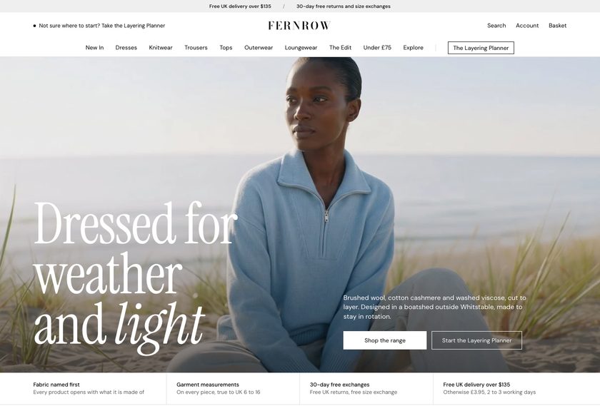
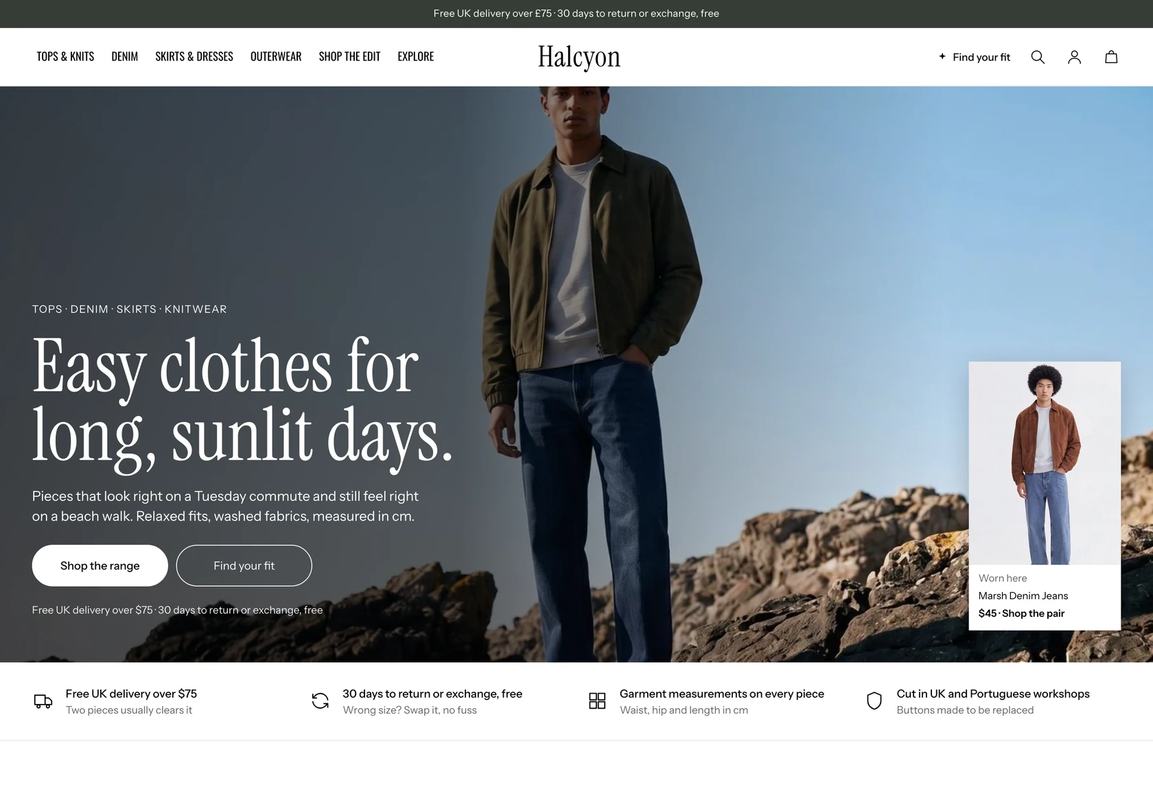
A teardown of the BELL ST homepage, collection page and product page, showing where a clean premium denim store stops short of selling, plus a redesign that answers the visitor's questions.
Watch the full 31-minute recording.
Pressing play loads the video from YouTube — you can allow it for every teardown under cookie preferences.
What we found.
BELL ST sells premium pure cotton denim, and the foundation is strong. The design is clean, the real life photography is well shot, and the product page already carries a description, fabric care and traceability details. The idea behind the product is a good one, and the store looks like a brand worth taking seriously at first glance.
The problem is that the site behaves like a catalog. The homepage headline about pure cotton denim says what the product is, but it does not say who it is for or why a stranger should trust the brand with their money. The four collection names are used as if every visitor already knows what each one means, and they do not.
The same gap repeats lower down. The collection page has category text that is hard to read, so visitors who arrived from an ad with real interest find no one to guide them and leave within seconds. The product page then lists the jeans and the buy option, but does not explain the fit, answer doubts about a £135 price, or keep selling once the buy box ends.
The direction is a store that talks to the visitor: a hero that answers three questions, collection names that explain themselves, a Find My Fit quiz, product cards with deciding facts, and a product page that keeps reassuring and pairs scarves with jeans. The one idea to remember is that the store has the product, and now it has to make the case for it.
Problem, opportunity, impact
The store works like a catalog. It shows pure cotton denim in clean photography but never says who the jeans are for, why a £135 pair is worth it, or which of the four fits suits the visitor.
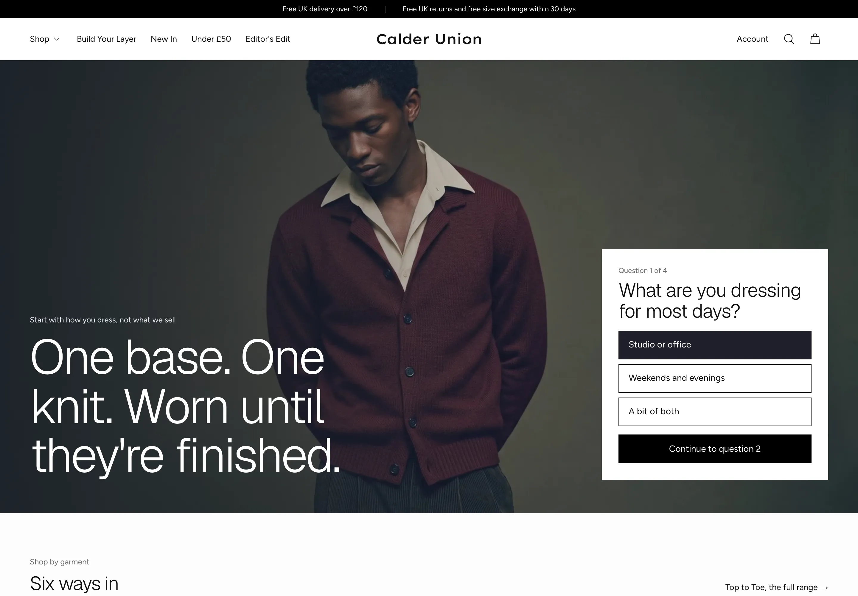
Turn the store into a salesman. Answer what it is, who it is for and whether to trust it in the first seconds, explain each fit, guide shoppers with a fit quiz, and keep selling below the buy box.
More new visitors stay, find the right fit with confidence and add to the basket, with a natural lift in order value from pairing scarves with jeans. No conversion rate is promised.
Scored across five dimensions.
Five dimensions, each scored out of ten.
-
01
Homepage & PDP review Where attention leaks and buyers hesitate, section by section.
-
02
Mobile UX audit 70% of your traffic — judged on its own terms.
-
03
Trust & credibility check The signals that make first-time buyers convert.
-
04
Collection & discovery Filtering, merchandising and guidance from browse to buy.
-
05
Prioritized CRO roadmap Ranked by impact vs. effort, ready to ship.
Every issue, paired with its fix.
12 issues found, 14 fixes proposed.
Homepage Answers Only One Of Three Questions
The headline about the beauty of pure cotton denim says what the product is. It does not say who the jeans are for or why a new visitor should trust the brand with their money.
Collection Names Mean Nothing To Newcomers
The four collection names are presented as if visitors already know them. A first time shopper cannot tell what separates one from another, so the names give them nothing to choose by.
The Store Behaves Like A Catalog
Products are displayed and available, but nothing persuades. There is no guidance, no answered doubt and no push toward the right pair, so a visitor has to sell themselves.
Nothing Guides Shoppers To Their Fit
Denim with no stretch has to be sized correctly, yet there is no quiz, no fit finder and no help choosing a collection. The shopper is left to guess among similar looking options.
Collection Page Text Is Hard To Read
The text that explains each category is difficult to read, so a visitor has to work to understand it. Most will not, and the explanation does no selling at all.
Ad Visitors Arrive And Find No Guidance
People who tap an ad have shown intent, but the landing experience does not welcome them. Like a shop with no assistant, it lets interested visitors leave within a few seconds.
Product Cards Lack Deciding Details
The cards show the jeans but not the facts that drive a decision, such as the fit, the waist options or whether a pair is a bestseller, so shoppers cannot compare quickly.
Product Page Lists Rather Than Convinces
The page is clean and has a description, care and traceability, but it mostly says the product is available. It does not explain why this pair is the right one to buy.
A £135 Price Gets No Reassurance
For a premium price, buyers want to know about returns, fit risk and whether the brand is worth it. The recorded page does not answer those questions near the buy box.
Selling Stops Below The Buy Box
After the buy box the page does little more to convince. A visitor who is not ready to buy yet finds no further reasons, proof or ways to explore the product.
No Prompt To Add A Second Item
The page sells one product and stops. There is no scarf pairing, no bundle and no related suggestion, so the chance to raise order value is left unused.
Real Wearer Proof Is Missing
Shoppers cannot see which model wears which pair, at what height, or how the jeans look on real people. Without that, the fit stays an uncertain claim.
Answer Three Questions In The Hero
Rewrite the homepage opening so it says what the jeans are, who they are for and why the brand can be trusted, with sourcing, returns and quality visible within the first few seconds.
Explain Each Collection In The Navigation
Add a plain line under each of the four collection names in the menu, covering the cut, the rise and the leg, so a stranger knows what each one is before clicking.
Add A Find My Fit Quiz
Build a short quiz that asks a few questions and recommends a pair, and link it from the homepage and the top navigation, so the site acts like a person helping the shopper.
Offer Browsing By Wash And By Need
Let shoppers explore by wash, by featured pieces or by fitting need in one place, so they can start from what they care about instead of from product names.
Rewrite Collection Introductions For Readability
Replace the hard to read category text with clear, legible copy for each collection, covering the cut and who it suits, and place the matching products directly beneath it.
Show Deciding Facts On Product Cards
Add short tags to each card, such as button fly, bestseller, waist options or where it was worn, so a shopper can compare pairs without opening every page.
Show Measurements That Follow The Chosen Size
Put a size selector at the top of the collection page and let the waist and leg figures update with it, so shoppers can see how each collection differs on their own size.
Open The Product Page With A Short Summary
Place a brief summary near the buy box that explains what the pair is and who it suits, followed by delivery, returns and reviews, rather than relying on a long description.
Put Find My Size Beside The Size Choice
Add a size helper next to the colour and waist options, linking to the fit quiz, so fit doubt is resolved at the exact moment the shopper is deciding.
Answer The Price Questions Directly
Add FAQs near the buy box, such as whether a pair that does not fit can be returned for the full £135, and whether an unfamiliar brand is worth that price.
Keep Selling Below The Buy Box
Continue the page with how the jeans change daily wear, how the fit works, reviews, customer photos, and fabric care and origin, so a hesitant visitor keeps meeting reasons to buy.
Label Each Photo With Model And Height
Turn the gallery into real world proof by stating which model wears which collection and her height, so shoppers can compare the fit against their own body.
Suggest A Scarf After Add To Basket
Offer one scarf once a pair is in the basket, and show a pairing section on the page, since a shopper who has agreed to buy one item is easier to persuade to add another.
Test A Small Bundle Discount
Offer a modest saving when three items are bought together, and add a section of what other customers bought, to raise order value without leaning on heavy discounts.
The version we'd build.
The teardown in 7 lines.
- A clean, beautifully photographed store can still lose visitors if it only displays products and never persuades.
- Every homepage should answer what it is, who it is for and whether the brand can be trusted within the first few seconds.
- Collection names that the owner knows by heart are meaningless to a visitor, so each one needs a plain explanation.
- A fit quiz lets a website behave like a salesperson by asking questions and recommending a pair.
- On a premium product page, the doubts about price, fit and returns need answers beside the buy box.
- The sale does not end at the buy box, so the rest of the page should keep reassuring the visitor who is still unsure.
- Once a shopper has been convinced to add one item, suggesting a second is far easier than the first sale.
Questions this audit answers.
Design quality gets a visitor to look, but it does not make them decide. This store shows its denim well, yet it does not explain who the jeans are for or why they are worth the price, so visitors leave unconvinced.
What is it, who is it for, and can I trust this brand. If a visitor can answer all three within the first few seconds, they are more likely to feel confident enough to keep shopping. Here only the first is answered.
The owner knows what each of the four names means, but a new visitor does not. Without a plain explanation of the cut and who it suits, the names add confusion instead of helping someone choose.
It means the store shows what is available and leaves the decision to the visitor. A salesperson would ask questions, answer doubts and suggest the right product. The site currently does none of that.
It is a short set of questions that ends with a recommended pair. Because the denim has no stretch and sizing matters, it removes guesswork and lets the website guide the shopper the way a person would.
They clicked because the product image interested them, then landed on a page with hard to read text and no guidance. With nobody to help them, many leave within a few seconds.
It is clean and has useful details, but it mostly states that the product is available. It does not make the case for the pair, answer doubts about a £135 price, or keep persuading once the buy box has been passed.
By suggesting a scarf once a pair is added to the basket, showing a pairing section on the product page, and testing a small saving when three items are bought together. Each uses the trust the first decision has already earned.
No. It is an idea from the design team that shows where to start, and the hero image was a weak placeholder. A real project would refine the visuals, copy and every page.
No. The aim is to optimise the store for conversion, and the revenue calculator only illustrates what different rates would mean. No specific result is promised.
No. The existing look is already clean and well photographed. The audit is about the visitor's journey, what they feel on arrival, and what helps them feel confident enough to buy.
The teardown covers the homepage, the collection page and the product page, followed by a walkthrough of the proposed redesign and next steps. The recording is 31 minutes long.
See what's quietly costing you sales.
Tell us about your store and we'll send a personalized 5-minute video showing exactly where you're losing buyers — and how to win them back.
Takes about 40 seconds. No call required.
-
5-minute video teardownA personalized walkthrough of your store, recorded by Eva.
-
Homepage & PDP reviewWhere attention leaks and buyers hesitate.
-
Mobile UX audit70% of your traffic — judged on its own terms.
-
Trust & credibility checkThe signals that make first-time buyers convert.
-
Prioritized CRO roadmapRanked by impact vs. effort, ready to ship.