Homepage
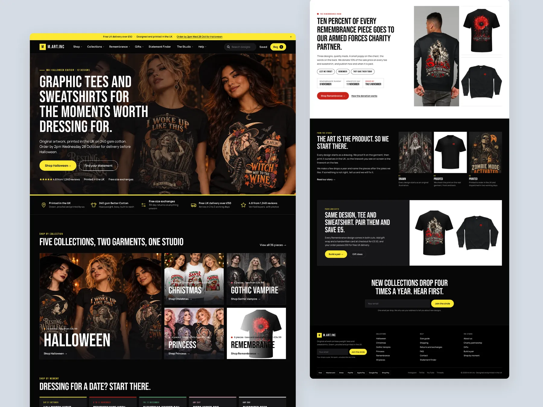
The full page shown as two tall columns, from the first screen through the collections to the footer, so the whole journey reads at once.
Storefronts we designed and built, across supplements, fragrance, health, wellness and skincare.
All 35 projectsFour engagements, measured before and after. What changed, why it changed, and by how much.
All case studiesDiagnosis, design and development from one studio — so the recommendation and the build never disagree.
All five services192 real Shopify stores torn down page by page, scored, and shown beside the version we would build. Free to watch.
Browse all teardownsConversion-first Shopify themes, each built for one industry’s buying journey. No required apps, no monthly theme fee, one licence per store.
See all themes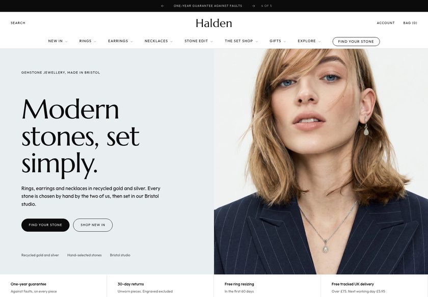 Halden
Jewelry & Accessories
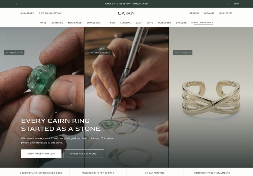 Cairn
Jewelry & Accessories
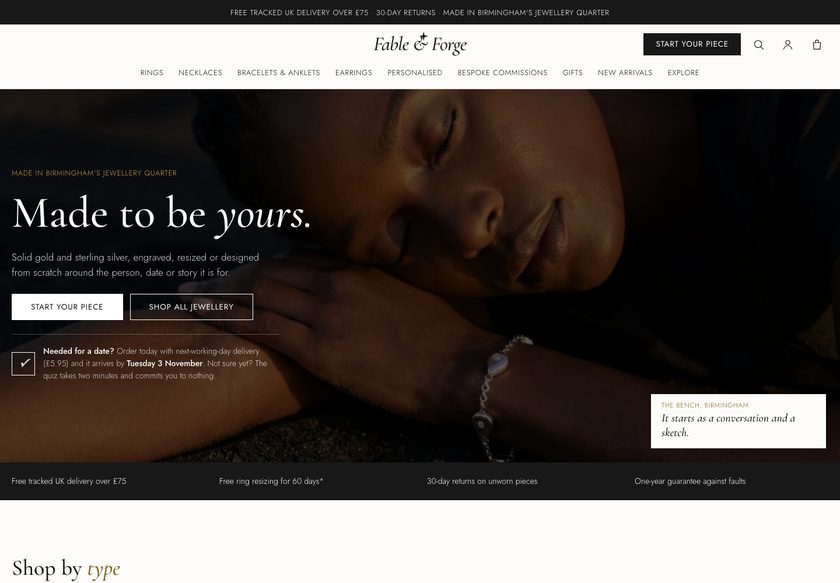 Fable & Forge
Jewelry & Accessories
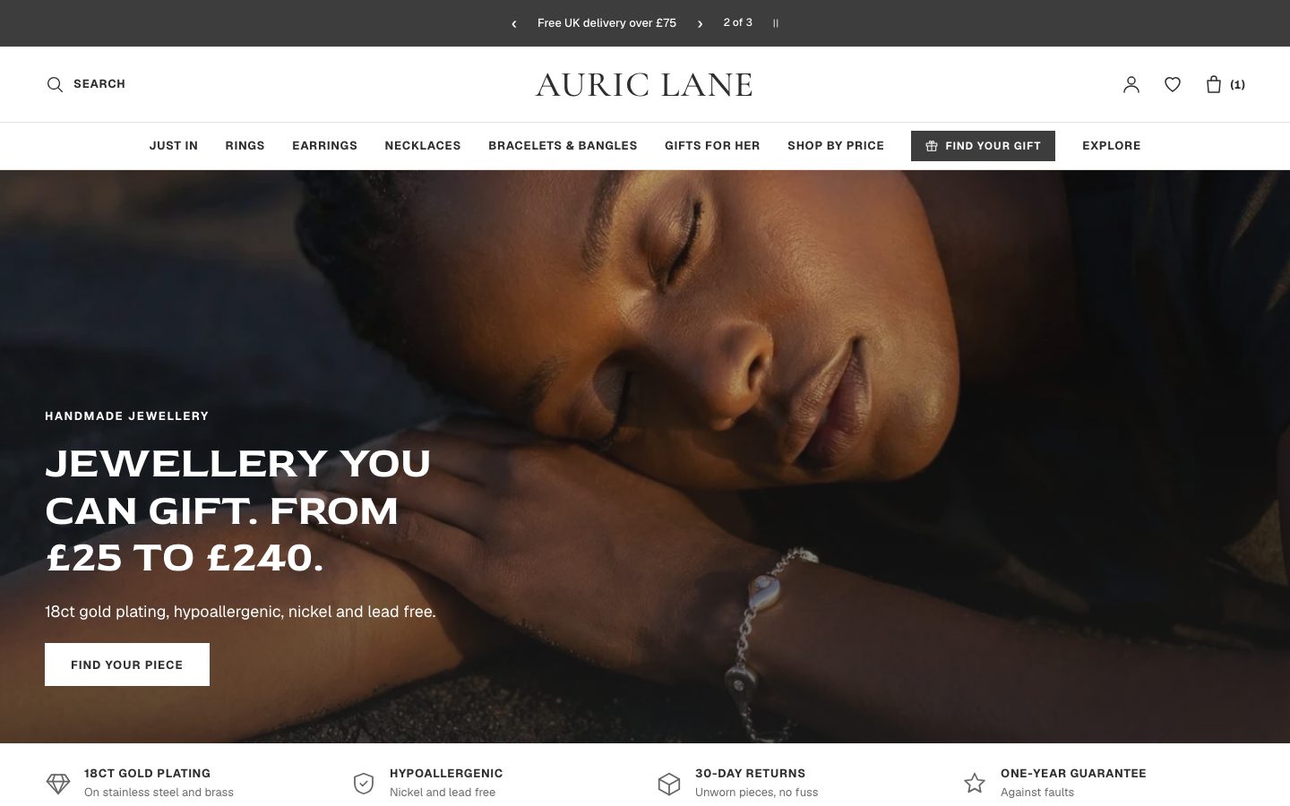 Auric Lane
Jewelry & Accessories
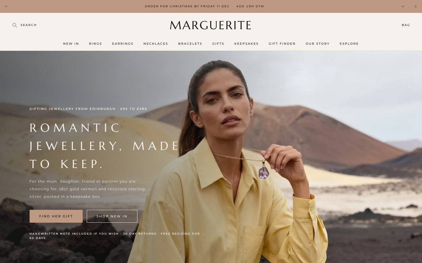 Marguerite
Jewelry & Accessories
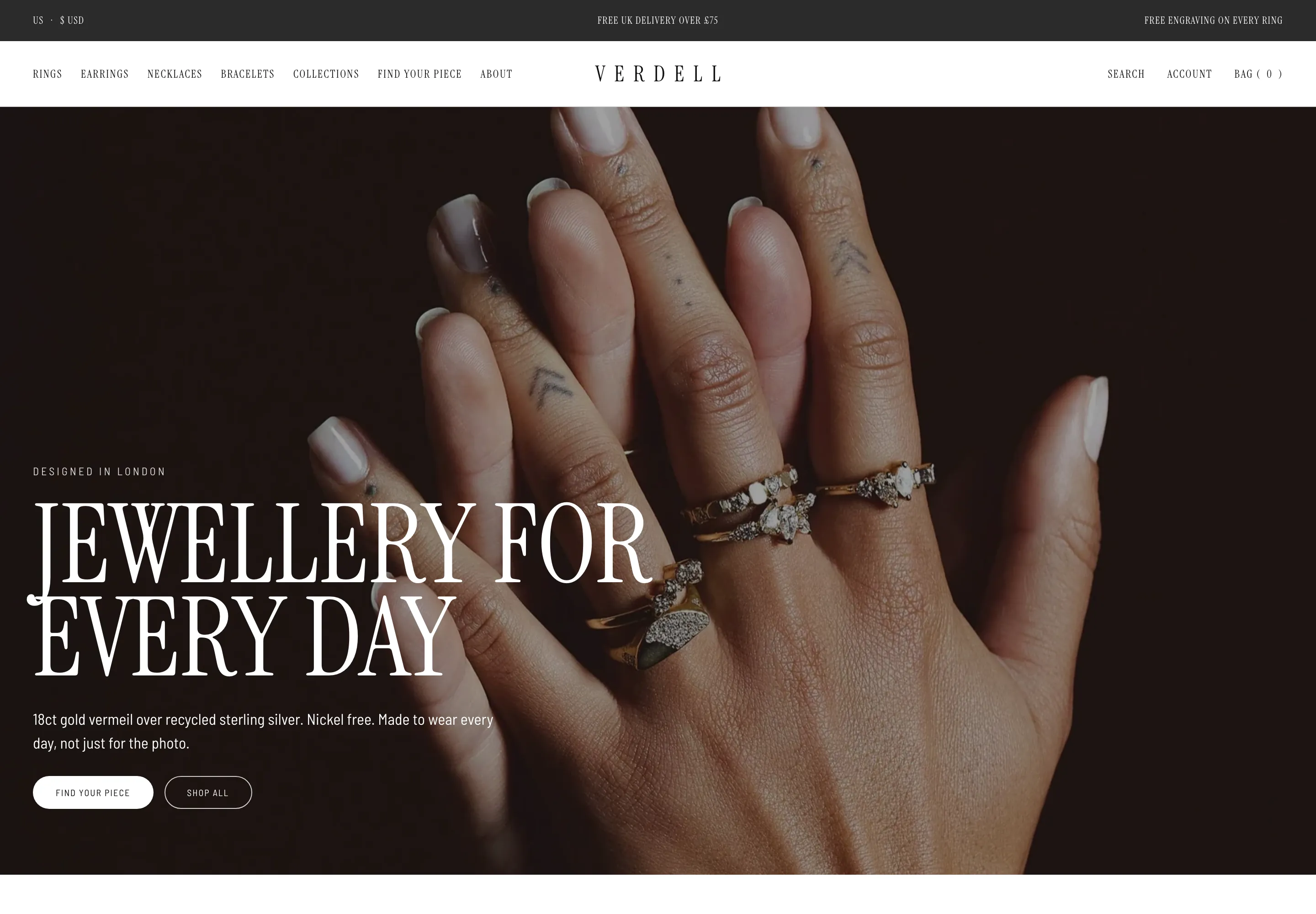 Verdell
Jewelry & Accessories
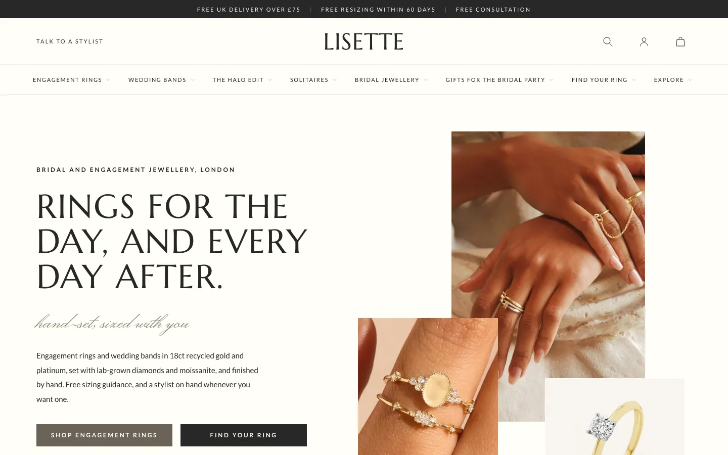 Lisette
Jewelry & Accessories
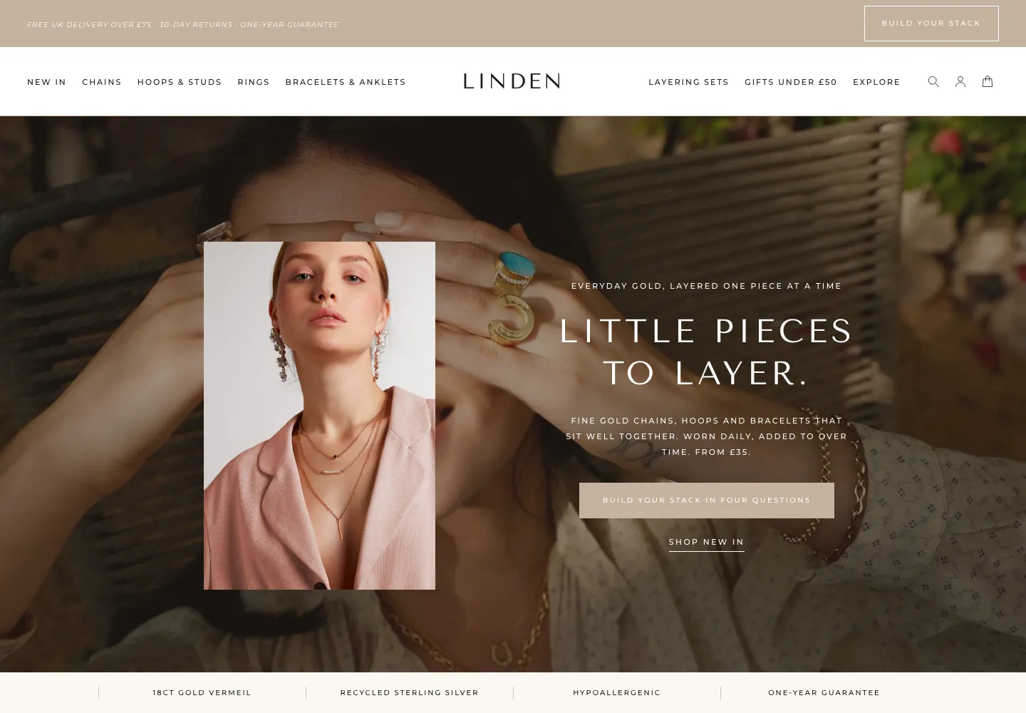 Linden
Jewelry & Accessories
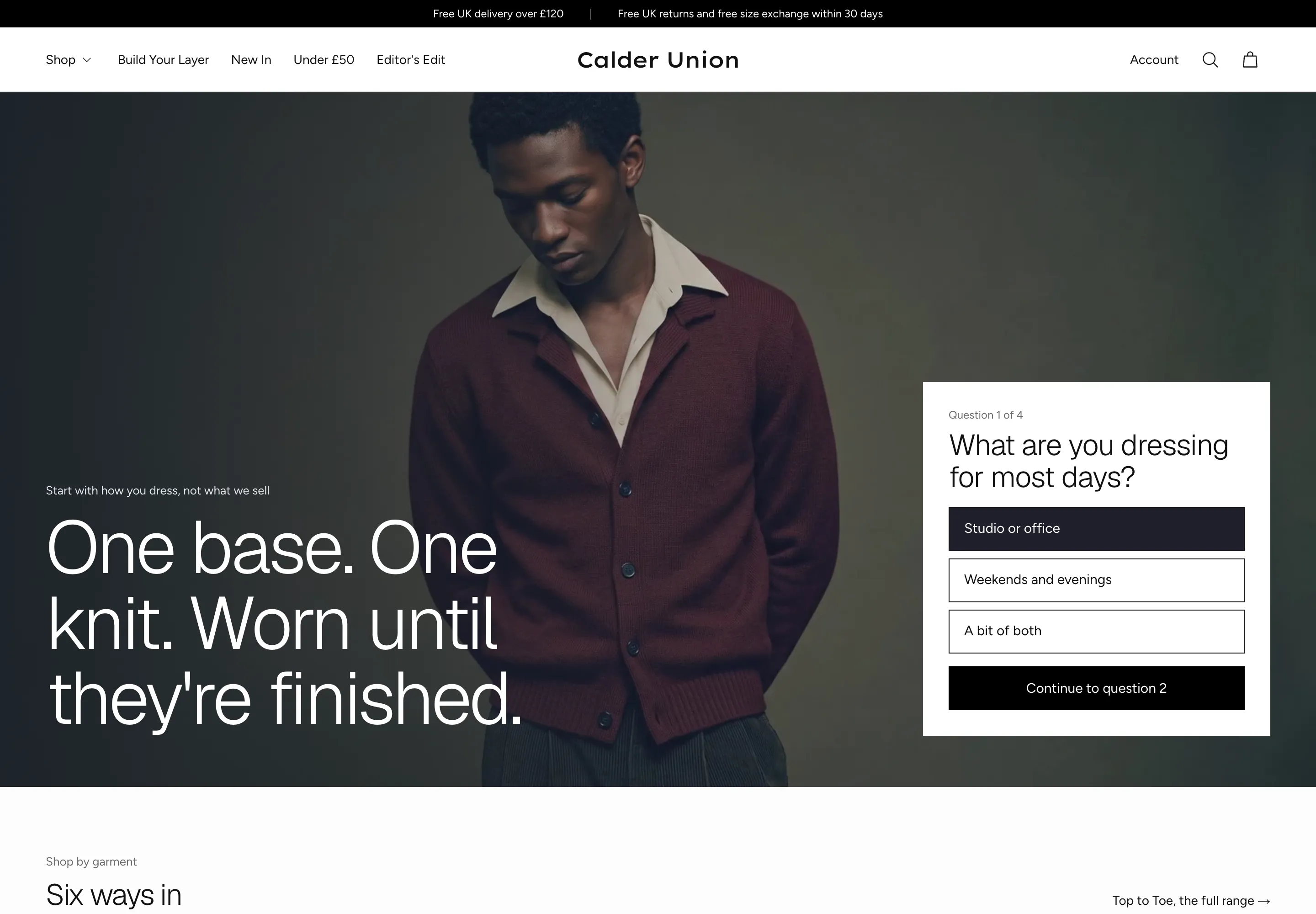 Calder Union
Clothing & Apparel
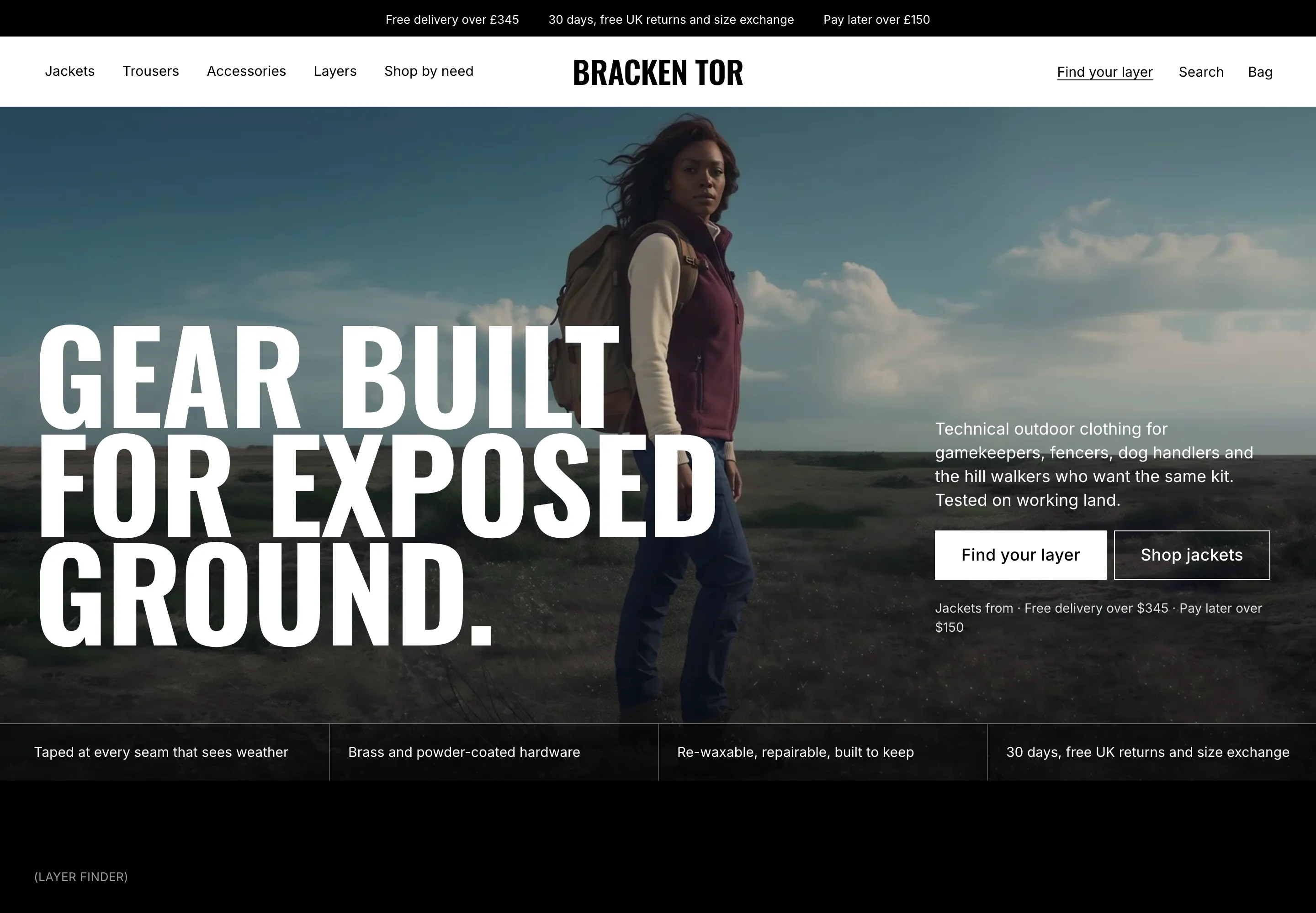 Bracken Tor
Clothing & Apparel
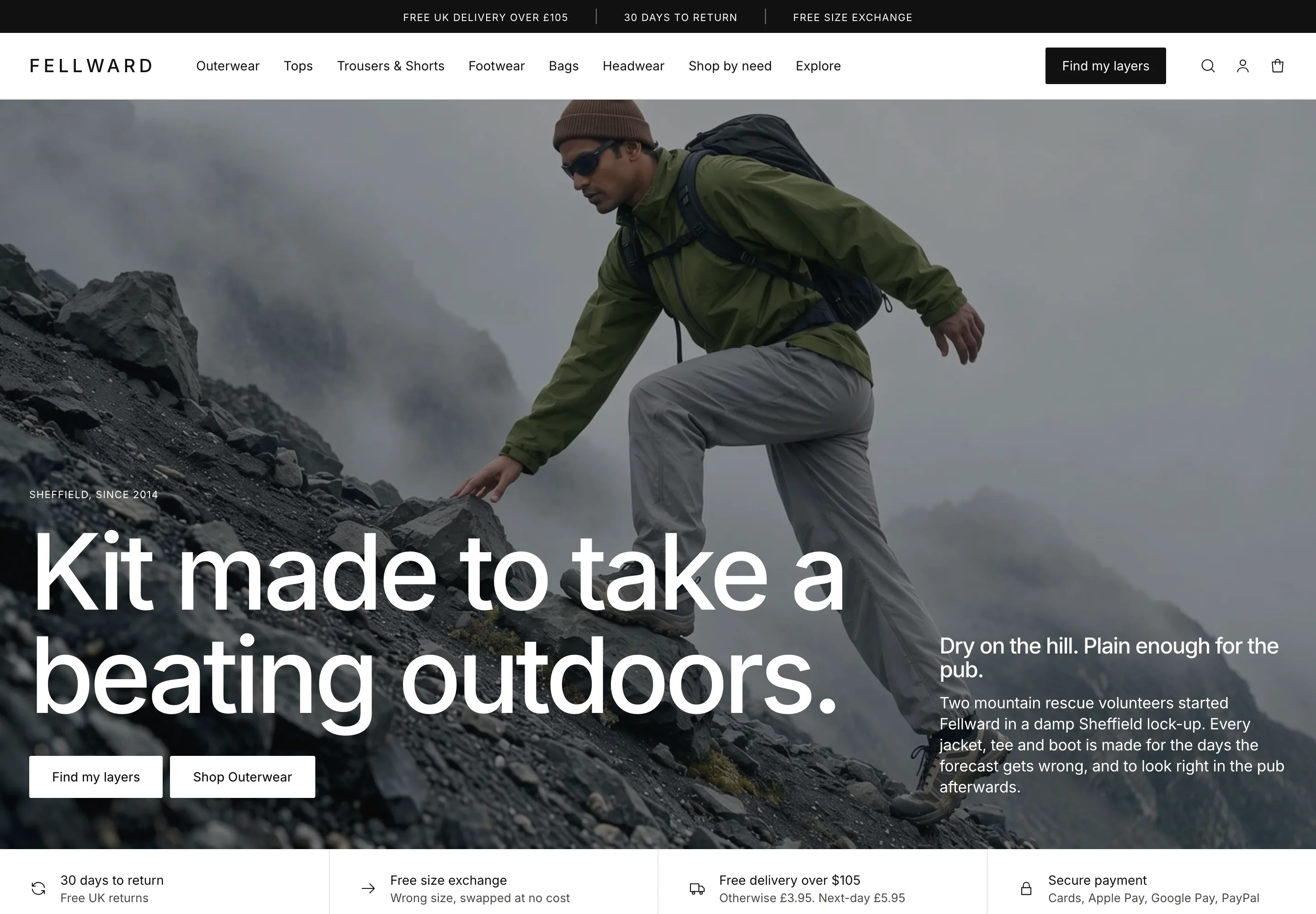 Fellward
Clothing & Apparel
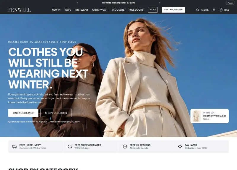 Fenwell
Clothing & Apparel
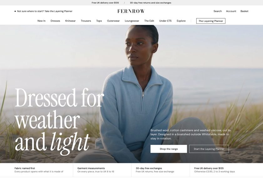 Fernrow
Clothing & Apparel
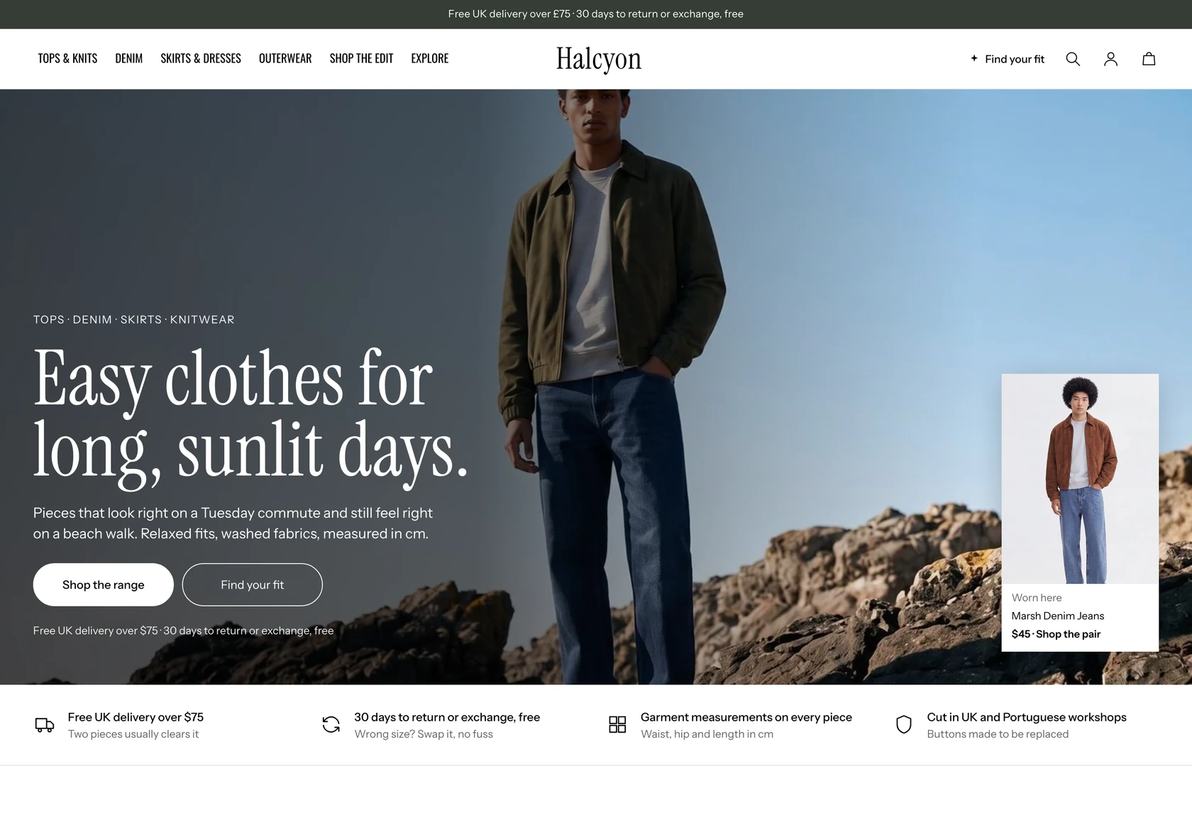 Halcyon
Clothing & Apparel
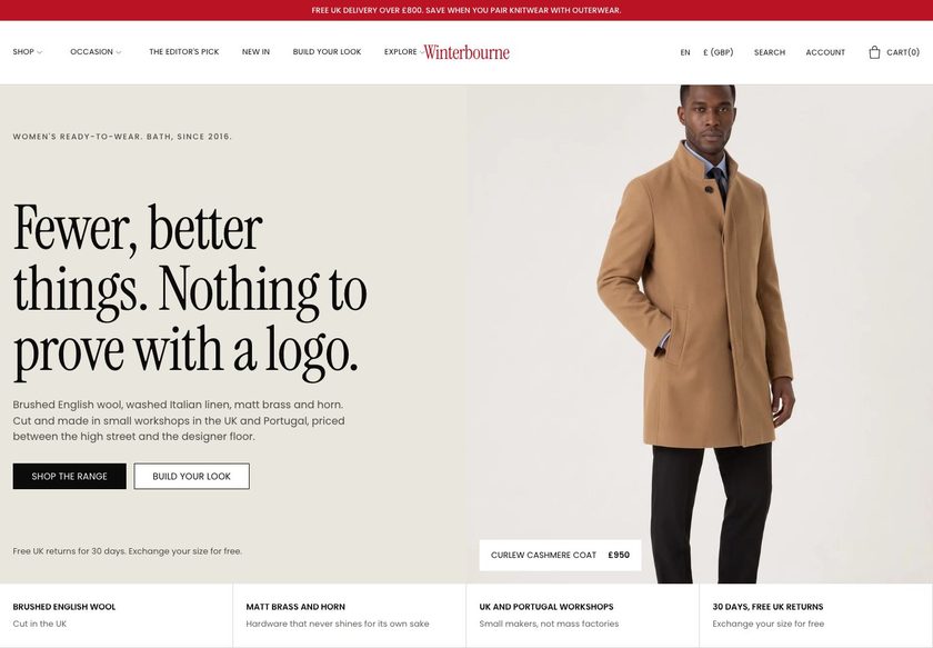 Winterbourne
Clothing & Apparel
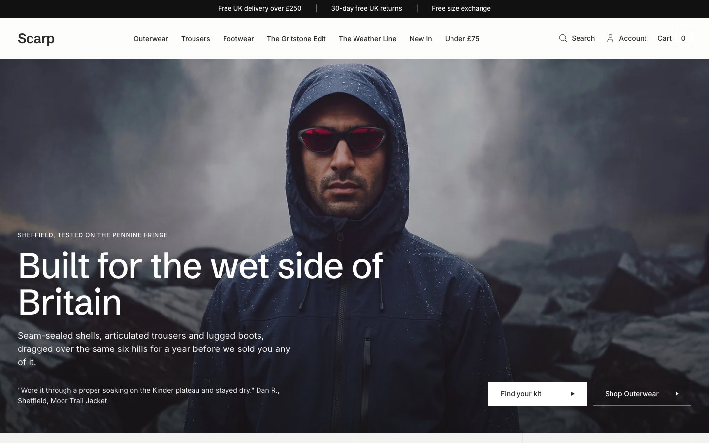 Scarp
Clothing & Apparel
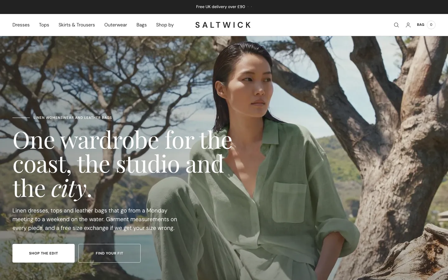 Saltwick
Clothing & Apparel
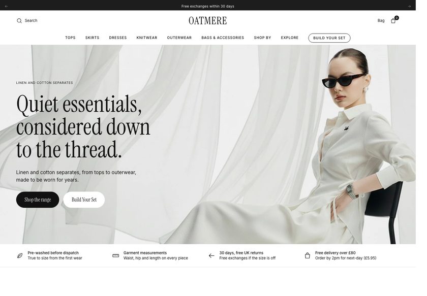 Oatmere
Clothing & Apparel
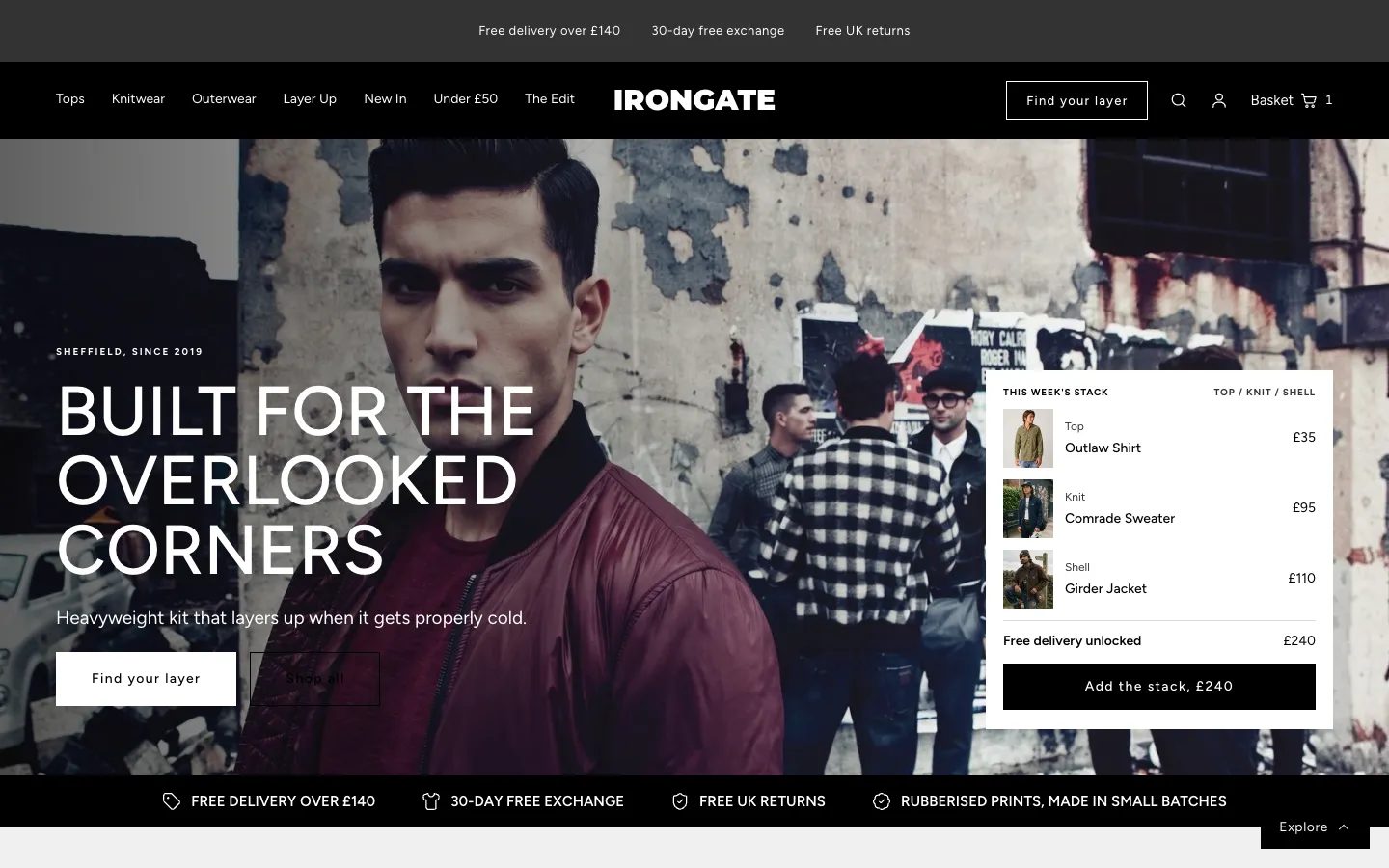 Irongate
Clothing & Apparel
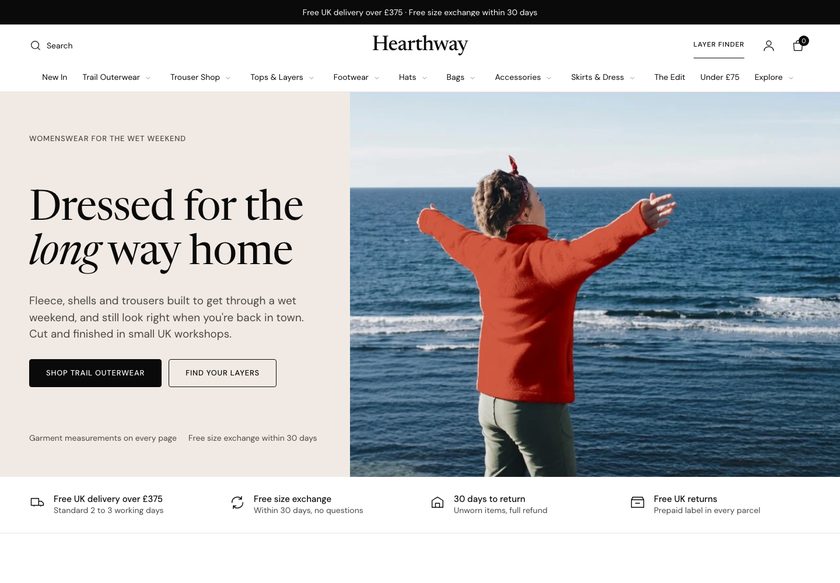 Hearthway
Clothing & Apparel
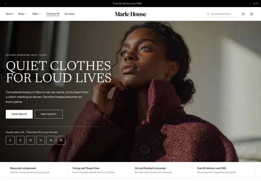 Marle House
Clothing & Apparel
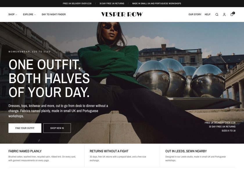 Vesper Row
Clothing & Apparel
A page by page teardown of a UK printed graphic tee store, covering the homepage, a collection page and a product page, plus a redesign concept built around guided buying paths.
Pressing play loads the video from YouTube — you can allow it for every teardown under cookie preferences.
The store has a real range of printed graphic tees with plenty of personality, from slogan designs such as Born to Be Wild and Brains Are Overrated to seasonal themes. The products are not the weak point. A visitor can see clothing worth considering, and a price point like £25 is easy to accept once trust is in place.
The core problem is the presentation layer. The homepage does not say what the business does, who it is for, or why it can be trusted. A visitor can tell it sells clothing from the name alone, and the navigation, the hero and the Shop Now prompts give no sense of direction, so hesitation starts in the first few seconds.
The same problem repeats further down. The collection page lists images, names and prices like a catalog, with only standard Shopify sorting. Two tees look identical without opening each page. On the product page, measurements, delivery, returns and reviews are missing, so the questions a buyer has go unanswered.
The direction is to act like a good shop assistant. Win trust at the top, offer clear paths by collection, moment, budget and gift, and use a fit finder to recommend the right tee. Then back every product with reviews, sizing and delivery answers. The idea to remember is that the visitor needs guiding, not just showing.
The site presents products like a catalog. It never says what the business is, never answers fit, delivery or returns questions, and shows no reviews, so first time visitors have no reason to trust it.
The store could become a guided shop where the homepage explains the brand in seconds, navigation and a fit finder lead each visitor to the right tee, and reviews and bundles support a larger basket.
A visitor who understands the brand, finds the right tee faster and sees proof and answers on the product page is far more likely to buy, and to add a second item. Existing traffic works harder.
Five dimensions, each scored out of ten.
13 issues found, 15 fixes proposed.
The first screen does not say what the store sells, who it is for, or why a stranger should trust it. Beyond the brand name, a visitor cannot tell what makes this clothing different.
Hovering over the navigation reveals nothing useful. There are no routes by collection, occasion, budget or gifting, so the menu misses its chance to help a visitor start exploring.
The collection section begins partway down the page and does not tell the visitor which collections or types of apparel exist. The space feels unfinished rather than directional.
Visitors are asked to shop now before they know what the store offers. It is like greeting someone at a shop door with a hard sell before they have looked around.
The page is a grid of images, names and prices. It lists what is available but does little to help a visitor discover, compare or choose between products.
Only the standard Shopify theme sorting is offered, covering price and availability. There are no filters for design, colour, garment or size to narrow a long list.
Born to Be Wild and Brains Are Overrated share the same colour and price, and the cards say nothing more. A shopper must open five or six pages to compare, and may leave frustrated.
The product page shows a name, price, colour and size, but no measurements. The first question in a buyer's mind is whether it will fit, and the page does not answer it.
Nothing on the product page says when an order will arrive, what delivery costs or how returns work. These are the objections that stop a first time buyer at the Add to Cart button.
A new visitor spending £25 with an unfamiliar brand looks for other customers' experiences. With no reviews on any page, there is no proof that anyone has bought and been happy.
The site does not explain why to buy from this store rather than from Etsy, Amazon or a cheaper seller. Fabric, print quality and UK production are not used to justify the price.
There are no bundles, pairing suggestions or free delivery thresholds. A customer buying one tee is never shown a jacket or a second item to go with it.
Clicking About or other links does not take the visitor anywhere useful, and the charity programme is not described on the site. A genuine trust asset is left unused.
State what the store sells, who it is for and why it can be trusted in the first screen. Add proof points such as printed in the UK, fabric weight and size exchange next to a clear call to action.
Place a slim bar above the header with free UK delivery above a set order value, designed and printed in the UK, and easy returns, so trust signals appear before the visitor scrolls.
Organise the shop menu by collection, department, price band and moment. Let a visitor reach Christmas, Halloween, Gothic or Remembrance tees, or an under budget range, in one click.
Create a gifting section in the menu and on the homepage. Visitors who arrive without something in mind can be given ideas for loved ones and occasions they had not considered.
Ask a few questions such as size and style, then recommend one tee and two close alternatives. It acts like an assistant in a physical shop asking how it can help.
Show each collection with a clear image and name directly under the hero. A visitor should see the range of themes before being asked to buy anything.
Open each collection with a short description and dispatch information. Add garment toggles for tees and sweatshirts so visitors can narrow the range without leaving the page.
Offer filters for garment, design, colour, price and size, and sorting that reflects how people shop. Include the finder as a fallback for visitors who are unsure.
Add badges such as bestseller or customer favourite, a short description, review stars, available sizes and price. Two similar tees should be comparable without opening either page.
Show a size guide beside the size selector and add a fit finder that recommends a size from the buyer's own details. Remove the doubt about whether the tee will fit.
Show an order by date for arrival, dispatch time, free size exchange, returns and secure checkout under Add to Cart. Repeat these answers in an FAQ lower on the page.
Where a tee has no reviews yet, display storewide reviews and customer photos with honest wording. Add a recent reviews section on the homepage and each collection page.
Use short sections to explain the heavy cotton blend, the print quality, the cut and the UK production. Give the buyer reasons to pay for it over a cheaper marketplace tee.
Offer build your own pairs and pre built bundles, plus a bar showing how much more to spend for free delivery. Suggest a jacket or second tee to complete the look.
Create real pages for the founder, the artist and the charity programme, and link them from the homepage. Give shoppers a human reason to trust and remember the brand.
A concept redesign created by Convertica Studio from this audit. It shows how the store could work, it is not the live store.
The full page shown as two tall columns, from the first screen through the collections to the footer, so the whole journey reads at once.
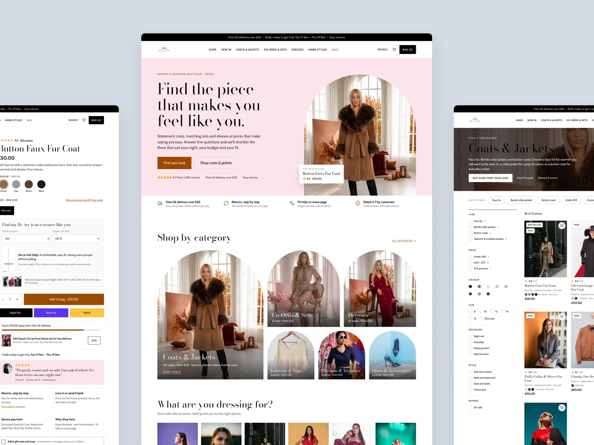
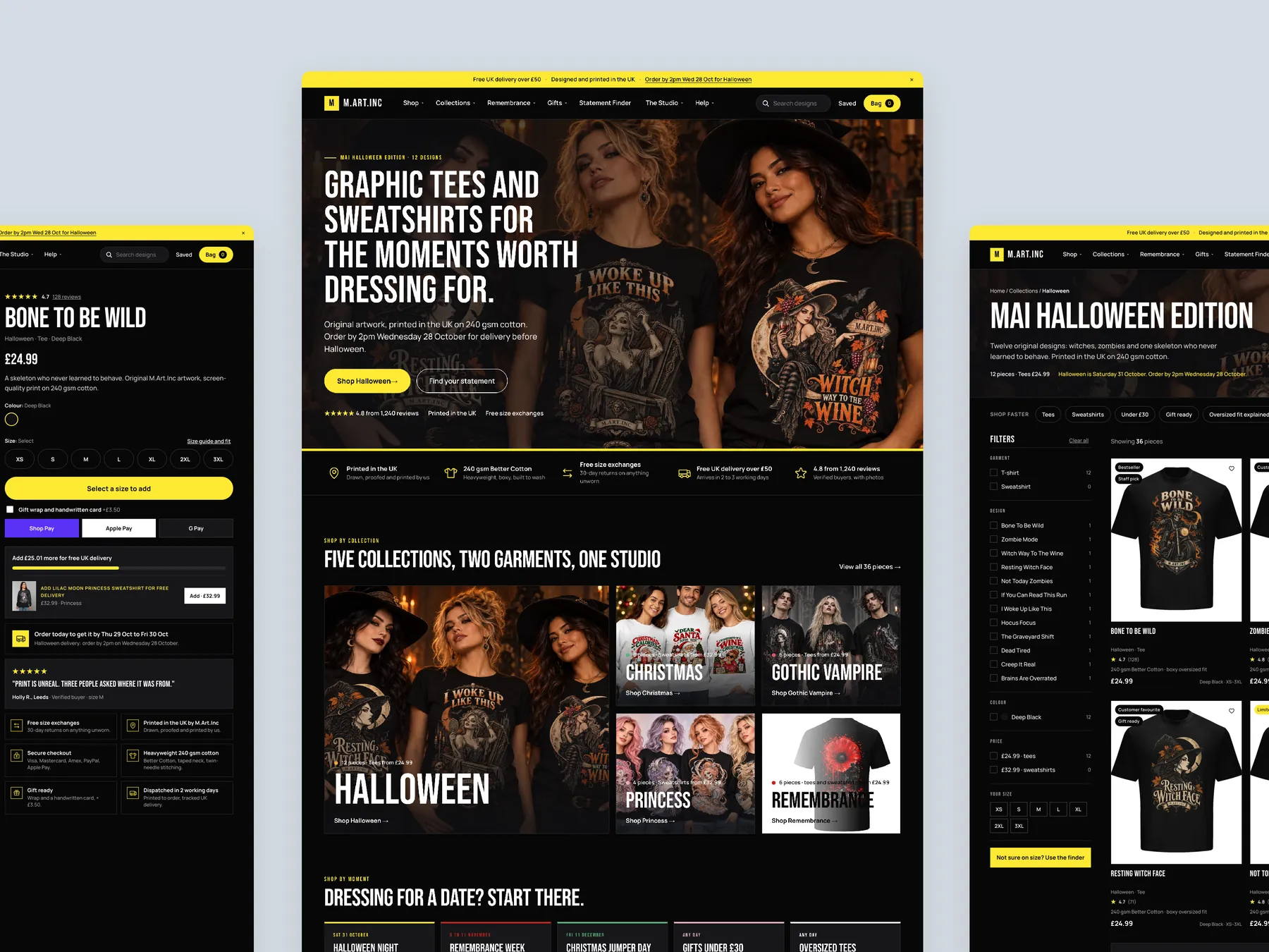
The homepage in the centre, the product page on the left with its buy column, and a collection page on the right with its header, filters and first cards.
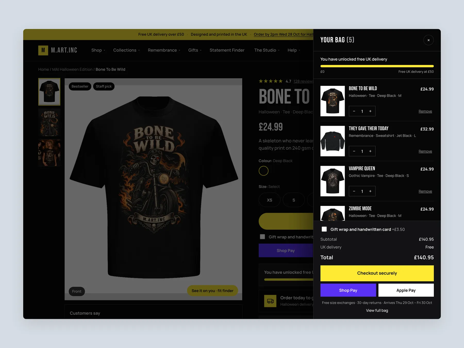
A slide-over opens on top of the product page with five lines, so the shopper keeps their place and sees the delivery progress without leaving.
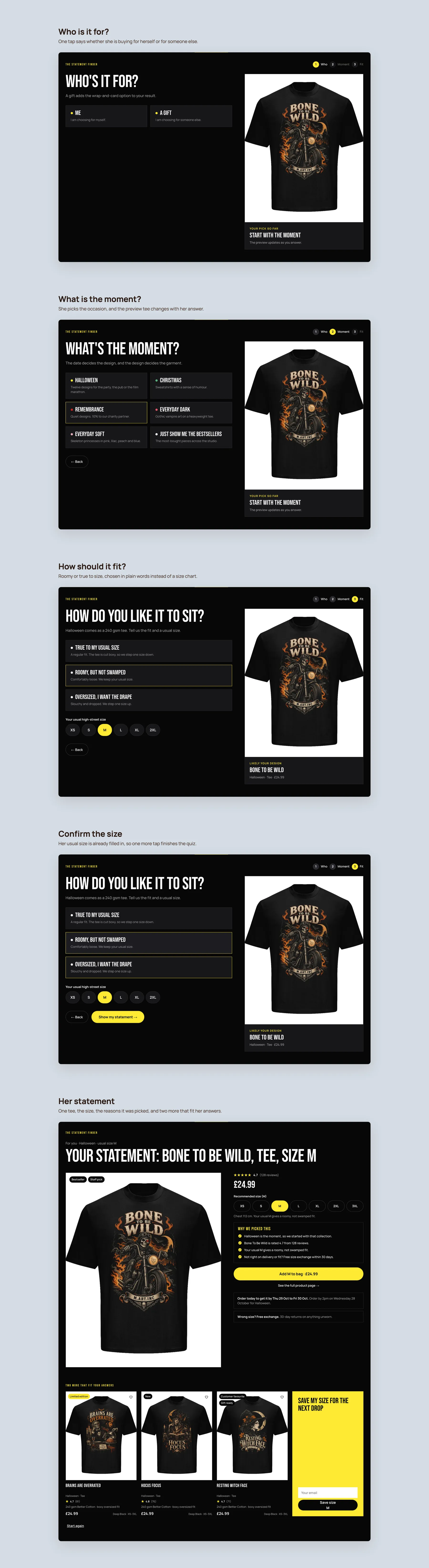
Five screens on one board: who it is for, the moment, the fit, the size, and the recommended tee with the reasons it was picked.
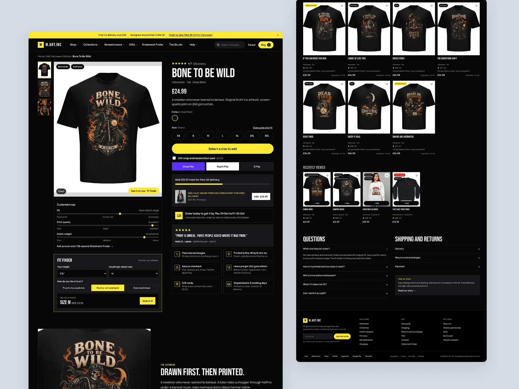
The full page as two tall columns, with the buy box whole on the left and the page running down to the footer on the right.
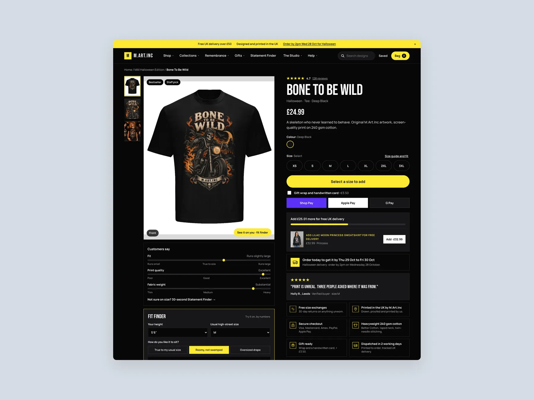
The header and the buy box together: sizes, the fit note, the add to bag button and the delivery and exchange lines, all in the first view.
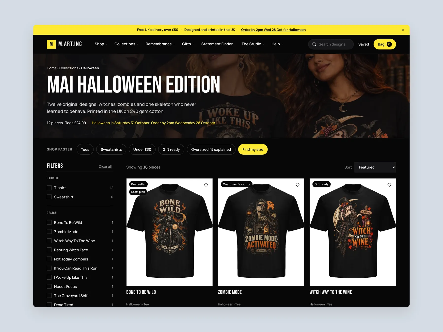
The first screen with the collection banner, quick shortcuts, filters and the first row of tees with their badges.
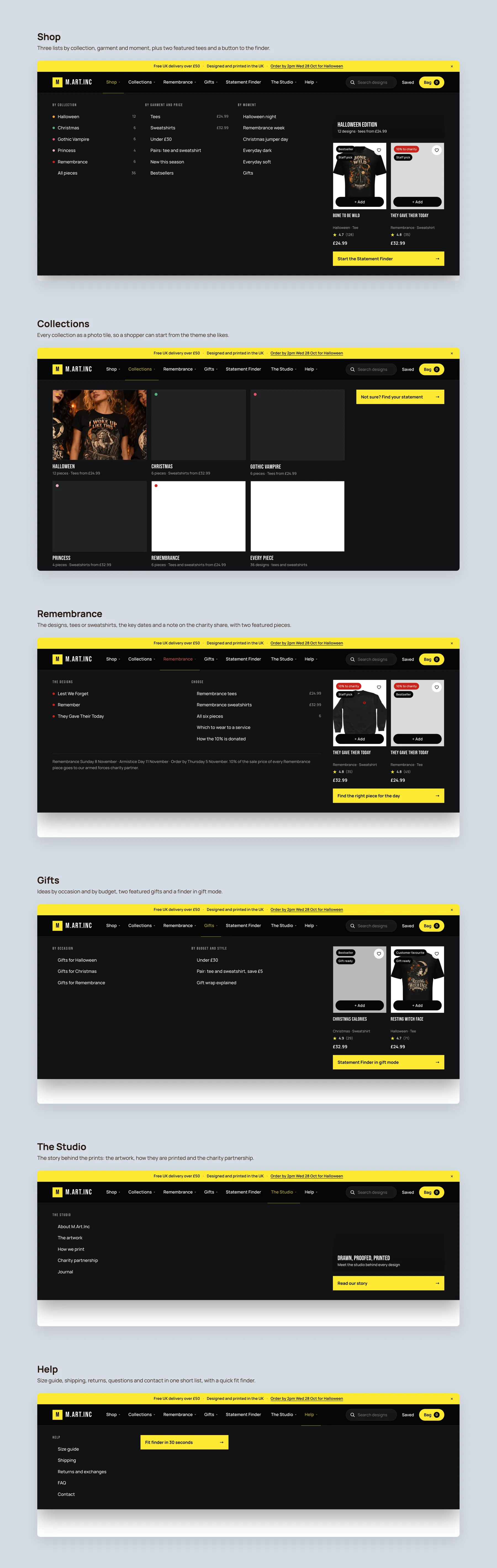
Each of the six panels open in nav order: Shop, Collections, Remembrance, Gifts, The Studio and Help, each with its own lists, featured tees or tiles.
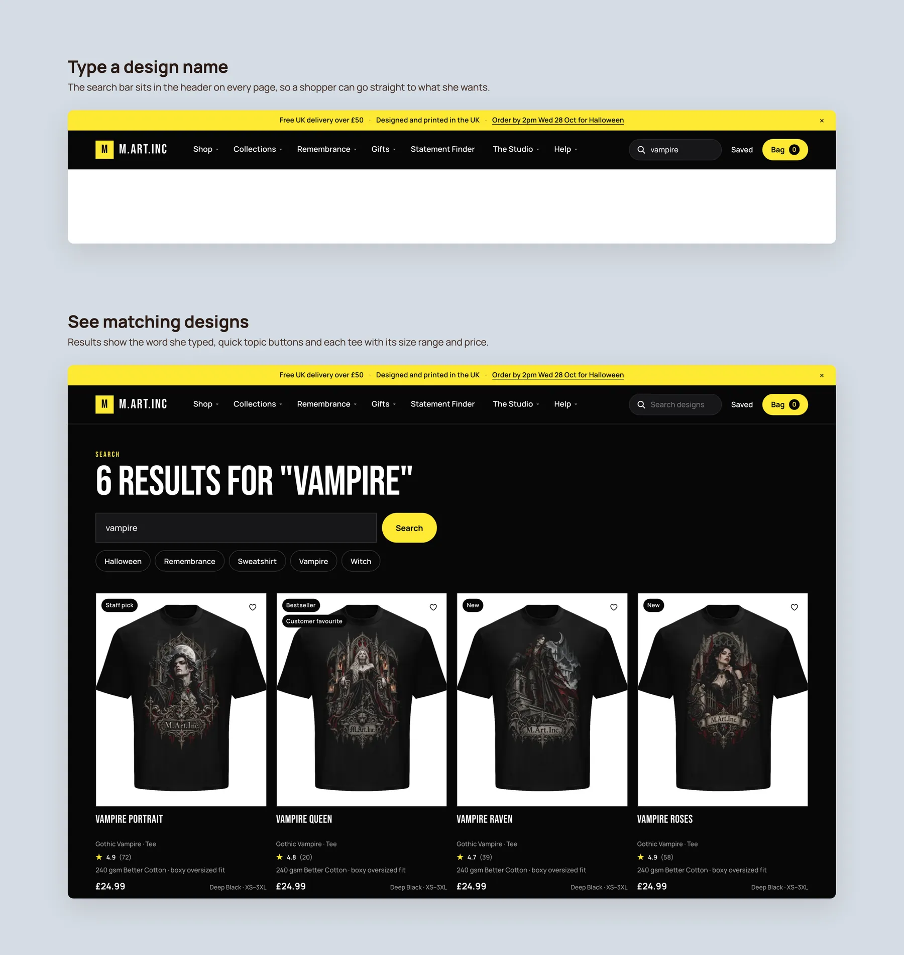
The bar with a design name typed in the header, then the results page for that word with topic buttons and tees showing size range and price.
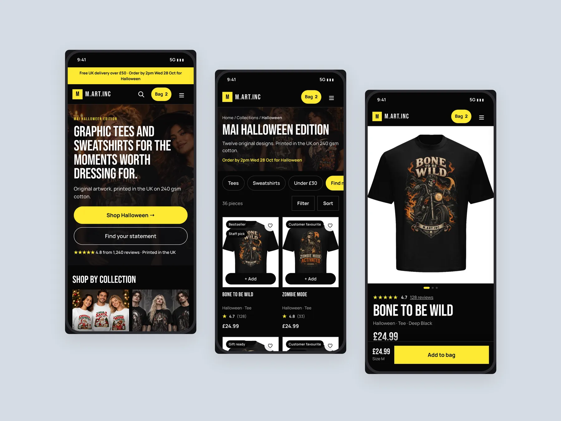
The home, collection and product screens side by side on mobile, built for the way most shoppers browse.
The audit finds that the biggest opportunity is converting the traffic already arriving, not buying more. Until the pages reassure and guide visitors, extra ad spend sends more people into the same hesitation. Fix the store first, then scale traffic.
The hero does not say what the business sells, who it is for or why it can be trusted. A visitor can only infer from the brand name that it sells clothing. The first few seconds should answer all three questions.
It behaves like a catalog, listing images, names and prices with only the standard Shopify sorting. Similar tees cannot be told apart without opening each page. Filters, badges and short summaries would make discovery much easier.
They show the problem clearly. Same colour, same price and nothing else to compare, so a shopper cannot tell which is right. A summary and badge on each card lets a buyer decide at a glance.
Measurements, delivery information, returns information and reviews are all absent. Those are the questions a buyer asks before paying. The page needs to justify the price and show that the purchase is safe.
Use storewide reviews and customer photos, and say plainly that they come from other products. A new visitor sees that real people have bought from the brand and were happy, which supports the decision.
It is a route that helps a visitor reach the right product without browsing everything. Examples are navigation by collection, moment or budget, a gifting section and a quiz that recommends a tee based on size and style.
It adds a free delivery progress bar, pairing suggestions on the product page and bundles on the homepage and collection page. The aim is for one customer to buy two or three items rather than one.
FAQs answer delivery, returns and payment questions at the point of decision. They also give search engines and AI assistants clear answers to draw from, which can help the store be found.
The concept shows what the three pages could look like. The store can leave things as they are, implement the ideas itself, or have the studio build them. The audit lays out these options at the end.
The recommended next step is a short call to discuss scope, questions and concerns. If a call is not convenient, the owner can send questions by email and receive written answers.
The audit reviews the homepage, a collection page and a product page of the store at mart-inc.co.uk, then walks through a redesign concept for each. The recording runs for 29 minutes.
Tell us about your store and we'll send a personalized 5-minute video showing exactly where you're losing buyers — and how to win them back.
Takes about 40 seconds. No call required.