Homepage
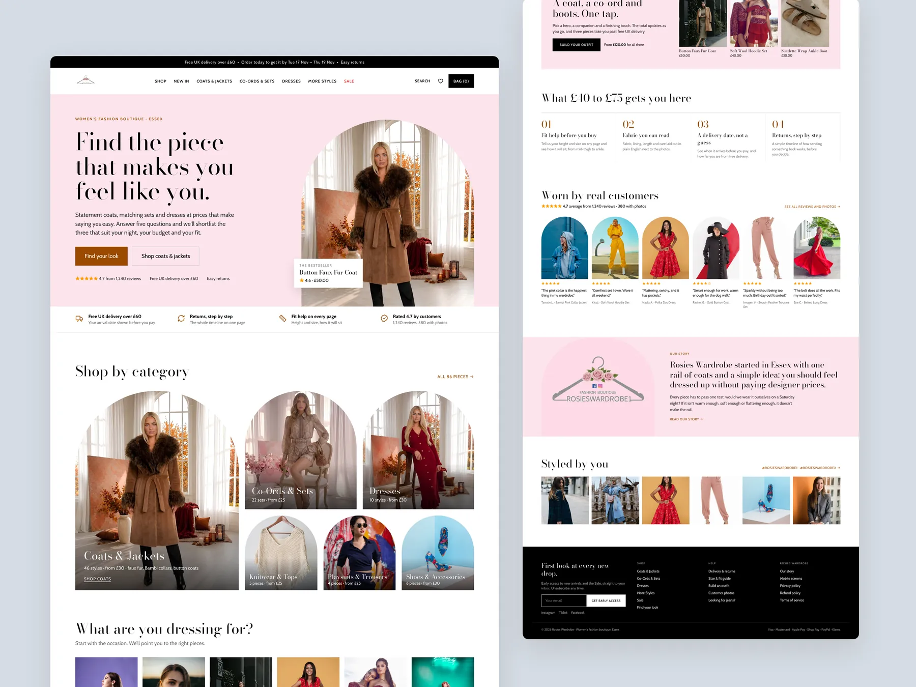
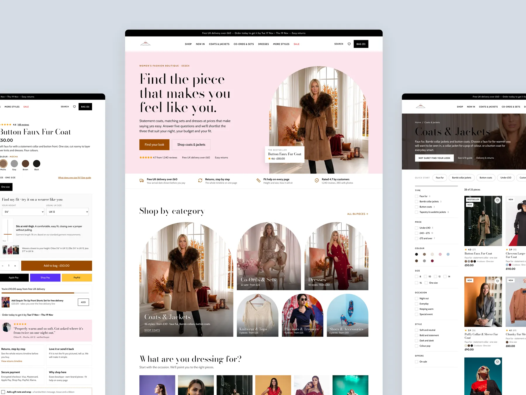
The full page shown as two tall columns: a clear promise, a way in by occasion, and the coats up front.
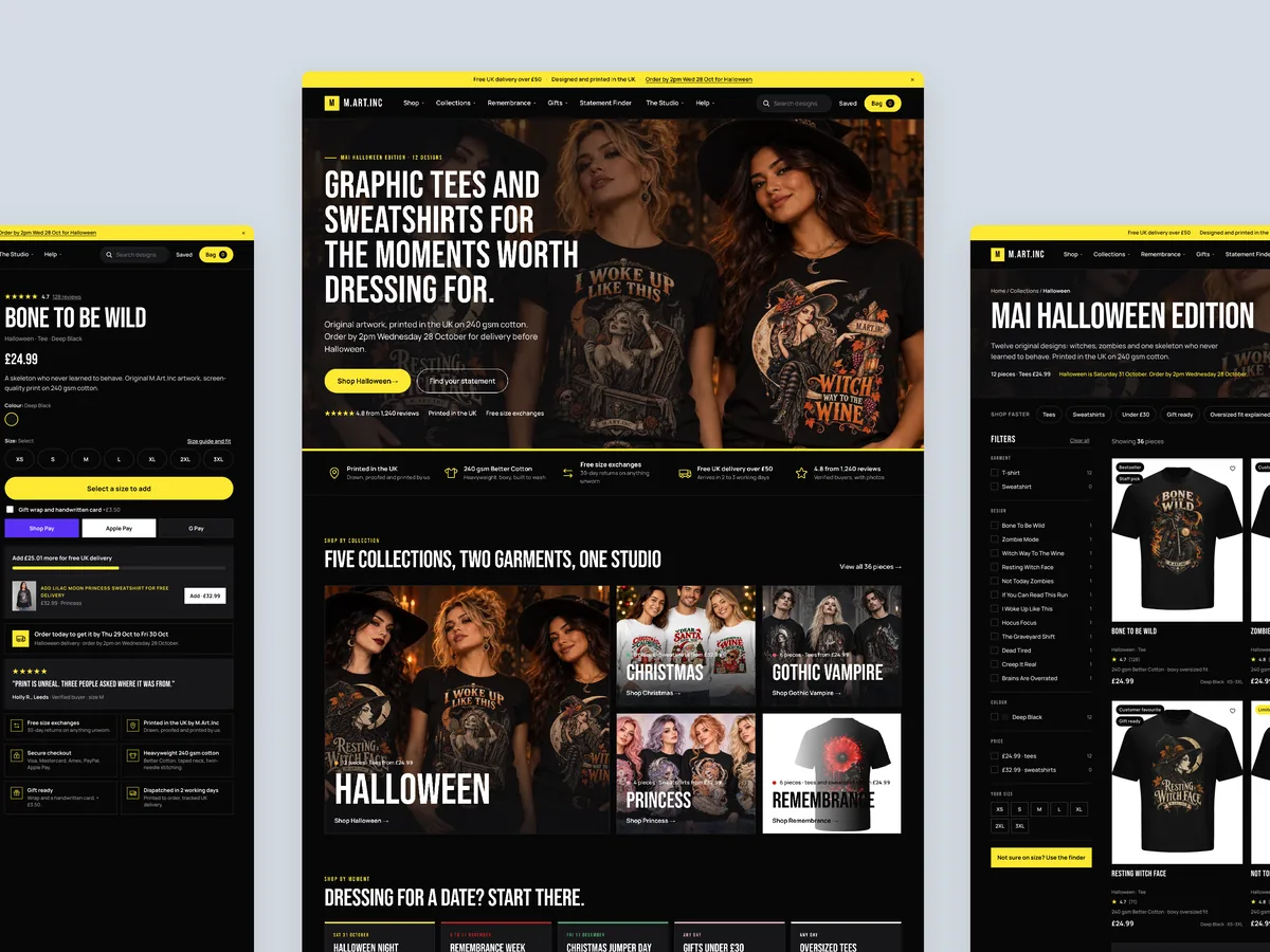
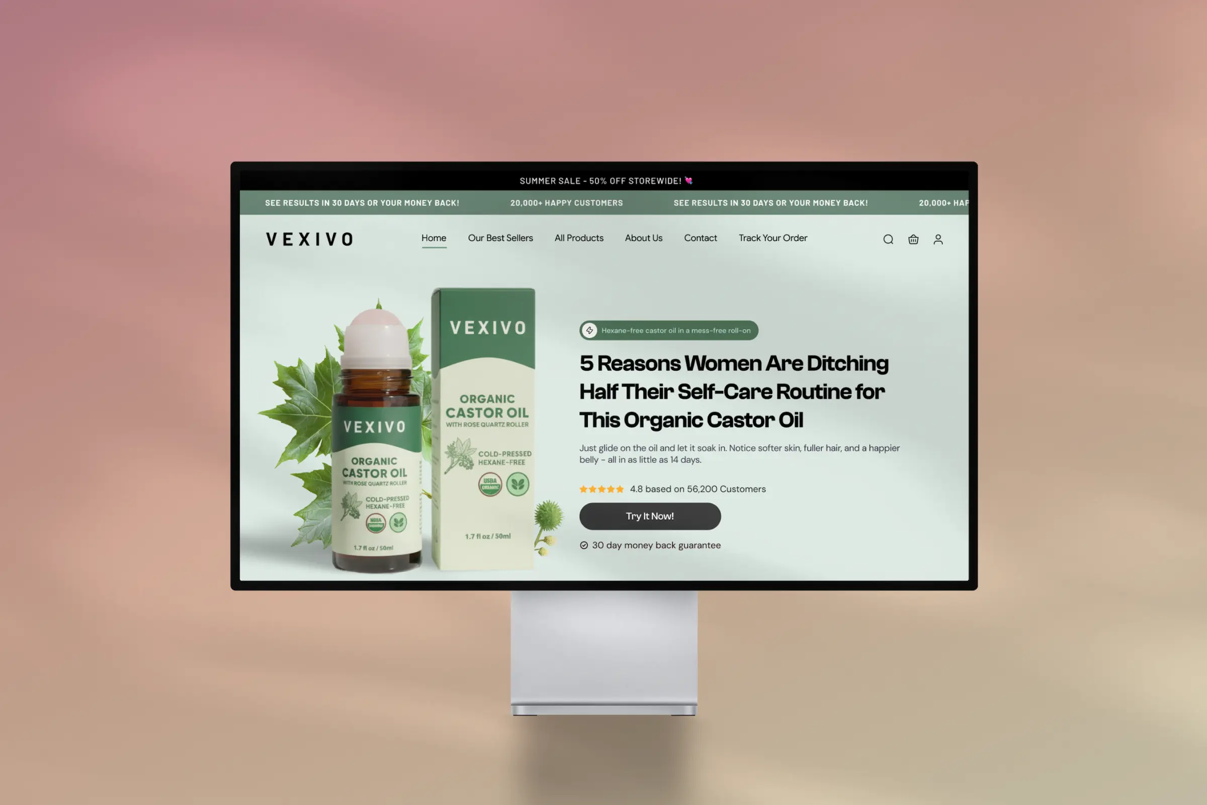
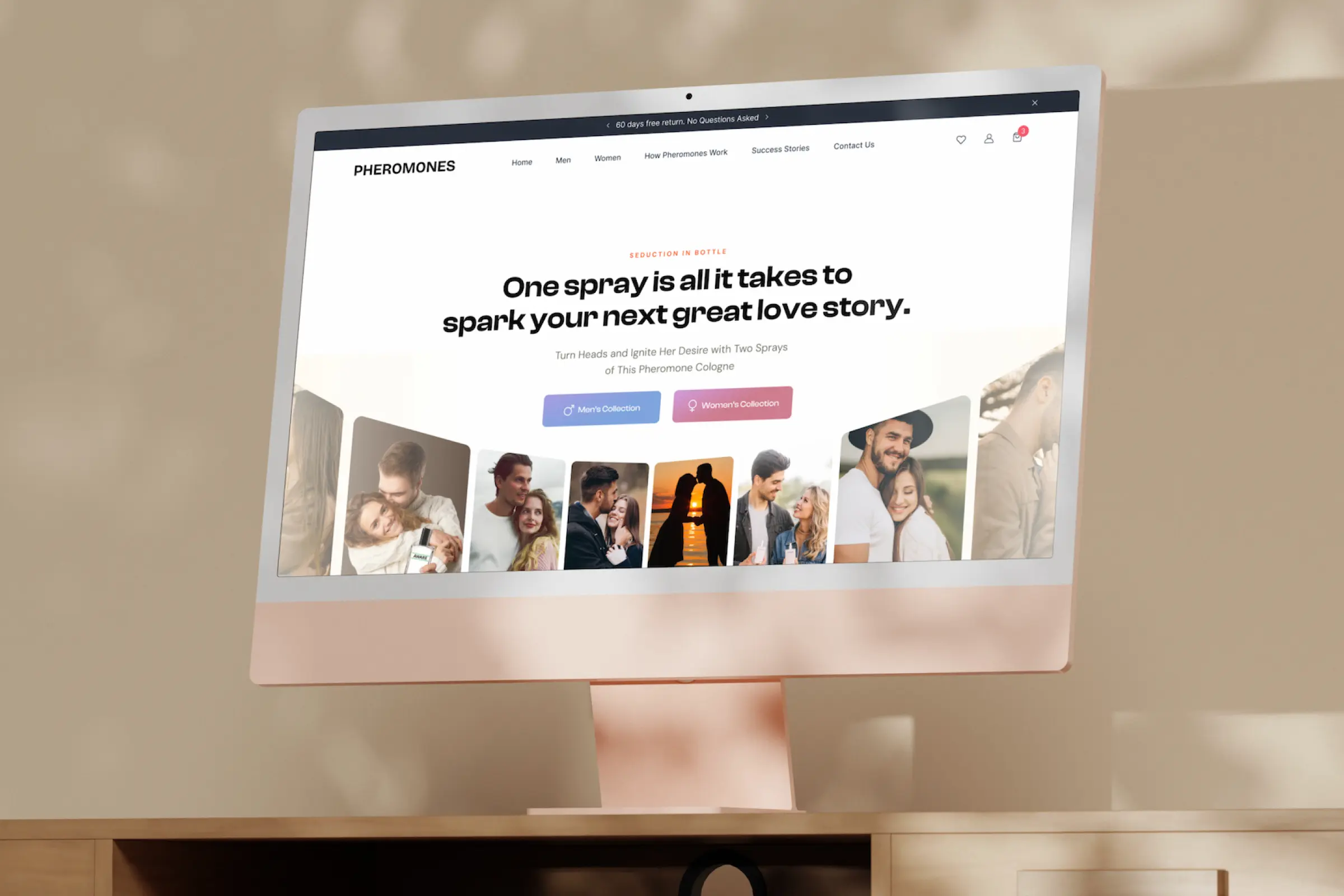
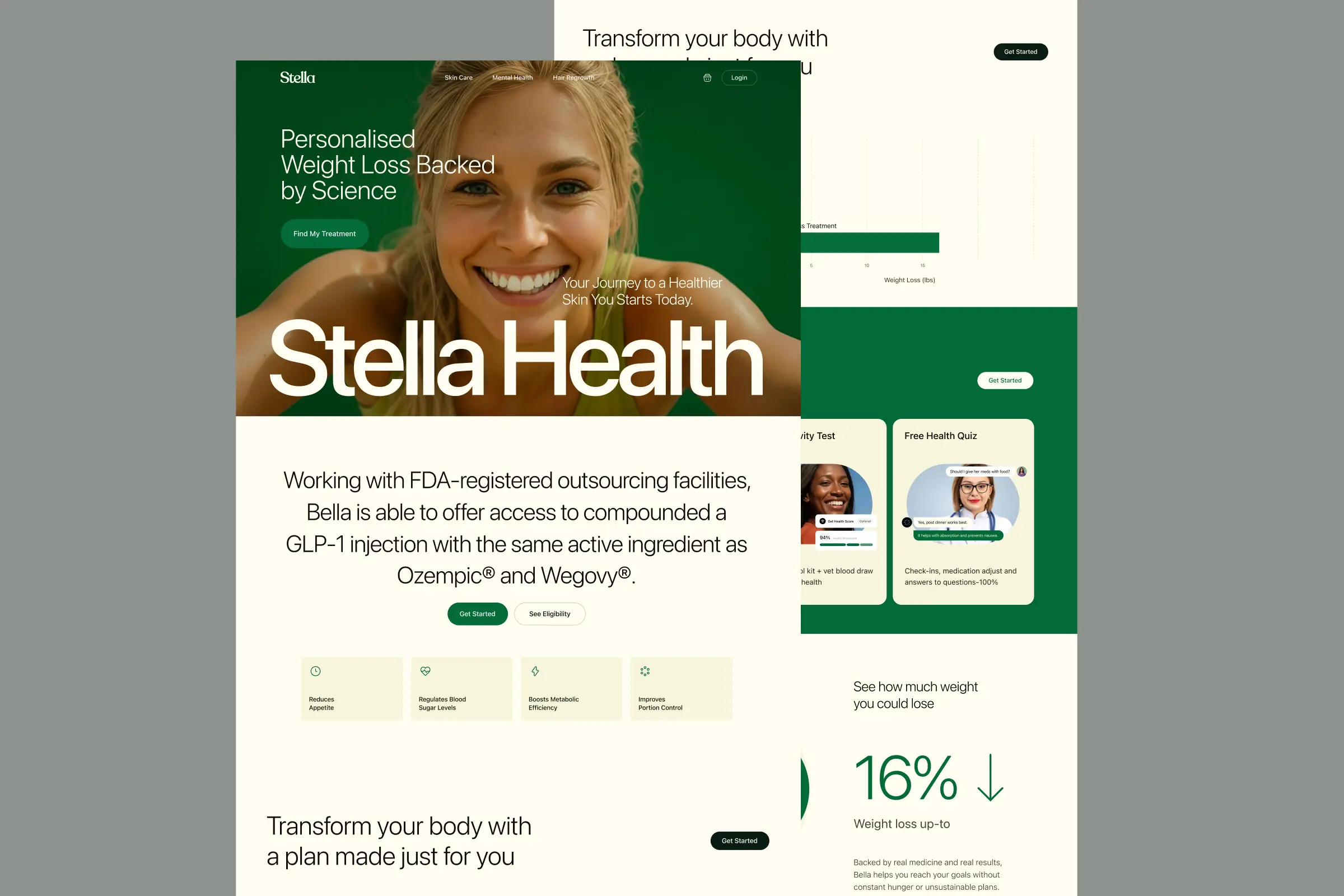
Storefronts we designed and built, across supplements, fragrance, health, wellness and skincare.
All 35 projectsFour engagements, measured before and after. What changed, why it changed, and by how much.
All case studiesDiagnosis, design and development from one studio — so the recommendation and the build never disagree.
All five services192 real Shopify stores torn down page by page, scored, and shown beside the version we would build. Free to watch.
Browse all teardownsConversion-first Shopify themes, each built for one industry’s buying journey. No required apps, no monthly theme fee, one licence per store.
See all themes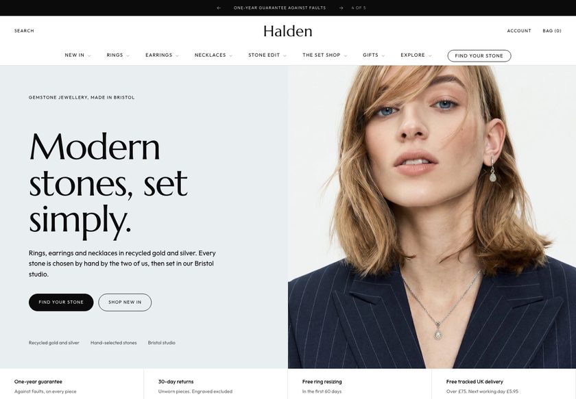 Halden
Jewelry & Accessories
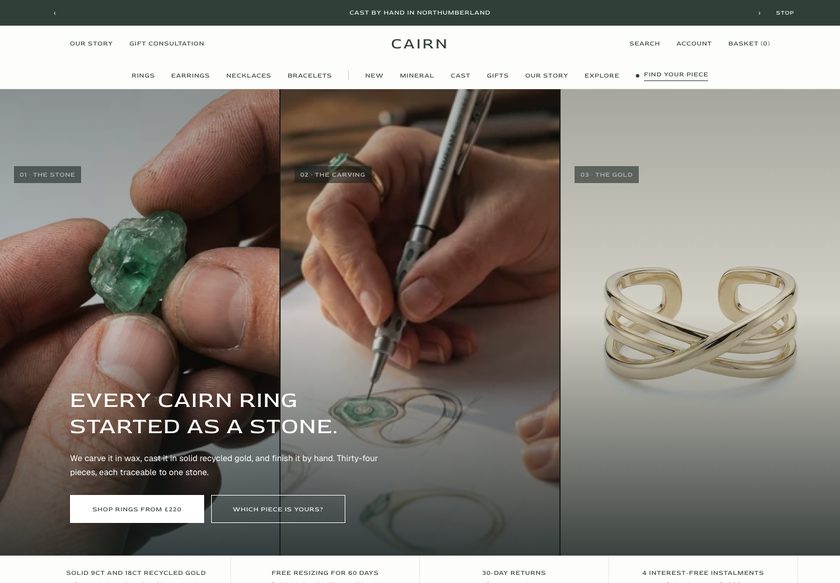 Cairn
Jewelry & Accessories
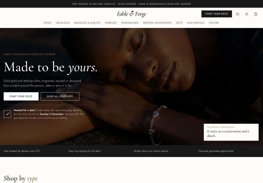 Fable & Forge
Jewelry & Accessories
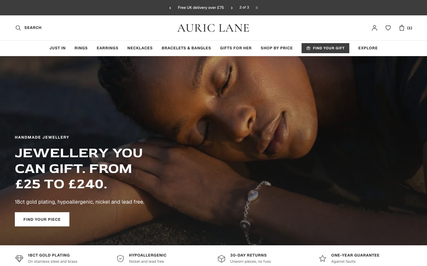 Auric Lane
Jewelry & Accessories
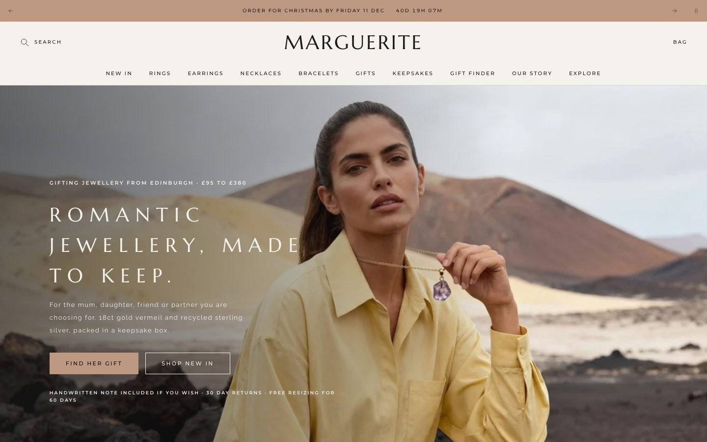 Marguerite
Jewelry & Accessories
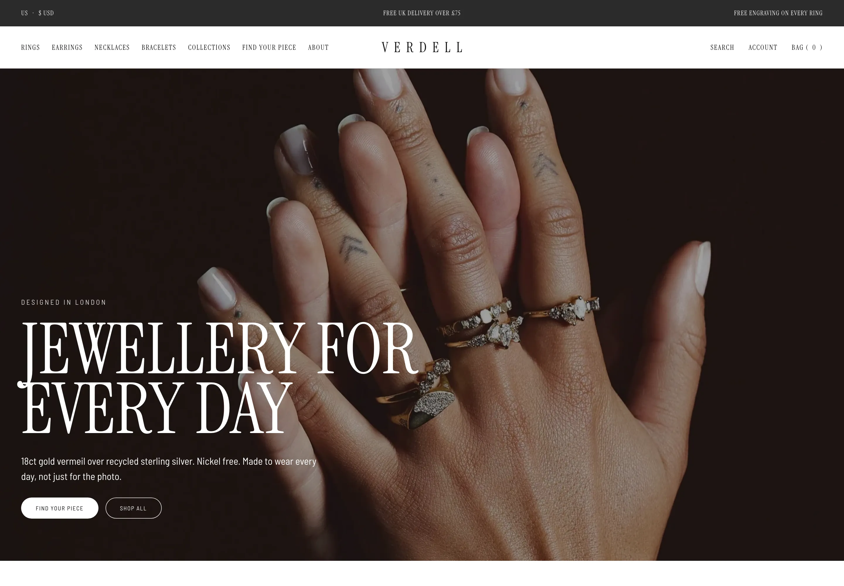 Verdell
Jewelry & Accessories
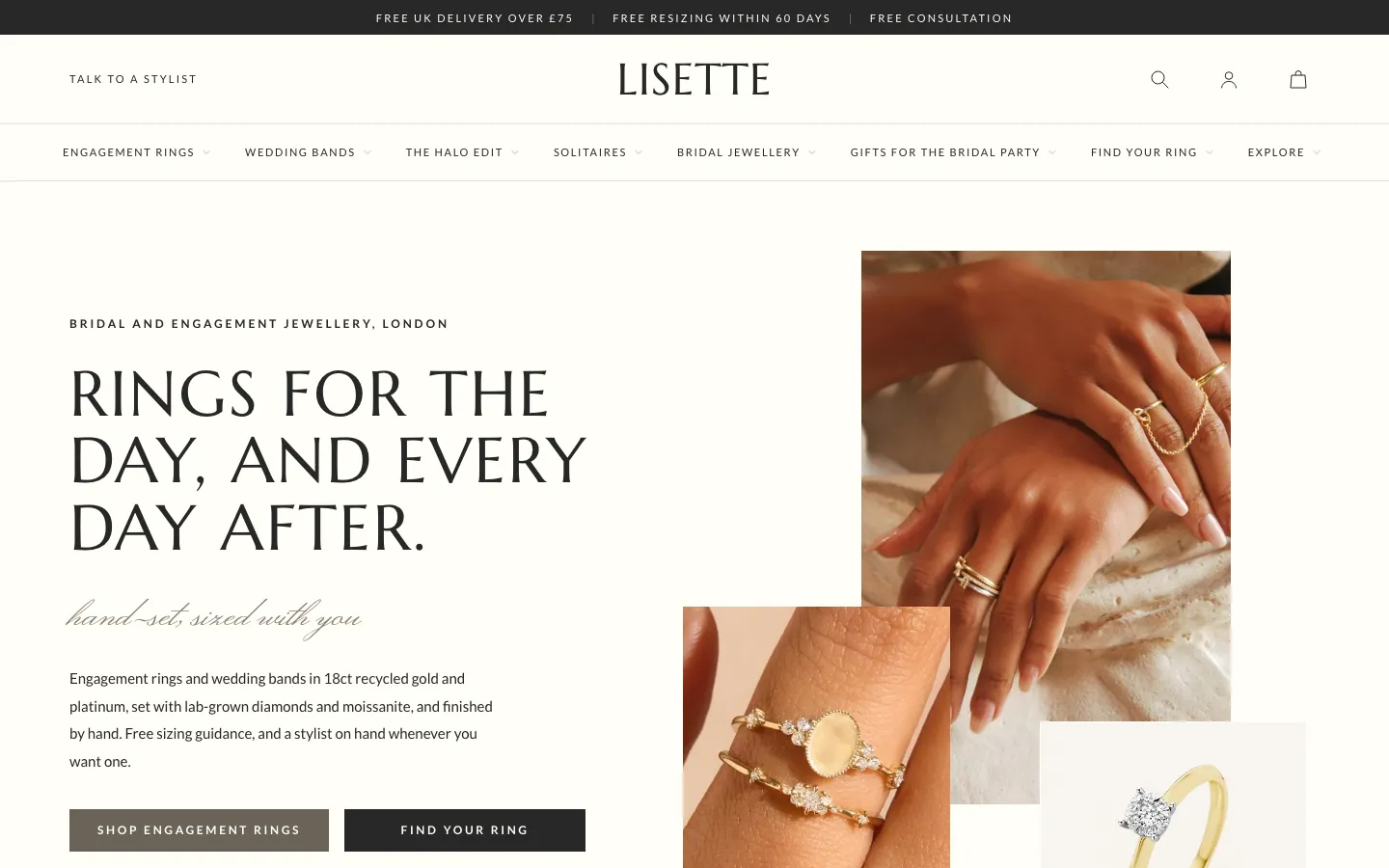 Lisette
Jewelry & Accessories
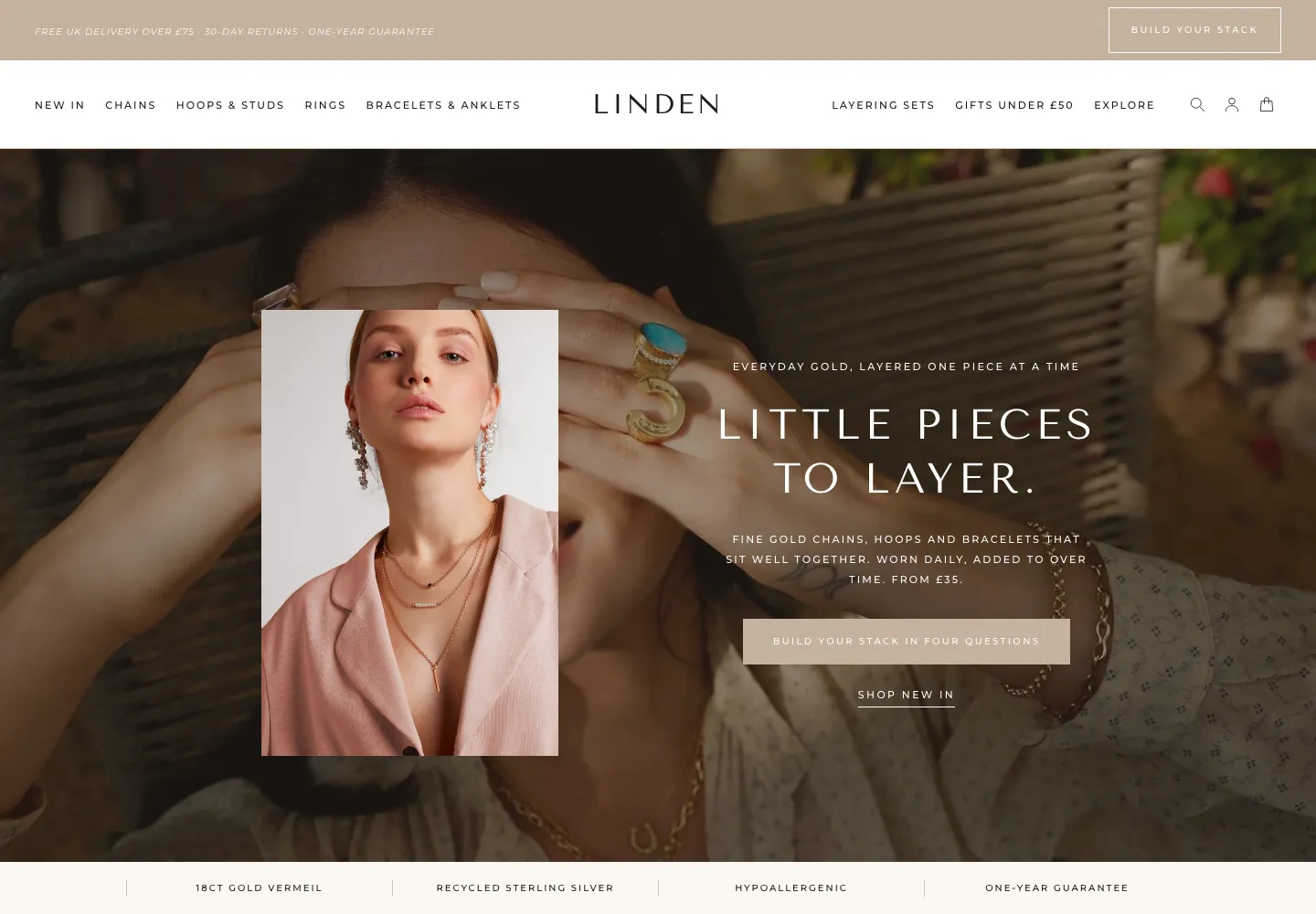 Linden
Jewelry & Accessories
 Calder Union
Clothing & Apparel
 Bracken Tor
Clothing & Apparel
 Fellward
Clothing & Apparel
 Fenwell
Clothing & Apparel
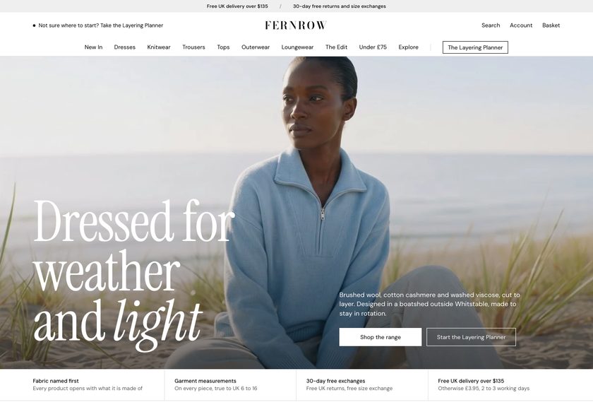 Fernrow
Clothing & Apparel
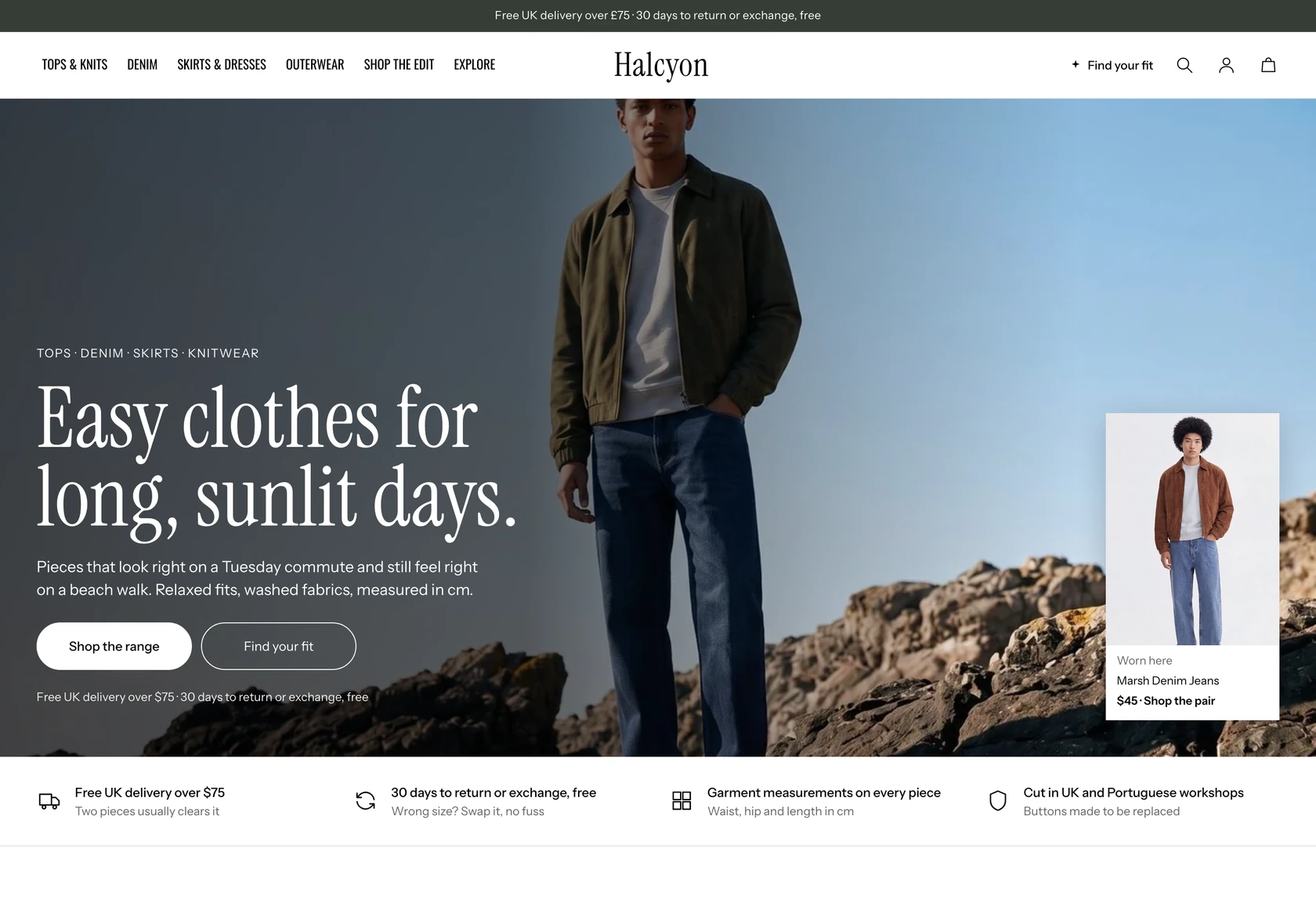 Halcyon
Clothing & Apparel
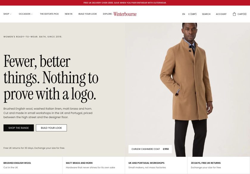 Winterbourne
Clothing & Apparel
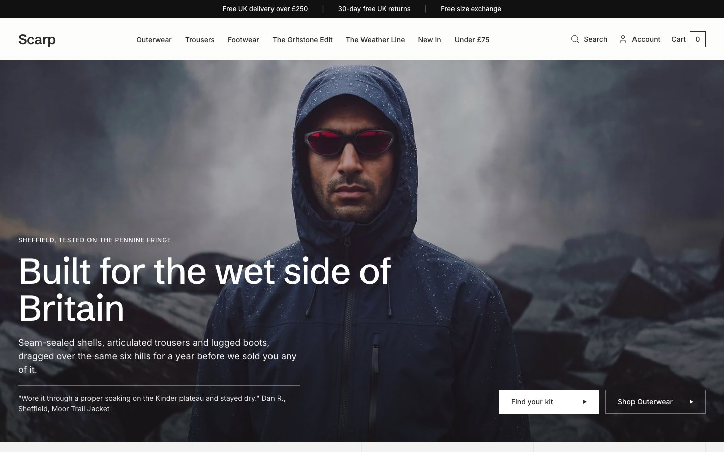 Scarp
Clothing & Apparel
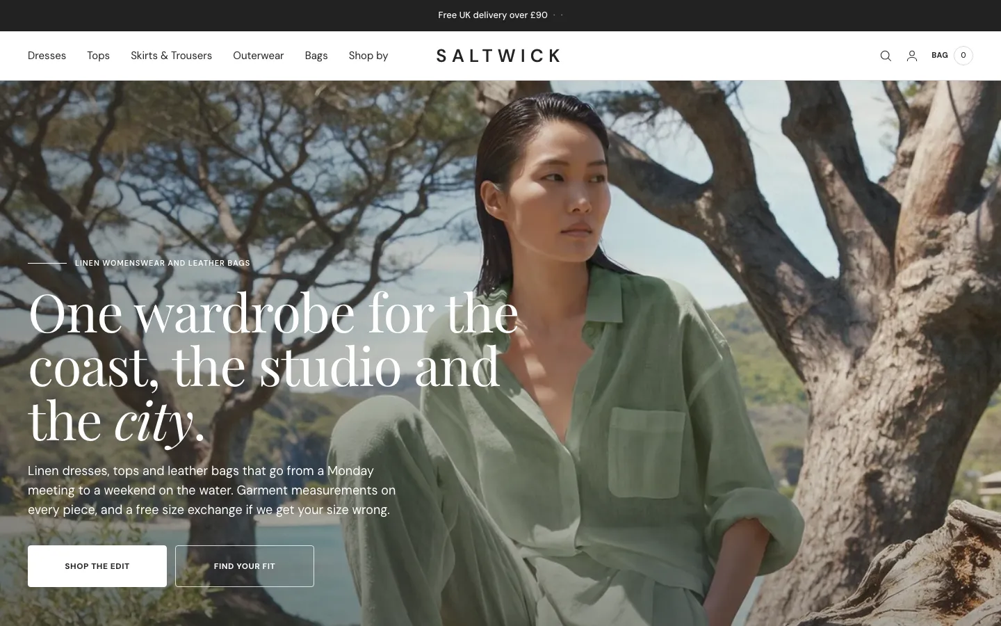 Saltwick
Clothing & Apparel
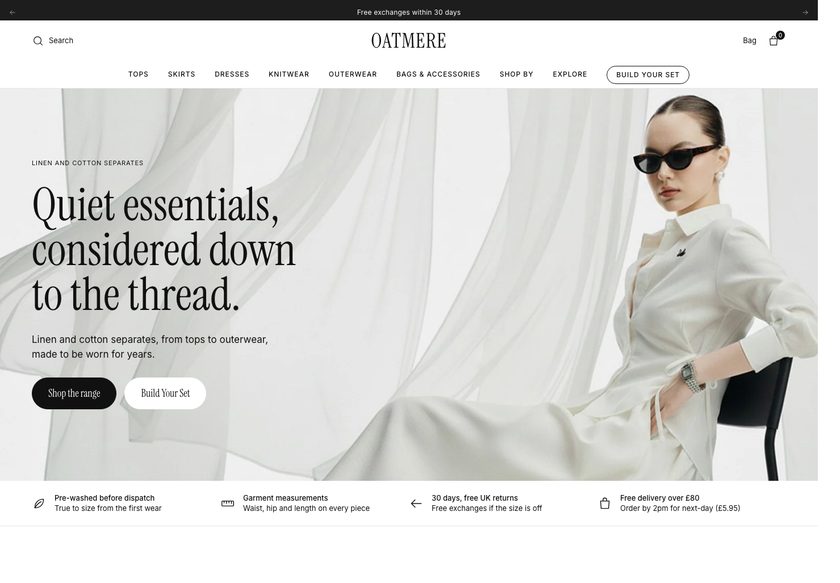 Oatmere
Clothing & Apparel
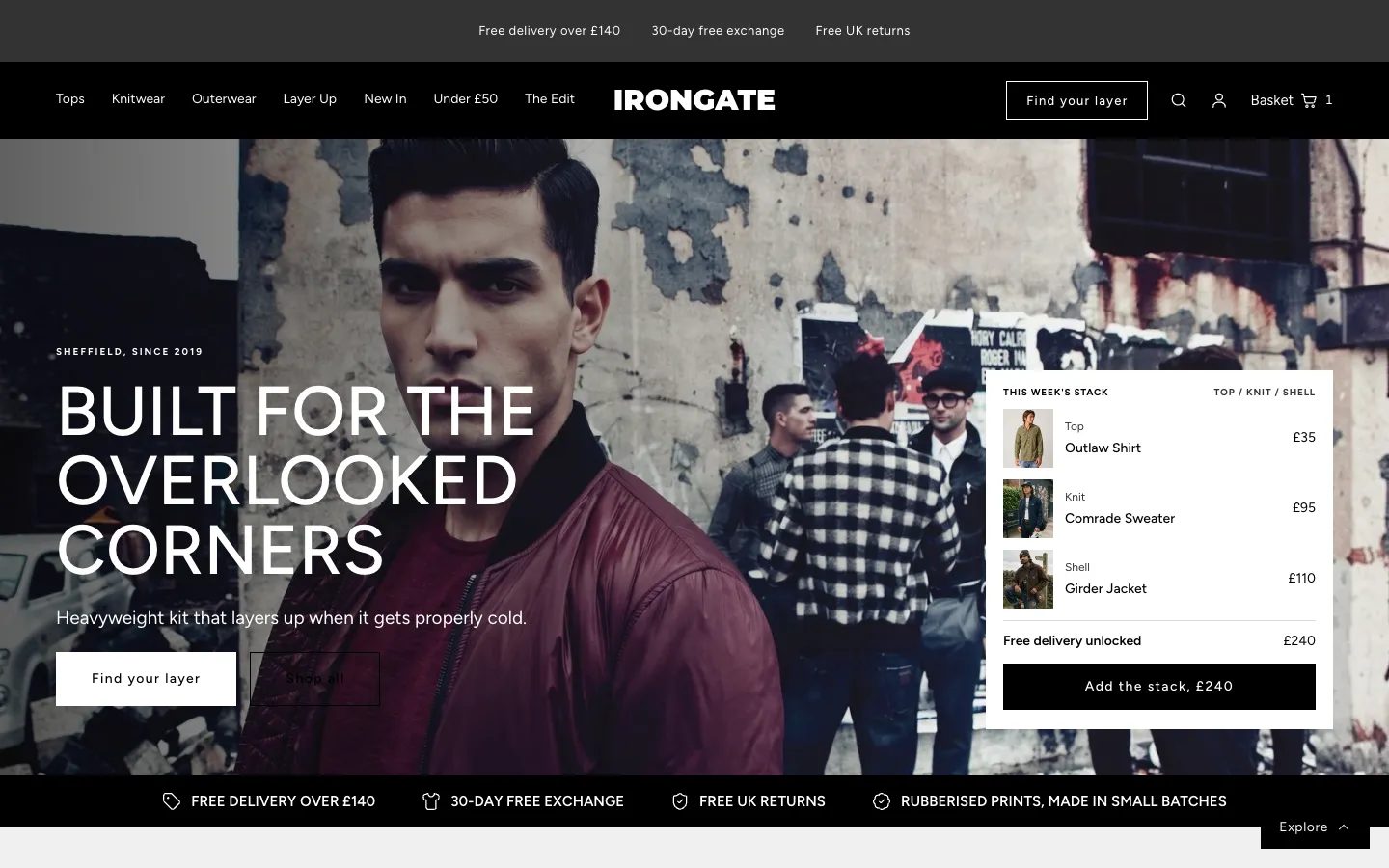 Irongate
Clothing & Apparel
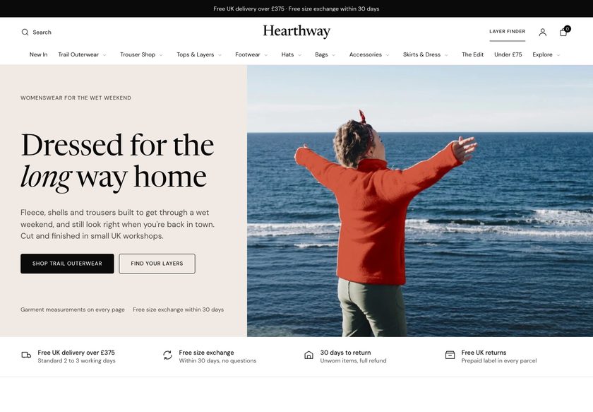 Hearthway
Clothing & Apparel
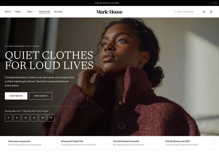 Marle House
Clothing & Apparel
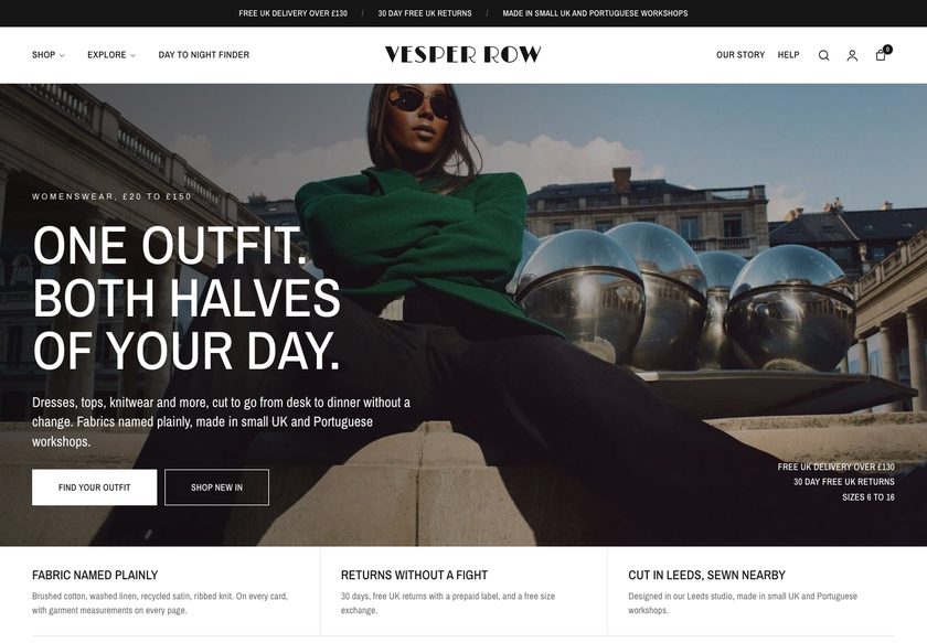 Vesper Row
Clothing & Apparel
A page by page teardown of a UK womenswear store covering the homepage, collection page and fox fur coat product page, with a Figma concept showing how each page could help visitors decide to buy.
Pressing play loads the video from YouTube — you can allow it for every teardown under cookie preferences.
Rosie's Wardrobe sells women's clothing, and the range is the strongest part of the store. The autumn and winter edit, from knitwear to fox fur coats, gives a visitor plenty to want. The photography sets the mood of a clothing shop straight away, and the categories already separate tops, dresses, coats and accessories. The store also has real visits to work with.
The core problem is that the pages present products but do not help anyone decide. The hero does not say who the clothes are for or why the shop can be trusted, and the menu lists category names without showing what sits inside. A visitor has to put money down on a brand they have not been given a reason to believe in. That hesitation costs sales.
The same gap repeats further down the funnel. Collection pages are plain grids of image, name and price, and the jeans page has no products at all. On the product page the fur coat shows one colour and one size with no explanation, no delivery or returns information and no reviews, so every question a buyer has goes unanswered. They leave to find the answers elsewhere.
The direction is to make the site behave like a good shop assistant. Put trust signals in the hero, build menus and finders that guide people to the right collection, add decision points to product cards, and give the product page sizing help, delivery, returns, reviews and bundles. Remove the reasons not to buy, and the reasons to buy are what remain.
The pages show clothes but do not help anyone decide. The hero, menu, collection grids and product page leave out who the store is for, sizing, delivery, returns and reviews, so visitors hesitate and leave.
A store with strong autumn and winter pieces and existing visits could become a guided shop that answers questions the way a good shop assistant would, with trust in the hero, finders, richer product cards, reviews and bundles.
More visitors who feel sure enough to buy, a larger basket from bundles and a free delivery threshold, and fewer exits caused by missing size, delivery and returns information. No figures are promised
Five dimensions, each scored out of ten.
13 issues found, 15 fixes proposed.
The homepage hero reads as a clothing shop from the images alone. It does not say who the clothes are for or give a reason to trust the brand, so a first time visitor is left unsure within the first few seconds.
Nothing near the top of the homepage mentions delivery, returns, fit help or customer opinions. A shopper about to spend money sees no proof that the brand is safe to buy from.
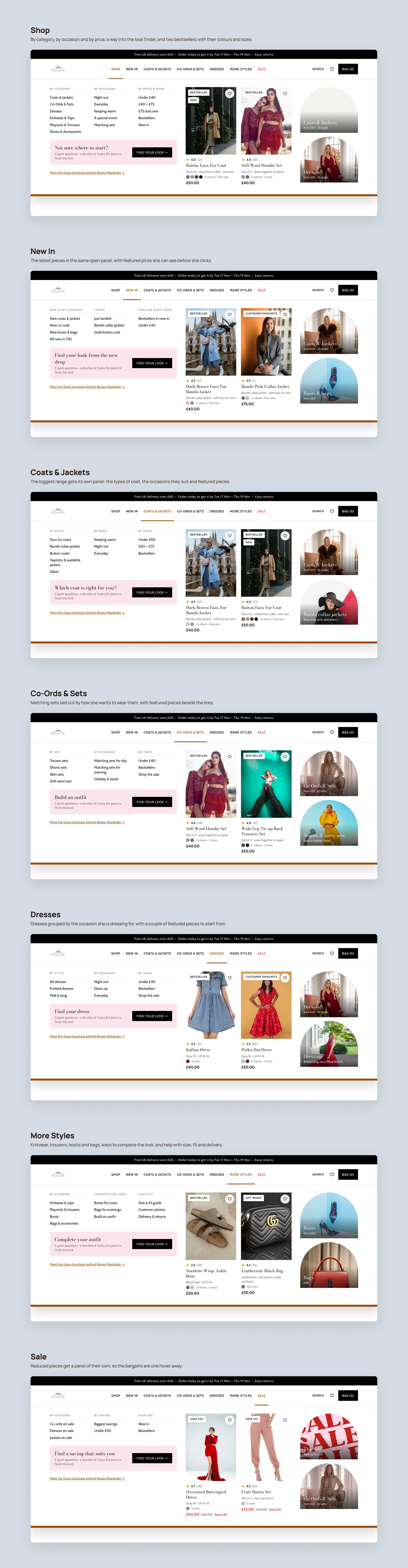
Hovering over Shop reveals What's New, Accessories, Tops and Dresses as bare labels. The menu does not show what sits inside each one or let a visitor browse by occasion, price or need.
The page moves from a category section to a Cozy Looks All Season banner, new arrivals and an Instagram link. There is no finder, no occasion route and nothing that steers a visitor toward the right product.
The jeans collection contains no products at all. A visitor who clicks it hoping to buy jeans reaches a dead end, which looks careless and sends them away.
The dresses page is a grid of images, names and prices with little else. It does not help a shopper compare pieces or work out which one to choose.
Collection pages lack the sorting, categories and filters a visitor needs to narrow a range. Choosing between similar pieces means scanning the whole grid by eye.
Cards show only an image, name and price. Size and colour availability are missing, so shoppers open eight to ten product pages just to learn what each item offers.
The fur coat page lists only one colour and one size, with nothing to guide a visitor beyond the Add to Cart button. A shopper who wants something different has no alternative to consider.
The coat is sold in a single size that is never defined. Whether it suits a teenager or her mother is the first question a buyer asks, and the page does not answer it.
The product page says nothing about checkout, delivery times or what happens if the item is wrong. Without that, buying a coat from an unfamiliar shop feels like a risk.
There are no customer reviews on the product page or elsewhere on the site. Shoppers want to see how the coat looks on real people, and nobody wants to be the first to buy.
The product page does not suggest a sweater or shirt to pair with the coat, and offers no bundle, free delivery threshold or small discount. Each visitor buys one item or nothing.
State what the shop sells, who it is for and why it can be trusted, in the hero itself. A visitor should know within three seconds whether this is their kind of store.
Place UK delivery, step by step returns, fit help and happy customers directly beneath the hero. These four points answer the main hesitations before the visitor scrolls.
Organise the dropdown into departments such as coats and jackets, co-ord sets and dresses, each browsable by style, occasion and price. A shopper limited by budget can then start from price.
Ask a few questions, such as what the visitor is looking for and their size, then recommend matching pieces. It does the job a shop assistant does when asking how they can help.
Offer routes such as a night out or keeping warm so visitors can shop by the reason they are buying. This gives people who do not know the category names a way in.
Either stock the jeans page with products or take it out of the navigation until it is ready. No visitor should click a category and find it empty.
Show a badge such as bestseller or new, the key feature, sizes and colours on each card. Shoppers can then compare pieces at a glance without opening every page.
Offer filters by type, price, colour, size, occasion, style and offers, plus clear sorting. Add a short intro and quick start buttons so the page guides rather than lists.
Show the star rating and review count near the product name, with a full reviews section below. Include customer photos so buyers see how the coat looks in real life.
Say exactly what one size means and add a tool that suggests a fit from size and height. This removes the first question buyers have and reduces returns.
Show delivery dates, easy returns, secure payment and a short why shop here note next to the button. Every reason to hesitate gets an answer at the moment of decision.
Tell shoppers how far they are from free delivery and suggest an item that closes the gap. This raises order value while giving the customer something in return.
Pair the coat with a sweater, shirt, bag or shoes and give free delivery or a small discount on the set. A build your own outfit section does the same on the homepage.
Present fabric, fit, length, closure, colours, care and what arrives in the box in a tidy panel. Add an FAQ and a recently viewed row so buyers can check and return easily.
Let shoppers add gift wrap and write a short message at the product page. Visitors buying for someone else then have a reason to complete the order here.
A concept redesign created by Convertica Studio from this audit. It shows how the store could work, it is not the live store.
The full page shown as two tall columns: a clear promise, a way in by occasion, and the coats up front.
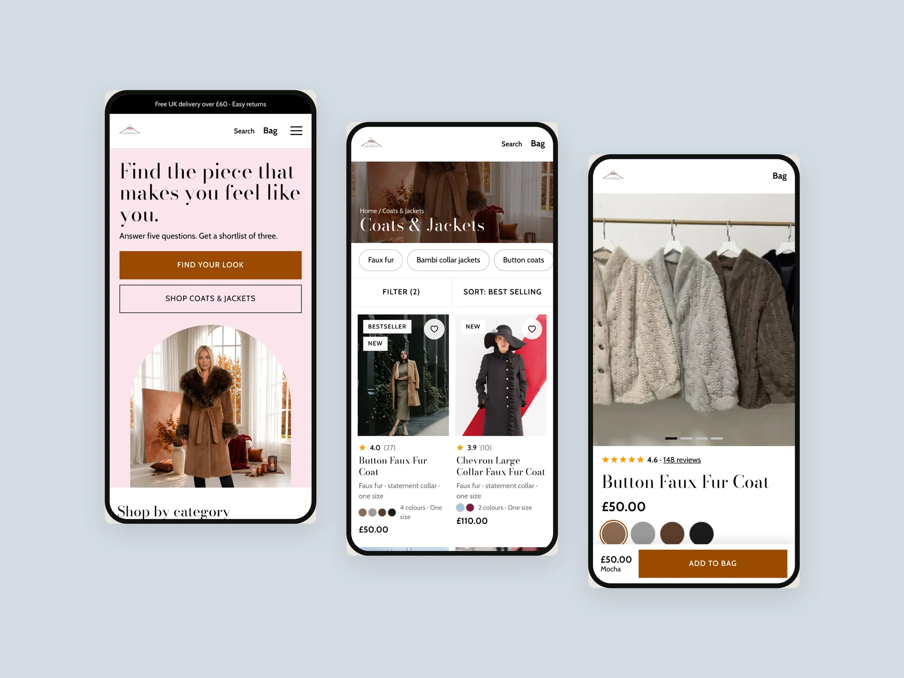
The homepage in the centre, the product page on the left with its buy column and the Coats & Jackets collection on the right.
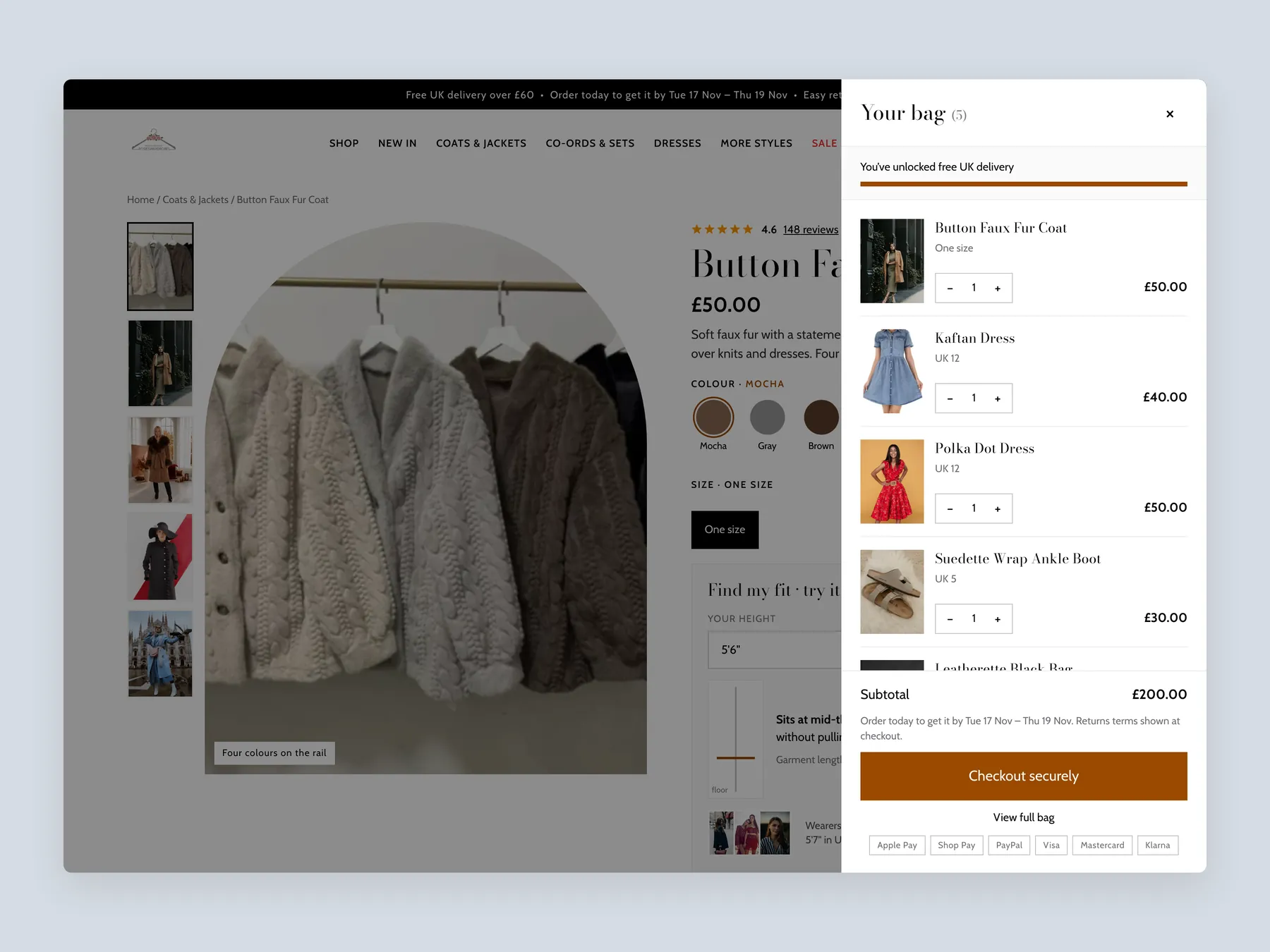
A slide-over drawer opens over the dimmed product page, with the full bag and a free delivery progress bar.
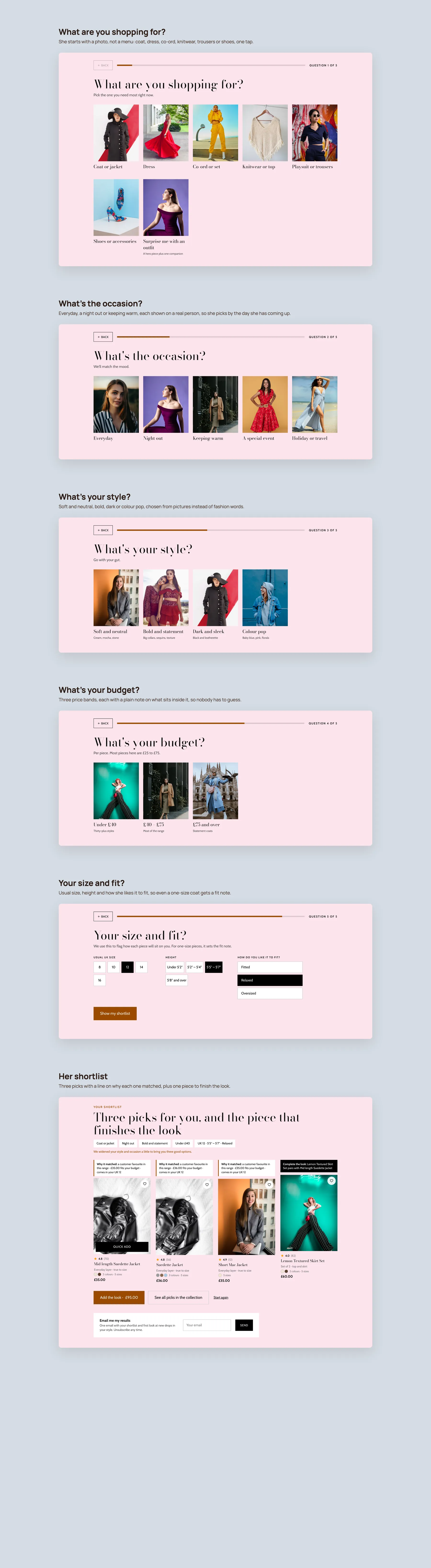
Five picture-led questions on what she is shopping for, the occasion, her style, her budget and her size and fit, then a shortlist with a reason for each pick and a piece to finish the look.
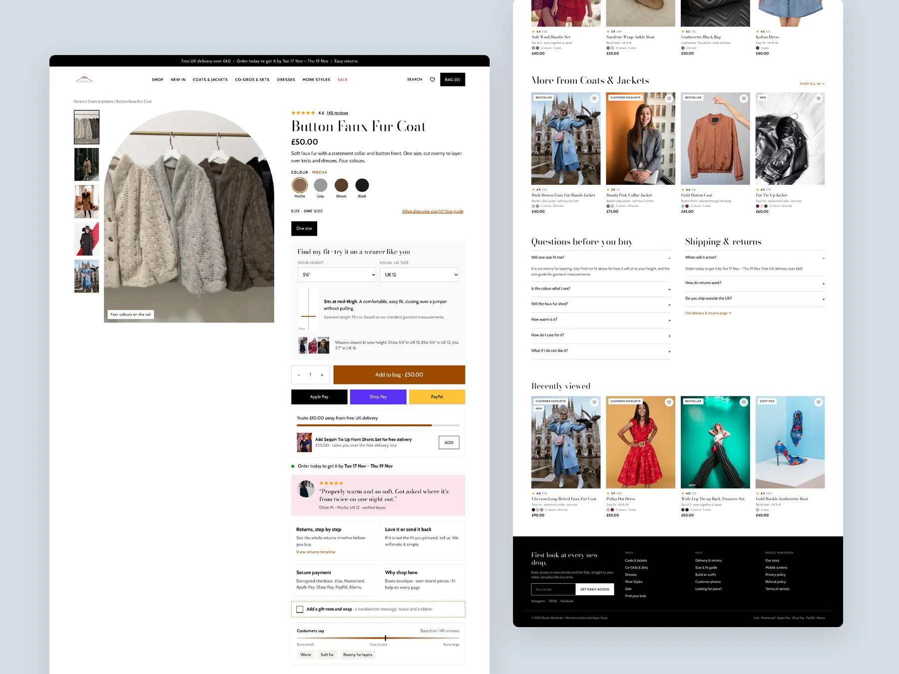
The full page in two columns: the buy box, fit help, delivery and returns, and outfit suggestions below.
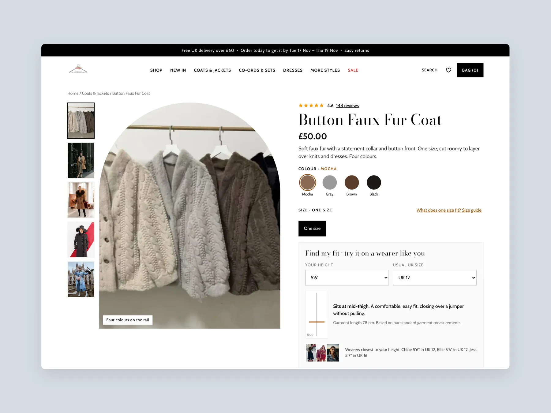
The header and the buy box with colours, size, a size guide link and a find-my-fit tool.
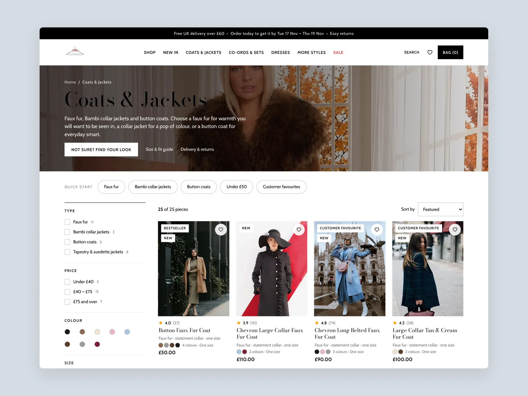
Coats & Jackets with an introduction, quick-start filters, a filter column and the first row of products.
Every nav item with its panel open: links by category, occasion and price, a prompt to the look finder, and featured pieces.
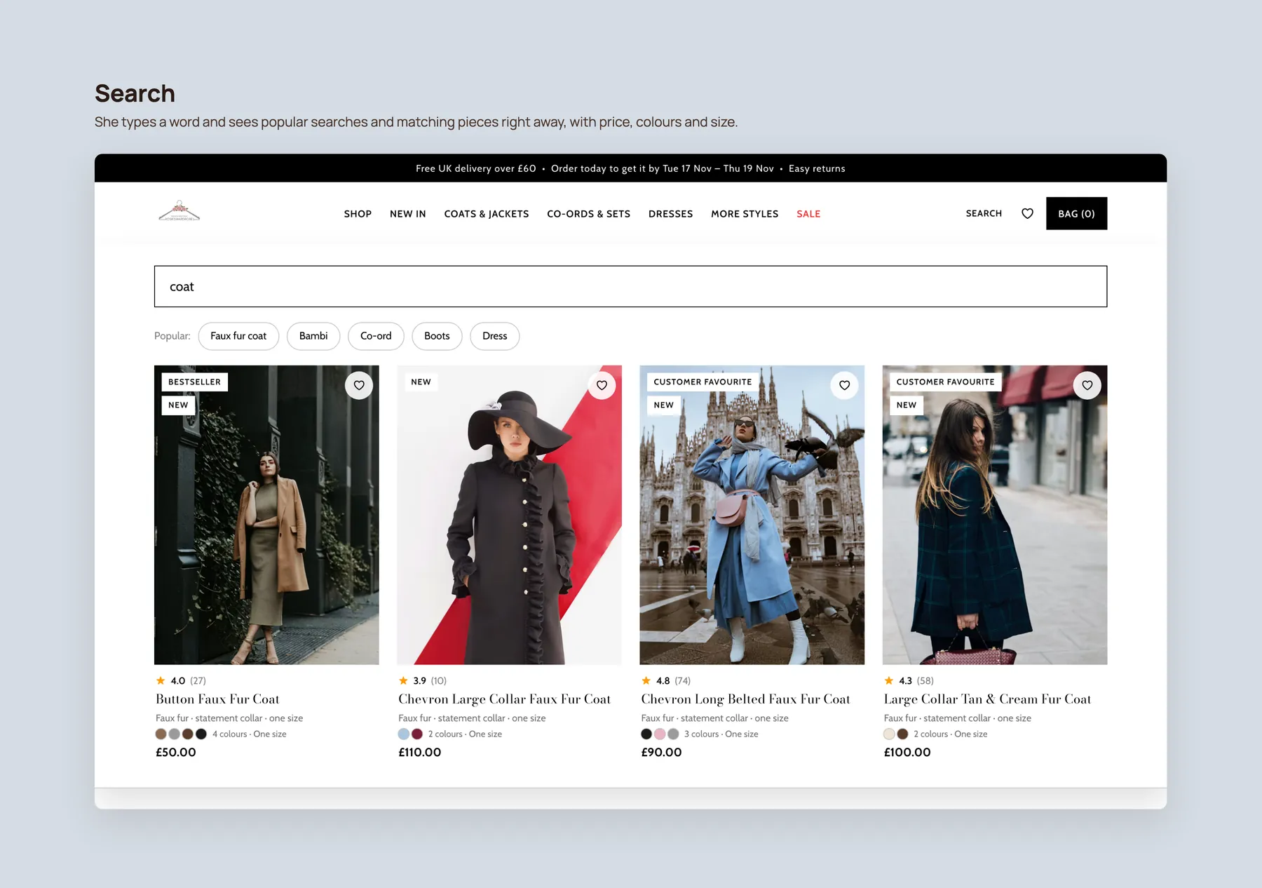
A typed word brings up popular searches and matching products with prices, colours and sizes.
Three phone screens showing the home, collection and product pages.
The products are not the issue. The autumn and winter range is strong. The audit found that the presentation of the pages does not help visitors feel confident enough to buy.
A visitor decides within seconds whether a store is for them and whether it can be trusted. The current hero looks like a clothing shop but does not say who it serves or why to believe in it.
The Shop menu shows labels such as What's New, Accessories, Tops and Dresses without revealing what is inside. A better menu groups items by category, occasion and price so shoppers can start from their own need.
The jeans page has no products. A visitor who wants jeans finds nothing to buy, which feels unfinished and sends them elsewhere. Either stock it or hide it until it is ready.
They should help people choose, not only list items. That means more filters and sorting, short guidance, and product cards that show size, colour and badges so shoppers can compare without opening every page.
It needs answers to the questions a buyer has before paying: what the one size means, how delivery works, what happens on returns, and what other customers think. Reviews are the biggest missing piece.
Nobody wants to be the first to buy. Shoppers want to see how a coat looks on real people and whether others were happy. Reviews with photos give a first time buyer that proof.
By pairing the coat with items such as a sweater, shirt, bag or shoes and offering free delivery or a small discount on the set. A free delivery progress message and a build your own outfit section support this.
The audit recommends making the site convert first. Once it is producing sales, adding traffic through ads has a clearer payoff because more visitors then turn into orders.
It is a clickable prototype of redesigned homepage, collection and product pages. It is not a final design. It shows how guided paths, finders, richer product cards, reviews and bundles could work for this store.
The recording sets out three routes: leave the site as it is, make the changes in house, or have the studio build them. The studio offers a full site, the three key pages, or a pre-built clothing theme that it installs.
The audit reviews the homepage, a collection page and a fox fur coat product page, then walks through a Figma concept for each and the next steps. The recording runs 25 minutes.
Tell us about your store and we'll send a personalized 5-minute video showing exactly where you're losing buyers — and how to win them back.
Takes about 40 seconds. No call required.