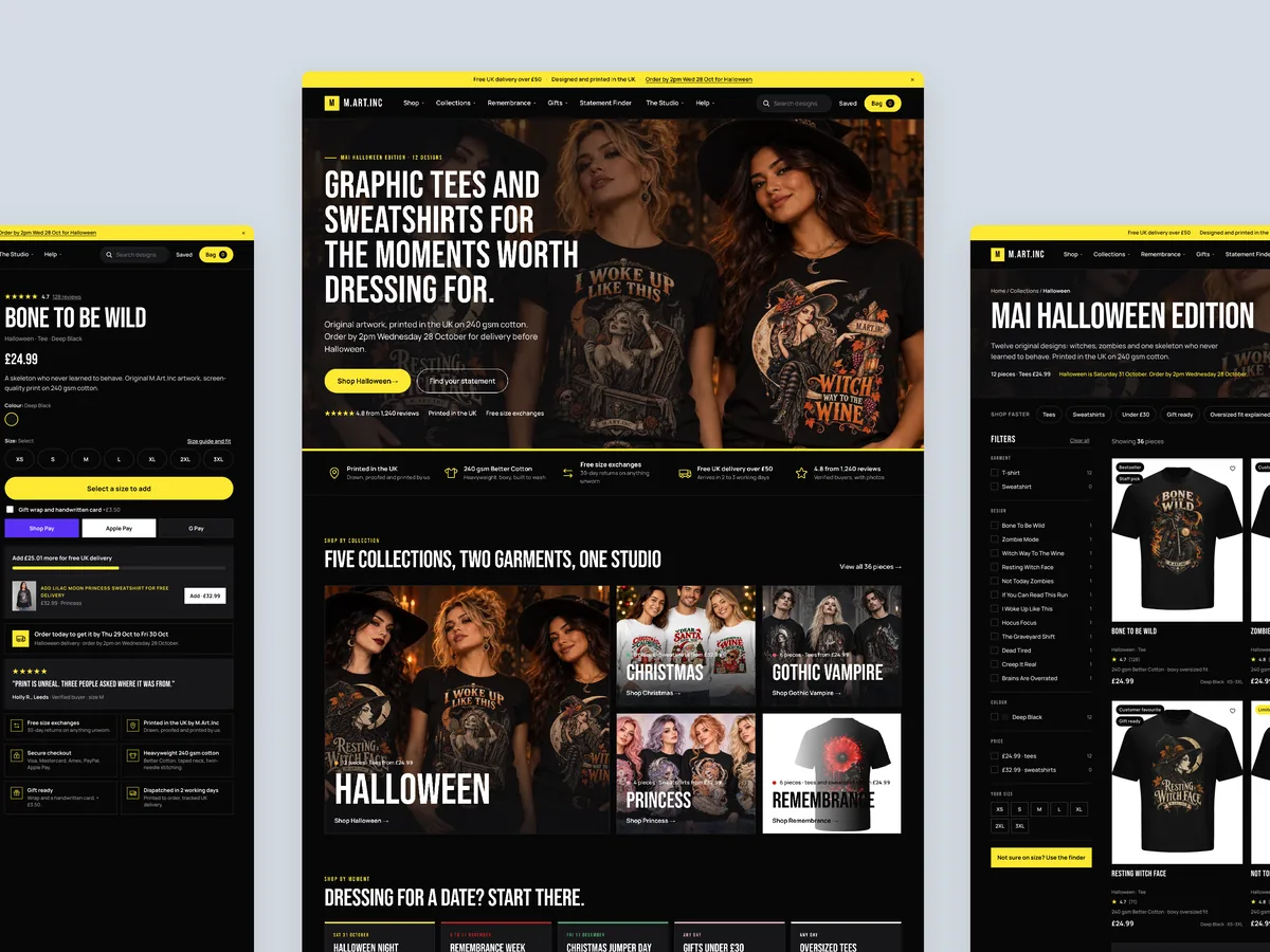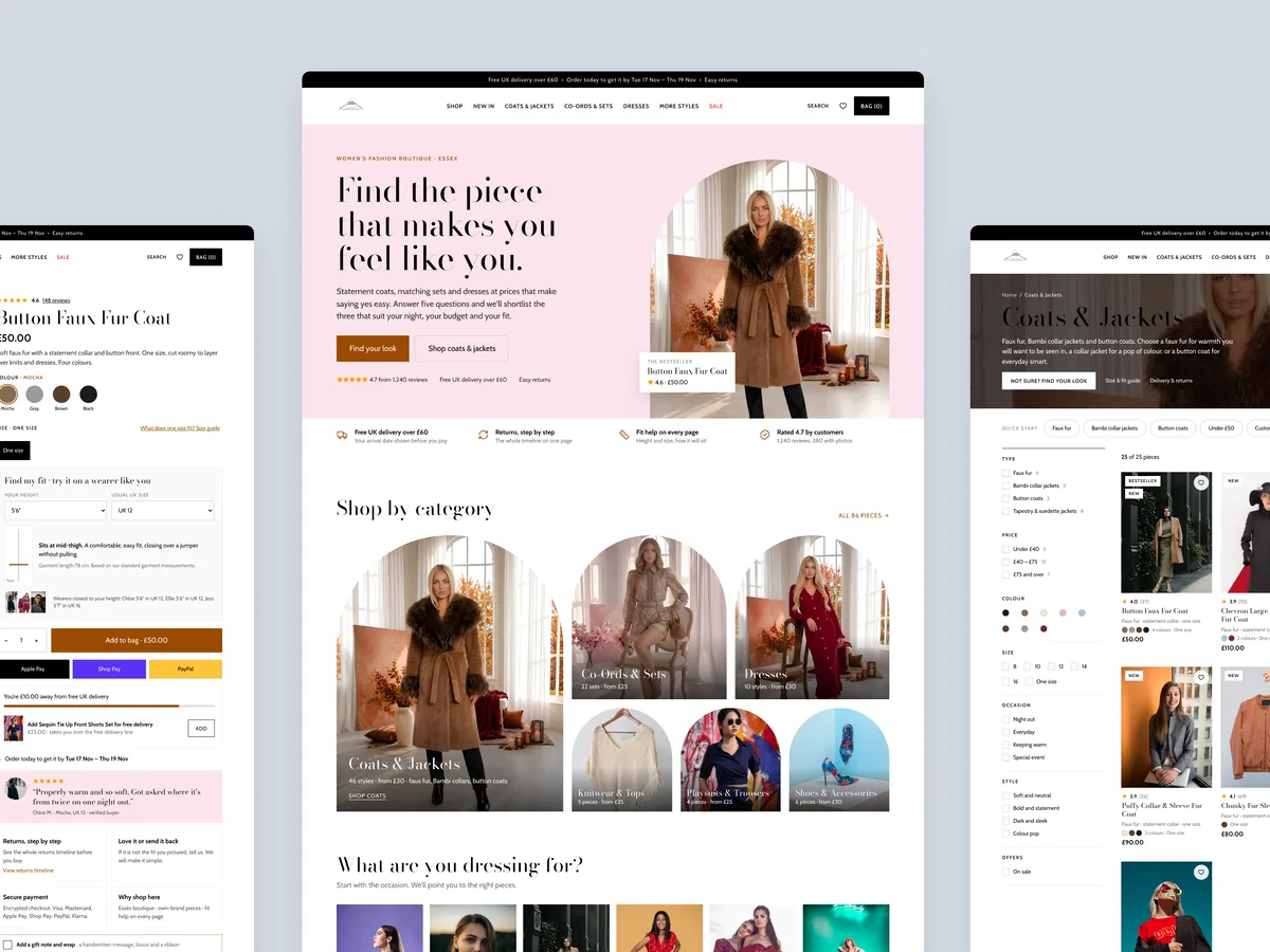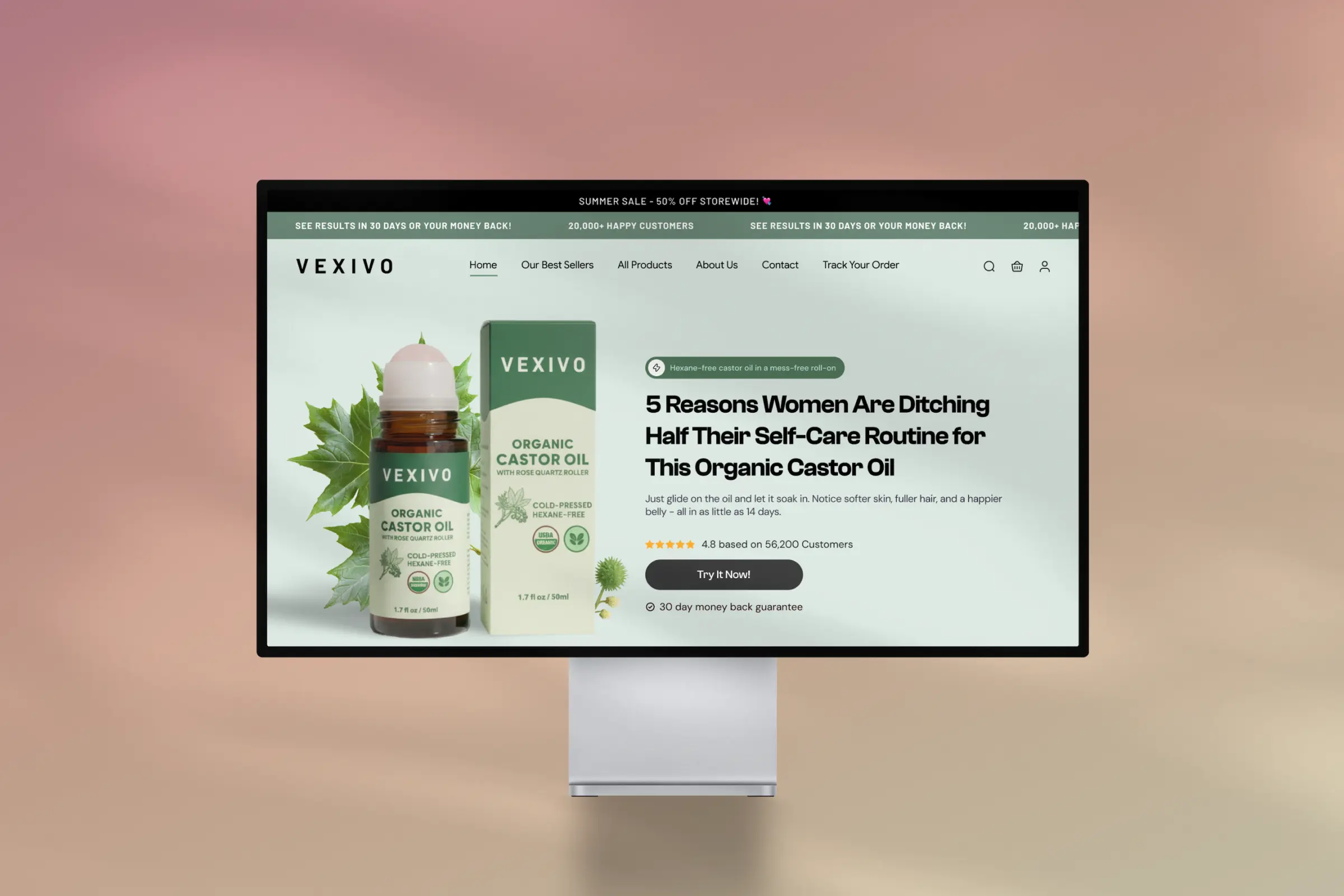
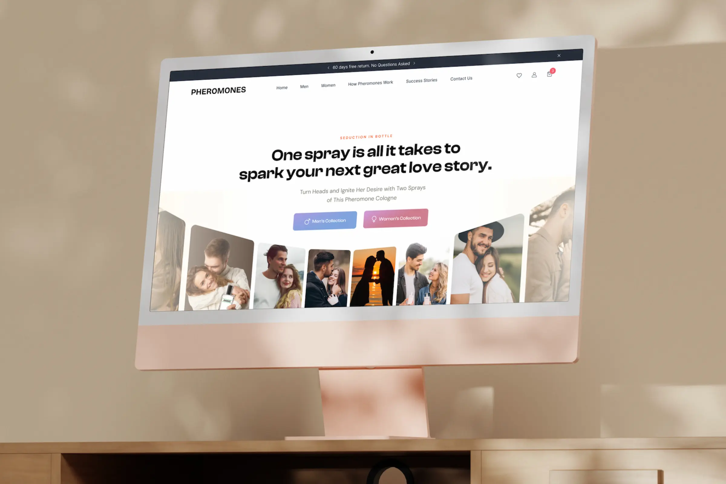
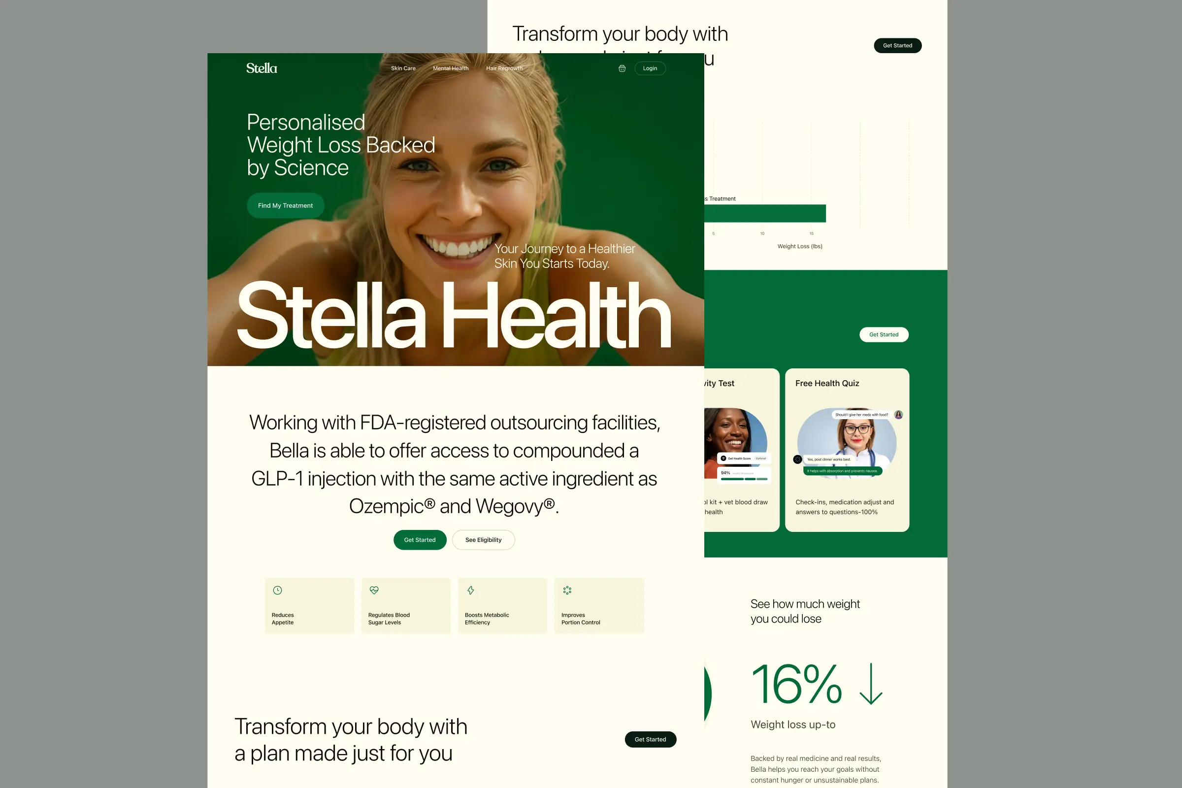
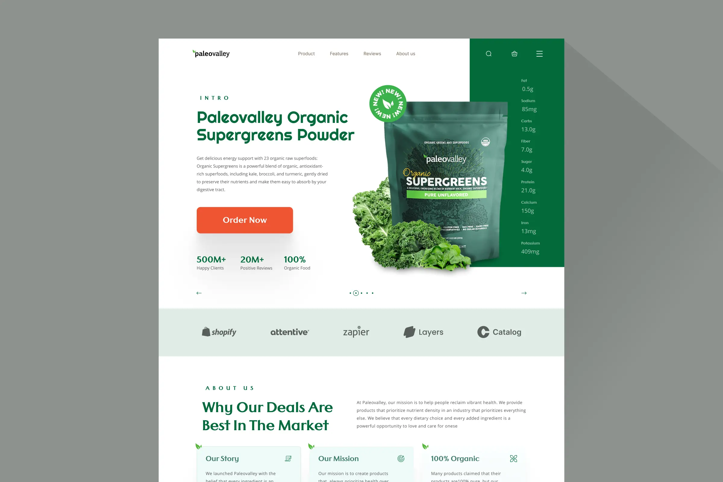
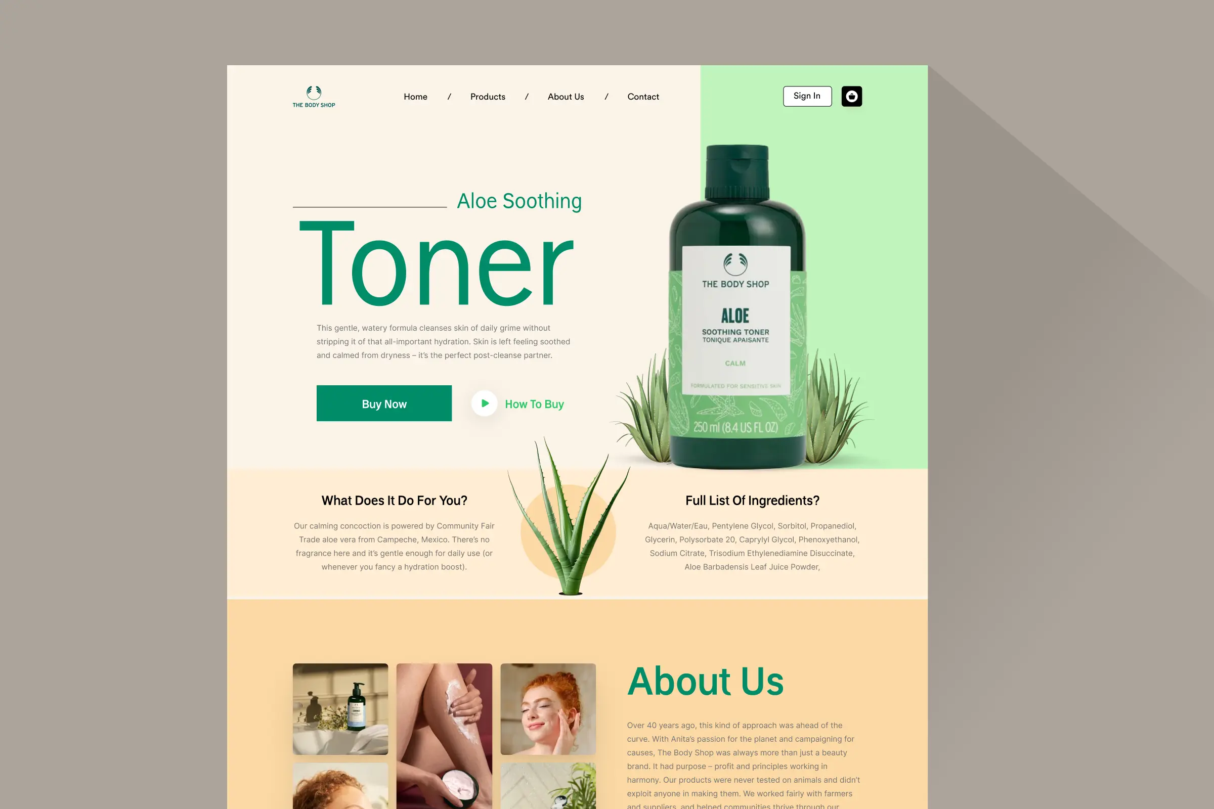
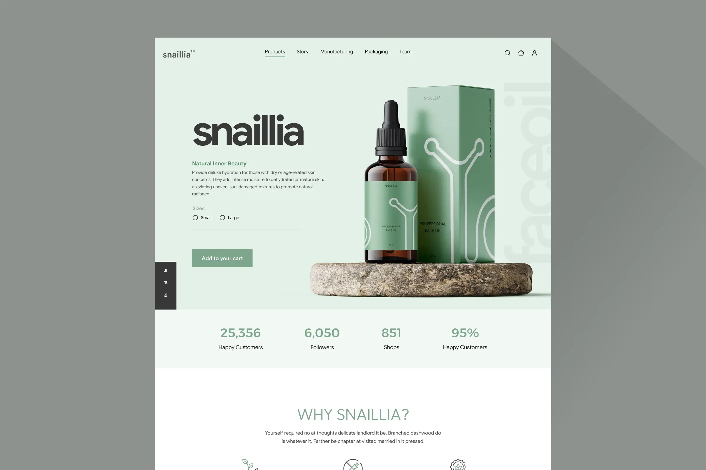
Homepage, two tall columns
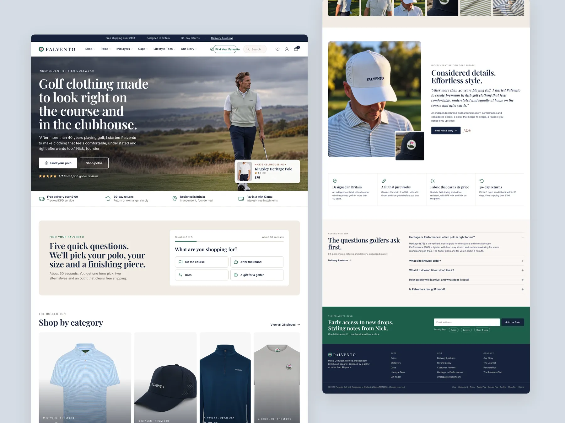
Homepage in two tall columns: the top of the page on the left, the page down to the footer on the right.
Storefronts we designed and built, across supplements, fragrance, health, wellness and skincare.
All 35 projectsFour engagements, measured before and after. What changed, why it changed, and by how much.
All case studiesDiagnosis, design and development from one studio — so the recommendation and the build never disagree.
All five services192 real Shopify stores torn down page by page, scored, and shown beside the version we would build. Free to watch.
Browse all teardownsConversion-first Shopify themes, each built for one industry’s buying journey. No required apps, no monthly theme fee, one licence per store.
See all themes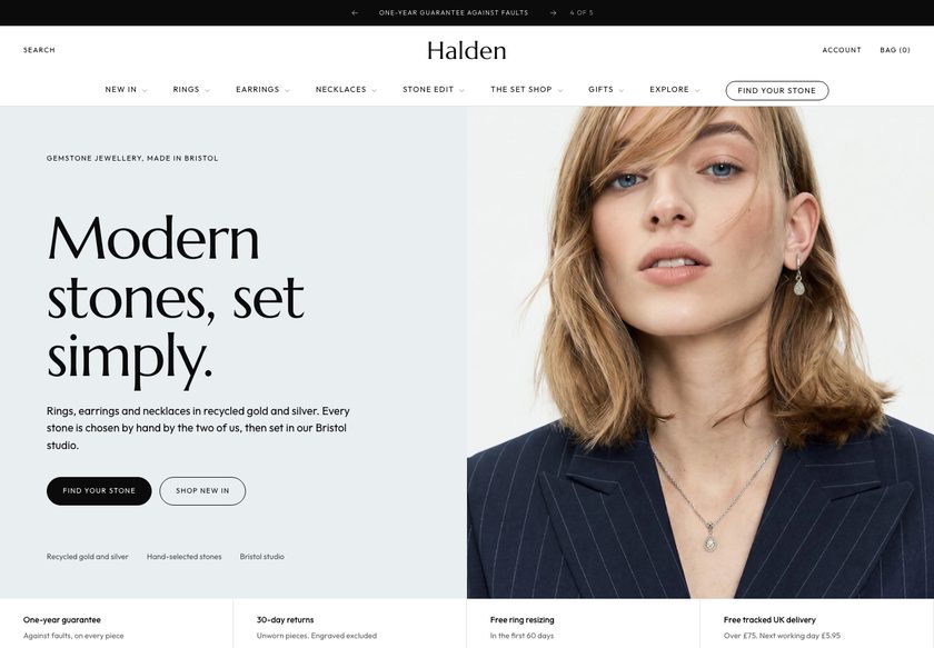 Halden
Jewelry & Accessories
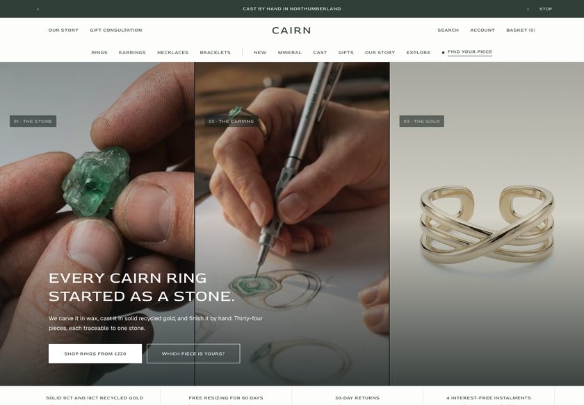 Cairn
Jewelry & Accessories
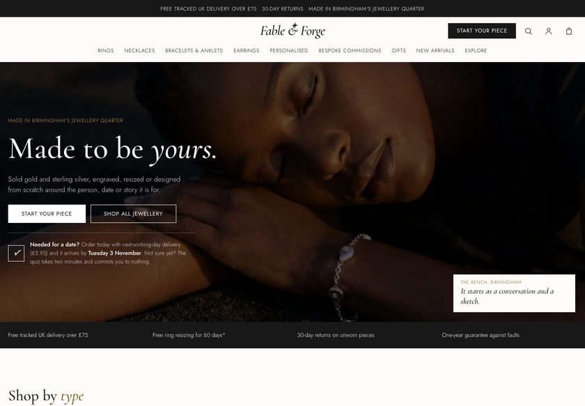 Fable & Forge
Jewelry & Accessories
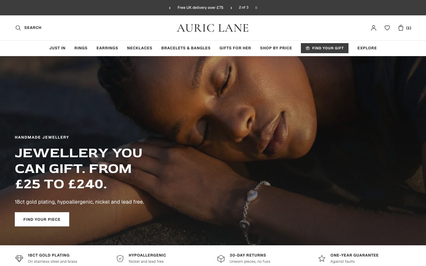 Auric Lane
Jewelry & Accessories
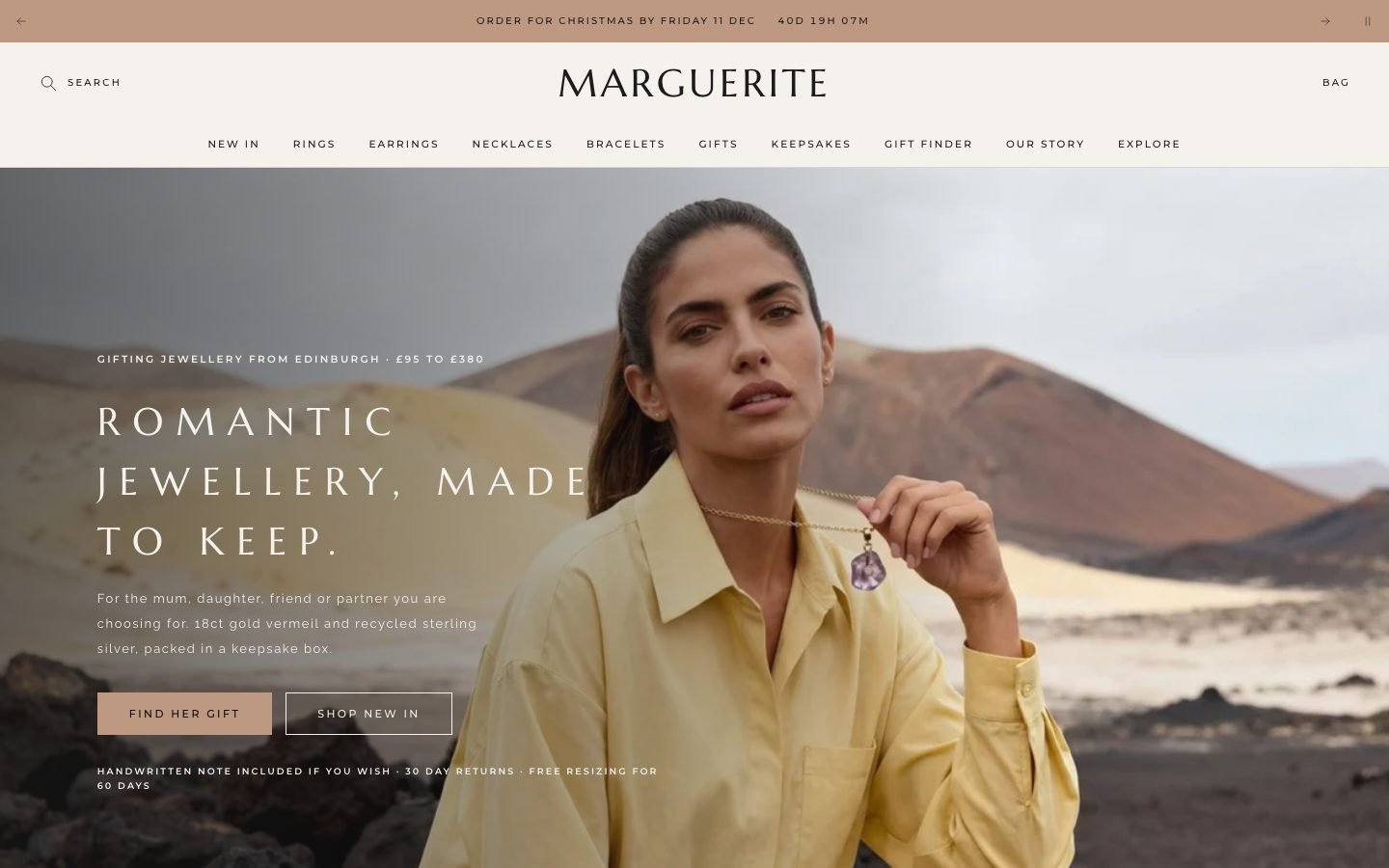 Marguerite
Jewelry & Accessories
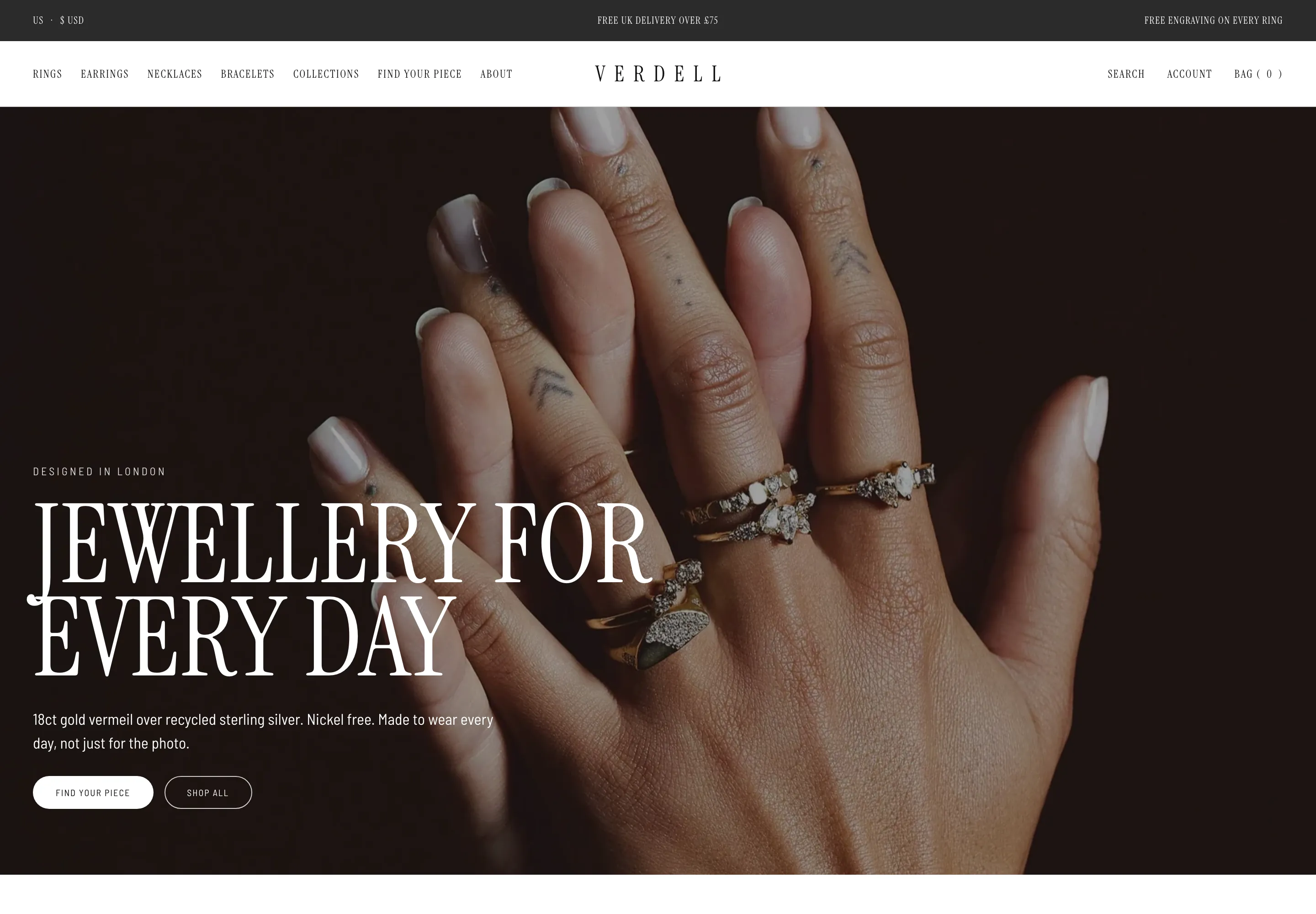 Verdell
Jewelry & Accessories
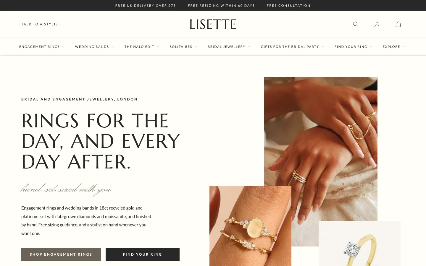 Lisette
Jewelry & Accessories
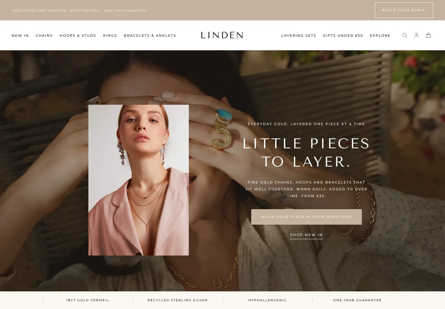 Linden
Jewelry & Accessories
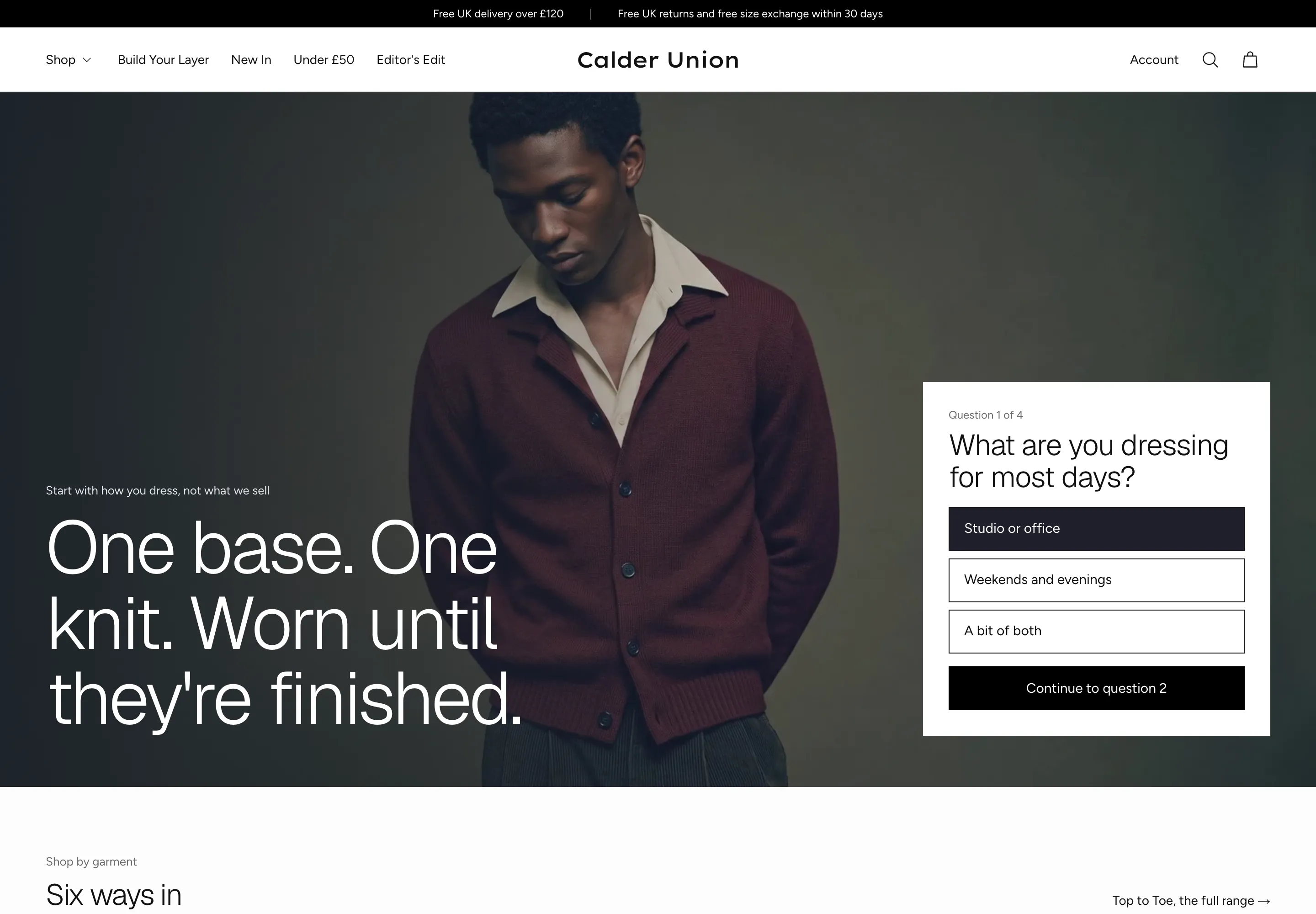 Calder Union
Clothing & Apparel
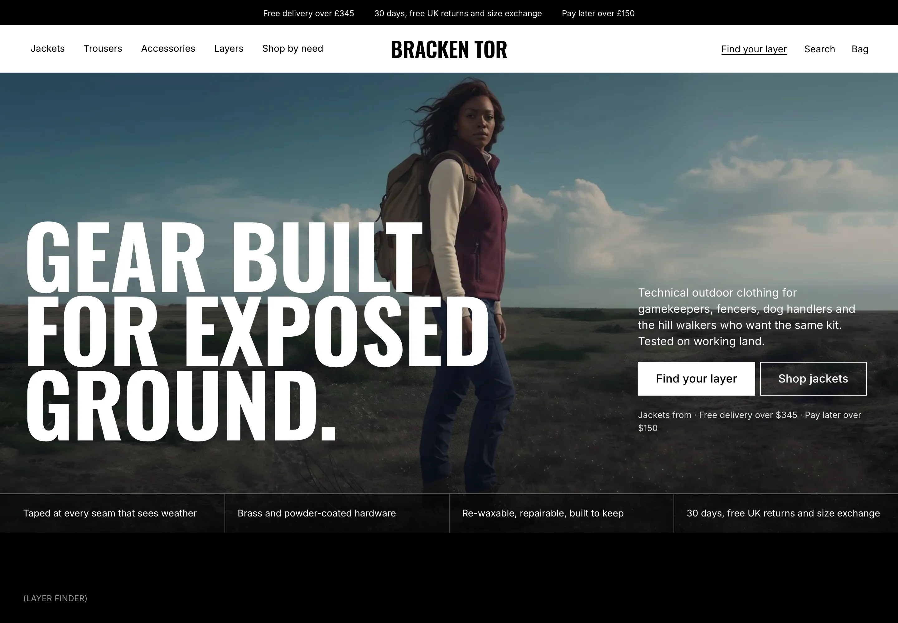 Bracken Tor
Clothing & Apparel
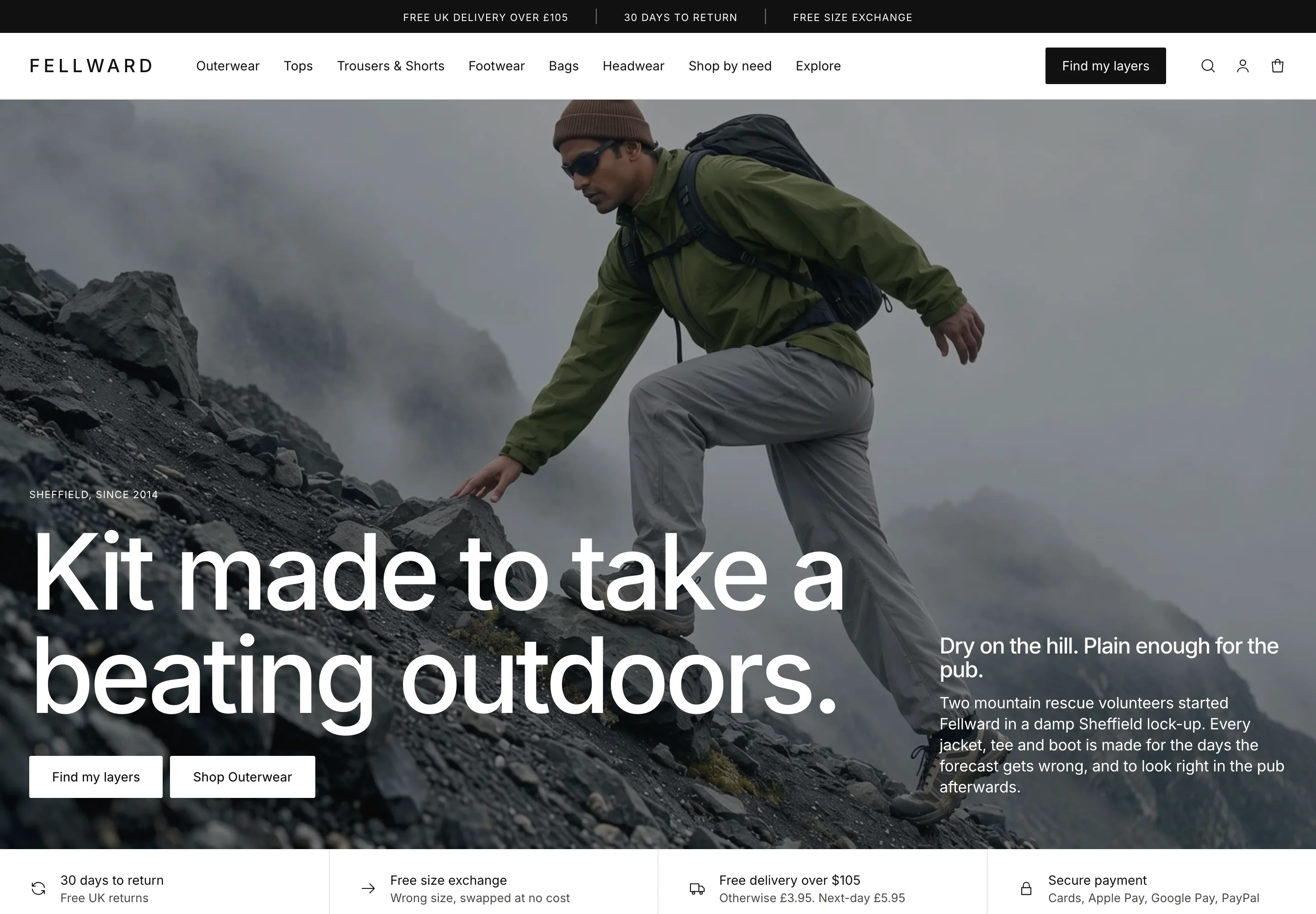 Fellward
Clothing & Apparel
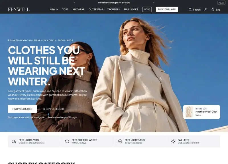 Fenwell
Clothing & Apparel
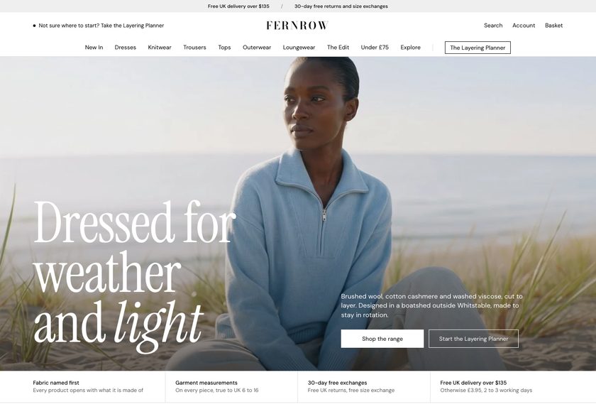 Fernrow
Clothing & Apparel
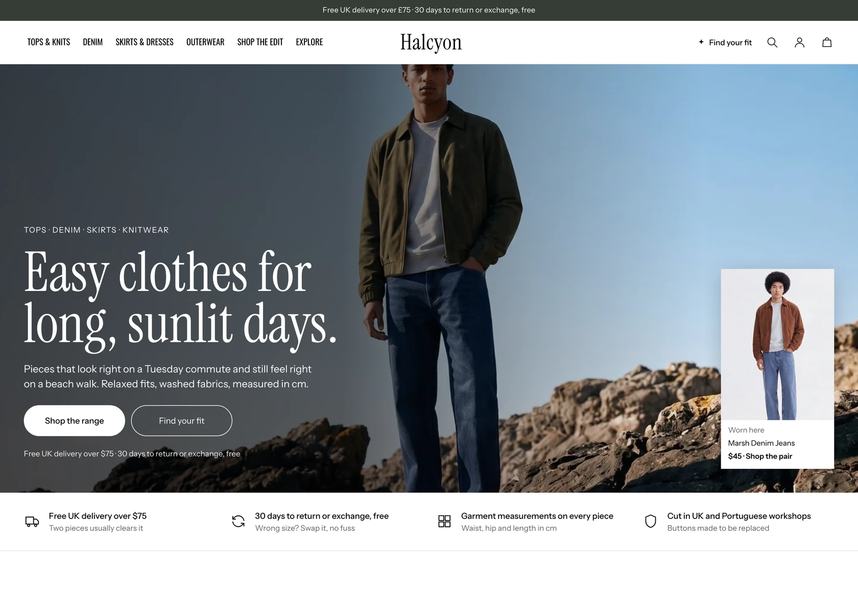 Halcyon
Clothing & Apparel
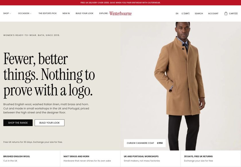 Winterbourne
Clothing & Apparel
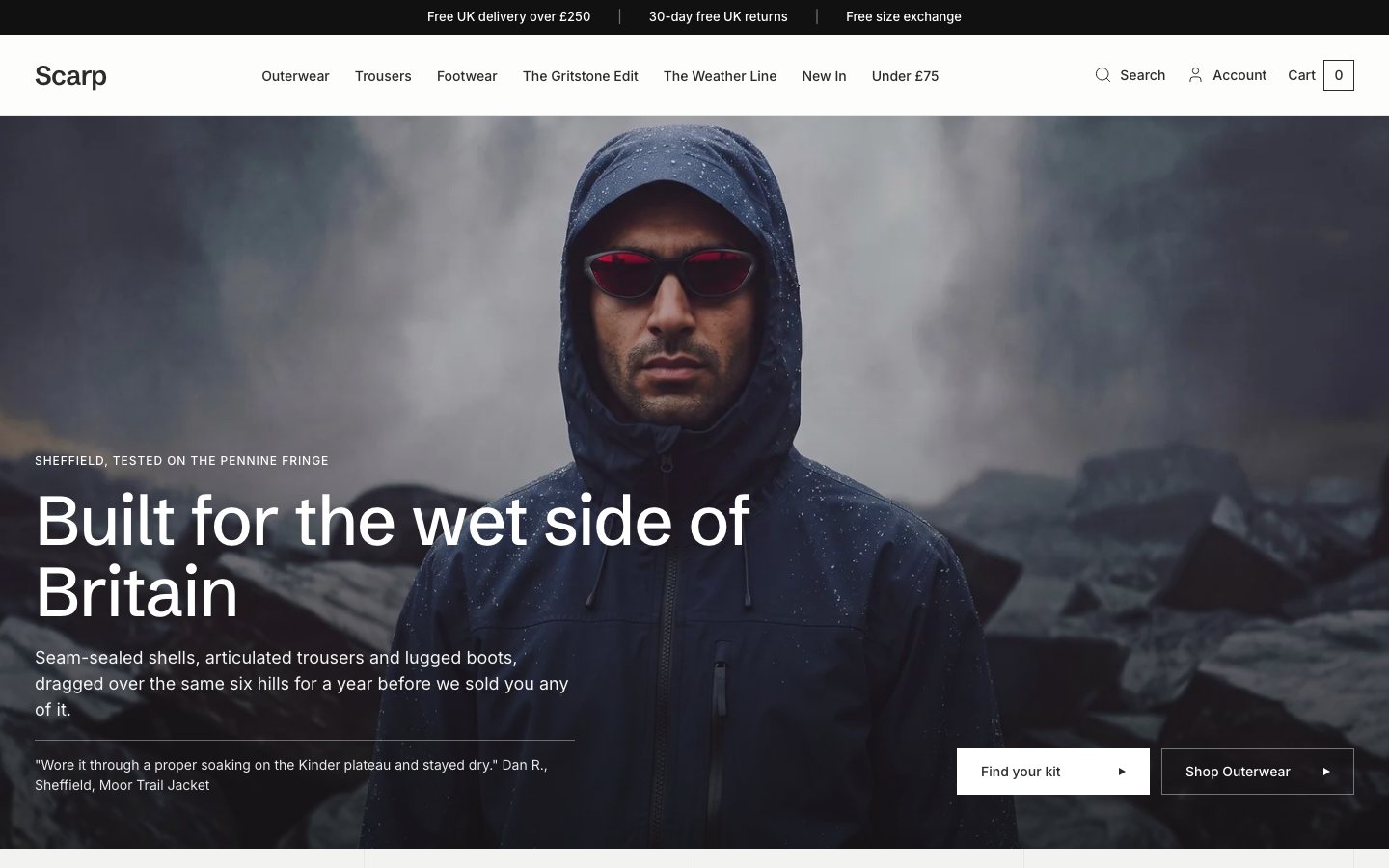 Scarp
Clothing & Apparel
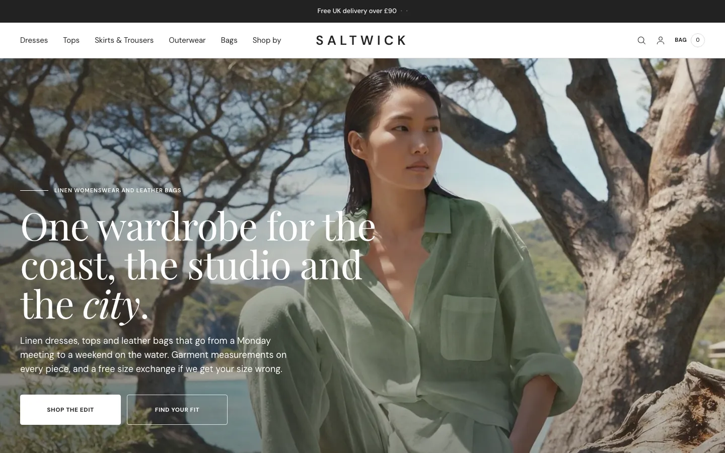 Saltwick
Clothing & Apparel
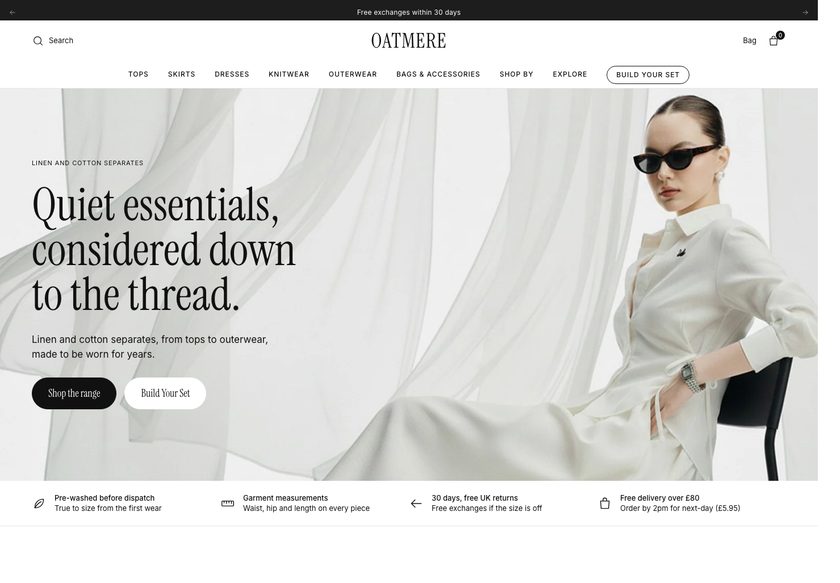 Oatmere
Clothing & Apparel
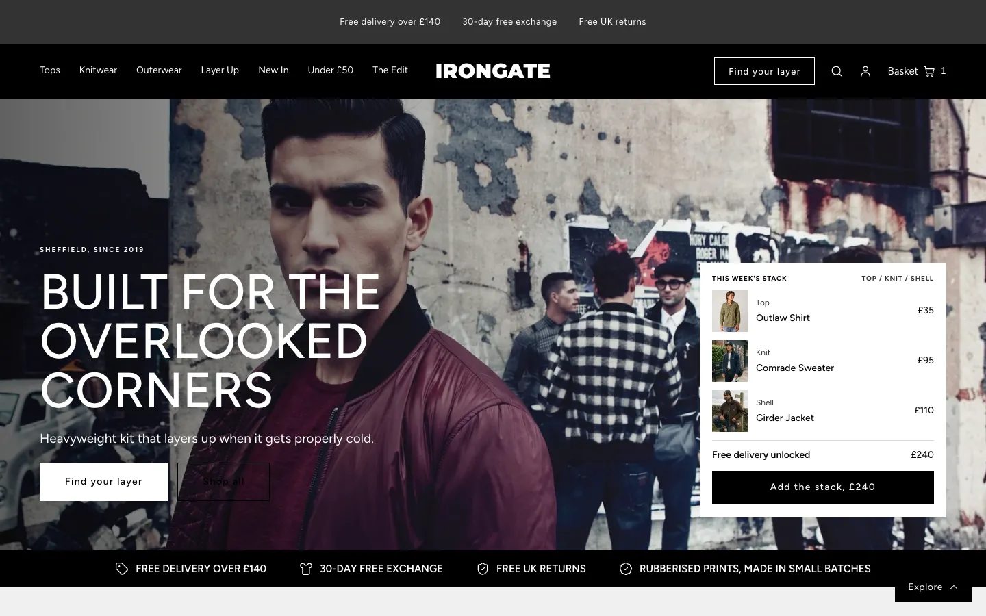 Irongate
Clothing & Apparel
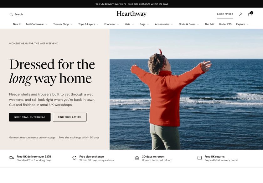 Hearthway
Clothing & Apparel
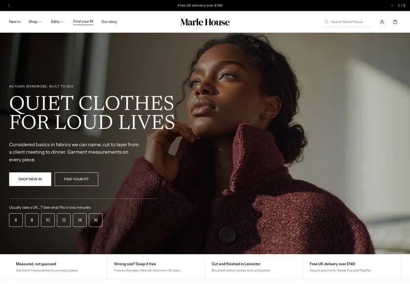 Marle House
Clothing & Apparel
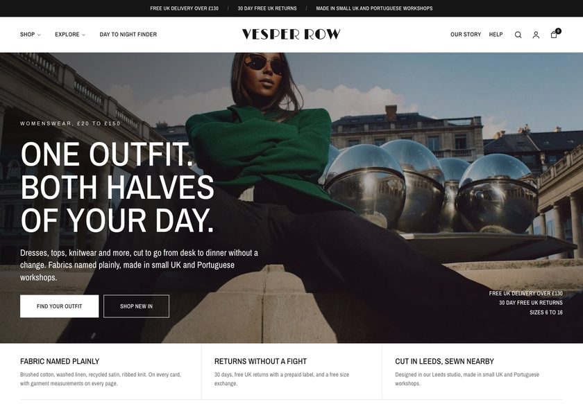 Vesper Row
Clothing & Apparel
A page by page teardown of Palvento Golf's homepage, collection page and product page, with a clickable redesign concept built around guided buying paths and trust.
Pressing play loads the video from YouTube — you can allow it for every teardown under cookie preferences.
Palvento Golf sells men's golf apparel, and the range itself is strong. The polos, caps and lifestyle tees look good, and the collection gives a shopper plenty to choose from. The product page already shows a clear name, a price, a size chart, and short notes on delivery, returns and design. The basics of a good store are in place.
The core problem is the presentation layer. The homepage hero says men's golfwear, refined, and the image reads as a clothing brand, but it does not say who the store is for or why anyone should trust it. A first-time visitor has to guess, and a visitor who has to guess usually hesitates and leaves.
The same gap repeats further down. The navigation hides what is inside each menu, so a visitor opens every one to learn what exists. The collection page is a plain grid of image, name and price, with no sorting or filters. The product page has no reviews, no bundles and no prompt to add a second item.
The direction is guided buying. Give the hero a clear promise and trust signals, organise navigation by category, range, occasion and price, and turn the collection page into a place where products can be compared at a glance. Add reviews, pairings and a free shipping threshold. The idea to remember: help the visitor choose.
The site presents products but does not guide anyone to the right one. The hero does not say who it is for, the collection behaves like a catalogue, and no reviews give a visitor a reason to trust the purchase.
Palvento could become a store that works like a helpful shop assistant: a clear hero, guided paths by range, occasion and price, comparable product cards, visible reviews, and bundles that lift the order size.
Visitors who already arrive would find the right polo, cap or tee faster, trust it sooner and add a second item more often. That means more orders from the same traffic and a higher average order valu
Five dimensions, each scored out of ten.
12 issues found, 16 fixes proposed.
The hero reads men's golfwear, refined, over a clothing image. It does not tell a first-time visitor whether the store is for them, and it shows no sign that other customers trust the brand.
A visitor has to open each menu item to learn what is available. Nothing in the navigation shows how the range is organised, so the number and type of collections stay hidden until someone clicks.
Scrolling the homepage shows polos, zip layers and tees mixed together, then a story block with nothing beneath it. A new visitor gets no direction toward a collection, a price or an occasion.
Each product appears as an image, a name and a price. The page lists what exists but does not help a golfer discover which polo suits them, so every card looks much like the next.
There is no way to narrow the range by price, size, colour, fit or occasion. A shopper must scroll the whole list to find what they came for.
Cards do not show colours, sizes, fabric or why one polo costs 60 and another 75. A visitor opens five to ten product pages to compare, and many will stop before they finish.
The store shows no customer reviews on the homepage, collection pages or product pages. Without them, a visitor has no proof that real customers bought and were happy with the fit and quality.
Delivery, returns and design notes are a good start. But the page does not justify the price, explain the fabric or answer the questions a buyer has before paying.
No pairings, bundles or free shipping threshold appear on the site. A shopper buying one polo is never prompted to add a cap or tee, so order size stays at a single item.
A shopper can find similar clothing on Amazon or Etsy for less. The site does not explain why Palvento costs what it does, through fabric, fit, design origin or returns.
Nothing on the current pages tells a hesitant buyer that the cost can be split. When price is the blocker, there is no visible reassurance to keep them from leaving.
A size chart exists, which is good. There is no fit finder or model reference, so a buyer unsure about sizing has to work it out alone before risking a return.
State what Palvento sells, who it is for and why it can be trusted within the first three seconds. Pair a clear headline with review proof and one visible call to action.
Place delivery, returns, design origin and pay in three installments directly beneath the hero. A buyer who worries about money or returns sees the answer before scrolling.
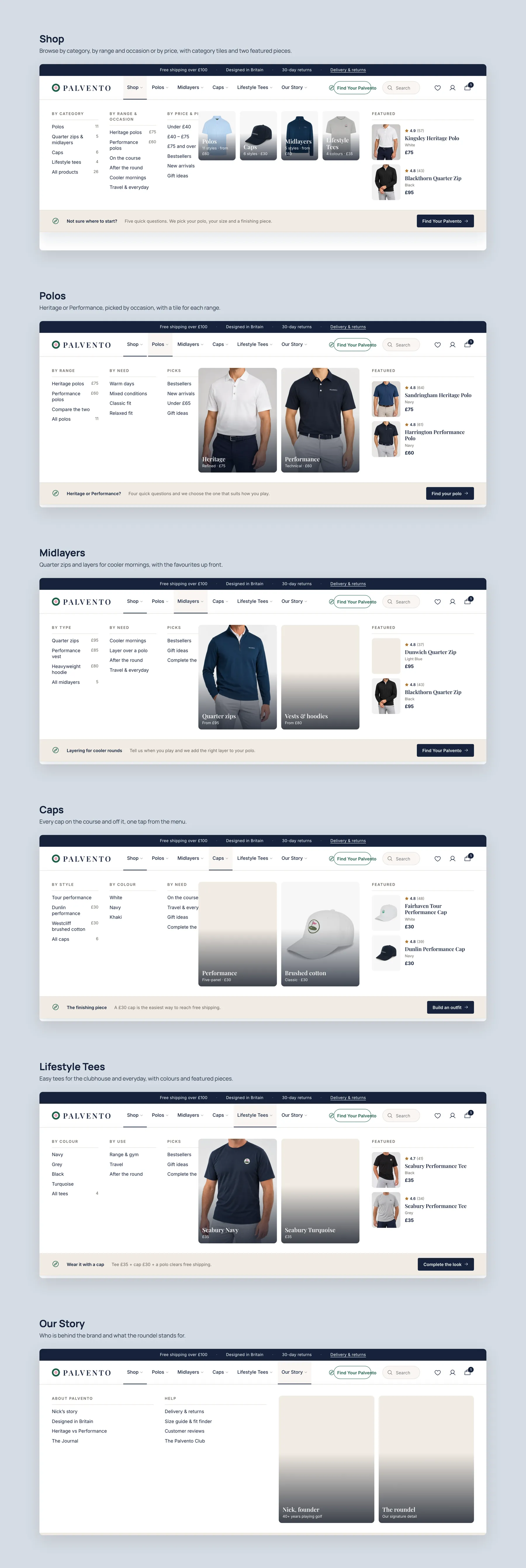
Group the shop menu by category, range, occasion and price, with polos, caps and lifestyle tees each broken into clear sub groups. Visitors should see what exists without opening every item.
List under 40, 40 to 75 and 75 and over as direct links. A visitor who shops by budget can go straight to products they can afford without hunting.
Ask a few short questions about style, colour and size, then recommend matching products. It works like a shop assistant asking how it can help.
Show tiles for polos, caps and tees, plus shop by course, round, cooler weather and travel. Add a heritage versus performance split and a size guide bar so each visitor has a starting point.
Feature best sellers after the guided paths, with badges such as best seller, customer favourite and gift ready. Each card should carry a star rating and a name.
Let shoppers filter by price, category, range, size, colour, fit, occasion and condition, and sort the results. A short description and quick toggles at the top of each collection help too.
Show the fit, fabric, UPF rating and available sizes on each card. Shoppers can then compare two polos and see why one costs 60 and the other 75 without opening either page.
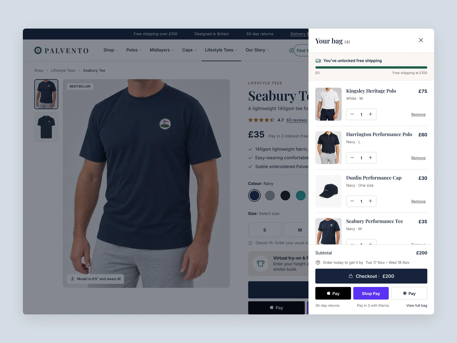
Offer a simple builder that lets a shopper combine a polo, cap and tee into one outfit. Pair it with a free shipping threshold so a bundle feels like a saving.
Place the star rating beneath the title and add a full review section with customer photos lower down. Where a product has no reviews yet, reuse storewide reviews so each page carries proof.
Give buyers a fit finder that shows what the model wears and compares sizes. It reduces sizing doubt, and sizing doubt is a common reason to leave without buying.
Display a line that updates as items are added, such as how much remains to reach free shipping. The buyer gets a saving and the store gets a larger order.
Place pairings and customers also bought rows on product pages, matched to the current item. Someone viewing a tee should see relevant polos, caps and other lifestyle tees.
Add a section on fabric, fit, design origin and the return promise, so a buyer sees why the item is worth the price. Back it with a clear returns statement and secure payment badges.
Let buyers mark an item as a gift with a card and message, and show an expected delivery date near Add to Cart. Both remove small doubts at the moment of purchase.
A concept redesign created by Convertica Studio from this audit. It shows how the store could work, it is not the live store.
Homepage in two tall columns: the top of the page on the left, the page down to the footer on the right.
Bag slide-over open over the product page, shown as a whole screen with the full drawer and the free shipping bar.
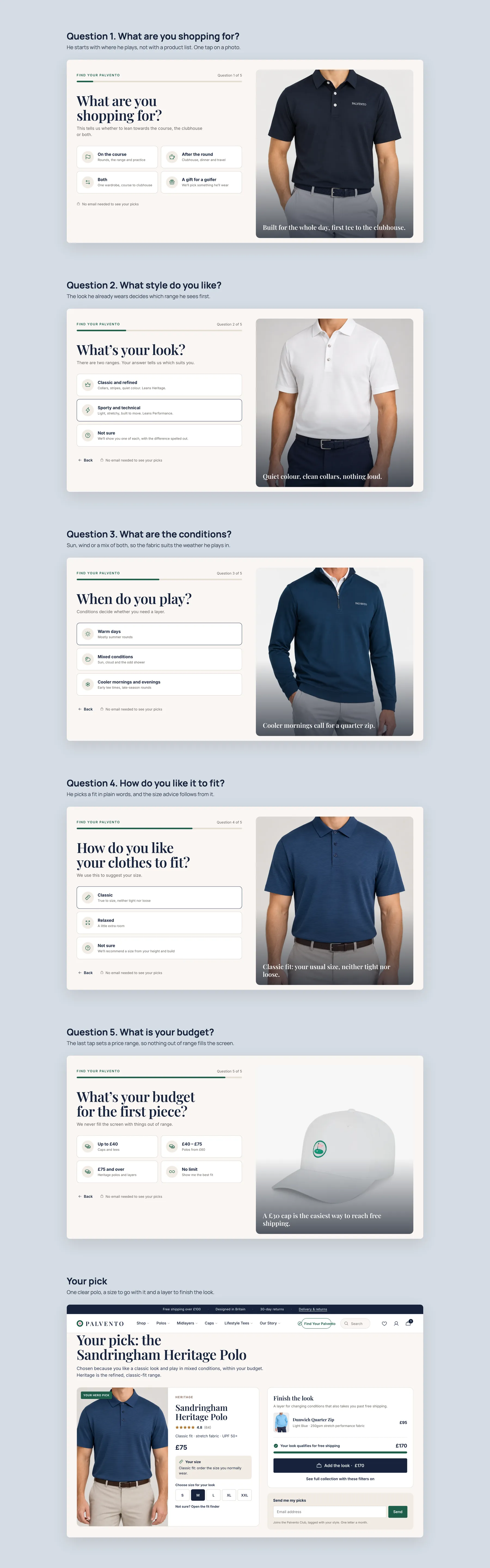
Find Your Palvento quiz, step by step: five questions about where he plays, his style, the conditions, the fit and the budget, ending in one clear pick with a layer to finish the look.
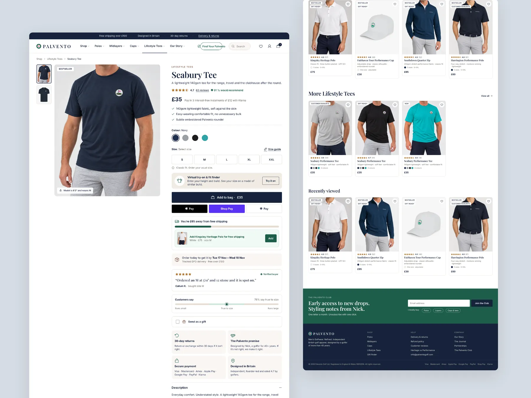
Product page in two tall columns, with the buy box and size picker whole on the left and the page ending on the footer on the right.
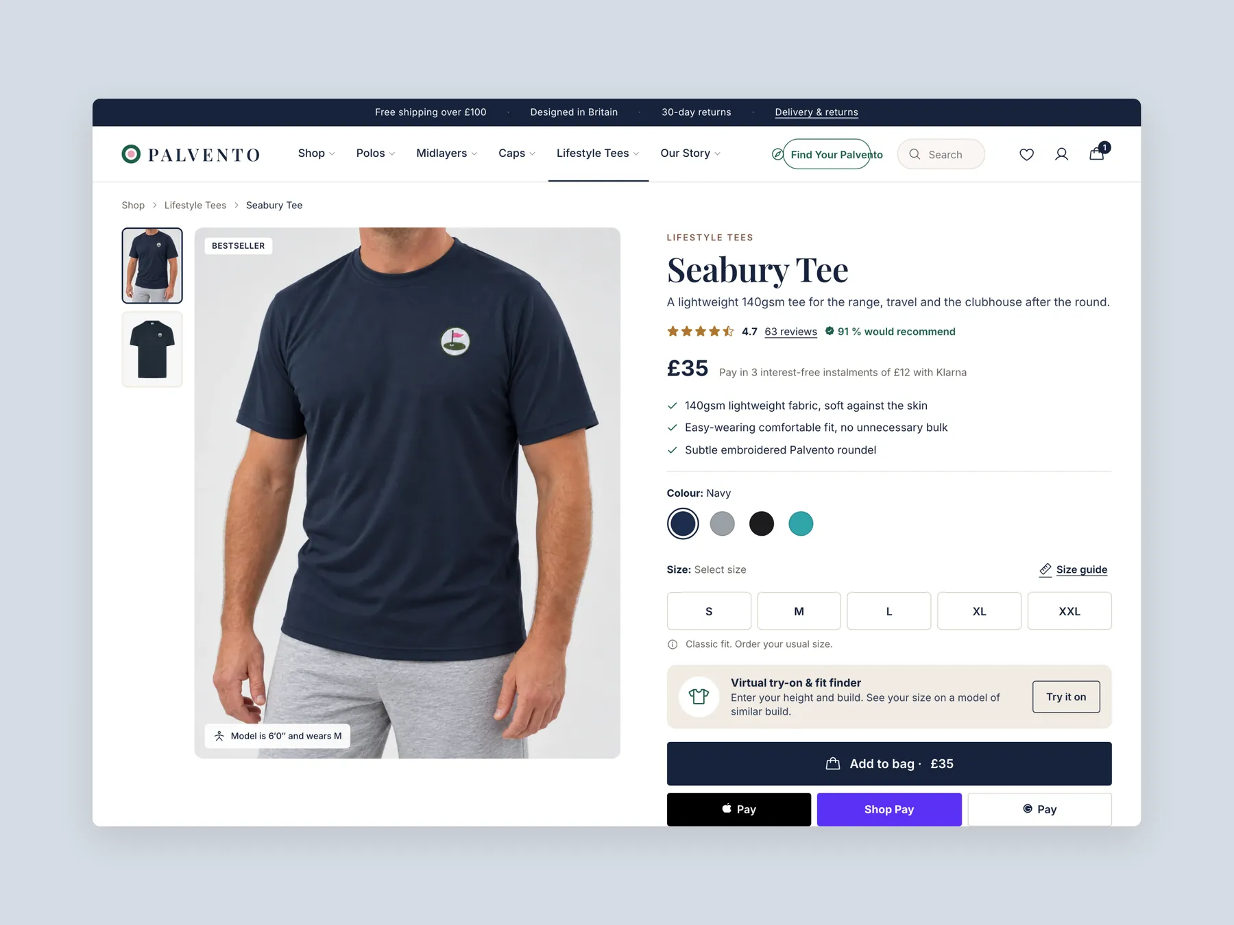
Product page first screen: the header and the buy box with sizes, button and delivery lines.
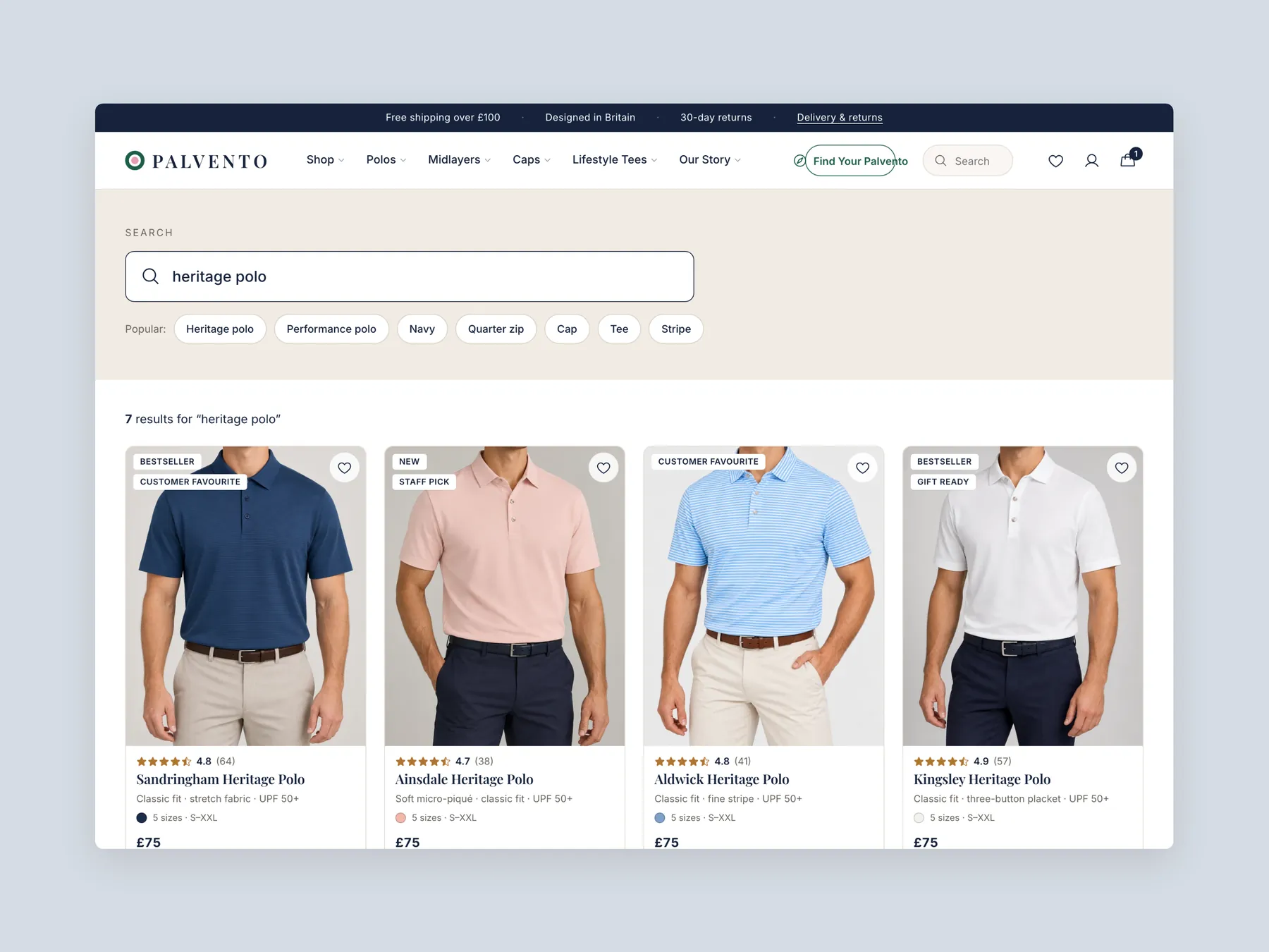
Product grid first screen: the header, the search bar and the first row of polo cards with prices and sizes.
Mega menu with every panel open, one screen per nav item: Shop, Polos, Midlayers, Caps, Lifestyle Tees and Our Story.
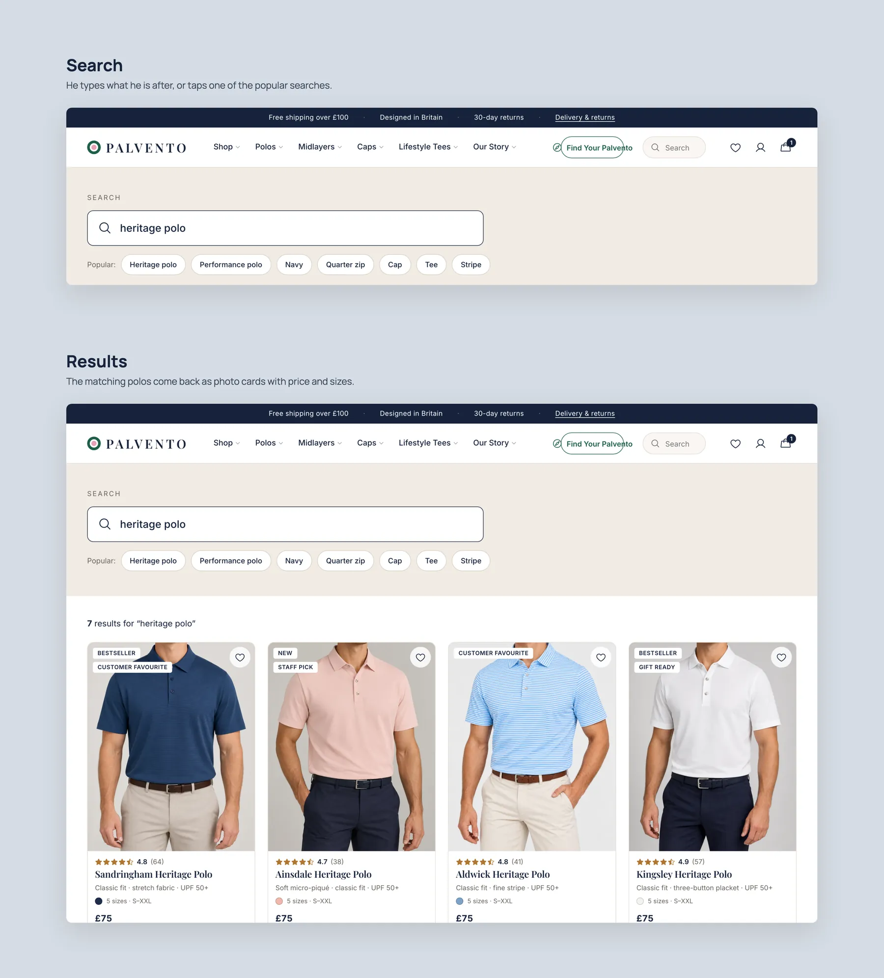
Search: the bar with a query typed and the results page for it.
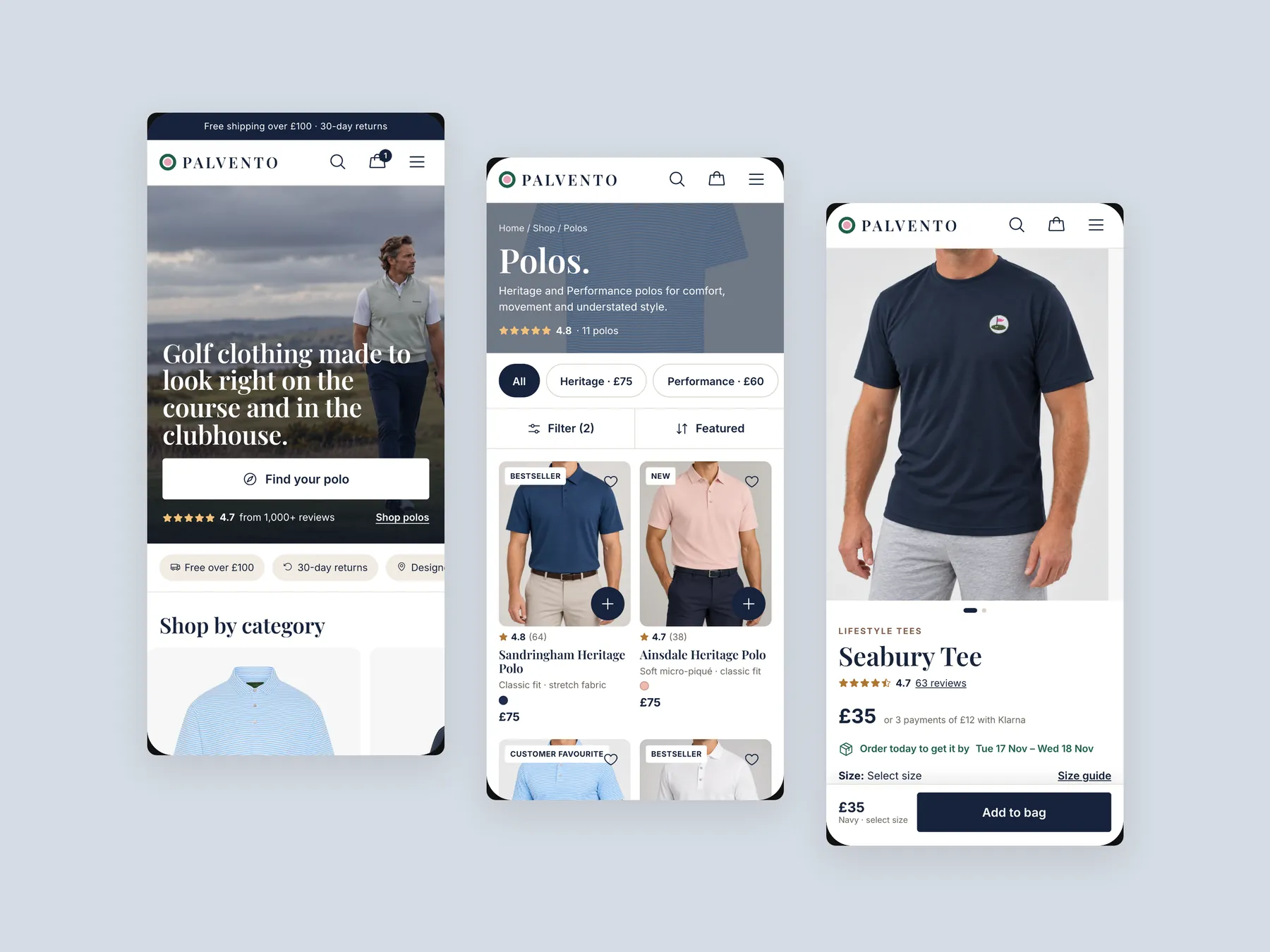
Mobile: three phone screens, the home, the collection and the product page.
The presentation layer does not help visitors choose. The hero does not say who the store is for, the collection page is a plain catalogue, and there are no reviews. The products are strong; the guidance around them is missing.
Our CRO strategist recommended pausing. Make the existing visitors buy first, then add Meta or other ads. More traffic sent to a page that does not convert only repeats the same leak at a higher cost.
A visitor decides within seconds whether a store is for them. The hero should say what is sold, who it is for and why to trust it. Without that, visitors hesitate, and hesitation costs sales.
They are routes that point a visitor toward a collection or product: shopping by category, range, occasion or price, plus a short product finder. They work like a shop assistant asking what you are looking for.
It lists products with an image, a name and a price, and offers no sorting or filters. A shopper cannot compare items without opening each page, so the page does not help them discover the right product.
It shows a clear name, a price and a size chart, and it explains delivery, returns and design below. Those are the foundations of a good product page. What is missing is proof, objection handling and order size prompts.
Reuse storewide reviews and show them under each product page, so a visitor sees that real customers are happy. Product specific reviews can replace them as they arrive.
Through a look builder, a free shipping progress line, complete the look sections and also bought rows. Each one nudges a buyer from one item to two, such as a polo plus a cap.
If price is the blocker, seeing that an item can be paid in three installments removes a reason to leave. The concept shows this near the hero and on the product page beside the price.
No. It is a clickable prototype that shows what could be done, not a finished design. It is meant to show how the same products can feel clearer and more trustworthy.
There are three routes: leave the site as is, do it yourself, or have the studio do it. A full rebuild of about 18 to 19 pages is 3,500 in three stage payments, an upgrade of three pages is 2,200, and a ready made theme is 350, or 1,000 installed.
The video is 25 minutes. It reviews the homepage, collection page and product page of the current store, then walks through a redesign concept for each, and ends with pricing and next steps.
Tell us about your store and we'll send a personalized 5-minute video showing exactly where you're losing buyers — and how to win them back.
Takes about 40 seconds. No call required.