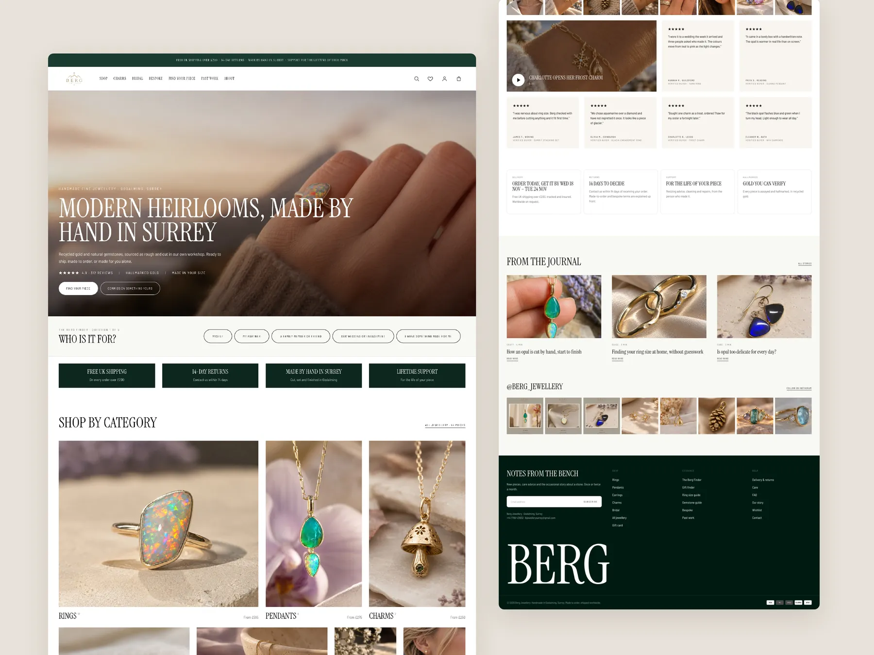
Homepage
The full page as two tall columns, from the opening screen down to the footer.
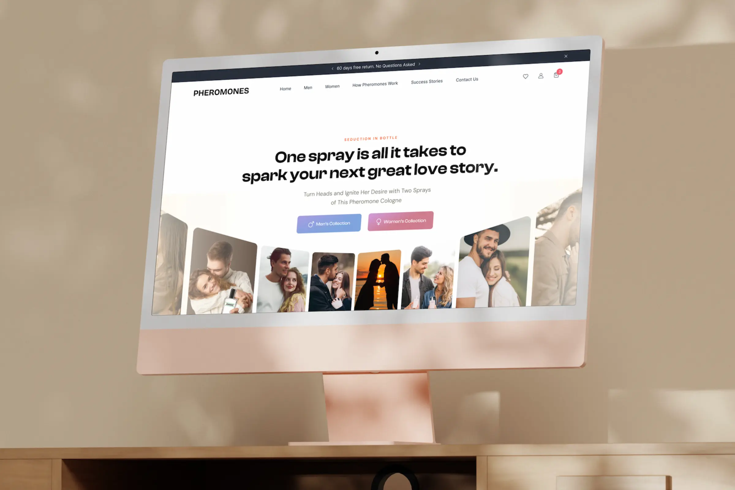
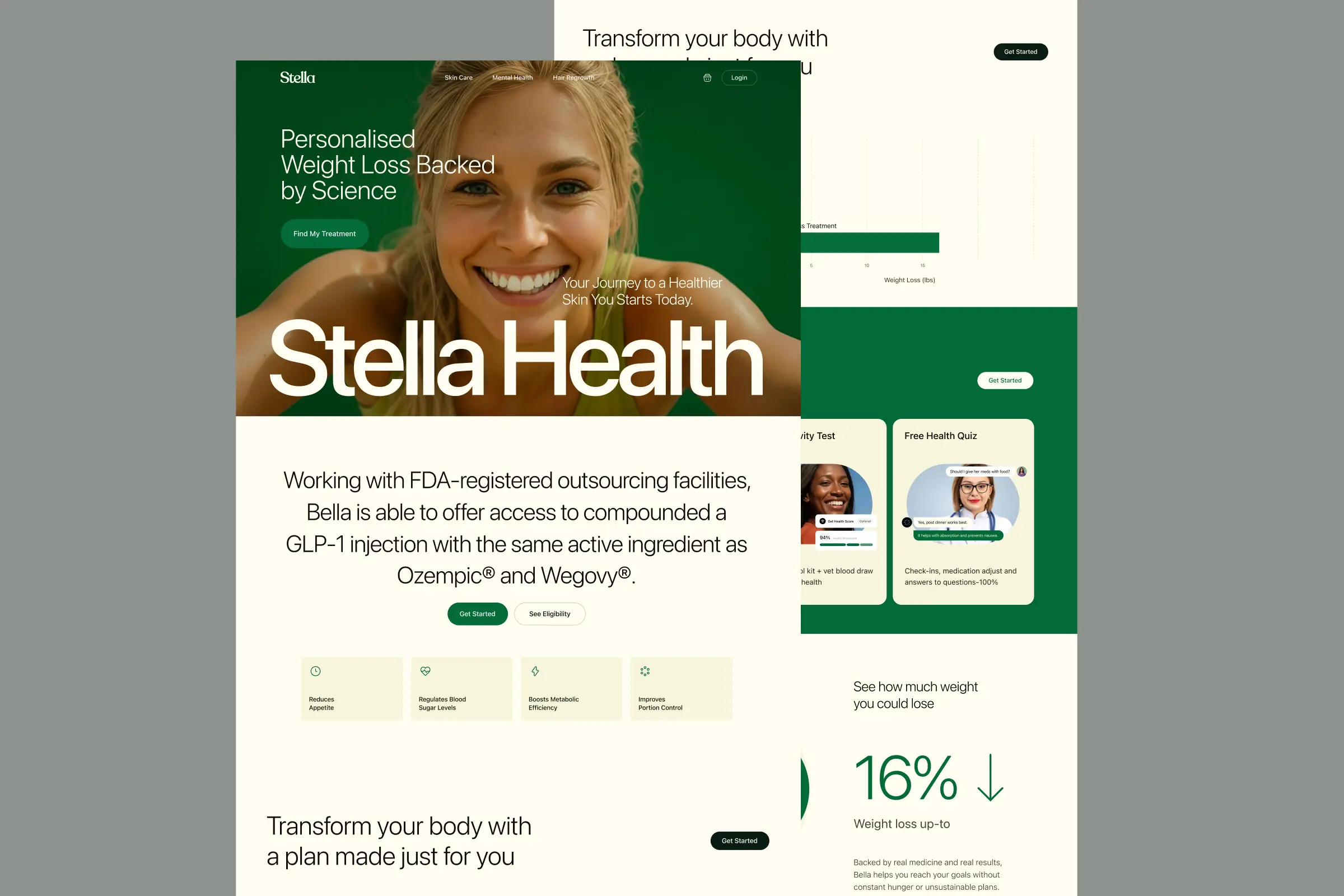
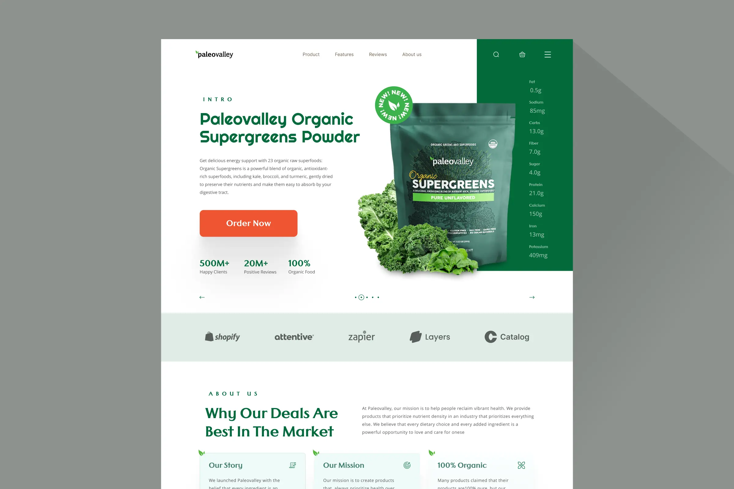
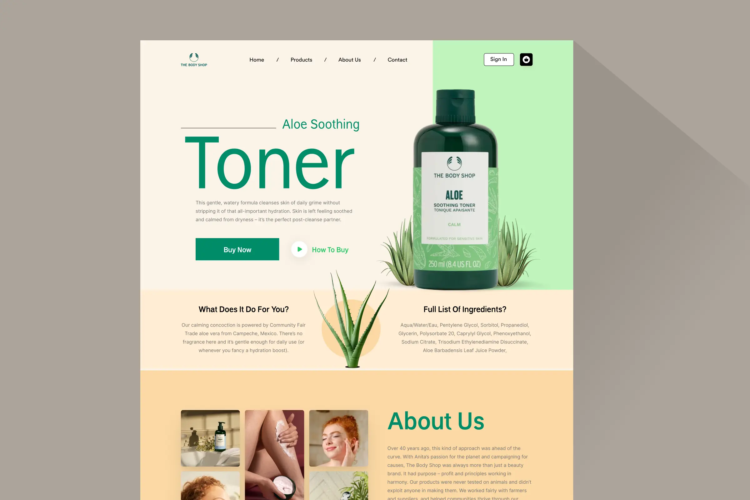
Storefronts we designed and built, across supplements, fragrance, health, wellness and skincare.
All 35 projectsFour engagements, measured before and after. What changed, why it changed, and by how much.
All case studiesDiagnosis, design and development from one studio — so the recommendation and the build never disagree.
All five services192 real Shopify stores torn down page by page, scored, and shown beside the version we would build. Free to watch.
Browse all teardownsConversion-first Shopify themes, each built for one industry’s buying journey. No required apps, no monthly theme fee, one licence per store.
See all themes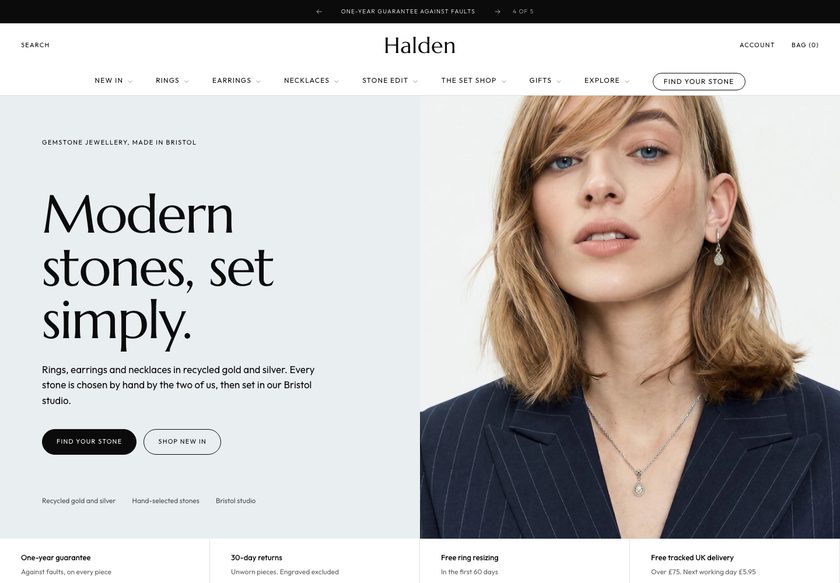 Halden
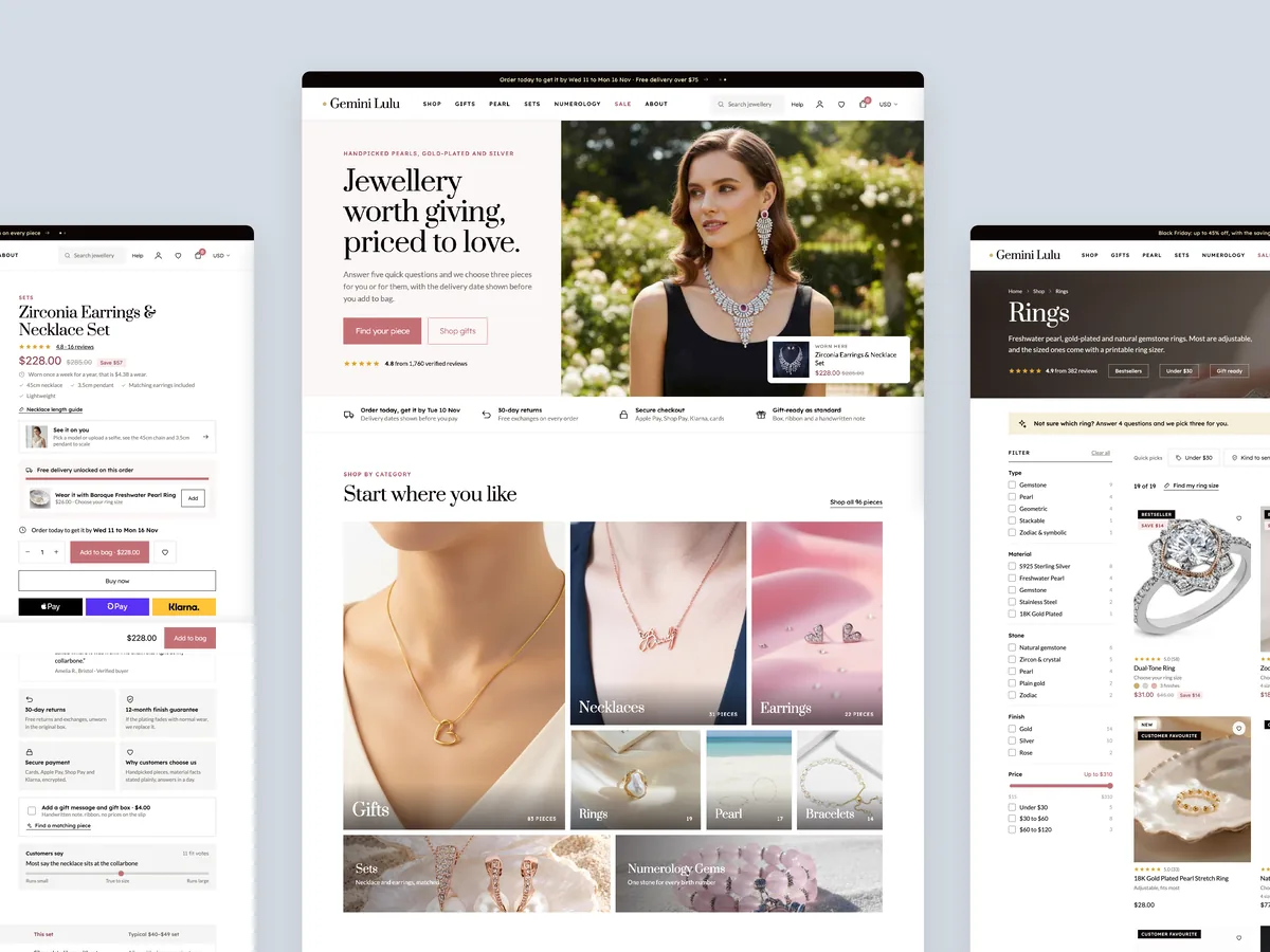
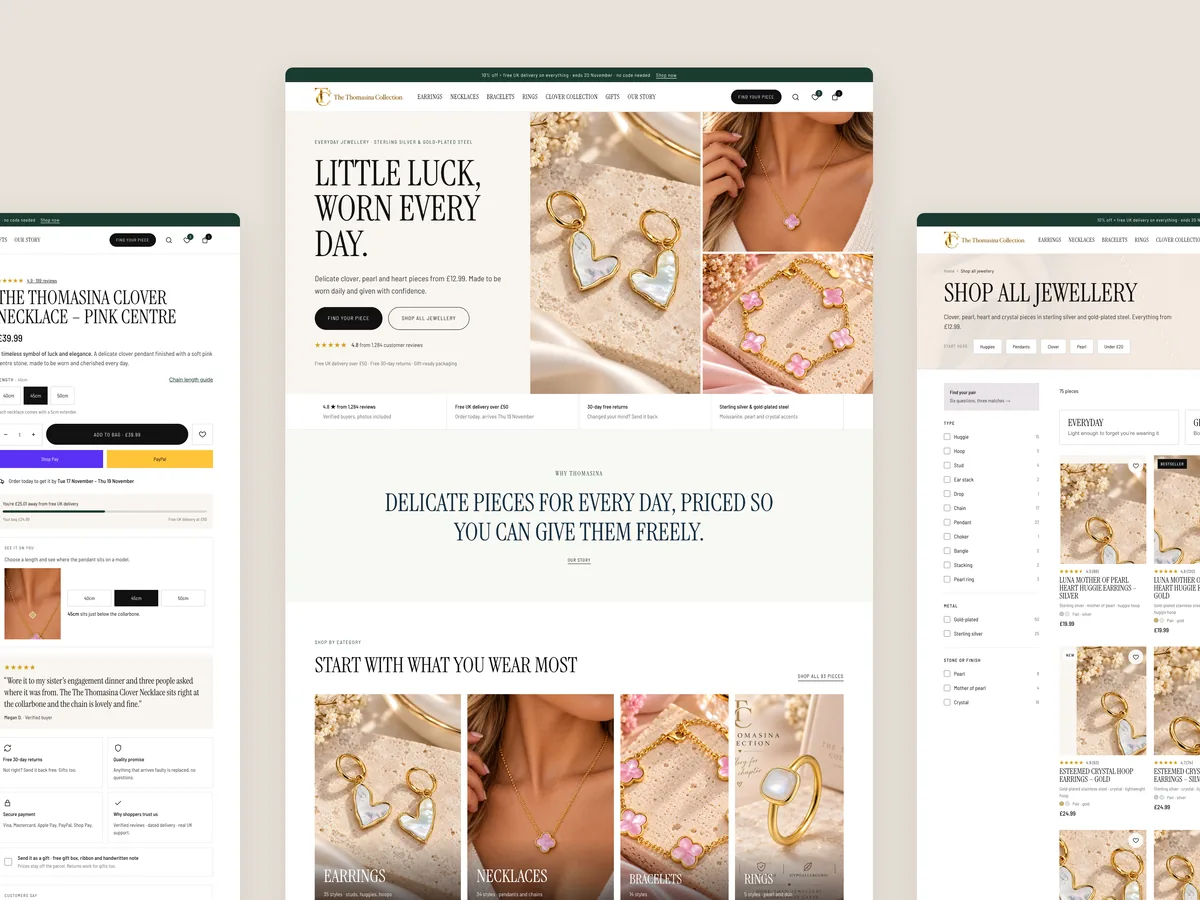
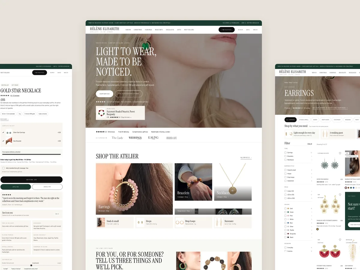
Jewelry & Accessories
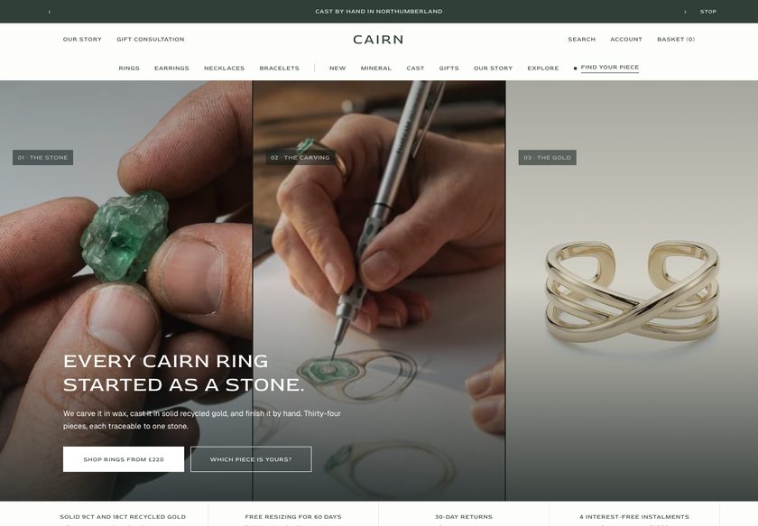 Cairn
Jewelry & Accessories
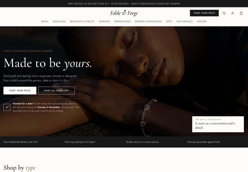 Fable & Forge
Jewelry & Accessories
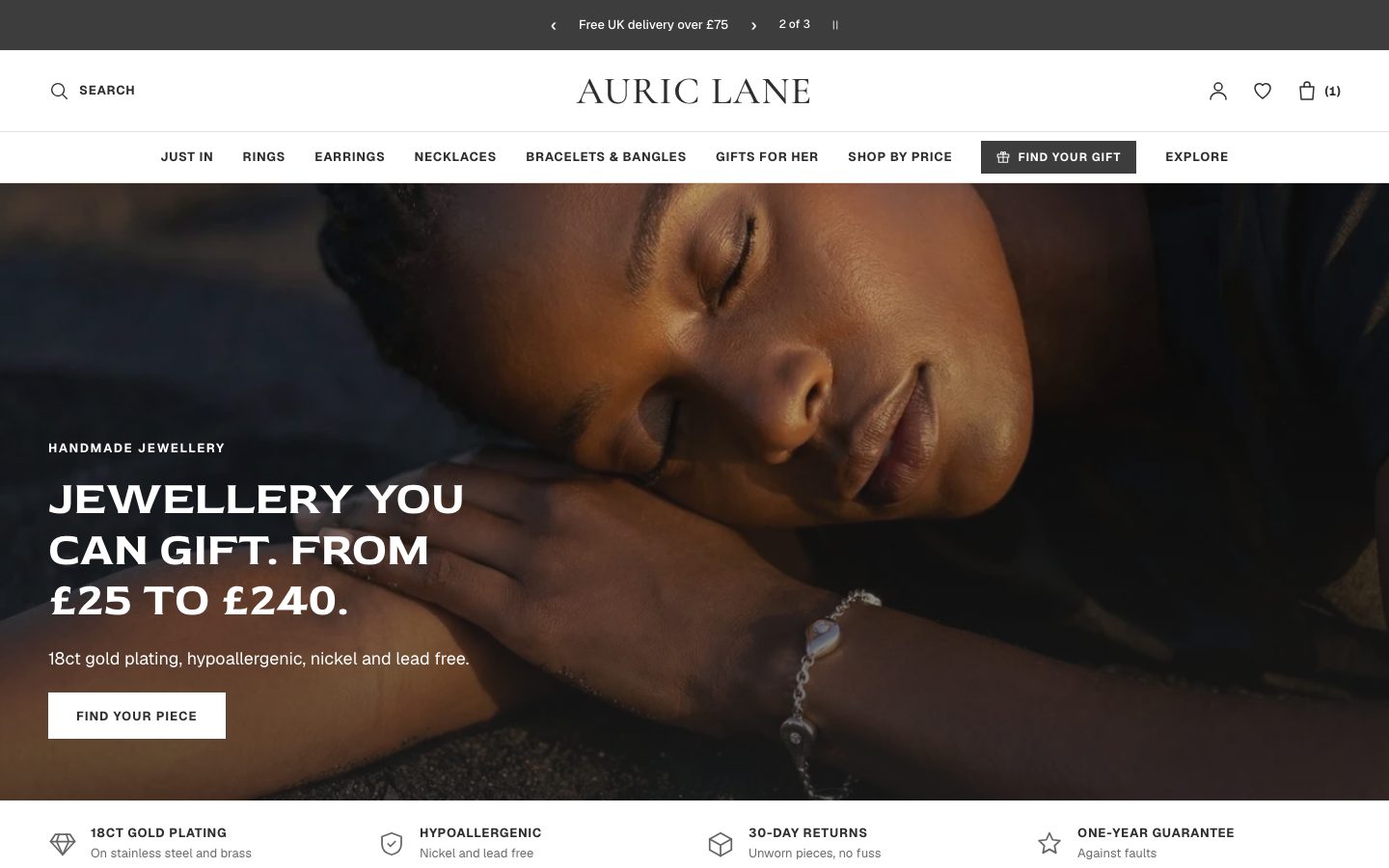 Auric Lane
Jewelry & Accessories
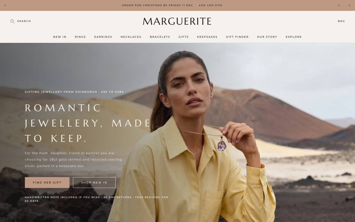 Marguerite
Jewelry & Accessories
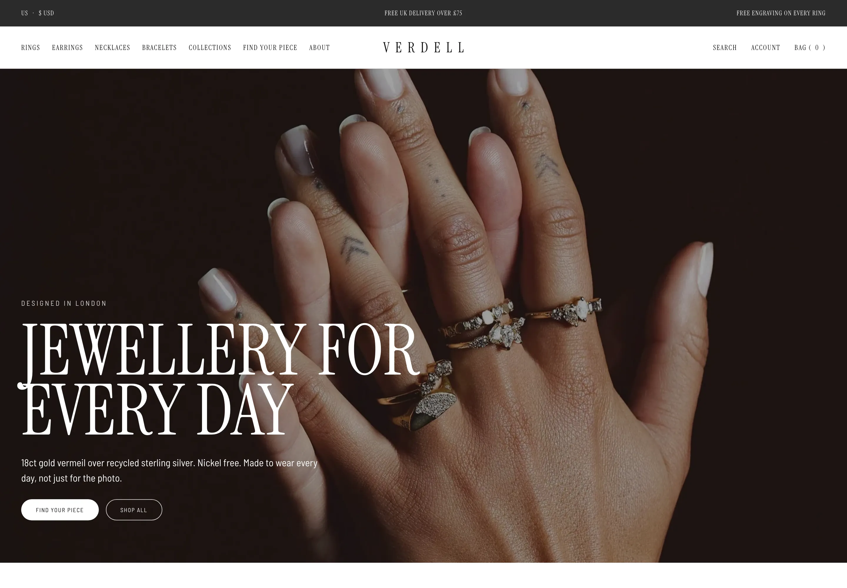 Verdell
Jewelry & Accessories
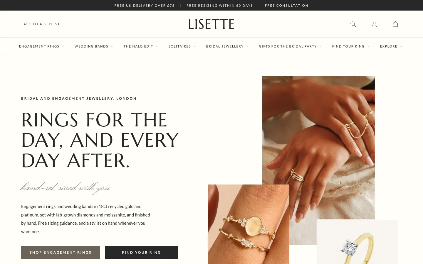 Lisette
Jewelry & Accessories
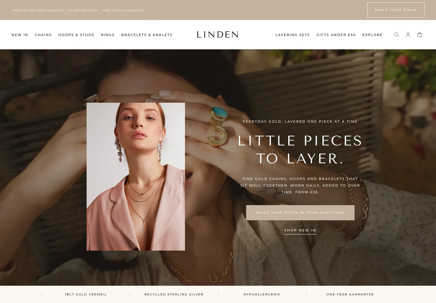 Linden
Jewelry & Accessories
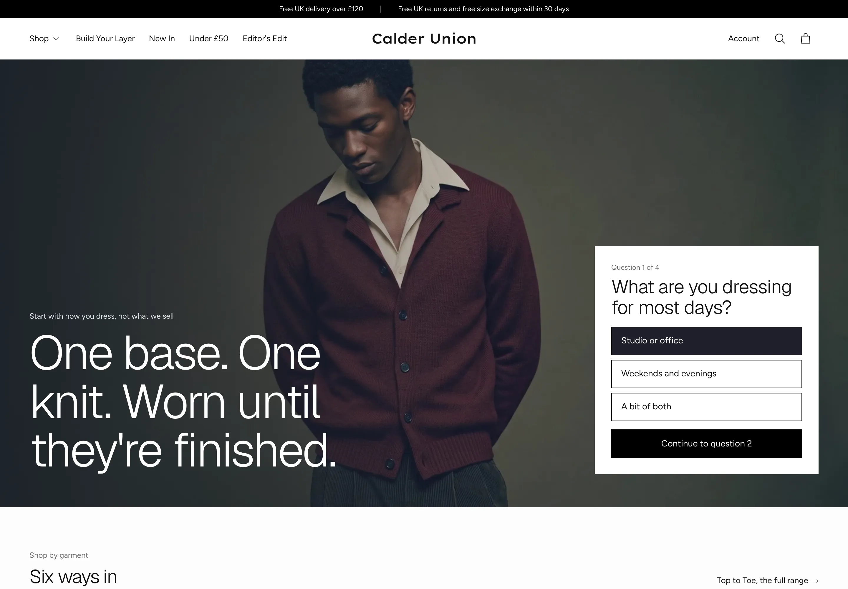 Calder Union
Clothing & Apparel
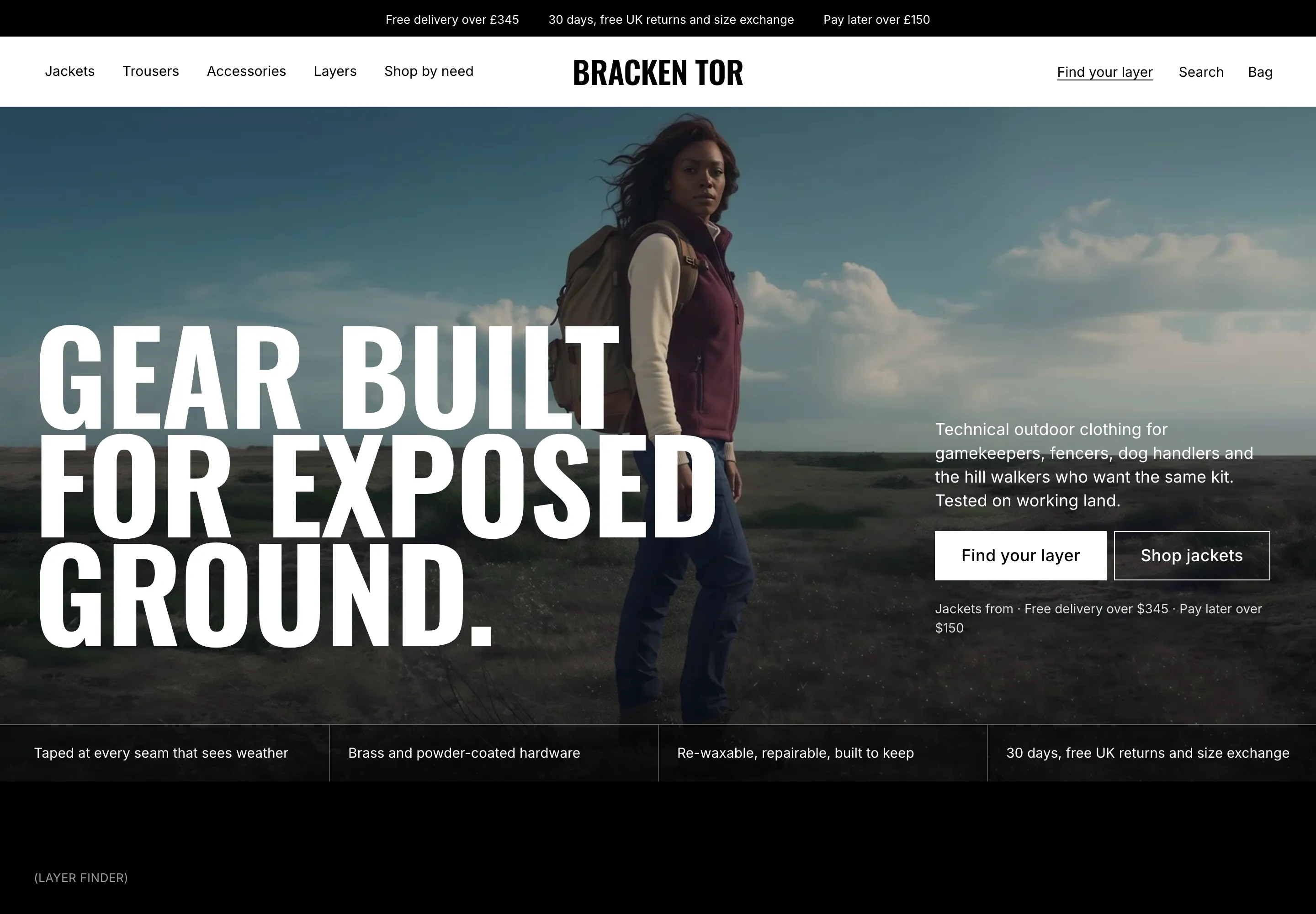 Bracken Tor
Clothing & Apparel
 Fellward
Clothing & Apparel
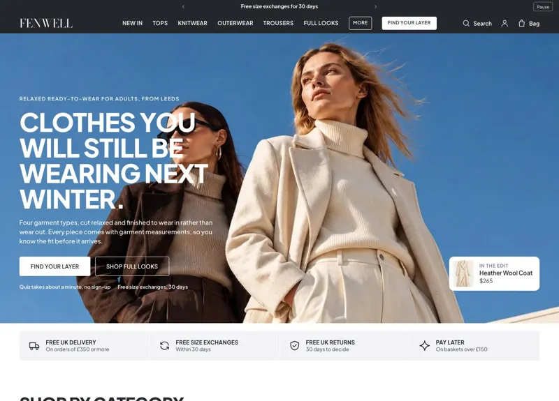 Fenwell
Clothing & Apparel
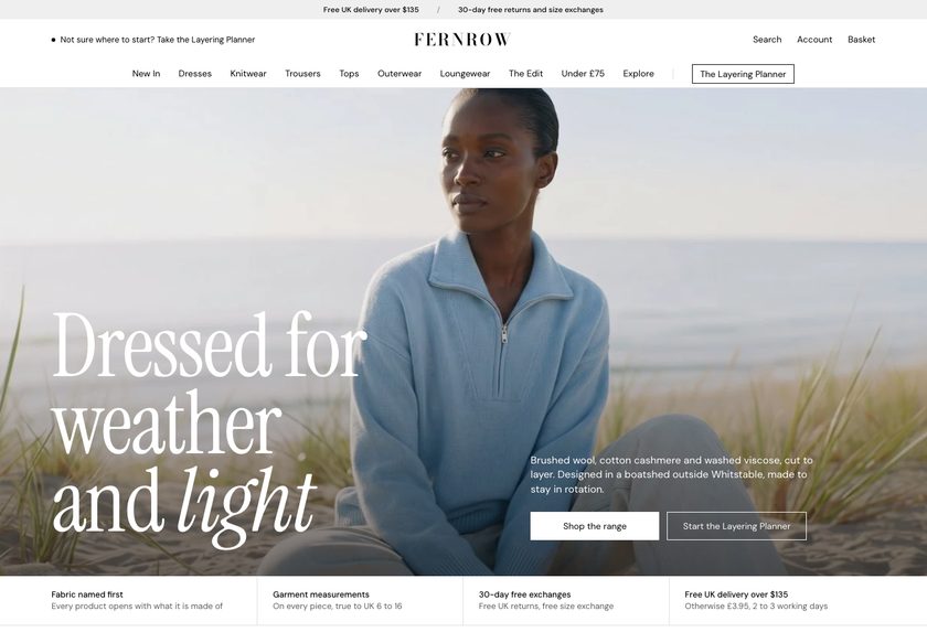 Fernrow
Clothing & Apparel
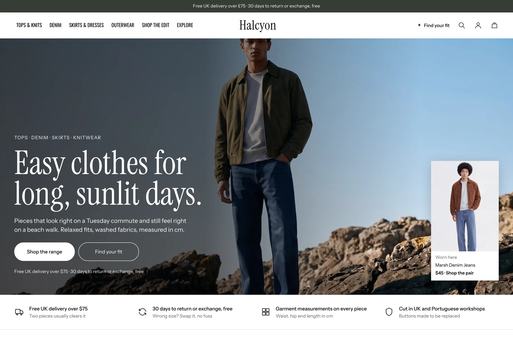 Halcyon
Clothing & Apparel
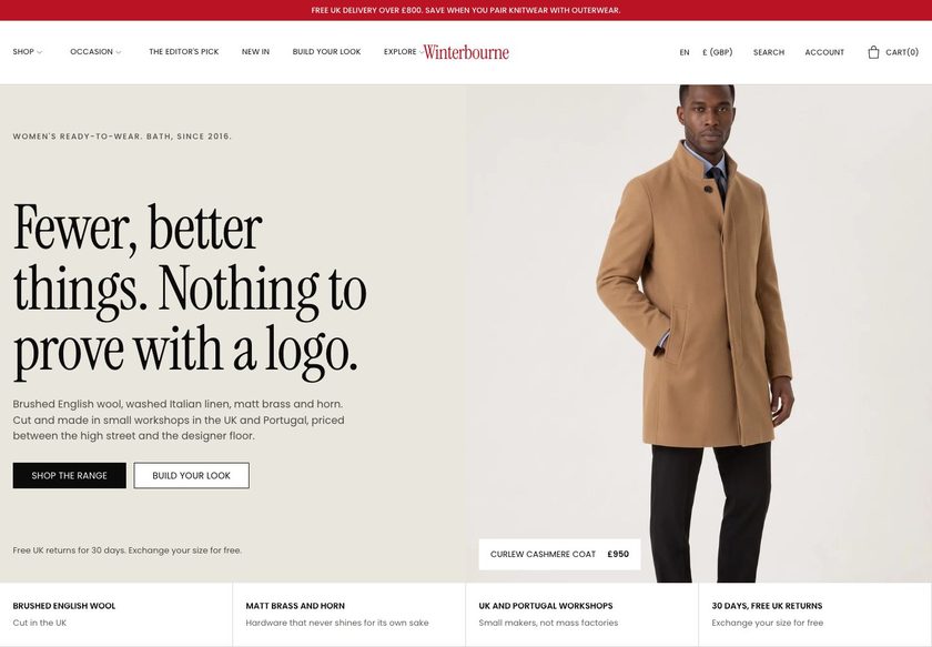 Winterbourne
Clothing & Apparel
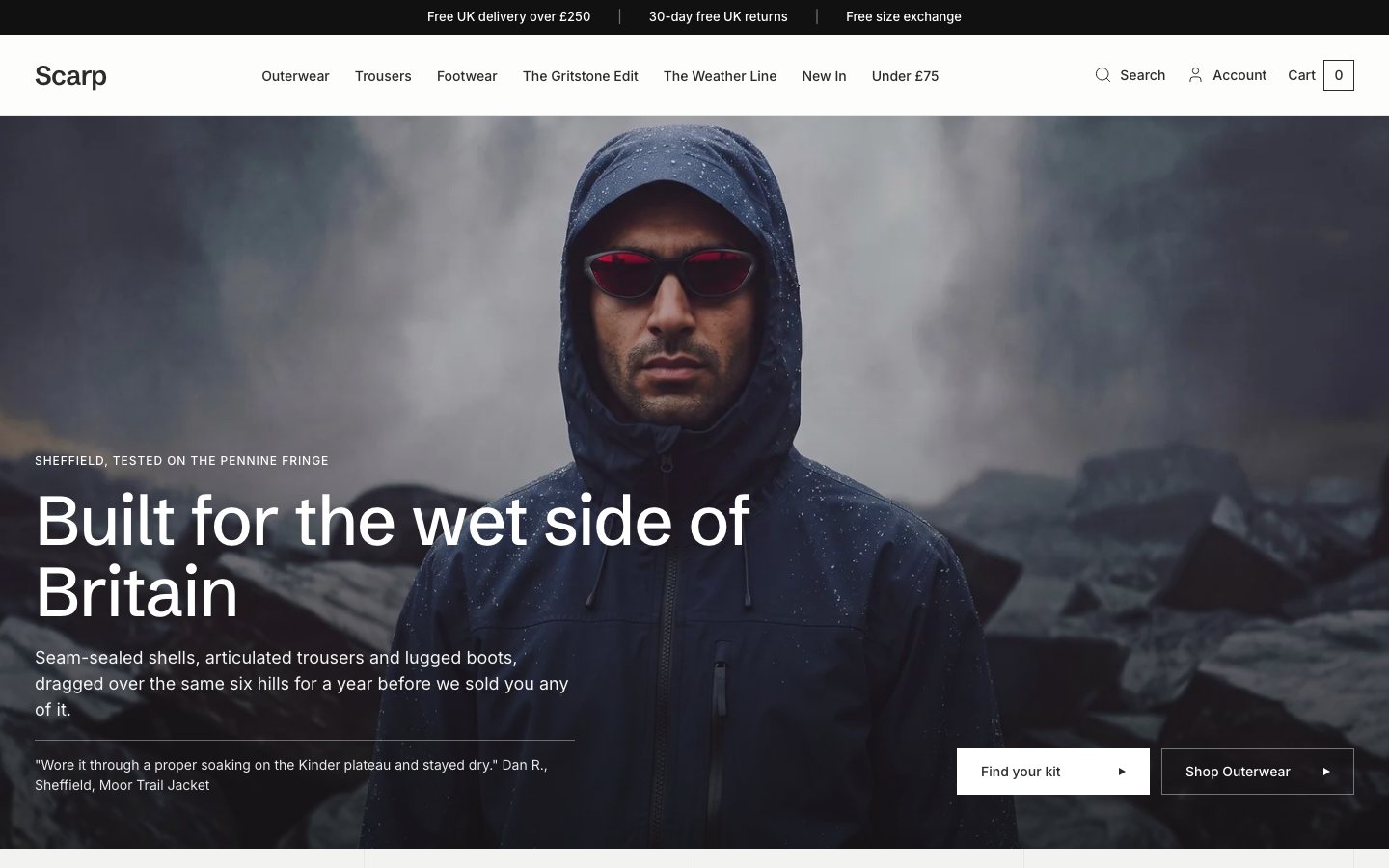 Scarp
Clothing & Apparel
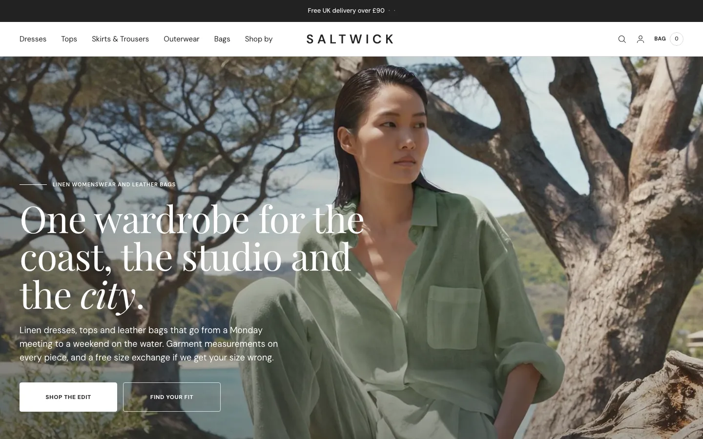 Saltwick
Clothing & Apparel
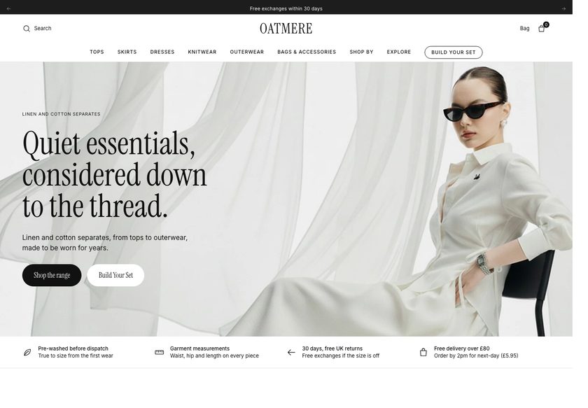 Oatmere
Clothing & Apparel
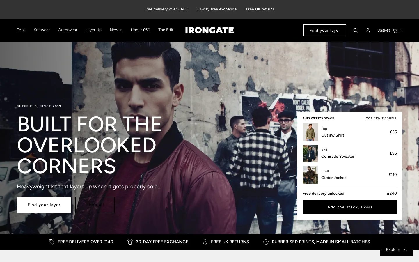 Irongate
Clothing & Apparel
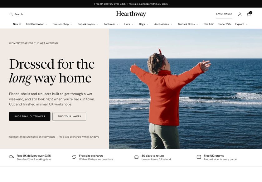 Hearthway
Clothing & Apparel
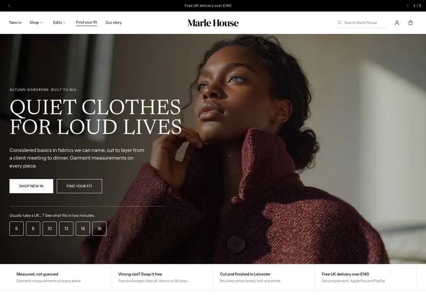 Marle House
Clothing & Apparel
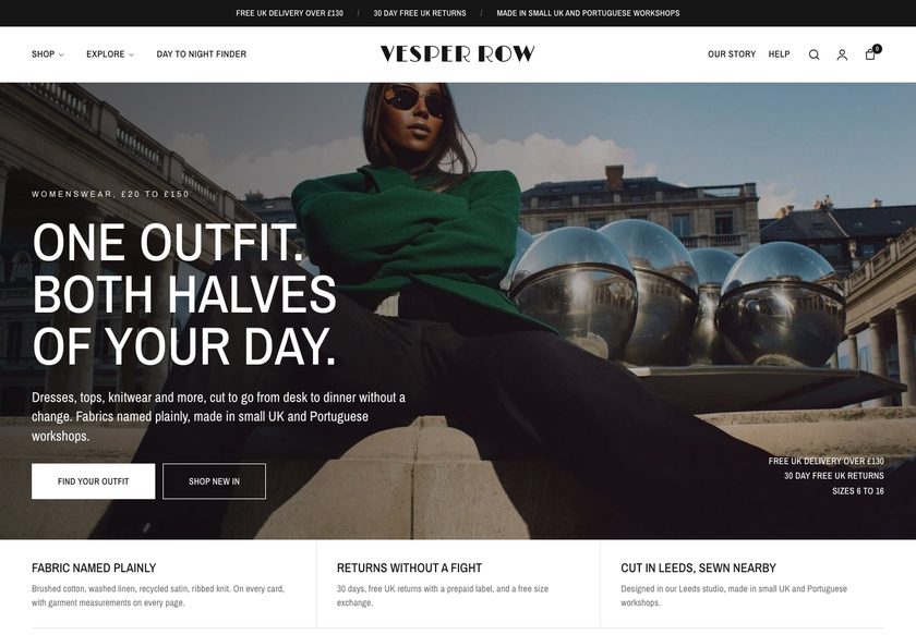 Vesper Row
Clothing & Apparel
A page by page CRO teardown of Berg Jewellery covering the homepage, collection pages and product pages, with a concept redesign built to help shoppers find the right piece and trust the purchase.
Pressing play loads the video from YouTube — you can allow it for every teardown under cookie preferences.
Berg Jewellery sells gemstone rings, earrings, pendants and bangles, and the products are genuinely attractive. The site is clean, the photography is tidy, and the visitor is never fighting the layout. Free UK delivery over a set threshold and a clear delivery time on the product page are good instincts, and the store is right not to run ads until the site converts.
The core problem is that the site presents jewellery but does not help anyone choose it. The homepage has no hero that says what the business is, who it is for or why it can be trusted. For pieces priced like the $675 ring, shoppers check every small detail, and the answers to those details are not on the page.
The same gap repeats further down. Collection pages are plain grids with a photo, a name and a price, with no filters, so comparing two pairs of earrings means opening both. One collection was entirely sold out with no way to be notified. Product pages have long descriptions, no reviews, no ring sizes and no returns information.
The direction is to turn the catalogue into a guided shop. A clear hero, navigation by category, occasion, stone and price, a find your piece quiz, richer product cards, reviews, size guidance, returns and bundles all answer the buyer's doubts before they leave. Visitors who reach a product page already want to buy, so make that decision feel safe.
The site shows lovely jewellery but never helps a visitor choose it. No trust signals, no reviews, no filters and thin product pages leave shoppers unsure about spending serious money on a ring.
Berg Jewellery can become a guided shop where a visitor says who the gift is for, sees the right pieces, reads real reviews, checks sizing and returns, and adds a matching piece before checkout.
Stronger trust, easier product discovery and clearer product pages should turn more of the existing visitors into buyers and lift order size through bundles, without paying for extra traffic.
Five dimensions, each scored out of ten.
12 issues found, 15 fixes proposed.
The first screen does not say what Berg Jewellery makes, who it is for or why it can be trusted, so a new visitor has to work that out alone before deciding to stay.
Hovering over All Products shows bangles, earrings and pendants as a plain list. It does not guide a shopper by occasion, stone or price, so there is no obvious path to follow.
The homepage jumps to a grid of products without first sorting them by category, so visitors get no separate routes into rings, earrings or pendants.
A block of images on the homepage could be Instagram posts or customer testimonials, and the page does not say which. Social proof that cannot be recognised does not build trust.
The earrings collection was entirely sold out when visited, with no way to be told when pieces return. Interested visitors leave and the store captures nothing.
Each collection shows an image, a name and a price. It does not say why a piece is worth buying or how it differs from the one beside it, so choosing is left to the shopper.
There are no filters by stone, metal or price, and no sorting, so shoppers must open every product page to compare options.
The earring page has a long block of text and no key points. A visitor cannot quickly see why this piece is worth the price, whether for themselves or as a gift.
No product page carries a review. At this price point, nobody wants to be the first customer, and a first time visitor has nothing to reassure them.
The ring page does not list sizes or explain how to measure, so a buyer cannot know whether it will fit, which matters most when the ring is a gift.
There is no word on returns where the decision is made. A gift buyer in particular needs to know what happens if the size or the piece is wrong.
Free UK delivery over a threshold is the only order value tactic, and a single earring page already exceeds it. Jewellery pairs naturally, but nothing suggests a ring, pendant or set.
Open the homepage with a clear line on what Berg makes, who it is for and why it is trustworthy, with review proof and a primary button into the collection.
Organise the menu so a visitor can browse rings by occasion, stone or price band, and add routes for bridal, charms and past work.
Add a short reassurance strip below the hero covering delivery, returns and how each piece is made, so objections are handled before browsing starts.
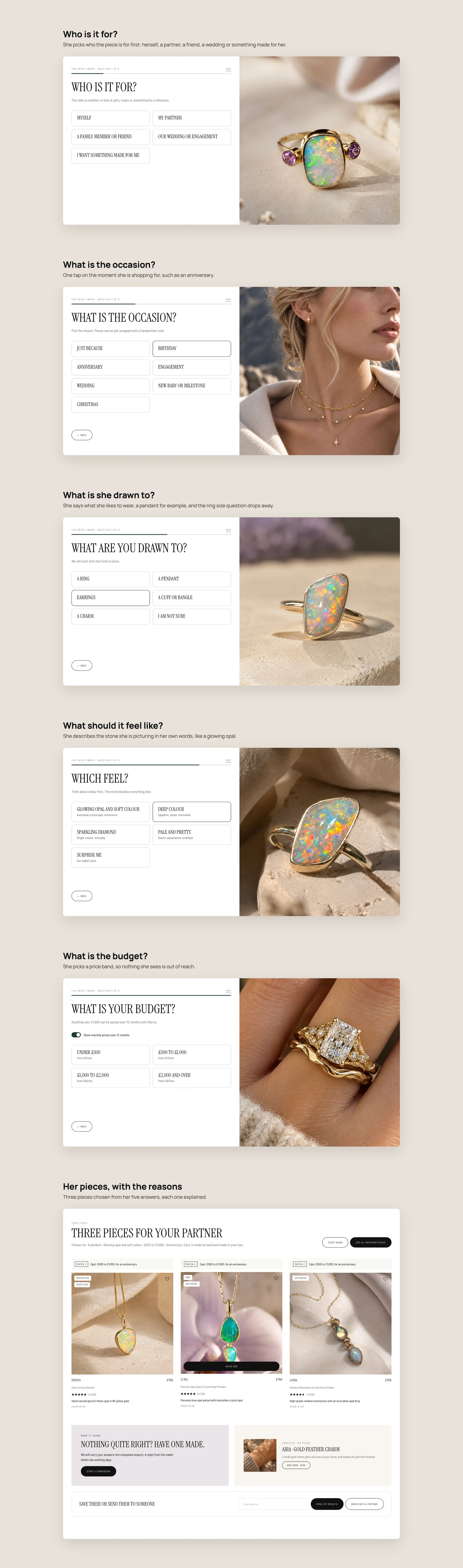
Ask who the piece is for, what type, colour, budget and ring size, then recommend matching products. It works like a shop assistant greeting a visitor.
Replace the single product grid with sections for each category, then occasion routes such as engagement, wedding, birthday and treat yourself.
Give custom work its own section on the homepage and collection pages, so anyone wanting a bespoke piece can start a commission straight away.
Add a labelled reviews section with customer photos, and keep the Instagram feed separate and clearly marked as Instagram.
Let shoppers filter by category, price, gemstone, metal and product line, and sort results, so they can narrow a collection without opening every page.
Show a badge, a short summary of key features and a star rating on every card, so two pieces can be compared at a glance.
Replace the dead end on sold out products with an email alert sign up and a link to similar pieces that are available now.
Break the long text into short points on stone, metal, craftsmanship and why the piece suits a gift, so the value is clear before anyone scrolls.
Place a star rating by the price and a reviews section lower down, using genuine feedback gathered from Instagram buyers and past customers.
List available ring sizes with a guide to measuring, and offer a gift box and note so buying for someone else feels safe.
Place returns terms, a contact option for questions to the maker and secure checkout cues next to the button where hesitation is highest.
Add a complete the look block and a frequently bought together bundle with a modest discount, so a buyer can add a ring, pendant or charm.
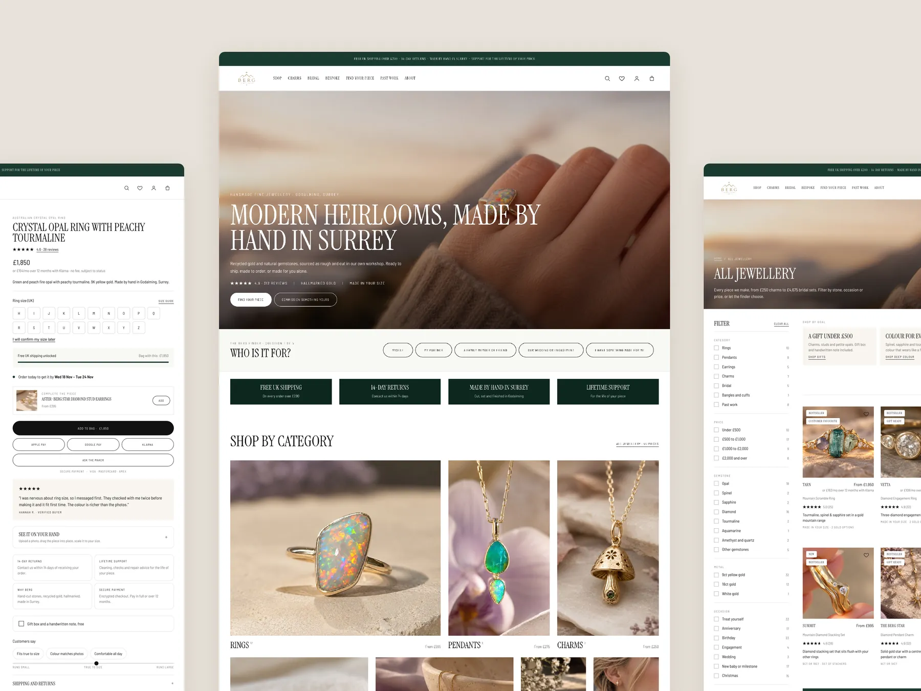
A concept redesign created by Convertica Studio from this audit. It shows how the store could work, it is not the live store.
The full page as two tall columns, from the opening screen down to the footer.
The product page on the left, the homepage in the centre and the all jewellery collection page on the right.
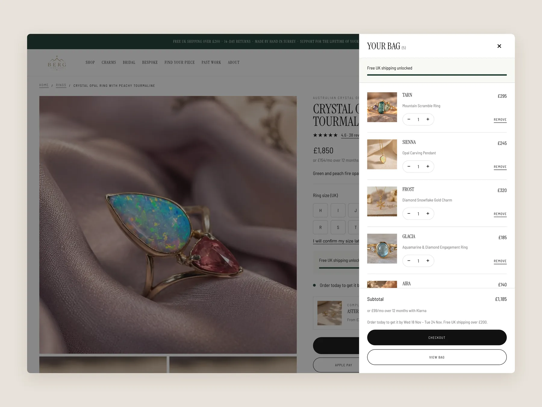
The slide-over drawer open over the product page, with the page dimmed behind it.
Five short questions, one per screen, then the results page with three pieces chosen from her answers.
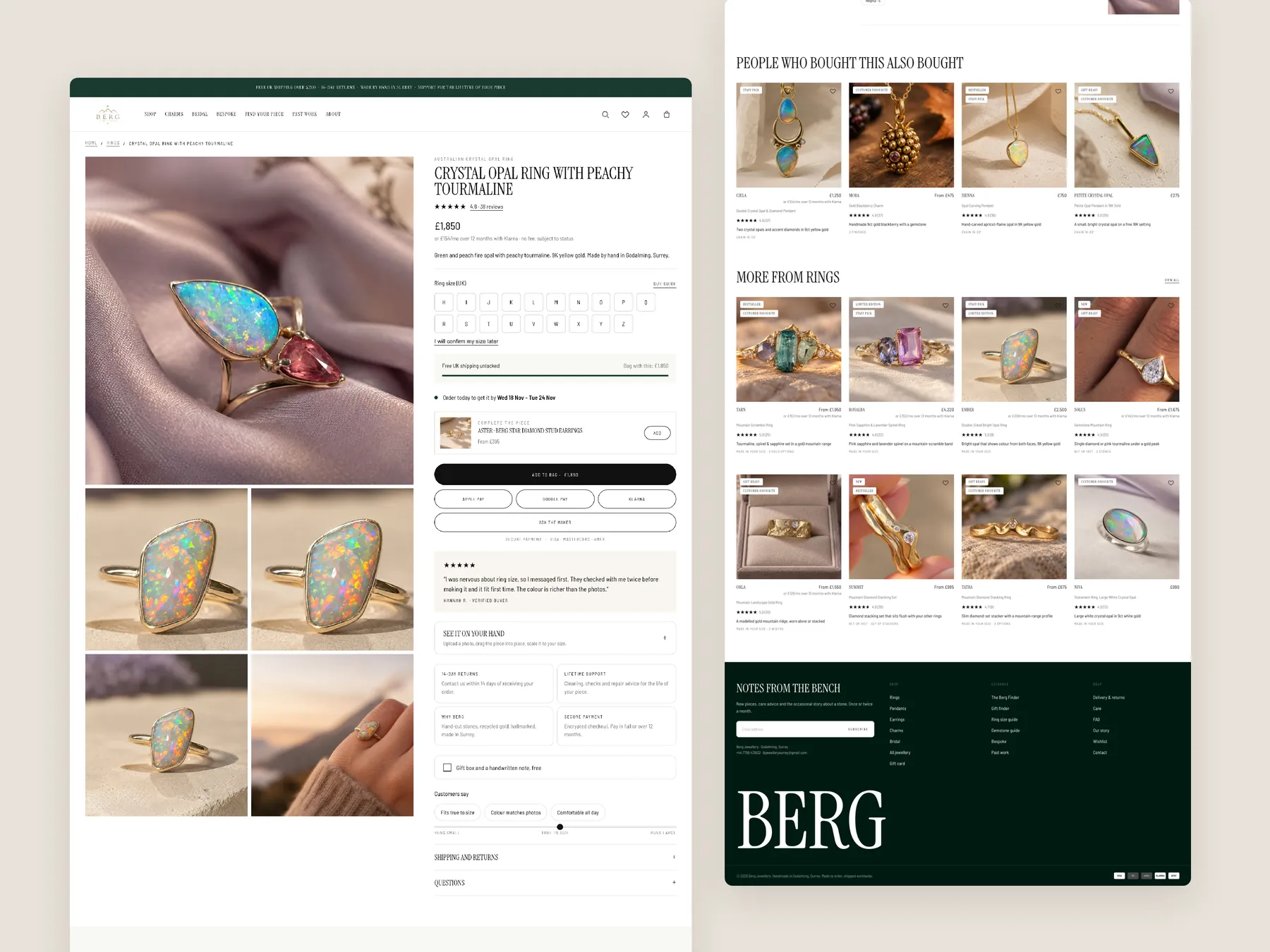
The full page as two tall columns, with the buy box whole in the first column.
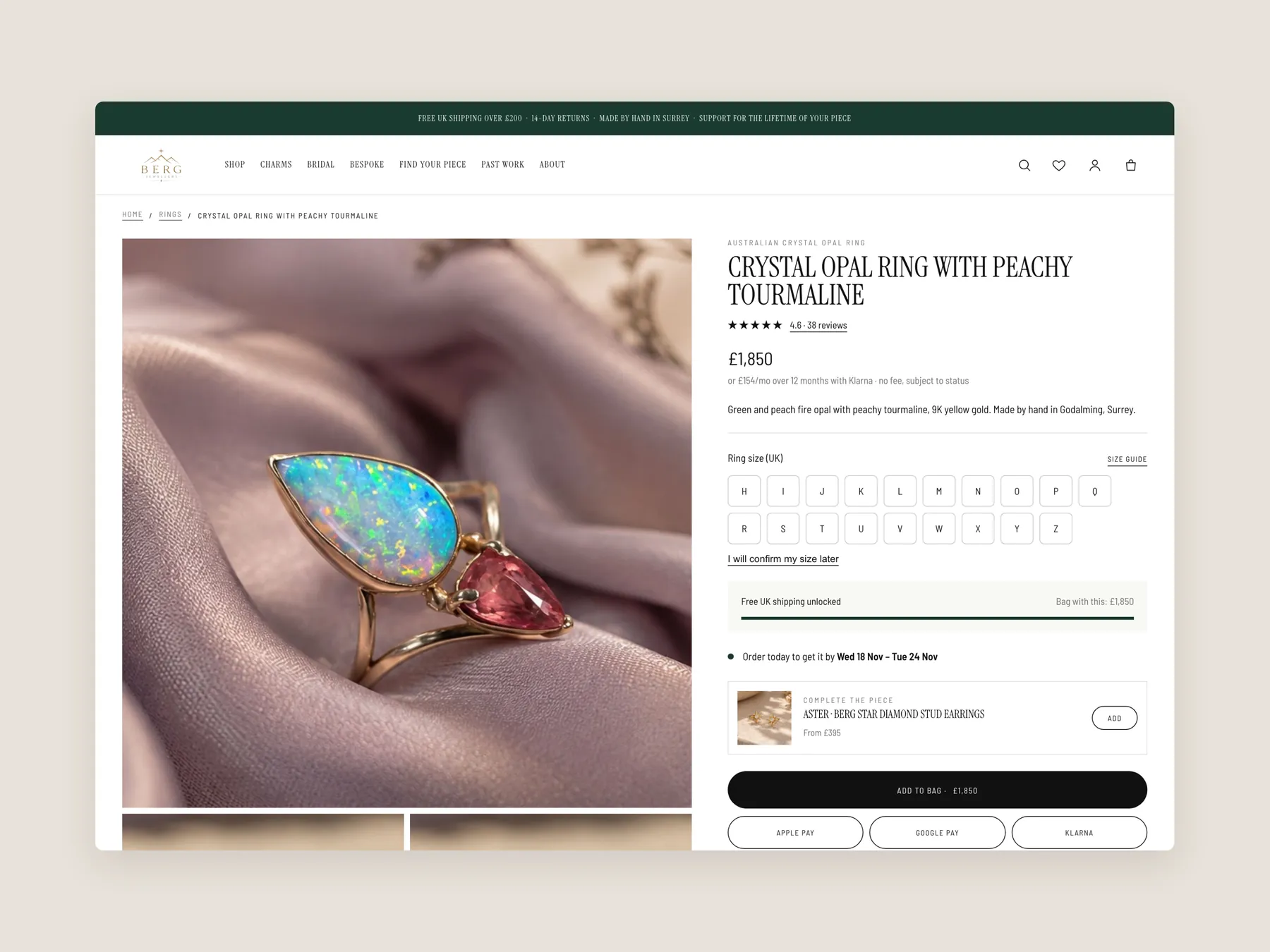
The header, the gallery and the top of the buy box.
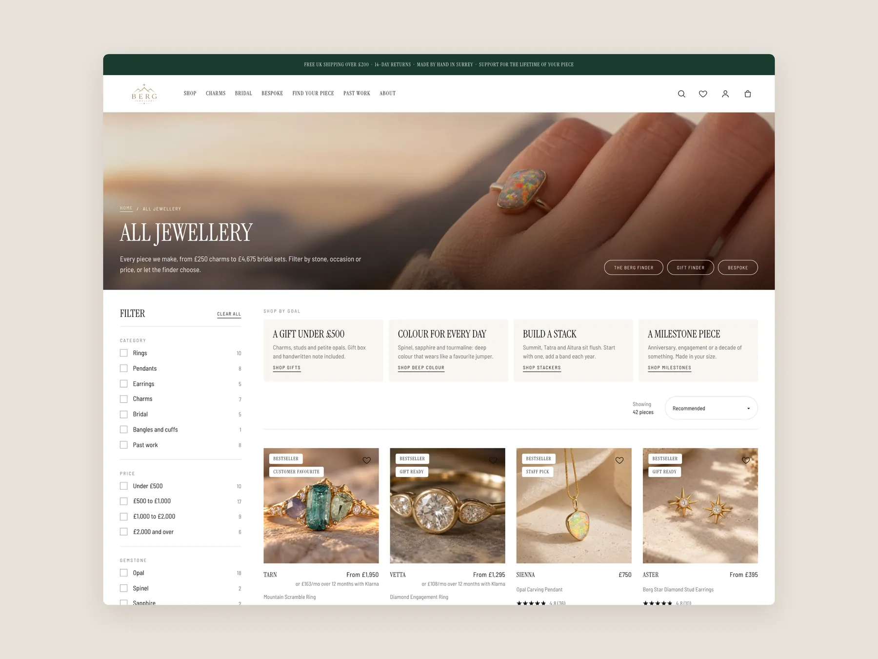
The header, the shop by goal tiles, the filters and the first row of pieces.
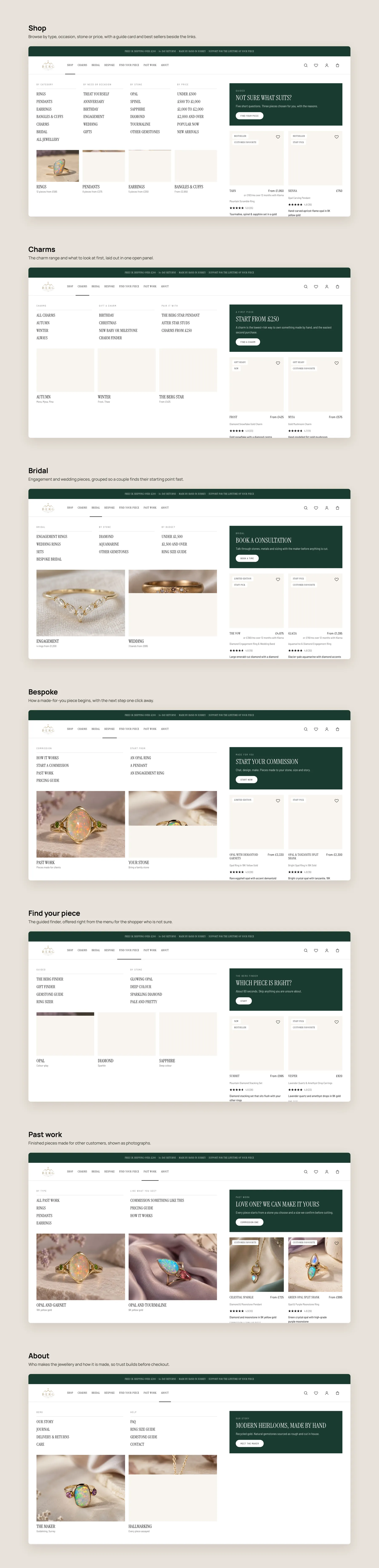
Each of the seven menu items opened in turn, with its links, photo tiles and featured pieces.
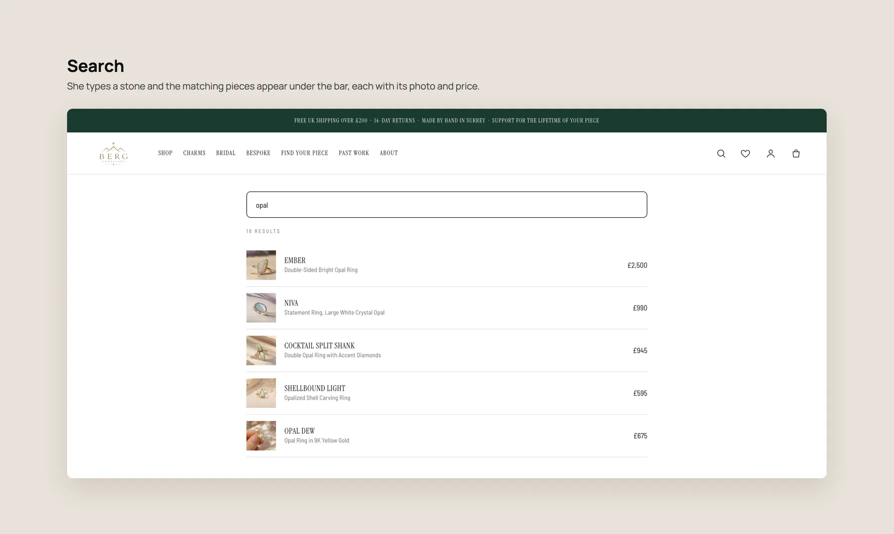
The bar with a stone typed in and the matching pieces listed beneath it with photo and price.
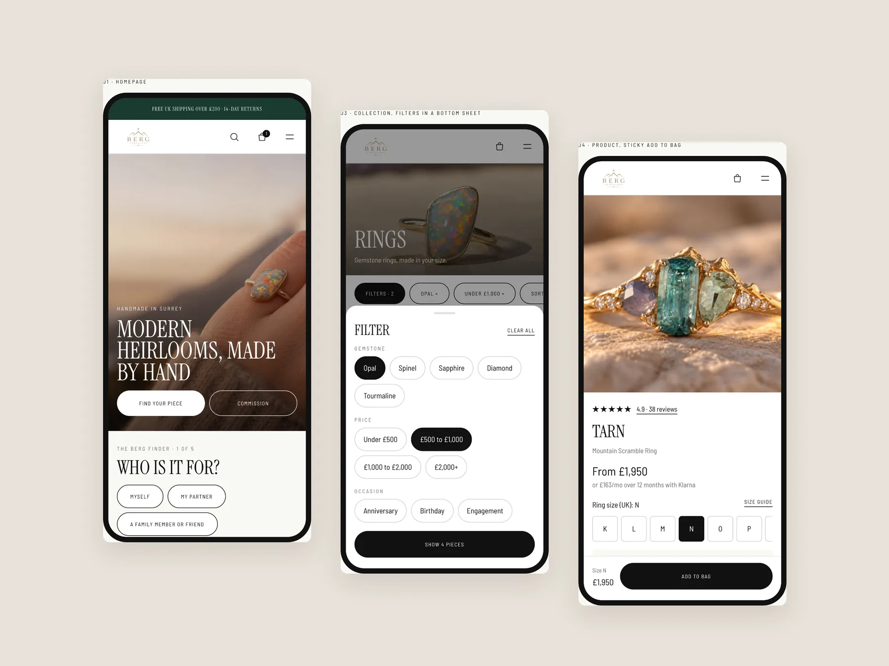
The home, collection and product screens side by side.
The products look good and the store already receives visitors, but the pages do not help those visitors decide. Adding ads before fixing that would pay to bring more people to the same hesitation.
Yes. Ads work best once the site turns visitors into buyers. Fixing trust, discovery and product pages first means every pound spent on traffic later has a better chance of paying back.
It should say what the business makes, who it is for and why it can be trusted, within a few seconds. Reviews, delivery and returns cues, and clear routes into each category all help.
Jewellery is a considered purchase and often a gift. Seeing that other buyers were happy removes the fear of being the first, and that fear is strongest on higher priced pieces.
It can use filters for stone, metal and price, plus cards with badges, short summaries and ratings. Shoppers then compare options in one view instead of opening each product page.
It is a short set of questions about who the piece is for, the type, colour, budget and ring size. It then recommends matching products, giving online shoppers the guidance they would get from staff in a physical shop.
A buyer needs to know the piece will fit, especially when it is a gift. Without sizes, a size guide and returns terms, the risk of getting it wrong can outweigh the wish to buy.
Jewellery pairs easily, so suggest matching rings, pendants or charms with a complete the look block and a bundle offer. A small saving on a set encourages shoppers to add a second piece.
Offer a back in stock alert and show similar available pieces. That keeps the interested visitor on the site and gives the store a way to reach them when stock returns.
No. It is a clickable prototype that shows how the ideas could work on the homepage, collection page and product page. The final design would be developed and refined from it.
Not necessarily. The work can focus on the homepage, collection page and product page of the current store, or go wider if the store wants a fuller rebuild.
The audit reviews the Berg Jewellery homepage, a collection page and a product page, followed by concept designs for each and a walk through of next steps. The video runs for 28 minutes.
Tell us about your store and we'll send a personalized 5-minute video showing exactly where you're losing buyers — and how to win them back.
Takes about 40 seconds. No call required.