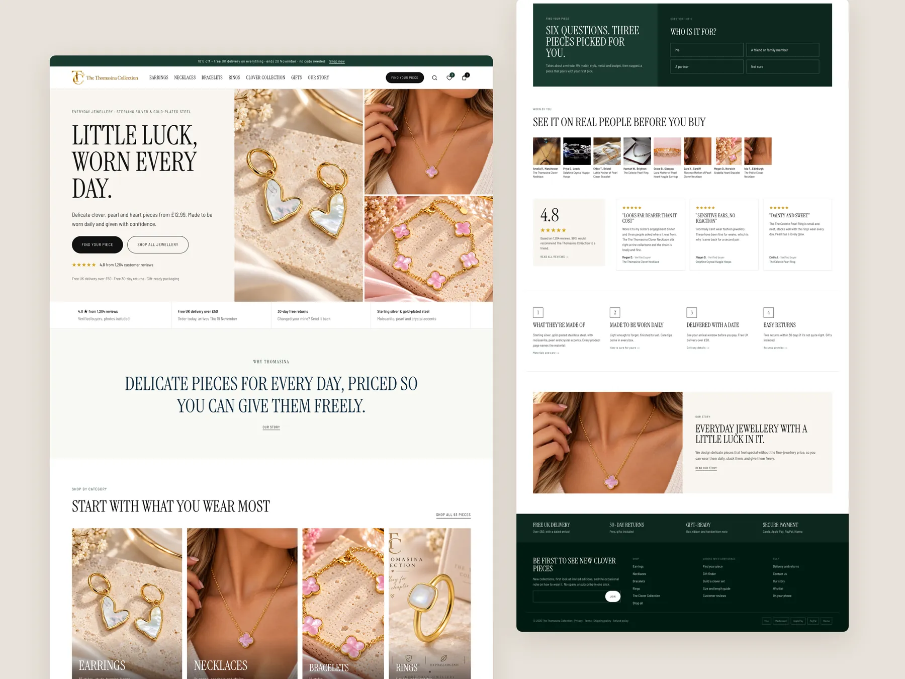
Homepage, two tall columns
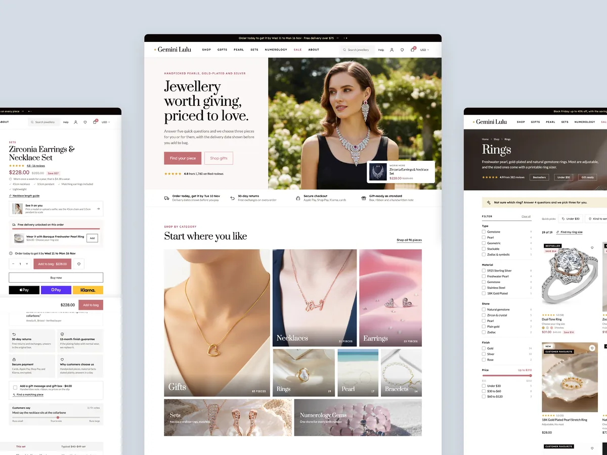
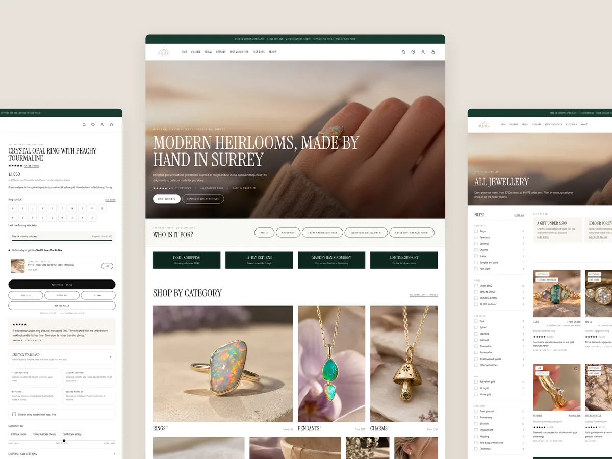
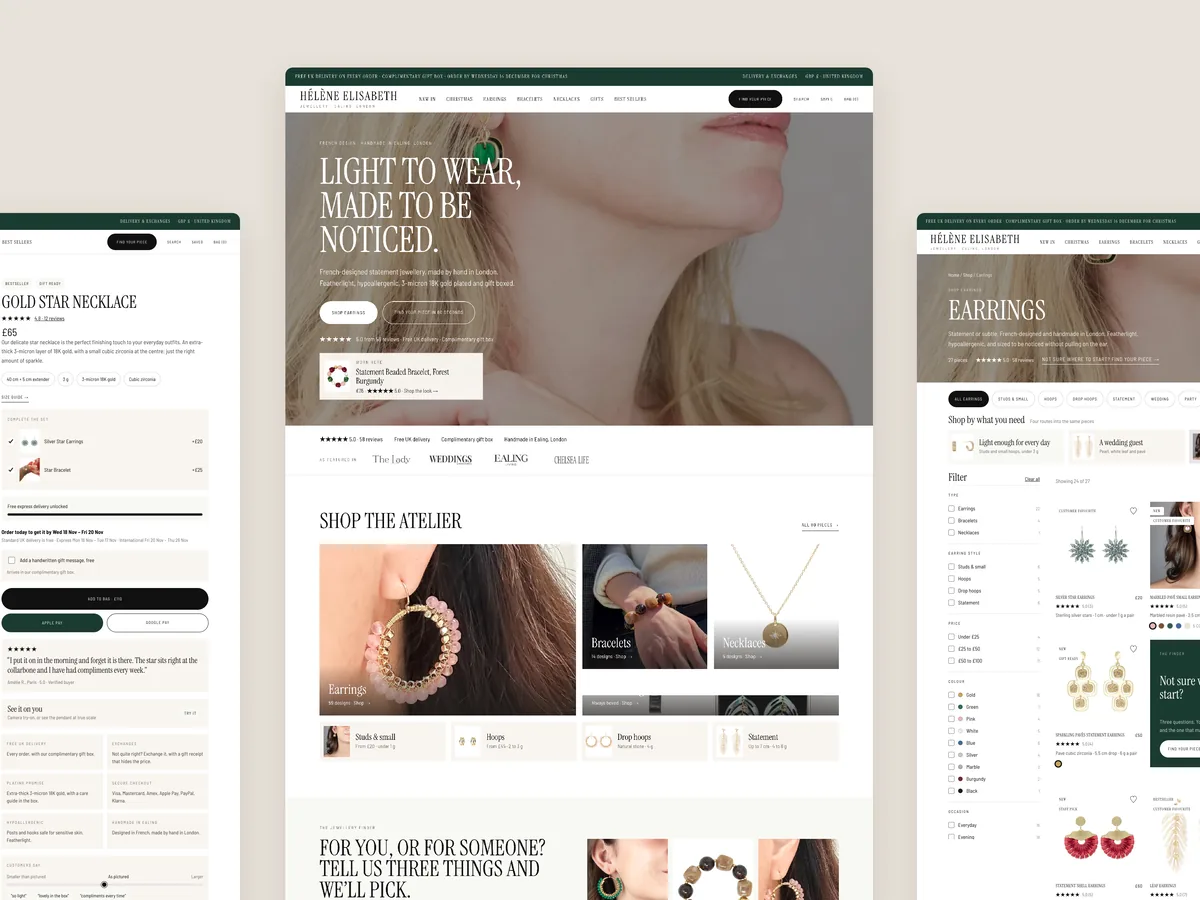
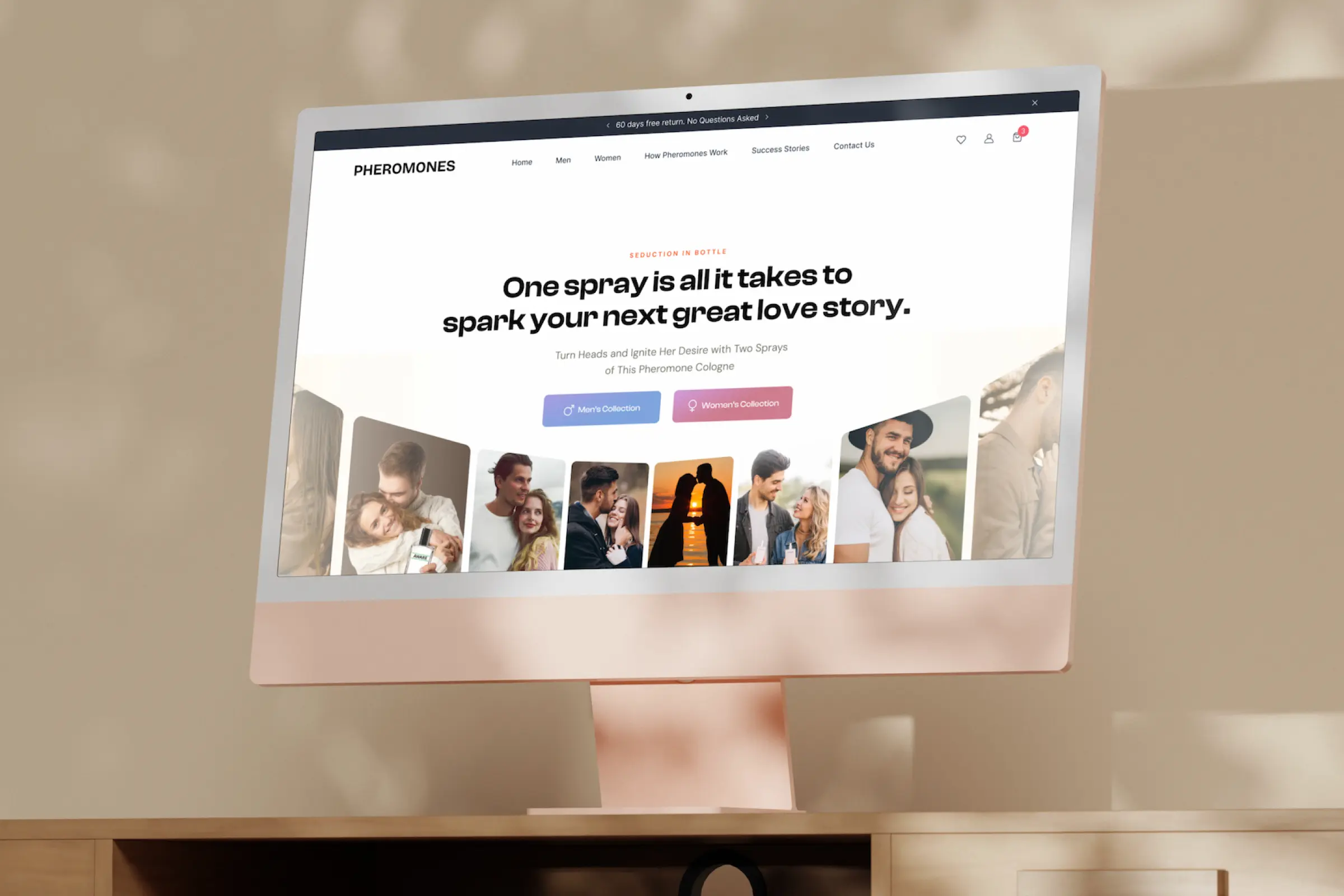
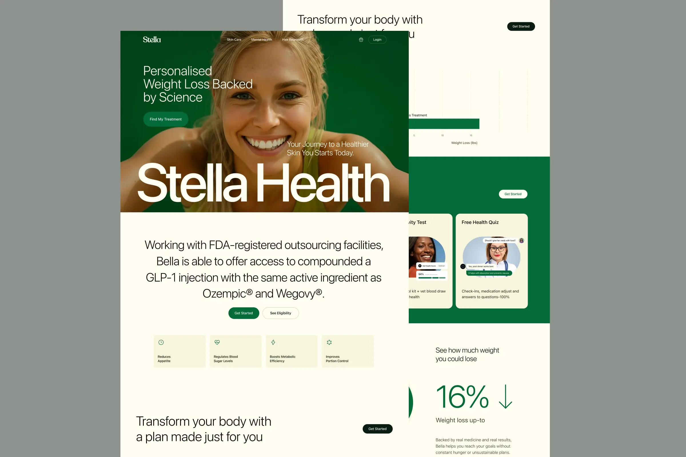
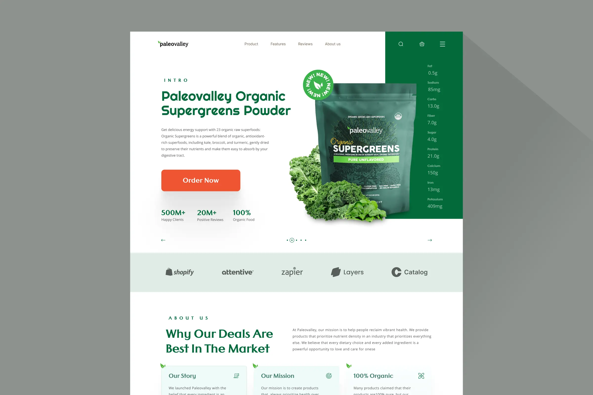
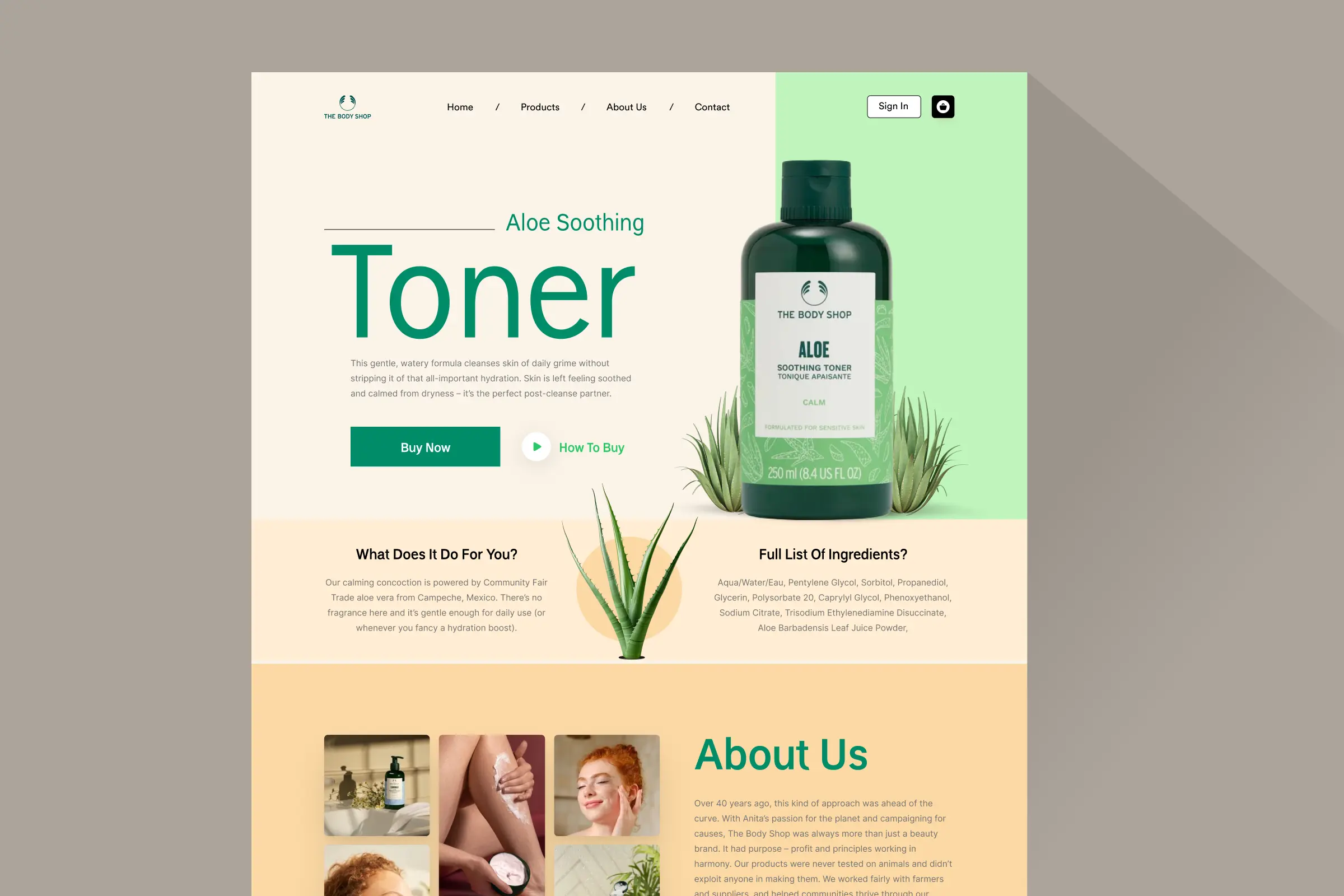
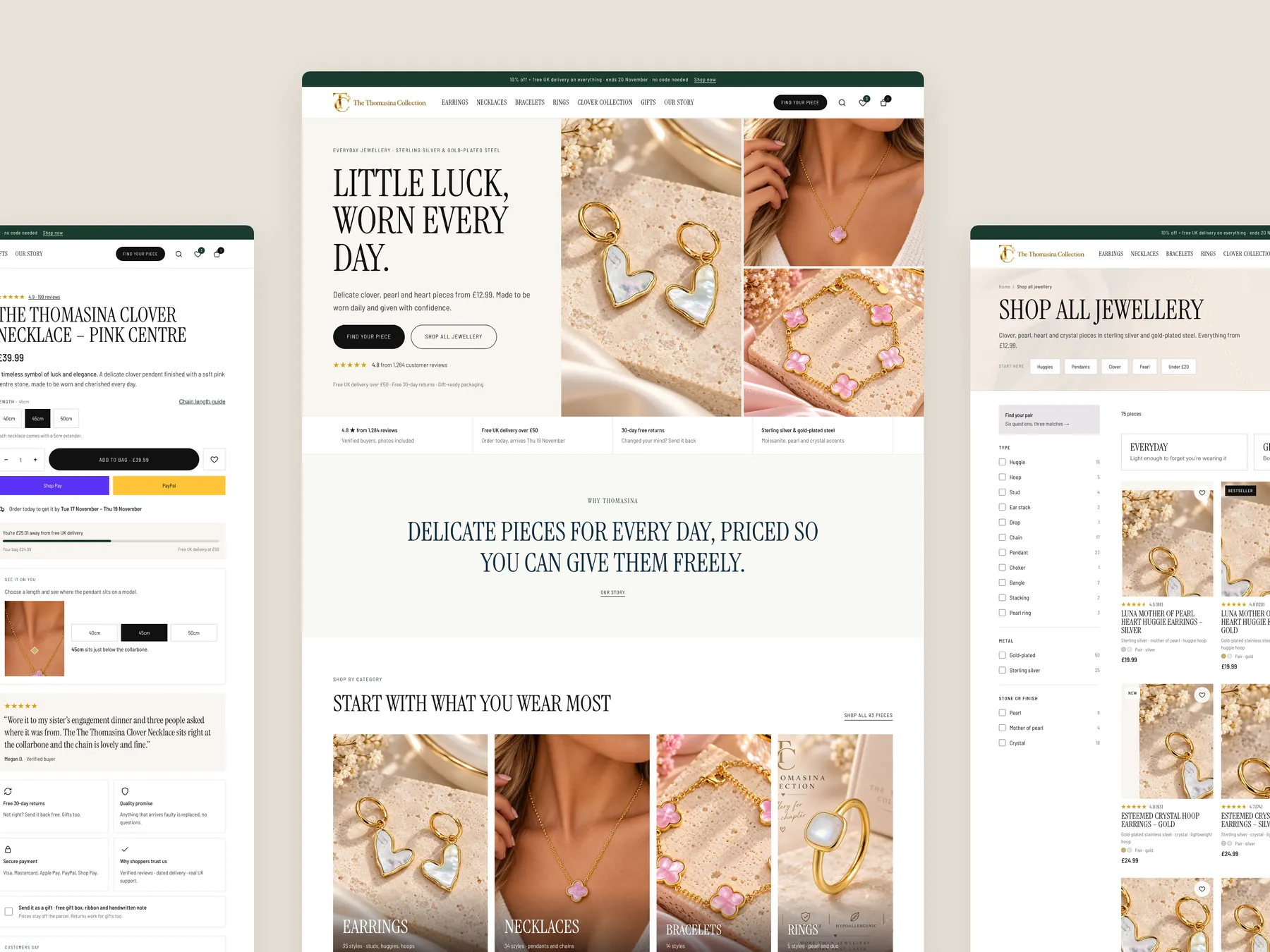
**Homepage.** The full homepage shown as two tall columns: a clear statement of the brand, two ways in (find your piece or shop everything), categories sized to what the store sells and a route for gifts.
Storefronts we designed and built, across supplements, fragrance, health, wellness and skincare.
All 35 projectsFour engagements, measured before and after. What changed, why it changed, and by how much.
All case studiesDiagnosis, design and development from one studio — so the recommendation and the build never disagree.
All five services192 real Shopify stores torn down page by page, scored, and shown beside the version we would build. Free to watch.
Browse all teardownsConversion-first Shopify themes, each built for one industry’s buying journey. No required apps, no monthly theme fee, one licence per store.
See all themes Halden
Jewelry & Accessories
 Cairn
Jewelry & Accessories
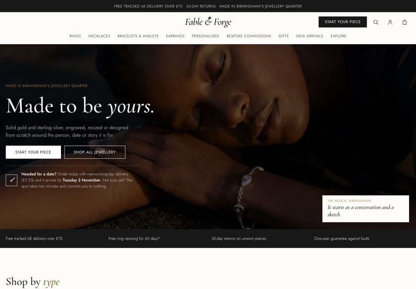 Fable & Forge
Jewelry & Accessories
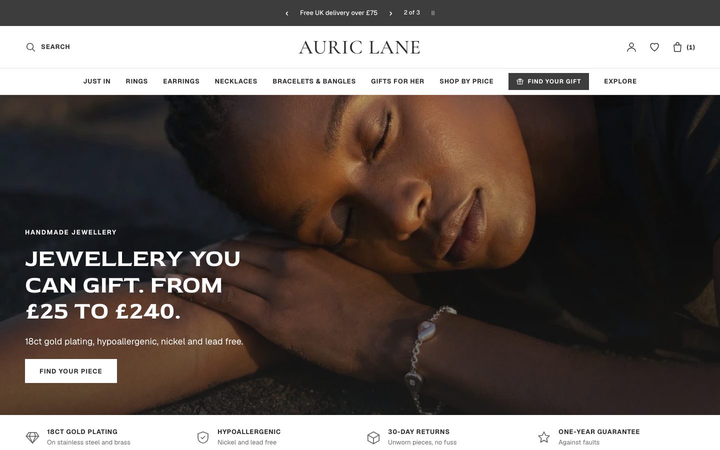 Auric Lane
Jewelry & Accessories
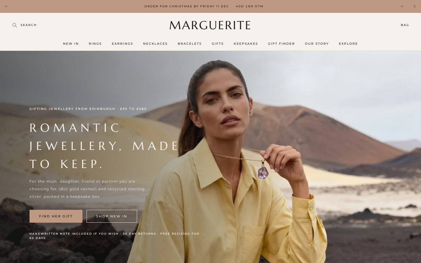 Marguerite
Jewelry & Accessories
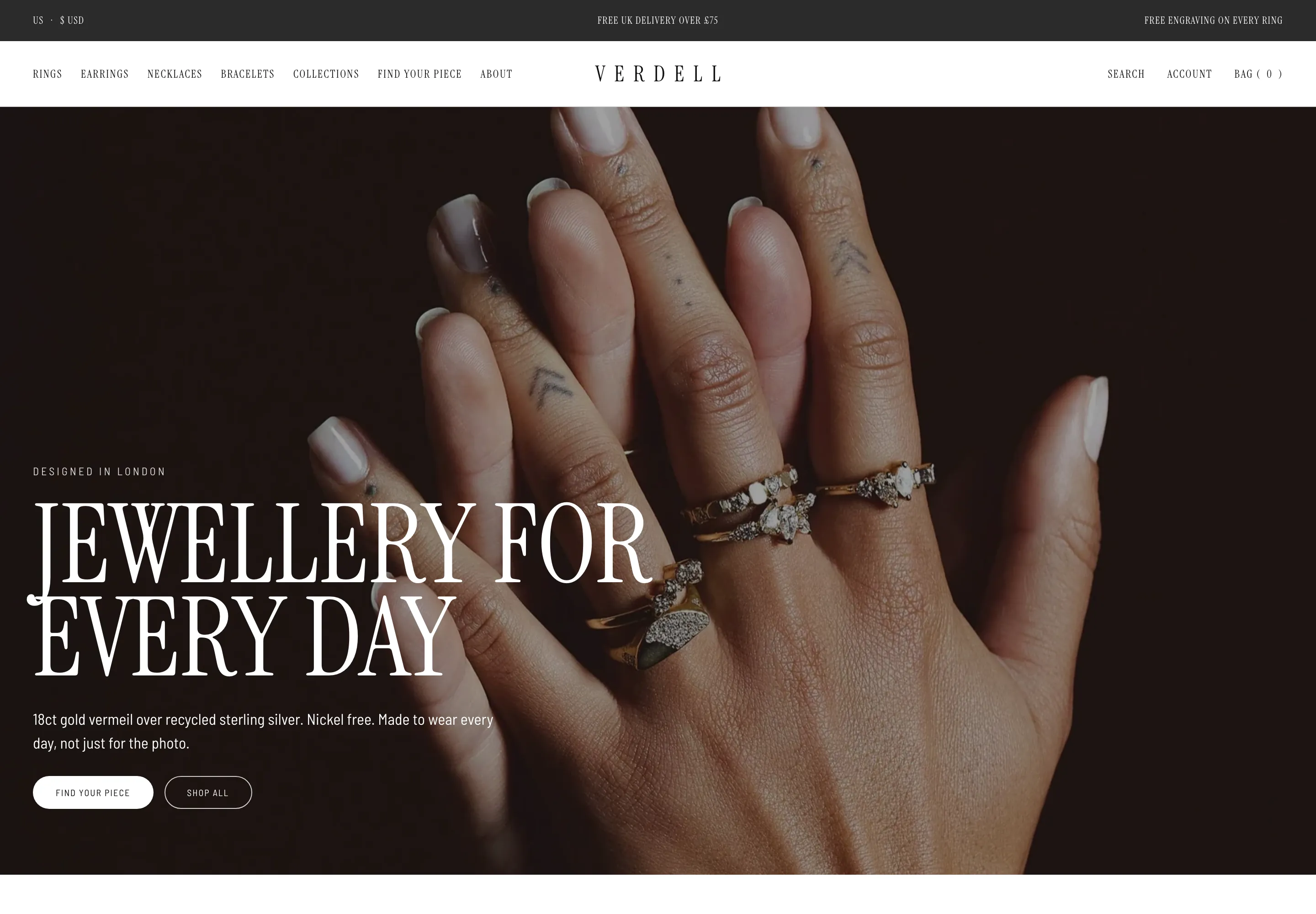 Verdell
Jewelry & Accessories
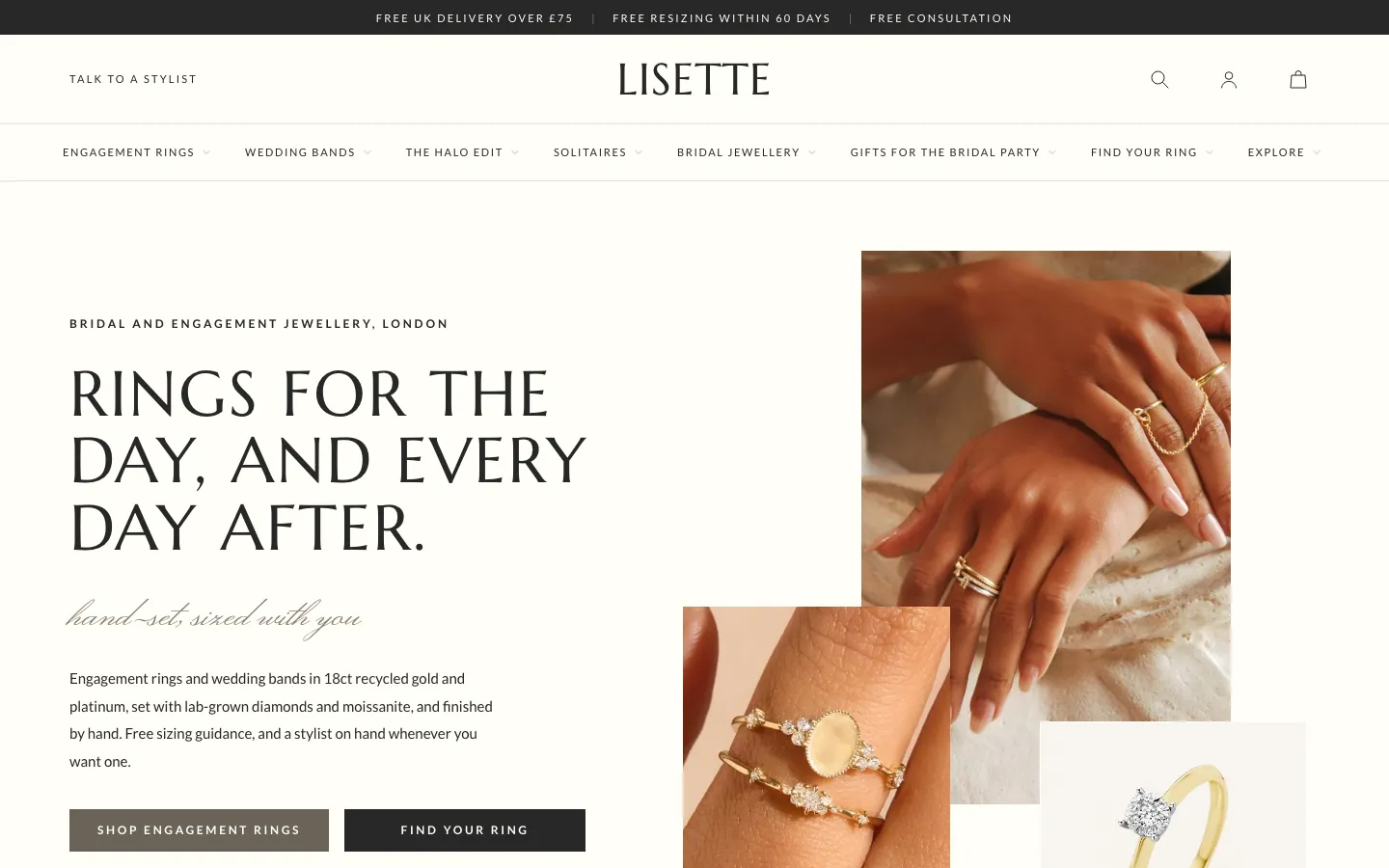 Lisette
Jewelry & Accessories
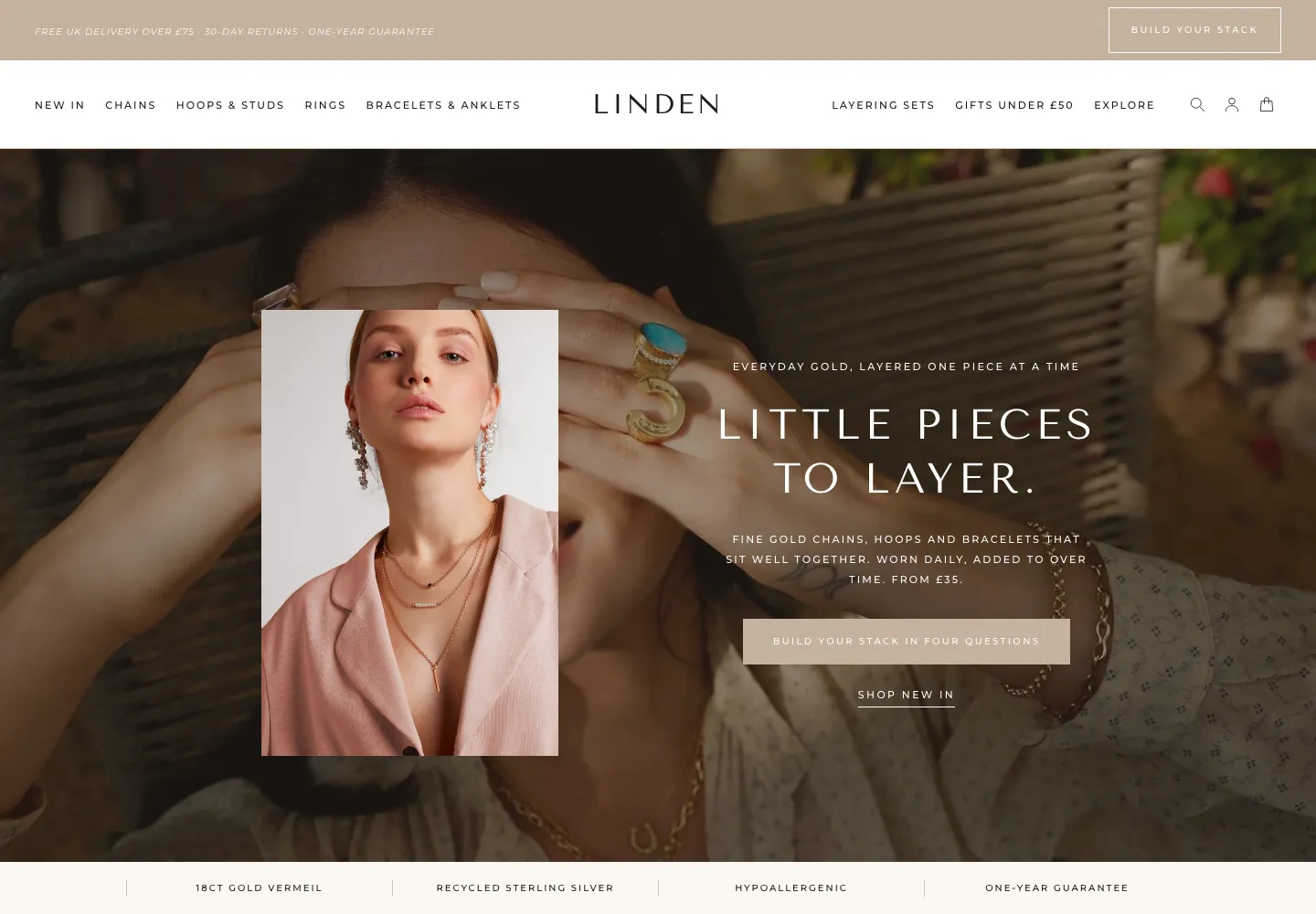 Linden
Jewelry & Accessories
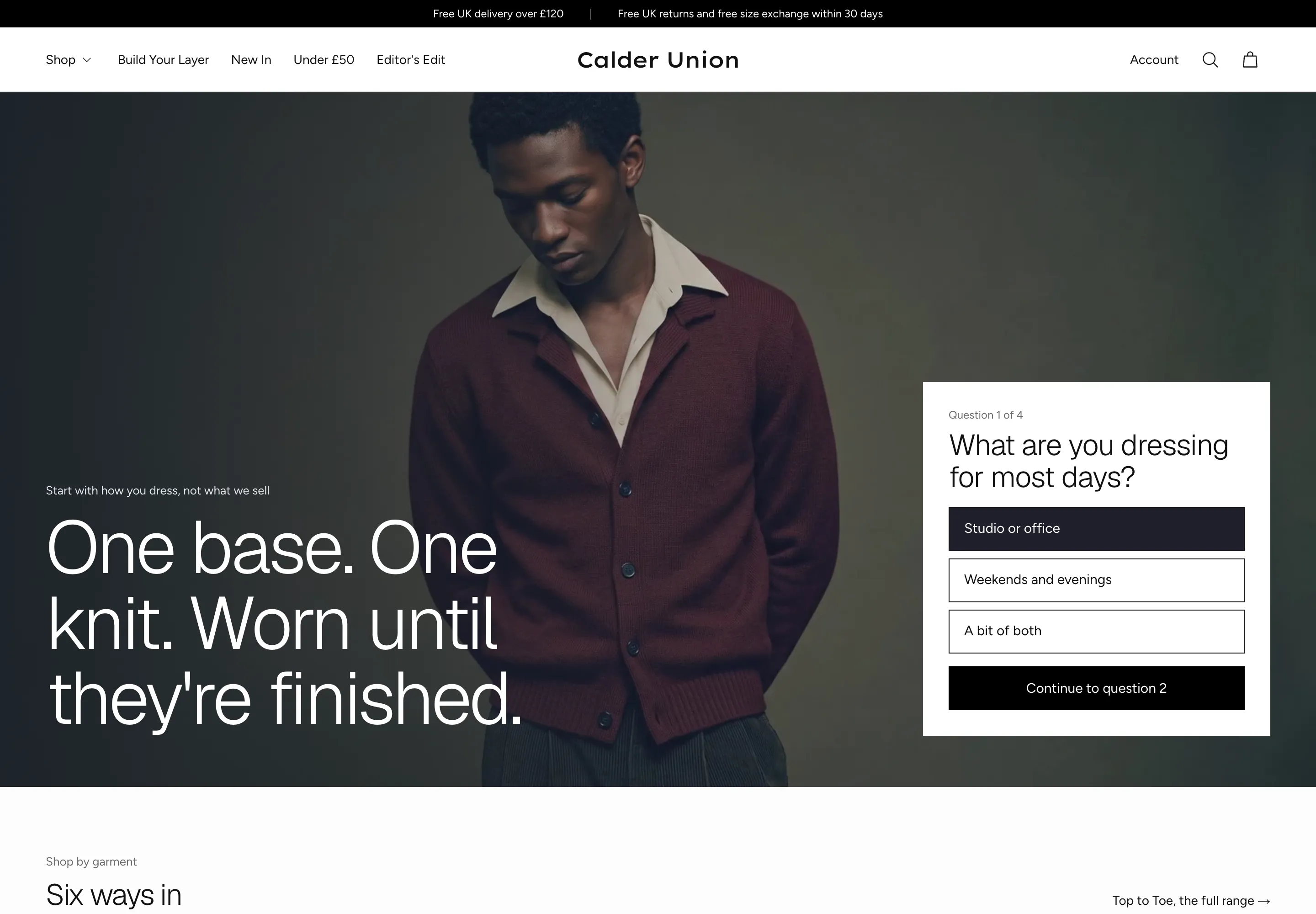 Calder Union
Clothing & Apparel
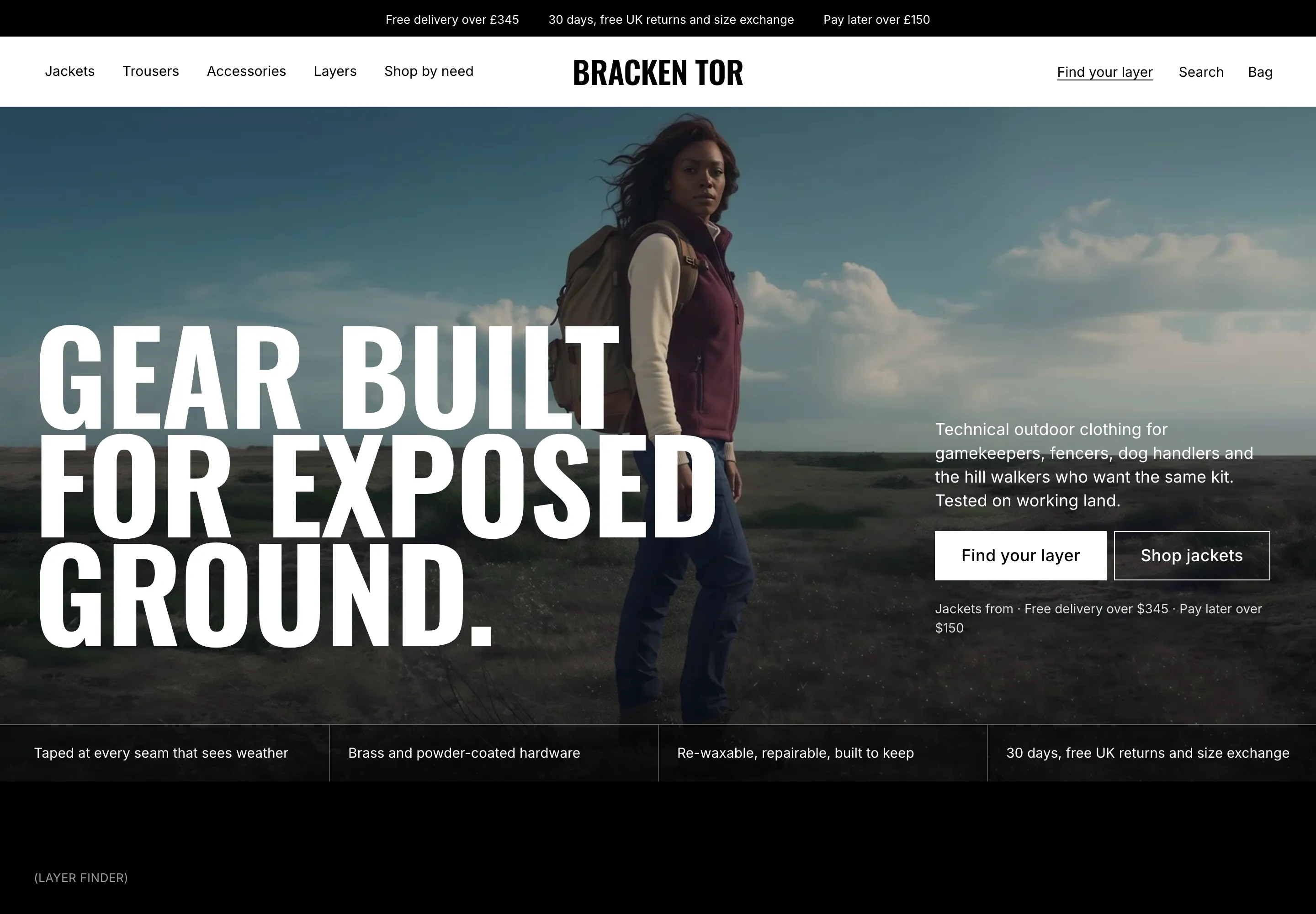 Bracken Tor
Clothing & Apparel
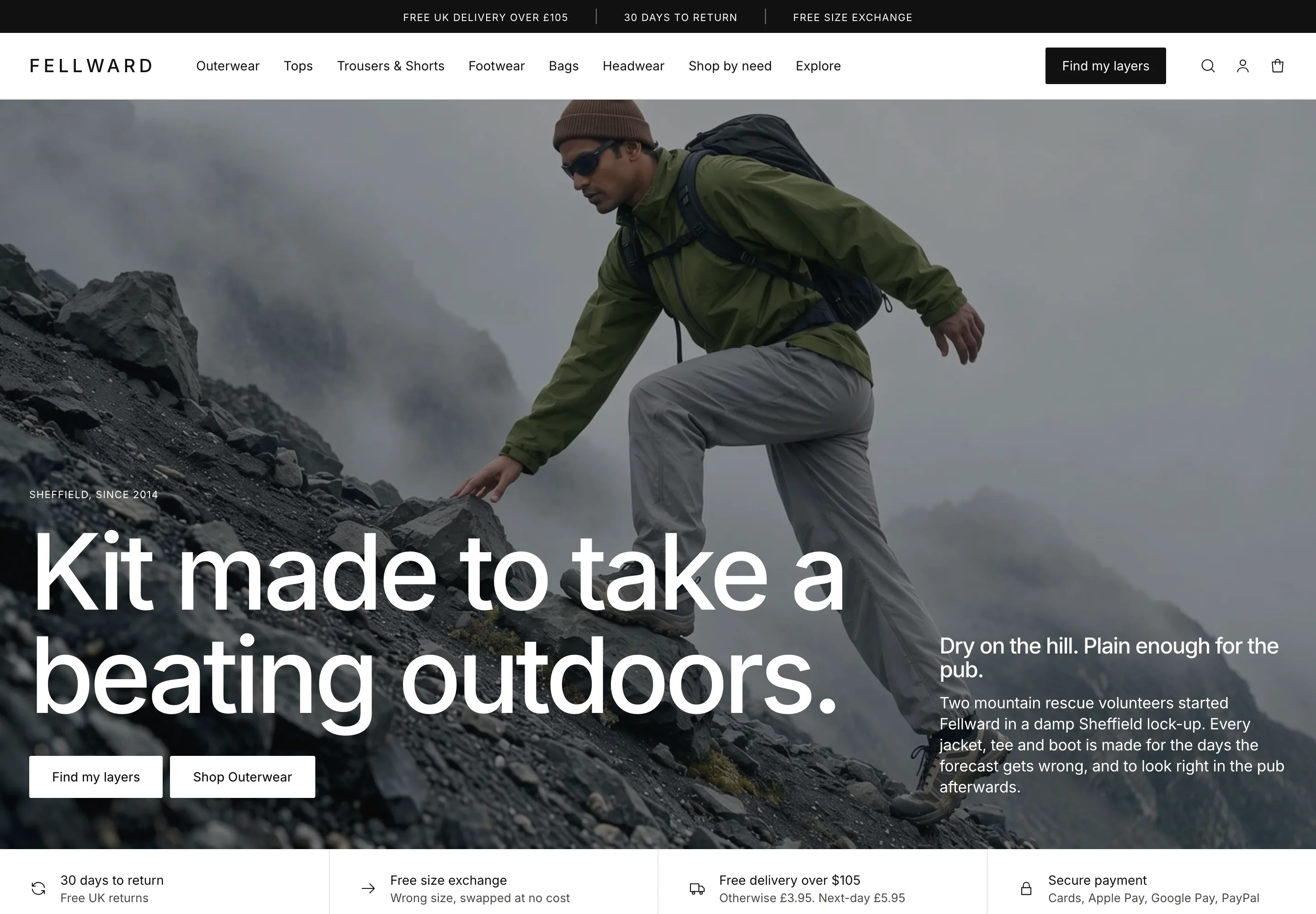 Fellward
Clothing & Apparel
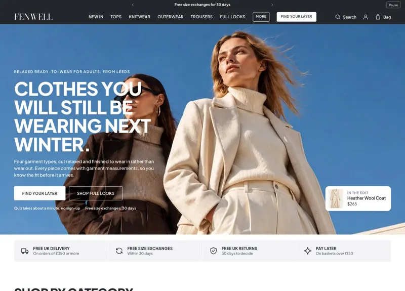 Fenwell
Clothing & Apparel
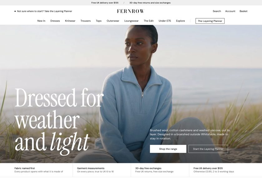 Fernrow
Clothing & Apparel
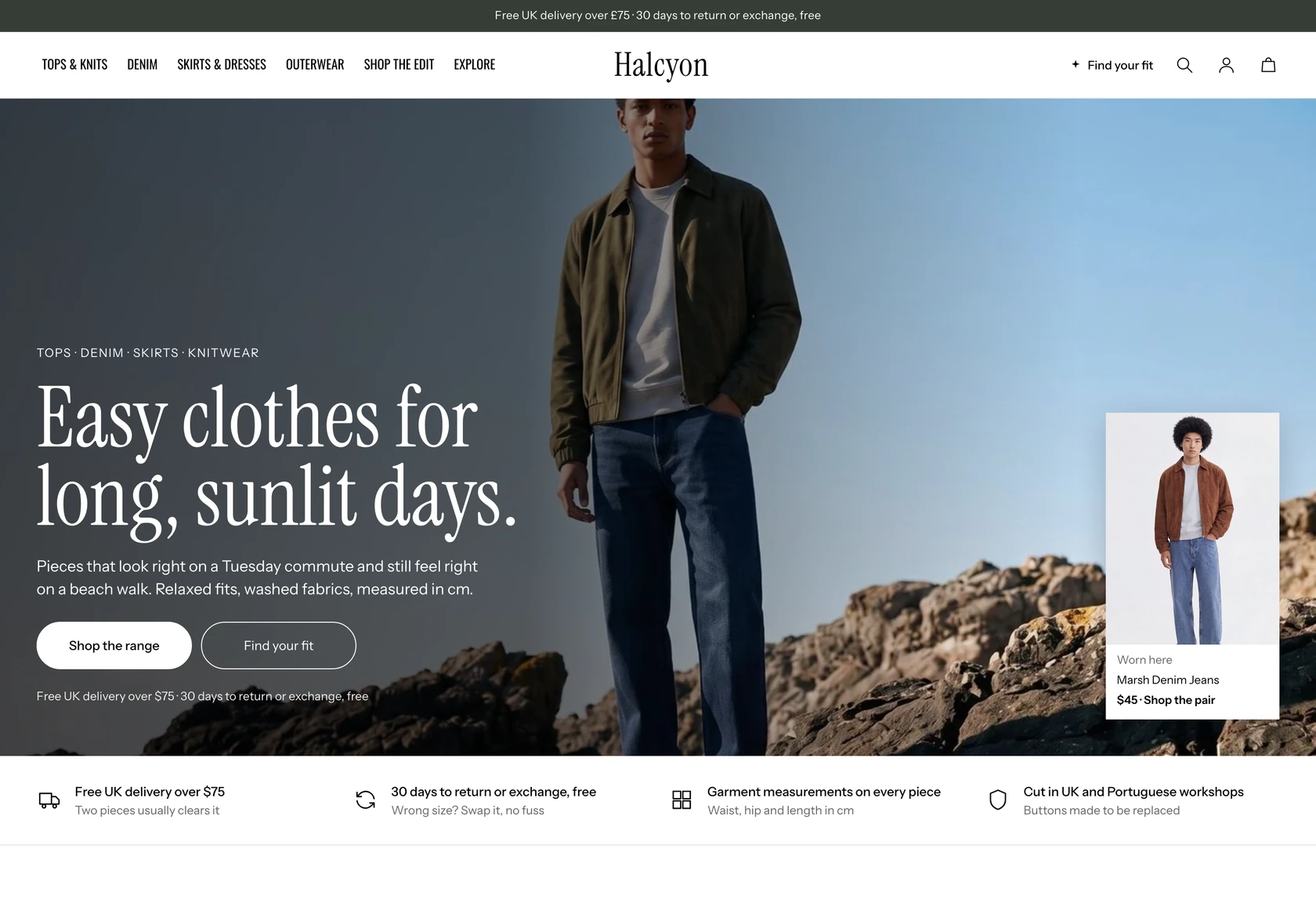 Halcyon
Clothing & Apparel
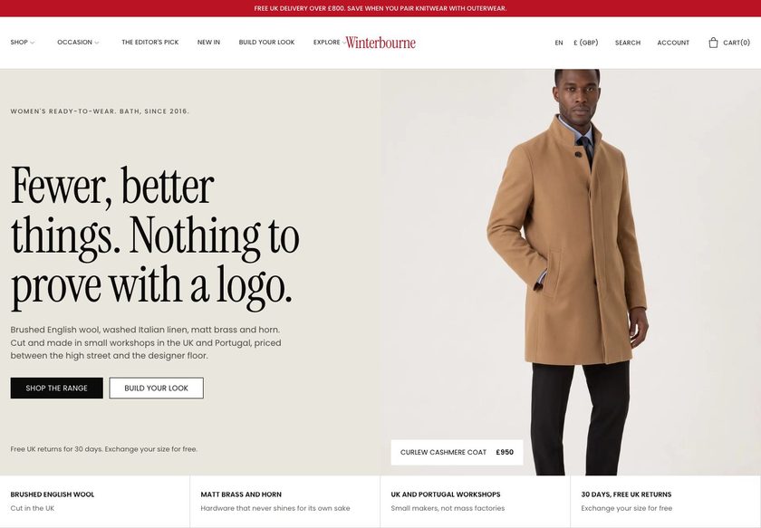 Winterbourne
Clothing & Apparel
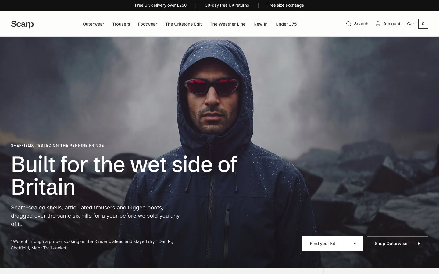 Scarp
Clothing & Apparel
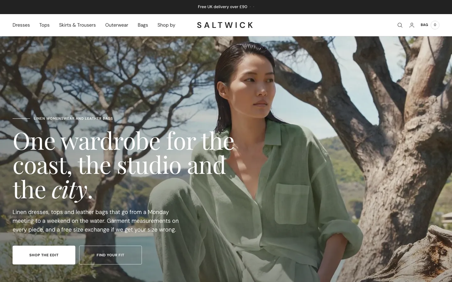 Saltwick
Clothing & Apparel
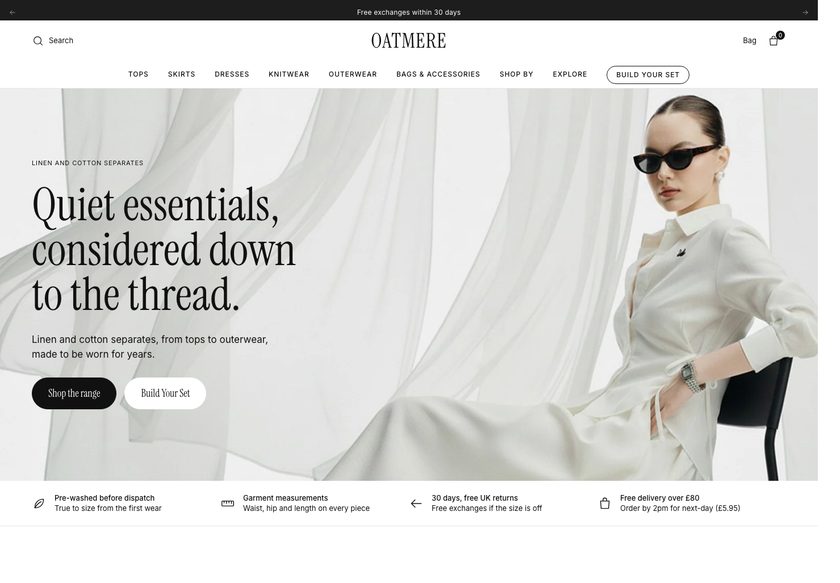 Oatmere
Clothing & Apparel
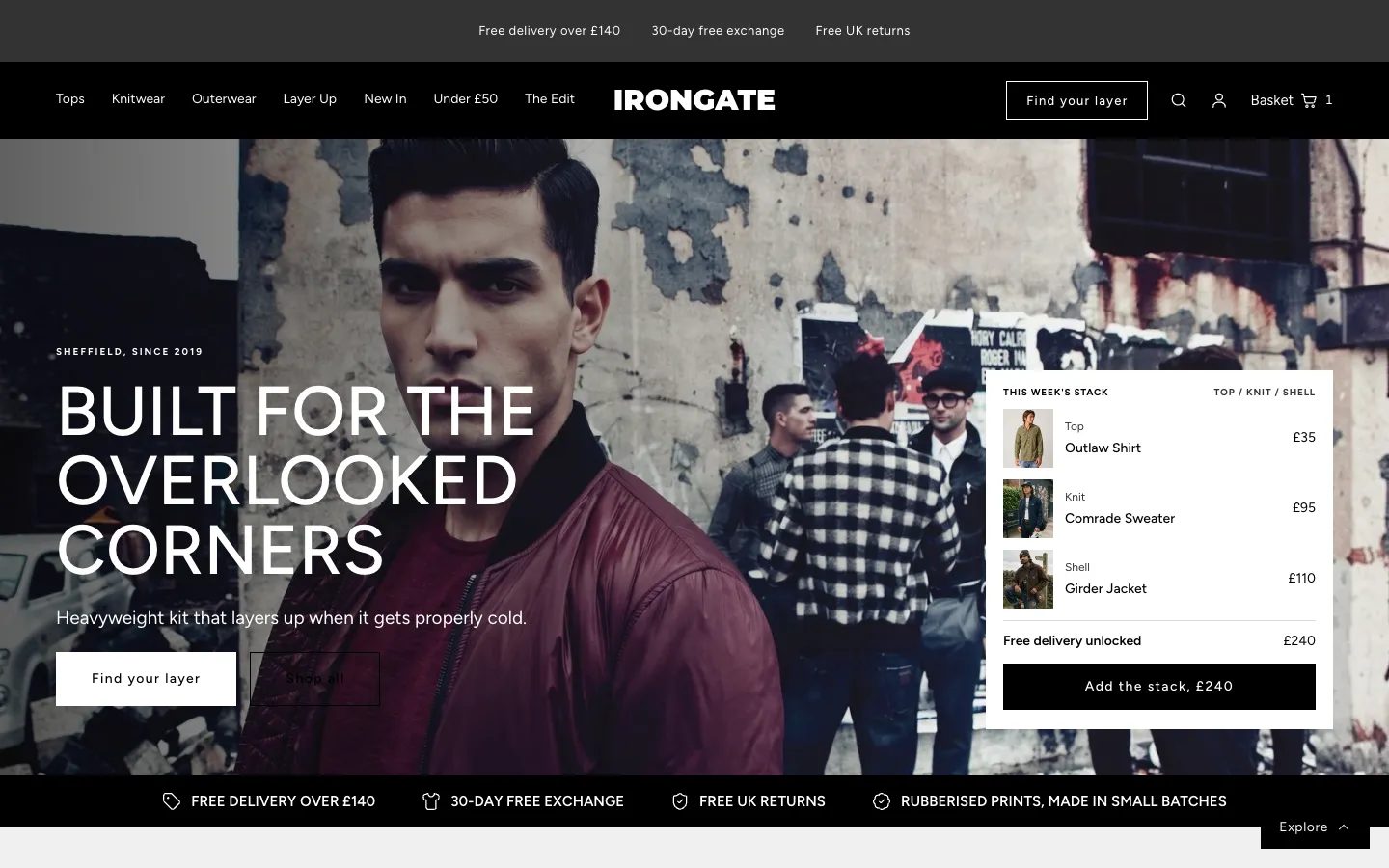 Irongate
Clothing & Apparel
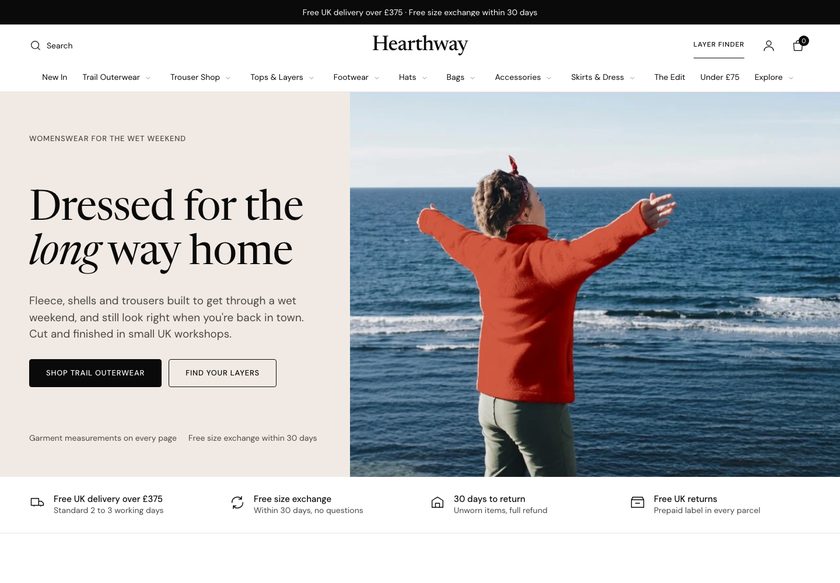 Hearthway
Clothing & Apparel
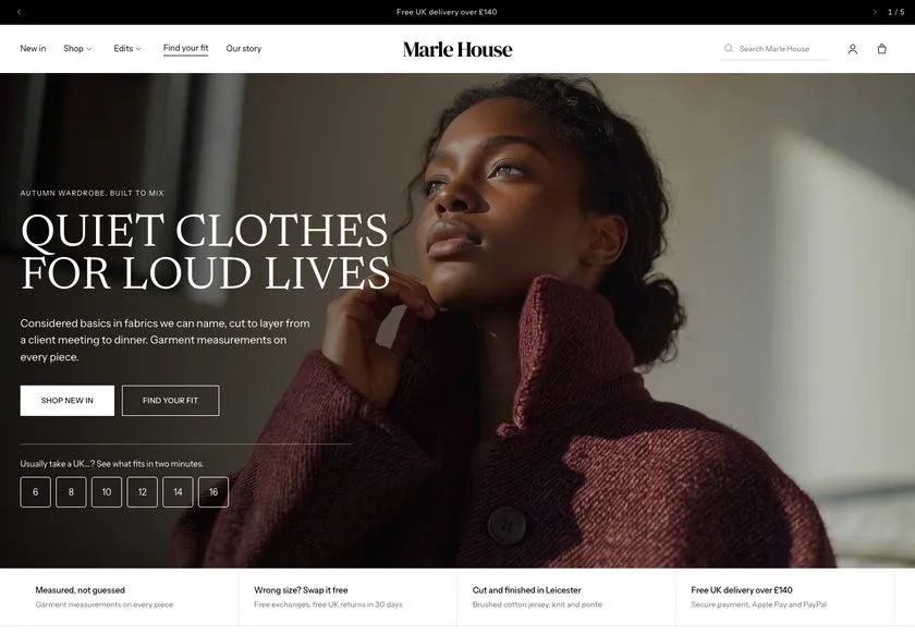 Marle House
Clothing & Apparel
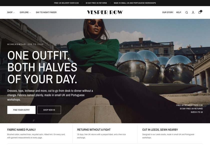 Vesper Row
Clothing & Apparel
A teardown of the Thomasina Collection jewellery store, covering the homepage, a rings collection page and a product page, with a clickable redesign concept built around guided buying.
Pressing play loads the video from YouTube — you can allow it for every teardown under cookie preferences.
Thomasina Collection sells sterling silver and gold-plated jewellery, from rings and huggies to pendants and clover pieces, and the range itself is a strength. Prices are approachable, with rings at £20 and £28, and the store already runs a 10% off plus free UK delivery offer. Ads are running and real visitors are arriving, so the traffic side is already moving.
The core problem is the presentation layer, not the products. The hero shows two women and no statement of what the shop does, who it is for or why it can be trusted. A visitor only knows this is jewellery because of the necklaces and bracelets further down. The navigation also hides its contents until each menu is opened, so no path is offered at the first step.
The same pattern repeats down the funnel. On the rings collection page the pieces differ only by colour and design, and the £20 and £28 prices come with no reason. Filtering and sorting are thin, so shoppers open page after page to compare. On the product page, questions about delivery, returns, materials and fit go unanswered, and no reviews appear anywhere on the site.
The direction is to replace the catalogue with a salesperson. State what the shop is in the hero, build navigation paths by type, style, metal and price, add a short guided finder, give each card a badge and rating, and bring reviews and bundles to the product page. Pause the extra ad spend until the site converts the traffic it has. A shop that guides is a shop that sells.
The store presents jewellery like a catalogue. The hero does not say what the shop is, who it is for or why to trust it, and nothing guides a visitor from a grid of products to a confident purchase.
Thomasina Collection could behave like a good salesperson in a physical shop: asking what the visitor needs, recommending pieces, answering delivery and returns questions, and offering pairs and bundles at the point of choice.
More of the visitors already arriving from ads reach a piece they trust, add more than one item to the basket and complete checkout, so the same traffic produces more orders and a higher order value.
Five dimensions, each scored out of ten.
12 issues found, 15 fixes proposed.
The homepage hero shows two women and nothing else. It does not state what the business does, who it is for or why it can be trusted, so a visitor has to infer jewellery from the products below.
A visitor has to open each menu item to learn what is inside. The first step of the buying journey offers no visible paths by type, style, metal or price.
The homepage is a grid of images and names. It does not tell a visitor where to go or what to buy, and it ignores what the shopper is expecting to find.
Reviews are missing from every page reviewed. For a jewellery brand people have not heard of, there is no previous buyer experience to lean on, and nobody wants to be the first to buy.
On the rings page the pieces differ only by colour and design. Nothing explains why one ring is £20 and another £28, so there is no reason to prefer one over the other.
Shoppers cannot narrow rings by metal, stone, motif, price or occasion. They open several product pages to compare and then leave out of frustration.
Delivery, returns, arrival date, how the piece is made and how it looks when worn are not answered on the page where the Add to Cart decision happens.
The 10% off plus free UK delivery message sits on the site with no role in the journey. It is not tied to a basket threshold or to buying more than one piece.
The product page makes no attempt to sell a ring with a bracelet, a charm or a second necklace. Jewellery pairs naturally and the page does not use that.
A £40 necklace sits next to cheaper lookalikes on marketplaces such as Etsy, eBay and Amazon, and the page gives no case for why this one is worth the price.
Visitors who came for themselves often buy for someone else, yet there is no gift entry by recipient, occasion or price, and no gift card or note option.
Ads are sending visitors to pages that do not yet convert them, so extra spend would only add more visitors to the same leaks.
State what the shop sells, who it is for and why it can be trusted in the first screen, with delivery, returns and sterling silver and gold-plated details beside the headline.
Open each menu with paths by type, style, motif, metal and price, plus a reviews link, so a visitor looking only for earrings or necklaces reaches the right place in one hover.
Place two clear calls to action in the hero that start a short quiz and recommend pieces from the answers, the digital version of a shop assistant asking how they can help.
Organise the homepage by category, collection, occasion and recipient, followed by bestsellers, so every visitor has a route that matches how they want to shop.
Show a badge such as bestseller or customer favourite, a star rating and the key detail on each card, so pieces can be compared without opening the product page.
Let shoppers filter by type, metal, stone or finish, motif, price, occasion and gift, and sort the results, so they narrow a range of rings in seconds.
Offer shortcuts such as huggies, pendants, clover, pearl and under £20 at the top of the page, so a shopper can jump to the group they want.
Start gathering reviews and show them on the homepage, collections and product pages, with customer photos where possible, so the first buyer is not left guessing.
Where a piece has no reviews of its own, show reviews from other products so visitors see that people have bought from the brand and been happy.
Put delivery dates, returns, quality, secure checkout and materials directly under the button, so the common questions are settled before the visitor hesitates.
Show how far the basket is from free UK delivery beside Add to Cart, so a shopper who can spare a little more adds a second piece to qualify.
Suggest a matching ring, bracelet, charm or smaller necklace on each product page, with a bundle discount, so one purchase becomes two or three.
Add a section explaining materials, making and care, and why the piece is worth its price against marketplace alternatives, so cost feels earned.
Build a gifts route by recipient, occasion and price, and let buyers add a card and a personal note, so gift shoppers can finish quickly.
Pause further ad growth until the redesigned pages convert current visitors, then scale, so more traffic means more orders and not more lost visitors.
A concept redesign created by Convertica Studio from this audit. It shows how the store could work, it is not the live store.
**Homepage.** The full homepage shown as two tall columns: a clear statement of the brand, two ways in (find your piece or shop everything), categories sized to what the store sells and a route for gifts.
**Three pages together.** The homepage in the centre, the product page on the left with its buy column and the shop-all collection page on the right with its filter rail and first cards.
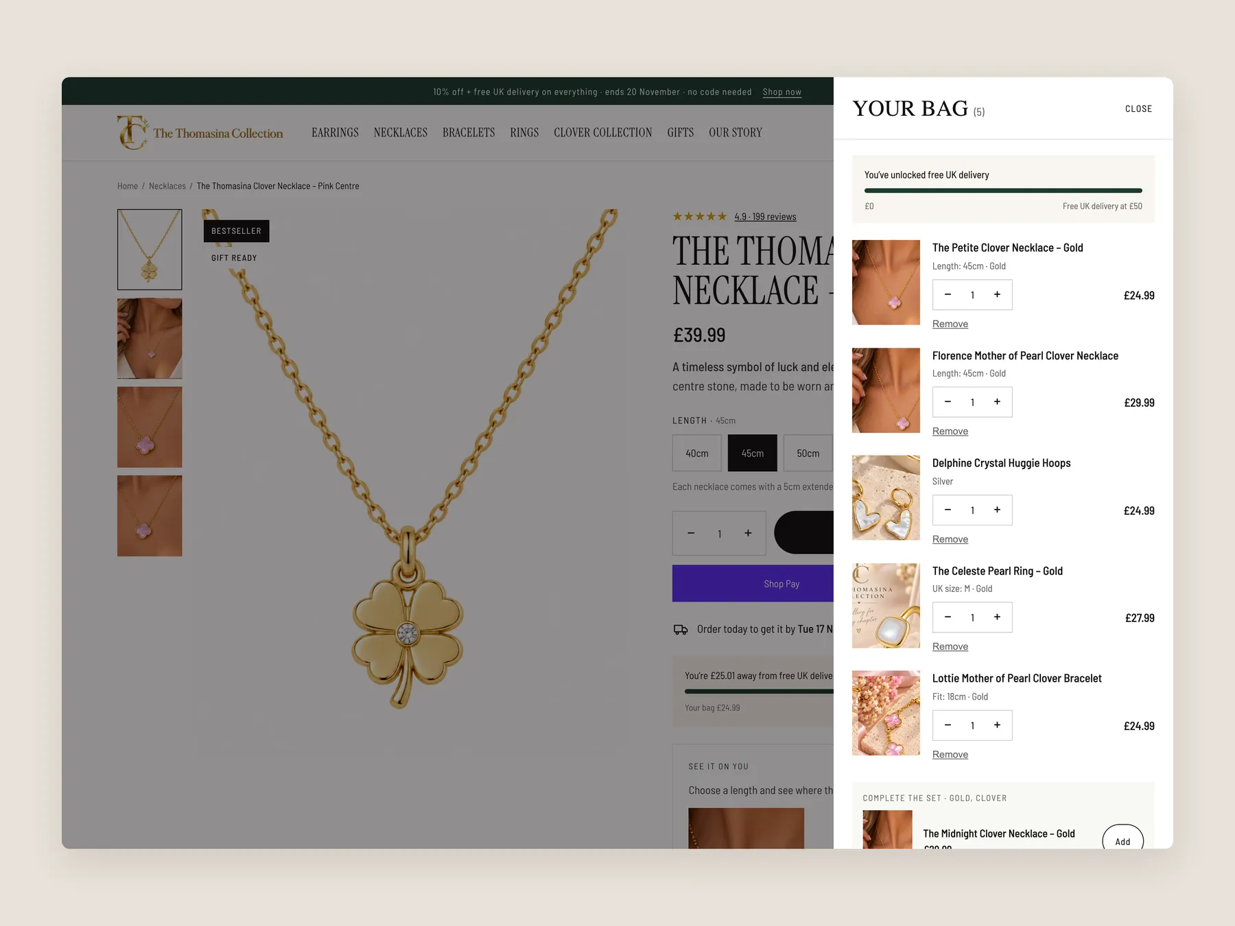
**The bag.** The product page dimmed behind the open bag drawer, shown whole from top to bottom, with a progress bar toward free delivery and a full set of lines.
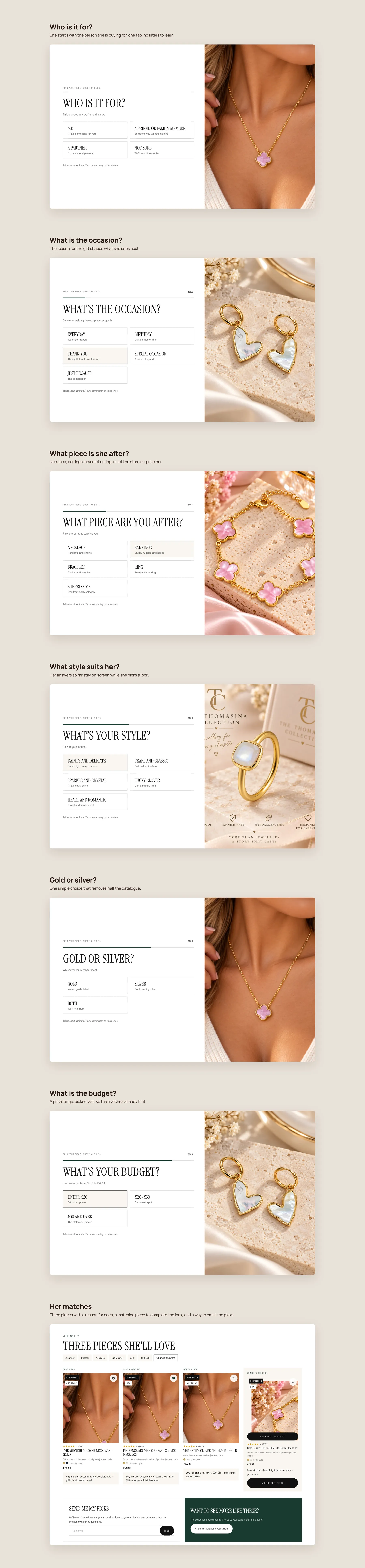
**The quiz.** Find your piece, step by step: who it is for, the occasion, the piece, the style, gold or silver and the budget, ending on three matches with a reason for each and a piece to complete the look.
**Product page.** The whole product page as two tall columns, from the buy box to the footer.
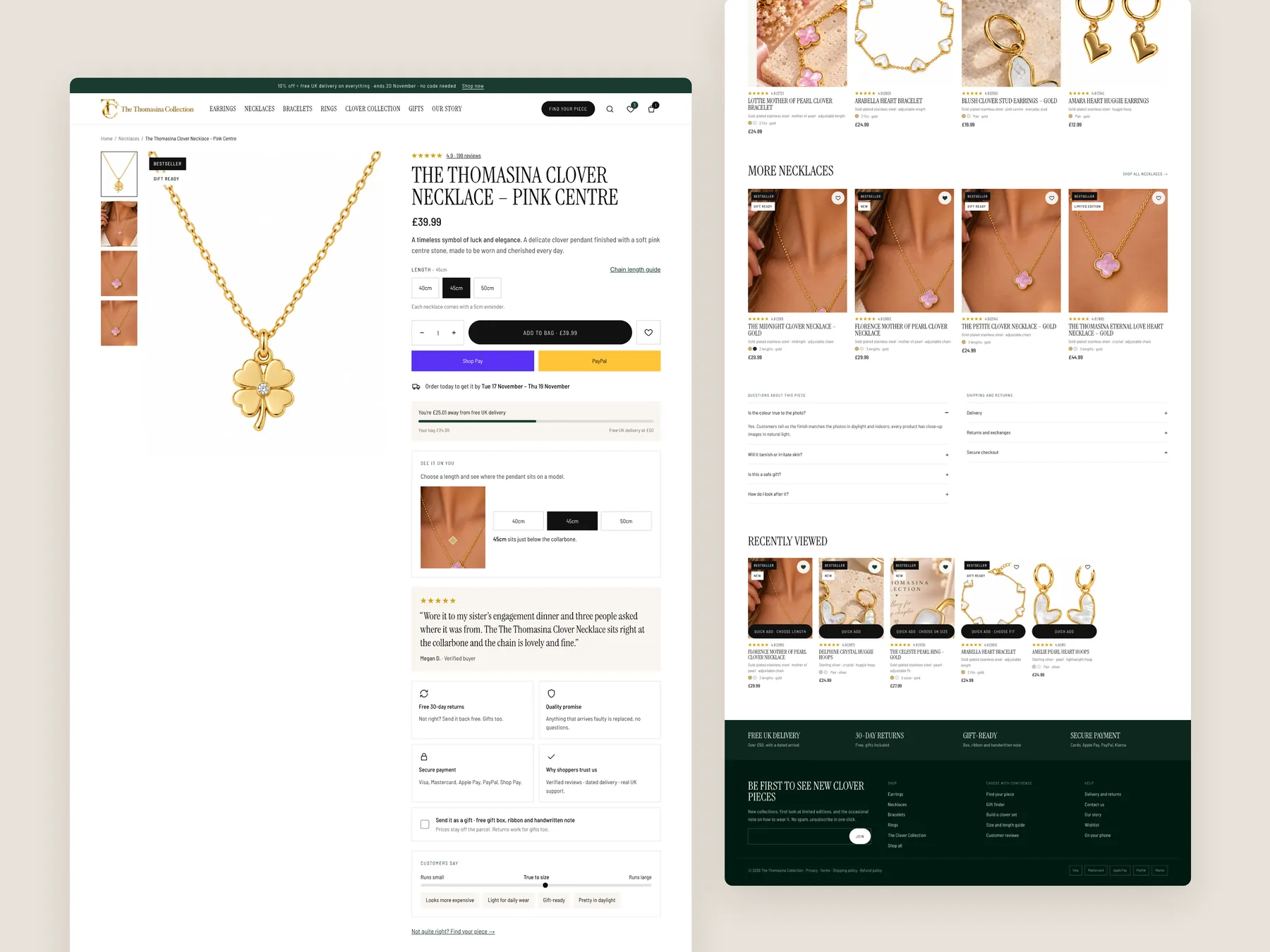
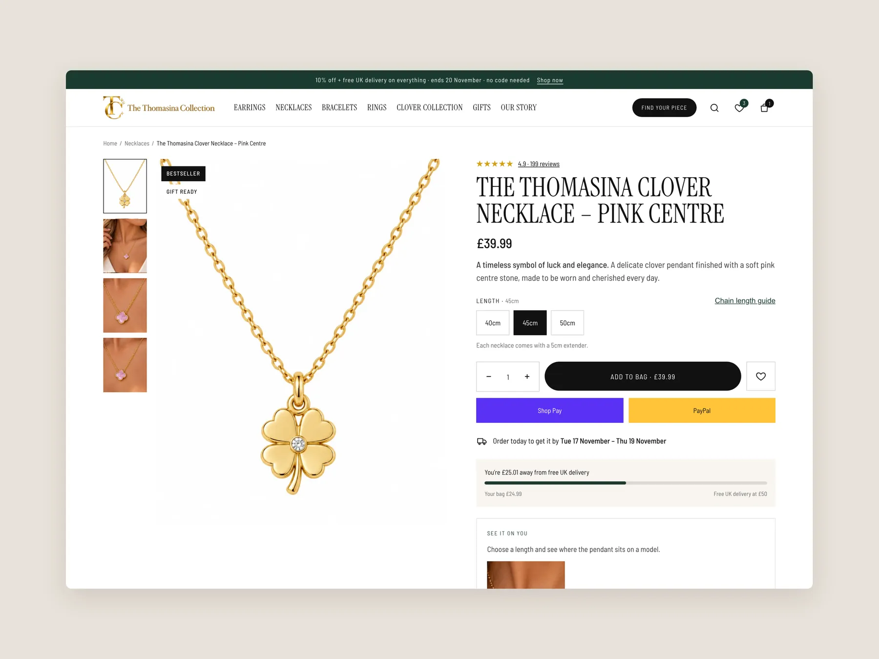
**Buy box.** The first screen of the product page: header, photo gallery, length choice, Add to bag, express checkout, delivery date and free-delivery progress.
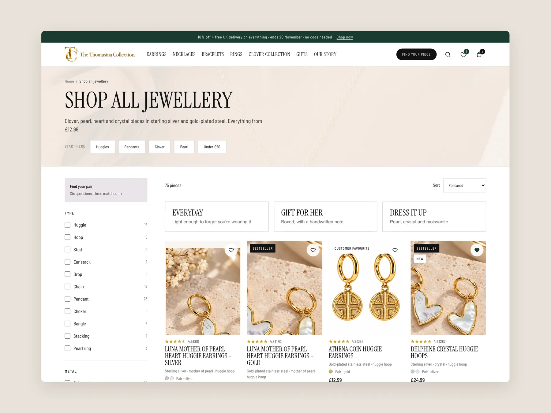
**Collection.** The first screen of the shop-all page: the banner, quick starting points, filters, ways to shop by need and the first row of cards with prices.
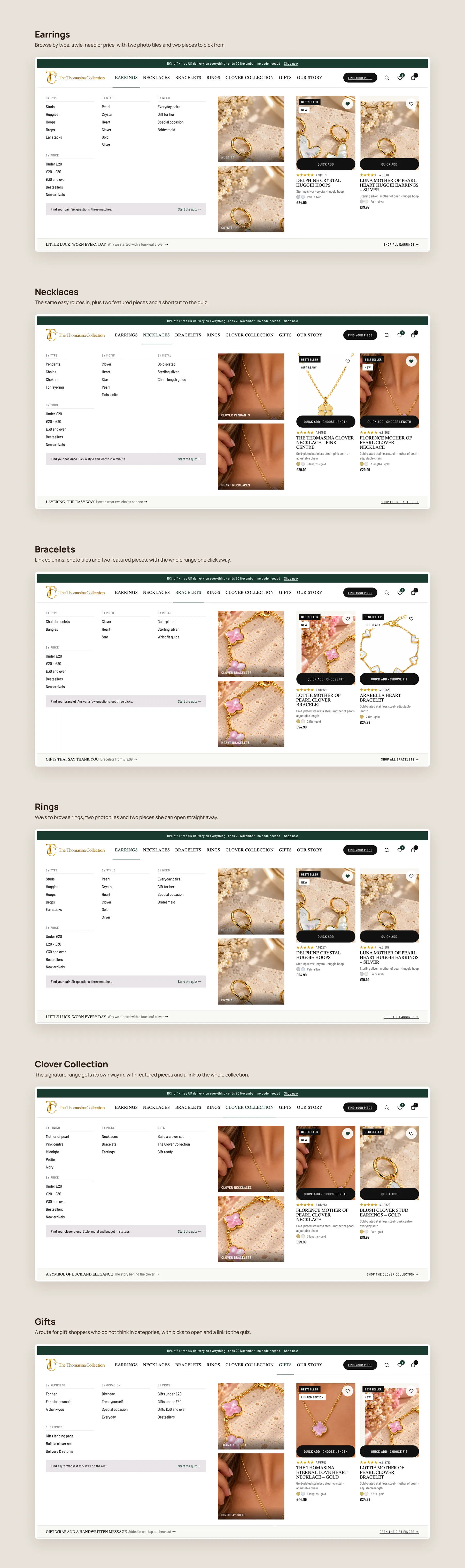
**Mega menu.** Every panel opened one after another, from Earrings to Gifts, each with link columns, photo tiles and featured pieces.
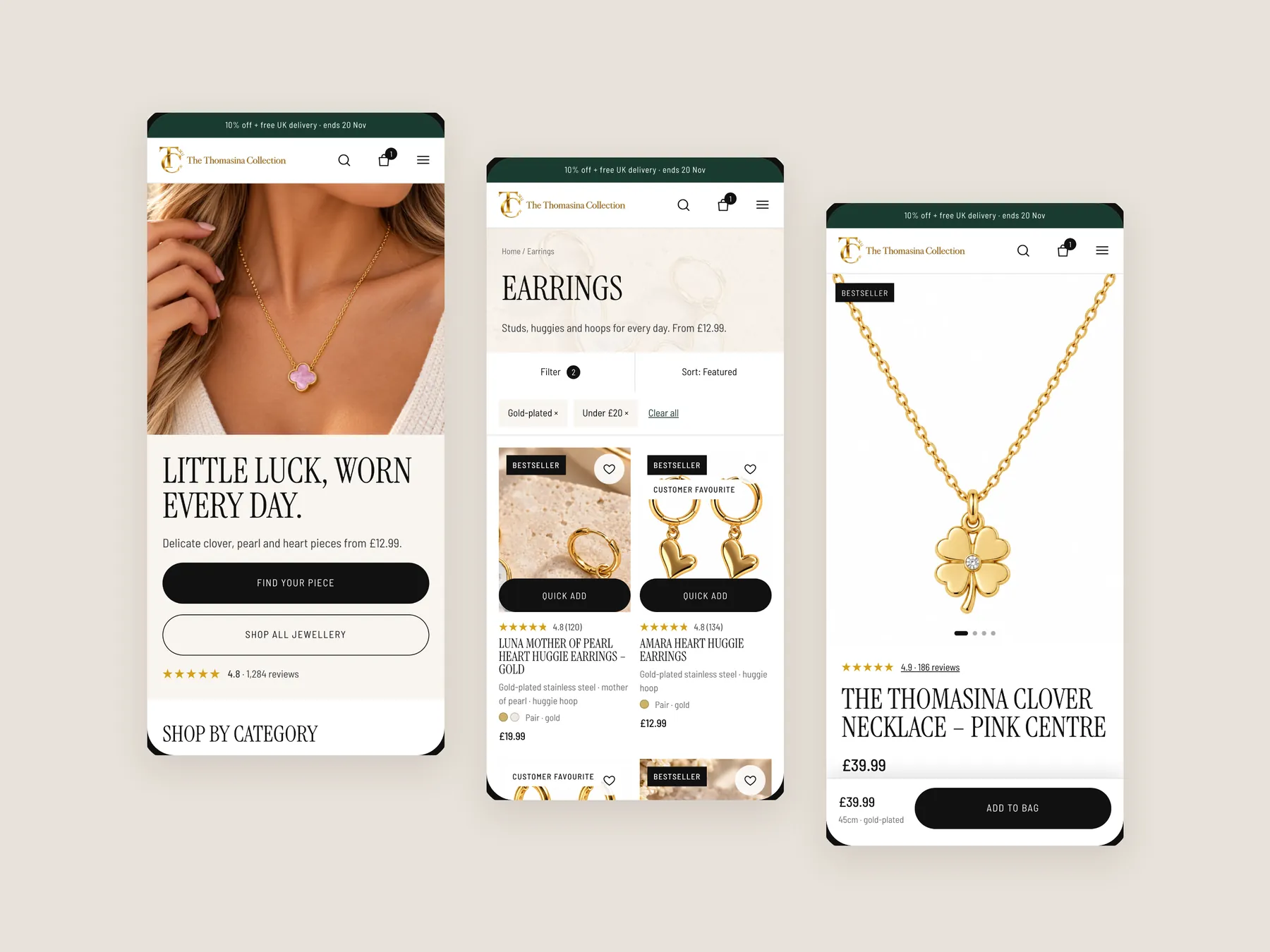
**Mobile.** Three phone screens side by side: home, collection and product, designed for thumbs first.
The store already runs ads and has visitors. The audit found that the pages do not help those visitors choose or feel confident, so extra traffic would reach the same leaks. Fixing conversion first makes every later visitor worth more.
A catalogue shows images, names and prices and leaves the choice to the visitor. The homepage and rings collection work this way, with no paths, comparisons or reasons to buy. A salesperson style site asks what the visitor needs and guides them.
A visitor decides within seconds whether a shop is for them. The current hero shows two women but does not say what the business does, who it serves or why it can be trusted, which creates hesitation before any product is seen.
Each menu has to be opened to see what it holds, so no buying path is visible at the first step. The concept opens menus by type, style, motif, metal, price and reviews, with a gifts route added.
No reviews appear anywhere on the site, and buyers want to see previous experiences before they commit. Where a piece has none yet, storewide reviews can show that people have bought from the brand and been satisfied.
Cards should carry a badge, a rating and the key detail of each piece, and the page needs filters for type, metal, stone, motif, price and occasion, plus sorting. That lets shoppers compare at a glance instead of opening each page.
It should answer delivery, returns, arrival date, materials, how the piece is made and how it looks worn, and explain why the price is fair. It should also show reviews and reassurance near the Add to Cart button.
Jewellery pairs easily, so product pages can suggest a ring, bracelet, charm or second necklace with a bundle discount. A bar showing the distance to free UK delivery also encourages a shopper to add another piece.
It is a short set of questions on the homepage that recommends products from the answers. It works like a shop assistant asking how they can help, and it supports discovery for visitors who do not know what to buy.
Visitors who do not find something for themselves often buy for a loved one. A gifts route by recipient, occasion and price, with a card and note option, gives those visitors a clear way to finish a purchase.
No. It is a clickable prototype made in Figma to show how the homepage, collection page and product page could remove friction. It reuses the existing offer, including 10% off and free UK delivery, and is a concept only.
The audit reviews the homepage, a rings collection page and a product page, then walks through a clickable redesign concept for each. The recording runs 24 minutes and ends with options for taking the work forward.
Tell us about your store and we'll send a personalized 5-minute video showing exactly where you're losing buyers — and how to win them back.
Takes about 40 seconds. No call required.