Homepage
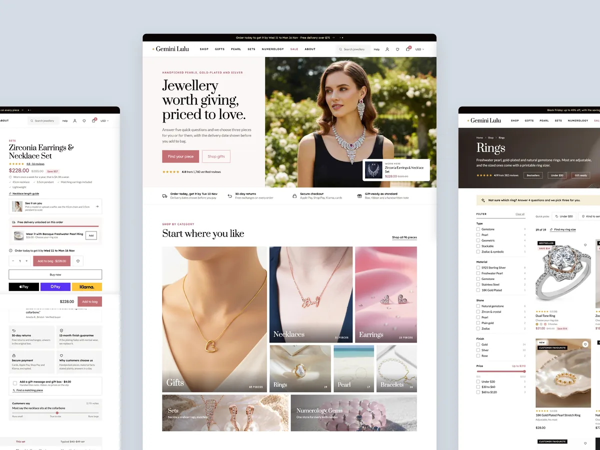
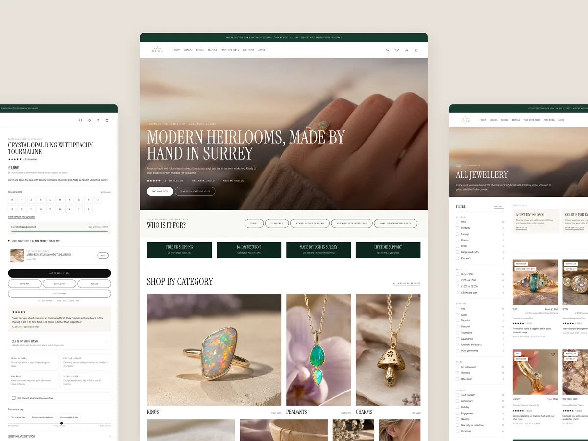
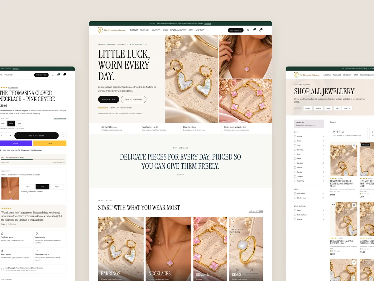
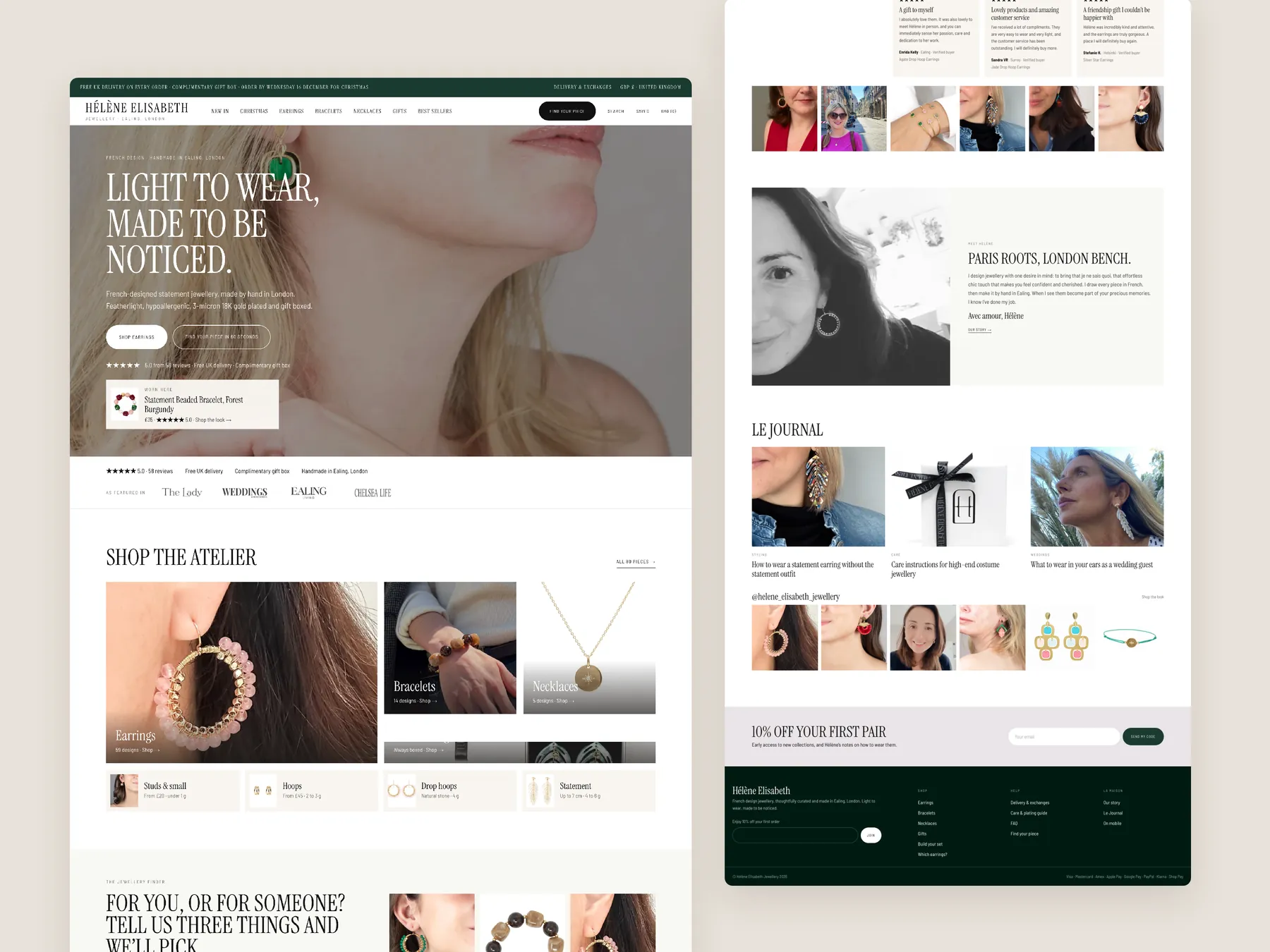
The long page shown as two tall columns: a clear promise at the top, routes by category, occasion and gift budget, and sets, down to the footer.
Storefronts we designed and built, across supplements, fragrance, health, wellness and skincare.
All 35 projectsFour engagements, measured before and after. What changed, why it changed, and by how much.
All case studiesDiagnosis, design and development from one studio — so the recommendation and the build never disagree.
All five services192 real Shopify stores torn down page by page, scored, and shown beside the version we would build. Free to watch.
Browse all teardownsConversion-first Shopify themes, each built for one industry’s buying journey. No required apps, no monthly theme fee, one licence per store.
See all themes Halden
Jewelry & Accessories
 Cairn
Jewelry & Accessories
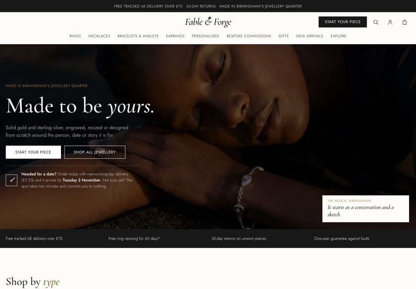 Fable & Forge
Jewelry & Accessories
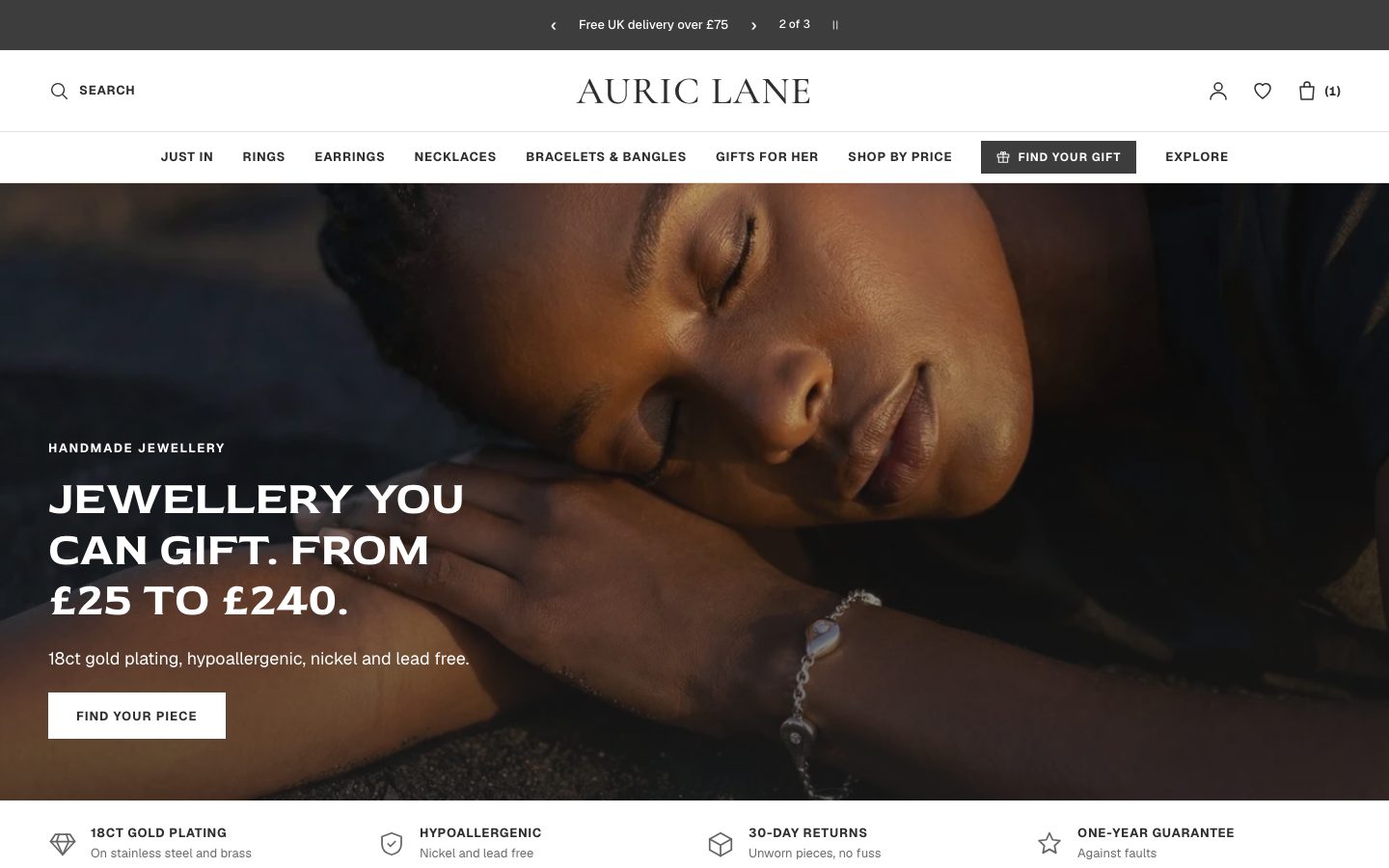 Auric Lane
Jewelry & Accessories
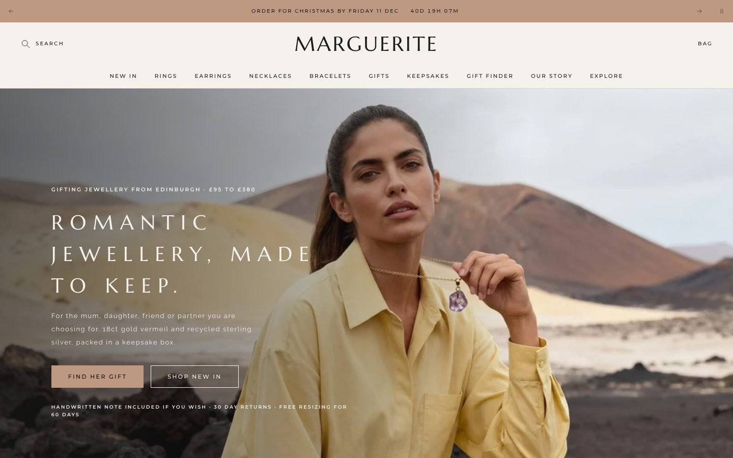 Marguerite
Jewelry & Accessories
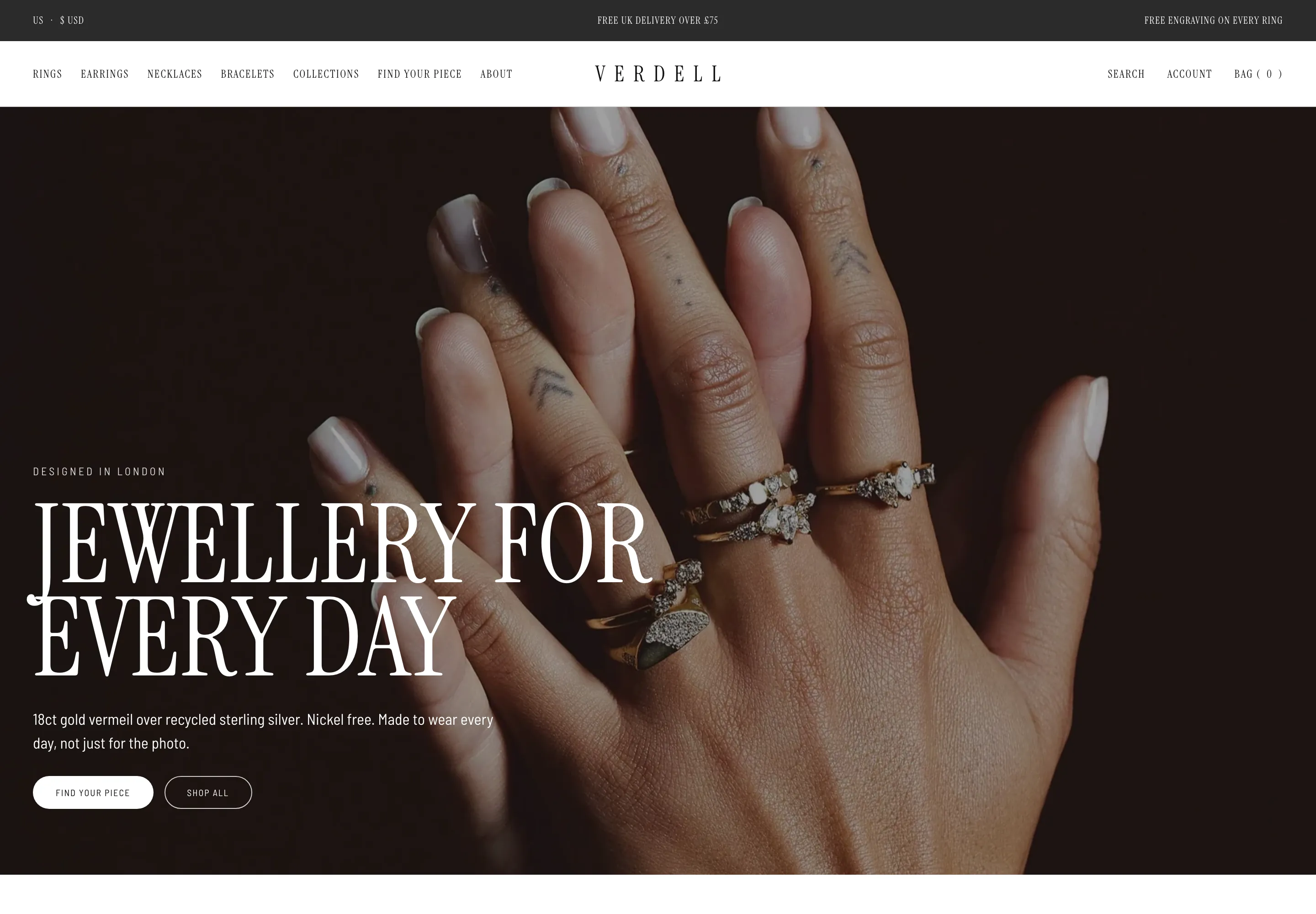 Verdell
Jewelry & Accessories
 Lisette
Jewelry & Accessories
 Linden
Jewelry & Accessories
 Calder Union
Clothing & Apparel
 Bracken Tor
Clothing & Apparel
 Fellward
Clothing & Apparel
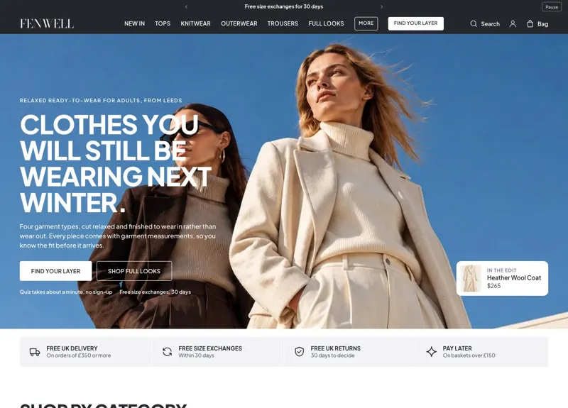 Fenwell
Clothing & Apparel
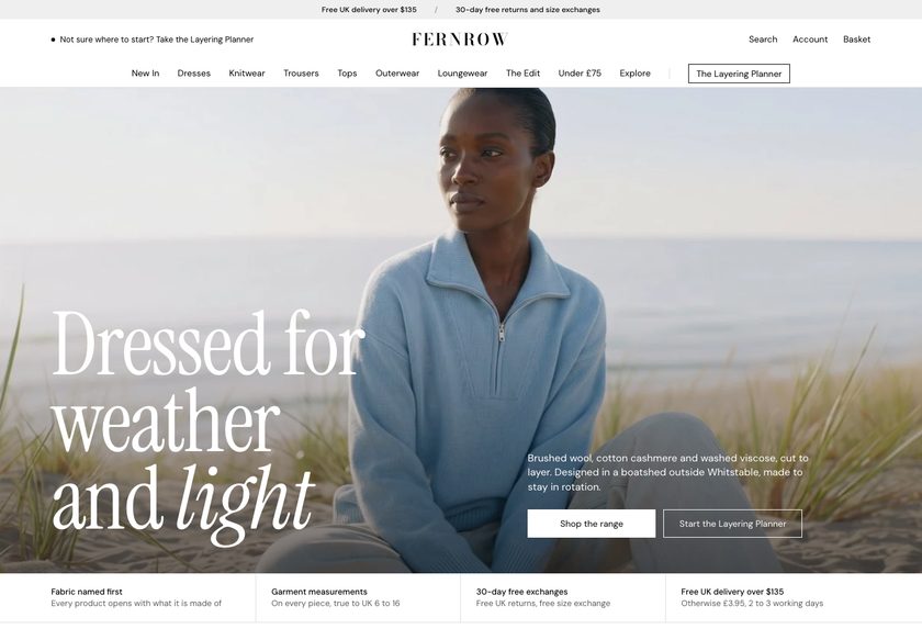 Fernrow
Clothing & Apparel
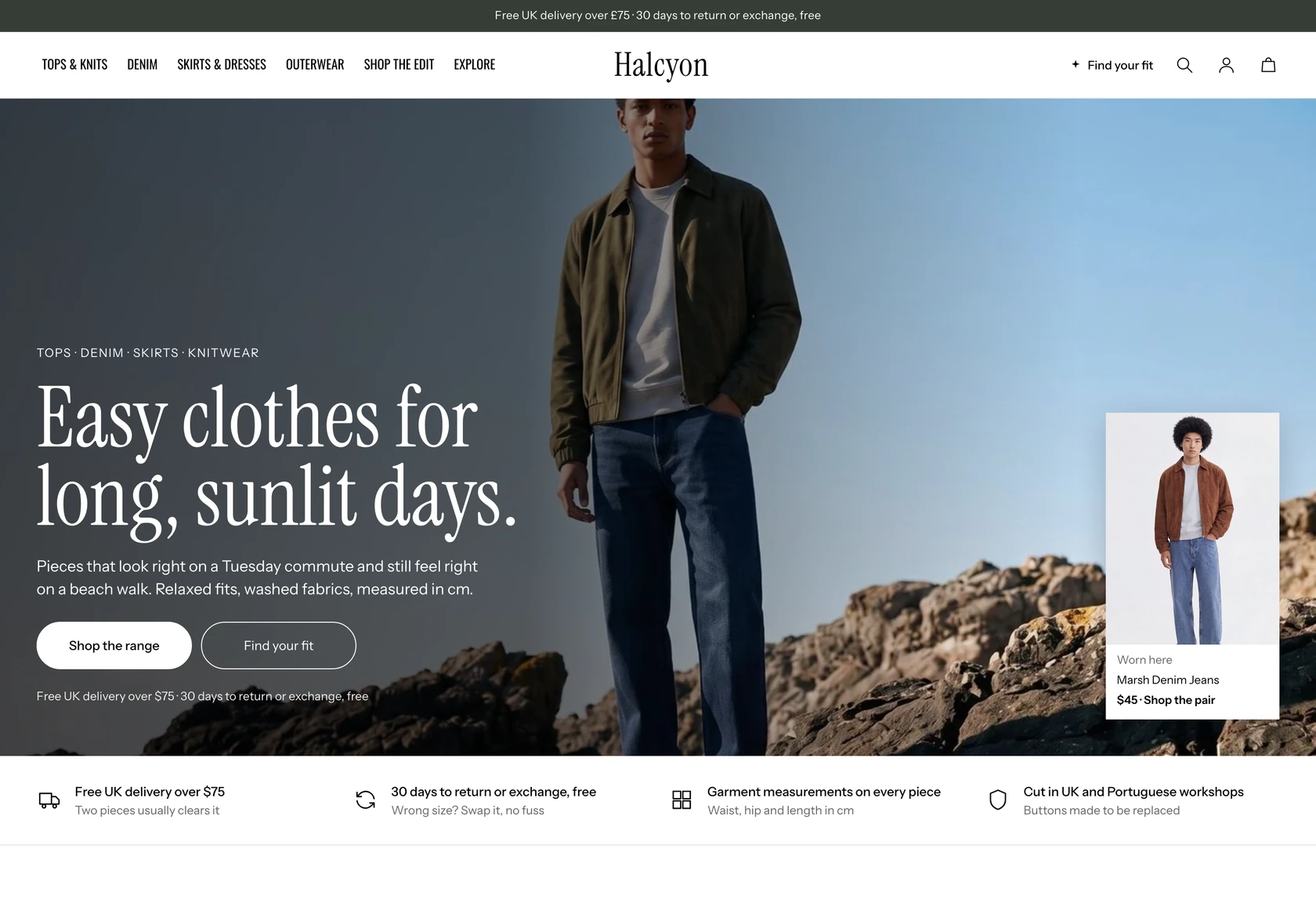 Halcyon
Clothing & Apparel
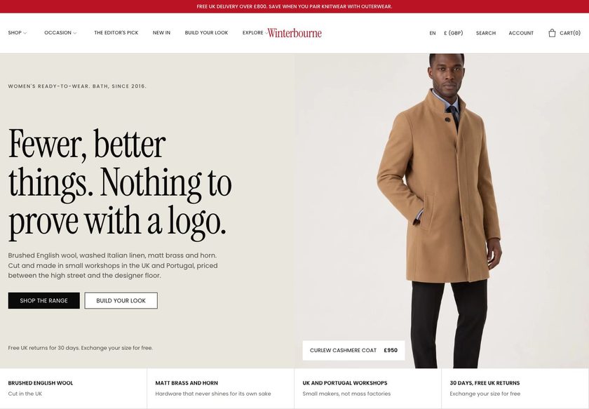 Winterbourne
Clothing & Apparel
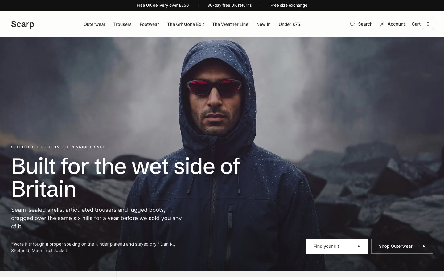 Scarp
Clothing & Apparel
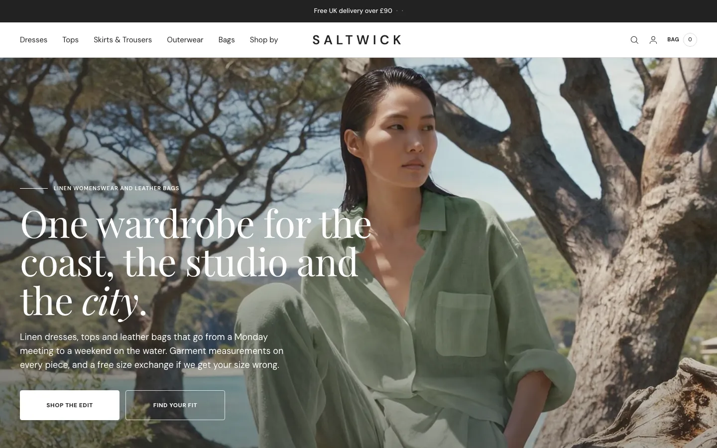 Saltwick
Clothing & Apparel
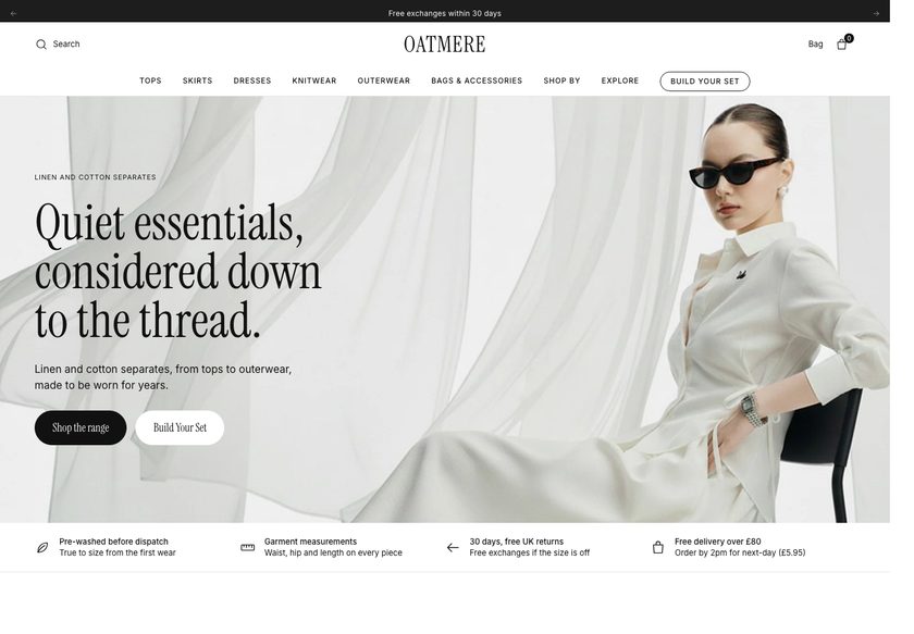 Oatmere
Clothing & Apparel
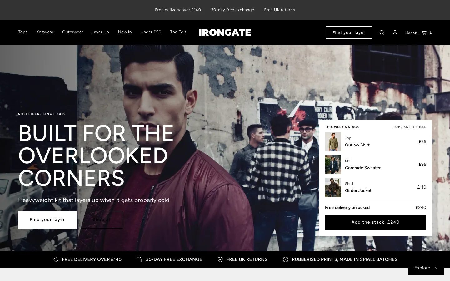 Irongate
Clothing & Apparel
 Hearthway
Clothing & Apparel
 Marle House
Clothing & Apparel
 Vesper Row
Clothing & Apparel
A teardown of a Shopify jewellery store covering its homepage, ear studs collection page and necklace product page, with a conversion focused redesign concept for each page.
Pressing play loads the video from YouTube — you can allow it for every teardown under cookie preferences.
The store already has the hardest part in place. The jewellery photographs well, the catalogue is organised by category, and the products look good. The homepage shows products early, the collection pages have clear names and descriptions, and reviews already exist on every page type. The necklace page even tries to raise basket size, which few stores do.
The core problem is the presentation layer, not the products. A first time visitor can tell this is a jewellery store, but not who it is for, why it can be trusted or when an order would arrive. The hero offers free delivery and little else, and nothing invites the visitor to say what they are looking for. Hesitation starts on the first screen.
The same gap repeats further down the funnel. The homepage behaves like a list of names and prices, and the navigation hides its contents until it is opened. On the ear studs page, comparing four products means opening four pages. On the necklace page, a long description and missing returns and checkout cost details leave questions open at the moment of decision.
The direction is a guided buying experience. Ask what the visitor needs, show clear paths by category, occasion, budget and recipient, put the key facts on the product cards, and answer delivery, returns and care on the product page. Offer pairs and bundles from the first screen. A good online jewellery store should behave like a good shop assistant.
The presentation layer leaves visitors to work out where to start. Pages read like a catalogue, with few guided paths, thin trust signals in the hero and product details that need extra clicks.
Turn the store from a catalogue into a guided shop, with a finder, clear paths by occasion, budget and recipient, scannable product cards and a product page that answers every question before checkout.
Visitors reach the right product faster, compare pieces without opening many pages, and meet fewer unanswered questions at Add to Cart. The result is more confident buyers and larger baskets.
Five dimensions, each scored out of ten.
12 issues found, 14 fixes proposed.
The homepage looks like a jewellery store, but the first screen does not say who the pieces are for or what the shopper is meant to do next. The visitor has to decide alone whether this store suits them.
Reviews exist on the site, but the first screen carries no rating, no maker story and no sign that other buyers trust the brand. Trust is built too late, if the visitor scrolls far enough to find it.
Free delivery on all orders is stated, but not when an order will arrive, where the pieces are made or who makes them. These are the first questions a gift buyer has about jewellery.
Scrolling the homepage shows product after product with a name and a price, and little else. It works like a shop that points at stock the moment someone walks in, before asking what they want.
There are no clear routes by earrings, necklaces, bracelets, ear studs, occasion, budget or recipient. A visitor who is unsure what to buy has no way to narrow the range.
The menu gives no hint of how many collections exist or how they are organised. Visitors must open every menu to learn what the store sells, which adds effort before any browsing starts.
The collection page ends with reviews, so anyone who does not scroll to the bottom never sees them. Social proof should appear earlier, where the buying decision begins.
The sorting and filters on the ear studs page are the stock Shopify theme options. They do not reflect how people shop for jewellery, such as by style, colour, occasion or price.
Product cards show little beyond an image, a name and a price. Comparing four ear studs means opening four product pages, and comparing twenty means twenty, so shoppers give up.
The necklace page runs a long block of description text. Key facts such as materials, dimensions and care are buried in it, so a shopper has to read paragraphs to find simple answers.
Near Add to Cart the page mentions delivery but not returns, and does not say what the buyer will pay at checkout. Those two unanswered questions are common reasons to leave.
The necklace page works to raise order value, which is good, but pairs, sets and bundle savings do not appear on the homepage or collection pages where many shoppers first choose.
State what the store sells, who it is for and why it can be trusted in the first screen. Put a rating and the delivery promise directly under the headline so hesitation never starts.
Next to free delivery, say when orders arrive and where and by whom the jewellery is made. Add a gift box mention if one is offered, so gift buyers can plan before they scroll.
Place a short guided finder as the main call to action. Ask who the piece is for and what style they like, then recommend products, the way a shop assistant would at the door.
Show clear tiles for earrings, necklaces, bracelets and ear studs straight after the hero. Each tile should lead to its collection so visitors can start exploring without opening the menu.
Group the menu by style, occasion, colour, budget and recipient so the choices are visible at once. Include under a set price points, which remove budget as a blocker for gift buyers.
Offer routes for everyday, evening, wedding and gifting, plus a shop by colour block for gold, green, pink and blue. Place them before the bestsellers so the range is shown first.
Show the star rating near the top of the homepage and collection pages, and place review content above the fold on product pages. Pair written reviews with real customer photos.
Add filters for type, style, price, colour, occasion and collection, and let visitors shop by need. Show how many pieces each collection holds so they know the size of the range.
Add a badge, the rating, a one line summary and colour options to each card. Shoppers can then compare pieces at a glance without opening a page for each one.
Replace the long text block with short cards for materials, dimensions and care, plus a brief note on what plating means. This educates the buyer and justifies the price at once.
Place reassurances directly beneath the button covering delivery, exchanges and returns, secure checkout and what the buyer will pay. Answer the objection where it appears.
Place a size guide close to the options and let buyers add a handwritten gift message before they add to cart. Both make gifting feel easier and remove small points of doubt.
Add a buy the set section with a small saving on bundles, and a complete the look block on product pages. Jewellery suits pairing, so larger baskets are easy to earn.
Include a short set of questions about tarnish, plating and care on the homepage, and a fuller FAQ at the foot of each collection. This answers buyers early and helps search and AI assistants.
A concept redesign created by Convertica Studio from this audit. It shows how the store could work, it is not the live store.
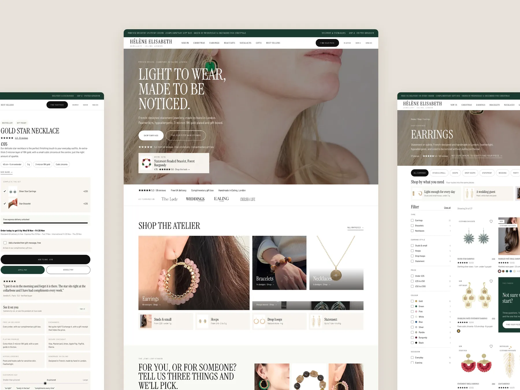
The long page shown as two tall columns: a clear promise at the top, routes by category, occasion and gift budget, and sets, down to the footer.
The homepage in the centre, the product page on the left with its buy column, and the earrings collection on the right with its header and filters.
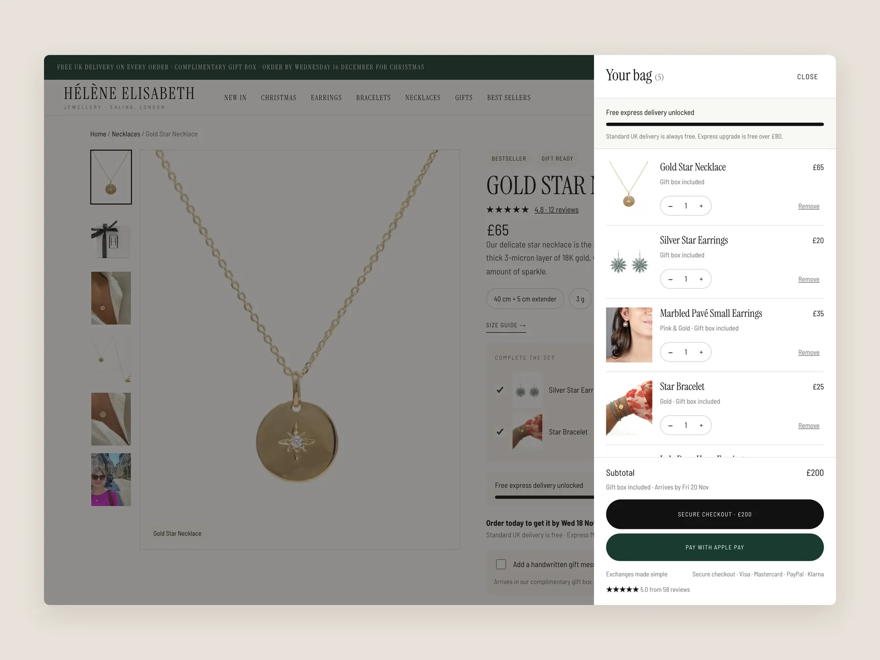
The slide-over bag open over the product page, with five pieces in it and a progress bar toward express delivery, so the whole screen reads at once.
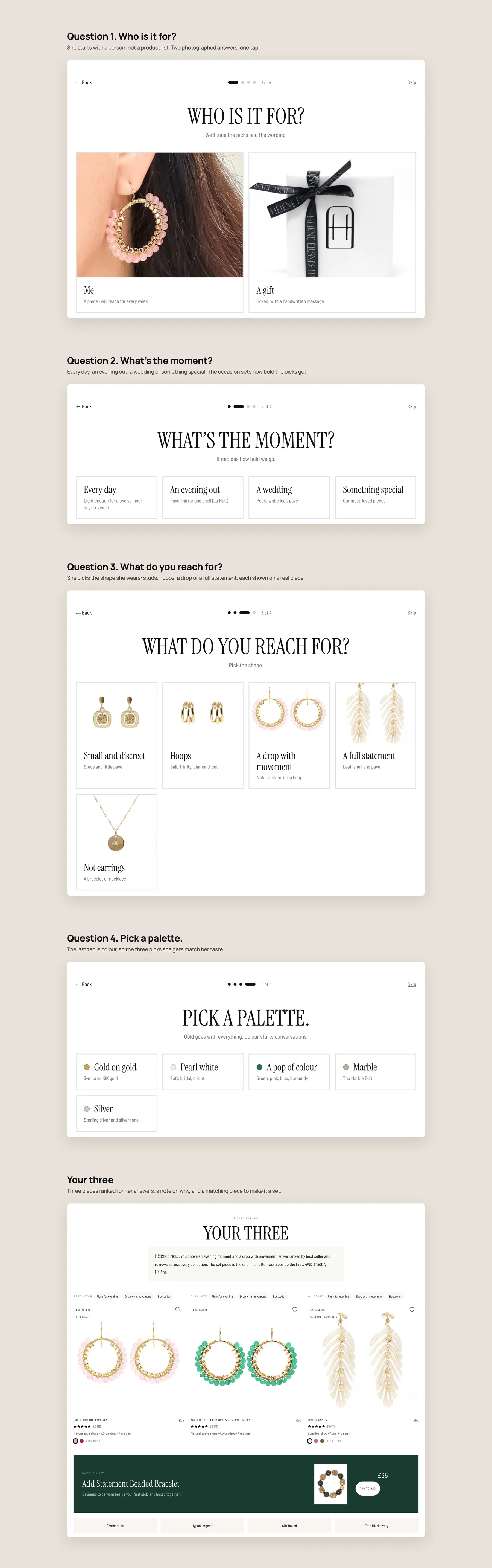
Four taps, who it is for, the moment, the shape and the palette, then three picks ranked for her answers with a note on why and a matching piece to make a set.
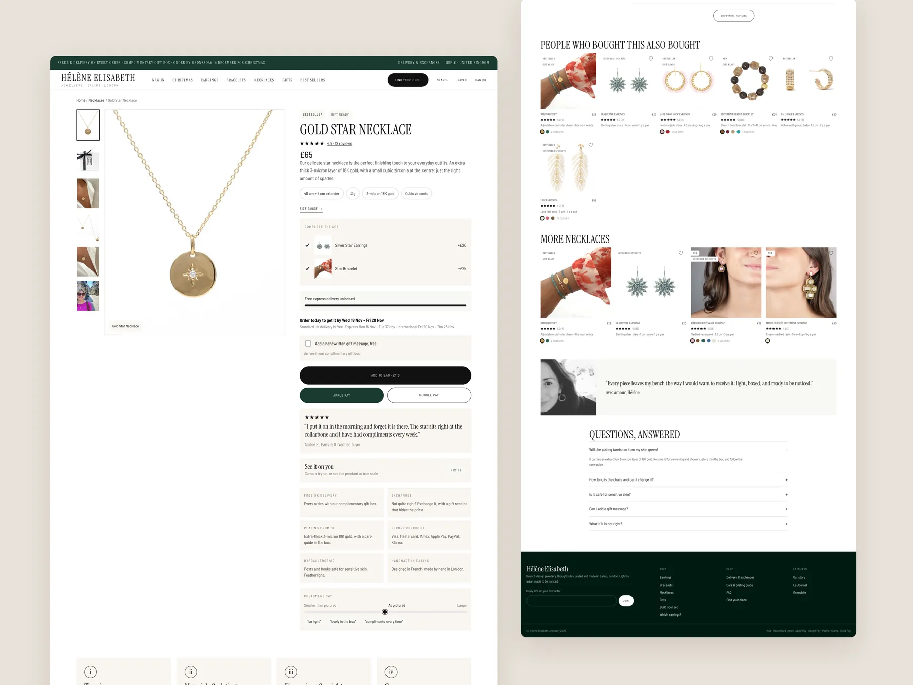
The full page in two columns: the buy box with proof beside the title, then the blocks that answer the questions a premium buyer has.
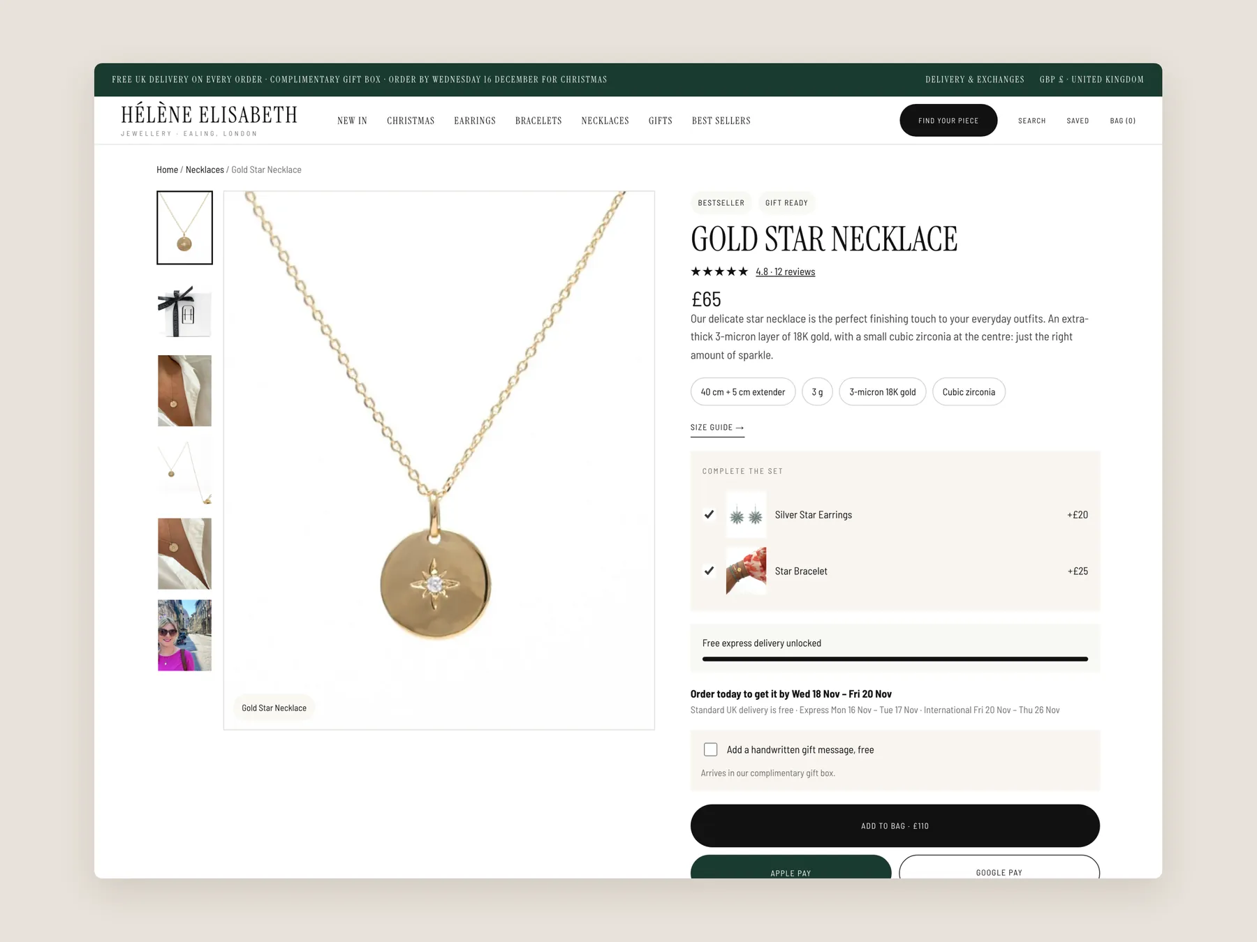
The header and the whole buy box on one screen, with rating, key facts, set offer and delivery lines close to the button.
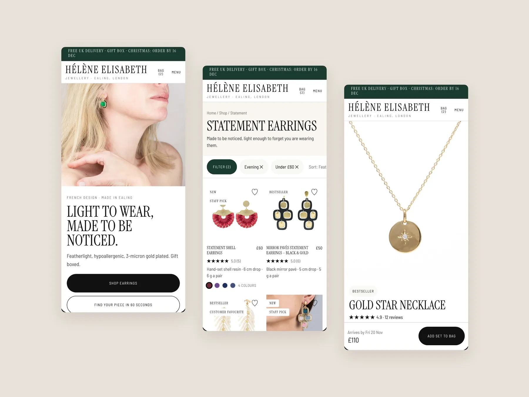
The earrings page with a reason to buy in the header, style chips, ways to shop, filters and a first row of cards showing price, rating and colours.
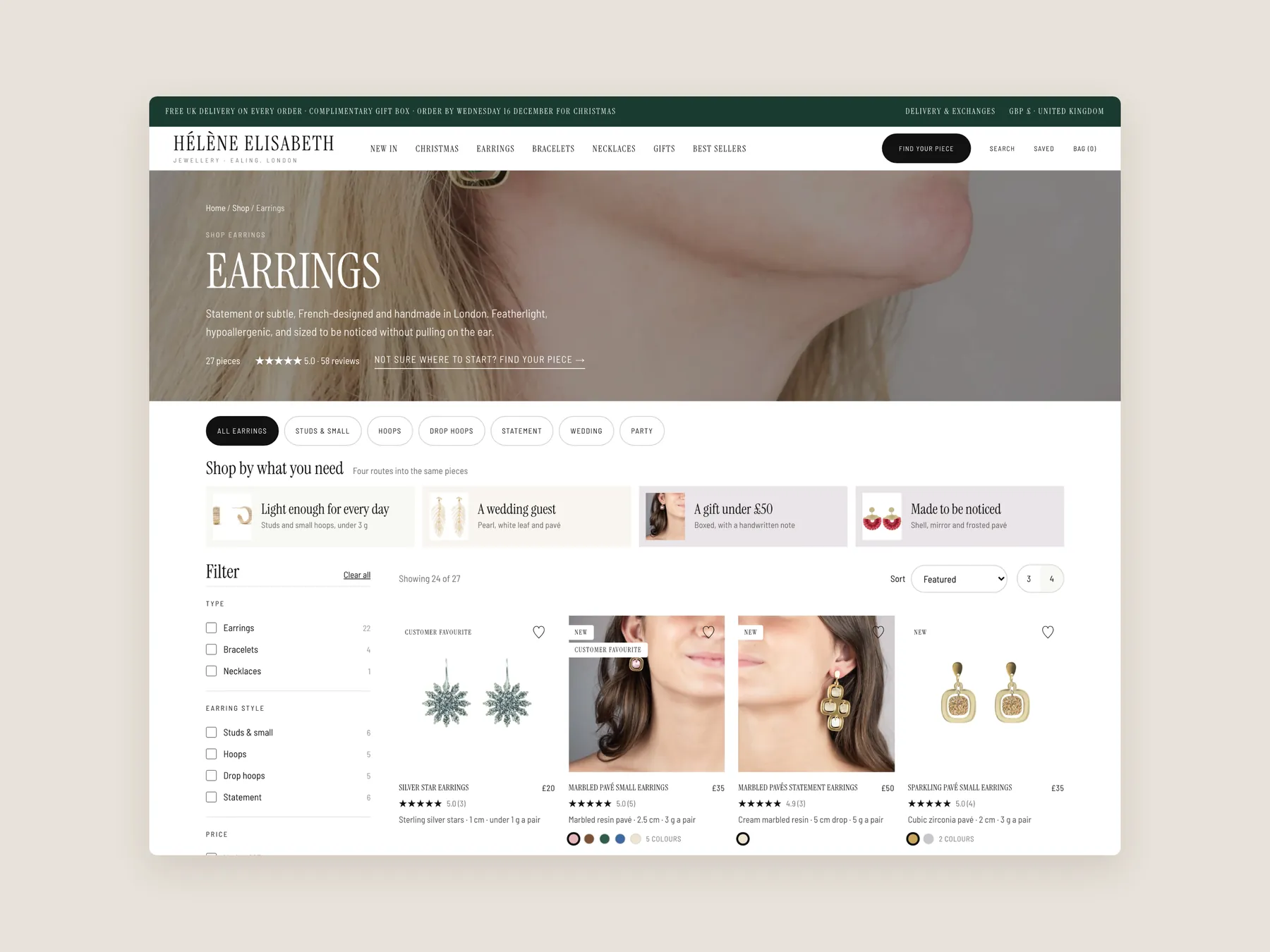
Christmas, Earrings, Bracelets, Necklaces and Gifts, each panel open so the routes by style, occasion, colour, budget and recipient are visible from the top of the site.
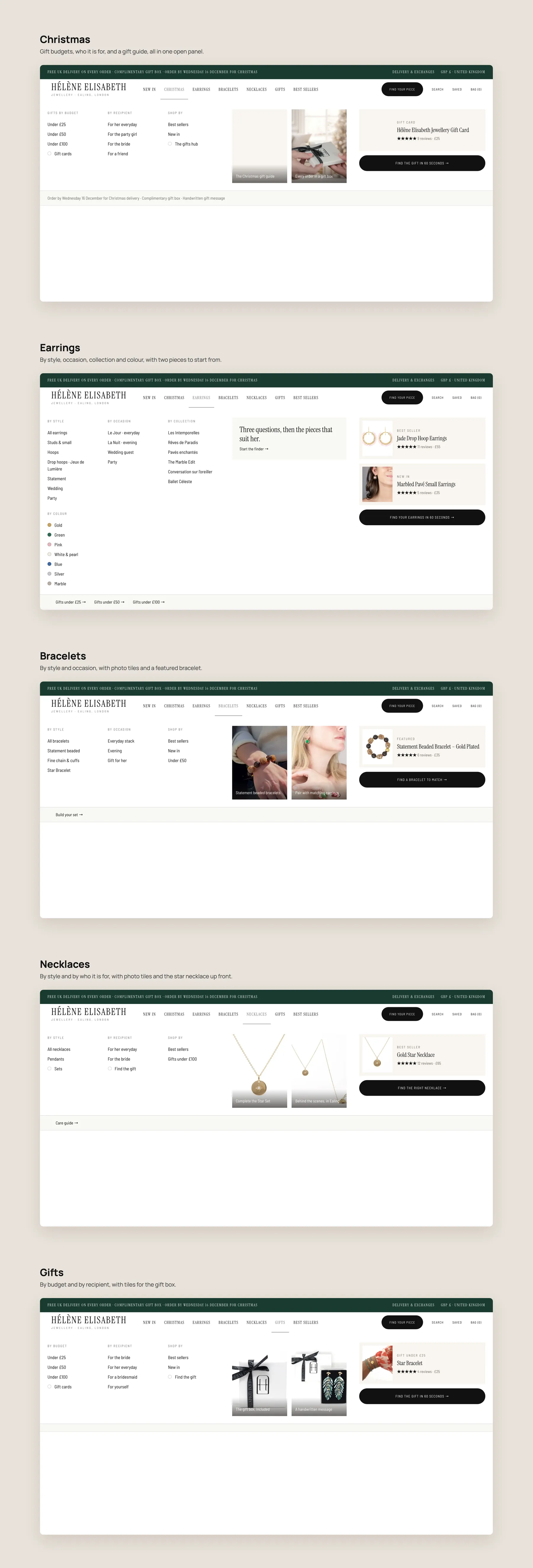
A typed query with the matching piece shown right under the field, ready to add to the bag.
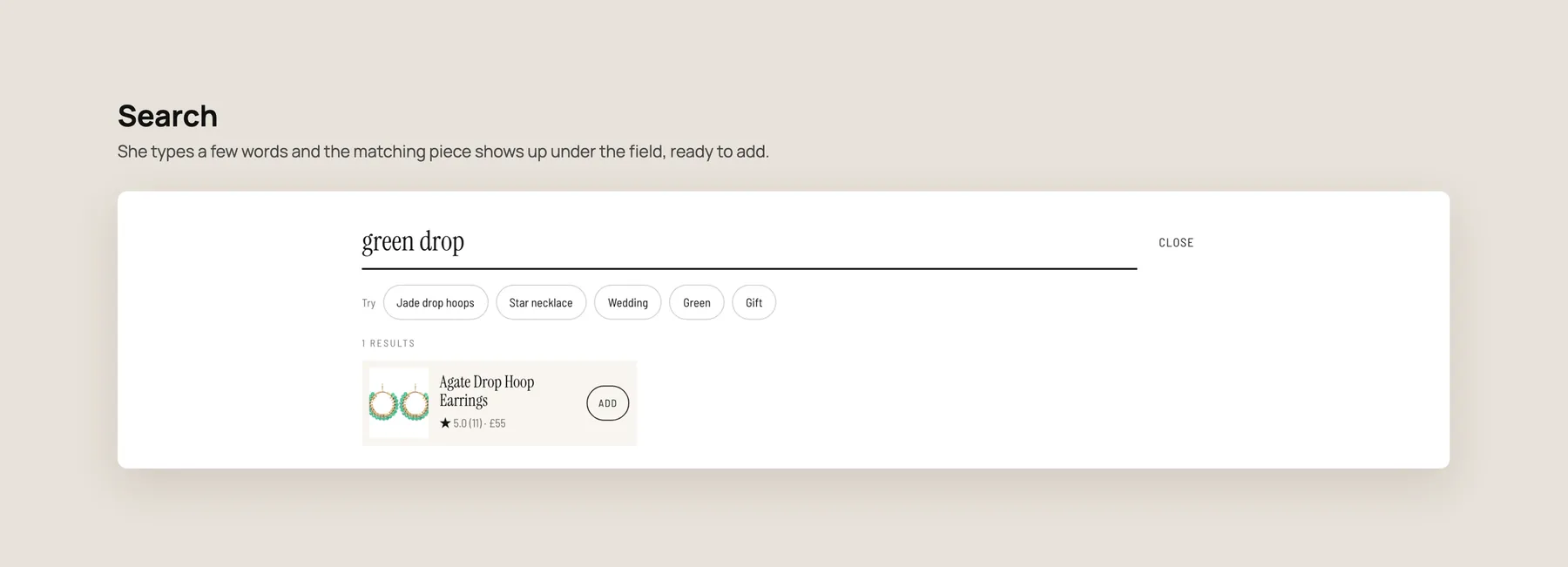
Home, collection and product on three phone screens, built for one-handed use.
Neither. The audit found that the products look good and that the store does not need more traffic first. The issue is that the visitors already arriving are not guided to the right piece or reassured enough to buy.
After the hero, the page lists products with only a name and a price. There are no guided routes by category, occasion, budget or recipient, so a visitor who is unsure what to buy has to work it out alone.
It shows that this is a jewellery store, but does not say who it is for or why others trust it. Free delivery is mentioned without timing, and nothing explains where or by whom the pieces are made.
The menu hides its contents until a visitor opens each item. There is no hint of how many collections or paths exist. The redesign groups the menu by style, occasion, colour, budget and recipient so the range is visible immediately.
On the ear studs page, comparing products means opening each product page. Cards that show a badge, rating, short summary and colour options let shoppers compare at a glance and reach the right piece sooner.
The necklace page has a bestseller label, reviews, a clear price and a delivery note. It also tries to raise order value, which our CRO strategist noted is rare among the stores reviewed.
Returns information and a clear indication of what the buyer will pay at checkout. Delivery is covered, but these two questions remain unanswered at the point where the shopper decides.
It starts earlier. A buy the set section with a bundle saving appears on the homepage, and product pages offer a complete the look pairing and a progress message toward free express delivery.
A short guided questionnaire in the hero. It asks who the piece is for and what style they like, then recommends products. It copies what a shop assistant would do when someone walks in and asks for help.
Three routes: keep the store as it is, implement the changes yourself, or have the studio do it. The studio options were a full rebuild at 3,500 paid in stages, a patch of the three reviewed pages, or the finished theme at 1,200.
The recording says a live Shopify store with better conversion rates is expected within four to five weeks. It also notes that results can take longer, and no outcome is promised.
The audit covers the homepage, the ear studs collection page and a necklace product page, followed by a redesign concept for each. The video runs 23 minutes and ends with options and pricing.
Tell us about your store and we'll send a personalized 5-minute video showing exactly where you're losing buyers — and how to win them back.
Takes about 40 seconds. No call required.