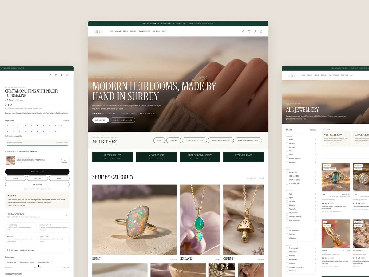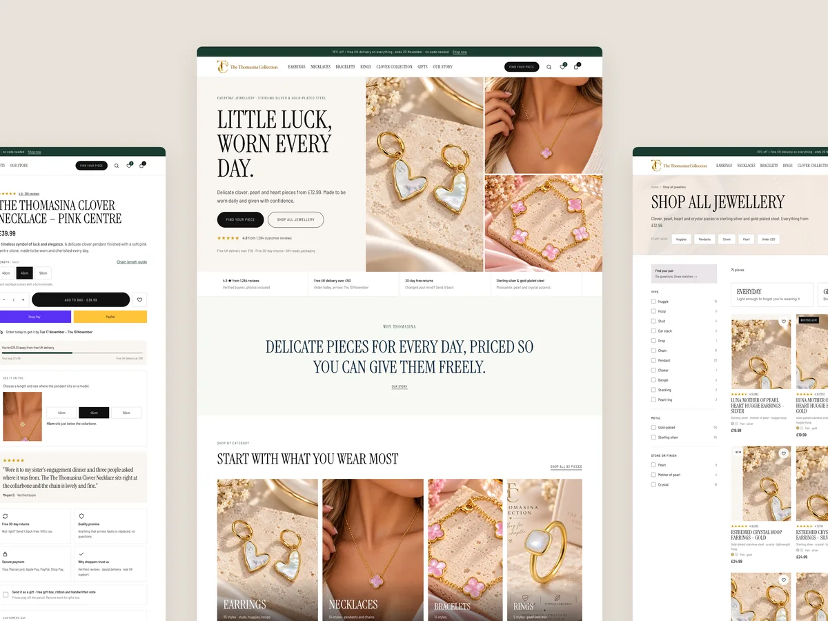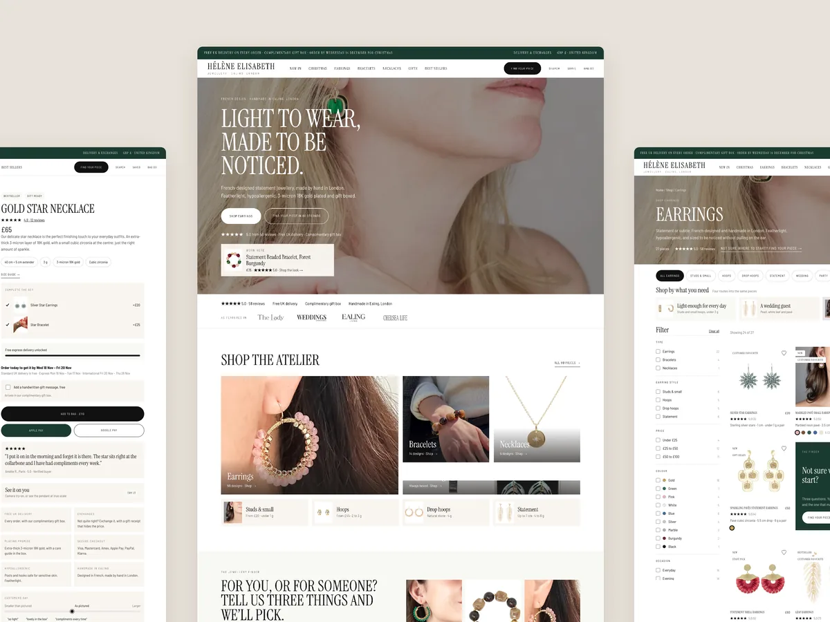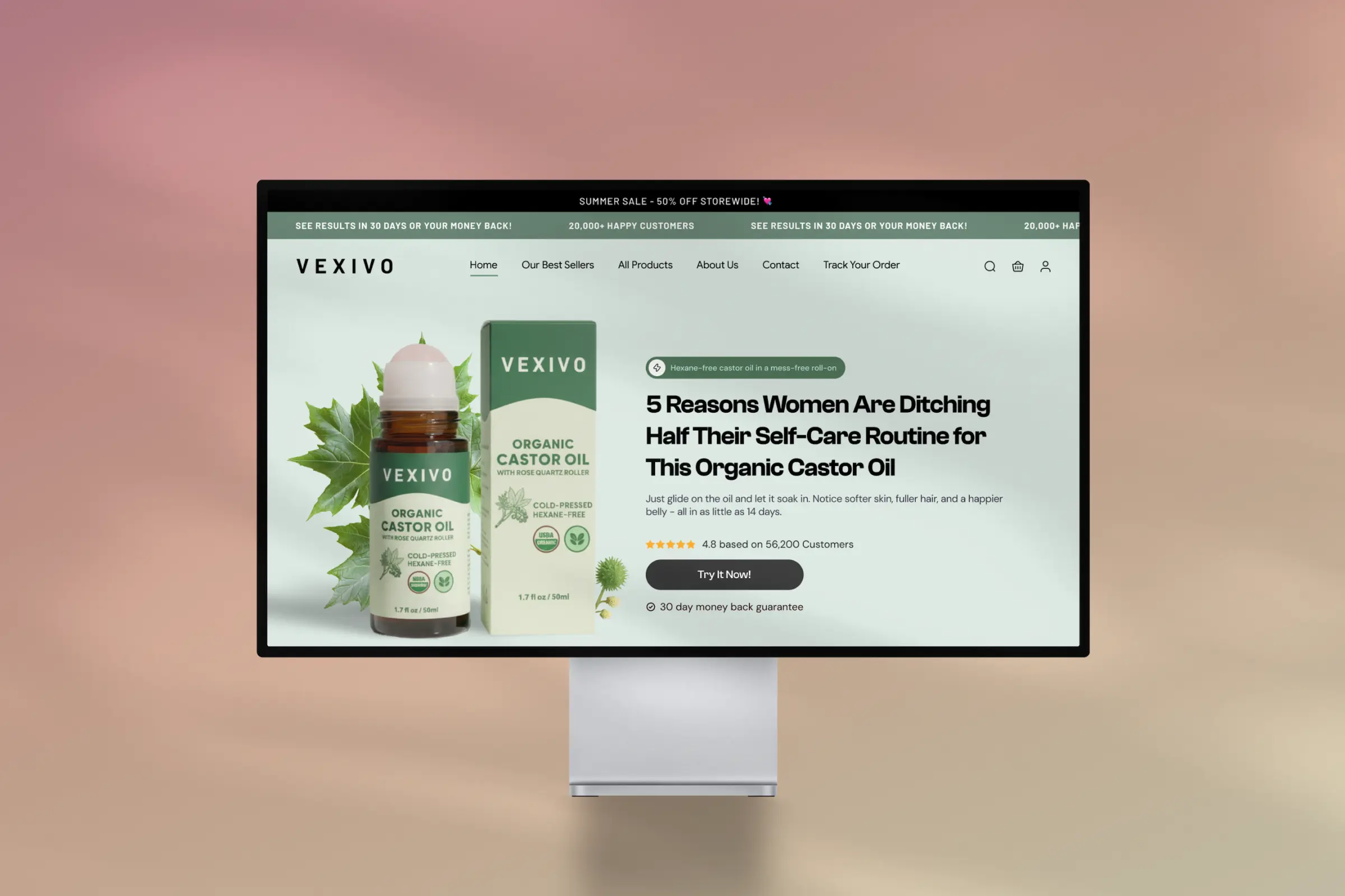
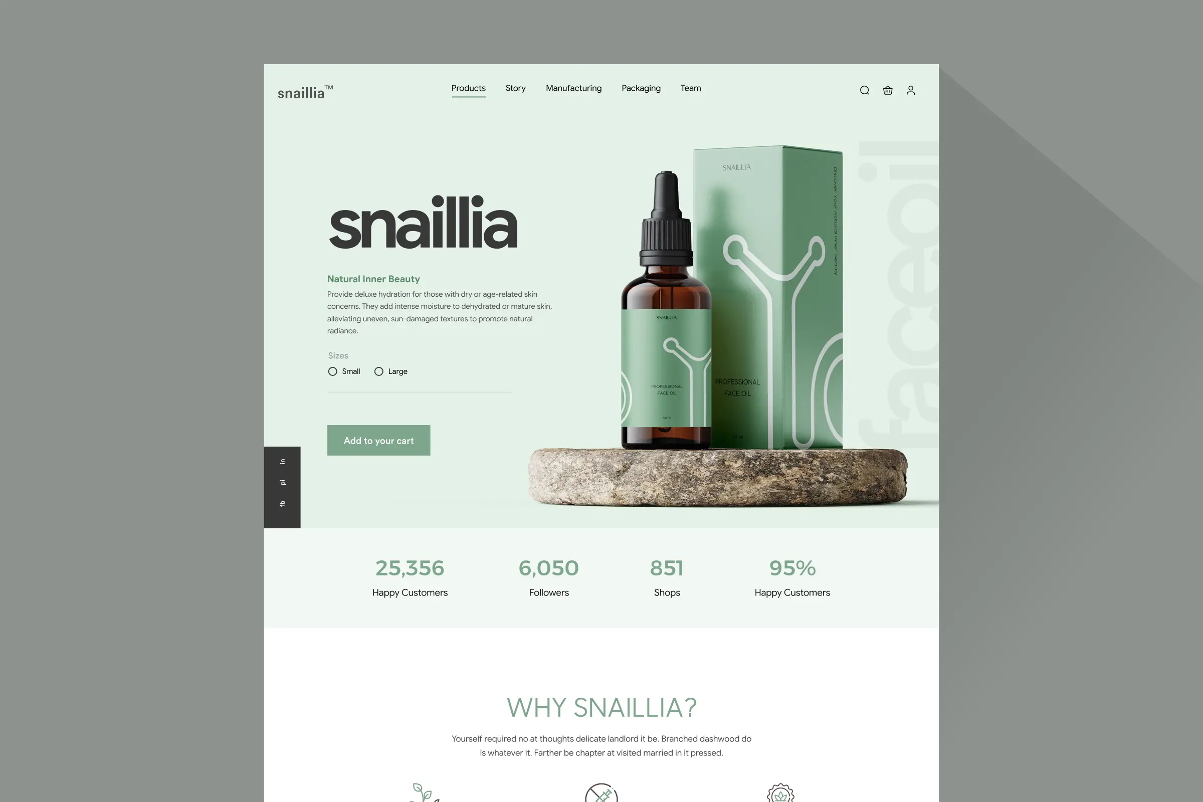
Homepage
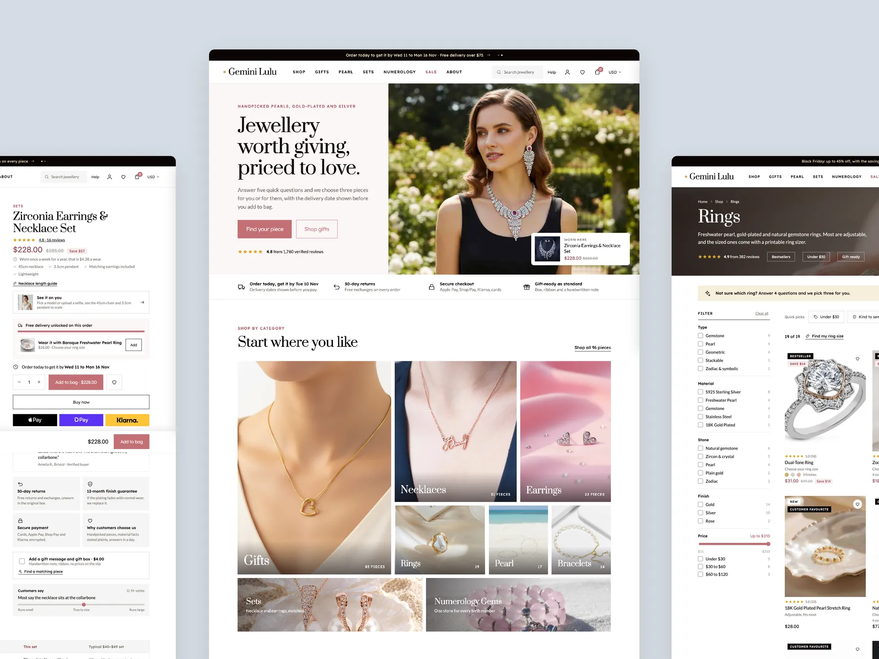
The full page shown as two tall columns, from the opening screen to the footer, with the shop-by-category and gift paths up front.
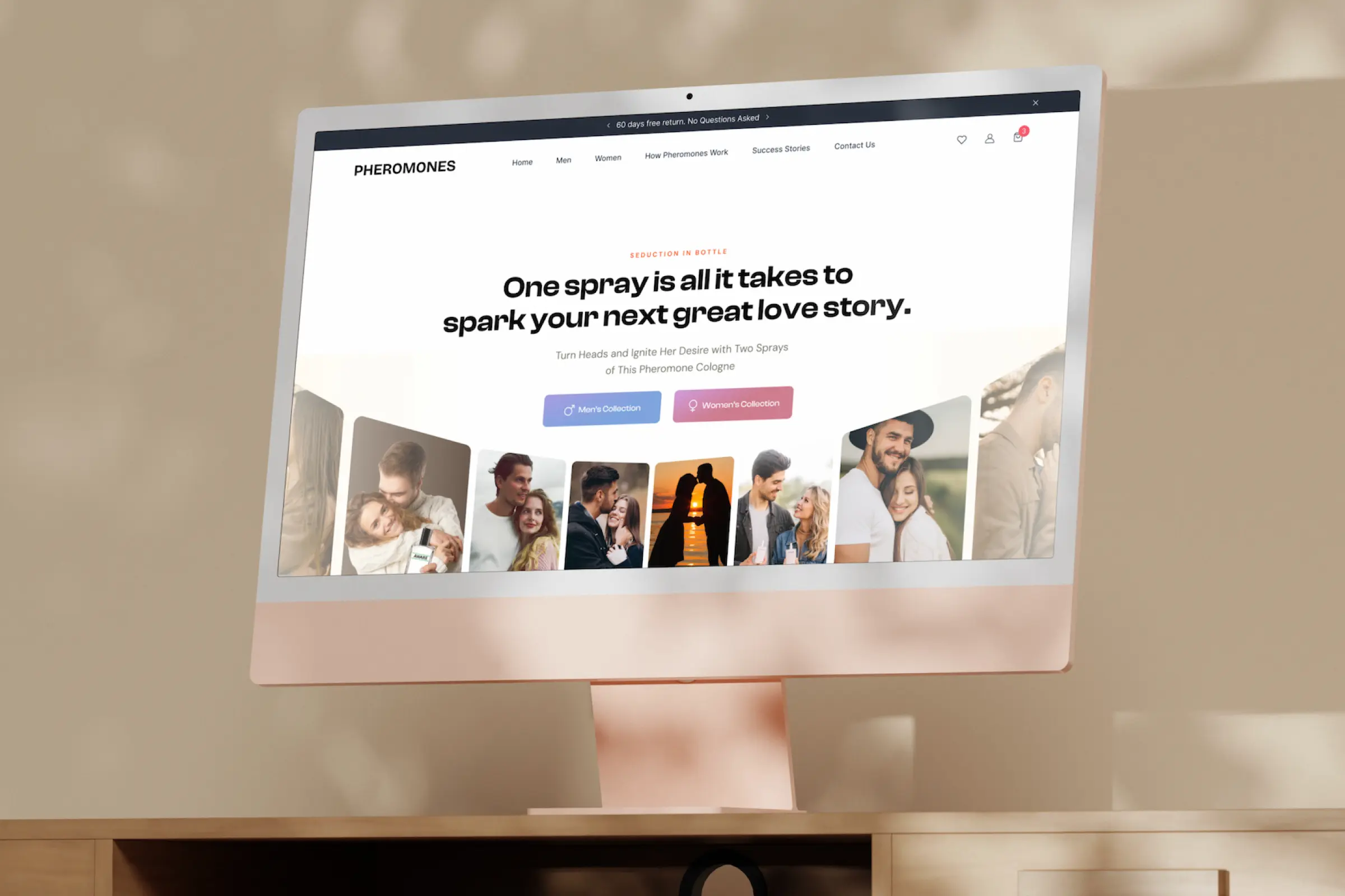
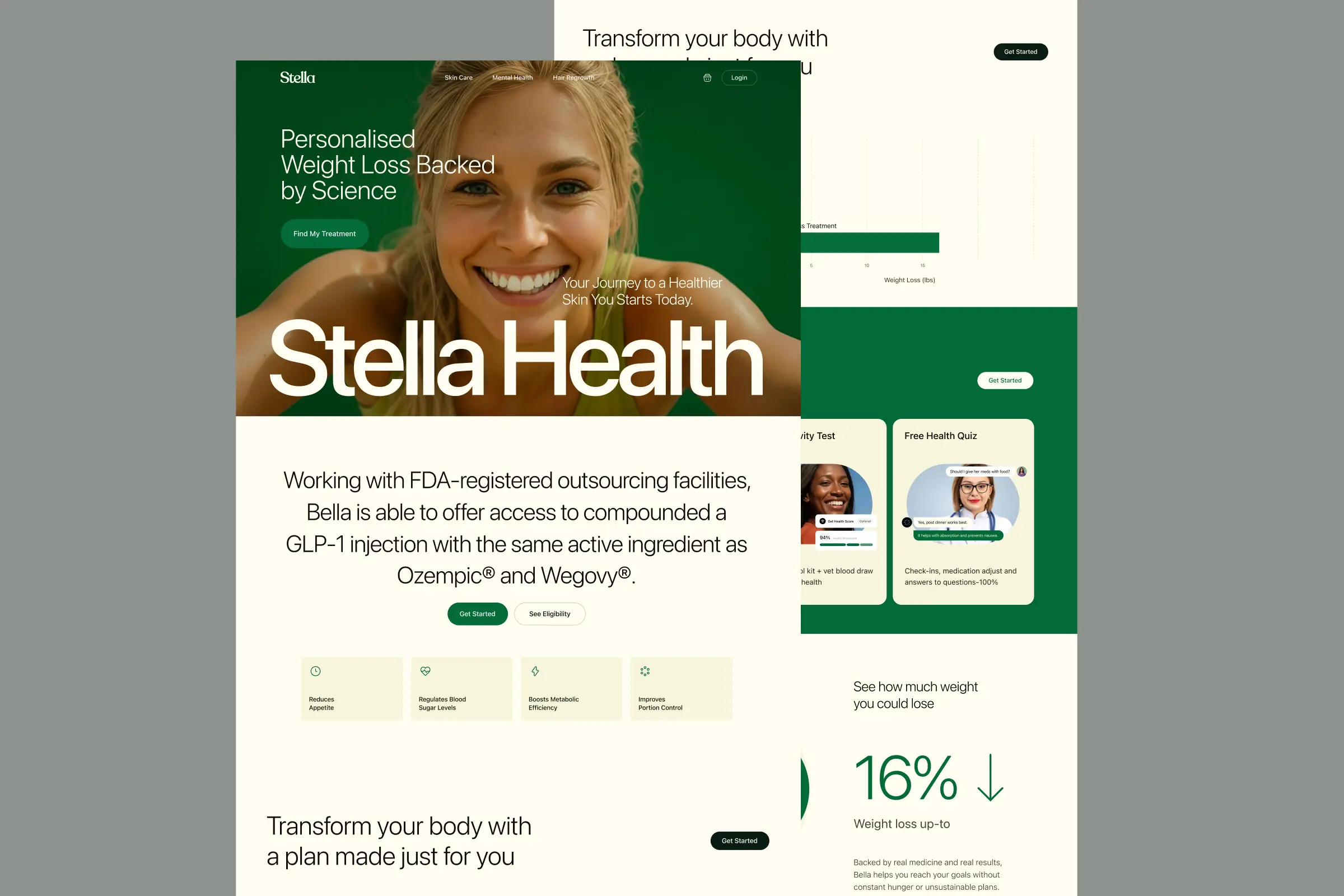
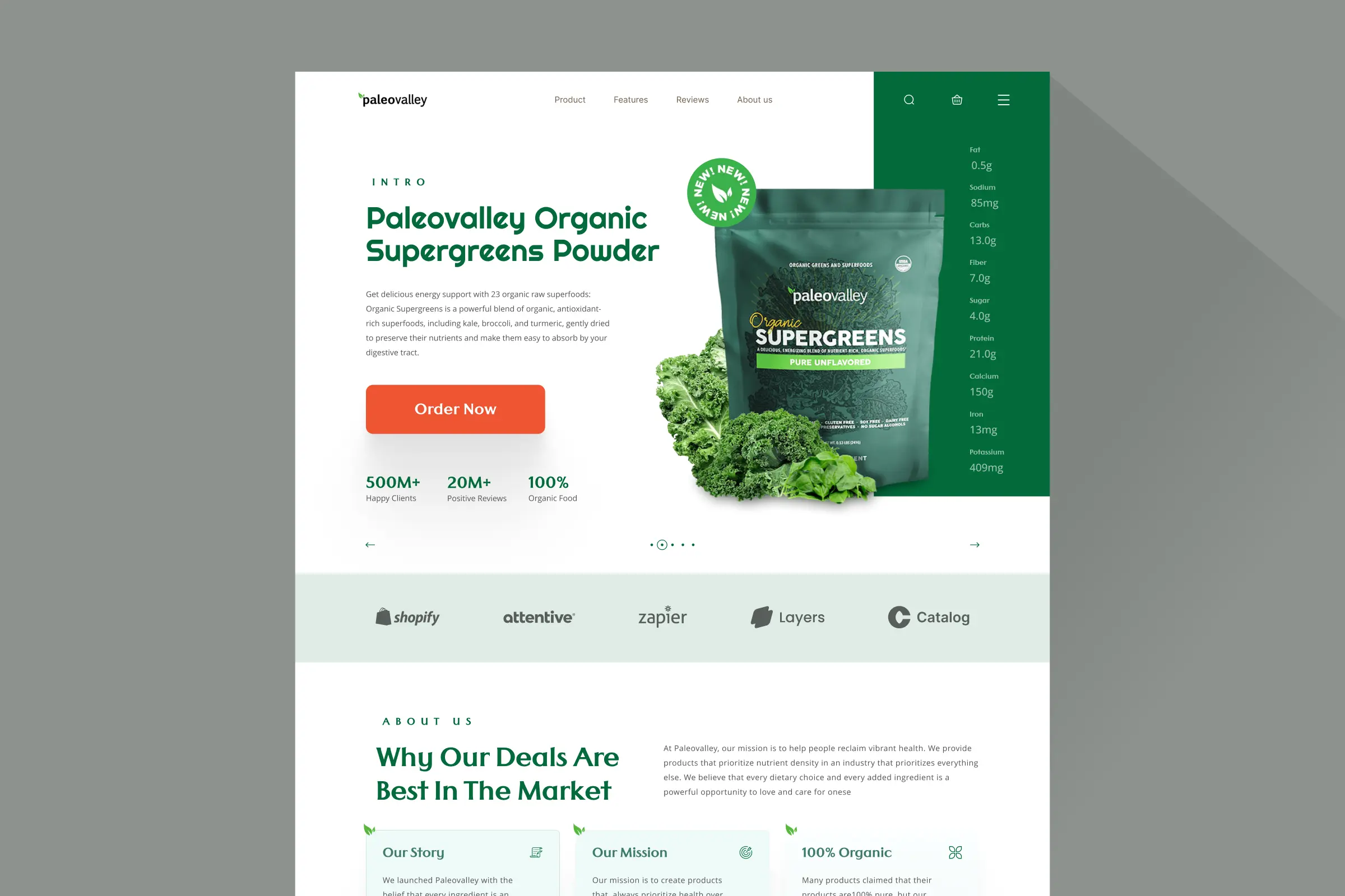
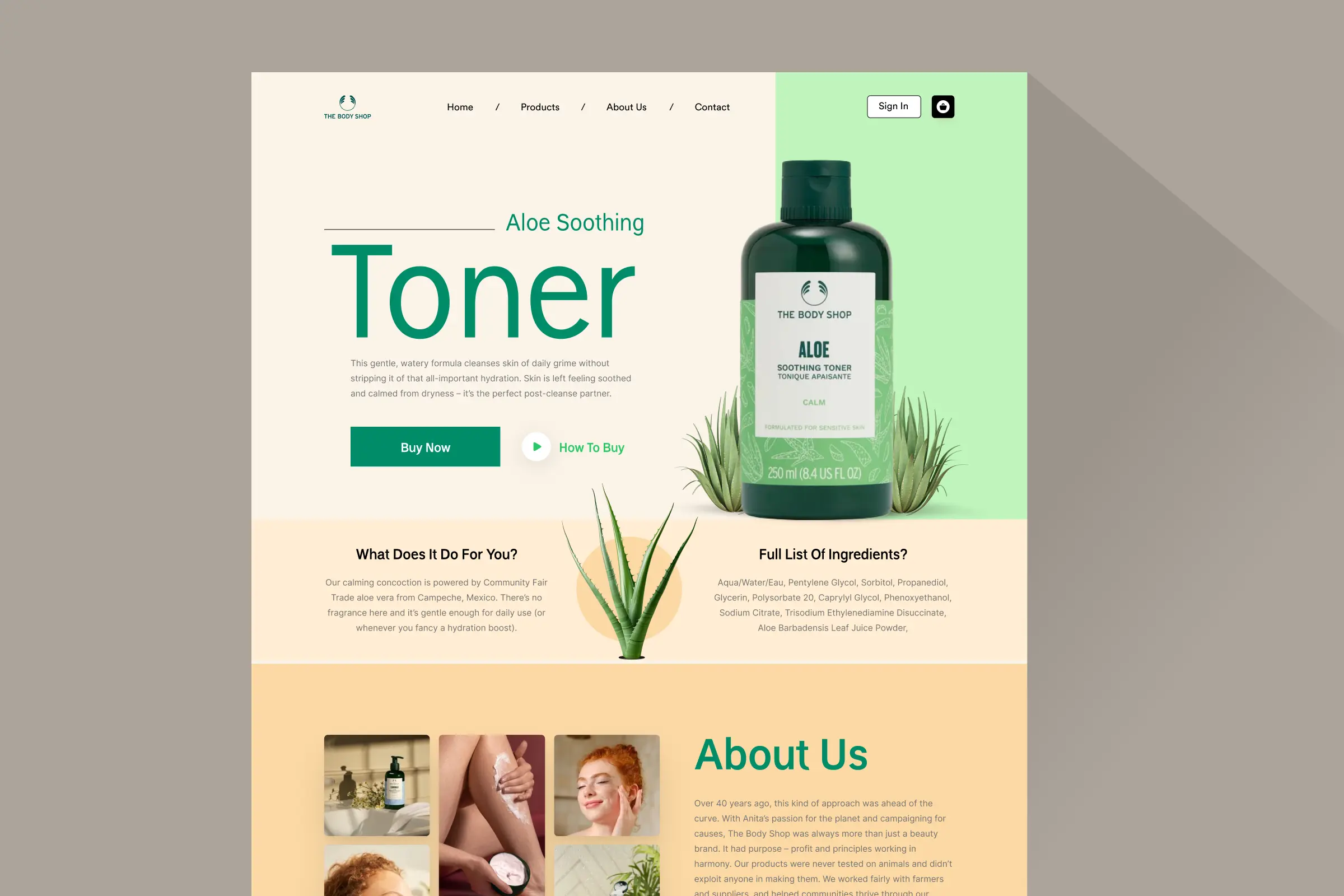
Storefronts we designed and built, across supplements, fragrance, health, wellness and skincare.
All 35 projectsFour engagements, measured before and after. What changed, why it changed, and by how much.
All case studiesDiagnosis, design and development from one studio — so the recommendation and the build never disagree.
All five services192 real Shopify stores torn down page by page, scored, and shown beside the version we would build. Free to watch.
Browse all teardownsConversion-first Shopify themes, each built for one industry’s buying journey. No required apps, no monthly theme fee, one licence per store.
See all themes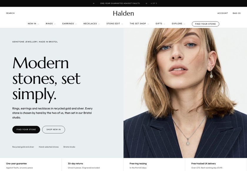 Halden
Jewelry & Accessories
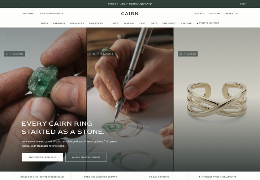 Cairn
Jewelry & Accessories
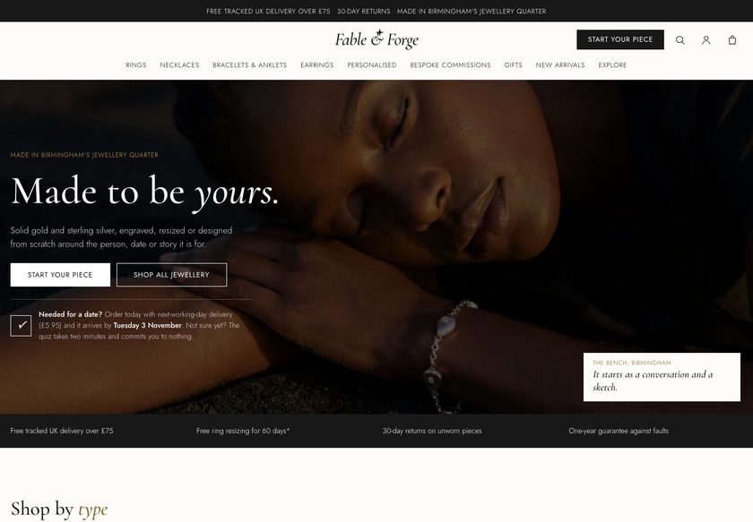 Fable & Forge
Jewelry & Accessories
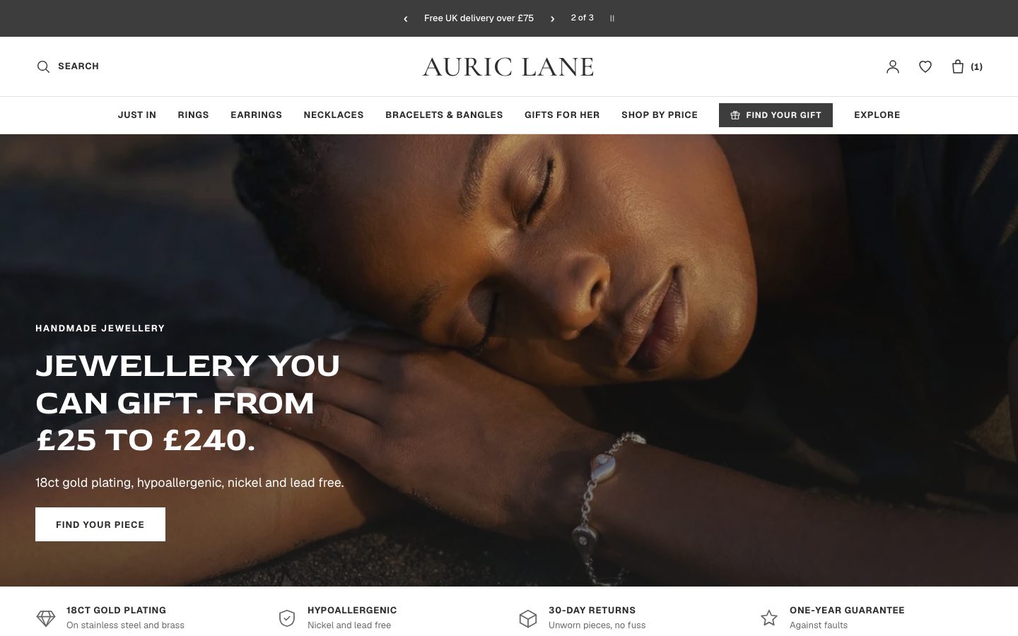 Auric Lane
Jewelry & Accessories
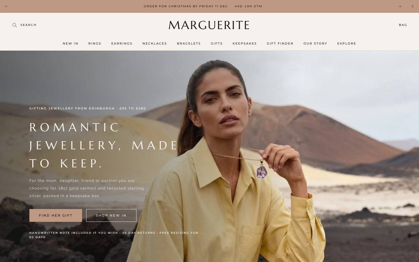 Marguerite
Jewelry & Accessories
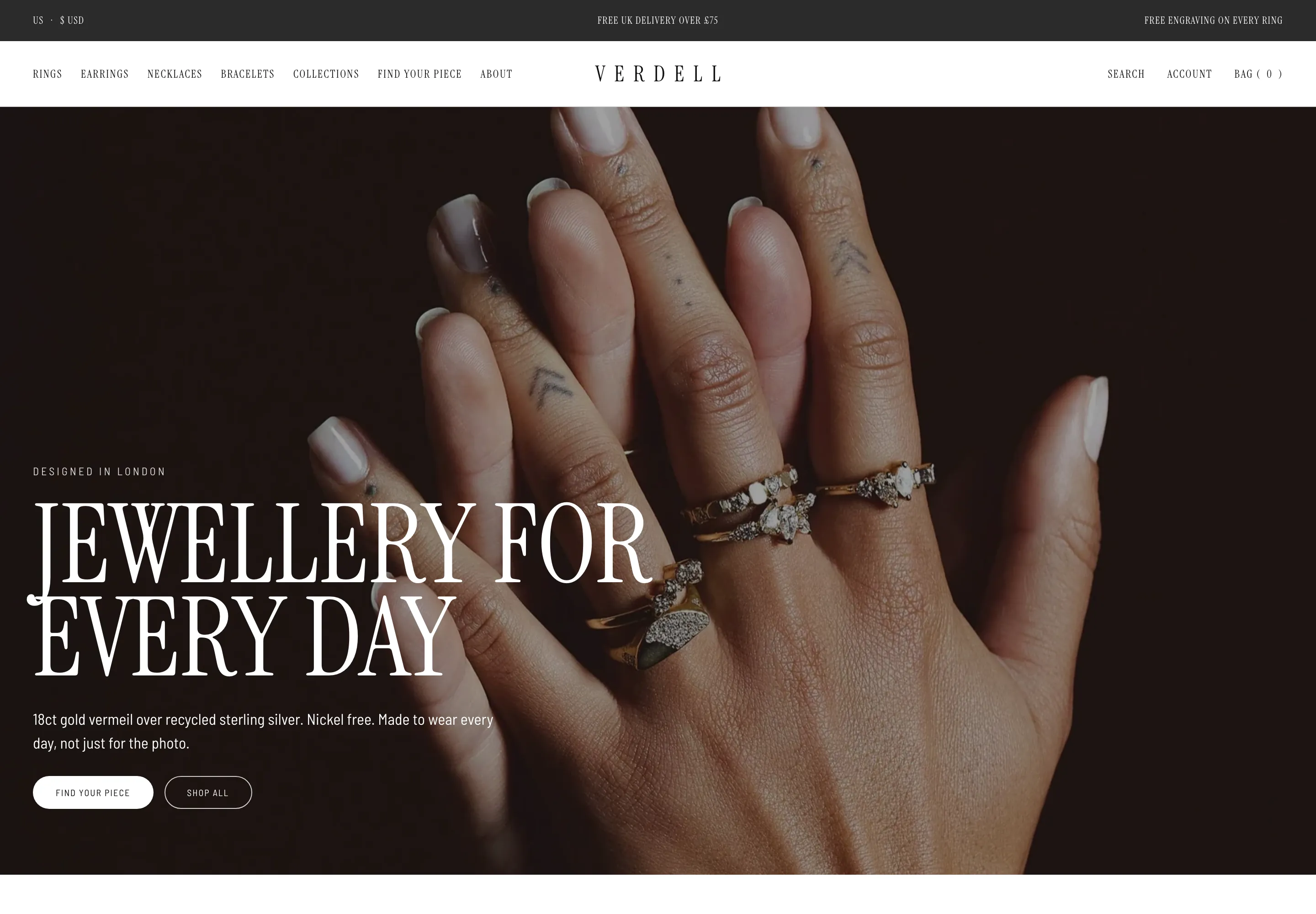 Verdell
Jewelry & Accessories
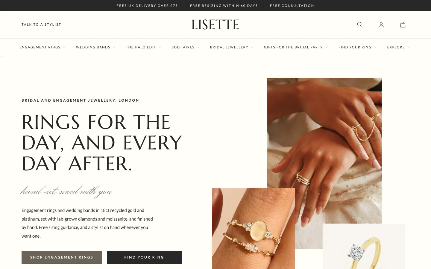 Lisette
Jewelry & Accessories
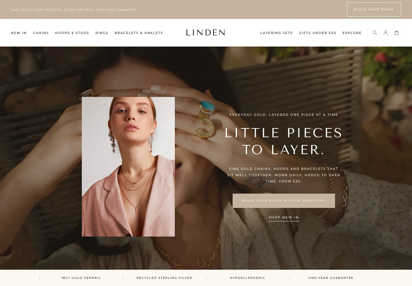 Linden
Jewelry & Accessories
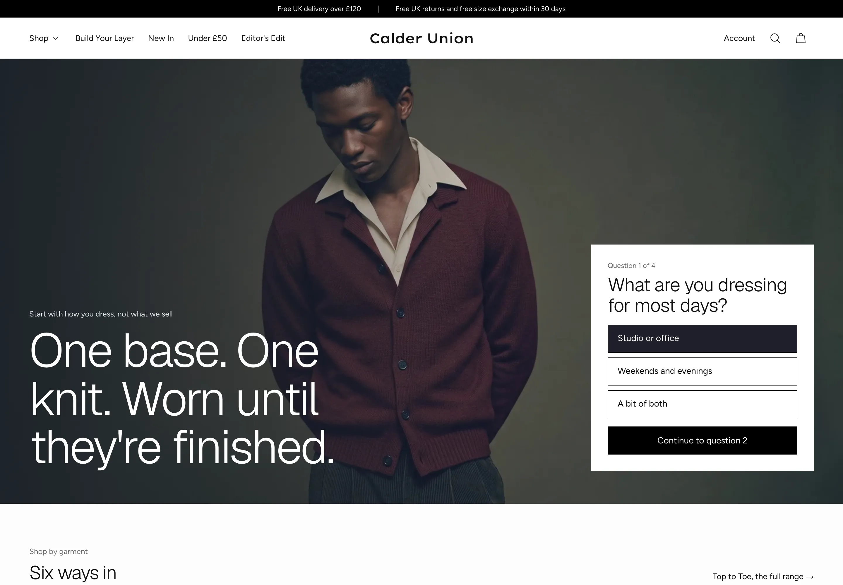 Calder Union
Clothing & Apparel
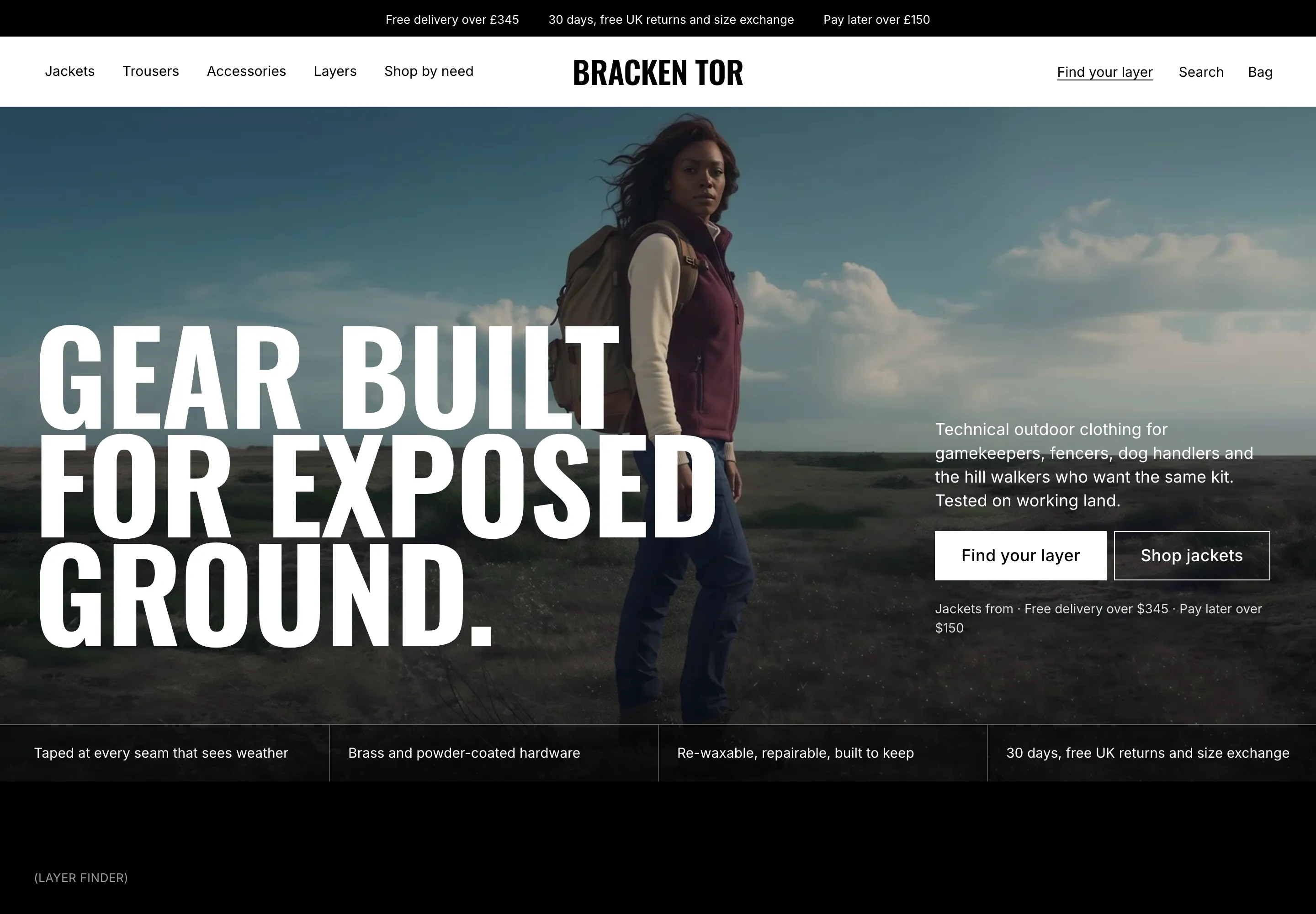 Bracken Tor
Clothing & Apparel
 Fellward
Clothing & Apparel
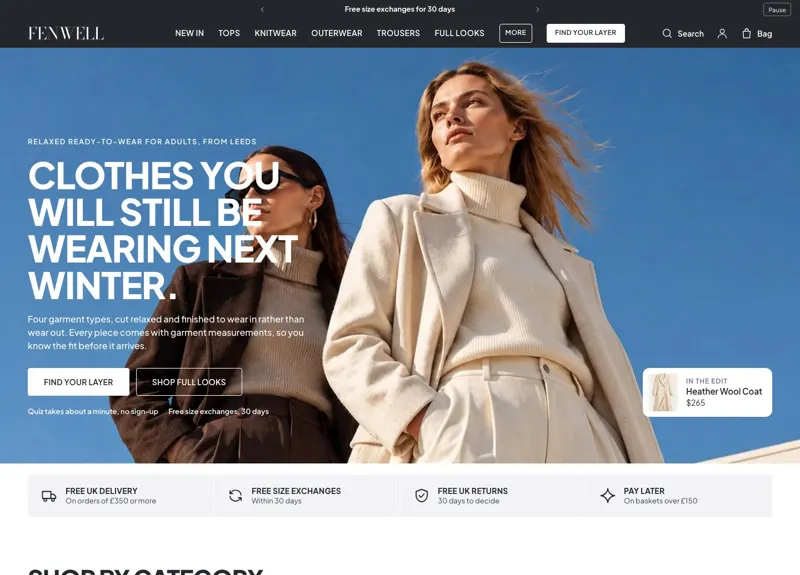 Fenwell
Clothing & Apparel
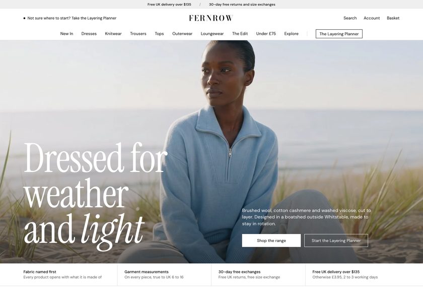 Fernrow
Clothing & Apparel
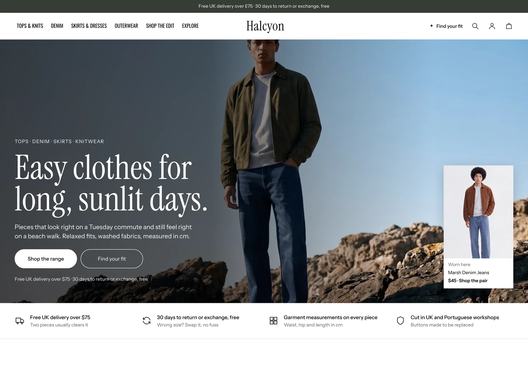 Halcyon
Clothing & Apparel
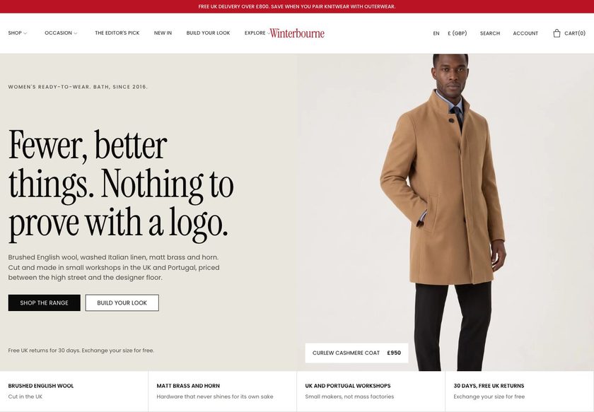 Winterbourne
Clothing & Apparel
 Scarp
Clothing & Apparel
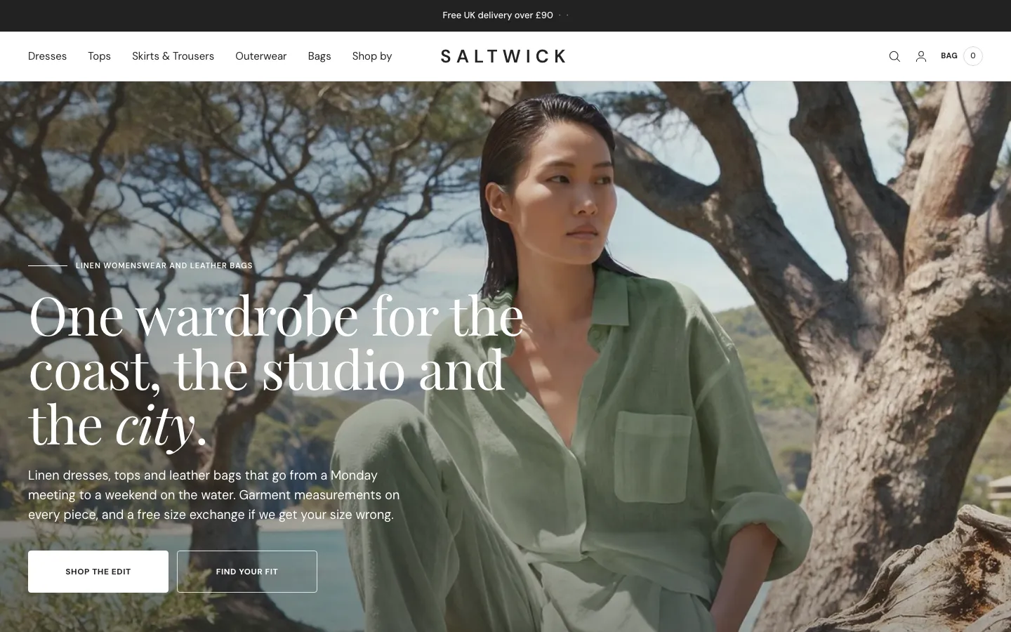 Saltwick
Clothing & Apparel
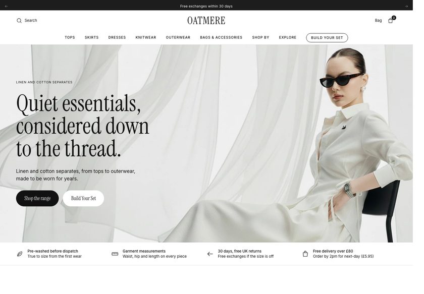 Oatmere
Clothing & Apparel
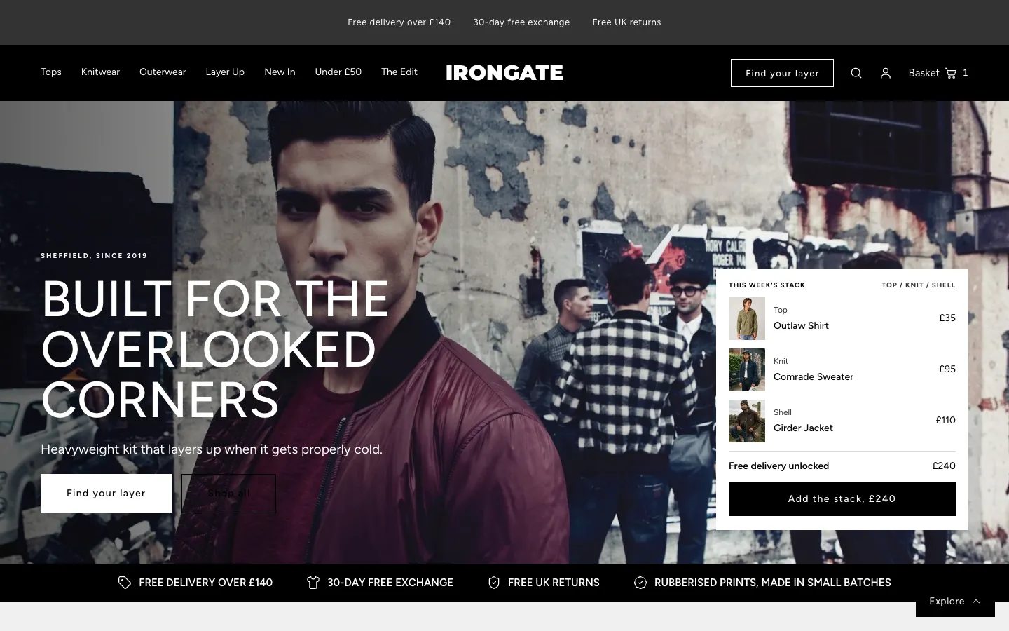 Irongate
Clothing & Apparel
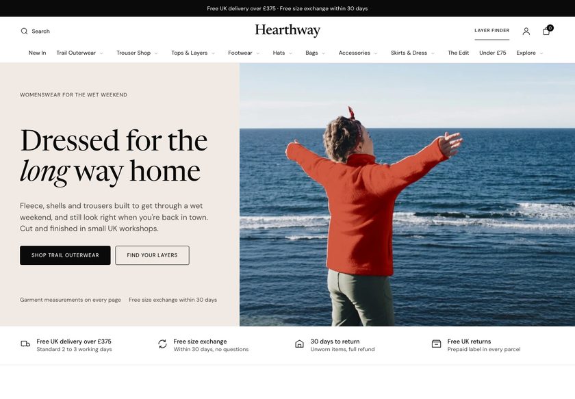 Hearthway
Clothing & Apparel
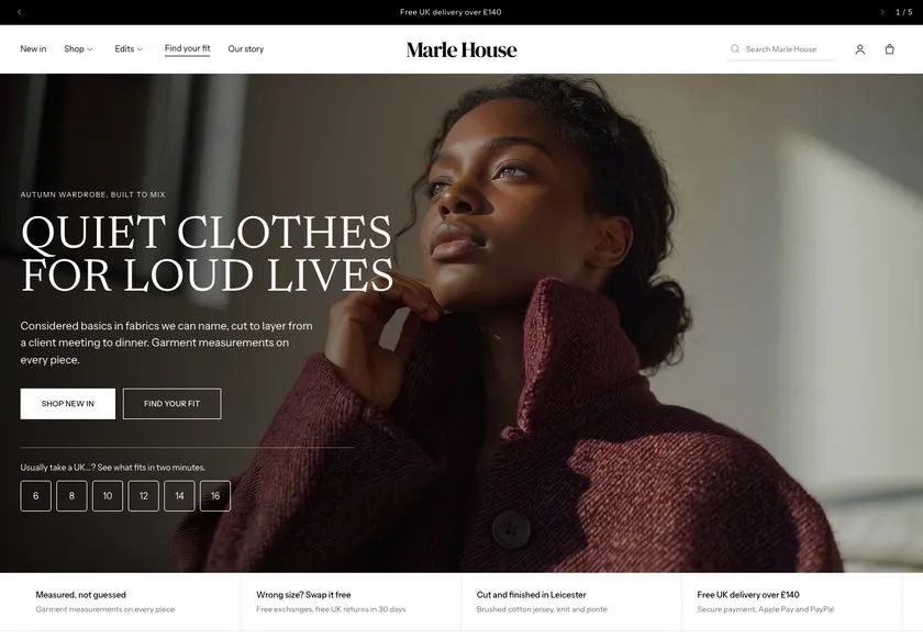 Marle House
Clothing & Apparel
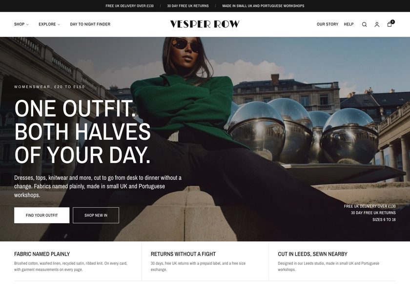 Vesper Row
Clothing & Apparel
A teardown of the Gemini Lulu homepage, collection page and product page, with a clickable redesign concept that adds guided buying paths, richer product cards and trust signals where shoppers decide.
Pressing play loads the video from YouTube — you can allow it for every teardown under cookie preferences.
Gemini Lulu has a wide jewelry range covering pearls, gold plated pieces, sterling silver, gemstones and numerology stones, and it is already building a gifting angle, which most jewelry stores skip. Reviews exist on the homepage, so the store knows social proof matters. The products are not the weak point. The raw material for a store that sells is already on the site.
The core problem is the presentation layer. A first time visitor cannot tell within a few seconds what the store does, who it is for or whether other people trust it, because the hero does not say. The navigation is long but does not show what sits inside each menu, and the shop feed offers images and slogans rather than paths into the range.
The same gap repeats lower down. The collection page is a grid of images, names and prices with little sorting, filtering or best seller cues, so shoppers open product after product to find sizing and material. The product page starts with an empty review block, then gives a name and price with no delivery time, no returns answer and no reason for the price.
The direction is to make the site work like a person on the shop floor. Ask who the piece is for, show the right collection, answer delivery and returns early, explain the materials behind the price, and offer a matching ring or bundle at the point of choice. Build confidence first, and the traffic already arriving does more work.
PLACEHOLDER
The pages show jewelry but do not guide the buyer. The hero does not say who the store is for, the collection page works as a catalog, and the product page opens with an empty review block and little else.
Gemini Lulu can act like a helpful shop assistant: guided paths by type, recipient and budget, cards that answer questions, a product page that handles delivery, returns and price, and bundles that lift order value.
More visitors reach a piece they trust, fewer leave to hunt for answers, and bundles plus a free delivery threshold lift order value. The gains come from the traffic the store already receives.
Five dimensions, each scored out of ten.
12 issues found, 16 fixes proposed.
On landing, a visitor cannot tell what the business sells, who it is for or whether people trust it. Those three answers are needed in the first few seconds, and the hero section does not give them.
Reviews do appear on the homepage, which is a good sign, but they are not placed where buyers expect to find them. Delivery, checkout and returns reassurance is also missing from the first screen.
The menu is long and everything is listed, but it does not show what sits inside each item. Hovering gives no sense of how many paths exist or which one suits a shopper's goal.
There is no way to explore by occasion, recipient, material or budget from the homepage. A shopper who is unsure what to buy has no route except scrolling or guessing at a menu item.
The shop section shows pictures and slogans about special women deserving jewelry. It does not reveal which collections exist, how many there are or which situation each one suits.
The page lists images, names and prices but never says what to buy. Sorting and filtering are thin, and there are few cues for best sellers or customer favorites to help shoppers choose.
To learn sizing, description or material, shoppers must open each product, even from the first row. Some details are present on the cards, but not enough to compare pieces at a glance.
The product page leads with a review block that has no reviews. A first time visitor from an ad or social post looks for other people's experience first, and finds none.
Beyond name and price, nothing says when the order will arrive, how delivery is charged, what checkout costs or what happens if something goes wrong. Returns are left unanswered.
Nothing explains why the piece costs what it does. Fresh pearls, gold plating, sterling silver and gemstones are not described, so a shopper may compare with cheaper marketplace listings and leave.
A sale of up to 70% off is shown with no reason behind it. A discount with no purpose teaches shoppers to expect markdowns and gives the store nothing in return.
The store makes no attempt to grow the basket. There are no pairing suggestions, no free delivery or discount threshold and no bundles, though jewelry sets and matching pieces suit them well.
State what the store sells, who it is for and why it can be trusted, in the first screen. Add two clear buttons, one for gifts and one for finding a piece.
Place delivery time, returns, secure checkout and gift ready packaging directly beneath the hero. Shoppers should see these answers before they scroll, not after they open a product.
Group the shop menu by type, material and price, and gifting by recipient and occasion. Show these groups on hover so shoppers see how many paths exist and pick the right one.
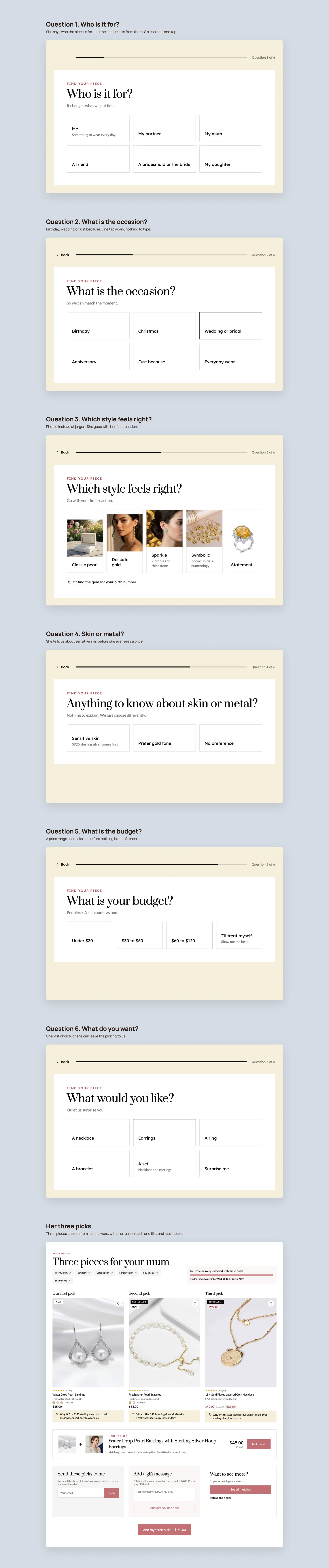
Ask who the piece is for, the occasion, the style, skin sensitivity, budget and jewelry type, then recommend products. It mirrors a salesperson asking how they can help, and it can also serve ads.
Replace image only tiles with labeled paths by category, recipient and occasion. Each tile should say what the collection holds and when to choose it.
Introduce best sellers once the visitor knows what the store does and has seen guided paths. Use badges for best seller, customer favorite and new, with ratings on every card.
Add filters for type, material, tone, finish and price, plus quick pick tabs. Give each page a clear name, a short summary and a link to the finder.
Show badge, rating, a short description, available colors and any discount on every card. Shoppers should be able to compare rings or necklaces without opening each page.
Where a product has no reviews, borrow reviews from other pieces and label them as store reviews. Place them near the price on every product page.
Show the arrival date, delivery cost, returns policy, finish guarantee and secure payment close to the add to cart button, so doubt is removed at the moment of decision.
Add a short section on fresh pearls, 18K gold plating, 925 sterling silver and gemstones. Explain why the piece costs more than marketplace alternatives.
Replace blanket sale messaging with purposeful offers, such as free delivery or a percentage off when a ring is paired with a set above a set order value.
Suggest a matching ring or choker on each product page, offer ready made bridal and gifting bundles, and let shoppers build their own. Show a free delivery progress message.
Let shoppers upload a selfie to see a necklace or earring on themselves. It stands in for the try on a salesperson would offer in a physical store.
Offer a gift message and a card on the product page, and add a find my stone tool for numerology pieces. Both turn existing gifting ideas into easy actions.
Add questions such as whether a piece suits a wedding or only everyday wear, and show real customer photos. Both help shoppers judge fit and support search visibility.
A concept redesign created by Convertica Studio from this audit. It shows how the store could work, it is not the live store.
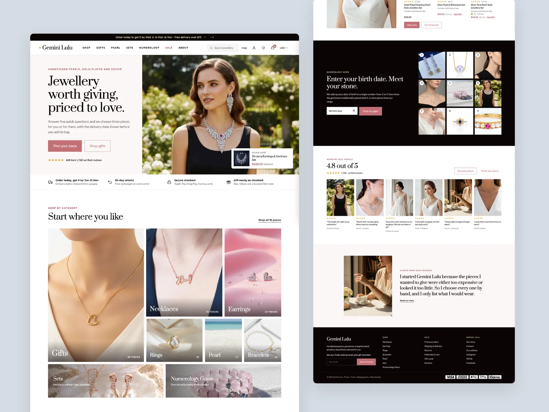
The full page shown as two tall columns, from the opening screen to the footer, with the shop-by-category and gift paths up front.
The homepage in the centre, a product page on the left with its buy column, and a collection page on the right with filters and the first cards.
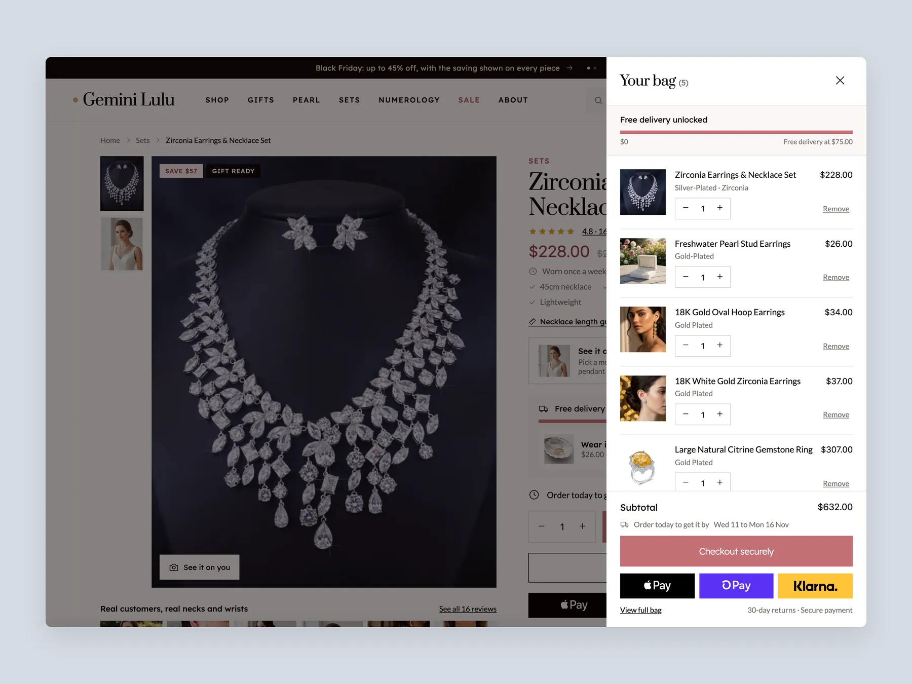
The bag opens over a dimmed product page, so the whole drawer is visible with its lines, free delivery bar and checkout buttons.
Six one-tap questions, from who the piece is for to the budget, ending on three picks with the reason each one fits and a matching set to add.
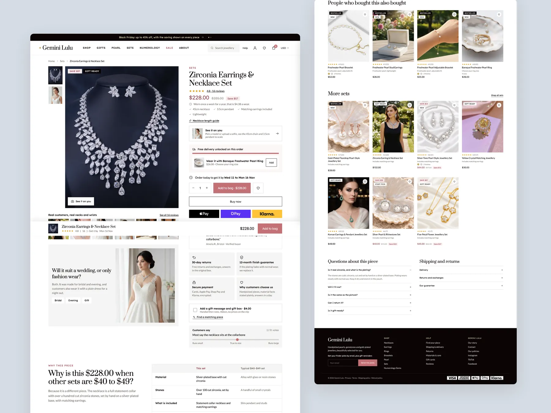
The whole page as two tall columns: the buy box with options and delivery information first, then the details below it, down to the footer.
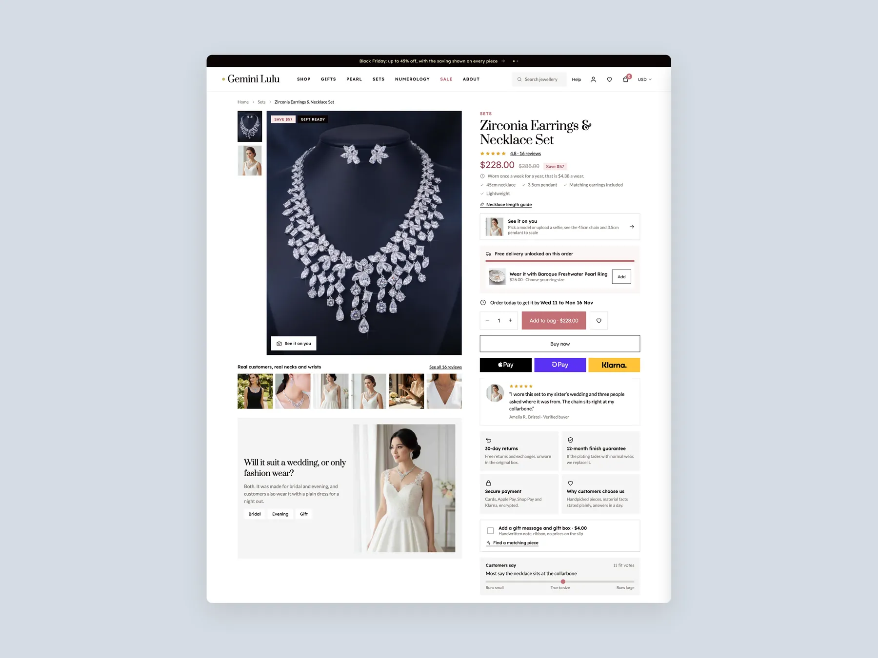
The product page header and the whole buy box on one screen, so the shopper sees photos, options, price and the button together.
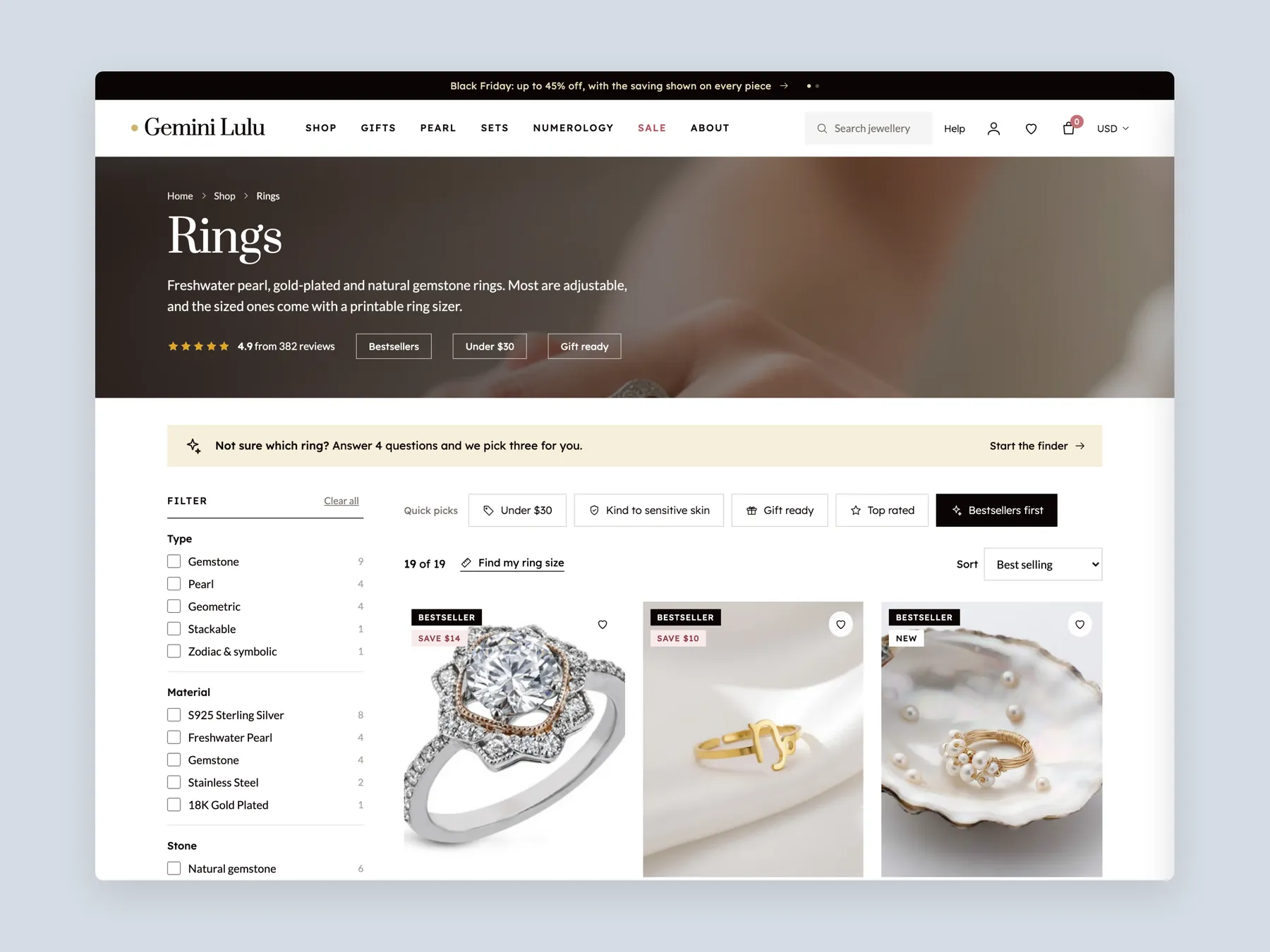
The Rings page with its banner, finder prompt, filter rail, quick picks and the first row of cards.
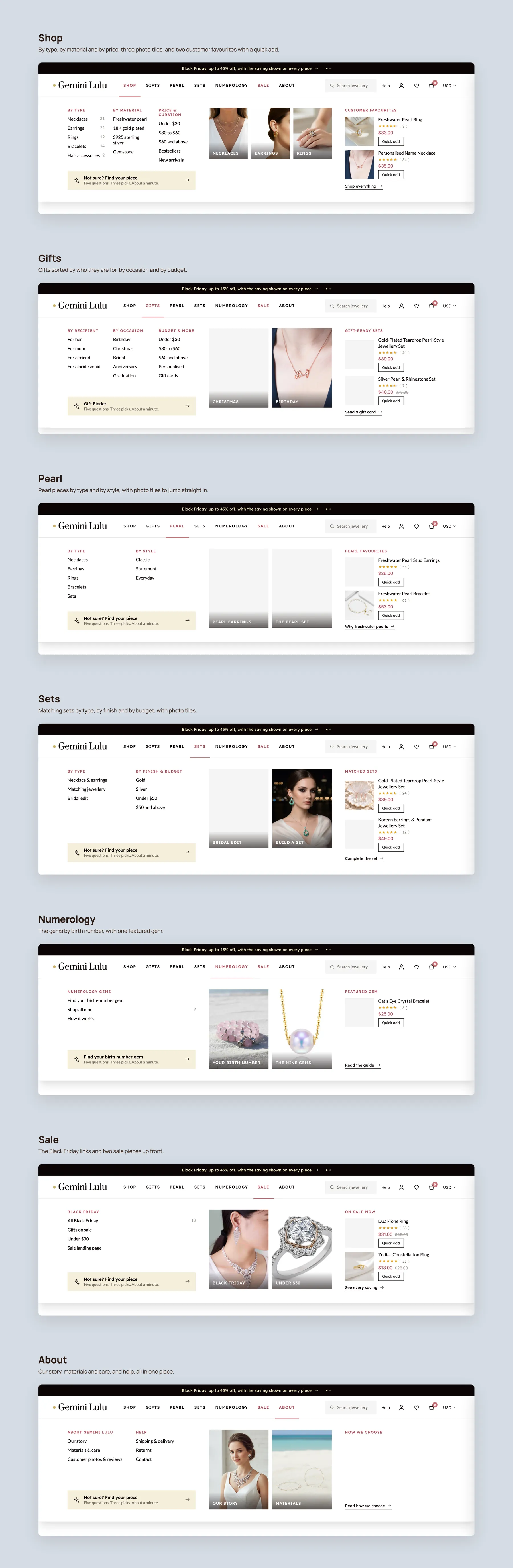
Every menu panel open in nav order: Shop, Gifts, Pearl, Sets, Numerology, Sale and About, each with its columns, photo tiles and featured pieces.
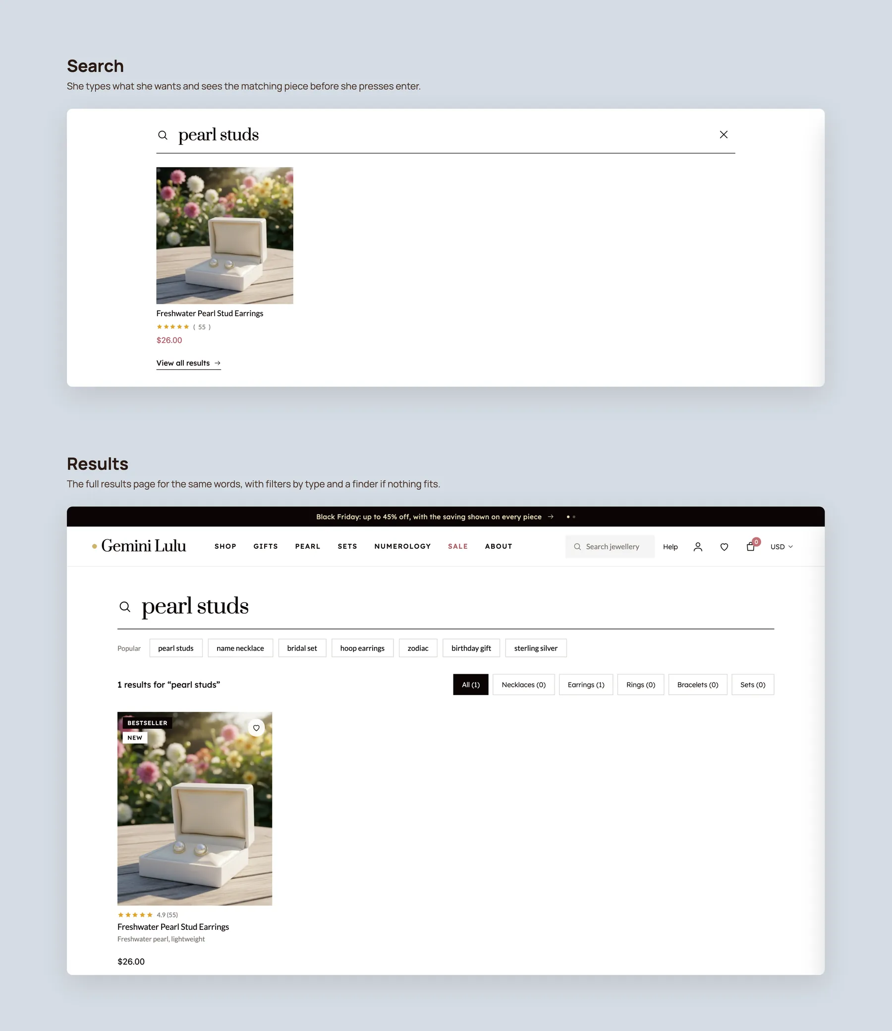
The search bar with a query typed and the matching piece shown at once, then the full results page with filters by type.
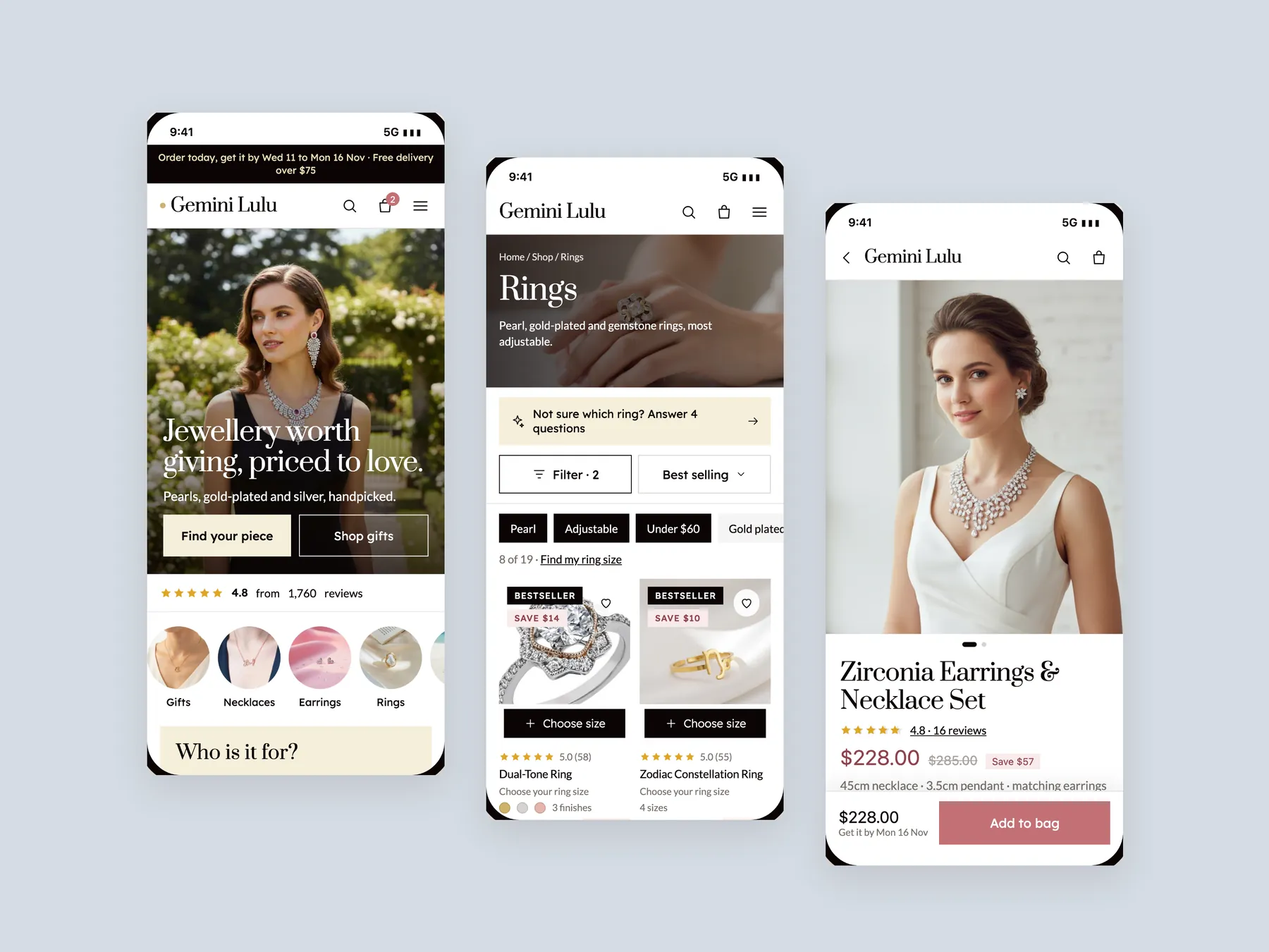
Three phone screens, home, collection and product, staggered left to right, built for the way most jewellery shoppers browse.
The products and range are strong, but the pages do not help visitors feel confident enough to buy. Adding visitors to a site that leaks sales at every step multiplies the leak. Fixing confidence first makes any later traffic worth more.
It should say what the business sells, who it is for and whether people trust it. For Gemini Lulu the hero did not answer any of these, which creates hesitation before the visitor has seen a single piece.
It shows images, names and prices but does not help anyone choose. A better page adds filters, sorting, best seller cues and informative cards so shoppers can compare pieces without opening each one.
A first time visitor from an ad or social post looks for other people's experience before anything else. An empty block signals that nobody has bought. Reusing reviews from other products as store reviews fills that gap honestly.
It should cover arrival time, delivery cost, returns, finish guarantee, materials, sizing and why the piece costs what it does. Gemini Lulu's product page showed only a name and a price.
Not when it has no stated reason. A purposeful offer, such as free delivery or a percentage off when a shopper pairs a ring with a set, protects margin and increases the size of the basket.
Jewelry suits pairing. Suggest a matching ring or choker, offer bundles by occasion, let shoppers build their own set and set a free delivery threshold so adding one more piece feels worthwhile.
It is a short set of questions about who the gift is for, the occasion, style, skin sensitivity, budget and jewelry type. It then recommends products, like a salesperson on a shop floor, and can also be used as an ad destination.
No. It is a clickable prototype built in Figma to show the improvements and the intended experience. It is meant to illustrate the direction before any development begins.
There are three: leave the site as it is, apply the changes yourself, or have the studio do it. The full redesign is 3,500 across 16 to 17 pages in 15 to 17 days. An upgrade of the three reviewed pages starts at 1,200. A prebuilt jewelry theme is 350, or 1,000 with installation.
No. The recording used an illustrative calculator with an assumed 3,000 visitors, a 130 average order value and a 3.4 conversion rate to show the size of the gap. They are not Gemini Lulu's actual numbers.
The audit reviews the homepage, collection page and product page, then walks through a redesign concept and the pricing options. The recording runs 27 minutes, with chapters for each diagnosis, the concept pages and next steps.
Tell us about your store and we'll send a personalized 5-minute video showing exactly where you're losing buyers — and how to win them back.
Takes about 40 seconds. No call required.