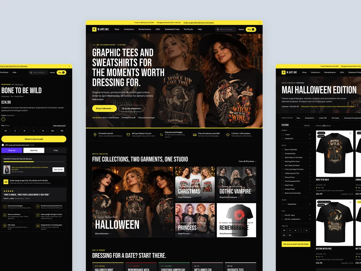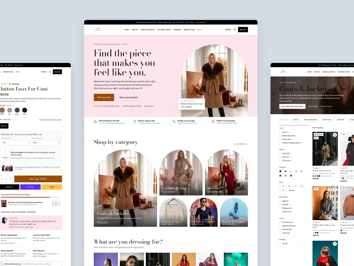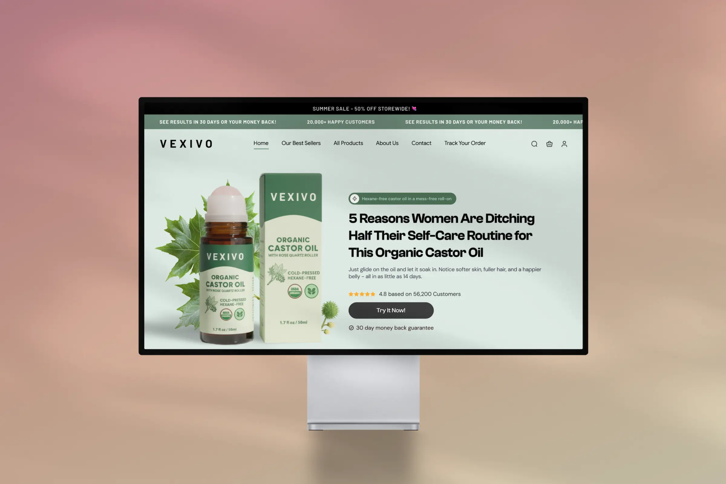
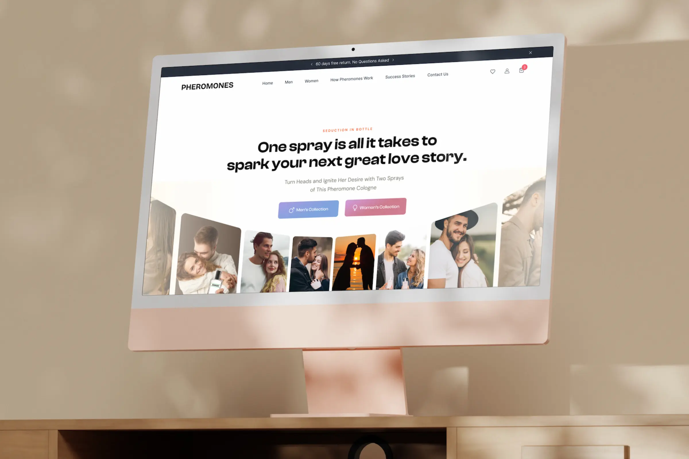
Homepage
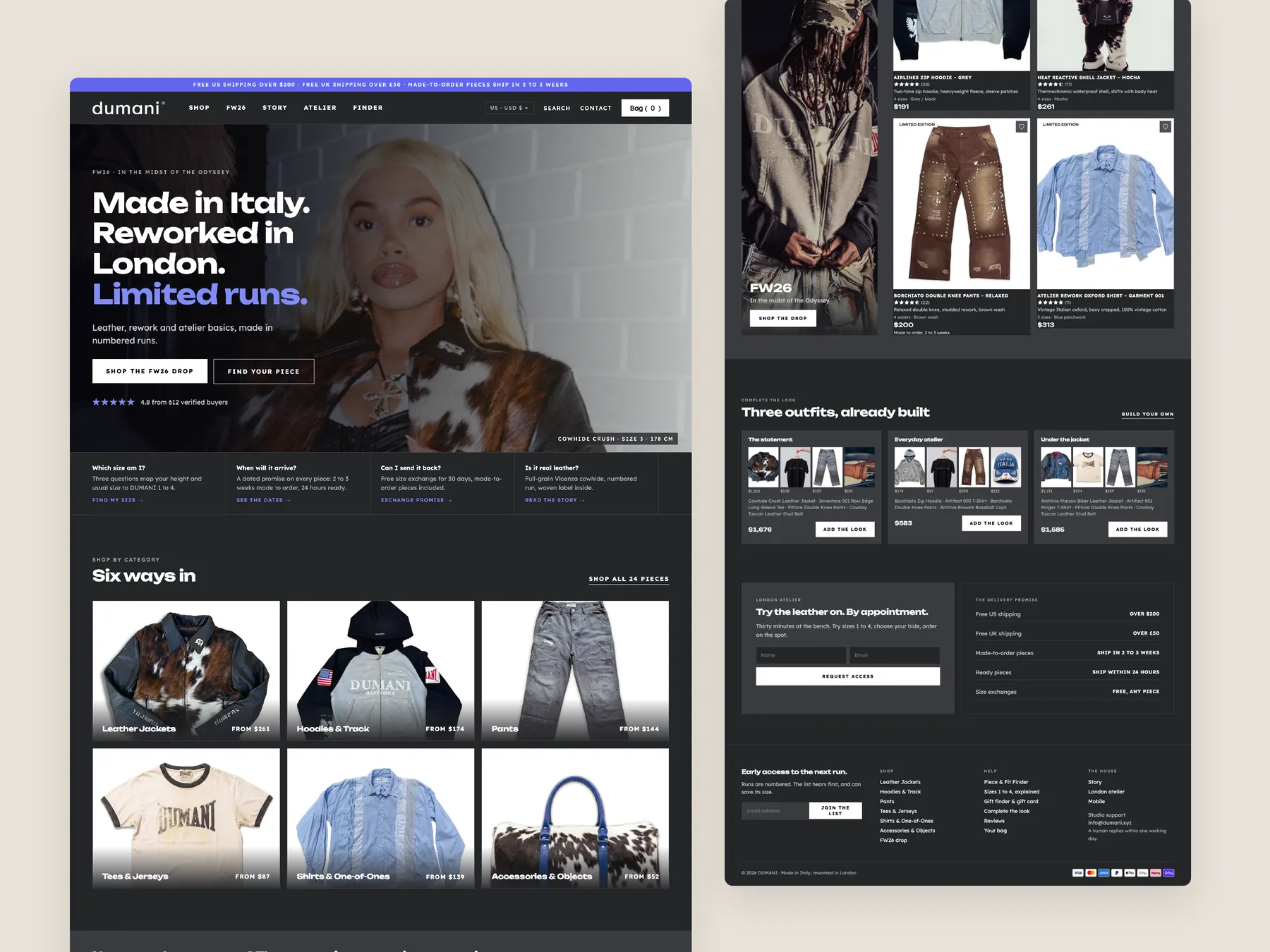
The whole page shown as two tall columns, from the first screen down to the footer, so you can read the order of the sections.
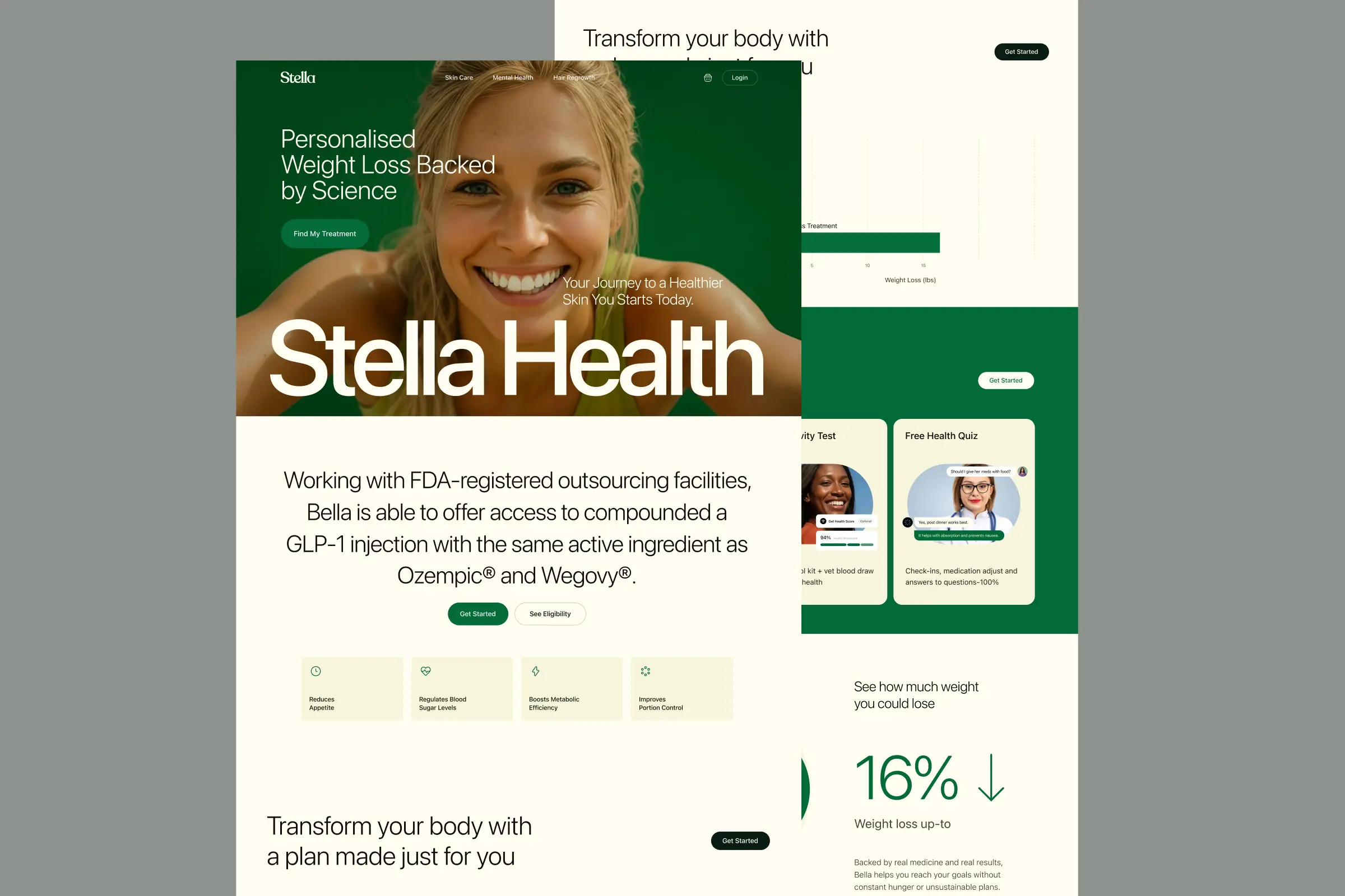
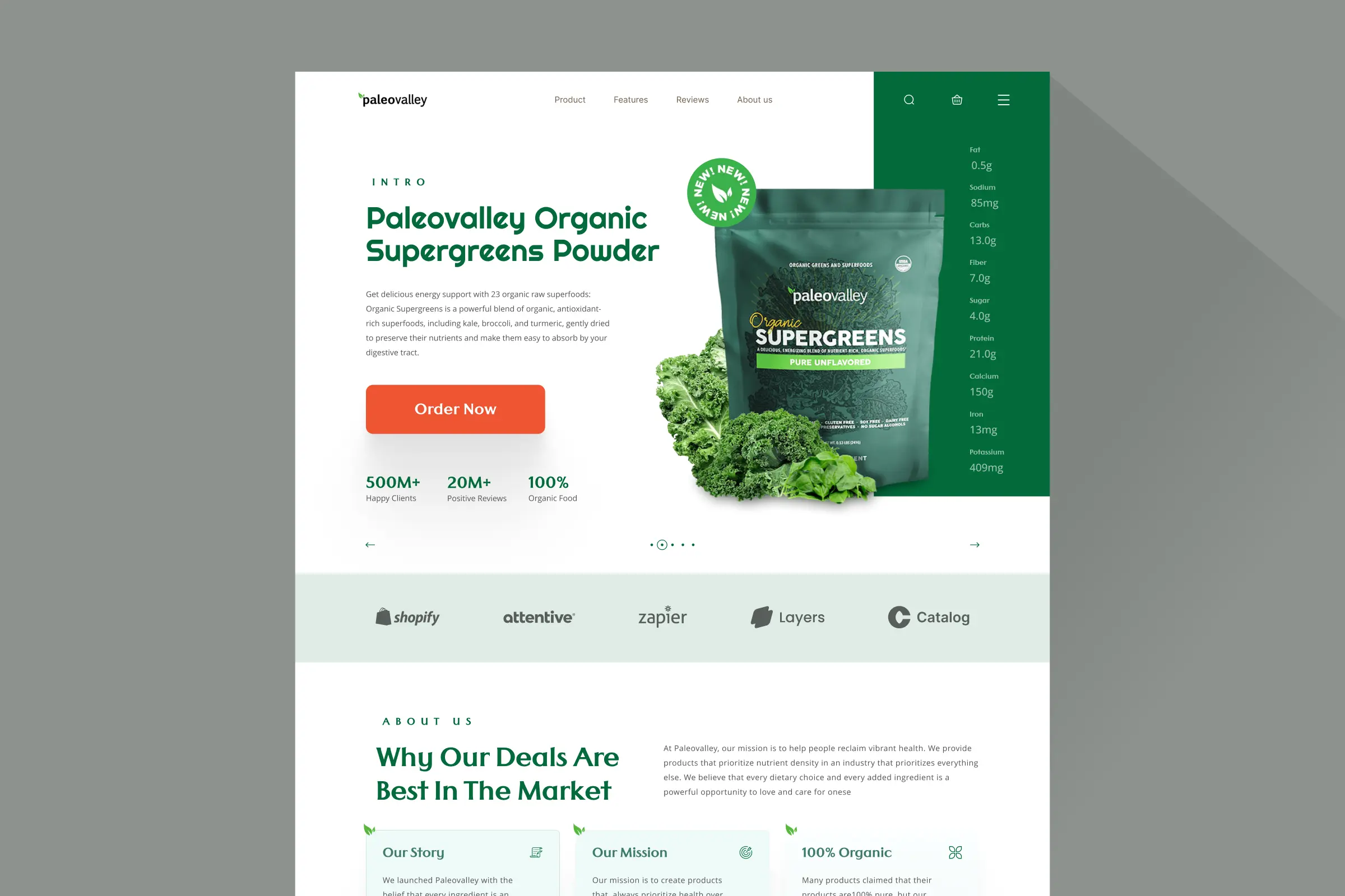
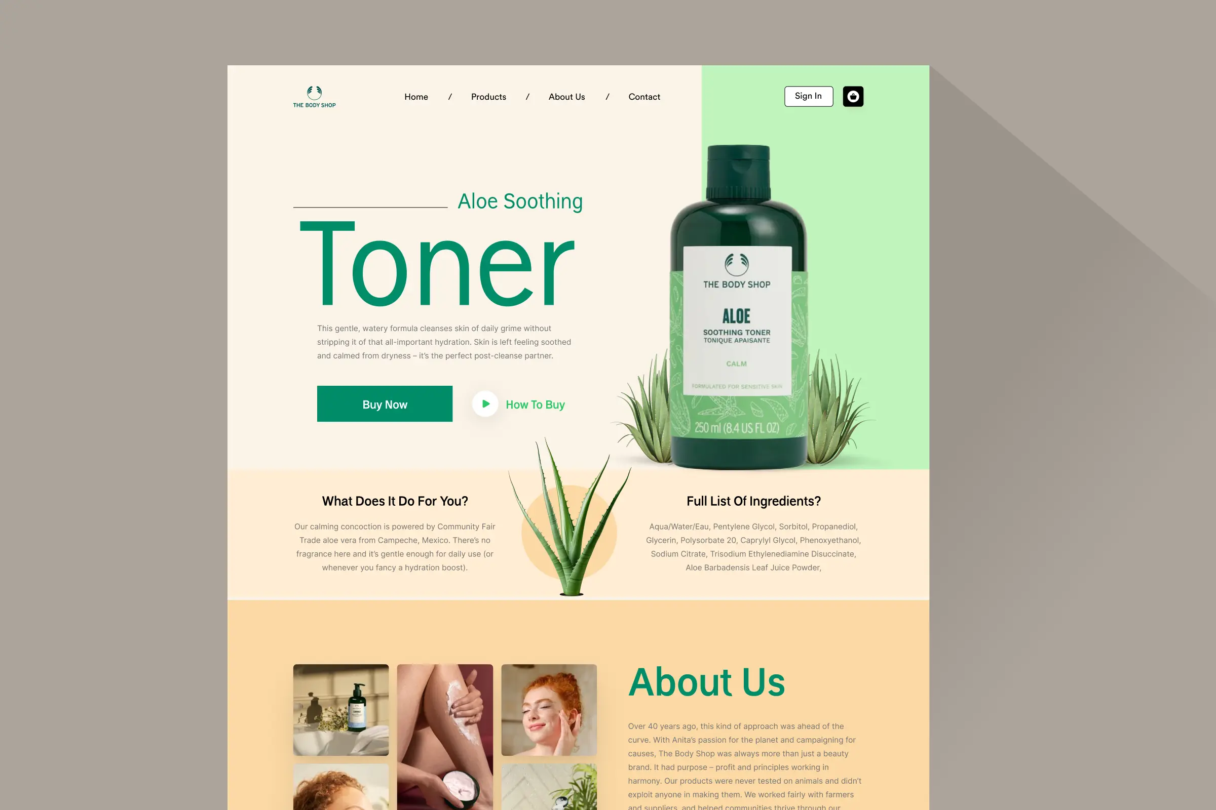
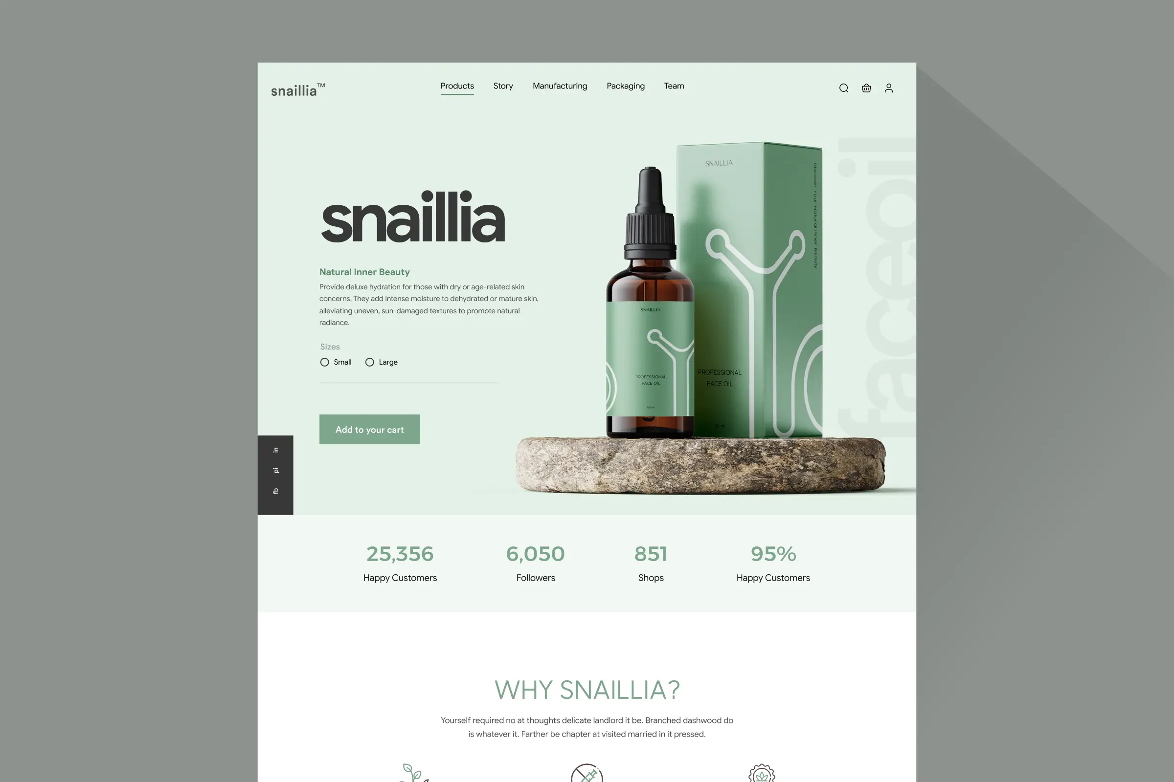
Storefronts we designed and built, across supplements, fragrance, health, wellness and skincare.
All 35 projectsFour engagements, measured before and after. What changed, why it changed, and by how much.
All case studiesDiagnosis, design and development from one studio — so the recommendation and the build never disagree.
All five services192 real Shopify stores torn down page by page, scored, and shown beside the version we would build. Free to watch.
Browse all teardownsConversion-first Shopify themes, each built for one industry’s buying journey. No required apps, no monthly theme fee, one licence per store.
See all themes Halden
Jewelry & Accessories
 Cairn
Jewelry & Accessories
 Fable & Forge
Jewelry & Accessories
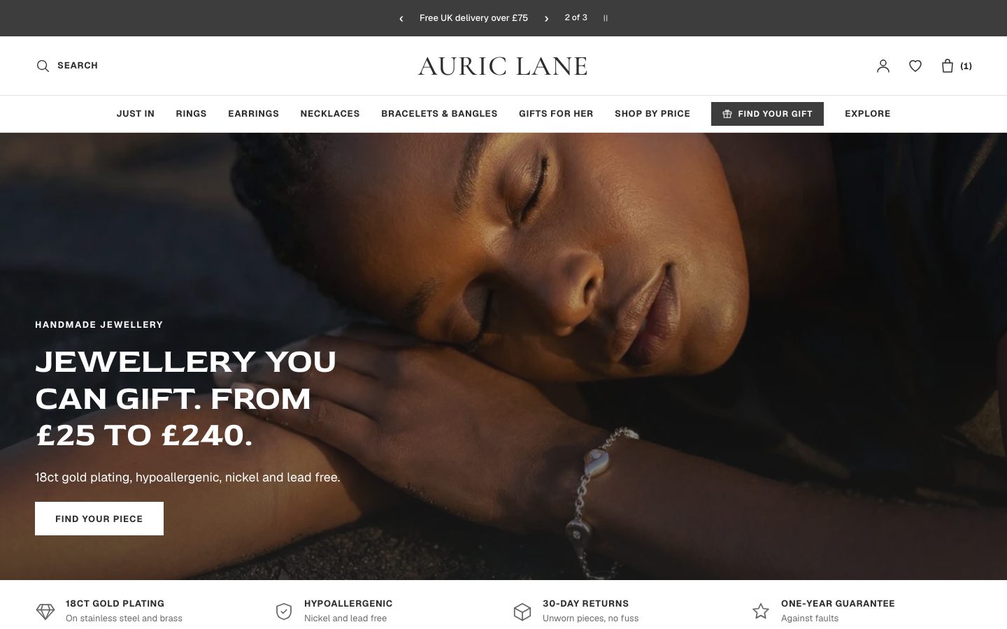 Auric Lane
Jewelry & Accessories
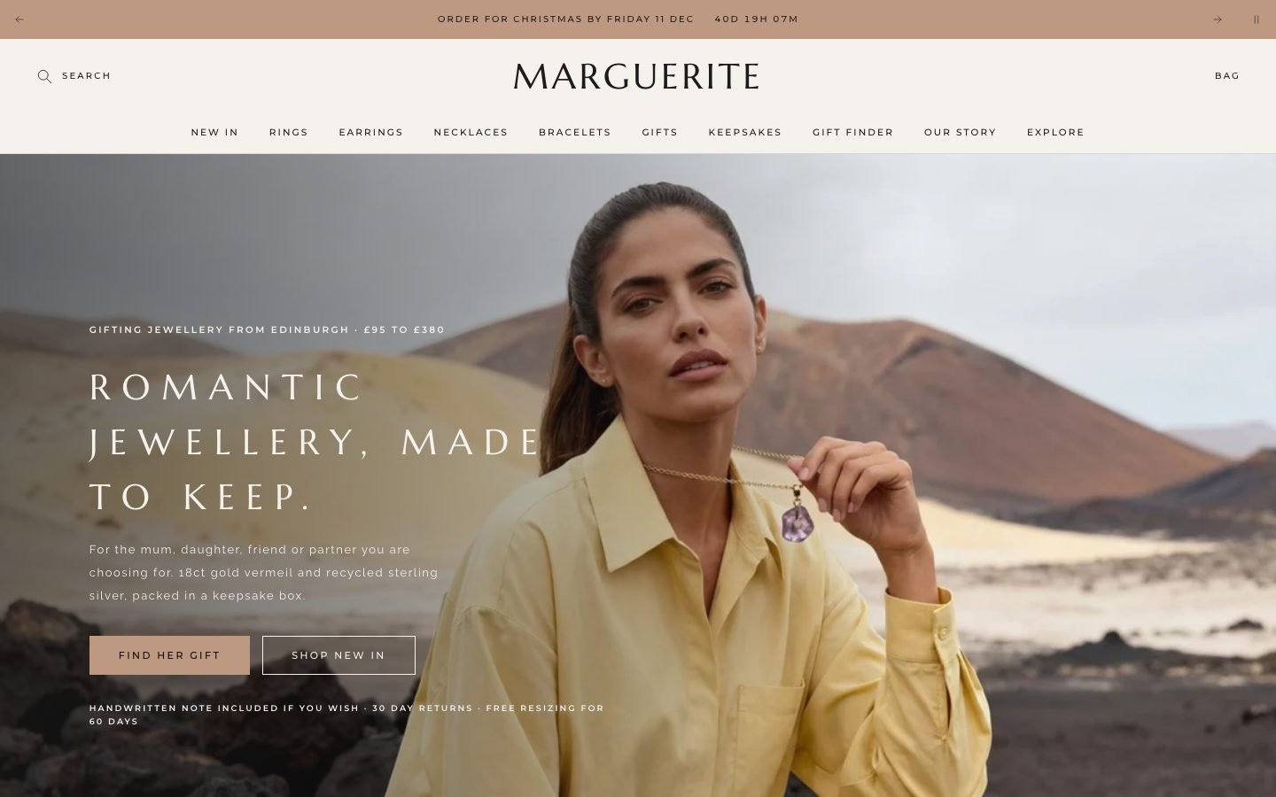 Marguerite
Jewelry & Accessories
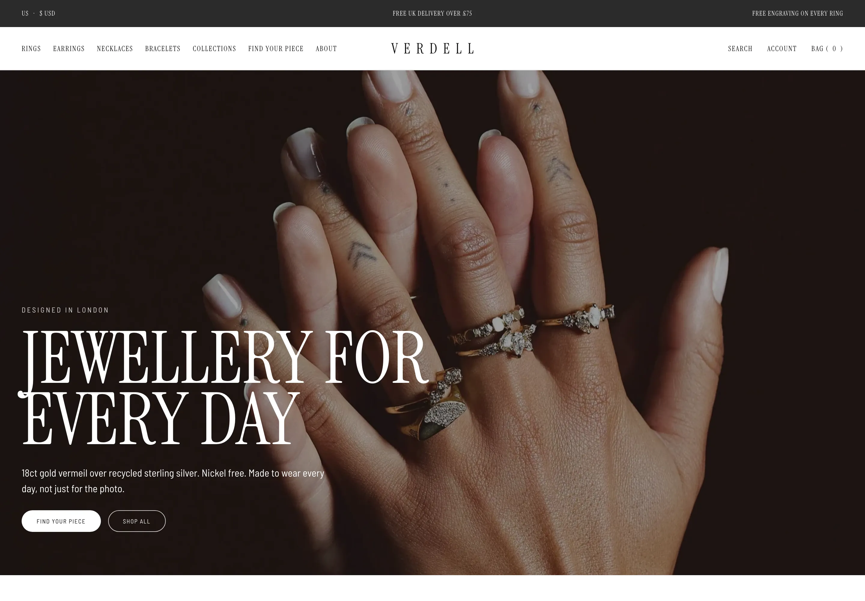 Verdell
Jewelry & Accessories
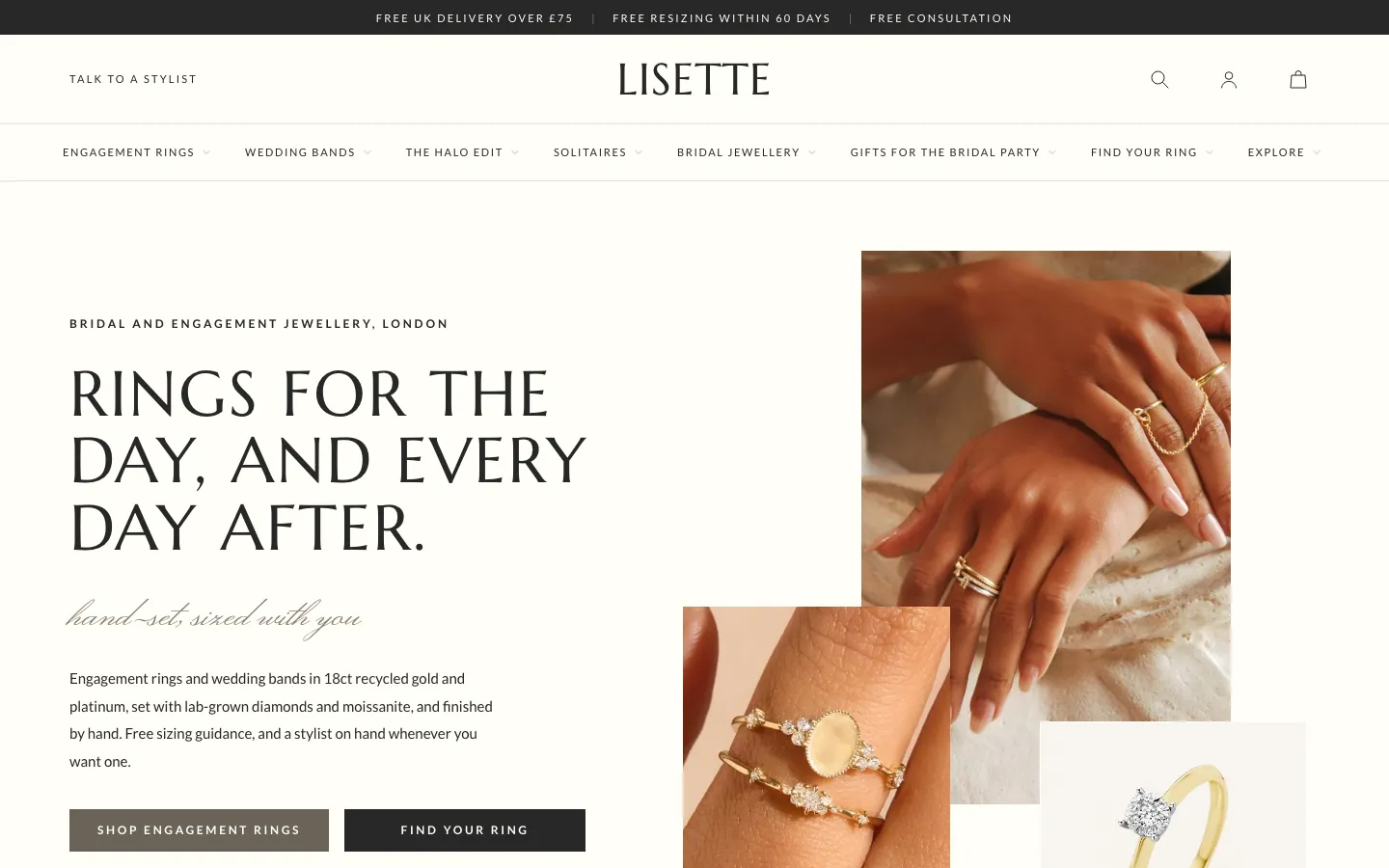 Lisette
Jewelry & Accessories
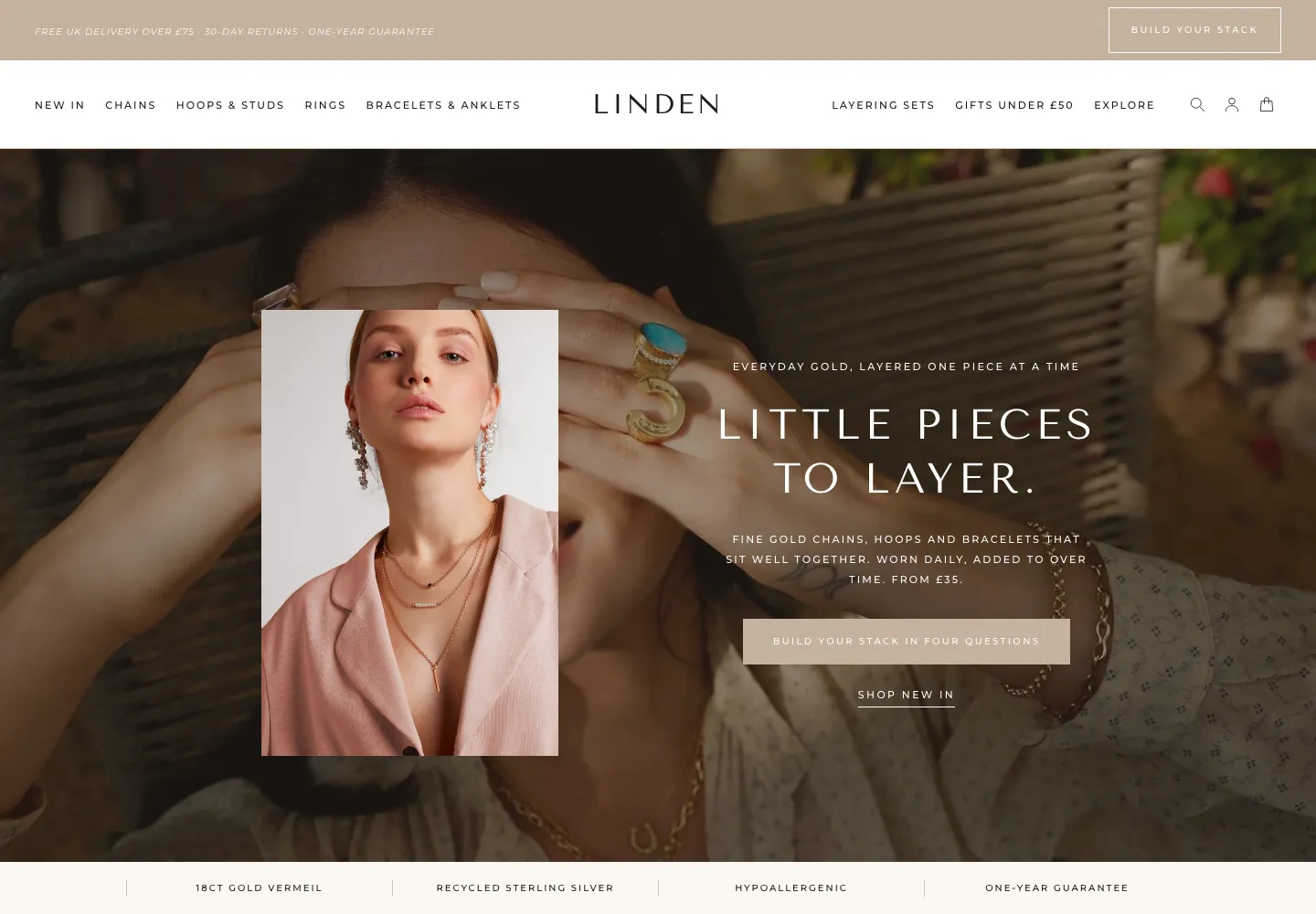 Linden
Jewelry & Accessories
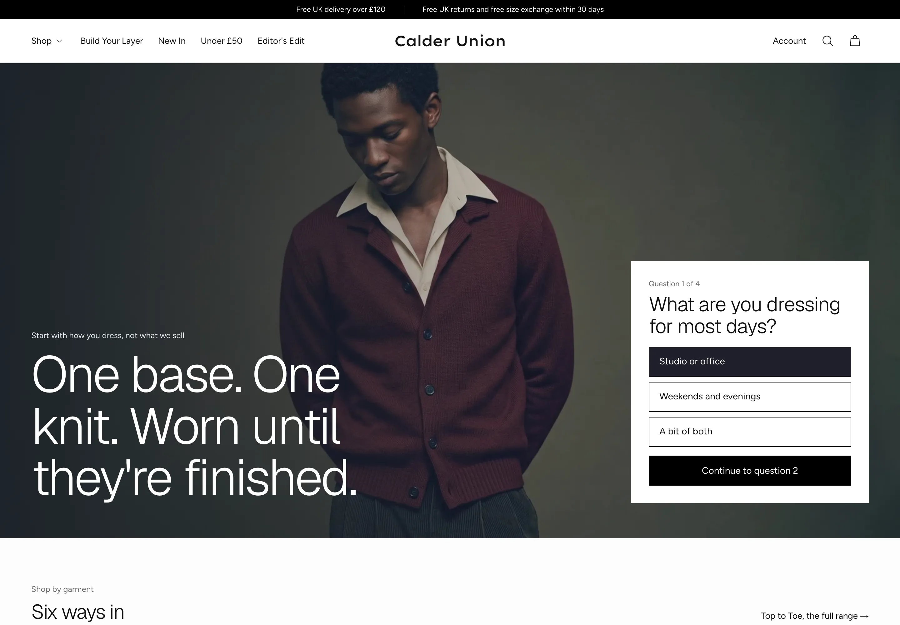 Calder Union
Clothing & Apparel
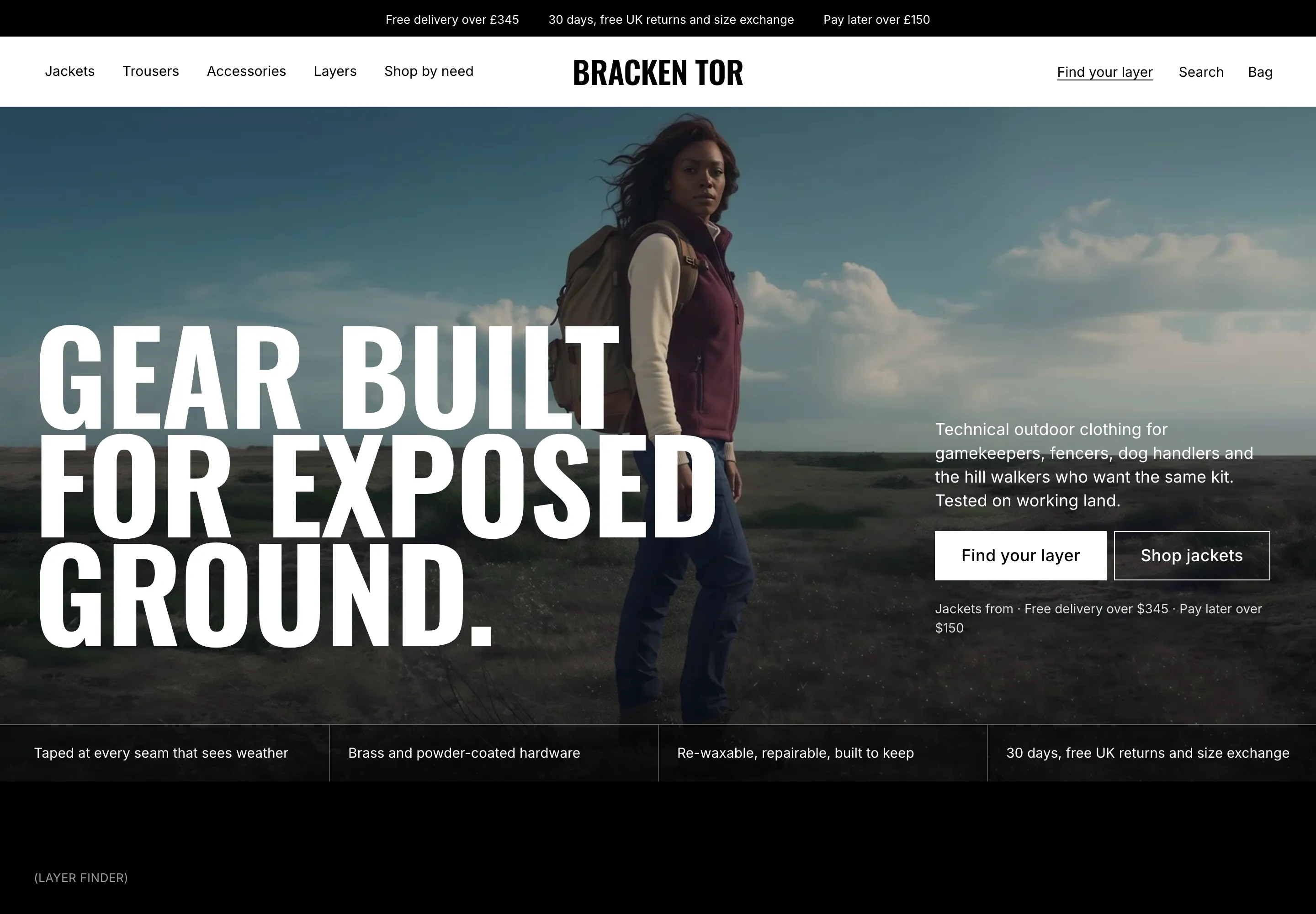 Bracken Tor
Clothing & Apparel
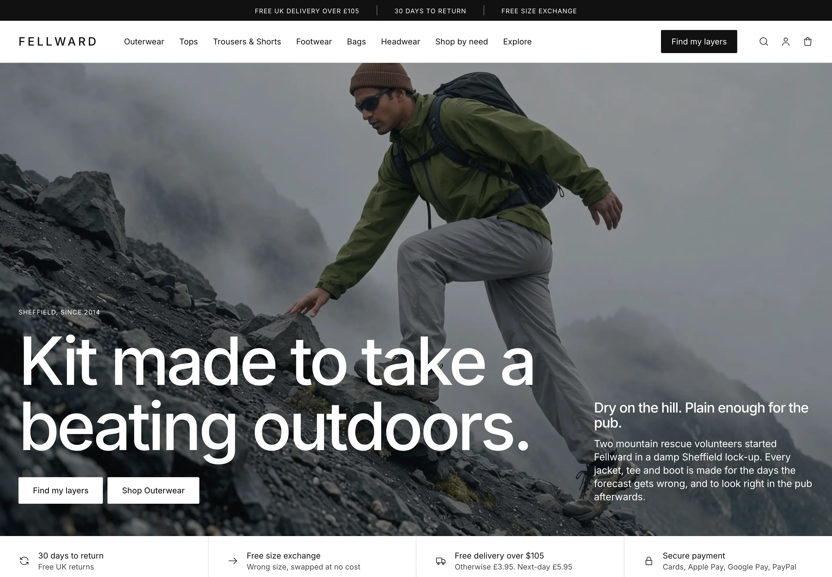 Fellward
Clothing & Apparel
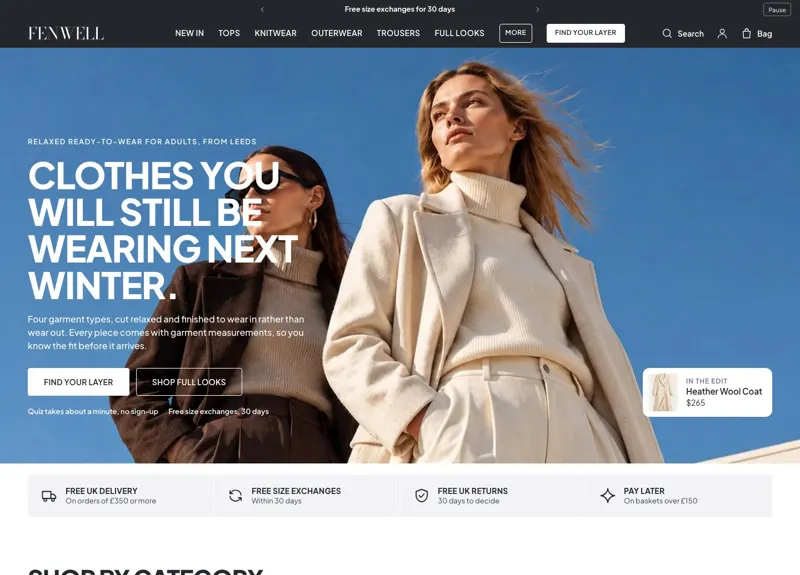 Fenwell
Clothing & Apparel
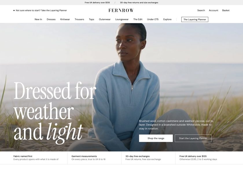 Fernrow
Clothing & Apparel
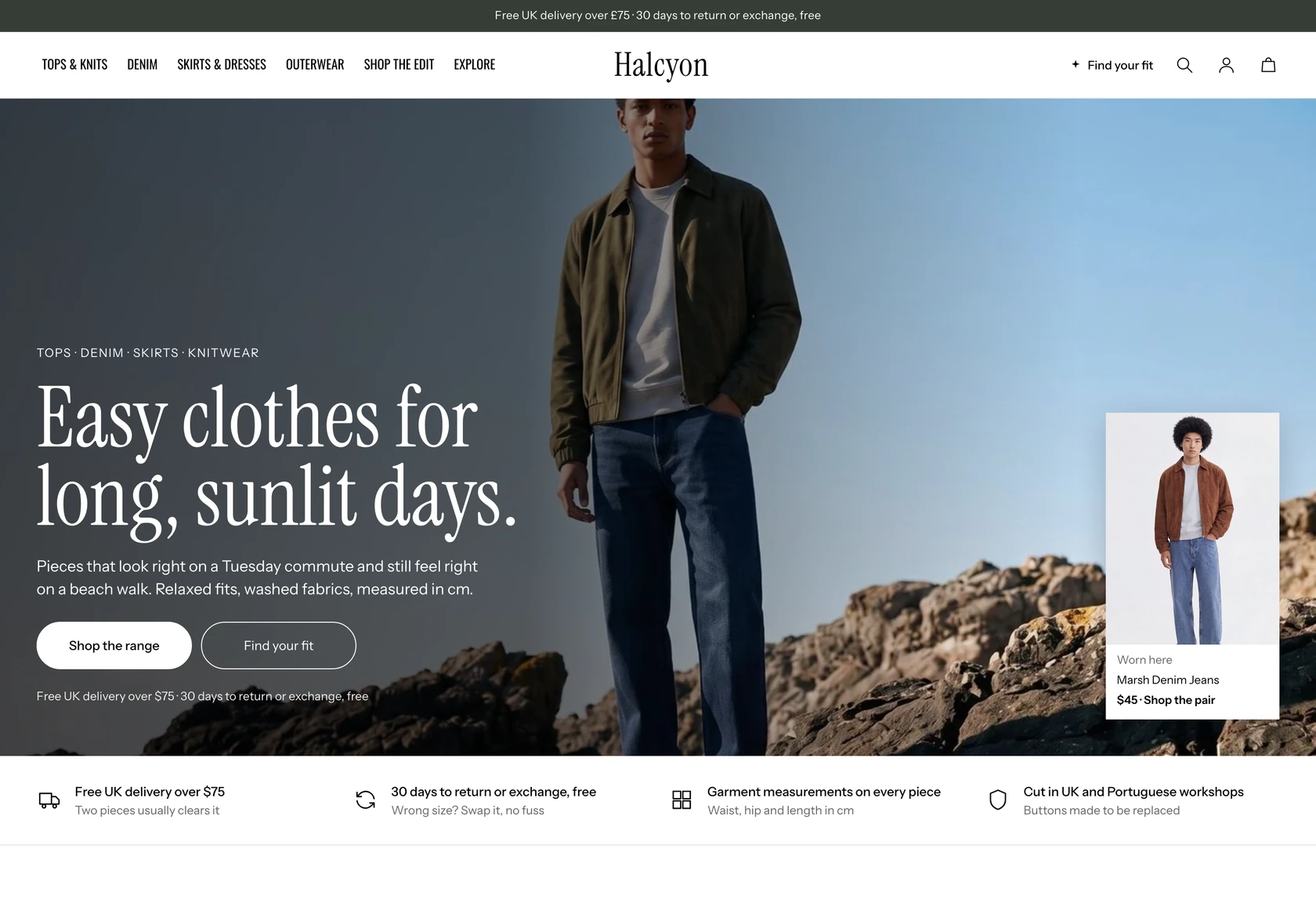 Halcyon
Clothing & Apparel
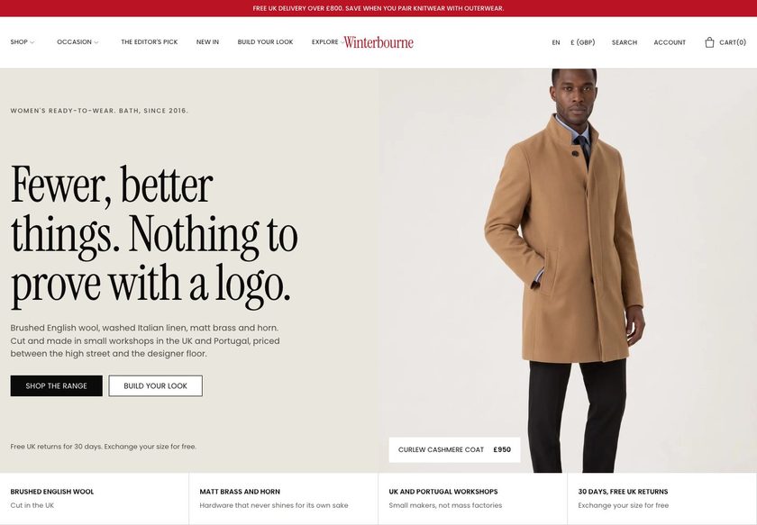 Winterbourne
Clothing & Apparel
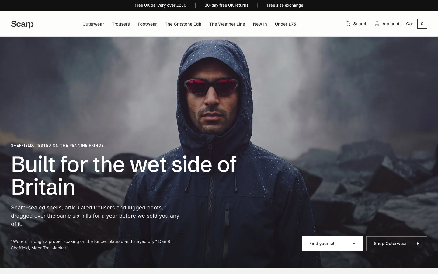 Scarp
Clothing & Apparel
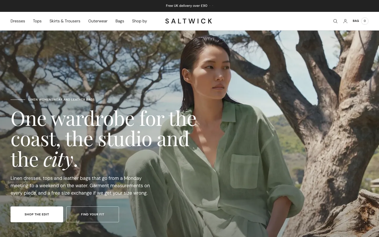 Saltwick
Clothing & Apparel
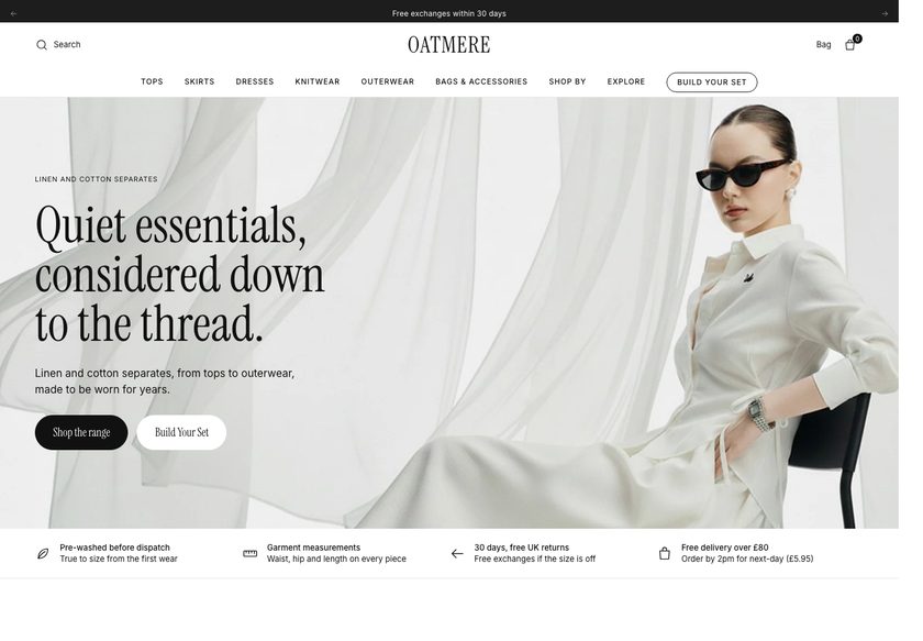 Oatmere
Clothing & Apparel
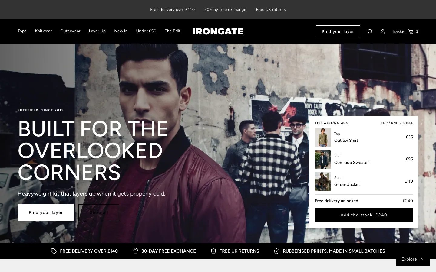 Irongate
Clothing & Apparel
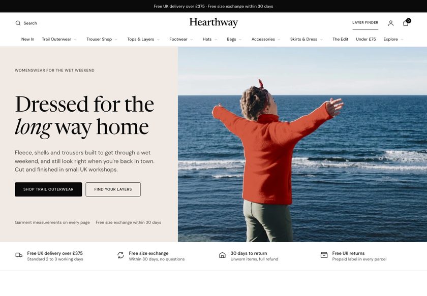 Hearthway
Clothing & Apparel
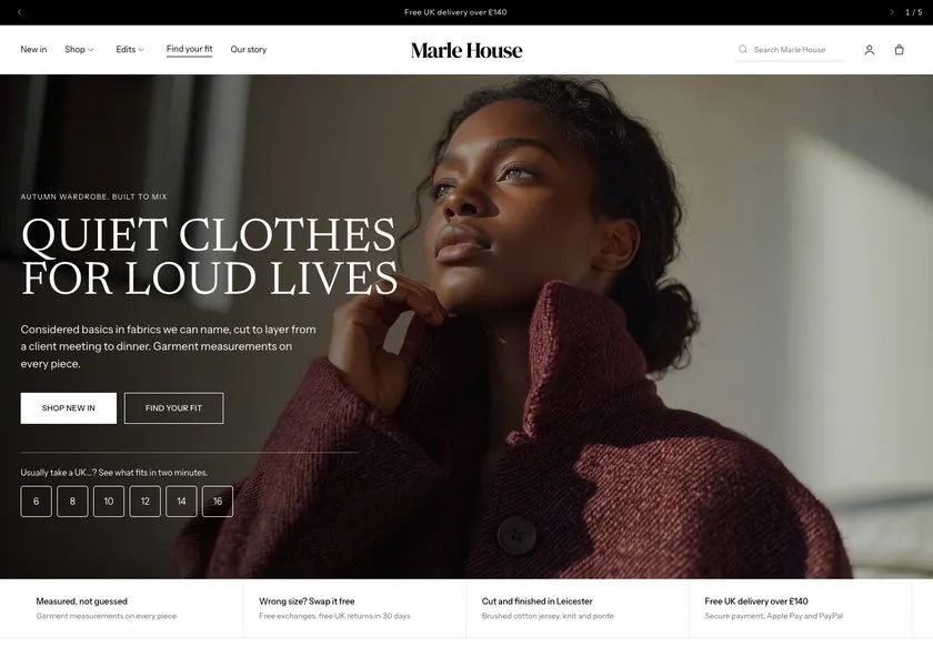 Marle House
Clothing & Apparel
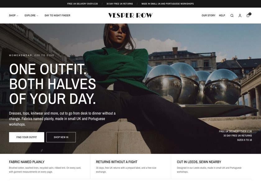 Vesper Row
Clothing & Apparel
A page by page CRO audit of the Dumani homepage, collection page and product page, followed by a redesign concept built to guide shoppers from first visit to a confident purchase.
Pressing play loads the video from YouTube — you can allow it for every teardown under cookie preferences.
Dumani sells considered garments, from leather jackets to hoodies, pants and track pieces, and the products themselves are strong. The homepage already has a store video, a new arrivals collection and a brand line, A Memory Of A Future, that gives the label a point of view. The range is worth showing off, so the work is about presentation, not product.
The core problem is that the site behaves like a catalog. The hero says the store is about garments but not who it is for or why a stranger should trust it, the navigation has to be opened to find anything, and the homepage scrolls as a run of images, names and prices with no routes to take. The visitor is left to work out where to start.
The same pattern repeats further down. On the collection page, three hoodies at around £100 cannot be told apart without opening each one, and the only sorting is the standard theme option. On the product page, a £700 jacket shows images, a name and a price, with sizes as 1 to 4, no measurements, no reviews and no answers about delivery or returns near Add to Cart.
The direction is a guided store. A hero that says who it is for and answers size, delivery, returns and real leather. A finder that works like a salesperson in a shop. Self explanatory product cards, bundles that complete the look, and a product page that justifies the price. The idea worth remembering: a high price needs a page that earns it.
The whole site behaves like a catalog. Images, names and prices are listed, but nothing guides the visitor, compares products or justifies the price, so careful buyers leave without choosing.
Dumani could feel like a shop with a salesperson on the floor: a hero that says who it is for, a finder that recommends a piece, cards that explain themselves and bundles that complete the look.
More visitors who find the right piece, trust the brand and finish checkout, plus a higher order value from bundles and pairings, all from the traffic the store already receives.
Five dimensions, each scored out of ten.
12 issues found, 15 fixes proposed.
The first screen tells a visitor the store is about garments, but not who the pieces are for or whether the brand can be trusted. The questions a stranger asks in the first few seconds go unanswered.
A visitor has to open each navigation item to see what is inside. Categories, budgets and collections are not visible from the start, so the menu offers no early guidance to the right product.
Below the hero the page is a run of products with an image, a name and a price. It does not show which collections exist or offer different ways to explore the range.
The only sorting on the collection page is the standard option from the Shopify theme. There are no extra filters or visual cues to help a shopper narrow the range or discover a piece.
Three hoodies look alike on the collection page, and nothing on the cards explains why one costs around £100. Shoppers must open each page to compare, and many will leave first.
A £700 jacket is presented with images, a name and a price. Nothing explains the material, the making or the value, so a careful buyer has no reason to accept a high price.
Sizes are listed as 1, 2, 3 and 4 with no measurements beside them. The sizing detail sits at the end of the page, so a buyer must hunt for the one answer they need.
To learn about the product a shopper has to read the full description. There is no scannable summary of materials, fit and care, so the answers are present but hard to find.
Around the Add to Cart button there is no word on delivery time, returns or checkout. These are the questions a buyer asks at the moment of decision, and the page does not answer them.
Reviews are not shown on the product pages or elsewhere. A first time buyer spending this much has no proof that other customers bought and were happy.
A jacket sits naturally with a shirt or pants, yet the page offers no pairings, bundles or complete the look suggestions. Each visit ends with one item at most.
Nothing on the pages gives a hesitant visitor a next step, such as a finder, a gift route or a bundle. A shopper who is not ready to buy this exact item simply leaves.
State what Dumani makes, who it is for and why it can be trusted, with a review signal beside it. Add clear buttons for the new drop, the collection and the finder.
Place short answers directly beneath the hero on size, arrival time, returns and whether the leather is real. Visitors then see the usual doubts handled before they scroll.
Group the shop menu by category, by way of buying and by budget, then add the FW26 drop and a story section. Each menu item becomes a route, not a label to open and check.
Build a short question flow on item, style, size and delivery speed, then recommend one piece with two alternatives. It plays the part of a salesperson asking how it can help.
Add category tiles for hoodies, track, pants and leather jackets, then new arrivals, bestsellers, a price band section and a gifting route, so each visitor finds a way in.
Show a badge, rating, a one line summary of what matters, colours, sizes and price on each card. Shoppers can then compare pieces without opening a page for each one.
Offer filters by category, fit, material, delivery, edition, size and price, plus quick routes such as under a set budget or statement pieces. Make discovery faster than the default sort.
Open with the name, rating, a short description and a size guide with fit finder. Follow with scannable material and making detail so the price is explained, not just stated.
Put a size guide and measurements near the size selector, with fit feedback such as how many customers kept their usual size. Buyers then choose a size without scrolling.
List easy returns, secure payment, duties covered, delivery timing and gift wrap near the button. Add a free shipping threshold at the top of the page so it is not missed.
Add reviews and customer photos to every product page. Where a product has none yet, show storewide reviews so shoppers still see that earlier customers were happy.
Replace long description text with charts, boxes and short blocks covering materials, fit and care. A buyer can take in the full detail in seconds instead of reading like a book.
Offer a shirt or pants with each jacket, ready made bundles of several pieces and a build your own option. Reward bundles with free shipping or a small discount.
Give visitors who are not buying for themselves a gift section with a finder and gift cards. Keep the leather by appointment request visible for buyers who want help.
Answer common questions on sizing, making and returns on each page. They help shoppers decide and give search and AI assistants clear answers to quote about the brand.
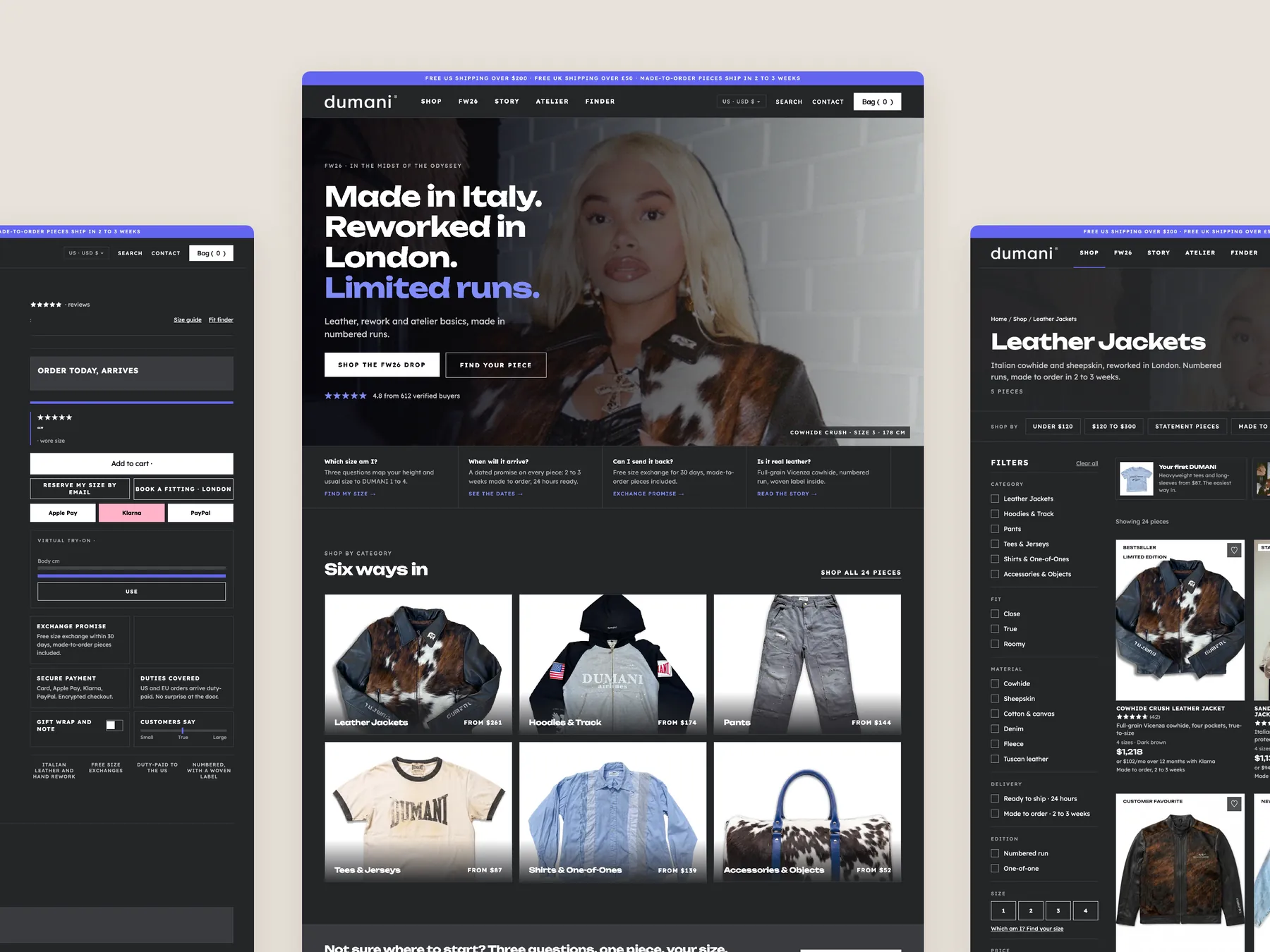
A concept redesign created by Convertica Studio from this audit. It shows how the store could work, it is not the live store.
The whole page shown as two tall columns, from the first screen down to the footer, so you can read the order of the sections.
The homepage in the centre, a product page on the left and a collection page on the right.
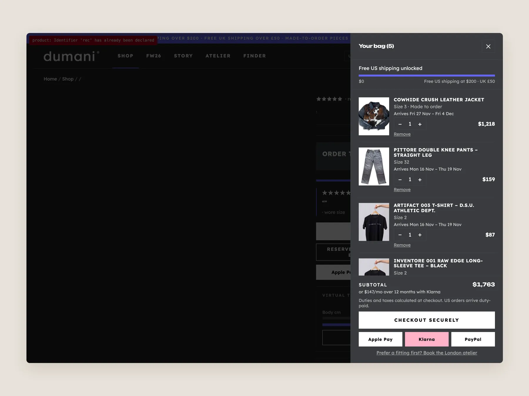
The bag opens over the product page with the page dimmed behind it, so the shopper never loses his place.
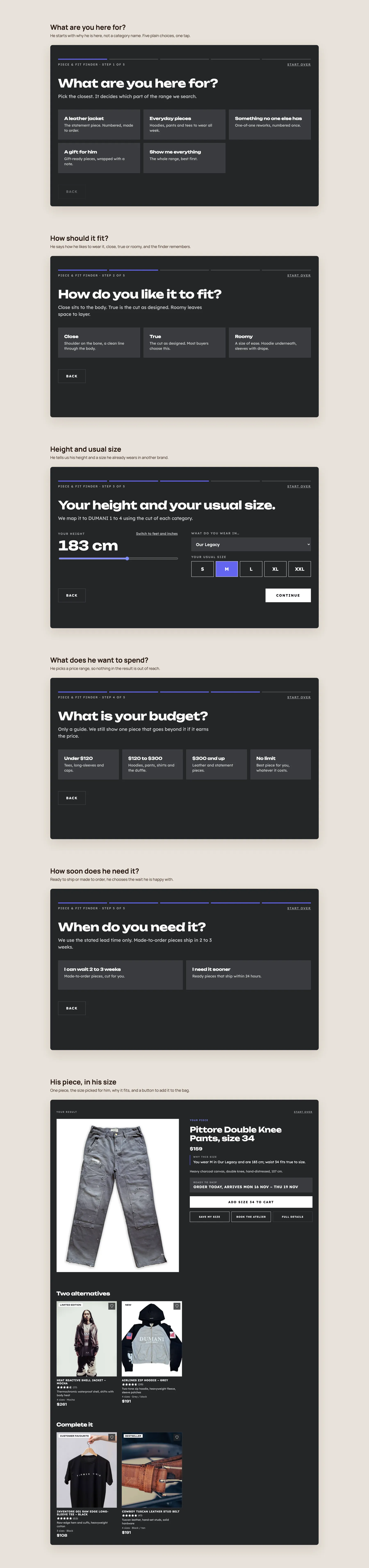
The quiz one step at a time: what he is here for, the fit he likes, his height and usual size, what he wants to spend, how soon he needs it, then one piece in his size.
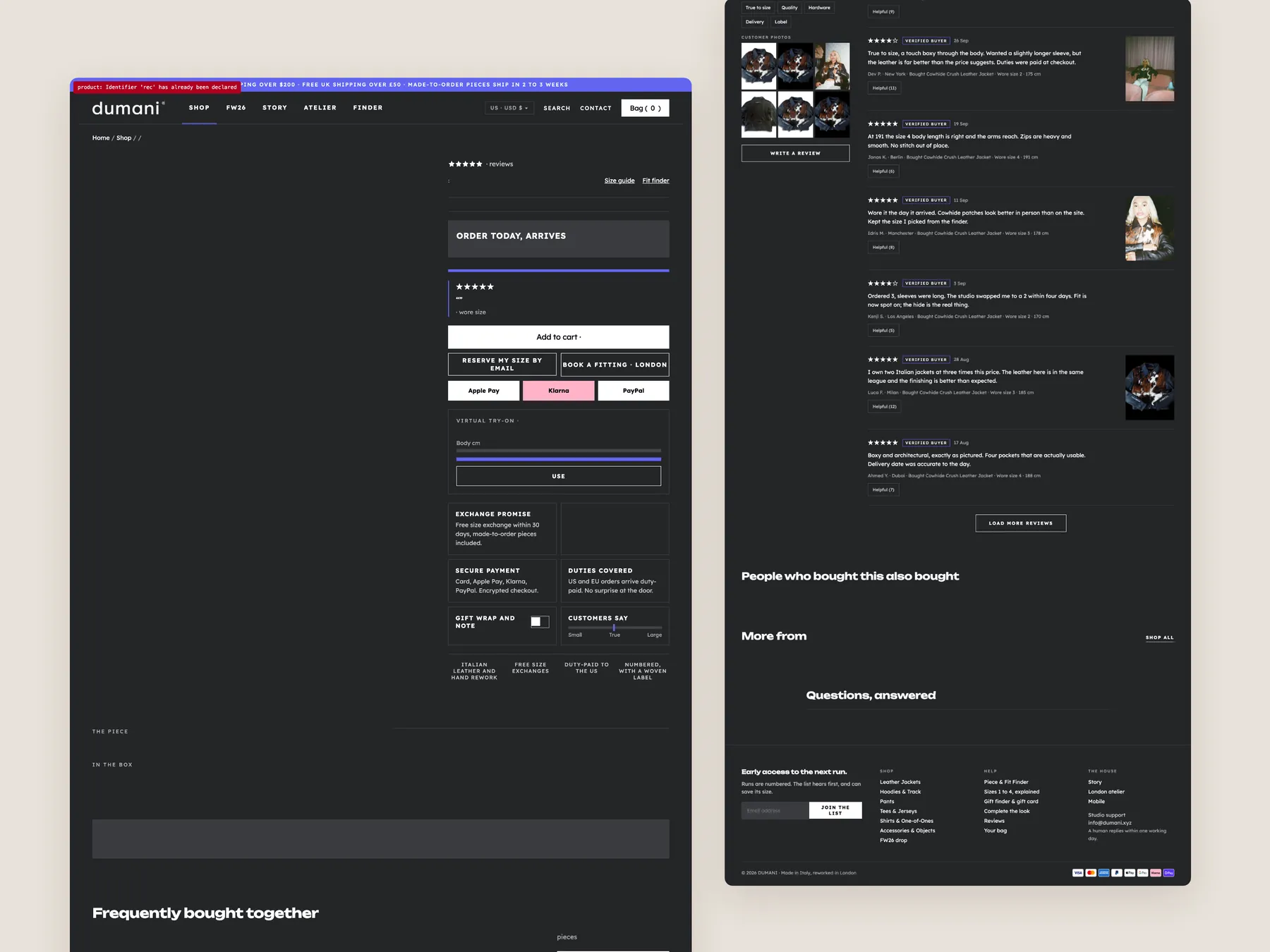
The full page as two tall columns, with the buy box at the top and the details, fit notes and related pieces below.
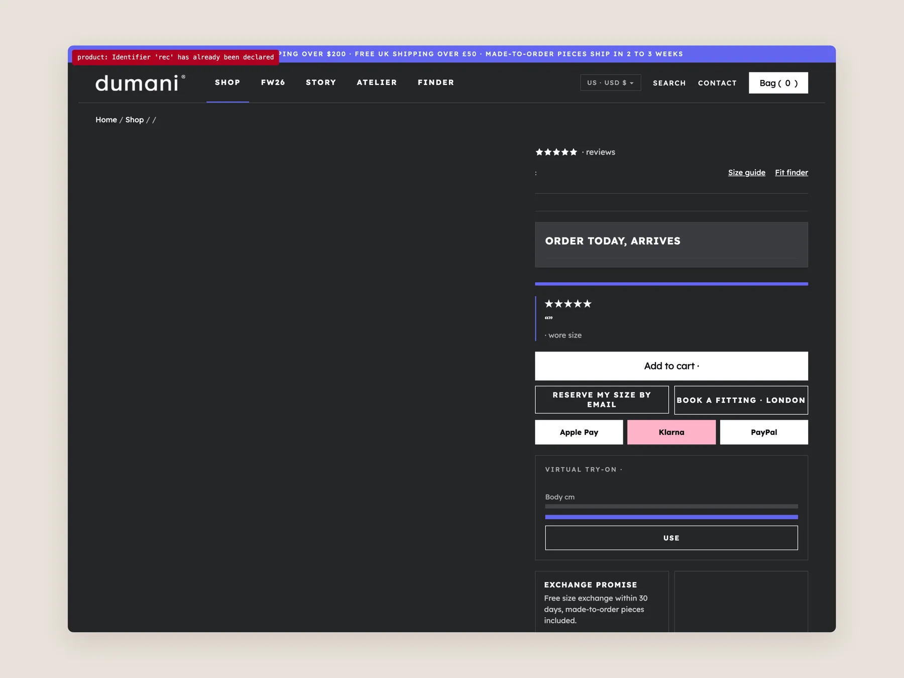
The header and buy box on one screen, with size, delivery and the add to bag button together.
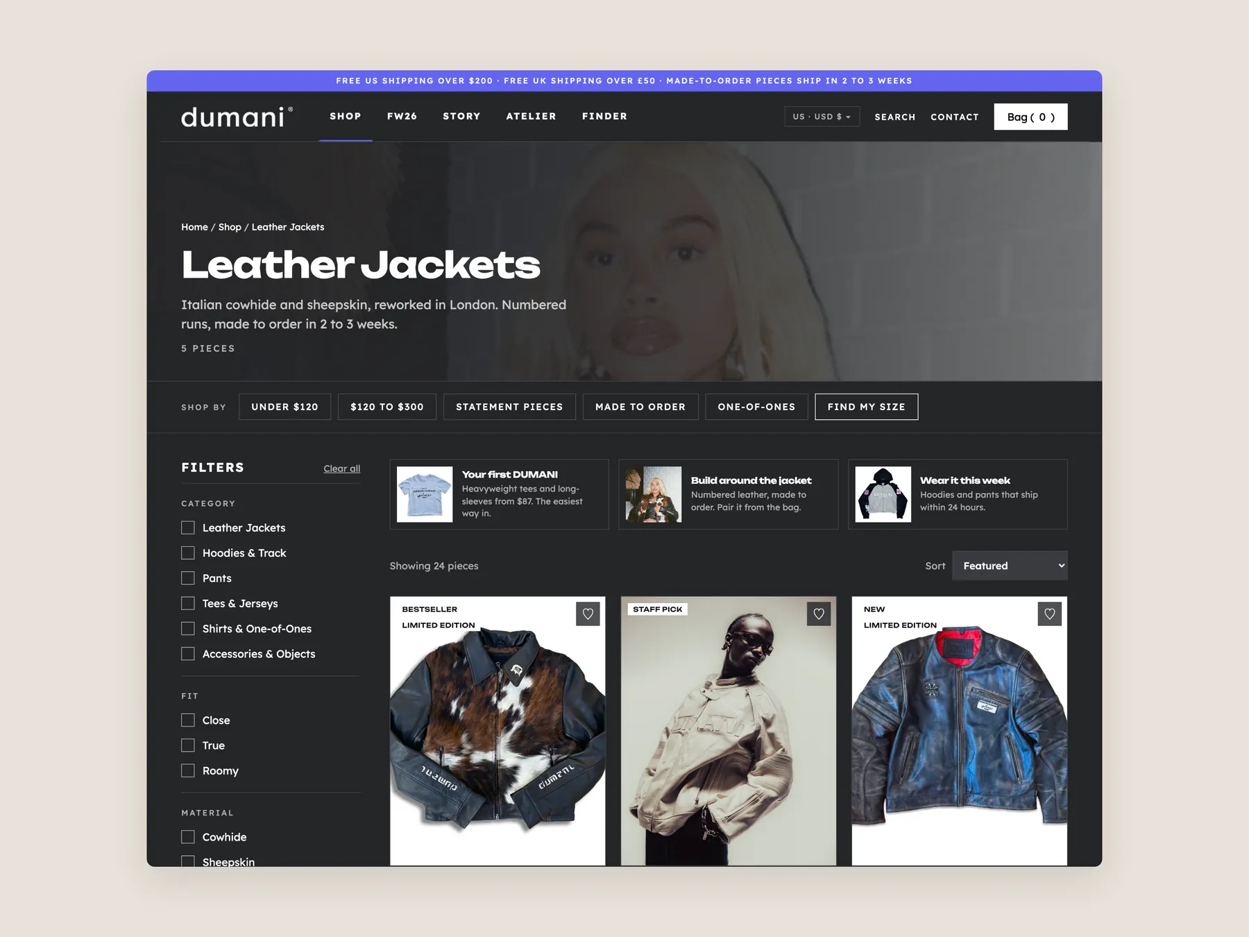
The leather jackets collection: the banner, the ways to shop, the filters and the first row of pieces.
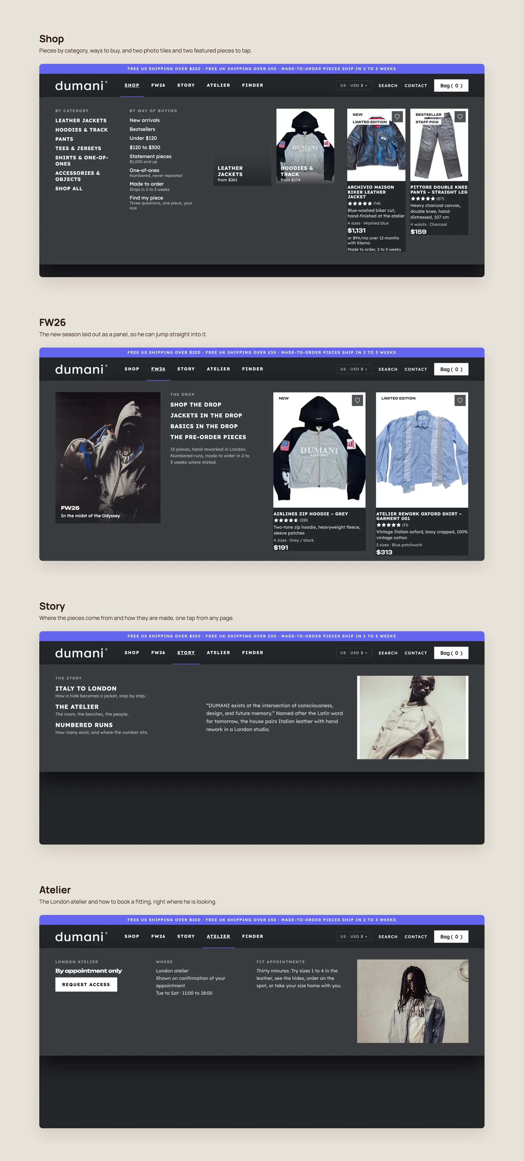
Each menu panel open in turn, Shop, FW26, Story and Atelier, so a shopper can find his way in one move.
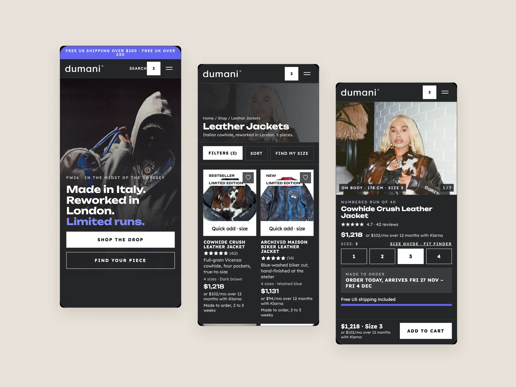
Three phone screens, home, collection and product, with the same clear path to the buy button on a small screen.
The audit found the products good, with a strong range of leather jackets, hoodies and pants. The issue is presentation. The site does not help a visitor find the right piece, compare options or feel safe buying.
After the hero, the page lists products with an image, a name and a price. It does not show collections, offer routes or recommend anything, so every visitor has to browse alone.
It should say what the business does, who it is for and whether the brand can be trusted, ideally within three to five seconds. Dumani's hero names garments but answers none of the other two.
Three hoodies at around £100 look the same on the collection page. Without a summary, rating or key detail on each card, shoppers cannot see why one differs, so they open several pages or leave.
The page shows images, a name and a price, but does not explain the value. A careful buyer sees a high price with no reasons, no reviews and no answers on sizing, delivery or returns.
It asks a few questions, such as item, style, size and how soon it is needed, then recommends one piece with two alternatives. It works like a salesperson in a shop asking how they can help.
Storewide reviews can be shown on the product page. They tell the shopper that other customers have bought from the store and were satisfied, which builds confidence for a new item.
A jacket can be paired with a shirt or pants, and bundles can include free shipping or a small discount. A shopper who came for one piece may then leave with two or three.
No. It is a clickable prototype that shows the mandatory elements and how they fit together. It is a concept to show what the site could do, not final artwork.
The concept shows a homepage, a collection page and a product page. They are the pages most connected to each other and the ones that need attention first.
A store can leave things as they are, carry out the changes itself, or have the studio build them. A strategy call is offered to go through scope and questions.
The video reviews the Dumani homepage, collection page and product page, then walks through a redesigned version of each and the next step options. It runs for 25 minutes.
Tell us about your store and we'll send a personalized 5-minute video showing exactly where you're losing buyers — and how to win them back.
Takes about 40 seconds. No call required.