










EZ Care CRO audit
The website does not clearly explain why a shopper should buy from this store instead of a hundred similar alternatives, leaving visitors to do most of the decision work themselves in a highly competitive beauty market.
Watch the 14:38 teardown.
Pressing play loads the video from YouTube — you can allow it for every teardown under cookie preferences.
The short version.
EZ Care has a clean homepage layout that immediately shows what the store sells, and a wide range of beauty and skin care items across categories people actively shop for. The business is growing and has strong potential; this is not a lack-of-products problem.
The real issue is differentiation. Beauty is a highly competitive category where customers compare ingredients, benefits, shipping, quality, reviews, and overall credibility before ordering, and the website never clearly answers why a shopper should choose this store over a hundred similar alternatives. Visitors land, browse, and see pricing, but they are not guided toward a purchase.
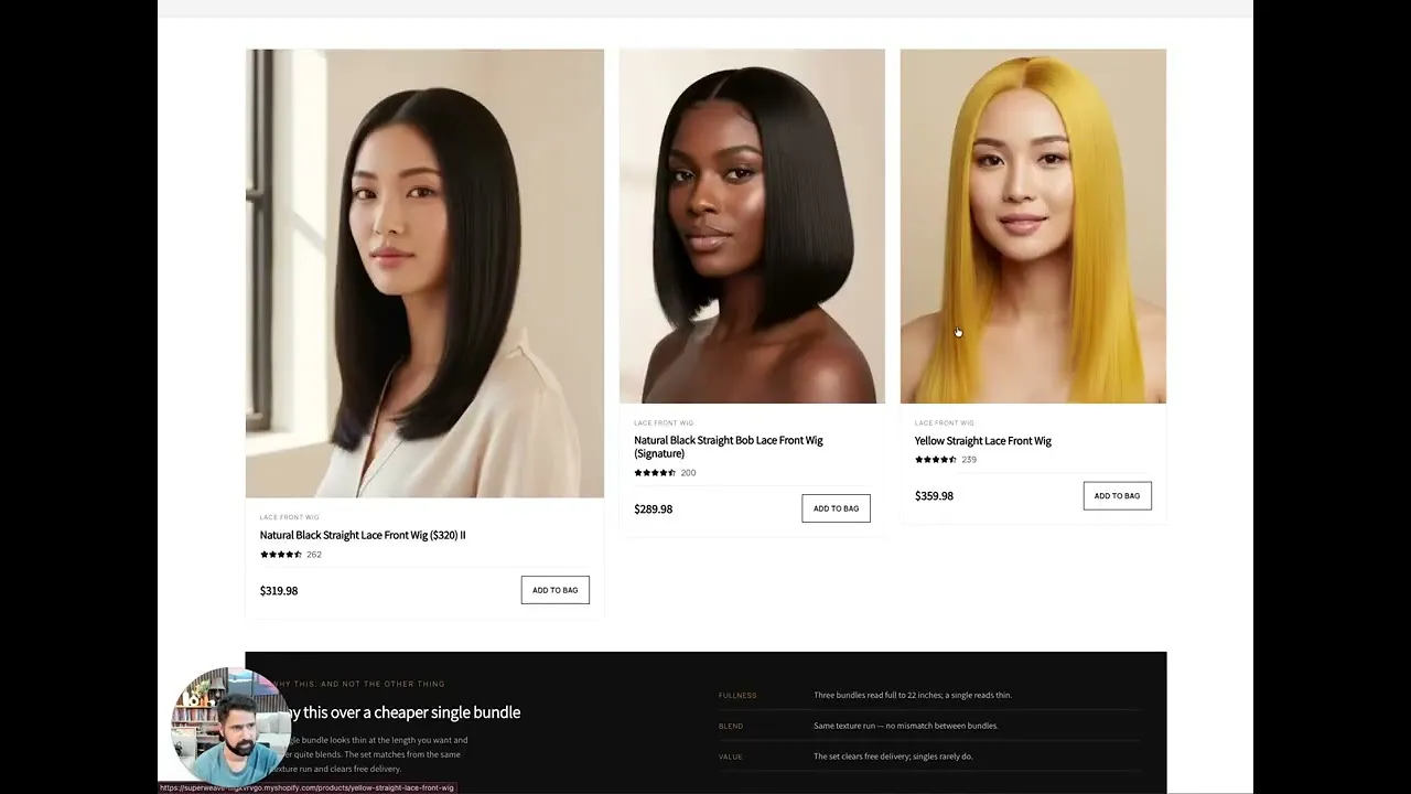
Page by page, the hero leads with seasonal promotions instead of a value proposition, the collection is overwhelming with similar-looking thumbnails and busy imagery that gives a dropship-store feel, and the product page relies on visitors doing their own research, with shipping, returns, and trust signals far from the add-to-cart button.
The redesign direction establishes credibility before products, guides shoppers by concern with real filters and badges, reworks the imagery into one consistent brand style, and rebuilds the product page around outcomes rather than packaging, with reviews, guarantees, and bundles close to the purchase area to lift both conversion and average order value.
The website does not clearly explain why a shopper should buy from this store instead of a hundred similar alternatives, leaving visitors to do most of the decision work themselves in a highly competitive beauty market.
Establish EZ Care as a credible, curated beauty destination by leading with a clear value proposition, consistent brand imagery, and guided shopping by concern, so customers find the right product faster and buy with confidence.
Stronger differentiation and credibility, easier product discovery, a brand-level feel instead of a dropship impression, fewer objections at checkout, higher conversion rate, and increased average order value through bundles and routines.
Scored across five dimensions.
Average of the five scores below, as judged at the time of recording. Weak overall — the detail is in which dimension is dragging.
11 findings, each with the fix beside it.
Every finding below was called out on the recording. Open one to read what was found and what we would change. Nothing is hidden from the page source.
01 No Clear Differentiation Fix included
The website does not explain why a shopper should choose this store instead of a hundred similar alternatives online.
Lead The Hero With One Clear Value Proposition
Focus the hero on the strongest positioning with one clear headline, supporting benefits, customer reassurance, and a stronger primary call to action.
02 Visitors Left To Do The Work Fix included
People land, browse products, and see pricing, but they are not guided toward a purchase with enough clarity.
Add Guided Shopping Funnels
Route visitors to the right category with paths like shop by concern and this month's best sellers instead of asking them to browse immediately.
03 Hero Leads With Promotions Instead Of Value Observation
The hero shows seasonal promotions and product listings rather than quickly answering why someone should shop here specifically.
This one is addressed by the wider recommendations below rather than a single change.
04 Credibility Not Established Early Fix included
Expertise, curated selection, shipping benefits, guarantees, and social proof appear too late to establish authority in a competitive market.
Establish Credibility Before Products
Build trust first through guarantees, featured brands, customer reviews, shipping information, and educational content.
05 Overwhelming Product Discovery Observation
The collection gives access to many products, but similar-looking thumbnails, long product names, and little context beyond price make discovery overwhelming.
This one is addressed by the wider recommendations below rather than a single change.
06 No Buying Cues In The Collection Fix included
There is no useful filtering, no badges like best sellers or editor picks, and no quick benefit summaries to help customers decide faster.
Use Badges And Curated Groupings
Highlight best sellers, editor picks, staff picks, and groupings like best for dry skin, with quick comparison elements.
07 Product Images Feel Like A Dropship Store Fix included
There is too much going on in the product images, and the inconsistency creates a dropship-store feeling instead of a brand.
Rework Product Imagery Into A Consistent Style
Create a symmetrical, uniform image style so every product looks like part of one brand rather than a dropship store.
08 Product Page Relies On Visitor Research Observation
On pages like the tattoo care balm, the purchase decision depends heavily on visitors doing all the research on their own.
This one is addressed by the wider recommendations below rather than a single change.
09 Missing Benefit Hierarchy And Proof Fix included
The product page lacks a clear benefits hierarchy, ingredient highlights, usage instructions, before-and-after visuals, and prominent customer reviews.
Put Benefits Before Technical Details
Lead the product page with who the product is for, what problem it solves, how to use it, and what results to expect, with key ingredients explained visually.
10 Reassurance Far From The Buy Button Fix included
Shipping, returns, and trust badges are not placed near the add-to-cart button where the decision happens.
Bring Trust Close To The Purchase Area
Place customer reviews, trust indicators, FAQs, shipping details, and return information near the add-to-cart button.
11 No Bundles Or Related Products Fix included
There is no natural merchandising of related products and bundles, so orders stay small.
Grow Order Value With Bundles
Add bundles, gift sets, and works-well-with recommendations in a natural way to increase average order value.
3 further recommendations that cut across the whole store.
Add Meaningful Collection Filters
Let shoppers filter by skin type, concern, key ingredients, and routine rather than scrolling a long list.
Educate Inside The Collection
Add build-your-routine content, buying guides, and FAQs within the collection to cut decision fatigue and keep shoppers engaged.
Sell Outcomes, Not Packaging
People buy the results of a beauty product, not the box, so show real before-and-after results and the ritual around the product.
What to take from this teardown.
EZ Care has a clean homepage and a broad catalog people actively shop for.
The store must explain why to buy here instead of a hundred similar alternatives.
Credibility, guarantees, and social proof should appear before products.
Inconsistent product imagery creates a dropship-store feel that a symmetrical image style can fix.
The collection needs filters, badges, and education to cut decision fatigue.
Product pages should sell outcomes and benefits, not packaging.
Reviews, shipping, and returns belong next to the add-to-cart button.
Bundles and routines are the natural path to a higher average order value.
What people ask about this teardown.
12 answers drawn from the recording and the written report — the questions store owners in beauty & skin care ask after watching this one.
Ask about your own store →
What is the biggest conversion problem on this store?
The website does not clearly explain why a shopper should buy from this store instead of a hundred similar alternatives, leaving visitors to do most of the decision work themselves in a highly competitive beauty market. This store has a clean homepage layout that immediately shows what the store sells, and a wide range of beauty and skin care items across categories people actively shop for. The business is growing and has strong potential; this is not a lack-of-products problem.
Why did this store score 4/10 on brand and positioning?
Brand and positioning was the weakest of the five dimensions at 4/10, against 5/10 for user experience. Product Images Feel Like A Dropship Store: There is too much going on in the product images, and the inconsistency creates a dropship-store feeling instead of a brand.
No Clear Differentiation: what does that mean in practice?
The website does not explain why a shopper should choose this store instead of a hundred similar alternatives online. The fix: Lead The Hero With One Clear Value Proposition — Focus the hero on the strongest positioning with one clear headline, supporting benefits, customer reassurance, and a stronger primary call to action.
Why is “Visitors Left To Do The Work” costing this store sales?
People land, browse products, and see pricing, but they are not guided toward a purchase with enough clarity. The fix: Add Guided Shopping Funnels — Route visitors to the right category with paths like shop by concern and this month's best sellers instead of asking them to browse immediately.
How do you fix “Hero Leads With Promotions Instead Of Value”?
The hero shows seasonal promotions and product listings rather than quickly answering why someone should shop here specifically.
Is “Credibility Not Established Early” worth prioritising?
Expertise, curated selection, shipping benefits, guarantees, and social proof appear too late to establish authority in a competitive market. The fix: Establish Credibility Before Products — Build trust first through guarantees, featured brands, customer reviews, shipping information, and educational content.
What would change if “Overwhelming Product Discovery” were fixed?
The collection gives access to many products, but similar-looking thumbnails, long product names, and little context beyond price make discovery overwhelming.
What should be fixed first?
Start with Lead The Hero With One Clear Value Proposition — Focus the hero on the strongest positioning with one clear headline, supporting benefits, customer reassurance, and a stronger primary call to action.
How can a store like this increase average order value?
Grow Order Value With Bundles. Add bundles, gift sets, and works-well-with recommendations in a natural way to increase average order value.
Does this store need a full redesign or targeted fixes?
Structural. The average is 4.2/10 and the weakest dimension, brand and positioning, sits at 4/10 — the recommendations amount to rebuilding how the store presents itself, not tuning what is there.
What is the one-sentence takeaway?
Reviews, shipping, and returns belong next to the add-to-cart button. Bundles and routines are the natural path to a higher average order value.
What was reviewed in this audit, and how long is it?
A free 14:38 CRO teardown recorded by Convertica Studio for a beauty & skin care store, walking the live site page by page. It produced 11 issues and 11 written fixes, plus scores across brand, UX, trust, product page and conversion. Any Shopify store can request the same review.
More teardowns from the library.

See what's quietly costing you sales.
Tell us about your store and we'll send a personalized 5-minute video showing exactly where you're losing buyers — and how to win them back.
Takes about 40 seconds. No call required.
-
5-minute video teardownA personalized walkthrough of your store, recorded by Eva.
-
Homepage & PDP reviewWhere attention leaks and buyers hesitate.
-
Mobile UX audit70% of your traffic — judged on its own terms.
-
Trust & credibility checkThe signals that make first-time buyers convert.
-
Prioritized CRO roadmapRanked by impact vs. effort, ready to ship.