Homepage
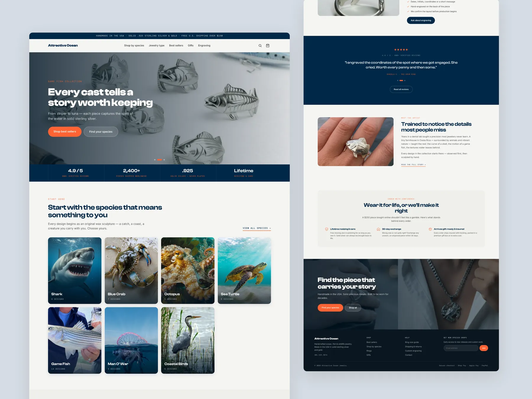
The whole page in two columns: the opening screen and the species tiles on the left, the closing sections and footer on the right.
Storefronts we designed and built, across supplements, fragrance, health, wellness and skincare.
All 35 projectsFour engagements, measured before and after. What changed, why it changed, and by how much.
All case studiesDiagnosis, design and development from one studio — so the recommendation and the build never disagree.
All five services147 real Shopify stores torn down page by page, scored, and shown beside the version we would build. Free to watch.
Browse all teardownsSix conversion-first themes, each built for one industry’s buying journey. Zero required apps, $300, one licence.
Compare all sixThe store has strong handmade products, but the site behaves like a product catalog and never builds the confidence, perceived value, or reassurance needed to justify a $250 average purchase.
Pressing play loads the video from YouTube — you can allow it for every teardown under cookie preferences.
Ocean Jewellery already has a lot going for it: genuinely beautiful handmade, ocean-inspired pieces, a premium story, and products with real emotional meaning. This is not a store that needs new products or more traffic — the pieces themselves are strong enough to carry a premium price.
The problem is that the site behaves like a product catalog instead of a guided buying experience. It shows products, collections, and specs, but for a roughly $250 handmade ring buyers need reassurance on quality, fit, craftsmanship, production timelines, returns, and gifting — and those answers arrive too late or not at all. Without them, shoppers hesitate, compare the brand against cheap alternatives, and leave.
The collection page compounds this by presenting almost ninety products with little guidance, and the product page does not prove why the jewelry is worth its price. Trust elements, engraving, and natural companion products — charms, earrings, necklaces, gift options — are all underused, leaving average order value on the table.
The fix is a redesign built around the buying journey: an emotional hero backed by trust signals, guided discovery by jewelry type and meaning, a collection page that recommends rather than dumps, and a product page that answers every question, sets made-to-order expectations, and promotes engraving and pairings. Every section should work together to prove the product is worth $250 and let buyers purchase with confidence.
The store has strong handmade products, but the site behaves like a product catalog and never builds the confidence, perceived value, or reassurance needed to justify a $250 average purchase.
Redesign the site around the buying journey — a stronger first impression, guided discovery, deeper trust, and a reassuring product page — so ocean-inspired handmade jewelry feels worth its premium price.
Stronger trust, clearer product discovery, better size and timeline confidence, a more persuasive product page, and higher conversion rate and average order value through engraving, pairings, and gift options.
Average of the five scores below, as judged at the time of recording. Weak overall — the detail is in which dimension is dragging.
Every finding below was called out on the recording. Open one to read what was found and what we would change. Nothing is hidden from the page source.
The site shows products, collections, and specs, but the buying journey feels underdeveloped and inconsistent. Visitors are left to convince themselves instead of being guided toward a purchase.
Ask visitors how they would like to shop, offer filters, and add bestseller, gift pack, and new badges so the page educates instead of dumping products.
With rings averaging around $250, buyers need more than photos and specs, yet the site does not create enough perceived value to separate the jewelry from $50 mass-produced alternatives.
Explain the materials, hand carving, and craftsmanship that make this a $250 product and why it is better than $40 mass-produced jewelry.
Questions about fit, shipping, returns, sizing, gifting, and reviews are answered too late or not at all, which creates hesitation at the exact moment trust should be building.
This one is addressed by the wider recommendations below rather than a single change.
This is an emotional product tied to memories and milestones, but the homepage opens with a bold statement and never explains what the brand is, why to trust it, or who has already bought.
Show bestsellers on the homepage so new visitors immediately see what other customers already love.
The hand carving, materials, fit, and production timeline that make this jewelry different from mass-produced pieces are never laid out for the buyer.
This one is addressed by the wider recommendations below rather than a single change.
The all-products page asks visitors to browse almost 90 items with little guidance instead of helping them shop by species, jewelry type, meaning, gift intent, or bestsellers.
Add a guided journey on the homepage that asks what shoppers are looking for and funnels them into the right jewelry type or meaning.
There are no bestseller, gifting, or hot-selling badges to help shoppers decide faster, even though a well-built collection page makes product page conversion much more likely.
This one is addressed by the wider recommendations below rather than a single change.
Reassurances such as customer counts, free returns, free shipping, and free adjustments are missing from the hero, homepage, collection pages, and product pages.
Place reassurances such as free returns, free shipping, and free adjustments across the homepage, collection pages, and product pages, not just in one spot.
Natural companions such as charms, earrings, bracelets, necklaces, engravings, and gift cards are never offered alongside the product being viewed.
Suggest a matching piece for a partner with a two-product discount, and show natural pairings further down the page.
Custom engraving is one of the strongest selling points, but it is barely mentioned and there is no clear way for a shopper to actually add it.
Present engraving as a headline feature with a clear button on the product page so shoppers can personalize a piece and see exactly how it works.
The made-to-order timeline, size guidance, guarantees, and gift-ready packaging that a $250 handmade purchase requires are not presented clearly above the fold.
Keep pricing, sizing guidance, and key reassurances clear and organized so every major question is answered before the add-to-cart button.
Lead with an emotional statement such as jewelry that starts a conversation, backed by products sold, solid silver, lifetime resizing and care, and a 4.95 rating.
Add the story of the maker to the homepage so the handmade claim has a real person and a real process behind it.
Highlight the 30-day exchange, insured gift-ready delivery, and lifetime resizing and care so buyers feel safe committing.
State that each piece is made to order and ships in two to three weeks so buyers know the timeline upfront instead of complaining later.
Walk buyers through what happens after they order, show the engraving process and materials, and close with frequently asked questions.
Ocean Jewellery has strong handmade products and a genuinely emotional story.
The biggest opportunity is converting existing traffic, not buying more of it.
A $250 handmade purchase needs reassurance on quality, fit, timeline, and returns.
The collection page should guide shoppers, not display ninety products at once.
Trust signals belong on every page, starting in the hero.
Engraving and companion pieces are untapped average order value drivers.
The product page must answer every question before asking for the sale.
A concept redesign created by Convertica Studio from this audit. It shows how the store could work, it is not the live store.
The whole page in two columns: the opening screen and the species tiles on the left, the closing sections and footer on the right.
The product page on the left, the homepage in the centre and the collection page on the right, so the shared look reads at a glance.
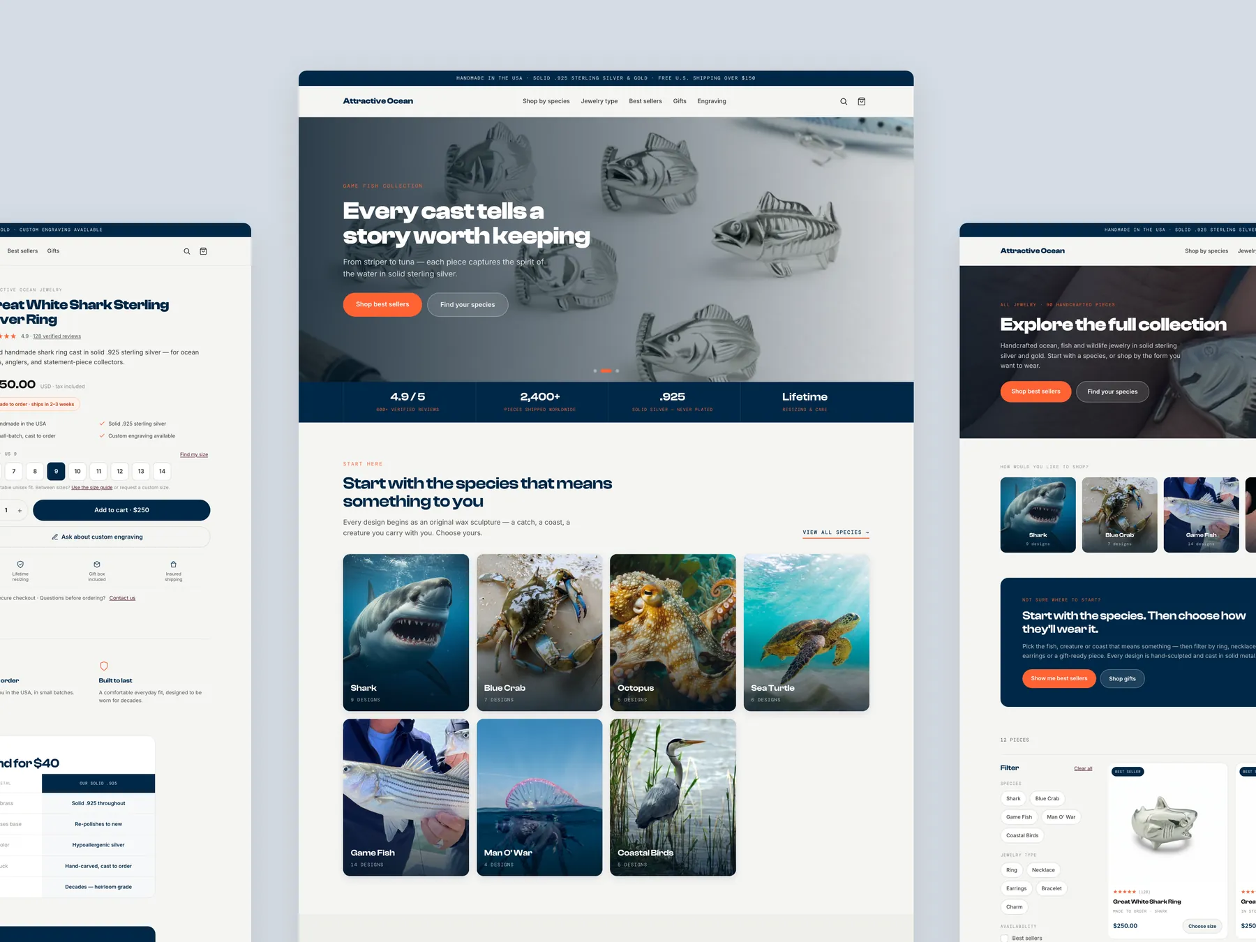
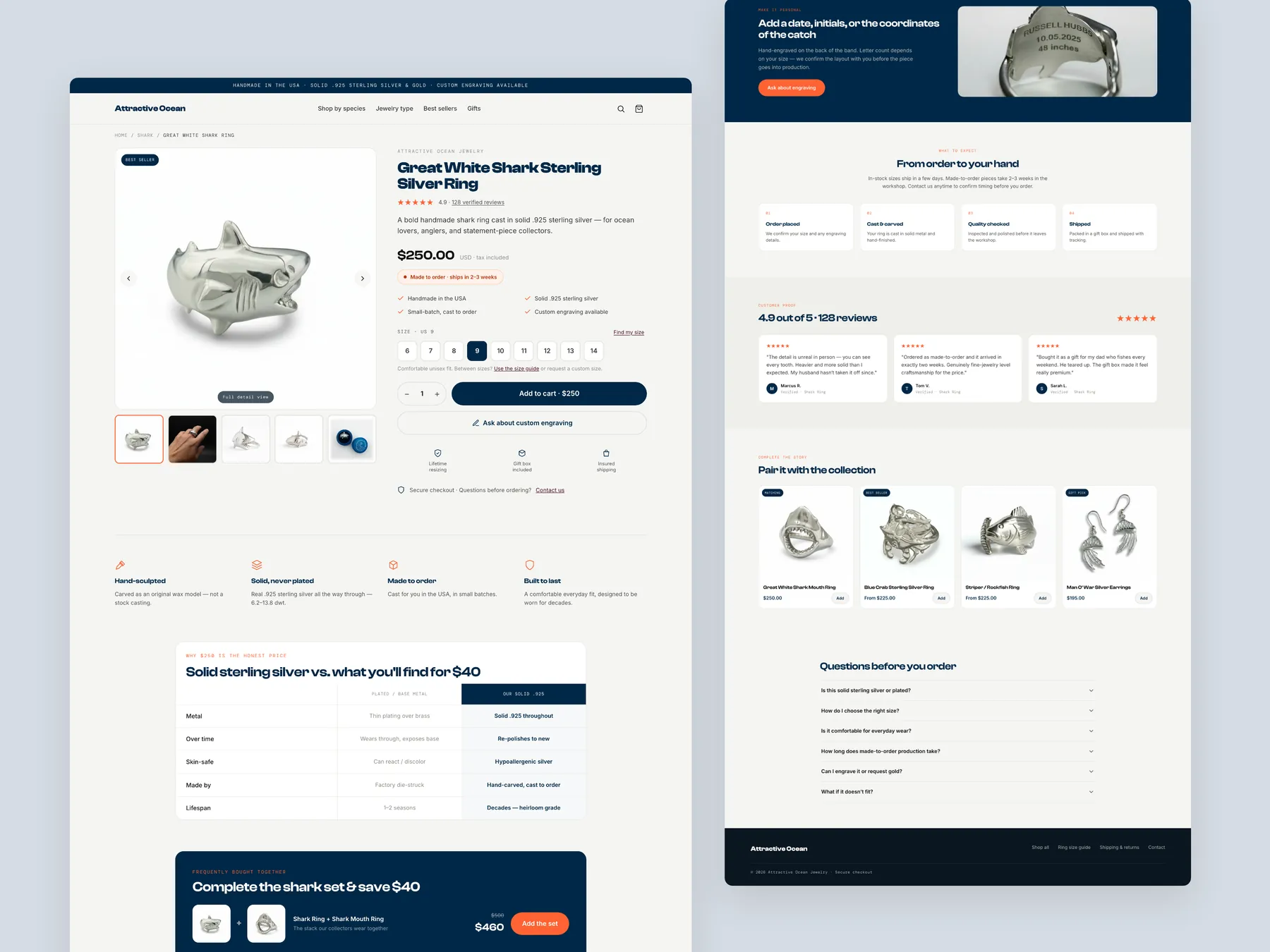
The full page in two columns: the buy box and gallery at the top, the supporting sections and footer running down the right.
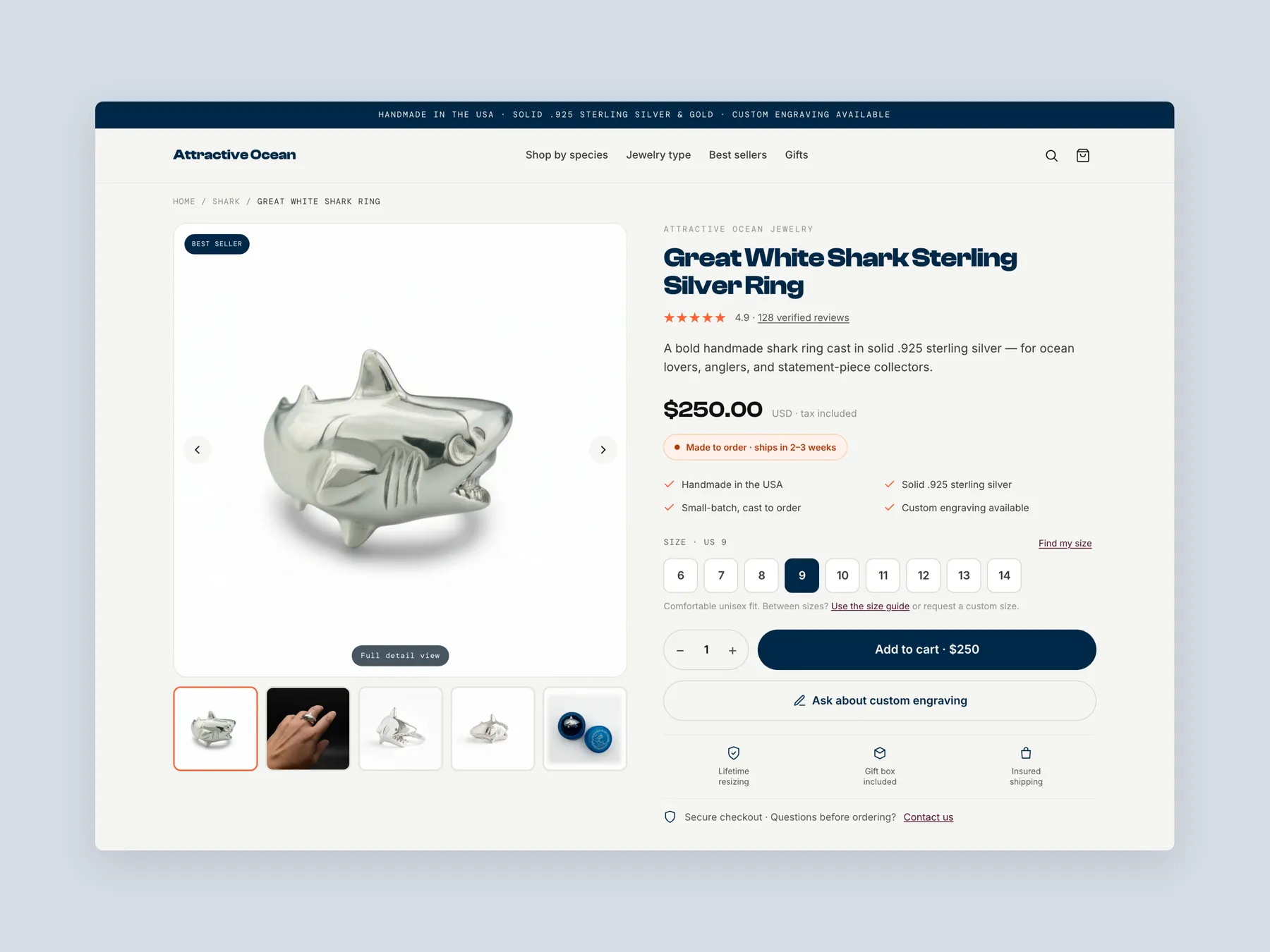
Header, photo gallery and buy box on one screen, everything a shopper needs to choose and add to the bag.
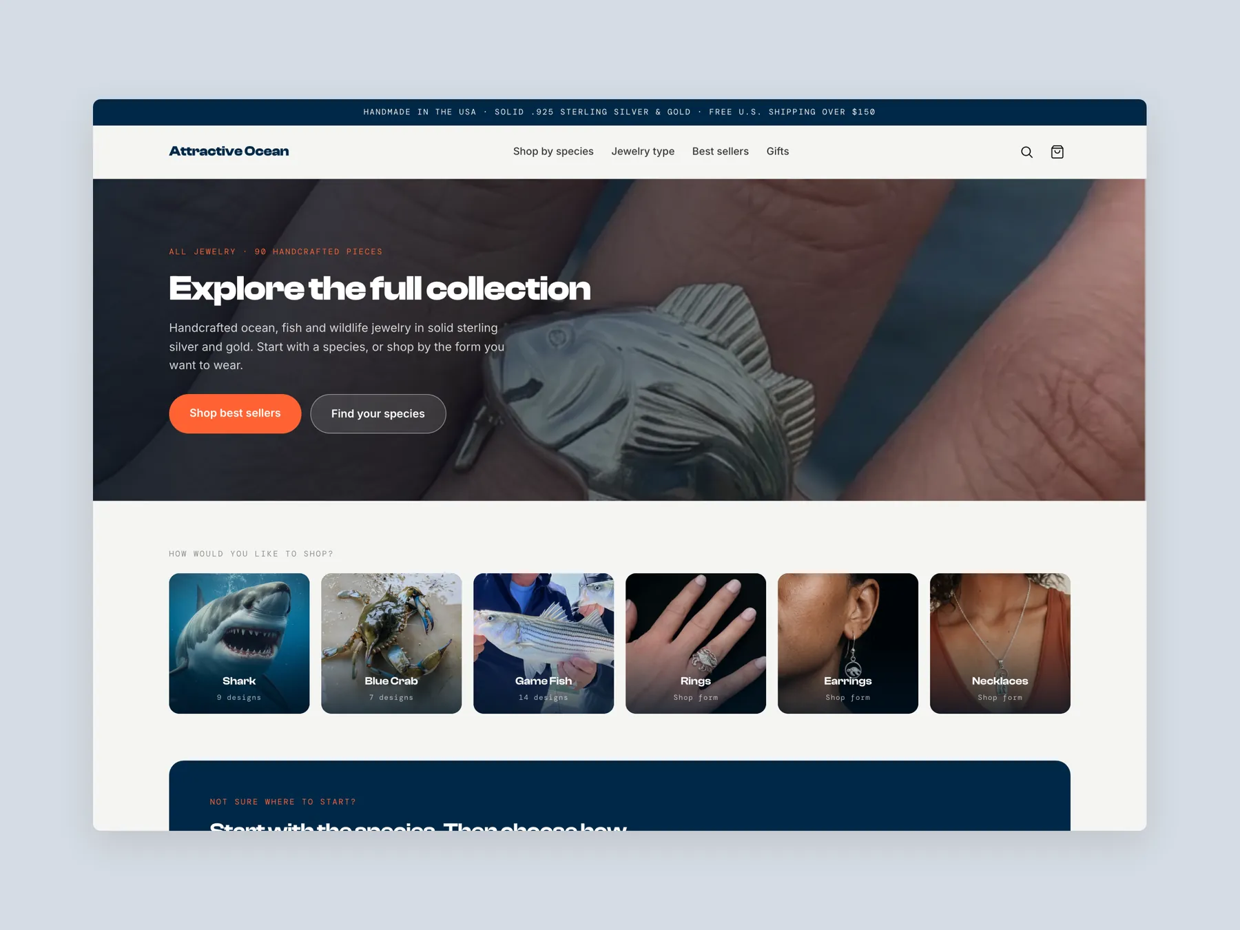
The header, the collection banner and the species tiles that let a shopper start with what means something to them.
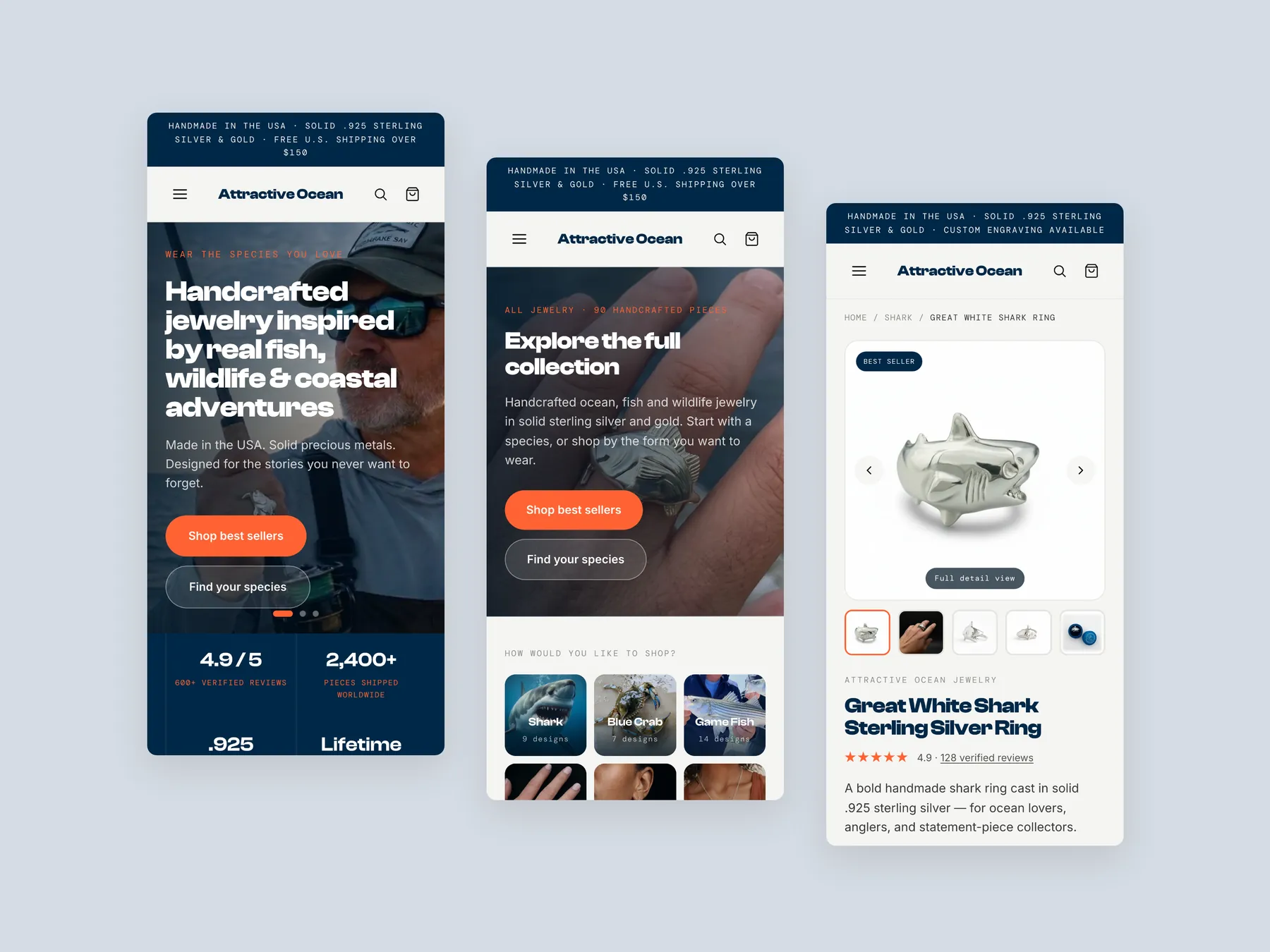
Three phone screens, home, collection and product, with the same order of information as on desktop.
12 answers drawn from the recording and the written report — the questions store owners in handmade ocean-inspired jewelry ask after watching this one.
Ask about your own store →The store has strong handmade products, but the site behaves like a product catalog and never builds the confidence, perceived value, or reassurance needed to justify a $250 average purchase. This store already has a lot going for it: genuinely beautiful handmade, ocean-inspired pieces, a premium story, and products with real emotional meaning. This is not a store that needs new products or more traffic — the pieces themselves are strong enough to carry a premium price.
Trust and credibility was the weakest of the five dimensions at 4/10, against 6/10 for brand and positioning. Common Buyer Questions Go Unanswered Early: Questions about fit, shipping, returns, sizing, gifting, and reviews are answered too late or not at all, which creates hesitation at the exact moment trust should be building.
The site shows products, collections, and specs, but the buying journey feels underdeveloped and inconsistent. Visitors are left to convince themselves instead of being guided toward a purchase. The fix: Rebuild The Collection Page As A Guided Experience — Ask visitors how they would like to shop, offer filters, and add bestseller, gift pack, and new badges so the page educates instead of dumping products.
With rings averaging around $250, buyers need more than photos and specs, yet the site does not create enough perceived value to separate the jewelry from $50 mass-produced alternatives. The fix: Justify The Premium Price — Explain the materials, hand carving, and craftsmanship that make this a $250 product and why it is better than $40 mass-produced jewelry.
This is an emotional product tied to memories and milestones, but the homepage opens with a bold statement and never explains what the brand is, why to trust it, or who has already bought. The fix: Feature Customer Favorites — Show bestsellers on the homepage so new visitors immediately see what other customers already love.
The hand carving, materials, fit, and production timeline that make this jewelry different from mass-produced pieces are never laid out for the buyer.
The all-products page asks visitors to browse almost 90 items with little guidance instead of helping them shop by species, jewelry type, meaning, gift intent, or bestsellers. The fix: Guide Shoppers To The Right Collection — Add a guided journey on the homepage that asks what shoppers are looking for and funnels them into the right jewelry type or meaning.
Start with Rebuild The Collection Page As A Guided Experience — Ask visitors how they would like to shop, offer filters, and add bestseller, gift pack, and new badges so the page educates instead of dumping products.
Add Trust Signals To Every Page. Place reassurances such as free returns, free shipping, and free adjustments across the homepage, collection pages, and product pages, not just in one spot.
Structural. The average is 4.6/10 and the weakest dimension, trust and credibility, sits at 4/10 — the recommendations amount to rebuilding how the store presents itself, not tuning what is there.
Engraving and companion pieces are untapped average order value drivers. The product page must answer every question before asking for the sale.
A free 20:47 CRO teardown recorded by Convertica Studio for a handmade ocean-inspired jewelry store, walking the live site page by page. It produced 11 issues and 13 written fixes, plus scores across brand, UX, trust, product page and conversion. Any Shopify store can request the same review.
Tell us about your store and we'll send a personalized 5-minute video showing exactly where you're losing buyers — and how to win them back.
Takes about 40 seconds. No call required.