










Renaissance de Beaute CRO audit
Visitors have to work too hard to answer basic questions — what makes each treatment different, which one is right for them, how to use it, what results to expect, and why it is safe to order today.
Watch the 13:40 teardown.
Pressing play loads the video from YouTube — you can allow it for every teardown under cookie preferences.
The short version.
Renaissance de Beaute has real strengths: a distinctive Moroccan skincare story, recognizable natural ingredients, and a range that can support individual products, complete rituals, spa combinations, and gifts. The Moroccan identity genuinely comes through on the site.
The problem is not the product — it is that visitors have to work too hard to answer basic questions: what makes each treatment different, which one is right for them, how to use it, what results to expect, and why it is safe to order today.
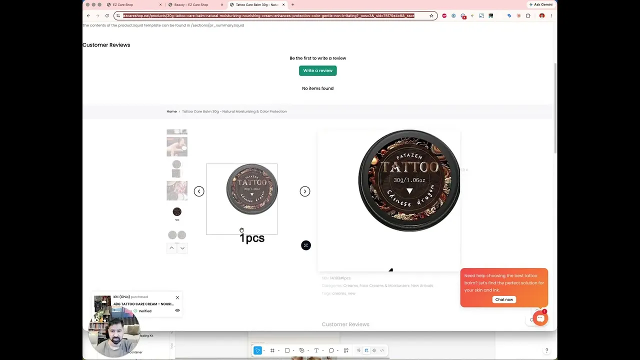
The homepage opening gives no sharp reason to keep exploring. The shop page is a product wall that leaves someone wanting hydration comparing moisturizers, oils, serums, masks, and scrubs with no guidance. The product page shows little more than a name, quantity, and short description — with reassurances, proof, and usage guidance missing at the moment of decision.
The direction is a clear sequence: establish the brand's value, help people identify the right treatment through shop-by-concern paths, answer their questions, provide evidence, and make the purchase feel simple. Translating the Moroccan ritual into cleanse, exfoliate, treat, and moisturize creates both product context and a natural path toward purchasing multiple items.
Visitors have to work too hard to answer basic questions — what makes each treatment different, which one is right for them, how to use it, what results to expect, and why it is safe to order today.
Connect the Moroccan spa heritage to customer outcomes with shop-by-concern paths, a simple ritual explainer, and product pages that sell complete routines instead of isolated items.
Clearer brand promise, easier treatment selection, stronger product understanding, reduced hesitation at the moment of purchase, higher conversion rate, and increased average order value through routine and ritual bundles.
Scored across five dimensions.
Average of the five scores below, as judged at the time of recording. Weak overall — the detail is in which dimension is dragging.
10 findings, each with the fix beside it.
Every finding below was called out on the recording. Open one to read what was found and what we would change. Nothing is hidden from the page source.
01 Homepage Opening Lacks A Sharp Reason To Explore Observation
The Moroccan identity comes through, but the first screen does not say who the products are for, what they do, or where to begin.
This one is addressed by the wider recommendations below rather than a single change.
02 Homepage Is Missing Its Core Jobs Fix included
Best sellers, shopping paths by concern, a simple Moroccan ritual explainer, customer results, and one clear next action are all absent.
Feature A Small Set Of Best Sellers
Present a limited number of best sellers, each with a concise benefit, a customer fit statement, and a clear reason it belongs in the routine.
03 Shop Page Is A Product Wall Observation
Someone who wants hydration is left comparing moisturizers, oils, serums, masks, and scrubs with no sense of which format or routine is right for them.
This one is addressed by the wider recommendations below rather than a single change.
04 No Shop-By-Concern Navigation Fix included
Shoppers cannot narrow the range by concern, product type, ingredient, or ritual — dry skin, brightening, mature skin, or deep cleansing.
Turn The Shop Page Into Guided Discovery
Let people narrow the range by concern, product type, ingredient, or area of use without opening every product individually, with a brief collection intro and a starting point.
05 Product Cards Show Only Name And Price Fix included
Cards do no selling: there is no primary benefit, ideal skin need, product type, or proof alongside the name and price.
Make Product Cards Sell
Show the main benefit, the ideal customer or concern, useful product information, ratings when available, and a quick-add option where appropriate.
06 Buy Area Does Not Ease The Decision Fix included
Above add to cart, the visitor cannot instantly see the main results, who the product is best for, the texture, the aroma, where to use it, or a few concise benefits.
Rebuild The Product Page Top Section
Immediately communicate what the product is, the primary skin benefits, who it is best for, and make sizes and prices easy to understand.
07 Purchase Objections Go Unanswered Fix included
The full ingredient list, how often to apply, suitability for sensitive or dry skin, how it feels, shipping and returns, and why to choose it over a standard moisturizer are all missing.
Put Reassurances Next To The Purchase Button
Include concise delivery, returns, secure checkout, and promotion details near the button so the customer never has to leave the page for answers.
08 No Reviews Or Application Imagery Fix included
There is no social proof, application imagery, ingredient explanation, or clear usage routine to strengthen the case.
Back The Story With Credibility
Support the ritual story with customer feedback, ingredient sourcing credibility, user imagery, and clear reassurances around ordering.
09 Products Are Sold In Isolation Fix included
Nothing recommends pairings such as a cleanser, scrub, or body treatment, so customers cannot build a routine instead of buying single items.
Recommend Routine Pairings
Suggest why each companion product belongs with the purchase — prepare with a scrub, cleanse, then seal in moisture — so customers complete their routine.
10 Ideas Are Not Prioritized Observation
The current experience introduces many ideas but does not consistently prioritize what the visitor needs to understand next.
This one is addressed by the wider recommendations below rather than a single change.
6 further recommendations that cut across the whole store.
Lead With One Clear Promise
Connect the Moroccan spa heritage to a customer outcome — nourishing, ritual-inspired skincare for healthier looking face, body, and hair — instead of a broad organic luxury description.
Add Shop-By-Concern Buying Paths
Customers may not know whether they need argan oil, black soap, or a serum, but they know their problem — so offer paths like hydration, brightening, anti-aging, and hair care.
Explain The Moroccan Ritual Simply
Translate the differentiator into a routine a modern customer understands — cleanse, exfoliate, treat, moisturize — creating a natural path to multiple items.
Surface Popular Routines
Promote routines such as the hammam cleansing ritual, the hydration routine, or the anti-aging facial routine — sell a complete ritual, not just one product.
Show Texture And Application Imagery
Skincare is sensory — show packaging, texture, application, and scale so customers can imagine how the product will look, feel, and fit their daily routine.
Explain Ingredients, Usage, And Proof Below The Fold
Cover key ingredients and their roles, how to use the product, sustainability information, FAQs, and social proof to build confidence.
What to take from this teardown.
The brand's Moroccan spa story and natural ingredients are genuine differentiators.
Visitors currently work too hard to figure out which treatment is right for them.
The homepage needs one clear promise and shop-by-concern starting points.
The shop page should be guided discovery, not a product wall.
Product cards must sell with benefits and fit, not just a name and a price.
The product page has to answer usage, suitability, shipping, and return questions before asking for the sale.
Selling complete rituals instead of isolated items is the biggest average order value opportunity.
What people ask about this teardown.
12 answers drawn from the recording and the written report — the questions store owners in moroccan natural skincare ask after watching this one.
Ask about your own store →
What is the biggest conversion problem on this store?
Visitors have to work too hard to answer basic questions — what makes each treatment different, which one is right for them, how to use it, what results to expect, and why it is safe to order today. This store has real strengths: a distinctive Moroccan skincare story, recognizable natural ingredients, and a range that can support individual products, complete rituals, spa combinations, and gifts. The Moroccan identity genuinely comes through on the site.
Why did this store score 4/10 on user experience?
User experience was the weakest of the five dimensions at 4/10, against 6/10 for brand and positioning. No Shop-By-Concern Navigation: Shoppers cannot narrow the range by concern, product type, ingredient, or ritual — dry skin, brightening, mature skin, or deep cleansing.
Homepage Opening Lacks A Sharp Reason To Explore: what does that mean in practice?
The Moroccan identity comes through, but the first screen does not say who the products are for, what they do, or where to begin.
Why is “Homepage Is Missing Its Core Jobs” costing this store sales?
Best sellers, shopping paths by concern, a simple Moroccan ritual explainer, customer results, and one clear next action are all absent. The fix: Feature A Small Set Of Best Sellers — Present a limited number of best sellers, each with a concise benefit, a customer fit statement, and a clear reason it belongs in the routine.
How do you fix “Shop Page Is A Product Wall”?
Someone who wants hydration is left comparing moisturizers, oils, serums, masks, and scrubs with no sense of which format or routine is right for them.
Is “Product Cards Show Only Name And Price” worth prioritising?
Cards do no selling: there is no primary benefit, ideal skin need, product type, or proof alongside the name and price. The fix: Make Product Cards Sell — Show the main benefit, the ideal customer or concern, useful product information, ratings when available, and a quick-add option where appropriate.
What would change if “Buy Area Does Not Ease The Decision” were fixed?
Above add to cart, the visitor cannot instantly see the main results, who the product is best for, the texture, the aroma, where to use it, or a few concise benefits. The fix: Rebuild The Product Page Top Section — Immediately communicate what the product is, the primary skin benefits, who it is best for, and make sizes and prices easy to understand.
What should be fixed first?
Start with Feature A Small Set Of Best Sellers — Present a limited number of best sellers, each with a concise benefit, a customer fit statement, and a clear reason it belongs in the routine.
What is the biggest opportunity here?
Connect the Moroccan spa heritage to customer outcomes with shop-by-concern paths, a simple ritual explainer, and product pages that sell complete routines instead of isolated items. Clearer brand promise, easier treatment selection, stronger product understanding, reduced hesitation at the moment of purchase, higher conversion rate, and increased average order value through routine and ritual bundles.
Does this store need a full redesign or targeted fixes?
Structural. The average is 4.4/10 and the weakest dimension, user experience, sits at 4/10 — the recommendations amount to rebuilding how the store presents itself, not tuning what is there.
What is the one-sentence takeaway?
The product page has to answer usage, suitability, shipping, and return questions before asking for the sale. Selling complete rituals instead of isolated items is the biggest average order value opportunity.
What was reviewed in this audit, and how long is it?
A free 13:40 CRO teardown recorded by Convertica Studio for a moroccan natural skincare store, walking the live site page by page. It produced 10 issues and 13 written fixes, plus scores across brand, UX, trust, product page and conversion. Any Shopify store can request the same review.
See what's quietly costing you sales.
Tell us about your store and we'll send a personalized 5-minute video showing exactly where you're losing buyers — and how to win them back.
Takes about 40 seconds. No call required.
-
5-minute video teardownA personalized walkthrough of your store, recorded by Eva.
-
Homepage & PDP reviewWhere attention leaks and buyers hesitate.
-
Mobile UX audit70% of your traffic — judged on its own terms.
-
Trust & credibility checkThe signals that make first-time buyers convert.
-
Prioritized CRO roadmapRanked by impact vs. effort, ready to ship.