










VEXHair CRO audit
The homepage does not prioritize the decision above the fold and the strongest reassurances sit too low, so shoppers compare premium-sounding shade names without guidance and leave before their biggest doubts, will it blend and what if the shade is wrong, are answered.
Watch the 14:33 teardown.
Pressing play loads the video from YouTube — you can allow it for every teardown under cookie preferences.
The short version.
VEXHair has real strengths, and credit where it is due: a premium look, clear headlines, a shade quiz, consultations, and test pieces on the homepage; solid range and categories on the collection page; and generally strong product page content covering shade information, payment options, Remy human hair, seamless wefts, color match, returns, care, and reviews. These are assets many brands in this category simply do not have.
The problem is organization, not substance. The homepage does not prioritize the decision above the fold, and the strongest reassurances sit too low, so a new visitor starts browsing products before understanding who this is for and why VEXHair is a safer choice. That is where they are lost.
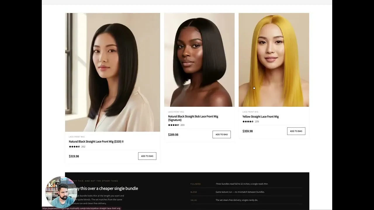
The same pattern continues deeper in the journey. On the collection page, shoppers choose by product name and shade category alone; names like Ashwood Brunette sound premium but do not say whether a shade is warm or cool, which is closest to their hair, or what length fits their goal, so they stall, compare, and leave. On the product page, the objections that actually block sales are buried in long sections, dropdowns, and carousels, far from the buy buttons, so at the moment of purchase people cannot quickly answer will it blend and what if the shade is wrong.
The direction is a guided journey across all three pages: a directional homepage with clear paths and trust checkpoints throughout, a collection that works as a guided shade and style selector whose cards sell before the click, and a restructured product page with visual objection handling and a virtual try-on that previews the selected shade on the shopper's own photo, turning a screen-based guess into a confident choice.
The homepage does not prioritize the decision above the fold and the strongest reassurances sit too low, so shoppers compare premium-sounding shade names without guidance and leave before their biggest doubts, will it blend and what if the shade is wrong, are answered.
Turn the site into a guided shade journey where the collection acts as a selector, the product page answers objections visually beside add to cart, and a virtual try-on removes the number one objection of shade match.
Faster brand comprehension, more confident shade choices, scannable objection handling, lower perceived risk through try-on and test pieces, higher conversion rate, and increased average order value through outcome-based bundles.
Scored across five dimensions.
Average of the five scores below, as judged at the time of recording. Weak overall — the detail is in which dimension is dragging.
9 findings, each with the fix beside it.
Every finding below was called out on the recording. Open one to read what was found and what we would change. Nothing is hidden from the page source.
01 The Decision Is Not Prioritized Above The Fold Observation
The homepage opens without putting the buying decision first, so the most persuasive content plays no part in the first impression.
This one is addressed by the wider recommendations below rather than a single change.
02 Strongest Reassurances Sit Too Low Observation
The proof that makes VEXHair a safer choice lives well down the page instead of at the moments where doubt appears.
This one is addressed by the wider recommendations below rather than a single change.
03 Visitors Browse Before Understanding The Brand Observation
A new visitor starts scanning products before learning who this is for and why VEXHair is the safer choice, and that is where they are lost.
This one is addressed by the wider recommendations below rather than a single change.
04 Shade Names Do Not Guide The Choice Observation
Names like Ashwood Brunette sound premium, but shoppers cannot tell which shade is closest to their hair, whether it is warm or cool, or what length fits their goal.
This one is addressed by the wider recommendations below rather than a single change.
05 The Collection Is A Grid, Not A Guide Fix included
The page hands shoppers a grid of products and leaves them to figure out the right one on their own, when it should be the page that sends them to the right product.
Use Quiz And Swatch Support As Decision Tools
Build the quiz, consultation, and swatch support into the collection as decision tools rather than side options, so shoppers reach the product page already close to a decision.
06 Objections Are Buried On The Product Page Observation
The content is strong, but sequencing and emphasis fail: the objections that actually block sales are answered in long text sections, dropdowns, and carousels far from the buy buttons.
This one is addressed by the wider recommendations below rather than a single change.
07 Key Doubts Go Unanswered At The Buying Moment Fix included
At the moment of purchase, people cannot quickly find answers to will it blend and what if the shade is wrong.
Make Objection Handling Visual And Scannable
Answer will it blend, will it damage my hair, is it comfortable, can I style it, how long does it last, and what if the color is wrong in a scannable visual format.
08 Trust Points Sit In One Block Fix included
Remy human hair, test pieces, returns, and consultations are buried together instead of acting as trust checkpoints throughout the page.
Spread Trust Checkpoints Through The Page
Remy human hair, test pieces, returns, consultations, and real-life proof should appear as checkpoints throughout the page, not buried under one block.
09 The Site Sells One Product At A Time Observation
Once someone is interested there is more for them at VEXHair, but no bundles, add-ons, or complete-the-set moments capture it.
This one is addressed by the wider recommendations below rather than a single change.
9 further recommendations that cut across the whole store.
Make The Homepage Directional
Lead with the outcome, back it with proof, and give clear paths: shop by shade, take the quiz, book a color match, or learn how clip-ins work.
Pull The Decision Points Higher
Position VEXHair in the hero as premium seamless clip-ins designed to blend naturally and be easy to choose, with the decision-making points moved up the page.
Turn The Collection Into A Guided Selector
Make cards and filters do more work by showing shade family, undertone, brightness, length, finish, and best-fit use cases so cards sell before the click.
Restructure The Top Purchase Area
Put the strongest decision drivers beside add to cart: shade, best-for guidance, what is included, length options, payment options, test pieces, and return clarity, not buried below the button.
Add A Virtual Try-On
Let visitors upload a photo, preview the selected shade with an AI-generated before and after, switch swatches in real time, and add to cart right there, with email consent handled to stay legally future-proof.
Pair Try-On With Test Pieces
Preview before you buy and confirm before you open the set removes the risk on both sides of the shade decision.
Build Outcome-Based Bundles
Frame bundles around outcomes such as first-time clip-in essentials, event-ready hair, and long-term care, alongside styling add-ons, extra wefts, and complete-the-set options.
Keep The Free Shipping Threshold Near The Cart
A free shipping threshold can nudge basket size as long as it sits close to the cart.
Sequence Mobile For Minimal Friction
Most beauty journeys start on the phone, so shade comparison, length selection, reassurances, reviews, try-on, and add to cart must appear in a clean order at the right moments.
What to take from this teardown.
VEXHair already has premium products, a credible offer, and shade-matching assets many brands lack.
The homepage must quickly answer what VEXHair is, why to believe it, and where to go next.
Shade choice should be guided by tone, undertone, and length, not by product names alone.
A collection page that educates sends shoppers to the product page already close to a decision.
Objections belong beside add to cart in a visual, scannable format.
A virtual try-on attacks the number one objection: will this match me.
Outcome-based bundles and a nearby free shipping threshold grow average order value.
What people ask about this teardown.
12 answers drawn from the recording and the written report — the questions store owners in hair extensions & beauty ask after watching this one.
Ask about your own store →
What is the biggest conversion problem on this store?
The homepage does not prioritize the decision above the fold and the strongest reassurances sit too low, so shoppers compare premium-sounding shade names without guidance and leave before their biggest doubts, will it blend and what if the shade is wrong, are answered. This store has real strengths, and credit where it is due: a premium look, clear headlines, a shade quiz, consultations, and test pieces on the homepage; solid range and categories on the collection page; and generally strong product page content covering shade information, payment options, Remy human hair, seamless wefts, color match, returns, care, and reviews.
Why did this store score 5/10 on user experience?
User experience was the weakest of the five dimensions at 5/10, against 7/10 for brand and positioning. The Decision Is Not Prioritized Above The Fold: The homepage opens without putting the buying decision first, so the most persuasive content plays no part in the first impression.
Strongest Reassurances Sit Too Low: what does that mean in practice?
The proof that makes this store a safer choice lives well down the page instead of at the moments where doubt appears.
Why is “Visitors Browse Before Understanding The Brand” costing this store sales?
A new visitor starts scanning products before learning who this is for and why this store is the safer choice, and that is where they are lost.
How do you fix “Shade Names Do Not Guide The Choice”?
Names like Ashwood Brunette sound premium, but shoppers cannot tell which shade is closest to their hair, whether it is warm or cool, or what length fits their goal.
Is “The Collection Is A Grid, Not A Guide” worth prioritising?
The page hands shoppers a grid of products and leaves them to figure out the right one on their own, when it should be the page that sends them to the right product. The fix: Use Quiz And Swatch Support As Decision Tools — Build the quiz, consultation, and swatch support into the collection as decision tools rather than side options, so shoppers reach the product page already close to a decision.
What would change if “Objections Are Buried On The Product Page” were fixed?
The content is strong, but sequencing and emphasis fail: the objections that actually block sales are answered in long text sections, dropdowns, and carousels far from the buy buttons.
What should be fixed first?
Start with Use Quiz And Swatch Support As Decision Tools — Build the quiz, consultation, and swatch support into the collection as decision tools rather than side options, so shoppers reach the product page already close to a decision.
How can a store like this increase average order value?
Build Outcome-Based Bundles; Keep The Free Shipping Threshold Near The Cart. Frame bundles around outcomes such as first-time clip-in essentials, event-ready hair, and long-term care, alongside styling add-ons, extra wefts, and complete-the-set options.
Does this store need a full redesign or targeted fixes?
Mostly targeted work, with one structural piece. The average is 5.4/10: brand and positioning is already at 7/10, but user experience at 5/10 needs rebuilding rather than adjusting.
What is the one-sentence takeaway?
A virtual try-on attacks the number one objection: will this match me. Outcome-based bundles and a nearby free shipping threshold grow average order value.
What was reviewed in this audit, and how long is it?
A free 14:33 CRO teardown recorded by Convertica Studio for a hair extensions & beauty store, walking the live site page by page. It produced 9 issues and 12 written fixes, plus scores across brand, UX, trust, product page and conversion. Any Shopify store can request the same review.
See what's quietly costing you sales.
Tell us about your store and we'll send a personalized 5-minute video showing exactly where you're losing buyers — and how to win them back.
Takes about 40 seconds. No call required.
-
5-minute video teardownA personalized walkthrough of your store, recorded by Eva.
-
Homepage & PDP reviewWhere attention leaks and buyers hesitate.
-
Mobile UX audit70% of your traffic — judged on its own terms.
-
Trust & credibility checkThe signals that make first-time buyers convert.
-
Prioritized CRO roadmapRanked by impact vs. effort, ready to ship.